Many small businesses do their best to stay consistent, yet tiny mismatches slip through – a slightly off shade on a postcard, a different tone in an email, a new font on a social post. None of these seems huge on their own, but together they blur the brand your customers are trying to recognize. Cohesive branding solves that by giving every touchpoint the same clarity, confidence and polish, which builds recognition and trust far faster.
This guide shows you how to create a cohesive brand from the ground up. You’ll learn the essentials of a strong, cohesive brand identity, see how it holds up across print and digital, and get a practical checklist you can use to tighten your brand without hiring a full team.
- Consistent branding means using aligned visuals, messaging and tone across all touchpoints, which strengthens recognition, trust and long-term loyalty.
- The five pillars of cohesive branding include voice and messaging, color palette, typography, logo usage and a unified imagery style.
- To ensure brand consistency across channels, maintain cohesion in print, digital and experiential touchpoints so customers have a seamless impression wherever they meet your business.
- Best practices include creating a brand style guide, using templates, standardizing language with a message bank, cloning existing assets before designing new ones, applying “rules of one” and using automation to reinforce consistency.
What is cohesive branding (and why is it important)?
Cohesive branding is the practice of keeping your visual style, messaging and tone aligned across every customer touchpoint. When everything a customer sees from you feels unified, your brand becomes easier to recognise and remember.
This alignment has a measurable impact. The Lucidpress State of Brand Consistency report found that consistent brands with cohesive branding can see revenue gains of up to 20%. Here are a few more notable benefits of cohesive branding for small businesses:
- Faster recognition: A unified look helps customers connect your materials instantly, no matter where they encounter your brand.
- Clearer differentiation: According to VistaPrint’s 2025 Small Business Marketing Guide, standing out among the competition is among the top-three challenges faced by small businesses. What’s more, 62% of consumers report struggling to choose between products and services from similar small businesses. When your branding stays aligned, customers can distinguish you more easily in categories with several similar businesses.
- Increased trust and perceived professionalism: Consistent execution signals reliability, as customers feel more confident that your business is organized, reliable and paying attention to the details that matter.
- Deeper emotional familiarity: A steady visual and verbal style creates a sense of comfort over time, which supports long-term brand loyalty.
- Better operational efficiency: With 77% of companies reporting issues with off-brand content, according to Lucidpress’ report, cohesive branding reduces rework and keeps production streamlined.
The pillars of a cohesive brand identity
Stronger recognition starts with consistency, and the previous section showed how much aligned branding influences customer perception. Keeping that alignment steady across every touchpoint is easier when you work from a clear structure.
A cohesive brand identity is built on a handful of core pillars that shape how your brand looks, sounds and feels wherever people encounter it.
Here are the pillars you’ll rely on:
- Brand voice → consistent messaging
- Color palette → consistent hex values
- Typography → same type family and hierarchy
- Logo usage → correct placement and sizing
- Imagery and graphic style → unified mood and style
Together, they create the foundation for any cohesive branding system.
Pillar 1: Brand voice and messaging
Brand voice is the personality your business uses when it communicates. It might be friendly, expert, playful or direct – the exact style matters less than keeping it steady across every channel.
Customers notice tone immediately, and shifts from one material to another can make your brand feel unfocused. A defined voice brings structure to your messaging and sets clear expectations for how your communication should sound.
Source: Brand guidelines by Hugo Maja via 99designs by Vista
To make that voice usable, outline a few practical markers: how formal you want to sound, the phrasing you tend to use and the types of expressions you avoid. These act as quick guardrails that help anyone creating content stay aligned.
Write a short elevator pitch in your ideal brand voice. Use it as your tone benchmark for all future materials.
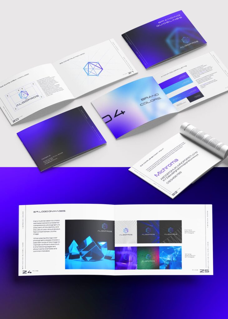
Pillar 2: Color palette
Color is one of the quickest ways customers identify a brand, which makes a defined palette essential for cohesive branding. A strong palette typically includes one primary color and two or three secondary colors that handle supporting roles. This mix gives you enough flexibility for different design needs without losing the unified feel that customers recognize.

Source: Brand guidelines by Terry Bogard via 99designs by Vista
Color psychology can also influence perception – warm tones often feel energetic, cooler tones lean more calm or structured – but the real anchor of consistency is accuracy. Using exact hex codes keeps every shade aligned across print and digital materials. A common mistake small businesses run into is relying on “close enough” colors, which gradually weakens the visual identity and makes assets feel unrelated.
A simple palette guide can help avoid that drift:
- List your approved hex codes
- Note allowed combinations
- Define where each color is typically used
Pillar 3: Typography
Typography plays a major role in how your brand is perceived, influencing whether it feels polished, approachable or more formal. Consistency here matters just as much as color or voice. Using the same set of fonts across materials creates familiarity, while a defined hierarchy ensures every piece is easy to read and visually organized.
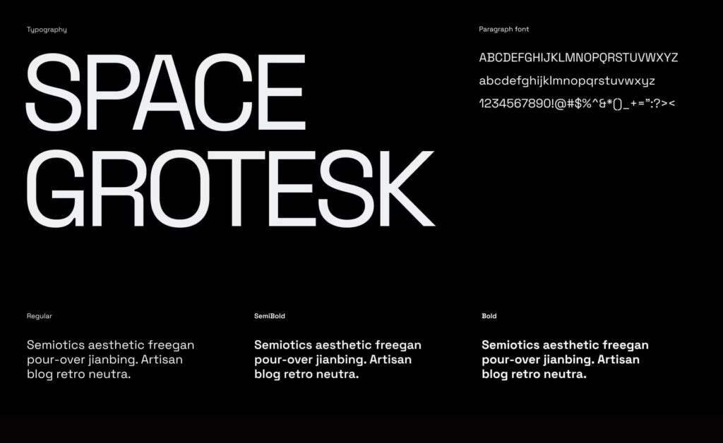
Source: Brand identity by Yevhen Genome via 99designs by Vista
Most brands stick to three roles: a heading font for emphasis, a body font for readability and a restrained accent font for occasional highlights. When these roles stay consistent, customers move through your content without friction.
A few simple pairing guidelines help maintain balance:
- Combine a clean typeface with a more expressive one
- Pair serif with sans serif to create contrast
- Keep accent fonts limited to key moments
Pillar 4: Logo usage
Your logo is one of the most recognisable elements of your brand, which makes consistent usage essential. Clear rules ensure it looks intentional wherever it appears.
These typically include minimum sizing so the details stay sharp, spacing requirements to prevent crowding and approved variations for dark or light backgrounds.
It’s also important to define when to use full-color, one-color or monochrome versions, as well as guidelines for placement across different formats.
Source: Brand guidelines by Arthean via 99designs by Vista
Pillar 5: Imagery and graphic style
Once your logo is defined, the next layer of cohesive brand identity comes from the imagery and graphic style that support it. These elements shape the emotional tone of your brand, and customers notice them far more quickly than they realise. Photography filters, illustration techniques, patterns, shapes and textures all play a role in creating that impression.
Maintaining consistency across these details keeps your visual world unified while still giving you room to be creative. A few simple practices help keep everything aligned:
- Use the same photo filters across campaigns
- Keep the illustration line weight or shading style consistent
- Repeat signature shapes or patterns throughout your materials
This approach builds a recognisable mood that customers connect with your brand, reinforcing the cohesive branding created by your voice, color palette, typography and logo.

Source: Brand identity by goopanic via 99designs by Vista

Source: Brand identity by goopanic via 99designs by Vista

Source: Brand identity by goopanic via 99designs by Vista

Source: Brand identity by goopanic via 99designs by Vista
How to create cohesive branding across multiple channels
Customers move between your physical and digital touchpoints without thinking about it – they see your storefront, scroll past your social posts, open your emails and interact with your packaging. To make every one of those moments work together, your branding needs to stay aligned wherever it appears. That means applying the same visual rules, voice and standards across every channel, not just a select few.
This is where the intentional use of marketing materials for small businesses becomes a real advantage. When each asset follows the same structure, customers recognise you faster and understand what your brand stands for.
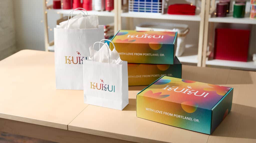
Create a cohesive look in print
Printed materials are often the first physical interaction customers have with your brand – at your store counter, in a shipped package or at an event. Matching colors, fonts and tone across print items, like business cards, packaging or thank-you notes sent after an order, helps customers form a clear mental image of who you are and what you’re about.


A cohesive print presence often looks like this:
- Your business card uses your primary brand color
- Your storefront sign uses the same typography as your website header
- Your product packaging or tote bags reinforce your logo and tagline
- Your small business thank you cards echo your voice – friendly, thoughtful, bold, etc.
These consistent elements build a recognisable visual story that carries through every printed touchpoint.
Want ideas for expanding your printed presence? Explore these promotional product ideas for brands.
Create a cohesive look in digital
Just as print benefits from clear rules, your digital presence needs its own structure to stay aligned. Digital channels change far more frequently – new posts, rapid updates and ongoing tweaks across your website or social feeds. Without a few simple standards, the look and tone can drift before you even notice it. The aim is to have lightweight guardrails that help every update reinforce the same identity while still giving you room to create.

Source: Brand identity by Yevhen Genome via 99designs by Vista

Source: Brand identity by Yevhen Genome via 99designs by Vista
Here’s a practical, at-a-glance guide for keeping your digital touchpoints cohesive:
| Channel | What to keep consistent | Practical example |
| Website | Fonts, header style, CTA buttons | Use the same button color and label style site-wide |
| Email newsletter | Logo placement, sign-off tone | End each email with a familiar human sign-off paired with your logo and tagline in the email header |
| Photo editing style, text overlay format | Apply one preset or filter to all posts to maintain a recognisable mood | |
| Facebook / LinkedIn | Headline tone, formatting | Decide whether you’re more conversational or direct, and keep that tone steady |
Create a cohesive feel (not just look)
Cohesive branding isn’t only visual. Customers form impressions through their full experience with your business – the way you communicate, the atmosphere of your space, the rhythm of your content and the way your packaging opens. This “brand feel” bridges physical and digital touchpoints and gives your identity emotional depth.

Start by defining two or three core feelings that should guide every interaction – for example, warm, confident, joyful, minimal or craft-driven. Use them as decision filters for messaging, service style, packaging materials and overall presentation.
What “brand feel” includes:
- Environmental experience: Lighting choices, music, layout, tone of signage
- Service interactions: Greeting style, email language, customer support tone
- Packaging and unboxing: Textures, materials, pacing of the opening experience
- Digital tone and rhythm: Pacing of content, voice used across your website and social platforms
To make this more practical, here’s how cohesive feel shows up across touchpoints:
| Touchpoint | Cohesion actions |
| Store/physical environment | Lighting, color accents, soundscape, staff greeting language |
| Packaging/unboxing | Consistent messaging, materials that match the brand mood, repeated use of your color palette |
| Website/social media | Aligned tone, imagery style, filters or presets, consistent pacing of messaging |
| Customer communication | Standardised voice, sign-offs, sentence length and word-choice guidelines |
Best practices and tips for maintaining a cohesive brand identity
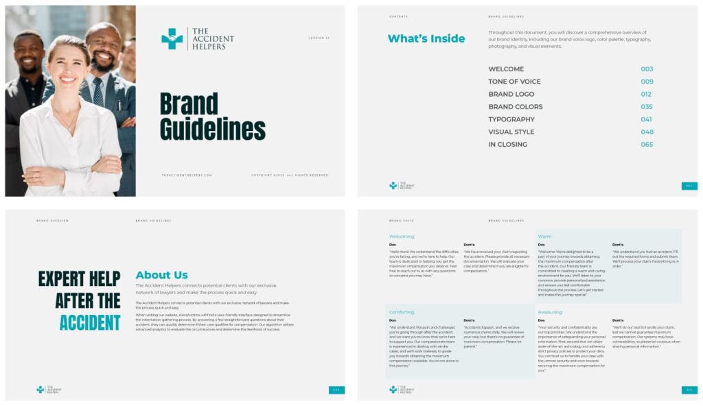
Start with a solid brand style guide
A brand style guide is the reference point that keeps your visual and verbal standards aligned. It outlines how your brand should look and sound, which removes guesswork and prevents materials from drifting in different directions.
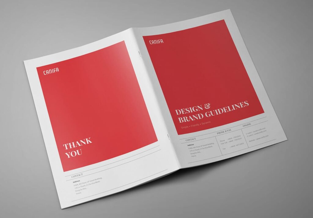
Source: Brand guidelines design by Terry Bogard via 99designs by Vista
A basic style guide usually includes:
- Your brand voice and tone
- Color palette and hex codes
- Typography and hierarchy
- Logo rules and approved variations
- Imagery guidelines
- Do’s and don’ts for everyday use
For a deeper walkthrough, check out our in-depth article on how to create a brand style guide.
And remember, you don’t necessarily need a designer to make this. A Google Doc with your logo files, color codes and font names is enough to start – and enough to prevent almost all brand inconsistencies.
Create a “brand starter toolkit” that anyone on your team can use
While a full brand book is helpful, it’s not always quick to use. When someone needs to publish a post, create signage or send a newsletter, digging through a large PDF slows everything down. A lightweight toolkit keeps your brand accessible and usable.
To create a “brand starter toolkit,” collect the following in one simple folder:
- Your logo pack (PNG, JPG and PDF/SVG if available)
- Color codes (HEX + CMYK)
- Font files or font links
- Social media post templates
- Email signature template
- Five to seven approved brand phrases (“We help you…” or “Our mission is…”)
This turns your branding into something that is usable, not theoretical.
Put it in a shared drive with “view only” permissions so key assets never get overwritten.
Use templates to keep things uniform
Templates lift a lot of weight in day-to-day branding. They streamline design work, keep your visuals aligned and speed up production. The real skill is knowing where to use them. Some assets benefit from a set structure, while others make sense as one-off designs when you need something unique. Focus on templating the materials you rely on most so your core branding stays steady, even as individual campaigns shift.
For every business, the designs worth “template-ifying” will differ, but the most common templates include:
- Business cards
- Flyers, brochures and menus
- Email signatures
- Social media post layouts
- Newsletter headers and footers
- Digital ads or posters
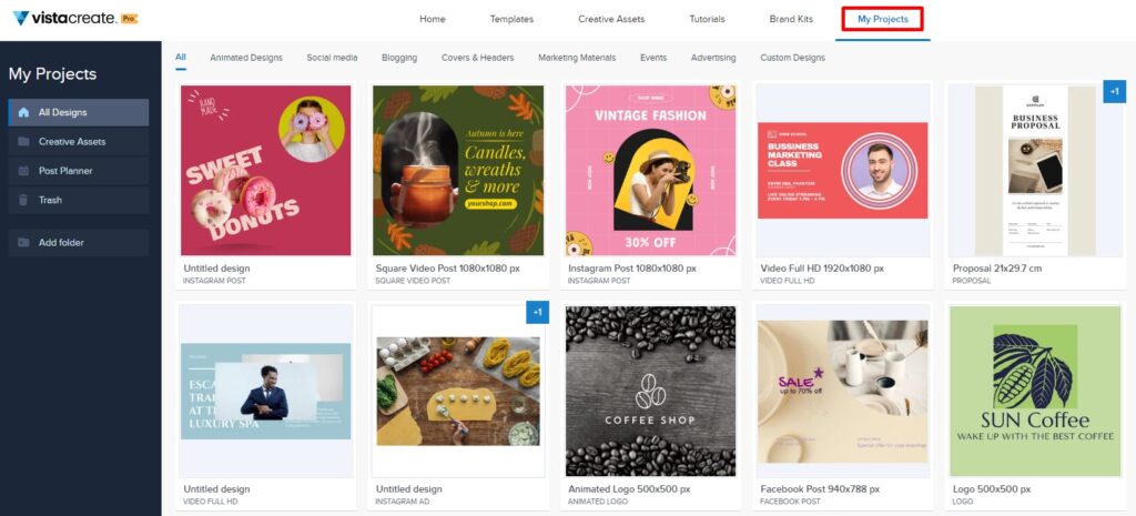
These templates cover the assets most small businesses use often, and having them ready makes your workflow far smoother. To keep them consistent and easy to update, build and store them in tools designed for repeatable use. VistaCreate works well for digital templates, while VistaPrint ensures your printed versions stay accurate in size, color and layout.
Create a shared folder for templates, save them with clear naming (e.g., “Instagram – product highlight,” “Flyer – 50% off sale”) and instruct your team (or future self!) to duplicate, not start from scratch.
Standardize brand language with a message bank
A strong voice stays consistent because it’s supported by shared language. A message bank collects your core phrases so your tone doesn’t shift as you move between channels.
Your message bank should include:
- A one-sentence elevator pitch
- Your tagline
- A short 50-75-word “About us” section
- Preferred vocabulary (e.g., “customers” vs. “clients”)
- Words or phrases you avoid (“cheap,” “discount” or claims you can’t substantiate)
This keeps messaging aligned across your website, social captions, newsletters and printed materials, even when multiple people are writing.
Use the “clone before create” method
Before designing anything new, check whether you already have something similar that you can duplicate and adjust. This simple habit keeps your formatting aligned and saves hours of unnecessary design time.
It works especially well for new flyers (duplicate an older promo layout), Instagram posts, event or in-store signage and packaging labels, naturally reducing off-brand experiments and strengthening muscle memory around your visual system.

Establish “brand rules of one”
When a brand grows, complexity tends to creep in. The “rules of one” simplify decisions and keep your foundation tight. These rules limit variation in key brand areas so cohesion stays strong across assets.
Here’s how “brand rules of one” works across different branding elements:
| Category | Rule | Why it works |
| Logo | Use one main logo | Prevents accidental logo swaps and visual drift |
| Colors | Repeat one primary brand color everywhere | Repetition builds recall faster than variation |
| Fonts | Use one heading font and one body font | Reduces clutter and uneven tone |
| Photo style | Use one editing preset or filter | Gives your feed a brand identity instead of a collage |
Use automation to reinforce consistency
Automation helps your brand stay aligned even when many people are creating assets or sending communication. Setting your brand elements to auto-apply removes the risk of inconsistent formatting.
| Tool type | Example tools | How it helps |
| Email signature generator | WiseStamp, MySignature, Google Workspace templates | Ensures every employee uses the same signature format |
| Brand kit libraries | VistaCreate Brand Kit, VistaPrint Brand Kit | Fonts and colors apply automatically to new designs |
| Social scheduling tools | VistaCreate Social Media Scheduling, Later, Buffer, Plann | Keeps content cadence and template usage consistent |
Maintaining a cohesive brand identity over time
Knowing how to create cohesive branding is the first step. Keeping it consistent as your business grows is where your systems matter most.
Start by building a central brand asset library. Store your logo files, color codes, fonts, templates and message bank in one shared location so everyone pulls from the same source. This prevents off-brand variations and keeps your team aligned without extra oversight.
Do a quick quarterly review to make sure your visuals, messaging and templates still reflect your direction. This is a light refresh, not a rebrand – a way to catch small inconsistencies before they snowball.
Assign a brand gatekeeper to oversee approvals and answer questions about usage. This person becomes the point of contact for anything that affects your cohesive brand identity, which keeps your materials consistent even as new channels or team members come into play.
Ready to achieve cohesive branding?
Cohesive branding gives small businesses a real advantage in a crowded market. When your voice, visuals and customer experience line up across every touchpoint, people recognise you faster and trust you sooner. The pillars you build – voice, color, typography, logo use and imagery – set the foundation. The systems you adopt – style guides, templates, message banks and automation – keep that foundation steady as your business grows.
With the right tools and a central place to store your assets, maintaining consistency becomes far easier. A few clear standards and habits go a long way toward keeping your brand strong everywhere your customers meet you.