Most people notice a brand’s typography long before they think about it. Few branding elements appear more often, making typography one of the most visible parts of a brand’s identity.
Yet many businesses choose fonts on instinct and hope for the best.
This guide breaks down what a brand typeface is, how to choose a brand font that fits your business and how to combine fonts into a cohesive system. You’ll also learn how to test your choices and apply them consistently across digital and print marketing materials.
- A brand typeface is the collection of typefaces a business uses across its visual identity and marketing materials.
- A brand font system typically includes a primary font, a secondary font and, in some cases, an accent font assigned to specific roles.
- A well-defined brand typeface helps create a more recognizable, cohesive and professional brand experience.
- Your brand fonts appear across websites, social media, emails, packaging, signage, printed materials and other customer-facing touchpoints.
- To choose the right brand font, define your brand personality, select suitable typefaces, test how they work together and verify they perform consistently across both digital and physical applications.
What is a brand typeface?
A brand typeface is the typeface, or group of typefaces, a company adopts as part of its visual identity. Many people associate brand typography with the font used in a logo. In practice, a logo font is only one element of the system.
Most brands use more than one typeface, assigning each a specific role, whether that’s headlines, body copy or occasional emphasis.
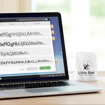
Source: Brand style guide by Yevhen Genome via 99designs by Vista
From websites and social media graphics to packaging and printed materials, these typefaces help create a cohesive visual language across every brand asset and form the foundation of a brand’s written communication.
Brand typeface vs. brand typography vs. brand font vs. logo font
| Term | What it means | Example |
| Brand typeface | The typeface families selected for the brand | Helvetica, Inter, Garamond |
| Font | A specific variation within a typeface | Helvetica Bold, Helvetica Light Italic |
| Brand typography | The complete system governing how text is used | Font choices, sizes, spacing, hierarchy and styling rules |
| Logo font | The font used in the logo or wordmark | A customized version of Futura used in a logo design |
A simple way to remember it:
- Typeface = the entire family (Helvetica)
- Font = a specific member of that family (Helvetica Bold 14 pt)
- Typography = the rules that determine how all text appears
- Logo font = the font used specifically within the logo
What usually makes up a brand font system?
A typical brand font system may include:
- Primary font: The core typeface used throughout the brand identity and most customer-facing materials.
- Secondary font: A complementary typeface that introduces contrast and expands the system’s flexibility.
- Accent font (optional): A more distinctive typeface reserved for limited use, such as campaign assets, quotes, special announcements or product launches.
- Headline font: Used for titles, banners, section headings and other high-visibility text.
- Body text font: Used for paragraphs, articles, product descriptions and other long-form content.
- Support font: Used for smaller informational elements such as captions, navigation labels, footnotes, forms and interface components.

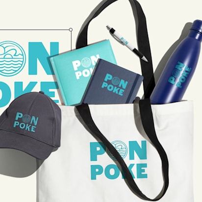
Source: Branding design by Milos Zdrale via 99designs by Vista
Some brands assign these roles to separate typefaces. Others rely on a single typeface family and use different weights, widths or styles to create hierarchy. The exact setup varies, but the underlying structure remains largely the same.
Why typography for branding matters so much
Typography has a surprisingly large influence on how a brand is perceived. The fonts you choose affect how professional, trustworthy, modern, approachable or distinctive your business feels before anyone reads a single sentence.
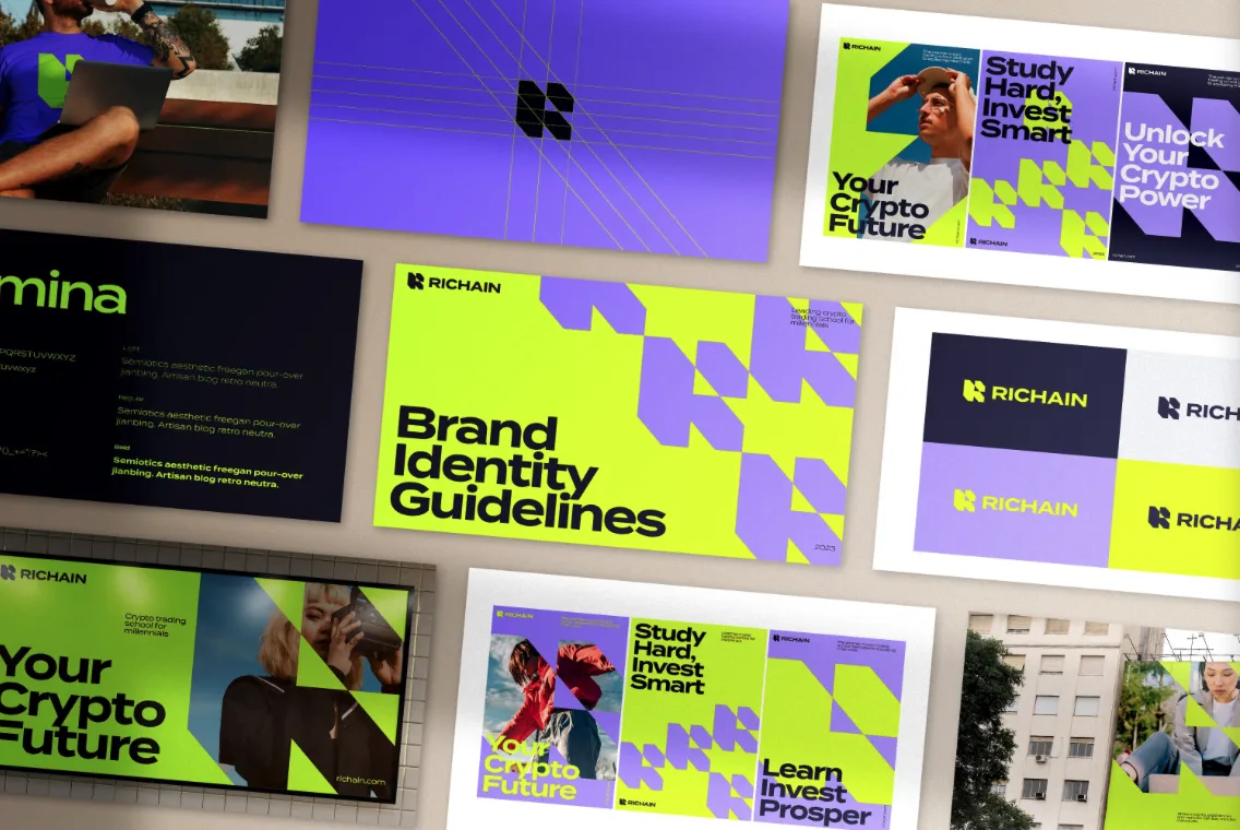
Source: Brand identity designs by goopanic via 99designs by Vista
Here are three reasons brand fonts deserve more attention than they often receive:
- Fonts shape first impressions: Different typefaces communicate different qualities. Even when two brands use the exact same words, typography can change how those words are interpreted.
- Typography creates recognition and trust: Consistent typography gives customers one less thing to figure out. The more often people encounter the same visual style, the easier it becomes to recognize your brand. When every touchpoint uses a different font, the experience can feel fragmented, even if everything else looks right.
- Typography becomes part of your brand identity: Fonts are one of the building blocks of a brand’s visual identity. Working alongside your logo, color palette, imagery and brand voice, they help create a coherent system that guides how the business presents itself across different platforms and formats.

Source: Brand identity design by goopanic via 99designs by Vista

Source: Brand identity design by goopanic via 99designs by Vista
How to choose a brand font: A step-by-step process
To get the benefits of a strong brand typeface, you first need to choose the right fonts for your brand.
Step 1: Define your brand personality
Start by defining the characteristics you want customers to associate with your business.

Ask yourself:
- Is the brand premium or accessible?
- Modern or traditional?
- Minimal or expressive?
- Playful or serious?
- Handmade or highly polished?
- Bold or understated?
Then go one level deeper. Focus on the emotional response you’re trying to create.
- What should customers feel when they encounter the brand?
- What qualities should they immediately associate with it?
- What would make the typography feel completely wrong?
If you haven’t already documented these characteristics, revisit your branding strategy first. Choosing fonts becomes much easier when the brand personality is clearly defined.
Limit your brand personality to three to five core traits. Too many competing characteristics lead to inconsistent design decisions.
Step 2: Match that personality to a font category
With those traits defined, you can narrow the search by focusing on the font categories most likely to support them.
| Font category | Common associations |
|---|---|
| Serif | Classic, trustworthy, editorial, premium |
| Sans serif | Modern, clean, approachable |
| Script | Personal, elegant, handmade |
| Display | Bold, distinctive, expressive |
| Monospace | Technical, structured, niche |
Remember, though, these associations aren’t hard rules. A modern serif can feel very different from a traditional one, and some sans serifs are far more formal than others. Still, the categories provide a useful starting point.
Step 3: Choose a primary brand font
At this stage, you’ll likely have several strong candidates. Now it’s time to choose the font that will do most of the heavy lifting – the anchor of the entire system.
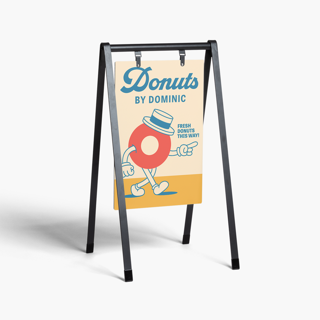
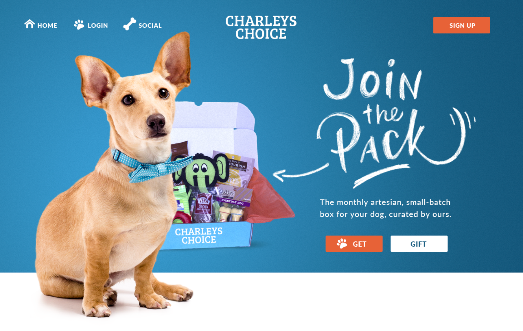
Your primary font often appears in high-visibility applications such as logos, headlines, packaging, signage and website hero sections.
Decided on the logo font? Find more actionable tips on the principles of logo design in our guide.
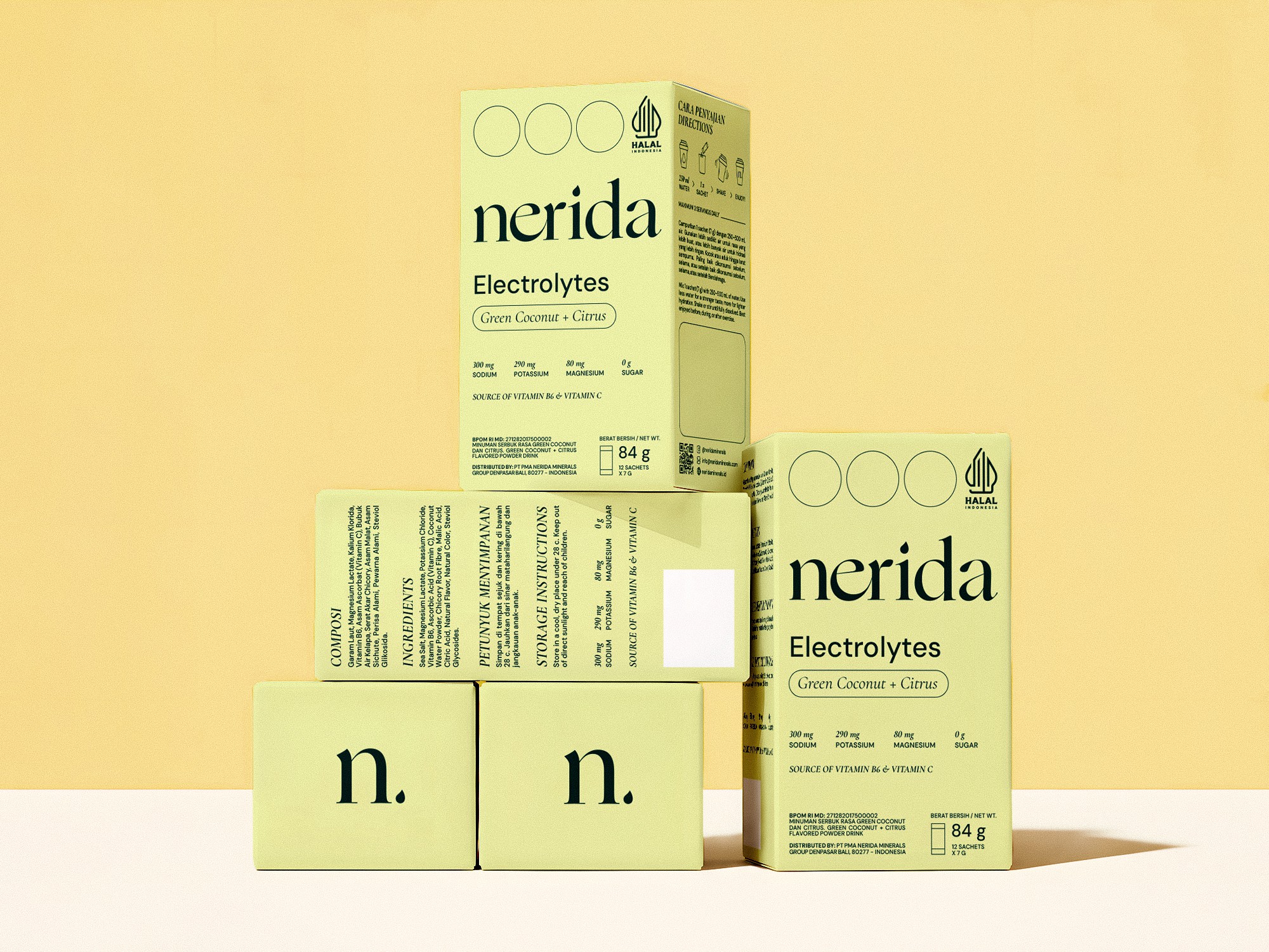
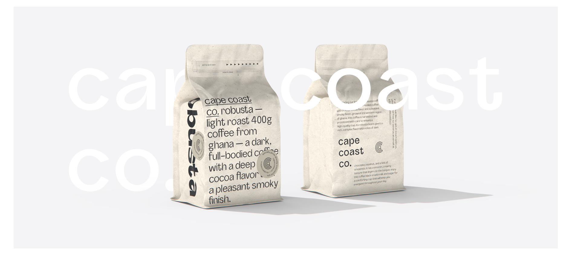
Source: Packaging design by Anastasia S. via 99designs by Vista
Because it appears so frequently, the primary font needs to strike a careful balance. It should feel distinctive enough to support brand recognition while remaining practical enough for everyday use.
As you evaluate candidates, ask:
- Does it reflect the personality traits defined in Step 1?
- Is it easy to read at a glance?
- Does it feel current without relying on short-lived trends?
- Will it still look appropriate three years from now?
- Does it work equally well online and in print?
Avoid choosing a font solely because it’s popular. Instead of finding the trendiest typeface available, you need to find the one that best represents your brand.
Step 4: Choose a secondary font for readability
One common mistake is treating the runners-up from the previous step as secondary font candidates. The problem is that those fonts were competing for the same role. A stronger choice is often a font that complements the primary typeface and performs well in longer-form content.
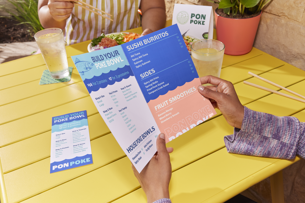
This is the typeface you’ll typically use for body copy, product descriptions, menus, emails, brochures and website content.
So, as you evaluate candidates, ask:
- Is it easy to read at smaller sizes?
- Are individual letterforms easy to distinguish?
- Does it offer enough weights and styles for different use cases?
- Does it complement the primary font rather than compete with it?
Source: Business website design by DSKY via 99designs by Vista
In most cases, the secondary font will be simpler and more restrained than the primary one. If the primary font creates personality, the secondary font creates usability.
Step 5: Decide whether you need an accent font
Some brands benefit from a third typeface used sparingly to create emphasis.
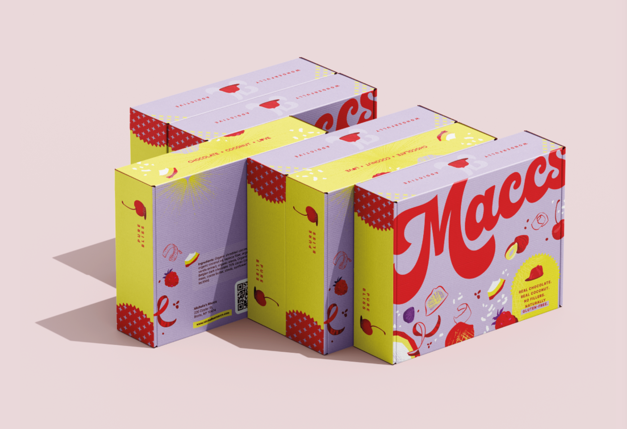
Source: Packaging design by Luz Viera Studio via 99designs by Vista
Accent fonts are typically reserved for:
- Campaign graphics
- Product launches
- Pull quotes
- Labels
- Packaging details
- Seasonal promotions
Because they appear infrequently, accent fonts can be more expressive than the rest of the system. The key word is “infrequently.” Overuse quickly turns distinction into clutter.
Source: Brand identity design by goopanic via 99designs by Vista
Most small businesses only need two or three fonts in total. Adding more rarely improves a brand system and often makes it harder to maintain consistency.
Before adding an accent font, ask yourself whether it solves a specific problem. If not, your existing font system is probably enough.
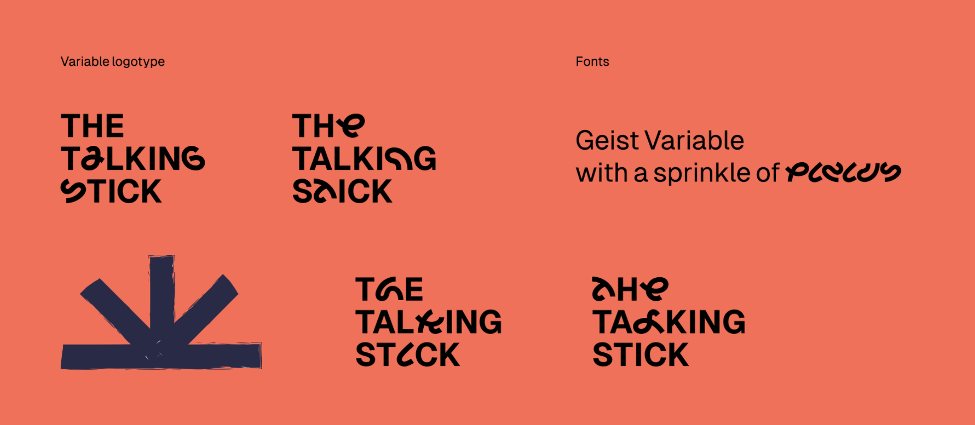
Step 6: Test font pairings
A strong font pairing creates contrast where it’s needed and consistency everywhere else. A weak pairing either feels too similar or pulls the eye in competing directions.

As you review your font combinations:
- Pair contrast, not conflict
- Avoid fonts with nearly identical characteristics
- Check the hierarchy between headlines, subheads, body copy and calls to action
- Test real content rather than placeholder text
- Review both digital and printed examples
The easiest way to evaluate a font system is to build a simple mockup. Create a landing page, social media graphic, flyer or product label using your chosen fonts. What looks balanced in a font picker often feels very different once applied to actual marketing materials.
If two fonts immediately draw attention to themselves, they’re probably competing. A good pairing should make the content feel organized, not the typography feel busy.
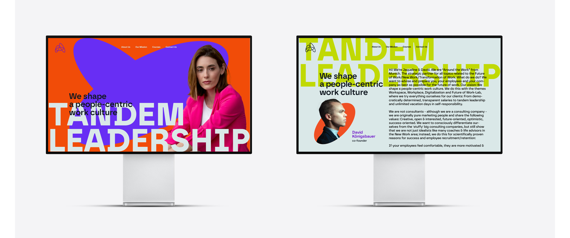
Step 7: Check legibility across sizes and formats
Once you’re happy with your font pairings, it’s time to leave the comfort of the design canvas. Fonts that look flawless at 200% zoom don’t always perform as well on a tiny label or a mobile screen.

Source: Brand identity by goopanic via 99designs by Vista

Source: Brand identity by goopanic via 99designs by Vista
Pay particular attention to:
- Tiny business card text: Check whether small details remain readable.
- Mobile screens: Review body copy, menus and buttons on multiple screen sizes.
- Large banners: Make sure headlines remain clear from a distance.
- Product labels: Test condensed layouts with limited space.
- Menus: Verify prices, descriptions and section headings are easy to scan.
- Packaging: Ensure the typography remains legible against different materials and finishes.
- Signage: Confirm important information can be read quickly from various viewing distances.
If you have to zoom in, step closer or concentrate to read something, your customers probably won’t.
Step 8: Test your typography for “phygital” experiences
Your font system shouldn’t be optimized for just screens or just print. It needs to perform consistently across both.
That’s becoming increasingly important as businesses invest in a mix of digital and physical marketing. In fact, 33% of small businesses plan to invest in both over the next 12 months, according to VistaPrint’s 2025 Small Business Marketing Guide.

Source: Brand identity by goopanic via 99designs by Vista

Source: Brand identity by goopanic via 99designs by Vista
Review your typography across:
Digital
- Mobile
- Websites
- Social media
Physical
- Signage
- Business cards
- Packaging
- Embroidery
- Promotional products
As you test, ask:
- Does it stay readable on a phone screen?
- Does it retain detail when printed?
- Does it work on textured or stitched materials?
- Does it remain clear from a distance?
- Does it reproduce consistently across different applications?
Step 9: Review licensing and availability
Check the licensing terms for your chosen fonts. Make sure they cover commercial use, websites, logo applications, desktop installation and team access. The last thing you want is to build a brand around a typeface that becomes difficult or expensive to use at scale.
Google Fonts simplifies this process considerably. Most fonts in the library are open-source and free for commercial, web and desktop use.
Save copies of your font licenses. Future employees, freelancers and agency partners may need access to the same files and permissions.
Step 10: Document font rules in brand guidelines

Source: Brand guidelines by by Terry Bogard via 99designs by Vista
The final step is turning your font choices into a system that other people can actually follow.
To do that, you need to document all your font choices in your brand guidelines, including:
- Which font to use where: Specify the role of each typeface across different applications.
- Sizes and weights: Define approved text styles for headings, subheadings and body copy.
- Headline and body hierarchy: Show how information should be organized and prioritized.
- Spacing rules: Document line spacing, letter spacing and layout standards.
- Print and digital examples: Demonstrate how the system should look across different formats.
- What not to do: Include common misuse examples, such as incorrect pairings, weights or formatting choices.
The goal is simple: Anyone working on the brand should be able to produce materials that look like they belong to the same business, whether they’re designing a website banner, a product label or a trade show display.
Where you’ll actually use your brand fonts
Your brand fonts will appear in dozens of places throughout the customer journey. The more consistently they’re used, the stronger and more recognizable the brand becomes.
Here are the touchpoints where typography typically plays the biggest role.
Digital touchpoints
For many businesses, digital touchpoints account for the majority of customer interactions. That makes them one of the most important places to apply your typography consistently:
- Website: Navigation, headings, body copy and calls to action.
- Social media graphics: Posts, stories, reels and cover images.
- Email marketing: Newsletters, promotions and automated campaigns.
- Ads: Display ads, social ads and landing pages.
- Online store: Product descriptions, categories and checkout pages.
- Presentations: Sales decks, webinars and investor materials.
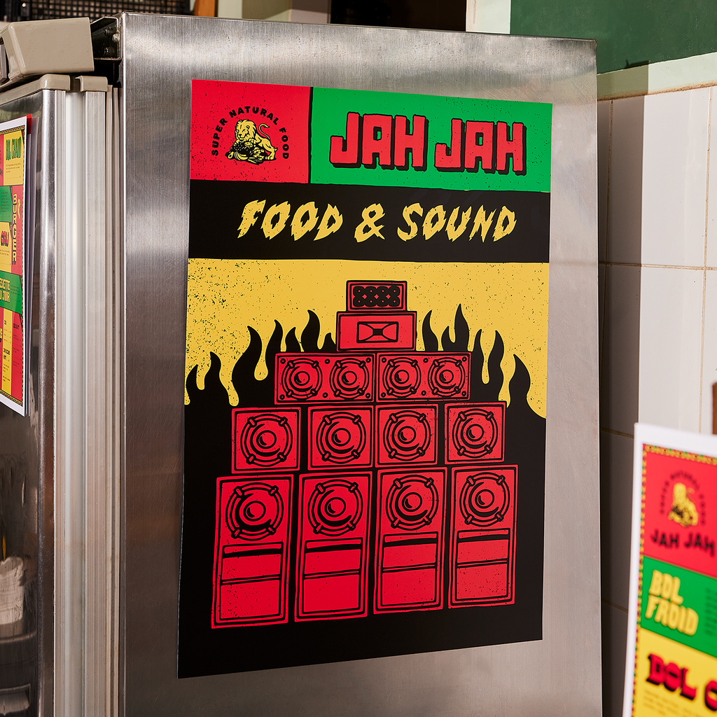
Source: Brand identity by goopanic via 99designs by Vista
Physical touchpoints
Offline materials bring your typography into the real world, often becoming the most tangible expression of your brand:
- Business cards
- Packaging
- Menus
- Flyers
- Labels
- Uniforms
- Store signage
- Vehicle wraps
- Promotional products
- Embroidered hats
Find the most effective fonts for business cards in our guide.

Source: Brand identity by goopanic via 99designs by Vista
Best fonts for small business: Font directions by industry cheat sheet
There isn’t one perfect font for every industry, but some typography styles naturally align with customer expectations. For example:
| Industry | Typography direction | Why |
|---|---|---|
| Law | Serif + clean sans serif | Authority, credibility and trust |
| Bakery | Script + soft sans serif | Warmth, craftsmanship and personality |
| Tech startup | Minimal sans serif | Innovation, simplicity and usability |
| Luxury beauty | High-contrast serif | Premium positioning and sophistication |
| Fitness | Bold condensed sans serif | Energy, movement and strength |
| Healthcare | Humanist sans serif | Clarity, accessibility and trust |
| Real estate | Serif + modern sans serif | Stability and professionalism |
| Children’s brand | Rounded sans serif | Friendly, approachable and playful |
| Financial services | Serif or humanist sans serif | Reliability and confidence |
| Restaurant | Characterful serif or script accents | Atmosphere and distinctiveness |
| Creative agency | Modern sans serif or display-led system | Originality and creative expression |
| Sustainable brand | Organic serif or humanist sans serif | Authenticity and approachability |
Ready to choose your brand typeface?
A brand typeface rarely steals the spotlight, yet few branding decisions appear more often. From websites and social media posts to packaging, signage and business cards, your fonts shape how customers experience your business every day.
The good news? Choosing the right typeface doesn’t require a design degree. Approach it with a clear process, document the rules and you’ll end up with a system that employees, freelancers and agencies can apply consistently as your brand grows.
Brand typeface FAQs
Can I use the same font as another brand?
Yes. Many brands use popular typefaces such as Helvetica, Inter, Montserrat or Garamond.
What makes a brand feel distinctive is rarely the font alone. The combination of typography, color, imagery, layout and messaging matters far more. That said, if a direct competitor is strongly associated with a particular typeface, choosing something different can help create clearer visual separation.
Should my logo font match my website font?
Not necessarily. In fact, many brands use different fonts for each purpose. A logo may use a more distinctive typeface, while the website relies on a highly readable font optimized for longer-form content.
The important part is compatibility: The two should feel like they belong to the same visual system, even if they’re not identical.
How often should a business update its brand typography?
Less often than most design trends would suggest. A strong font system can remain effective for many years when it’s built around the brand rather than current aesthetics.
Consider updating your typography if it no longer reflects the business, creates usability issues or limits how the brand appears across newer channels and formats. Otherwise, consistency usually delivers more value than frequent change.
What should I do if my chosen font isn’t available everywhere?
Start by defining approved fallback fonts in your brand guidelines.
- For websites, use web-safe alternatives with similar proportions and character shapes.
- For presentations, documents and collaborative projects, choose substitute fonts that preserve the overall look and hierarchy.
If font availability becomes a recurring issue, it may be worth switching to a more accessible typeface family before the brand becomes heavily dependent on it.