If you’re a small business owner, your time is precious, but you need customers to notice you. Consider this guide a time-saving shortcut. After speaking with our global community of freelance designers at 99designs by Vista, as well as our in-house design experts, our Trends 2026 research points to one big theme: People are craving personality they can trust. Font trends of 2026 tap into that feeling with typography that’s clearer, warmer and more human, without losing the simplicity busy brands need. Below, you’ll find eight trending font directions, each with easy steps to try on your logo, website, packaging or signage today.
Font trends for 2026:
Take a look at last year’s font trends and back through 99designs by Vista’s ongoing collection of design tips.
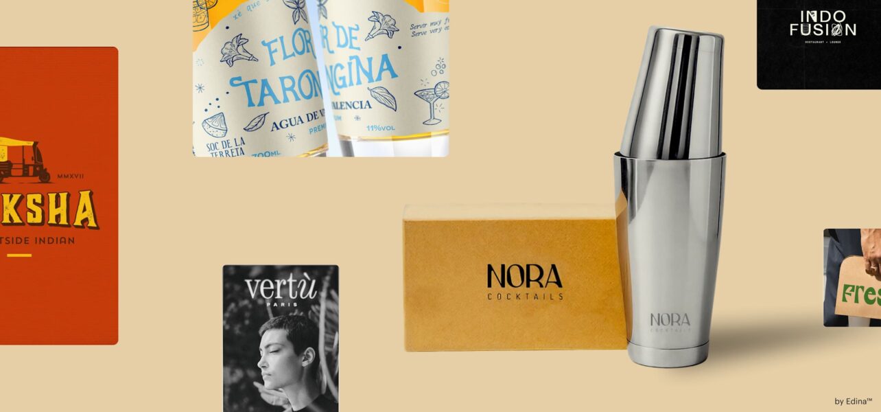
1. Smooth It Over
Say goodbye to sharp edges. Smooth It Over softens existing letterforms by easing corners, smoothing terminals (the ends of strokes) and rounding angles, to make familiar fonts feel friendlier and easier to read. Think of it as turning the volume down on corporate and up on welcoming vibes, while keeping your current brand structure intact. The result reads modern, warm and a little playful, which works well for neighborhood cafés, kids’ brands, pet care, fitness studios and any service that relies on approachability and trust. It’s also an easy refresh: keep your current type (or a close cousin) and simply round edges or choose a softer cut, so it stays recognizably you with a warmer, more human feel.
Source: font design by EWMDesigns via 99designs by Vista

Source: font design by EWMDesigns via 99designs by Vista
Source: font design by merci dsgn
via 99designs by Vista
Source: font design by Font 4 Photoshop via Behance
Source: font design by uzma via Behance
“The softness of the characters makes this type trend feel unintimidating and inclsuive. The organic forms and rounded shapes would be perfectly suited to brands that want to be precieved to be as playful and inviting.”— Mary Pho, Art Director, VistaPrint
How to achieve: Keep your primary font if you like it, then swap in a rounded cut (for example, a rounded version of your sans serif) for headlines, menus or window decals. If your font doesn’t have a rounded sibling, gently round corners in a wordmark update or choose a rounded sans like Nunito or Rubik for display lines while keeping a clear body font like Inter. Maintain strong contrast and round headlines with crisp body copy to stay readable and professional.
Source: font design by Sinan’s via 99designs by Vista

Source: font design by Creative Fonts via Behance
Source: font design by Boja via 99designs by Vista
2. Lingua-Lettering
Lingua-Lettering blends multiple writing systems, like Latin with Arabic, Japanese, Cyrillic, Devanagari and more in the same identity system. Sometimes scripts sit side by side; other times, designers echo shapes across scripts to create a shared rhythm. For global e-commerce, cultural institutions and food brands with international roots or tourism, this signals inclusivity and real-world reach.

Source: Font design by Tais Kahatt and Bicho Raro via Behance

Source: font design by Pixel Surplus and Thom Niessink via Behance

Source: font design by xin .z via Behance
“Bring language and culture into your design with Lingua-lettering. Why limit yourself to just one language when you can tell a richer story by weaving in others? Every language carries its own unique shapes, rhythms, and movements. Visual elements that can elevate your message and make it unforgettable. Design knows no borders, so neither should your creativity.”— Justin Hamra, Creative Director, VistaPrint
How to achieve: If you serve multilingual audiences, add a secondary script version of your wordmark or headline style for key touchpoints (storefront, packaging, website banners). Choose type families with broad language support so spacing and tone match across scripts. Work with a native speaker or cultural consultant to get the nuance right, and use clear hierarchy: one primary headline language, the second script as a supporting line or tagline. It’s bold and inclusive.
Source: Font design by ludibes via 99designs by Vista
Source: font design by Sensatype via Dribbble
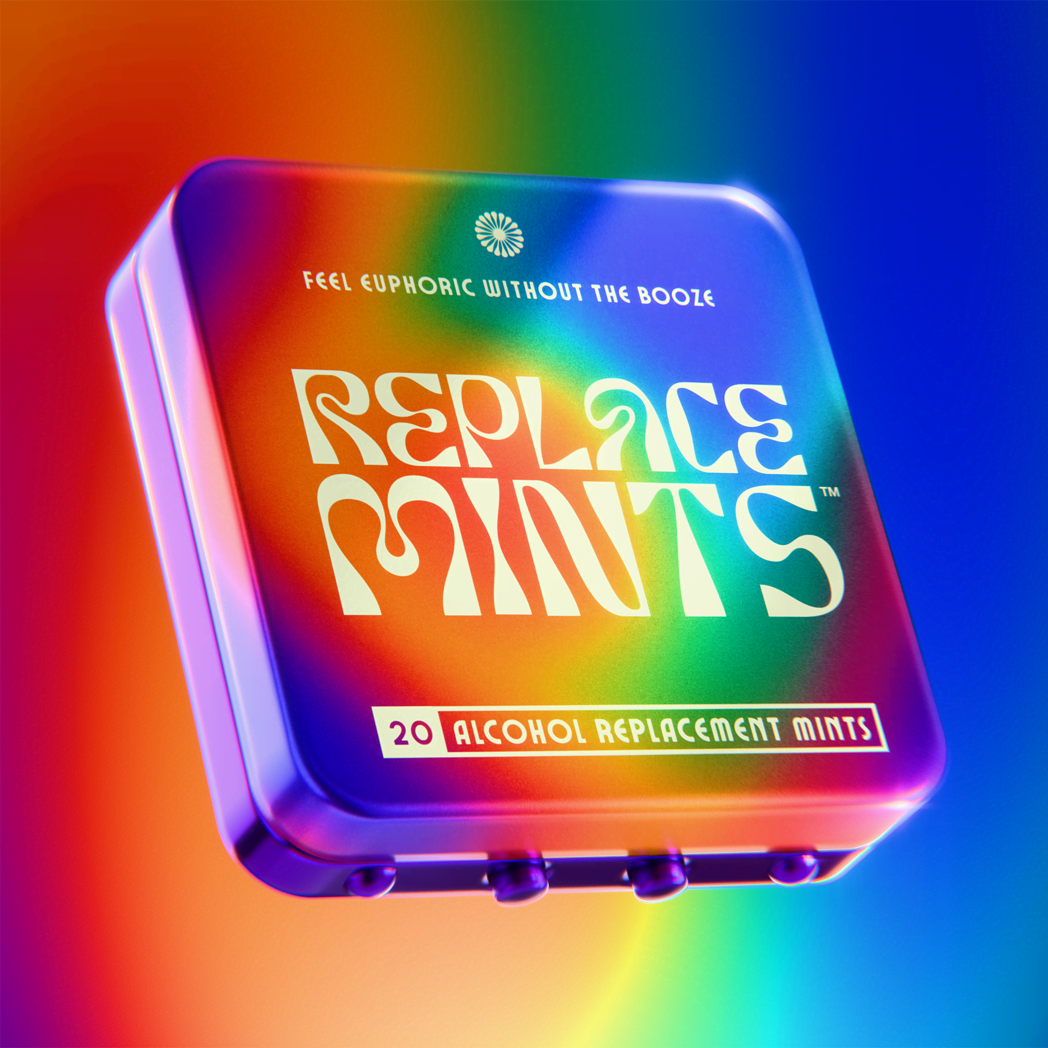
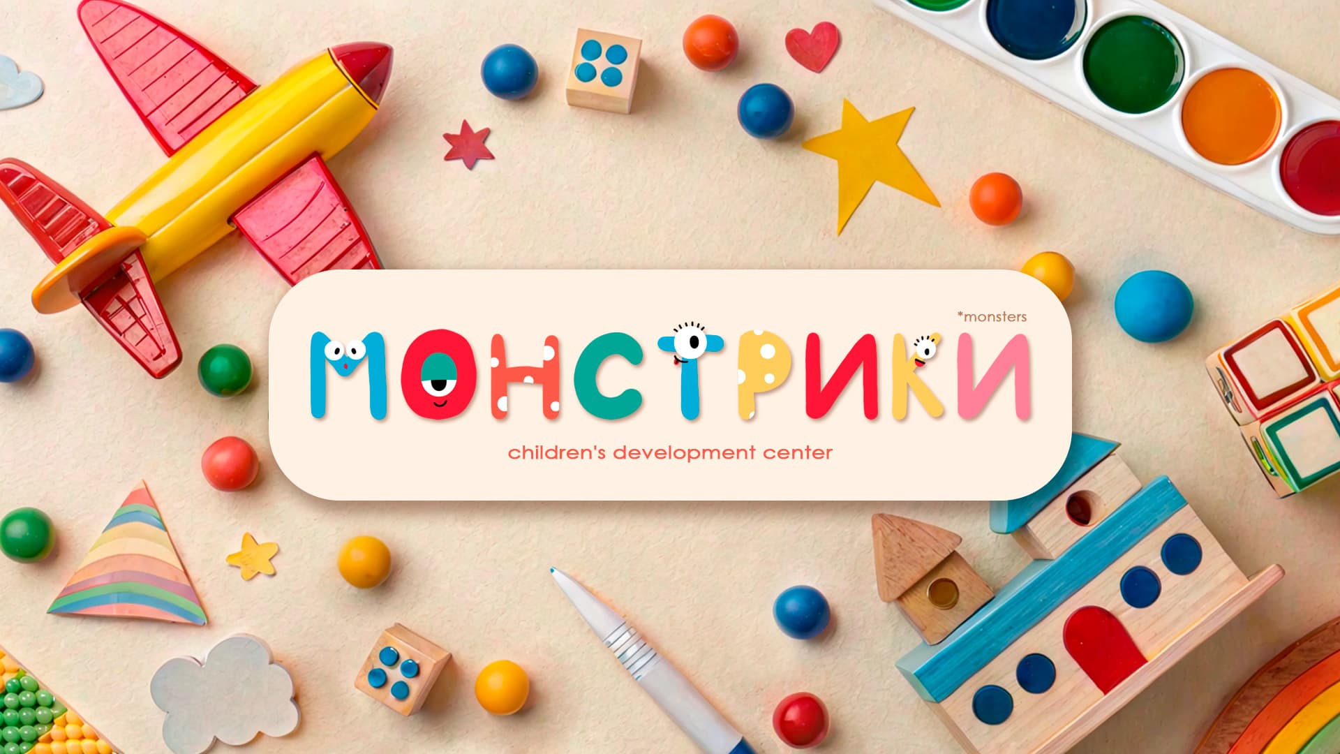
3. Halftone Blur
This look leans into oversized dots as stars of the show: chunky periods, circular counters (the holes inside letters like a and o) and dotted patterns that echo early pixel grids and halftone textures. It’s structured and playful, giving text a graphic rhythm that turns headlines into patterns you can spot from across the street. Great for bakeries, indie publishers, event posters and youth-oriented shops because the bold dot textures feel tactile, pop at a distance, print cleanly with simple processes and tap a retro-digital playfulness younger audiences love.
Source: via Vistaprint
“Take everything you know about pixel-perfect typography and smudge it. With halftone blurs and imperfect edges, this trend embraces the chaos of the printer. It’s raw, messy, and unapologetic. By leaning into imperfection, fonts take on a gritty retro energy that feels both nostalgic and rebellious, adding a tactile touch to any design.”— Justin Hamra, Creative Director, VistaPrint
Source: by HJ Zhao via Pinterest
Source: font design by Pixel Surplus via Behance
How to achieve: Start with your regular headline font and amplify the dots. Make the period a design element, use circular bullets in menus or build a simple dotted texture behind key words. Pair with solid, high-contrast colors and keep body text simple. If you want a font that leans into the circle type vibe, try rounded geometric sans fonts and scale up punctuation for a modular, logo-ready look.

Source: via Typeroom
“I think people should use more painting principles, that should be the way, aka everything new is the well-forgotten old.”— oreganoclay, Designer on 99designs by Vista

Source: via Are.na
Source: by Matej Vojtuš via Another Graphic
4. Cross-Cultural Type
Rooted in heritage, refreshed for today. This trend borrows shapes from traditional scripts, regional motifs and craft techniques like brush strokes from calligraphy, woven or carved textures or letterforms that nod to historical posters, then pairs them with modern spacing, color and grid systems.
Source: font design by velvetmade via 99designs by Vista
Source: font design by Sebastian Rubio via 99designs by Vista
Source: font design by Spoon Lancer via 99designs by Vista
“Global design trends are increasingly valuing authentic cultural narratives, with brands and creators seeking to honor and amplify traditional stories in fresh, accessible ways.”— TikaDesign, Designer on 99designs by Vista
Crucially, it should feel authentic to your story, not performative. Start from your brand’s real roots (founders, product origin, neighborhood history) and the communities you serve, co-create or consult meaningfully, credit sources and avoid generic ethnic mashups. For restaurants and food brands, that often means drawing directly from the cuisine’s culture to make a clear visual bridge. For other categories, align references with your brand and audience in a way that’s sincere and relevant; don’t adopt motifs just because they’re cool.
Done well, the result is expressive and respectful, ideal for restaurants, music venues, fashion labels, community orgs and any brand telling a place-based story.
Source: font design by ikiiko type via Behance
Source: font design by pswizzard via 99designs by Vista
“What makes this style stand out is its emotional and cultural depth—it’s not just visually appealing, but also tells meaningful stories rooted in local identity and heritage. In a design landscape dominated by clean, digital precision, this style feels more human and alive, embracing imperfection and character.”— Kaleya, Designer on 99designs by Vista
How to achieve: Start with research and collaboration. If you’re referencing a culture, work with a designer from that community to ensure accuracy and respect. Use culturally inspired lettering for hero moments (signage, packaging fronts, merch) and pair it with a clean, widely readable font for menus, captions and web copy. Keep color palettes grounded in materials (ink, clay, fabric dyes) for a tactile, real-world feel.

Source: font design by Yuliya Canavaggio via Behance
Source: font design by cadina via 99designs by Vista
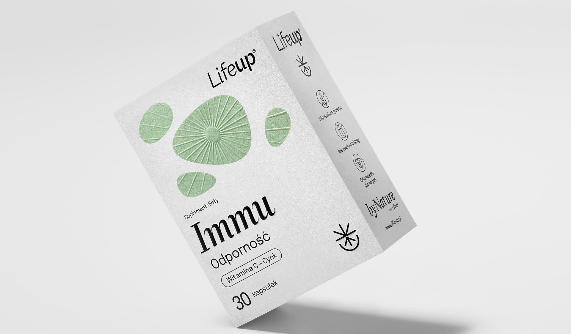
5. Pharma Serif
An offshoot of the broader apothecary vibe, recalling amber bottles, stamped lot numbers, tidy specimen labels and no-nonsense typography that blends nostalgia with clinical clarity—which is now popular in graphic design. This direction is less ornate and more utilitarian: condensed sans serifs paired with elegant serifs, all-caps labeling, monospaced details (every character the same width), and tight grids that echo dosage charts and lab forms.

Source: font design by Zindel via Pinterest

Source: font design by EmBaranska Design via Pinterest
The tone is precise and credible, great for wellness, functional beverages, outdoor gear and any product that benefits from a tested and trustworthy impression. It’s trending because the look cuts through visual noise: simple structures, clear hierarchy and restrained type communicate honesty and reliability fast, perfect for audiences tired of clutter and hype.
Source: font design by FLOV® STUDIO via Behance
“What makes these designs stand out is their ability to communicate a message instantly, without unnecessary distractions. Clean lines, bold typography, and clever use of negative space give the work a timeless and professional feel.”— SKF. Creative, Designer on 99designs by Vista
How to achieve: Combine a condensed sans (for bold headers) with a mono font like IBM Plex Mono or Space Mono for secondary data (ingredients, specs, hours). Use caps for key labels, but keep tracking (letter-spacing) comfortable for readability. Add simple rules, boxes and numeric icons to organize information. To keep it human, balance the lab look with warm color accents and lifestyle photography.

Source: font design by Daddu Media via 99designs by Vista
Source: font design by Razvan Postolache via 99designs by Vista
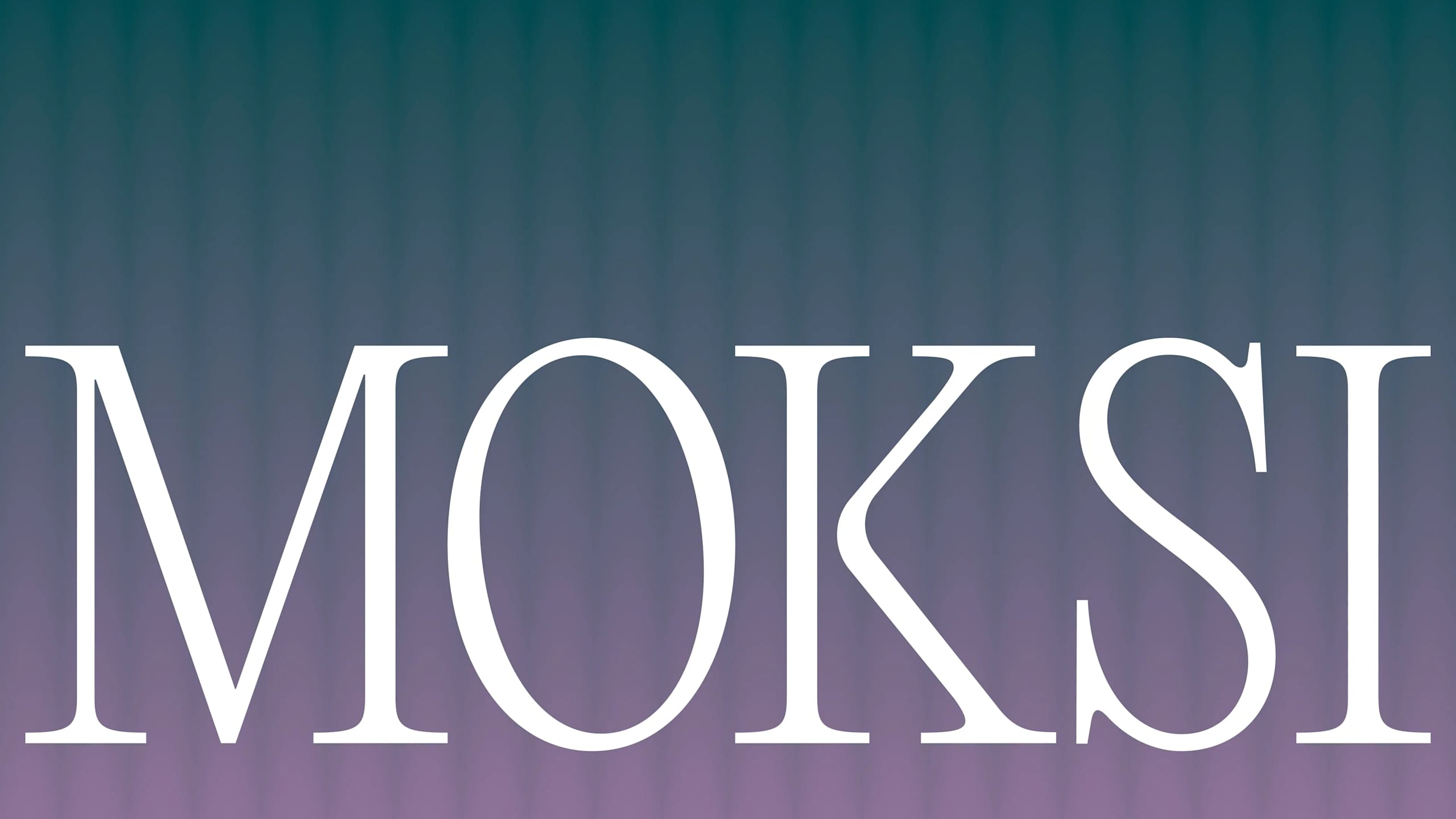
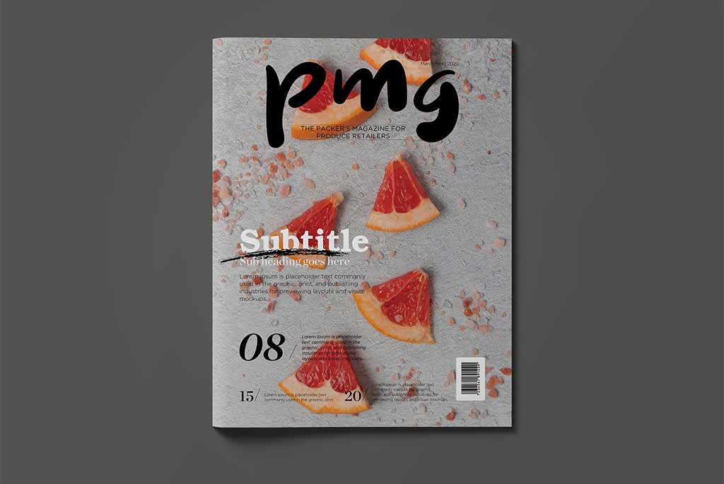
6. Cover Story Type
High-contrast serifs trace their roots to classic “Didone” styles long favored by glossy magazine mastheads and cover lines. For decades, those pages have trained us to read these letterforms as editorial, luxurious and authoritative, which is why they still feel instantly cover-ready.
Source: font style via Fcklck Studio
Set large, these fonts project style, elegance and prestige, associations people subconsciously carry from magazines to brands. Fashion and beauty lean on them for that very reason, but bakeries, florists and boutique services can borrow the same aura when used with restraint (big headlines, plenty of white space, paired with a simple sans for the details). If you want to telegraph taste and confidence at a glance, this is a strong fit.

Source: font design by Spoon Lancer via 99designs by Vista
Source: font design by Boja via 99designs by Vista

Source: font design by Indiegogh Creative via Pinterest
Source: font design by Ruaran via 99designs by Vista
“This trend makes a mark with its stylish sophistication. Typorgraphy that is nothing less than bold, unapologetic and giving 100% main character energy. Fonts that feel like a loud statement, struting on center stage and commanding everyone’s attention.”— Mary Pho, Art Director, VistaPrint
How to achieve: Reserve dramatic serifs (like Playfair Display or Bodoni-style families) for headlines, hero statements and price callouts. Give letters room to breathe with generous margins and line spacing. Pair with a simple sans for body copy (Poppins, Inter) to keep day-to-day reading easy. On social, set short phrases in all caps or title case and avoid long paragraphs in high-contrast serifs.

Source: font style by Yukita Creative via Dribbble
Source: font design by Bella. via 99designs by Vista
“Elegant use of typography: Fonts are often chosen with precision—clean sans-serifs or sleek serifs—with generous spacing and hierarchy doing the heavy lifting.”— ASLIKARACA, Designer on 99designs by Vista
Source: font design by sabby.thur via 99designs by Vista
7. Minutiae Marks
These are two-look typefaces: At small sizes, they appear clean, but at display scale, they reveal fine engraving, subtle pattern fills, alternate ligatures (special joined letters) or carved serifs. This creates a sense of craft and discovery; customers lean in, literally. They suit luxury goods, specialty coffee, skincare and stationery because those hidden details signal craftsmanship, materiality and time investment, mirroring the careful sourcing, formulation and finish these categories trade on.
Source: font design by Anna Grishilova via Behance
How to achieve: Pick a display cut with stylistic alternates and test it large on your packaging front or homepage hero. Turn on OpenType features like discretionary ligatures for headlines, then switch them off for small text. Keep print production in mind: Tiny details need sufficient contrast, so consider spot varnish or embossing to highlight the micro texture. Pair with a plain body font so your message stays clear.

Source: font design by Lydia ✄ design via 99designs by Vista
Source: font design by PetiteM via 99designs by Vista
8. Generative Typography
A little chaos, on purpose. Inspired by early experiments in “living” letterforms and revived by variable fonts and creative coding, these trendy fonts subtly shift, distort or randomize with each use. No two headlines look exactly alike, which reads as human, energetic and anti-sterile. This is a great match for festivals, creative studios, streetwear and launch campaigns.
Source: font design by Carbon Motionz via Pinterest
Source: font design by Harrys Designs via Behance
Source: font design by Titus Homei via Behance
Source: font design by EGER Graphic via Behance
“Dynamic typography variable fonts and kinetic typography that responds to user interaction—creates personalized, living experiences where text itself becomes an interactive element rather than static content.”— Bhuiyan, Designer on 99designs by Vista
How to achieve: Try a variable font with playful axes (wobble, slant, width) for posters and social graphics. Limit the effect to short headlines and keep body text rock-solid for accessibility. Try mixing a few alternates or stylistic sets in a headline so the same letter looks slightly different each time. Anchor everything with consistent color and layout so the randomness feels intentional.
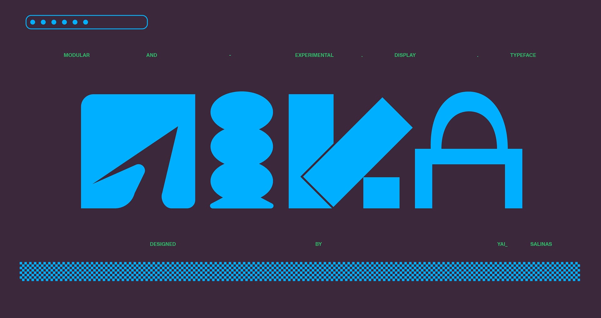
Source: font design by Yai Salinas via Behance

Source: font design by Jeremy Mickel via AIGA Eye on Design
Source: font design by Daniel Schriër via Behance
Express yourself through your fonts
Trends aren’t about fitting in; they’re about expressing who you are. With these font trends of 2026, personality and imperfection stand out because the market is flooded with overly polished sameness. Start small: Swap your headline font, soften edges on your current logo fonts or add a culturally rooted wordmark variant. Keep readability first, and use display fonts as your statement piece. When the typography feels like your voice, customers notice.
FAQs
What are the top font trends for 2026?
Eight big ones for small brands:
- Smooth It Over
- Lingua-Lettering
- Halftone Blur
- Cross-Cultural Type
- Pharma Serif
- Cover Story Type
- Minutiae Marks
- Generative Typography
Each balances clarity with personality.
How is AI influencing font design in 2026?
AI can speed up exploration, generating alternates, textures and variable behaviors, while humans curate the final, on-brand choices. A winning approach is often to use AI to prototype but keep human judgment for readability, tone and cultural nuance.
What font styles are becoming outdated in 2026?
Purely generic, ultra-polished sans serifs used everywhere without contrast or character are attracting less attention. Brands that add warmth (rounded edges, textured details) or purpose (clear hierarchy, heritage cues) feel fresher.
How can small businesses apply font trends in 2026?
Start with headlines and logos. Keep body copy simple and accessible, then layer in a display font for personality. Test on one channel (website hero, a new menu, a promo flyer), gather feedback, then roll out gradually.
Which fonts are best for branding in 2026?
Choose a flexible pair: a readable workhorse family (multiple weights, great numerals) for everyday text plus a distinctive display style for headlines. Popular fonts like Inter, Poppins or Source Sans work well for copy. Pair them with a dramatic serif, a rounded sans or a culturally inspired display cut that matches your brand story.
