You’re trying to explain your brand vision to a designer, client or printer. You know you want something bold but approachable, modern but warm, but translating that into a design direction feels difficult. A mood board bridges the gap between your vision and reality by turning abstract ideas into concrete visual references. In this guide, you’ll learn what a mood board is, browse mood board examples, understand what elements to include and discover how to translate your brand mood board into real-world assets and marketing materials.
- A mood board is a curated collection of visual references that communicates your desired aesthetic and brand direction.
- Branding mood board examples vary by goal and style, such as minimalist, bold, luxury or playful.
- Elements of a mood board include color swatches with codes, image references, textures, typography samples and supporting keywords.
- Industry-specific mood boards help align teams in branding, print marketing, fashion, interior design and e-commerce.
- Common mistakes include over-cluttering, mixing visual languages and a lack of visual cohesion.
What is a mood board?
A brand mood board is a collection of visual references or a collage of images that communicate a desired aesthetic, feeling or brand direction. It turns abstract branding ideas like “sophisticated but approachable” into tangible examples that your designer, printer or internal team members can understand and reference.
Mood boards serve several practical purposes for designers, marketers and small business owners. They:
- Create alignment across teams by giving everyone a shared visual language.
- Speed up communication with designers and printers by showing rather than telling.
- Accelerate approval processes by establishing a clear direction upfront.
- Ensure consistency across all brand touchpoints, from packaging to social media.
- Are useful for rebrands, campaigns, product launches, print projects and team alignment sessions.
Physical vs. digital mood boards
Create digital mood boards using digital tools like Pinterest, Canva, Milanote and Miro—perfect for remote collaboration. Make sure to include links to reference later on. Physical mood boards offer a tactile experience, ideal for in-person presentations. Include physical texture samples like fabric swatches or paper stock.
Start with your color palette, an image that captures your brand’s persona and a reference that represents your target audience. If these don’t feel cohesive together, refine your direction first.
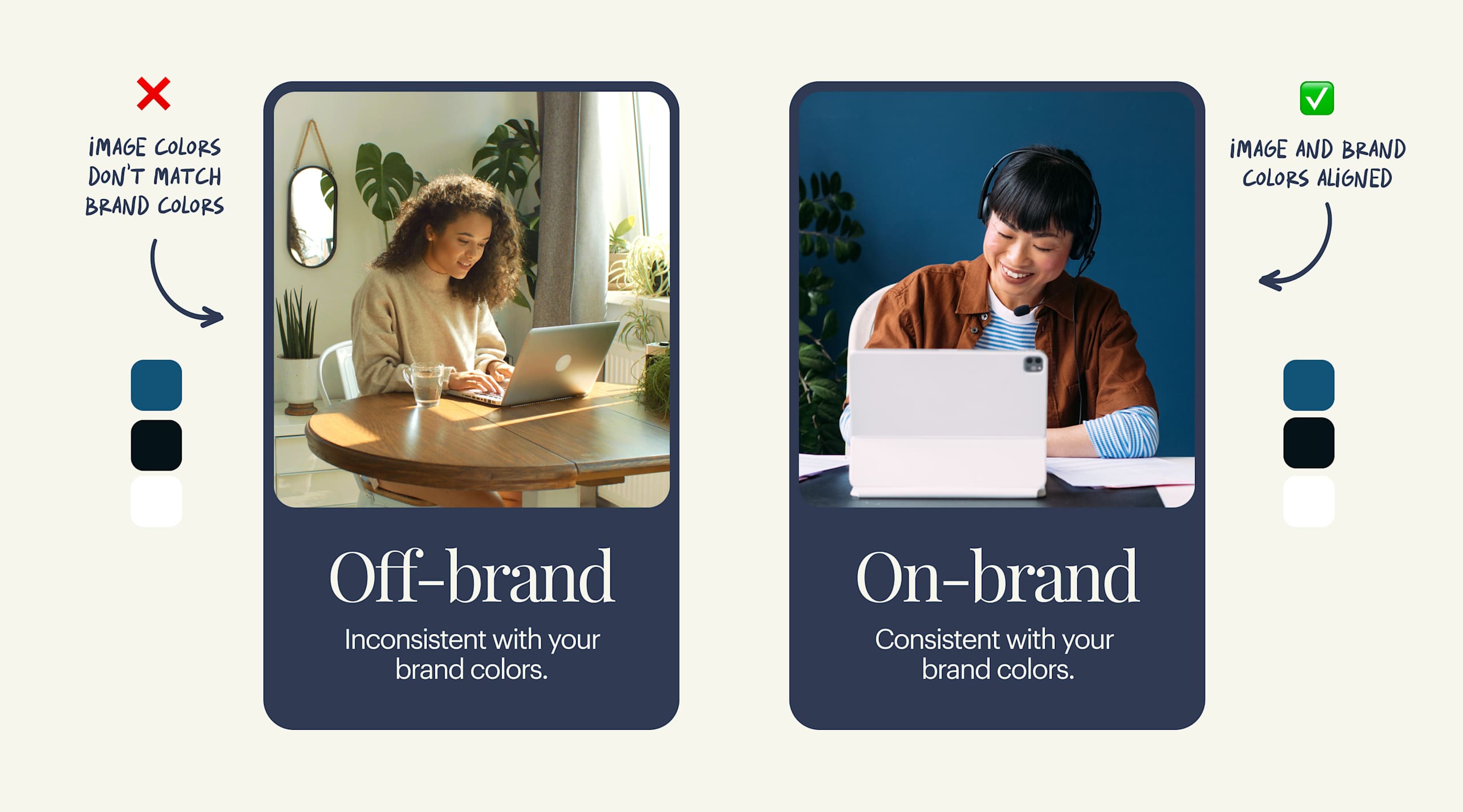
How mood boards impact brand consistency
Mood boards create a shared visual reference for everyone involved in marketing and design. When colors, typography, imagery and tone are defined, it becomes easier to apply your brand consistently across websites, social media, packaging and print materials. This alignment prevents misinterpretation, speeds up design decisions, and helps customers recognize your brand instantly, building trust and familiarity over time.
Mood board examples
Before you think about how to create a mood board for your needs, think about your goal and get inspired by the examples below.
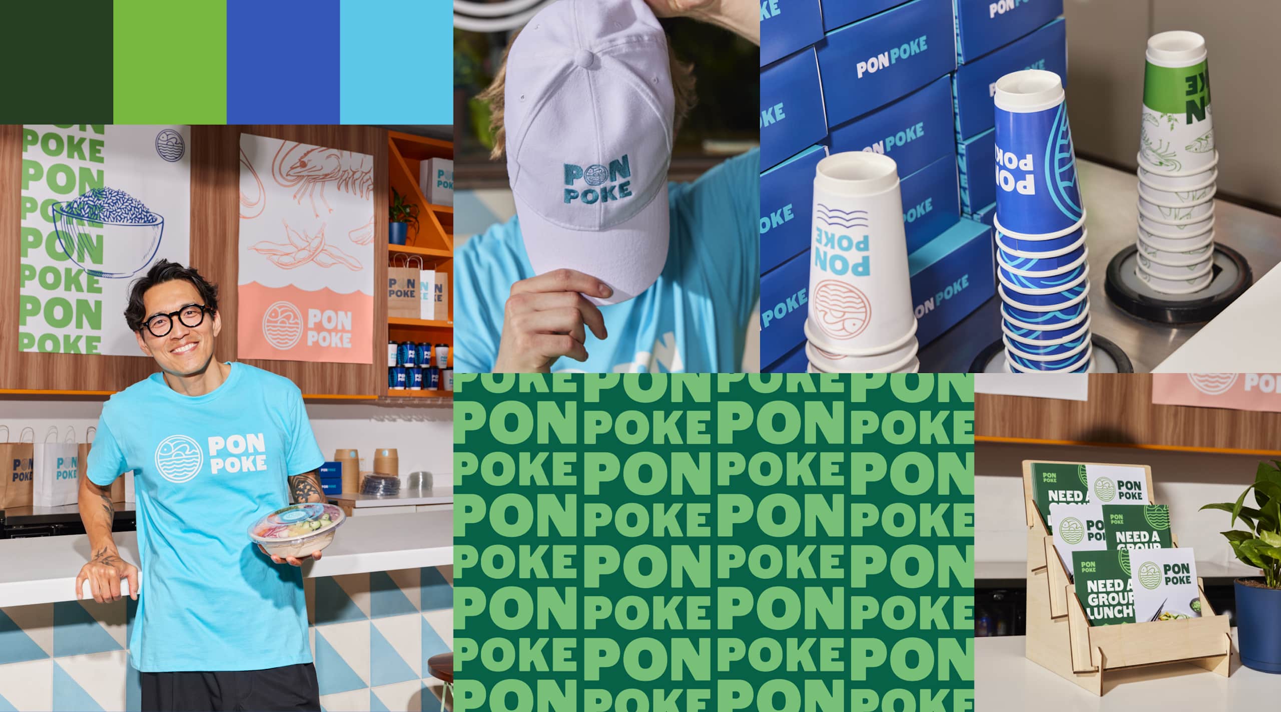
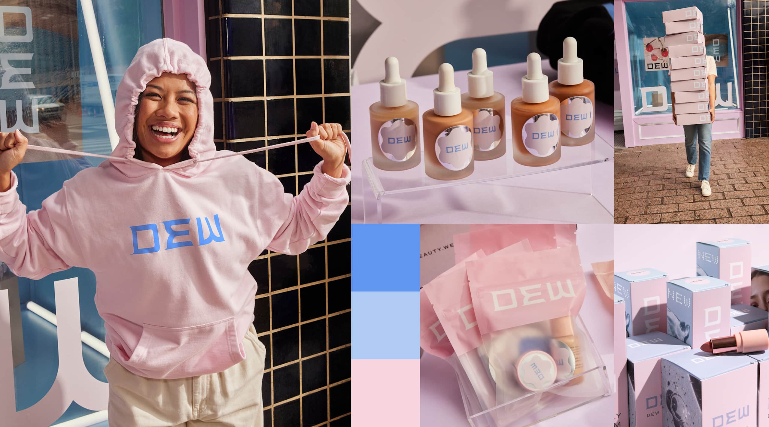
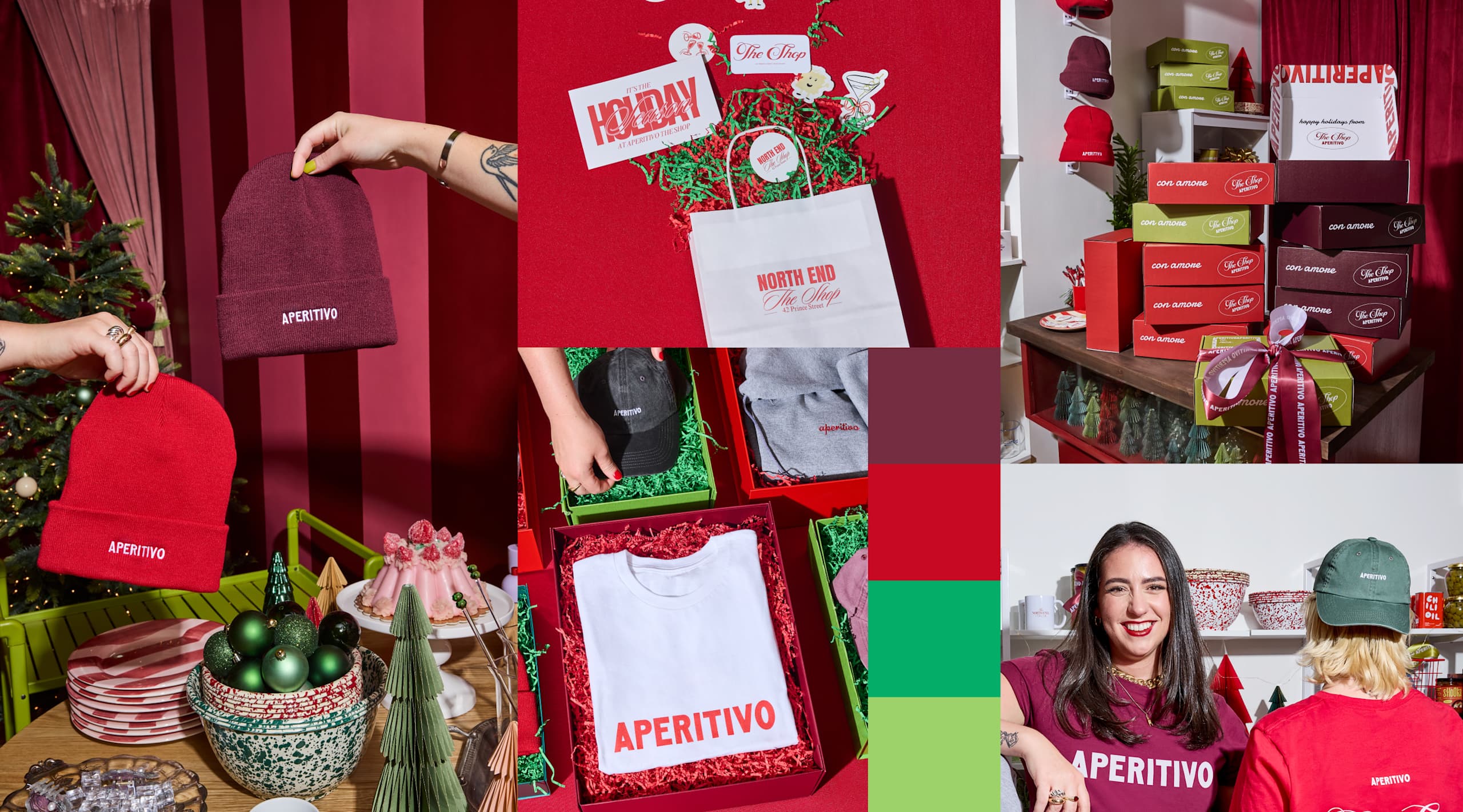
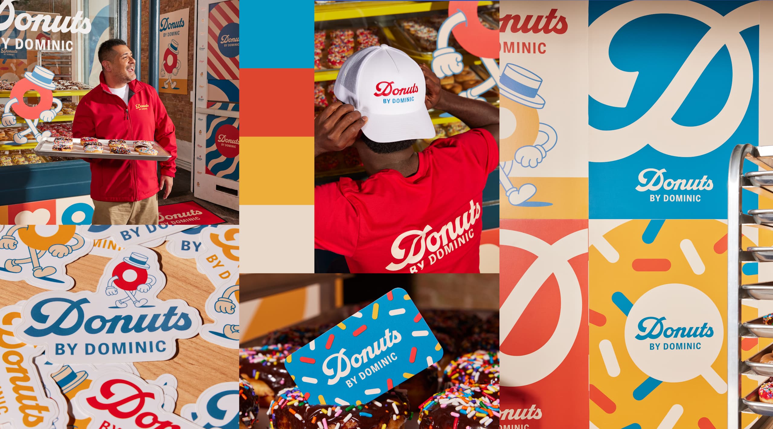
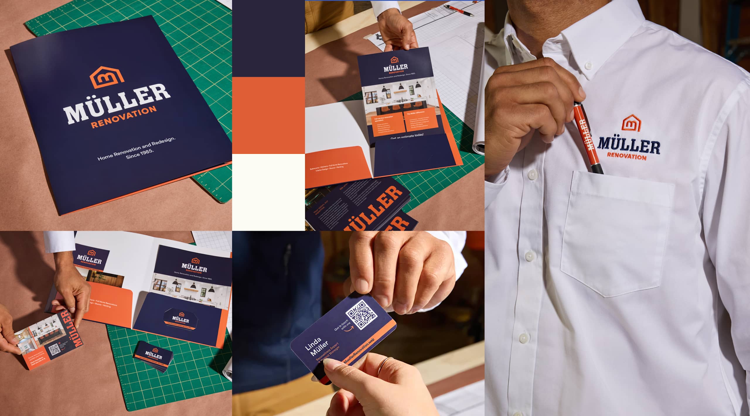
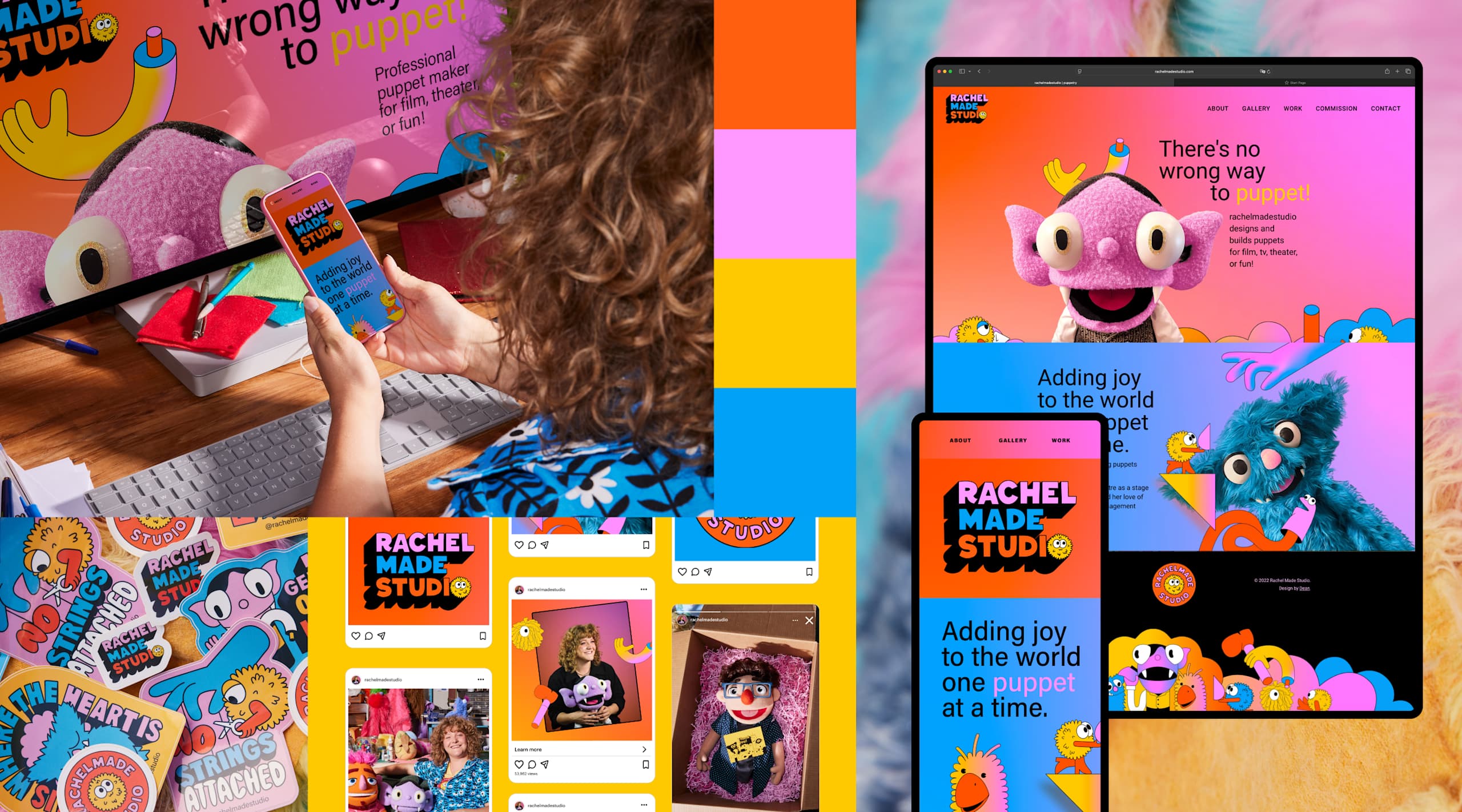
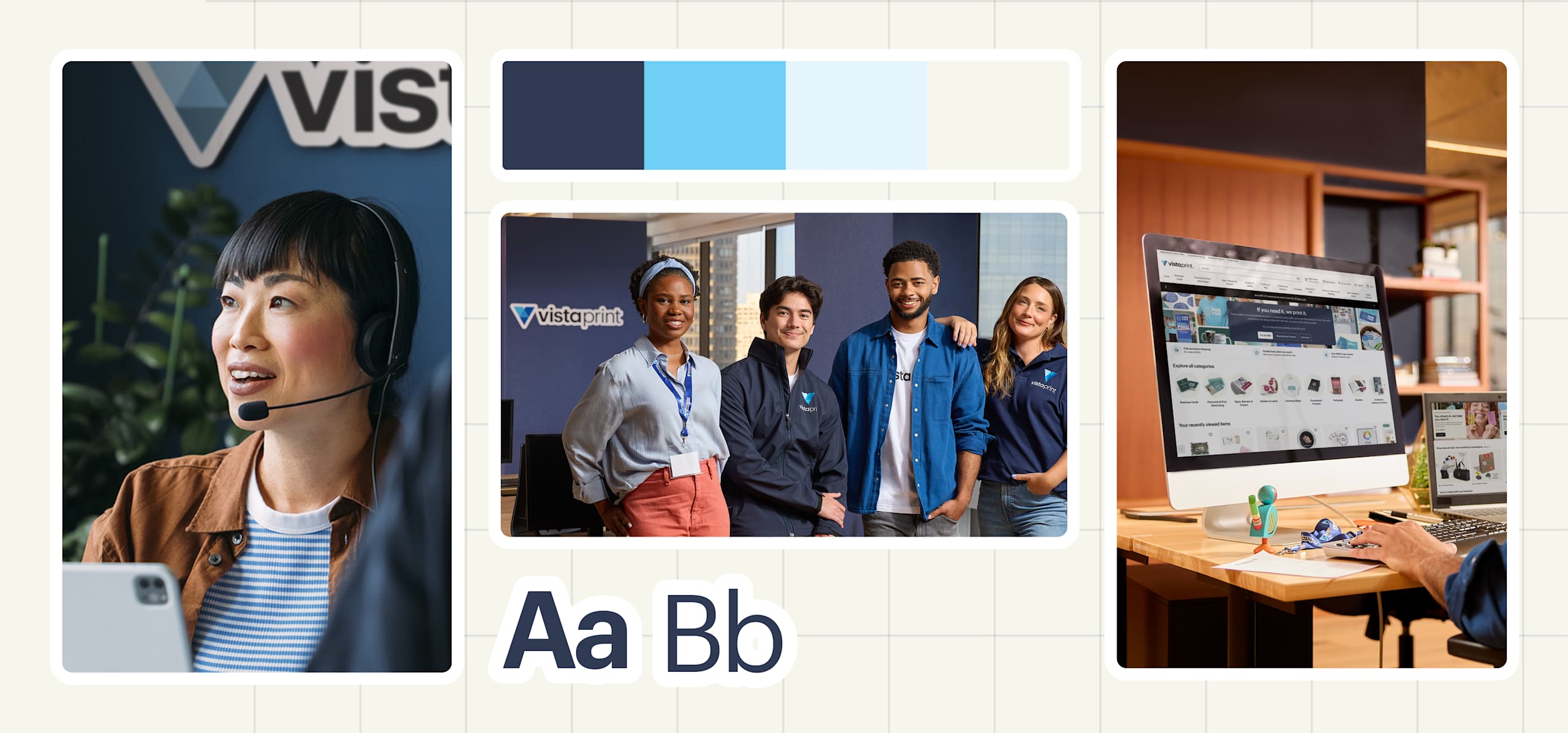
Branding mood board examples
Branding mood boards establish a core visual identity before designing any assets. Include 3 to 5 brand color swatches with codes, primary and secondary fonts, logo inspiration, photography style references and textures or patterns.
Product mood board examples
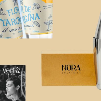
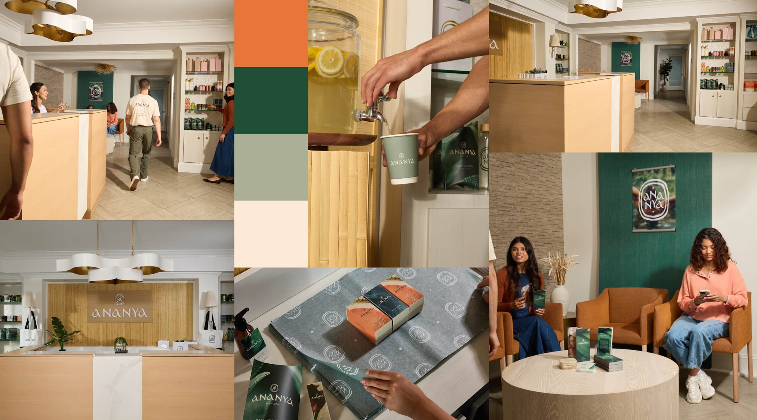
Product mood boards align teams on a product’s visual direction before product design begins or ahead of a product launch. Mood boards are often used early in the design process to guide product design decisions, and later to ensure marketing and packaging feel cohesive. Focus on product photography style, packaging inspiration, lifestyle context images and product colors.
For example, a skincare line mood board might showcase clean neutrals, botanical imagery, minimalist packaging and wellness lifestyle shots, communicating the brand identity and promise before design begins.
Seasonal campaign mood boards
Seasonal campaign mood boards capture limited-time promotions while maintaining the core brand identity. Include seasonal colors, holiday imagery, emotional tone references and campaign fonts.
A holiday campaign mood board might mix festive reds and greens with holiday patterns and bold typography, distinguishing seasonal marketing while staying on-brand.
Style-specific mood board examples
Minimalist mood boards feature 2 to 3 colors, white space and simple typography. For example, a tech start-up might use white space and navy sans-serif fonts to create a restrained, sophisticated aesthetic.
Bold mood boards use high-contrast colors, dynamic imagery and expressive typography. Luxury mood boards feature rich colors, refined serifs and high-end photography. Playful mood boards include bright colors, creative shapes, doodle illustrations and friendly typography.
The style of your mood board should match your business’s personality. A branding mood board for a lawyer’s office will have a different visual language than a cupcake business.
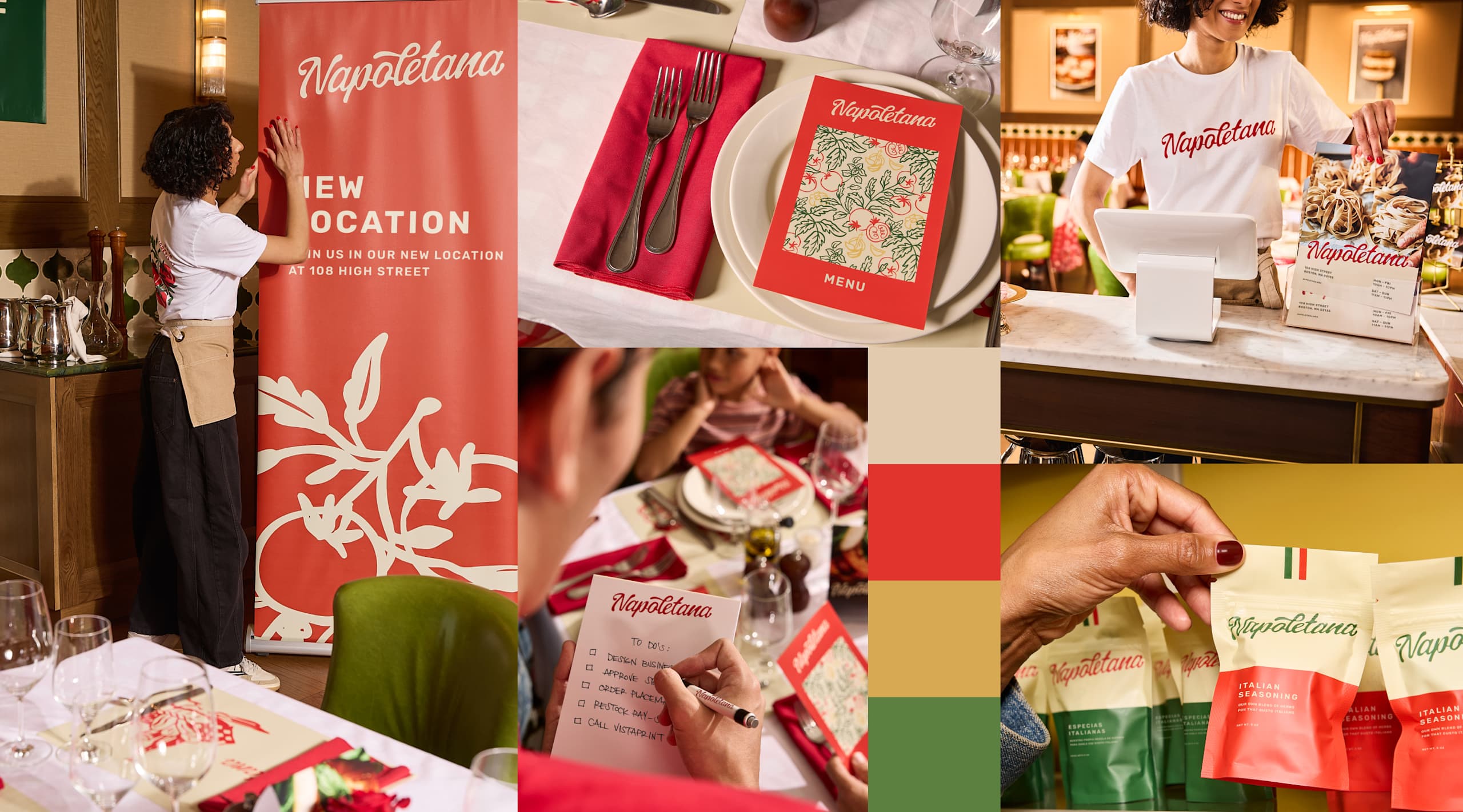
Brand identity mood board examples
Visual identity mood boards establish a cohesive look across every brand touchpoint. Your mood board should explore aesthetic colors and brand imagery that speak to your company’s personality and persona.
A restaurant visual brand identity mood board, for example, might balance upscale and welcoming aesthetics with bright warm tones, elegant script fonts, playful illustrations and photography of diners and plated food.
Print marketing mood board examples
Print marketing mood boards ensure printed marketing materials match digital aesthetics and your vision. Include paper texture samples, print finishes, such as matte or gloss, and color accuracy notes for CMYK printing.
Fashion and retail mood boards
Fashion and retail businesses need visual identity mood boards for collections, branding and marketing. Include fabric swatches, trend references and display inspirations.

Interior design and hospitality mood boards
For hospitality and interior design project mood boards, include material samples, lighting references and spatial layouts to visually describe the design concept.
E-commerce brand mood boards
E-commerce brands need consistency across website design, digital marketing, product listings, emails and social media content. Include product photography examples, email templates and promotional graphics in an e-commerce mood board.
Key elements of a mood board
- Color swatches: Include 2 to 3 primary colors and 2 to 4 secondary colors. Include exact codes (HEX for digital, CMYK for print), as exact color matching prevents costly revisions later.
- Imagery and photography style: Include lifestyle photos, product photography examples and illustration references in your mood board.
- Textures and patterns: Add digital textures or physical materials for print projects, including paper stocks, fabric swatches and finish options. Consider linen for sophistication, kraft paper for authenticity or glossy finishes for bold impact.
- Typography and fonts: Include 1 to 2 headline fonts, 1 to 2 body copy fonts and example usage in context. Typography communicates personality – serif fonts suggest elegance and tradition, while sans-serif fonts feel modern and innovative.
- Quotes and keywords: Add keywords that capture the feeling of your brand, product or campaign, like “bold,” “quirky” or “friendly.”
Add notes or annotations like “Bold typography for confidence” or “Muted tones for sustainability focus” to help everyone understand your choices and reasoning.
How to create a mood board in 5 easy steps
- Define your goal: Clarify the purpose of your mood board, such as a brand refresh, product launch or seasonal campaign. Write down 2 to 3 words that describe the feeling you want to communicate.
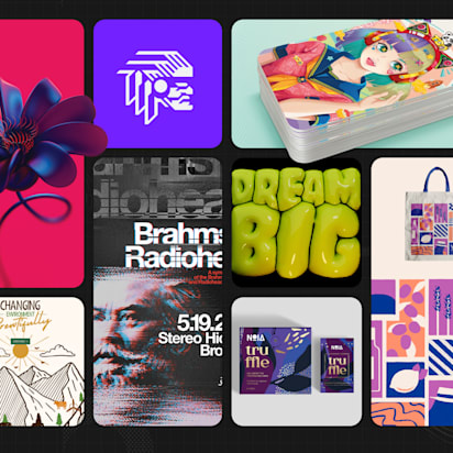
- Gather visual inspiration: Collect images, color references, typography samples and textures that reflect your product, project or brand. Focus on a curated collection of references that create a cohesive look rather than quantity.
- Choose colors and fonts: Select 2 to 3 primary colors, supporting shades and fonts. Include exact color codes and font names.
- Curate and refine: Edit your selections down to 10-15 cohesive design elements. Remove anything that feels off-brand or visually inconsistent.
- Add context and apply: Annotate your choices with notes explaining your reasoning. Use the mood board as a reference when creating marketing materials, packaging or brand assets.
Common mistakes to avoid
- Over-cluttering: Too many elements make your mood board hard to grasp. Limit yourself to 10 to 15 visual elements that look cohesive together.
- Mixed visual language: Contradictory elements confuse rather than clarify. If half your references are minimalist while the others are decorative, you’re sending mixed signals.
- Lack of cohesion: Every color, font, image and texture should feel like it belongs together.
- No context: Add brief notes explaining choices, for example, “Warm wood tones for approachability”.
- Ignoring practical constraints: Create a mood board that’s easy to execute. Don’t fill your board with expensive specialty printing if your budget is limited.
From brand mood board to real-world outcomes
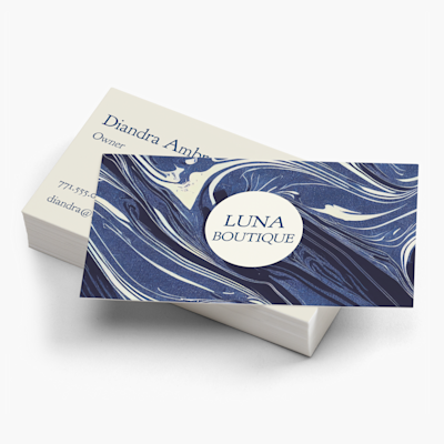
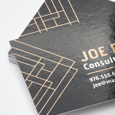
Turn the minimalist color scheme, rustic imagery, bold typography, simple line illustrations or geometric patterns featured on your digital or physical mood board into modern business cards, kraftpaper packaging with twine details, vibrant Instagram feeds or flyers and posters that increase brand recognition.
Cohesion across touchpoints builds brand recognition. When customers visit your website and receive your direct mail, they should immediately recognize the same brand identity.