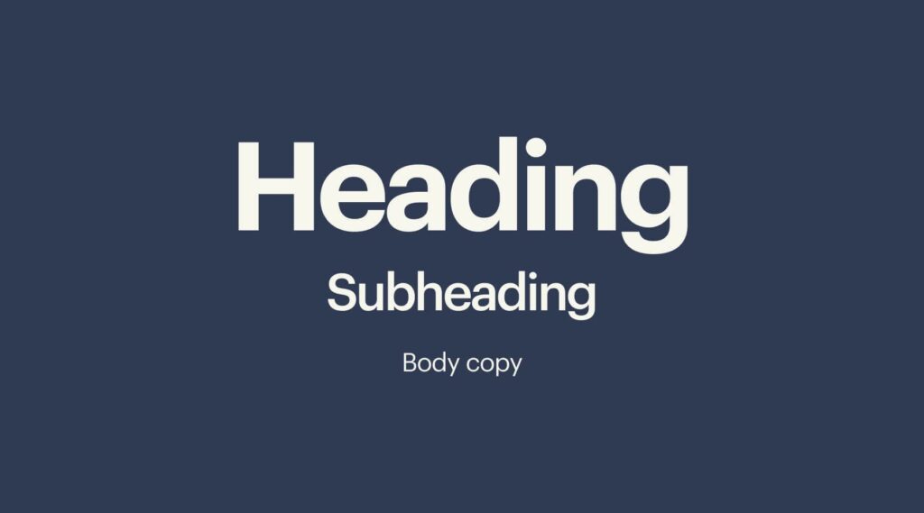
Design differs from art in that it has to have a purpose. Visually, this functionality is interpreted by making sure an image has a center of attention, a point of focus. Maybe you’re thinking, “But wait! I thought design was all about creativity?” If you’re a business owner, marketer or designer who’s just starting out, you might be tempted to go wild and combine the first five typefaces and colors that catch your eye, believing you’re creating something fresh and new. You will probably find yourself with a design that is muddled, unfinished or, well, just plain ugly.
Graphic design, like any discipline, adheres to strict rules that work beneath the surface to make the work stable and balanced. The principles of design are the rules you must follow to create an effective and attractive design composition. If the design is missing that balance, it will be weak and ineffective.
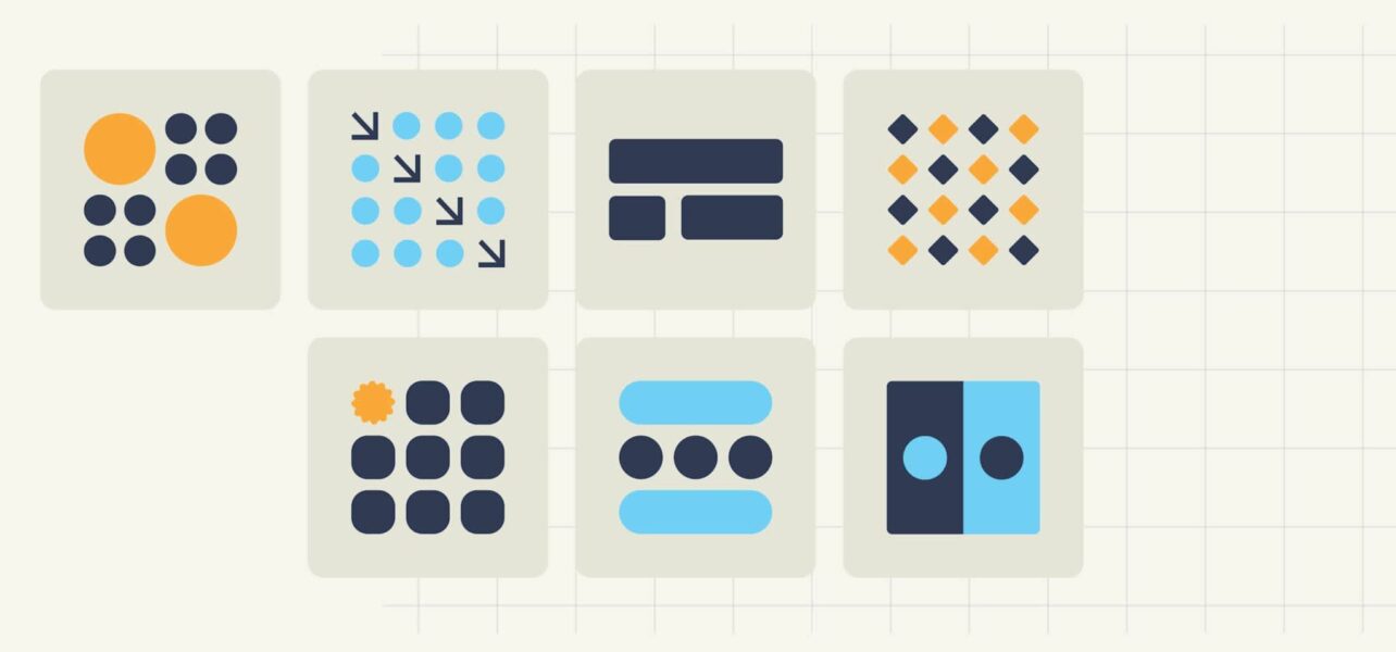
- Understand the seven core design principles: Emphasis, Balance, Contrast, Repetition, Proportion, Movement and White space – and why they matter.
- Learn how each principle guides the viewer’s eye and strengthens communication.
- Discover additional design elements and concepts such as hierarchy, framing, typography, color and shape that refine your work.
- Get a quick, step-by-step method for using these principles on logos, posters, packaging and more.
Principles of design
Learn more about design principles by watching our video or reading below. Either way, knowing these principles and how to use them can help your designs capture attention, improve recognition and make your marketing messages easier to understand.
| Principle | Definition | Direct application |
| Emphasis | Making one element stand out more than others | Use it to highlight your headline, offer or call-to-action. |
| Balance and alignment | Distributing visual weight and organizing elements so they feel connected | Use it to keep layouts clear and prevent important content from feeling crowded. |
| Contrast | Creating distinction between elements using differences in color, size, shape or typography | Use it to improve readability and make key messages stand out. |
| Repetition | Reusing visual elements like colors, fonts or shapes | Use it to create consistency and reinforce your brand. |
| Proportion | Managing the relationship between the size and weight of design elements | Use it to show viewers which information matters most. |
| Movement | Guiding the viewer’s eye through a design in a deliberate order | Use it to lead attention from headlines to supporting information and calls to action. |
| White space | Using empty space around elements intentionally | Use it to improve readability and give important content room to stand out. |
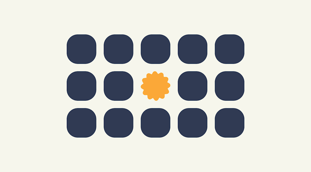
Emphasis
The first of the design principles is emphasis, referring to the focal point of a design and the order of importance of each element within a design. Say you’re creating a custom poster for a concert. You should ask yourself: what is the first piece of information my audience needs to know? Is it the band? Or the concert venue? What about the day and the cost of attending?
Make a mental outline. Let your brain organize the information and then lay out your design in a way that communicates that order. If the band’s name is the most essential information, place it in the center or make it the biggest element on the poster. Or you could put it in the strongest, boldest type. Learn about brand color theory and use strong color combinations to make your brand and business design pop.
Like writing without an outline or building without a blueprint, if you start your composition without a clear idea of what you’re trying to communicate, your design will not succeed.
Your main message should stand out at a glance. If you relax your gaze or zoom out and several elements still compete for your attention, the focal point probably isn’t strong enough.
Balance and alignment
Never forget that every element you place on a page has a weight. The weight can come from color, size or texture. Just like you wouldn’t put all your furniture in one corner of a room, you can’t crowd all your heavy elements in one area of your composition. Without balance, your audience will feel as if their eyes are sliding off the page.
Symmetrical design creates balance through equally weighted elements aligned on either side of a center line. On the other hand, asymmetrical design uses opposite weights (like contrasting one large element with several smaller elements) to create a composition that is not even, but still has equilibrium.
Symmetrical designs are always pleasing, if not occasionally boring. Asymmetrical designs are bolder and can bring real visual interest and movement to your composition.
Try viewing your design upside down for a few seconds. Removing the content from the equation makes it easier to notice whether one side feels visually heavier than the other.
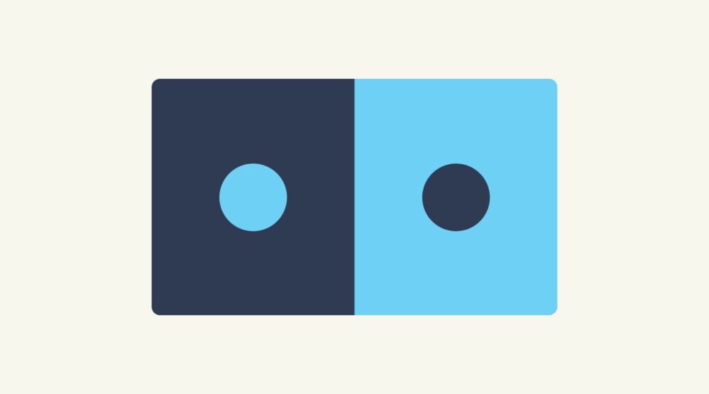
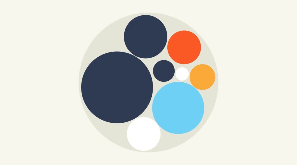
Contrast
Contrast is what people mean when they say a design “pops.” It comes away from the page and sticks in your memory. Contrast creates space and difference between elements in your design. Your background needs to be significantly different from the color of your elements so they work harmoniously together and are readable.
Contrast doesn’t have to come from color. Size, spacing, weight and shape can create just as much impact, often with a cleaner result.
If you plan to work with fonts, understanding contrast is essential because it means the weight and size are balanced. How will your audience know what is most important if everything is in bold? A large headline paired with smaller supporting text, or a bold call-to-action surrounded by generous white space, can be just as effective as contrasting typefaces. In fact, many strong designs rely on just one or two fonts, using different weights and sizes to create distinction. Contrast can be created through typography and color, but it also comes from differences in size, spacing and shape.
Looking for fresh ways to create contrast with type? Explore the top font trends of the year for inspiration on pairing styles, weights and layouts.
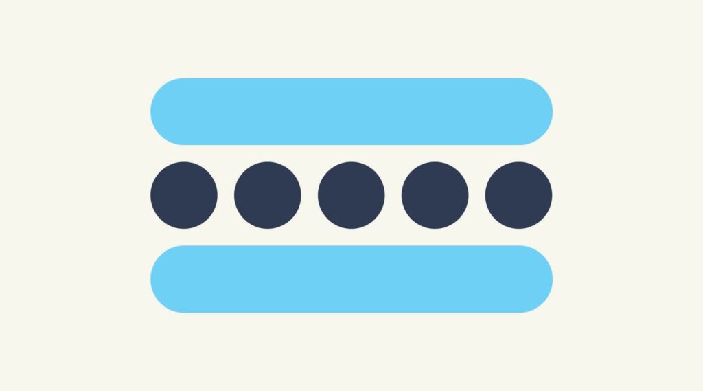
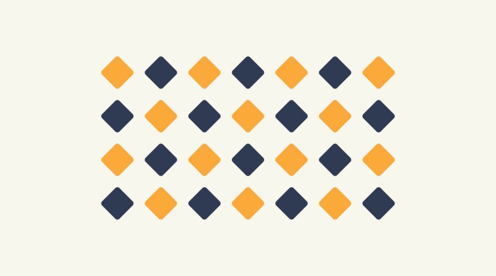
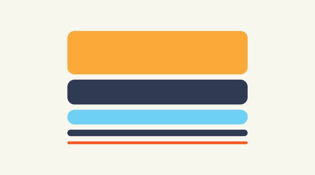
Repetition
If you limit yourself to two strong typefaces or three strong colors, you’ll soon find you’ll have to repeat some things. That’s ok! It’s often said that repetition unifies and strengthens a design. If only one thing on your poster is in blue italic sans-serif, it can read like an error. If three things are in blue italic sans-serif, you’ve created a motif and are back in control of your design.
Create a small set of repeatable rules before you start designing – headline style, button style, spacing, colors. Decisions become faster and your design stays more consistent.
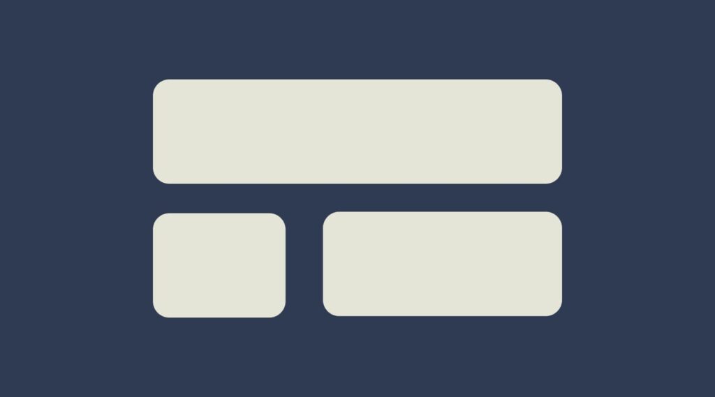
Proportion
Proportion is the visual size and weight of elements in a composition and how they relate to each other. It often helps to approach your design in sections, instead of as a whole.
Grouping related items can give them importance at a smaller size – think of a box at the bottom of your poster for ticket information or a sidebar on a website for a search bar. Proportion can be achieved only if all elements of your design are well-sized and thoughtfully placed. Once you master alignment, balance and contrast, proportion usually emerges organically.
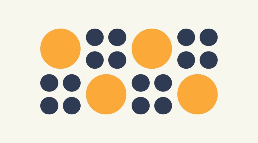
When everything is similar in size, viewers have to work harder to understand what matters. Make important elements noticeably larger rather than slightly larger.
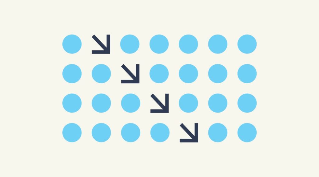
Movement
Going back to our concert poster. If you decided the band was the most important piece of information on the page and the venue was the second, how would you communicate that with your audience?
Movement is controlling the elements in a composition so that the eye moves from one to the next and the information is properly communicated to your audience. Movement creates the story or the narrative of your work: a band is playing, it’s at this location, it’s at this time, here’s how you get tickets. The elements above – especially balance, alignment and contrast – will work towards that goal, but without proper movement, your design will flop.
If you look at your design and feel your eye get “stuck” anywhere on it – an element is too big, too bold, slightly off-center, not a complementary color – go back and adjust until everything is in harmony.
Start at your main headline and follow the path your eye naturally takes. If you jump around the page instead of moving smoothly through it, your layout may need adjusting.
White space
All of the other principles of design focus on what you add to a composition. White space (or negative space) focuses on what you leave out. It’s the empty area around the elements in your design, and it shapes how those elements are seen, understood and prioritized.
For many beginning designers, white space can be difficult to get right. Empty areas often feel unfinished, which creates the temptation to fill every gap with text, icons or decorative elements. That instinct usually creates the opposite effect. Crowded layouts compete for attention and make important information harder to find.
White space creates structure. It separates related content, establishes hierarchy and gives the eye a place to rest. The space around an element also changes how it feels: a tightly packed layout can feel busy, while generous spacing often creates a cleaner, more refined look.
White space in design also plays a practical role across marketing materials. Used well, it can help:
- Improve readability on websites and emails
- Draw attention to calls to action
- Create a more polished feel on packaging
- Reduce visual clutter in social media graphics
If a design feels like it’s missing something, pause before adding another element. Remove one instead. Extra space is often the adjustment that brings everything else into focus.
Negative space can also become part of the design itself. Some logos use it to reveal a second image or idea that isn’t obvious at first glance, adding another layer of meaning for viewers who take a closer look.
Principles of design infographic

Other useful design concepts and elements
Beyond the seven fundamentals, there are additional design elements that can help refine your work and make communication clearer. Concepts like color, typography, shape, line and texture are the building blocks of a design, while principles determine how those pieces are arranged and used. The elements below can help strengthen your layout and help guide your audience through it more effectively.
Hierarchy
Hierarchy is the deliberate ranking of components so the viewer knows what to read or notice first, second and third. Size, weight, placement and color all help you build a visual ladder of importance.
Framing
Framing uses borders, shapes or surrounding elements to focus attention and create context. A frame can be literal (a box or stroke) or implied (negative space around an object) to separate or highlight content.
Typography
Typography is more than choosing a pretty font. It’s how you combine typefaces, weights, sizes, spacing and alignment to enhance readability and tone. Good typography reinforces hierarchy and contrast, guiding the reader effortlessly.
Color
Color sets mood, builds brand recognition and creates emphasis. Follow current color trends – such as the latest Pantone Color of the Year – and use color psychology and theory to pair hues that harmonize or intentionally clash to grab attention. Limit palettes to maintain consistency and avoid visual noise.

Shape
Shapes, geometric or organic, carry meaning and direct the eye. Repeating shapes can create rhythm, while contrasting shapes add interest. Consider how shapes interact to support balance and movement in your layout.

How to use the principles of design
Here’s how to put these design principles into practice:
- Start by defining your message in one sentence: what must viewers know first? Use that to set emphasis and hierarchy.
- Sketch quick thumbnail layouts to test balance, alignment and movement.
- Choose one or two typefaces and a limited color palette to control contrast and repetition.
- Group related information to manage proportion, and then deliberately add (or subtract) white space to let key elements breathe.
- Iterate, step back, squint and adjust until the eye flows effortlessly from point A to point B.
A design doesn’t have to strictly follow these rules to be “good,” and there are many graphic design trends that don’t. Some absolutely mind-blowing designs ignore principles to create eye-catching and effective work.
Still building your design skills? Our guide to graphic design for beginners covers foundational concepts, tools and techniques to help you put these principles into practice with confidence.
Applying design principles through an inclusive lens
Design principles become even stronger when they make information easier to read, navigate and understand. Small design choices can have a big impact on how comfortably all people with all accessibility levels can interact with your design.
- Contrast: Make text easy to read by creating enough distinction between text and background colors. Avoid relying on color alone to communicate information.
- Typography: Choose font sizes, spacing and line lengths that remain easy to scan across different devices. Design with responsiveness in mind so content is just as readable on a mobile screen as it is on a desktop.
- White space: Give elements room to breathe. Clear spacing can make layouts feel less overwhelming and help viewers focus on what matters most.
- Movement: Use animation and visual effects thoughtfully. Too much movement can distract viewers and pull attention away from important information.
Now you’re ready to design!
The elements of a design should be viewed as moving parts that combine to tell a story. As you approach your design project, you must first familiarize yourself with these principles of design. Only then will you be able to break these graphic design rules to create your own signature style.
Before applying these principles to your own work, explore these small business branding design examples to see how they’re used across real-world brands.
FAQs about design principles
Why are design principles important?
Design principles help bring structure to your work. They guide the viewer’s eye, show what matters most and make information easier to understand. Without them, even a visually appealing design can end up feeling cluttered or confusing.
What is the difference between elements and principles of design?
Elements are the pieces you use to build a design – things like color, shape, typography and texture. Principles are the guidelines for arranging those pieces so your design feels clear, balanced and easy to follow.
Are design principles the same for all types of design?
The fundamentals stay the same, but how you apply them changes depending on the format. A website, product package, social media post and poster all use principles like emphasis, contrast and balance, but each has different goals and constraints.
How can I practice these principles without formal training?
Start small. Redesign a flyer you find on a noticeboard, improve the layout of a social post or create different versions of the same design while focusing on one principle at a time. Small exercises like these help train your eye surprisingly quickly.