Let’s take a look at the technology and tech branding. How did the biggest tech giants of the last 100 years choose to present themselves to customers? Which approaches have worked and which have been scrapped along the way?
Consumer electronics brands like Sony certainly played a part in this story, but we won’t be looking at them. Why? Because their job was a little too easy. Obviously, ground-breaking products like Walkmans and high-res TVs sold themselves at the time. Branding played a part, of course, but it wasn’t as critical.
Instead, we’re going to focus on the century’s truly vanguard innovators—companies who had to sell products or concepts that people had never heard of before or may never fully understand, like broadband, microprocessors and search algorithms. Even when the use value of such products is self-evident, these companies must make the strange and revolutionary seem friendly and familiar. Now that is a tech branding challenge.
AT&T, est. 1885
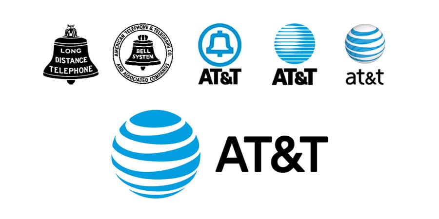
American Telephone and Telegraph Co., better known as AT&T, began as a consolidation of several corporations controlling the patent rights of Alexander Graham Bell, inventor of the telephone. Its role as a tech innovator goes far beyond old-fashioned telephones and telegraphs, however. In the 1940s, AT&T had already laid the groundwork for cellular telephony, sent the first-ever broadband transmission, and invented the transistor.
For the first hundred or so years of its existence, AT&T used the symbol of a bell for its logo icon, introducing a radically simplified version alongside bold type in the 1960s. In the 1980s, however, the American government required AT&T to spin off some of its subsidiary companies, including Southwestern Bell Telephone Company (SBC). As a result, SBC took the bell logo and AT&T fashioned something new for itself: a simplified globe crossed by horizontal bands signifying electronic transmission (see bottom cell of the image above).
Over the past thirty years, we’ve seen several logo evolutions. It became 3D in the late 1990s and then gained a transparency effect in the 2000s (see above, the second cell from the top right). Unfortunately, these fancy effects seriously damaged the brand mark’s versatility. In its latest update, from 2015, the company returned to monochrome two-dimensionality.
IBM, est. 1888
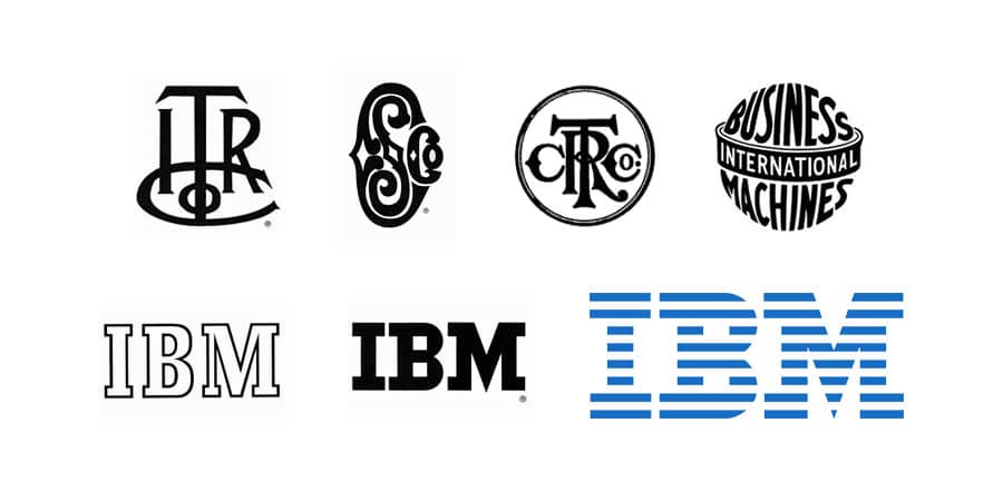
IBM is best known for its innovations in computing, especially in the 1960s. However, it began as the International Time Recording Company, creating—you guessed it—mechanical time recorders. In 1911 it expanded its operations and its name, becoming the Computing-Tabulating-Recording Company. Quite a mouthful. International Business Machines (IBM) was definitely a name improvement.
Its first logo mark as IBM, designed in 1924, features a globe encircled by a banner. Some 20 years later it simplified radically, introducing simple blue block letters. IBM really made its mark upon graphic design history, though, with its 1972 redesign by the legendary designer Paul Rand. Rand fragmented the block letters into 8 horizontal bands, intended to convey the “speed and dynamism” of forward movement.
General Electric, est. 1890
![]()
In the late 19th century, Thomas Edison—of electricity-inventing fame—found himself in control of several different companies: Edison Lamp Company, Edison Machine Works and Edison Electric Light Company, to name a few. He decided to merge them into one single entity, and General Electric was born.
You’re forgiven for thinking that General Electric is just a maker of banal household appliances—dish washers, laundry machines and the like. By the end of the 20th century, those were its most visible products. But in fact, its behind-the-scenes innovations are far more extensive. General Electric created components that made the technology of television possible, revolutionized power generation with its invention of aircraft turbosuperchargers, and was even a leader in computing in the 1960s.
GE’s logo, widely considered one of the world’s all-time best, has not changed a whole lot over the past 125 years. In 1934 GE brought its original script initials inside a circle articulated by a whirlpool-like effect to suggest speed and fluidity. There were hardly any further changes until 2004 when GE employed the agency Wolff Olins to provide a millennial update. Their tech branding makeover included a mild graphic cleanup, the introduction of a new blue color, and the creation of an accompanying proprietary typeface, GE Inspira.
Xerox, est. 1906
![]()
While the brand name Xerox is forever associated with printers and scanners, its origins, in fact, go all the way back to the turn of the 20th century. In its first form, it was the Haloid Photographic Company—a producer of photographic paper. In the 1950s, it changed its name to Haloid Xerox and, finally, to simply Xerox.
While photo paper and printing hardware might not qualify as revolutionary in themselves, Xerox happened to invent a number of other supplementary technologies along the way that turned out to be pretty important. In fact, astronomically important. The Graphical User Interface, the mouse and ethernet all came out of Xerox Parc in the 1970s and 80s.
Xerox sometimes seems like a company that was never quite able to realize the importance of its own inventions and the evolution of its graphic identity has similarly been troubled. In the 1960s it dropped the torch that accompanied its Haloid days in favor of an iconic typeface with thin ligatures and a squared, zero-like “O.” Unfortunately, its development since then has been rocky.
In 1994 the design agency Landor attempted to bring Xerox’s logo into the digital era by simplifying it to an “X” and adding some pixelation, which was typical for graphic interfaces of the time. Obviously this was bound to become outdated, however. Their 2008 logo evolution, a generic web 2.0-style icon complete with clumsy gradient and shine effects, is a very poor showing.
Hewlett-Packard, est. 1939
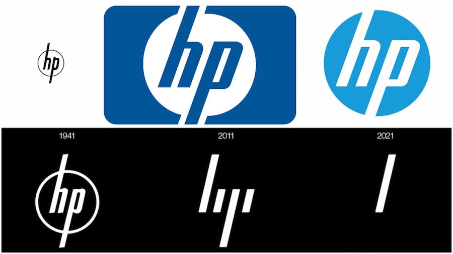
Stanford grads William Hewlett and James Packard started their company in a garage in 1939. Their first product was an audio oscillator, which they managed to make for a fraction of the cost of their competitors. They got into the semiconductor game in the 1960s, and in 1968 they created the first device to ever be called a personal computer. Since then, they have expanded their business by moving into calculators, scanners, printers and the like.
Their initial logo, which they kept until 1974, featured the founders’ initials with long ascenders and descenders breaking through a slim ring. In the 1980s, this was enclosed within a blue rectangle, and in 2010, this shrunk into a circle and became a lighter shade of blue.
Interestingly, HP also recently employed the design firm Moving Brands to execute a more radical identity alteration, which they have not yet decided to implement. This design, shown in the lower cell of the above image, abstracts the logo to just four slanted lines, with the implication that someday (2021, apparently), only one will be necessary. Here is Moving Brands’ explanation of their idea (via Brand New).
The defining signature of the system is the 13° angle. 13° represents HP’s spirit as a company, driven forward by ingenuity and optimism about the future and a belief in human progress [the company’s initials]. It also refers to the world of computing by recalling the forward slash used in programming. 13° exists within the brand identity, in the graphic language, product design and UI.
It’s kind of out there, but we like it.
Intel, est. 1968
![]()
In 1957, a group of engineers working for Shockley Semiconductor Laboratory jumped ship to start their own rival firm, which would become Fairchild Semiconductor. They are known as the “traitorous eight.” One of them, Gordon Moore, achieved additional fame for his “law” that computing power would double every 18 months for the foreseeable future. (He was right for 30 years). In 1968 Moore founded his own microprocessor company, Intel.
Moore and his co-founders created their initial logo, with the dropped “e,” by themselves, and it served them through the 1980s. With the advent of the personal computer, however, Intel found itself needing to appeal more to a new market: everyday consumers. That posed a problem, because Intel’s product was, for all intents and purposes, invisible. It was located inside the computer.
To solve their problem, Intel turned to branding. In 1991 it introduced a new logo featuring the phrase “intel inside”—a nod to the fact that their role was behind the scenes. They arranged with PC producers to put a sticker with this logo on any product in which their microprocessors were used, thus ensuring that they maintained public brand visibility even when their actual product was nowhere to be seen.
In 2005, an updated version of the logo put “Intel Inside” to rest but retained the “swoosh” element implying a dynamic leap.
Microsoft, est. 1975
![]()
In 1972, Bill Gates and Paul Allen founded a company called Traf-O-Data, which utilized computers to analyze automobile traffic data. This eventually grew into a larger operation that they called “Microsoft”, for “microprocessor software.” What follows is history, especially Microsoft’s entrance into the operating system game in the 1980s, when they introduced Windows and Office suite in competition with Apple.
Unlike Apple, however, Microsoft’s aesthetic sensibility has never exactly been its forte. Gates and Allen designed the company’s first logo, a Disco-era relic if ever there was one, in less than a day using the computer language program BASIC. In the 1980s they briefly rocked a heavy metal-looking wordmark before settling on a new design by Scott Baker. Known as the “Pac Man” design for the triangular gash in its “o,” which causes it to resemble the open-mouthed Pac Man character, Baker’s design uses a bold, italicized and condensed font of Helvetica.
Baker’s design remained in place for 25 years. Finally, in 2012 Microsoft introduced a new logo complete with a colorful four-square grid (supposed to represent the diversity of Microsoft’s products, but really it mostly alludes to Windows) and a lighter wordmark in a new proprietary typeface, Segoe UI. In a nod to the previous logo, the “f” and “t” remain conjoined.
Apple, est. 1977
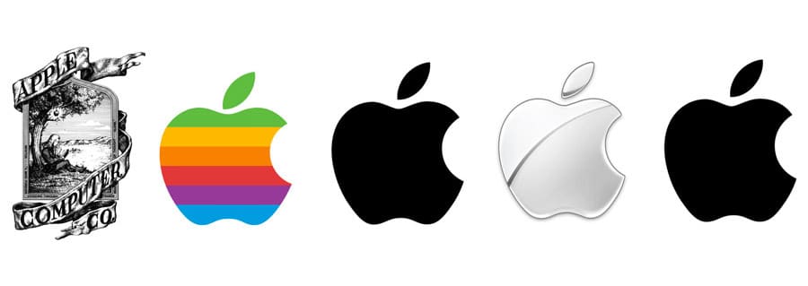
Apple was created by Steve Jobs, Steve Wozniak and Ronald Wayne in 1976 to develop and sell personal computers. It incorporated the next year. No further introduction was necessary.
Wayne designed the company’s first logo, a detailed etching of Sir Isaac Newton sitting beneath an apple tree, positioned within a frame. The phrase on the outside border reads, “Newton… A Mind Forever Voyaging Through Strange Seas of Thought … Alone.”
One year later, Jobs commissioned a professional graphic designer, Rob Janoff, to create a more simple logo, resulting in the iconic multi-colored apple silhouette. Jobs supposedly was the one who insisted on the rainbow color band as a way of “humanizing” the brand. The bite was to prevent confusion with a tomato.
When Jobs returned to the helm of the company in 1998, however, he decided to nix the colors in favor of a pure monochrome. Since then, Apple has experimented with a number of variations, adding different texture and shine effects to give the emblem more perceived tactility. Its core logo, however, has remained monochromatic, and most recently Apple has kept it that way in all of its implementations to accord with a flat design aesthetic.
Google, est. 1998
![]()
Larry Page and Sergey Brin began Google as a research experiment while PhD students at Stanford University. They thought they could improve upon search engine algorithms by ranking pages not according to keyword density, but to the number of backlinks. Hence their original name for the engine, “Back Rub.” Fortunately, they decided to replace that name with an intentional misspelling of Googol, the name for the number one followed by 100 zeroes.
Page created the first Google logo using a free graphics program. It was based on the typeface Baskerville and had an exclamation point—an obvious rip-off of Yahoo! The next year, Google brought on a professional designer, Ruth Kedar, who pivoted to the slimmer Catull typeface. From there the logo underwent a number of minor alterations, finally losing its drop shadow and three-dimensional effect in 2013, a version that also controversially extended the cross bar of the “e.”
In 2015 Google introduced an entirely new typeface based on a proprietary sans-serif, not-so-imaginatively called Product Sans. The typeface is also shared by Google’s new parent company, Alphabet, where it appears in red.
Facebook, est. 2003
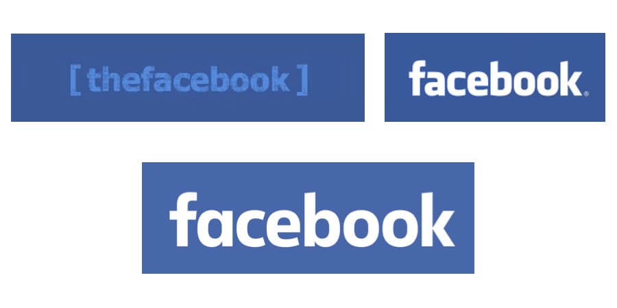
Mark Zuckerberg created “The Facebook” with the help of his Harvard classmates Eduardo Saverin, Dustin Moskovitz and Chris Hughes in 2003. In 2005 they dropped the “the,” but kept the original typeface, Klavika. The original logo, created by Joe Kral and Cuban Council, only slightly tweaked the base typeface, for instance, bringing the crossbar of the “f” and the top bar of the “a” into alignment.
In 2015, the company introduced a new logo based on a proprietary typeface that Facebook’s in-house designers created in collaboration with Eric Olson, the designer of Klavika. Its characters are slimmer and rounder. Most noticeably, the “a” has gone from a two-story to a one-story version. Josh Higgins, Facebook’s creative director, explains the reasoning behind the redesign thus (via Brand New):
When Facebook’s logo was first created in 2005, the company was just getting started and we wanted the logo to feel grown up and to be taken seriously. Now that we are established, we set out to modernize the logo to make it feel more friendly and approachable.
Whether the new logo is more “modern” is up for debate. Most likely, the real reason for the change is that the old logo did not show up well on smaller screens, for example on mobile devices, and the new typeface was brought in to correct that.
Tech branding takeaways
Having looked at these examples of how tech branding evolved over the 20th century, some takeaways are fairly evident.
- Blue is by far the favored color for tech branding, and monochrome is also the rule. Google, Microsoft and Xerox are the only contemporary brands to buck this trend. The former two are successful, the latter not so much.
- Almost every brand we looked at became simpler over time. Serifs became sans serifs, multiple colors became monochrome, etchings became silhouettes, and realism became geometric. HP’s redesign projection by Moving Brands is the most radical simplification of all. Again, the only brand to become more complicated is Xerox, with regrettable results.
Author: Alex Bigman