A logo is a visual symbol that represents a business. It’s often the first thing people notice and how customers recognize your brand. But with seven different types of logos, from monograms to mascots, businesses need to understand what each logo type is best for and how it can be used. The best type of logo for your brand is the one that matches its goals and intended use, so consider what your logo needs to achieve and where it will show up most, from business cards and packaging to social media profiles and signage.
- The seven main types of logos are lettermarks, wordmarks, pictorial marks, abstract marks, mascots, combination marks and emblems.
- Each logo type is suited to different use cases and business goals, such as increased recognition.
- Modern logo types worth exploring include dynamic logos, animated wordmarks, responsive logo systems, negative space symbols and hybrid icons.
- To choose the right type of logo for your business, focus on what the logo needs to achieve and how it will be used across print and digital materials.
Monogram logos (or lettermarks)
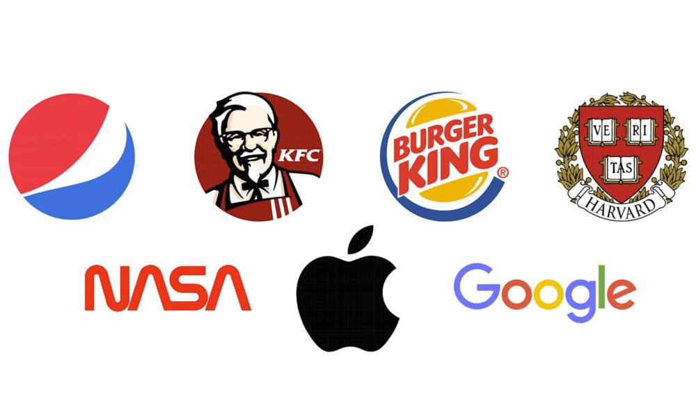
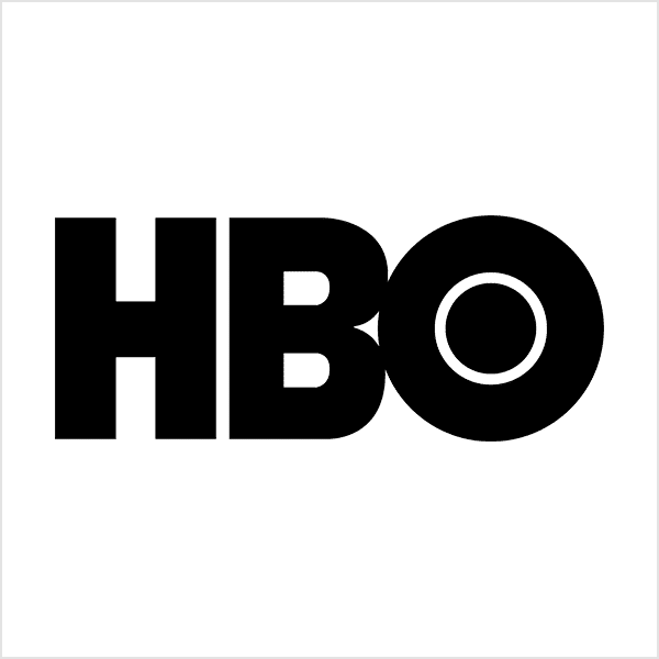
Monogram logos, also known as lettermark logos, are logos made up of letters, usually brand initials. Some best-known examples of this logo type include IBM, CNN, HP and HBO. Because these businesses have fairly long names, using initials in their logos makes them easier to recognize and remember.
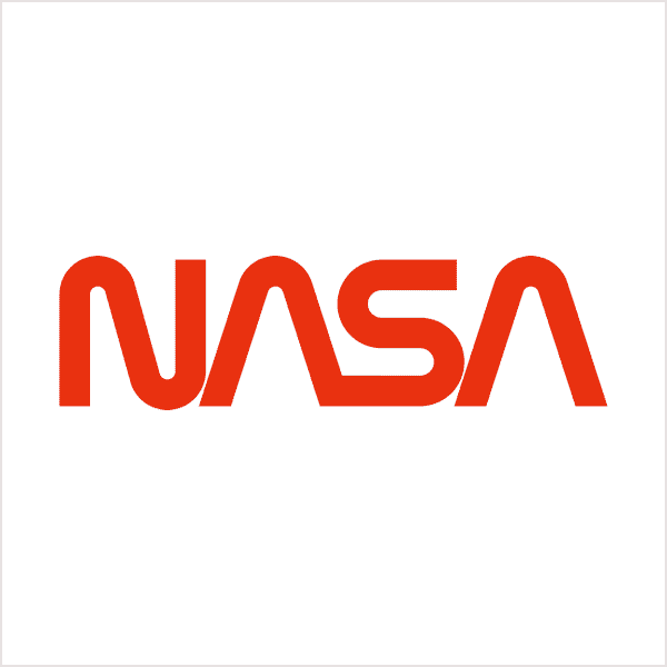
A lettermark is a typography-based logo that focuses on simplicity. By reducing a long business name to just a few letters, this type of logo keeps branding clean and efficient. For example, NASA is easier to recall than the National Aeronautics and Space Administration.

Logo font choice plays a major role with monograms and lettermark logos. The typography needs to reflect your brand identity while staying legible across print materials, especially product labels and promo items.
If your business is relatively new, add your full business name below the lettermark to help build brand recognition early on.
When to use a monogram logo
Businesses should create a monogram logo when:
- They need fast name recall for a long business name and want customers to remember the initials.
- Their logo will show up on small print surfaces, like business cards, loyalty cards, stickers or pens.
- Their brand needs to signal professional authority where clarity matters more than personality.
Pros and cons of monogram logos
Benefits
- Highly legible and scalable; easy to apply consistently across uses
- Space-efficient, fitting neatly into compact layouts and small print items
Drawbacks
- Customers may not connect the letters to your brand at first
- Differentiation can be tricky
Logo design tips for monogram logos
Clean, confident typefaces tend to work best, especially sans-serif fonts or well-balanced serifs with strong letterforms. Overly decorative fonts limit legibility at small sizes.
Restrained monochrome color palettes. Black, white, navy and muted neutral tones help lettermark logos feel professional and timeless, while a single accent color can add distinction without visual clutter.
>> Get inspired by some amazing monogram logos
Wordmarks (or logotypes)
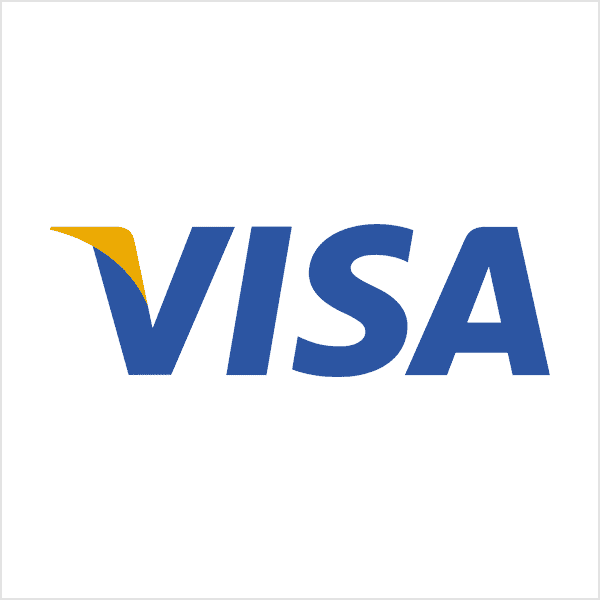
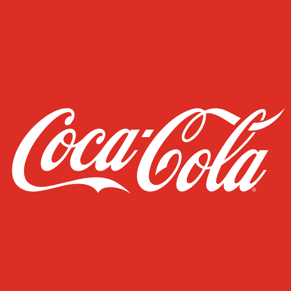
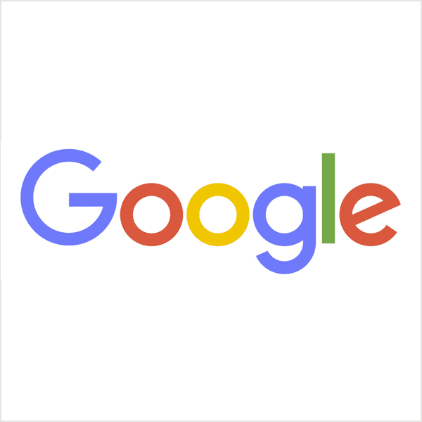
Similar to a lettermark, a wordmark or logotype is a font-based logo that focuses on the business name. This logo type works best when the company name is short and distinctive. Well-known examples include Visa and Coca-Cola. Google’s logo is another classic example of a wordmark. The brand name is memorable, and strong typography turns its logo into a recognizable brand asset.
Don’t yet have a business name? Get inspired by these business name ideas.
With wordmark logos, typography will be an important decision, so pick or design a font that captures the essence of your business. For example, fashion labels tend to use clean, elegant fonts that feel high-end, while legal or government agencies generally stick to traditional, heavier fonts that feel reliable.
When to use wordmark logos
Businesses should create a wordmark logo when:
- They’re building awareness for a new brand and want the name to do the branding work from day one.
- The business name is short, distinct and easy to read, even at a glance on signage or packaging.
- They want a logo that stays crisp across print and digital, with minimal variation between uses.
Pros and cons of wordmark logos
Benefits
- Having your name in a well-designed custom font will make your brand more memorable
- Consistent and reliable, works cleanly across print and digital uses
- Great for early-stage awareness, helps audiences learn and remember the name quickly
Drawbacks
- Limited symbolic storytelling
- Space constraints if the business name is long
Logo design tips for wordmarks
Wordmarks benefit from custom or unique fonts that feel specific to the brand. Subtle modifications, like adjusted spacing or custom letter shapes, often make the difference between generic and memorable.
Color can carry more personality here than with lettermarks. Many brands with wordmark logos use one primary color with plenty of white space to ensure readability across print and digital.
>> Check out some examples of typographic logos
Pictorial marks (or logo symbols)
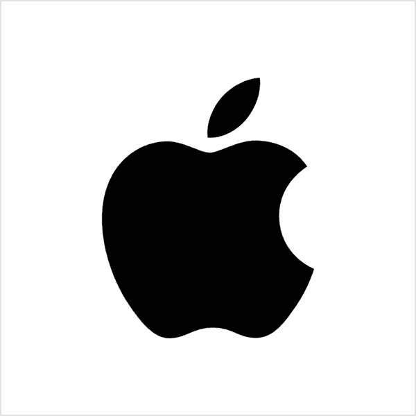
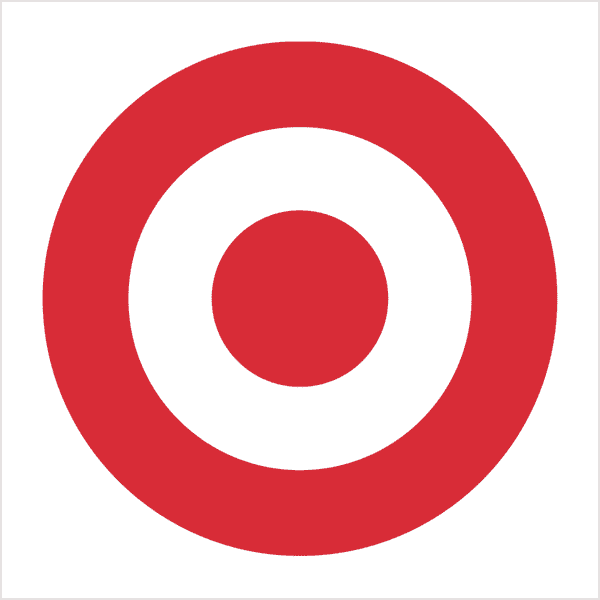
A pictorial mark, sometimes called a brand mark, uses a recognizable symbol instead of text to represent a brand, for example, famous logos like Apple’s apple or Target’s bullseye.
But because the symbol has to do all the work, pictorial marks can be harder for newer brands to introduce. The mark needs to be clear, relevant and flexible enough to grow with the business. Some brands reference their name directly, while others use symbolism to communicate brand values.

When designing a visual mark to represent your brand, consider these questions and options:
- Do you want to play on your name, like John Deere does with its deer logo?
- Do you want to use the logo to communicate what the product does, like the Snapchat ghost?
- Do you want to evoke an emotion, as the World Wildlife Foundation (WWF) does with its logo of an endangered panda?
When to use a pictorial mark logo
Businesses should create a pictorial mark logo when:
- They want global recognition where an international symbol works better across languages.
- The brand name is hard to pronounce, spell or translate, so a visual mark carries the load.
- Their business has a clear, stable core offering, making a specific symbol a safe long-term choice.
Pros and cons of pictorial marks
Benefits
- Instantly recognizable over time
- Language-independent; international
- Clean and versatile
Drawbacks
- Challenging for new brands
- Requires consistent use
Logo design tips for pictorial mark logos
With pictorial marks, simplicity is key. Bold shapes pair best with limited color palettes—one or two strong colors that reproduce consistently across different materials. Use simple, sans-serif fonts alongside the symbol so they don’t compete for attention. Clean fonts keep the symbol the hero while the brand name remains modern and legible.
>> Check out some examples of icon logos


Abstract logo marks
An abstract mark is a specific type of icon logo. Instead of a recognizable image, like an apple or a bird, this logo type uses an abstract geometric shape to represent a business.
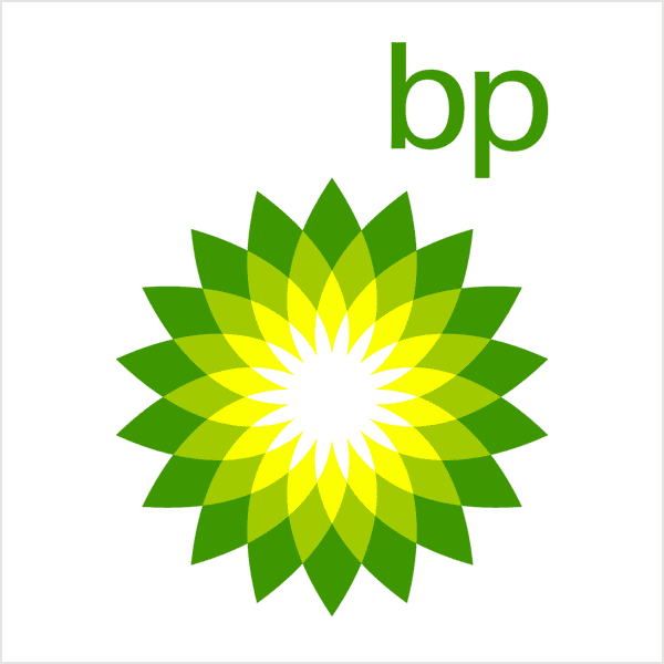
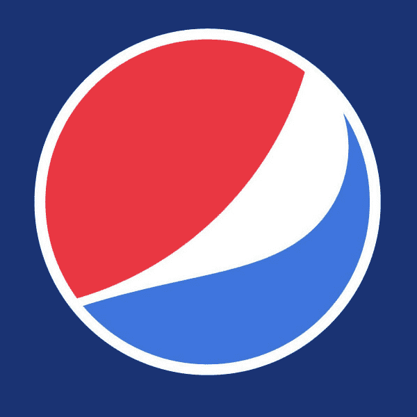
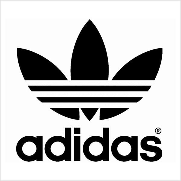
Famous examples of abstract logo marks include the BP logo, the Pepsi circle logo and the Adidas logo. Like all symbol logos, abstract marks work well because they condense your brand into a single icon, allowing you to create a truly unique symbol to represent your brand.
The benefit of an abstract mark is that you’re able to convey what your company does symbolically, without relying on the cultural meanings and implications of recognizable symbols. Instead, attribute meaning and cultivate emotion around your brand through color and form.
When to use an abstract logo
Businesses should design an abstract logo when:
- They want room to grow beyond a single product or service without redesigning the logo later on.
- Their brand prioritizes values or emotion over anything literal.
- They want a recognizable mark that doesn’t rely on cultural meaning or symbolism.
Pros and cons of abstract logo marks
Benefits
- Unique and ownable
- Adaptable over time
- Emotion-driven
Drawbacks
- Meaning and symbolism aren’t always immediately understood
- Requires design expertise
Logo design tips for abstract logo marks
Abstract logos give you more freedom with color and form, but because color often carries the meaning here, color choices should align closely with brand personality and emotional tone. Gradients or multi-color systems work if they’re controlled and considered.
Understated typography, with simple, modern fonts ground the abstract mark and increase brand awareness.
>> Check out some examples of abstract logos
Mascot logos
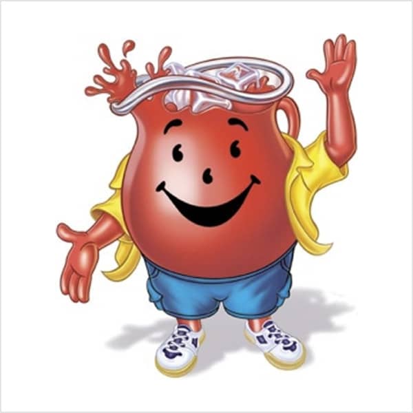
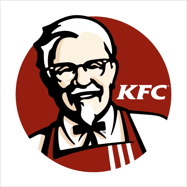
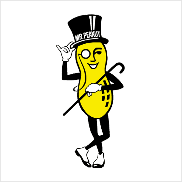
Mascot logos are logos with illustrated characters. Some examples of brands with mascot logos include Kool-Aid (Kool-Aid Mad), KFC (Colonel Sanders) and Planter (Mr. Peanut). Often colorful, sometimes cartoonish and most always fun, a mascot logo is a great way to create your very own brand spokesperson.
Mascots are great for companies that want to appeal to families and children. This type of logo is particularly effective in marketing and social media, where character-led content encourages engagement and interaction. To make a mascot logo more versatile, design simplified versions for small print.
When to use a mascot logo
Businesses should use a mascot logo when:
- They want a brand people can connect with quickly, especially in crowded local markets.
- Their marketing relies on social content, community events or promotions.
- They can build a consistent brand voice around a character.
- The target audience is families and kids.
Pros and cons of mascot logos
Benefits
- Strong personality
- High engagement potential
- Memorable and friendly
Drawbacks
- Limited scalability
- Not suited to all industries
- Illustration quality is critical
Logo design tips for mascot logos
Mascot logos tend to use warmer, more expressive color palettes that bring the character to life. Brighter colors often work well, especially for family-focused or consumer brands, but they should still print cleanly.
Use friendly and approachable fonts, with rounded edges or softer shapes. The key is balance—the mascot should stand out without overwhelming the brand name or becoming difficult to reproduce.
>> Check out some fun mascot logos
The combination mark (Hybrid logo)
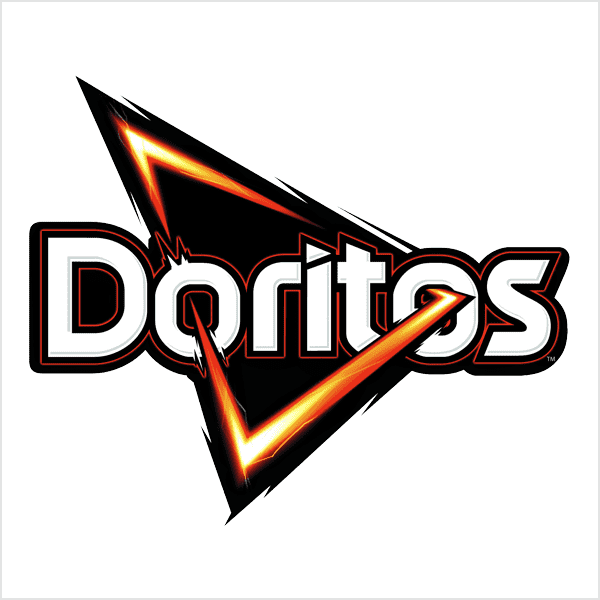
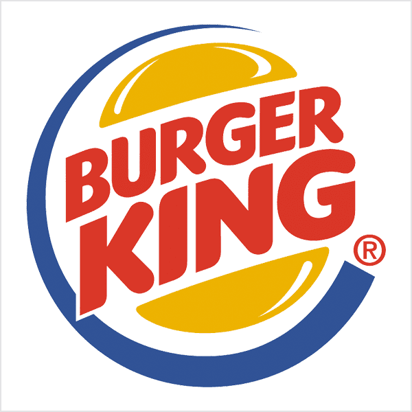
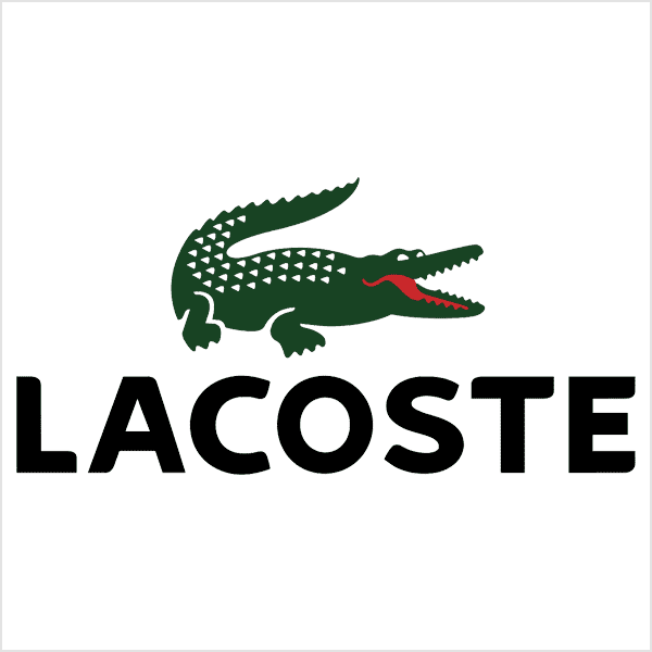
A combination mark is a wordmark or lettermark logo combined with a pictorial mark, abstract mark or mascot. The symbol and text can be laid out side-by-side, stacked on top of each other or integrated to create a brand logo. Some well-known combination mark logos include Doritos, Burger King and Lacoste.
A combination mark is a versatile choice, with both the text and icon or mascot working together to reinforce your brand and build recognition. Customers will also begin to associate your name with your pictorial mark or mascot, meaning that in the future you could rely exclusively on a symbol logo and not have to always include your name. And because the combination of a symbol and text creates a distinct image together, this type of logo is usually easier to trademark than a pictorial mark alone.
When to use a combination mark
Businesses should use a combination mark logo when:
- They want a versatile logo system that works on everything from signage to product packaging
- They want to build recognition now, with the opportunity to use the icon alone as familiarity grows
- They plan to use the logo across multiple layouts, like horizontal for headers and stacked for socials
Pros and cons of the combination mark
Benefits
- Highly adaptable and flexible
- Strong brand association
- Easier to trademark
Drawbacks
- Requires careful visual balance
- Can feel crowded
- Needs clear spacing rules
Logo design tips for combination marks
Strong contrast helps the text remain readable next to the symbol, especially on packaging and signage. Many brands use a bold primary color for the symbol and a more neutral tone for the text to keep the logo adaptable across layouts.


The emblem logo
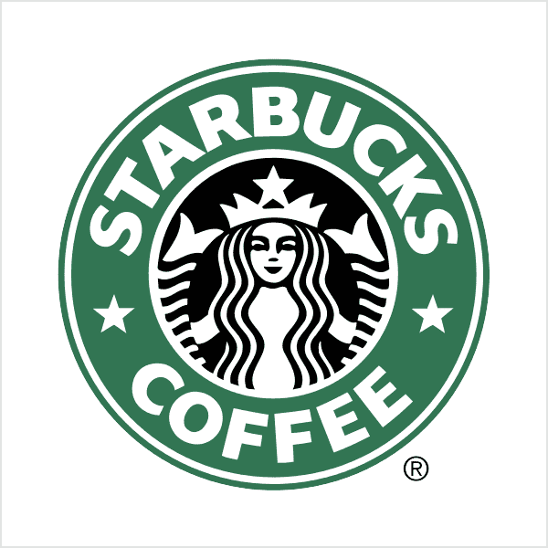
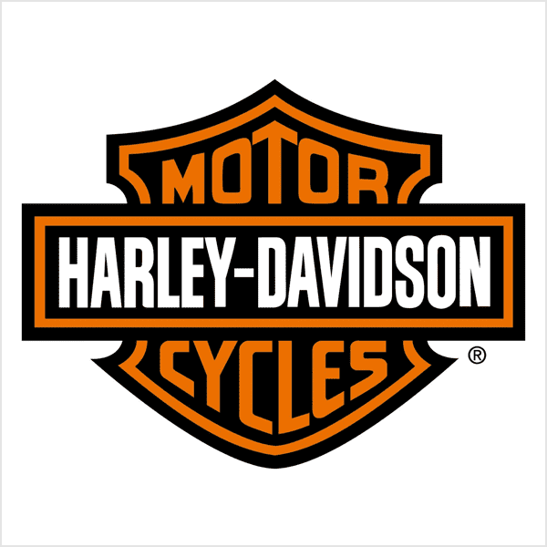
An emblem logo consists of text inside a symbol or icon, like badges, seals and crests. These logos have a traditional yet striking look. They are a go-to choice for schools, organizations and government agencies, as well as brands in the auto and food and beverage industries that want to communicate tradition and history. While they have a classic style, some businesses have modernized the traditional emblem look with logo designs fit for the 21st century (for example, Starbucks’ logo or Harley-Davidson’s famous crest).

Because of their level of detail and the name and symbol being rigidly entwined, emblem logos can be less versatile and more difficult to replicate across branding than other types of logos. For business cards, a busy emblem may be too difficult to read, or if you plan on embroidering this type of logo on uniforms, then simple logo designs are best. So, keep your emblem logo uncomplicated for a strong, bold look that’ll last for years.
When to use an emblem logo
Businesses should use an emblem logo when:
- The brand benefits from heritage cues, like craft, tradition or official credibility.
- The logo will live mainly on packaging, labels or uniforms, where badge-style marks feel natural.
- The logo design can be simplified for small print, such as business cards and merchandise.
Pros and cons of emblem logos
Benefits
- Established and authoritative
- Strong visual presence
- Works well on packaging
Drawbacks
- Limited scalability
- Less flexible and adaptable
- Detail can be lost when printed
Logo design tips for emblem logos
Emblem logos rely on contained shapes and fine detail, so clarity has to come first. Keep the typography simple enough to stay readable at small sizes, and avoid overly thin lines that disappear in print or embroidery. Choose fonts that match the emblem’s visual tone—classic serifs or slab fonts reinforce heritage, while cleaner sans-serif lettering can modernize the look without losing authority.
For flexibility, design a simplified version early on. Many emblem logos work best as a “full badge” for packaging and signage, plus a reduced mark (like the icon or initials) for social avatars and small-format uses.
>> Check out some fantastic examples of emblem logos
Advanced and modern logo types
Most businesses will do just fine with one of these seven types of logos. But brands rarely use a logo in one single way forever. Between social avatars, short-form video, packaging and promotional items, you may benefit from a flexible logo system using these modern logo types and variations.
Source: Logo design by Zea Lab via 99designs by Vista
Dynamic logos
A dynamic logo changes certain elements, like color, pattern, layout or a supporting graphic, while keeping the core mark recognizable. This approach works best when your logo shows up in many formats and sizes (from social icons to signage) and you need one identity system to use across print, digital and marketing materials without losing consistency. The key is restraint: if everything changes, nothing feels familiar.
When to use a dynamic logo
Businesses should create a dynamic logo when:
- The logo needs to adapt across social profiles, websites, signage, print and marketing materials while staying recognizable.
- They publish frequently or run recurring campaigns and want an adaptable system without redesigning the identity each time.
- Your logo must work at multiple sizes, so you can use a simplified version for small spaces (like avatars) and a fuller lockup for larger layouts.
Set simple rules for what can change and what can’t, then test the different versions. If it works on a business card, it usually works everywhere else.
Animated wordmarks
Animated wordmarks use motion to bring the logo to life. Letters might slide into place or reveal a detail. Done with a light touch, animation can make a brand feel confident and modern, especially in video and digital ads.

Animated wordmark design by Maryia Dziadziulia via 99designs by Vista
Animated wordmark design by Ševarika™ via 99designs by Vista
When to use an animated logo
Businesses should create an animated logo when:
- The logo will appear in video content, such as intros, outros, Reels and short ads, where motion helps modernize the brand.
- The logo will be used in digital spaces like website headers, where subtle animation can add personality without distracting from the content.
- Promoting product launches, bringing visual energy to the campaign without changing the core brand identity.
Animation is digital-only, so these logo designs always need to be designed by a strong static version for print. If the logo looks good only when it’s moving, it’s not a logo yet, it’s a special effect.
Negative space pictorials
Negative space logos use the background to form part of the symbol. When they’re well designed, negative space pictorials feel clever and memorable. Just make sure the hidden details don’t disappear at small sizes.
Source: Logo design by Yoga Perdana via Dribbble
Source: Logo design by Yoga Perdana via Dribbble
When to use a negative space pictorial logo
Businesses should create a negative space pictorial logo when:
- The logo needs to work in one color, or you want a bold mark that feels distinctive without relying on gradients or extra detail.
- They need a simple icon that stays clean at small sizes.
- The logo will appear on packaging – a crisp, high-contrast mark should read quickly on labels.
If the logo relies on a tiny negative-space trick, it needs extensive testing. Check it at business card size and if the detail vanishes, simplify the design or make the negative shape bigger.
Which logo type works best for your business goals?
Every type of logo has a “best use.” The easiest way to choose is to match it to your business goal and the context it’ll appear in most often.
If you want fast name recall
A wordmark puts your full business name front and center, which helps new brands build awareness quickly. This logo type prints cleanly on signage, packaging and website headers, but long names can be harder to fit on labels and small stickers.
A lettermark (monogram) solves that by shortening the name to initials, making it ideal for business cards, app icons, social avatars, loyalty cards, promotional pens, stamps and embroidered uniforms.
If you want global recognition
A pictorial mark works well for brands selling across regions or online. It shines on app icons, social avatars, packaging seals and storefront signs, but it needs strong brand awareness to stand on its own.
An abstract mark is a better fit if you want a unique symbol that can grow with your business. It’s especially useful on product lines, branded patterns and large-format marketing, but it needs consistent use to become recognizable.
If you want personality and engagement
A mascot logo gives your brand a character people remember, which works well for social media content, local marketing, kids and family brands, and seasonal promotions. In print, mascots work best on menus, posters, packaging and merch, but they often need a simplified version for small labels and business cards.
If you want the most flexibility across layouts
A combination mark is the safest all-round type of logo design. Use the full version on packaging, storefronts and ads, then switch to the icon alone for stickers, favicons and social profiles.
If you want authority and tradition
An emblem logo signals heritage and credibility, making it a strong fit for uniforms, labels and badges. Keep the detail controlled, because intricate emblems can lose clarity on small print products.
How to choose the right type of logo for your business
You now know the types of logos, how they work and where to use each one. From lettermarks and wordmarks to pictorial marks, mascots and emblems, every type of logo has different strengths. Choosing a logo type that fits your business goals means stepping back from logo design trends and asking a few practical questions before you commit:
- What is the main job of your logo? Name recall, brand recognition, credibility, personality or flexibility goals all point toward different logo types.
- Where will the logo appear most often? Different types of logos work best for business cards, packaging, promotional items and signage.
- How do customers discover your business? Search and referrals favor readable names, foot traffic needs legibility at a distance, while social platforms require clarity at small sizes.
- How much room do you want for growth? Literal symbols can limit future expansion, while more flexible marks and responsive logos adapt as your business grows and your offerings change.
- Do you want a usable logo system? A full logo, simplified version and one-color option keep your brand consistent across print and digital.
A well-designed logo means your materials look polished, your business name is easier to remember and your brand is more recognizable.
Want more logo design tips? Learn how to design a logo and how to pick logo colors.
Logo types FAQs
Which type of logo is the most versatile for both digital and print?
Combination marks are usually the most versatile option. Because they include both text and a symbol, they adapt easily across formats. Use the full version on websites, signage and packaging, then switch to the symbol for social avatars, stickers or small promo items. This flexibility matters in print, where available space varies. A well-designed combination mark makes it easier to build a responsive logo system, which helps your branding stay consistent.
As a new business, should I start with an icon-only logo or a wordmark?
Most new businesses start with a wordmark or combination mark. Icon-only logos depend heavily on brand recognition, which takes time to build. Without context, a symbol rarely tells customers who you are or what you do. Whereas a wordmark puts your business name front and center, making it easier for customers to remember and search for you. A combination mark lets you introduce a symbol alongside your name, then you can use the icon more as brand recognition grows.
What’s the difference between an emblem logo and a combination mark?
Combination marks are more flexible than emblem logos. In an emblem logo, the text and symbol are locked together inside a single shape, like a badge or seal. This gives emblems a classic, established feel, but makes them harder to scale down or separate for different uses. A combination mark keeps the text and symbol as distinct elements, even when they’re used together, making them easier to resize, rearrange and simplify for print, especially when space is limited.


