Choosing the right colors for your logo is a crucial step in the design process. A thoughtful color choice will not only help you stand out but also set the tone of your logo and, by extension, your brand identity.
Everyone has heard of color psychology, which tells us that colors can impact our emotions and behaviors. Think bright, exciting yellows or soft, calming blues. But can these color “rules” really affect your business and branding?
- Logo colors shape brand perception through emotional, cultural and psychological associations that influence consumer response.
- Different colors signal different traits (e.g., red = energy/urgency, blue = trust, green = nature/growth), so pick intentionally.
- Before choosing logo colors, define the personality and values of your brand so the palette reinforces the message you want customers to associate with your business.
- If using multiple colors, rely on color-wheel pairings (analogous, complementary, triadic) and adjust with tints and shades for the right tone.
- To strengthen brand recognition, choose a color palette that not only reflects your identity but also differentiates you from competitors and considers cultural meanings in global markets.
According to research by Lauren Labrecque and George Milne, the answer is yes! Colors can have a measurable impact on consumers and their perceptions, and this impact varies from color to color. Using this research-based approach, we’ve created a guide to show you what your logo colors might be telling potential customers.
Your complete guide to logo colors and their meaning
Read on to discover what colors symbolize in your logo designs, the history behind the different logo color meanings and how to stand out from the competition.
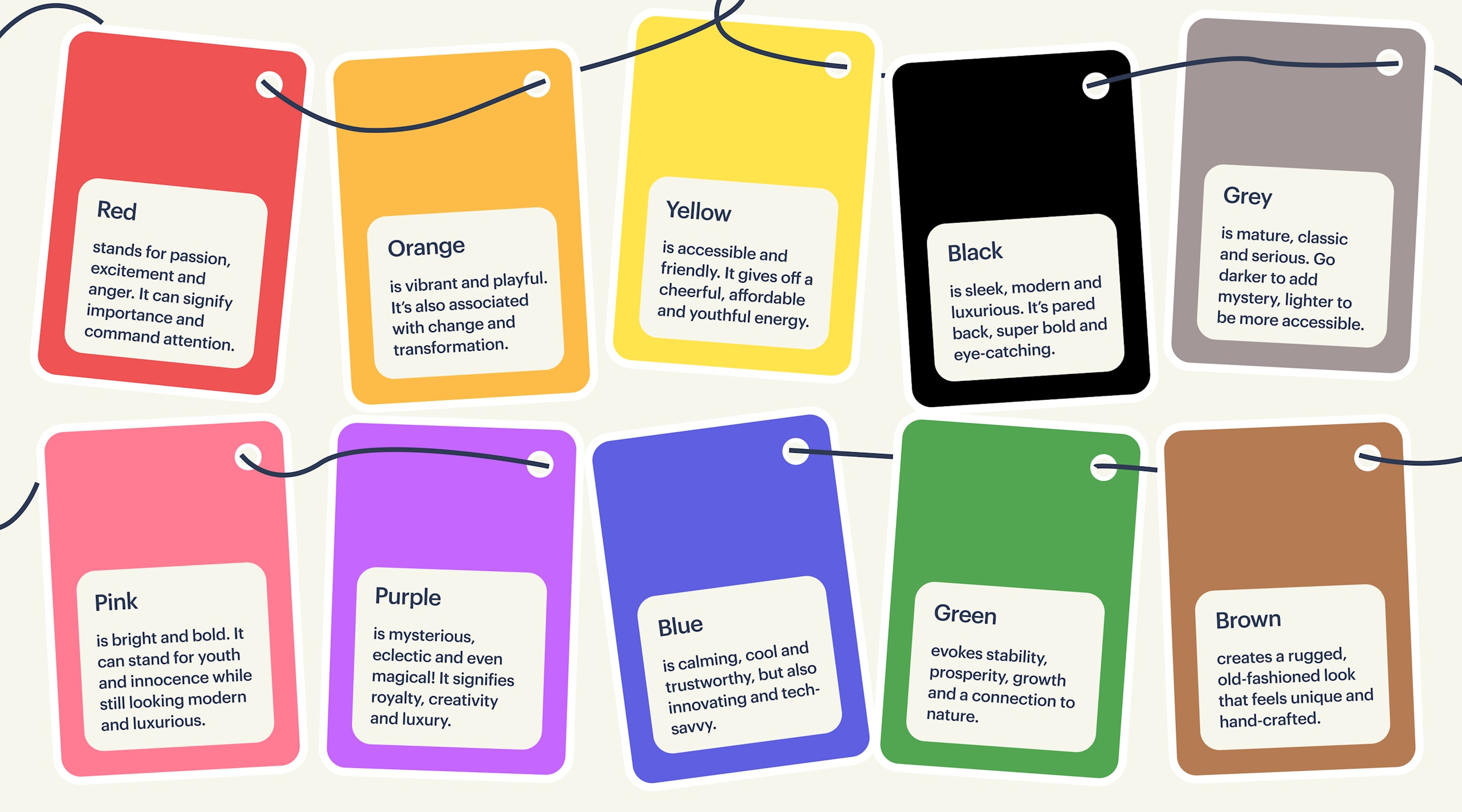
Red logos
Red is the universal sign of excitement, passion and intensity. It draws attention and makes you stand out from the crowd. Is your brand loud, playful, youthful or modern? Think red.
Red is the first color that babies can see (besides black and white). According to an article in The Atlantic, scientists theorize that humans evolved the ability to see red so clearly because it allowed us to more easily identify fruits growing on trees. Red is also tied to heightened emotions, like anger or excitement. Whether used alone or as an accent color, red is a powerful choice for a logo color.
Common associations for red logos:
- Energy and excitement
- Passion and love
- Urgency and attention
- Power and strength
- Adventure and action
- Aggressiveness and dominance
Explore red logos ideas >>
Orange logos
Orange is a combination of yellow and red, taking traits of both primary colors. It’s invigorating but playful, and because it’s used less often than red, it can stand out from the crowd with an energetic punch.
Orange is associated with change (think autumn leaves or orange skies at sunrise/sunset) and is often used by brands who like to think of themselves as a little bit different.
Common associations for orange logos:
- Creativity and innovation
- Warmth
- Friendliness
- Youthfulness
- Fun and playfulness
- Health and vitality
- Enthusiasm
Explore orange logos ideas >>
Yellow logos
Yellow reflects accessible, bright friendliness. This color exudes cheer, and your brand will radiate an affordable, youthful energy.
Yellow has many cultural associations, such as gold, fields of wheat and corn and sunlight, just to name a few. And different hues can create more varied effects, from soft, bright yellows, which are light and fresh, to deep, rich golds that hold more weight and authority.
Common associations for yellow logos:
- Optimism and happiness
- Clarity and intellect
- Warmth and sunshine
- Friendliness
- Caution and attention
- Youthfulness
Explore yellow logos ideas >>
Typically, green represents the natural world, which is why eco-friendly, vegan and natural wellness brands often have green logos. But green is also a super versatile color, evoking other feelings like safety, freshness and wealth.
Green logos
Since plants are green (and they come back to life after a long winter), many people associate green with growth or new life. But historically and across cultures, green has meant many things, from greed, poison, money and even death!
Common associations for green logos:
- Nature and environment
- Harmony and calm
- Tranquility
- Safety and stability
- Growth and renewal
- Freshness and cleanliness
- Wealth and prosperity
Explore green logos ideas >>
Blue logos
Blue symbolizes trustworthiness and maturity. If your brand identity is more serious and straightforward, blue is a great option. One thing to keep in mind, though, is that blue is a very popular choice and appears in over half of all logos, so choosing the right hue is key to standing out.
If you love blue but want to embody its more playful side, choose a lighter hue on the teal side of the color wheel.
Common associations for blue logos:
- Trust and reliability
- Calmness and serenity
- Innovation and technology
- Spirituality
- Wisdom and intelligence
- Professionalism and authority
Explore blue logos ideas >>
Purple logos
Purple is cutting-edge, wise and luxurious, but also quirky and eye-catching.
One reason purple has an air of luxury is that historically, purple dye was very expensive to make, and so was only worn by royalty or the very wealthy. One interesting thing about purple, though, is that while it’s associated with wealth and wisdom, it’s also considered a little eccentric and playful. Do you have an out-of-the-box, high-end project? Purple could be the perfect fit.
Common associations for purple logos:
- Luxury and sophistication
- Creativity and imagination
- Royalty and nobility
- Spirituality and mysticism
- Elegance
- Ambition and aspiration
Explore purple logo ideas >>
Pink logos
From soft millennial pink to neon magenta, pink can give a brand a modern, youthful look.
Pink is an unusual color. According to color theory, pink is just light red, and we don’t have an equivalent English word for light blue or light yellow. It’s also a relatively modern word – it only entered the English language in the 17th century, where it immediately represented luxury. So, in the long history of color, pink is young, hip and eye-catching.
Common associations for pink logos:
- Femininity and romance
- Playfulness and fun
- Creativity and imagination
- Empathy and compassion
- Sweetness and innocence
- Positivity and optimism
Explore pink logo ideas >>
Brown logos
Brown is the color of soil and tree bark, the epitome of earth tones. Because it is less vibrant than other colors, it appears rugged and serious. Brown is also the least-utilized logo color, so if you choose it, you’ll be sure to stand out from the competition.
Brown can give a brand a subdued, earthy feel and is great for outdoorsy companies or those selling naturally brown products like chocolate. Brown can also represent tradition and craftsmanship, so it is often used by types of logos that want a vintage, hand-made feel.
Common associations for brown logos:
- Earthiness and nature
- Organic
- Ruggedness and durability
- Confidence
- Authenticity and tradition
- Warmth and comfort
Explore brown logo ideas >>
Black logos
Want to look slick, modern and luxurious? It’s time to go black.
The simplicity of black creates an eye-catching look that also commands authority, giving all-black logos a feeling of intrigue and exclusiveness that luxury brands can capitalize on.
Common associations for black logos:
- Power and authority
- Mystery and intrigue
- Simplicity and minimalism
- Boldness and confidence
- Versatility
- Professionalism and seriousness
Explore black logo ideas >>
Gray logos
Gray is not quite dark, not quite light. It is the middle ground of mature, classic and serious. Go darker to add mystery or lighter to be more accessible.
Like black, gray is starkly simple. Because it’s softer, however, it takes on a more muted, formal vibe, giving gray logos a classic feel.
Common associations for gray logos:
- Balance
- Timelessness and maturity
- Practicality
- Sophistication and elegance
- Formality
- Professionalism
- Innovation
Explore gray logo ideas >>
White logos
On its own, white tends to come across as clean and weightless, like the essence of light itself. White is useful for brands that want to appear careful and methodical, spotless in their delivery.
While most logos will have a white version, this will inevitably be paired with another color as a background, and that color will dominate. When used as an accent – or added to another color to make it lighter – white is youthful and economical.
Common associations for white logos:
- Purity and simplicity
- Honesty
- Freshness
- Clarity
- Modernity
- Sophistication and elegance
Explore white logo ideas >>
Where do logo color meanings come from?
Logo color meanings come from the collision of science, art and culture. How your customers respond to colors and color combinations is influenced by three things: aesthetics, learned cultural associations and evolutionary programming.
Aesthetics
Like musical notes, some logo color combinations harmonize well, some create tension that stands out and others clash and turn consumers off. Color theory explains that consumers will tune out bland, too-similar color palettes and become overwhelmed by chaotic, conflicting color arrangements.

Learned vs. biological associations
Over time, we’ve all learned to associate certain colors with certain feelings: think of brides wearing white on their wedding day as a symbol of purity, or mourners dressing in black to embody the somber occasion. Many of these associations, however, are purely cultural: brides in India wear rich, multi-hued saris, and in South Africa, red is the color of mourning.
According to the Association for Psychological Science, researchers suspect that at least some of our color associations are the result of evolution. For example, red is a universal sign of heightened, passionate emotions, which makes both people (and other animals) stop and take notice.
How to choose a logo color?
Before picking your logo color scheme, think about the message you want to convey. What virtues do you want to highlight? Speed, innovation, efficiency, compassion, intuitiveness?
Brand personality traits that appeal to your target customer are an important consideration when choosing logo colors. Consumers consciously or subconsciously choose products that align with their personal identities. Colors help consumers to categorize products and services, identify which are for them, and in turn make purchasing decisions between similar products.
Once you know what your brand identity will represent, go through the list of colors above and identify which will help you convey the right message.
How to combine logo colors?
While you can focus solely on brand personality traits when choosing a single logo color, combining colors is where you have to take into account visual harmony. After all, your brand might be earthy and luxurious, but brown and purple are two colors that just don’t go well together.
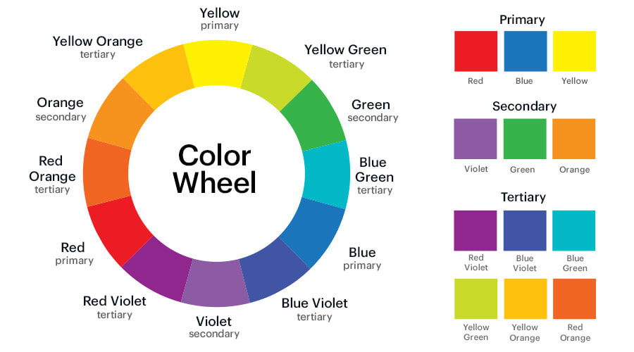
The color wheel – a circular representation of how colors are paired based on their light frequencies in nature – is an essential starting point for working with colors. It provides a scientific method for combining colors based on their proximity to one another on the wheel. Some common color wheel pairings include:
- Analogous: a harmonious selection of colors that are next to one another
- Complementary: a contrasting color selection of colors that are opposite one another
- Triadic: a selection of three colors that are opposite from one another based on an equilateral triangle
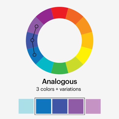
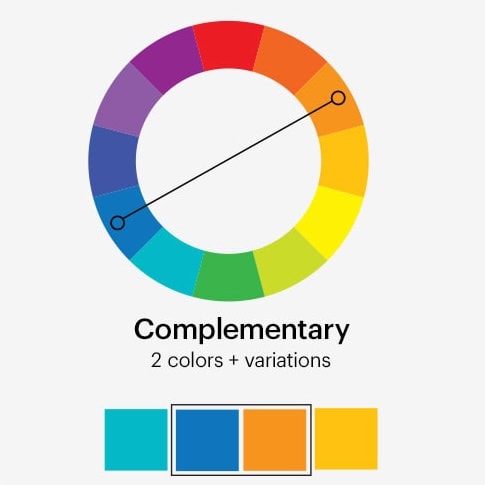
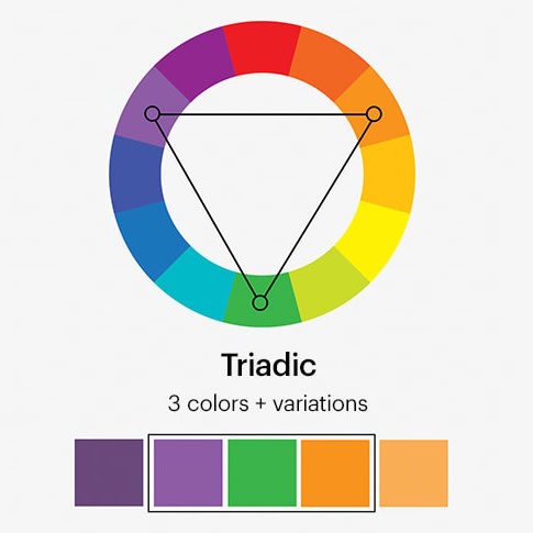
Once you start looking at logos with multiple colors, you’ll notice many use these color wheel pairing techniques.
Up until this point, we’ve mostly been talking about primary hues, which is to say the purest form of a color. For example, we know that even one of these colors, such as green, can come in thousands of variations – just look at a forest! These variations come as a result of mixing tints and shades. A tint is a lighter version of the base color made by adding white, and a shade is a darker version made by adding black.
Tints and shades can subtly change a color’s aesthetic and emotional impact. For example, pastels (or light-tinted hues) will naturally come across as soft and cheery, whereas darker shades will come across as more serious.

In terms of color combinations, softening or darkening the hues can help you manage combinations that might not ordinarily work in their purest form. For example, rainbow logos can be difficult to pull off due to their many colors, but softening the hues can make them more manageable.
Lastly, remember that you don’t have to combine logo colors equally. You can select a single dominant color and use an accent color in small doses. This can be helpful when you don’t want to limit yourself to one color but also don’t want to commit to multiple.
How does culture impact logo color meanings?
If your brand is international in scope, as so many today are, you should be aware of the symbolic meanings your logo colors can have when viewed in other cultures. A common example is the way white is viewed in most Western cultures as symbolic of purity, while in some Eastern cultures it is symbolic of death.
If you know that your logo will be prominently featured in particular regions, you should research the cultural psychology behind your colors more thoroughly. Understanding the underlying context, such as traditions (like our wedding dress example), cuisines and myths, can be helpful.
How to stand out with your logo colors
The key to a good logo is brand recognition. So, to stand out, it can be a good idea to choose a color palette that differs from your biggest competitors.
Often, a certain color might seem like the most obvious choice for your brand, but that also means it’s an obvious choice for other businesses in your industry. This is why some logo colors end up being typical in a given industry. For example, searching “cafe logos” turns up mostly brown logos. While a color might seem to fit your brand, if it makes you look like everyone else, its message can be lost in the noise.
This is why choosing a logo color isn’t just about expressing who your company is, but what makes your company unique. The underlying issue with the “cafe logos” example is that the color choice is a result of superficial brand traits (coffee beans and coffee being brown) that are likely to be universal for you and your competitors. Instead, because color is such a primal, visceral means of visual communication, it should relate to something more specific to you and your audience.
What color will your logo be?
Consider how you want your brand’s personality to be perceived and what colors can help communicate that to your customers. It’s also worth considering what your competitors are doing. Can you benefit from being an exciting, fun company in a more traditional field? Sometimes the key to standing out is finding a way to swim against the current and show off what truly makes your business unique.
Want more logo design tips? Check out our article on how to design a logo.
Author: Johnny Levanier


