Zoomable Image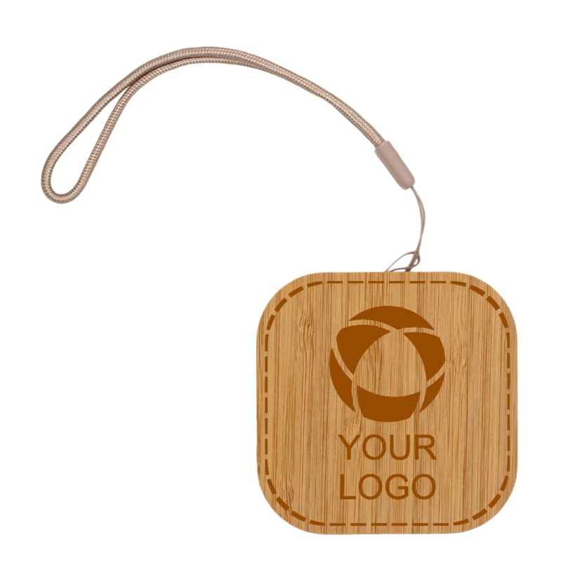 Zoomed to minimumUse plus and minus key to zoom and arrow keys to pan
Zoomed to minimumUse plus and minus key to zoom and arrow keys to pan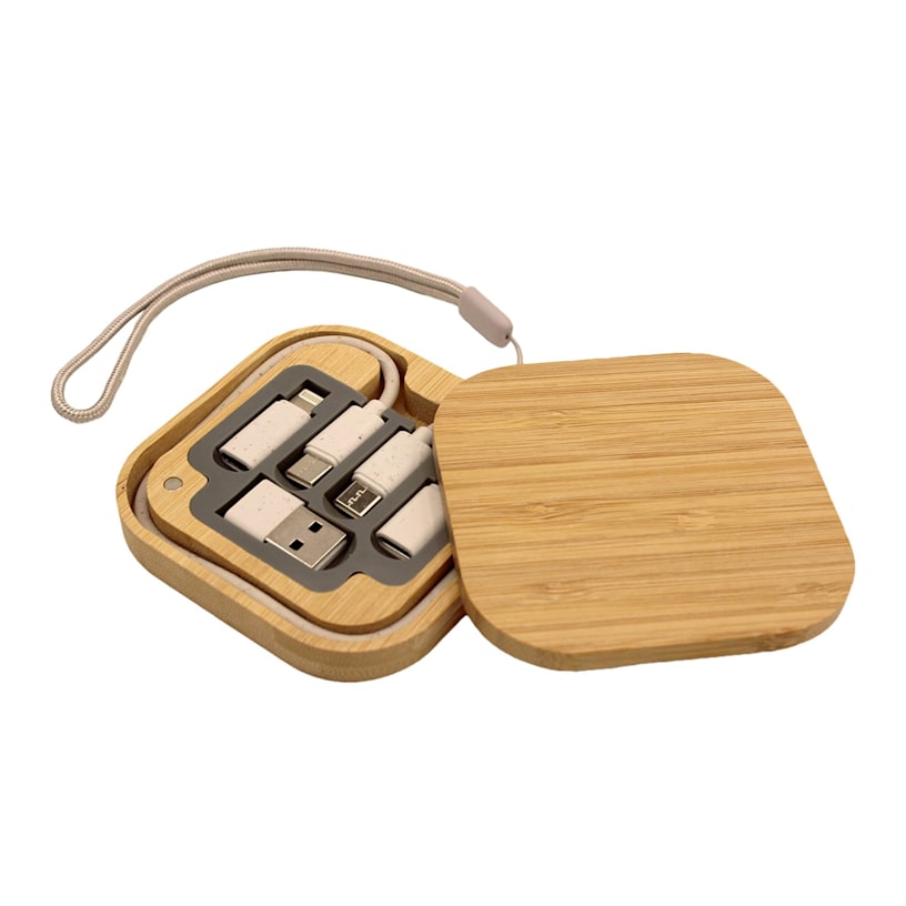
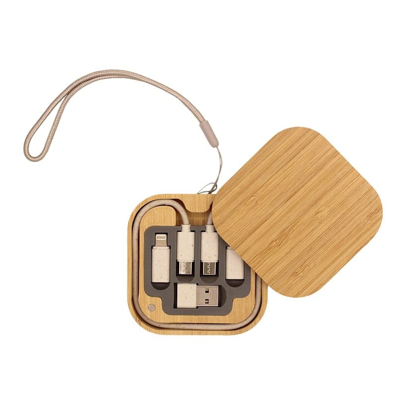
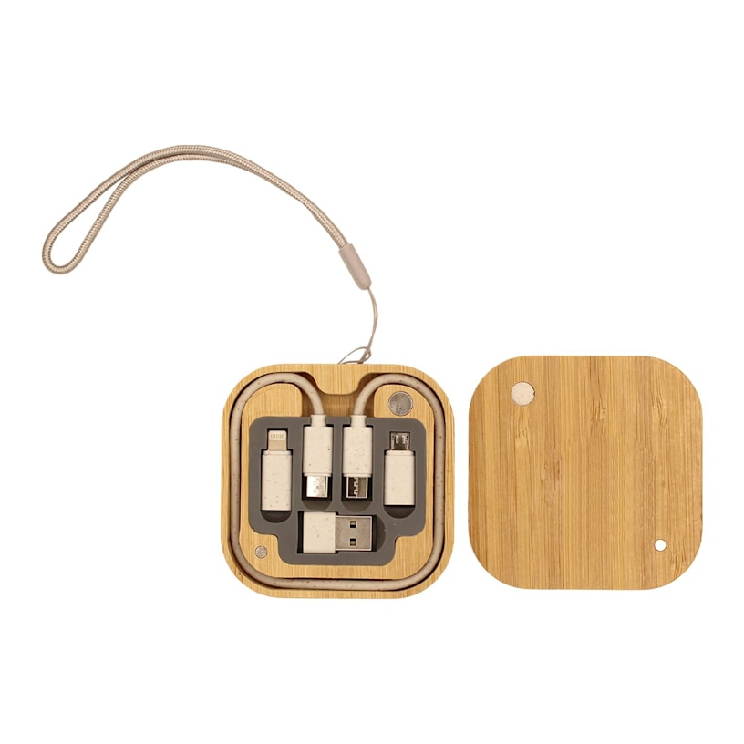
iPort Charging Cable Kit
Power up your devices anywhere with this custom charging kit featuring essential adapters. Stylish magnetic case keeps all your charging needs organized and ready to go.
Stay connected with this compact travel solution.
- Plastic & bamboo
- Magnetic closure
- Usb-c to usb-c charging cable
- Multiple device adapters
- Compact travel design
- Bamboo carrying case
- Natural variations in bamboo grain may cause slight differences in imprint appearance
Travel safely with this compact cord kit that keeps all your charging needs organized in one place. Use it to power up phones, tablets and other devices with its versatile USB-C cable and multiple adapters for different ports. It's easy to customize – add your logo, message or info using our intuitive studio. Need a hand? Our design experts are here to help bring your ideas to life.
Product features
Product Id
PRD-WLJPIISPE
Type
Charging Cables
Weight
0.184lbs
Width
3.1in
Height
3.1in
Quality
Classic
Material
Bamboo
Material composition
Plastic 100%
Reviews
Filter By
stars
(0%)
stars
(0%)
stars
(100%)
stars
(0%)
star
(0%)
Reviewed by 2 customers
Idea is great, but. . . .
Jan 26, 2026 | Joleen D. |
Verified Buyer
While I loved the concept, the finished product is not what I hoped for. The logo is very lightly burned on top and is hard to see - would be better to order un-engraved and put a sticker on top.
Response from Vistaprint Customer Care Team:
We're very sorry for the disappointment with the printing of the charging cables. Your satisfaction is our number one aim, so this is not the type of experience we want you to have. Because the cables did not fully meet your expectations, we took the necessary actions to make this right, and you should be receiving an email shortly with the details. We appreciate you taking the time to share your feedback. Feel free to contact us directly for any additional assistance.
Logo looks weird with the lines in the wood
Nov 28, 2025 | Wendy C. |
Verified Buyer
I wish I loved these but I don't. The lines in the wood make the logo look all wonky because the color of the text is brown like the wood.
Response from Vistaprint Customer Care Team:
We are sorry for the inconvenience caused and understand your concern regarding the appearance of your logo on the iPort Charging Cable Kit. Upon reviewing your design, we noted that the font used was dark brown, which did not create sufficient contrast with the wood-colored background. This resulted in reduced readability and the odd appearance you noted. Also, we recommend using both the on-screen preview and the downloadable PDF proof before finalizing your order. These tools provide an accurate, true-to-print representation of how your design will appear. You can learn more about these features here: https://www.vistaprint.com/customer-care/help-center/360052259371/?swsquery=pdf%20proof&querycat=helpcenter_search_dropdown
For future orders, we recommend updating your design by choosing a text or logo color that contrasts more clearly with the background to ensure better visibility. You are welcome to make these adjustments and reorder at your convenience. Hope this helps.
Displaying Reviews 1-2