In this guide, we’ll dive into why typography makes or breaks a business card, and we’ll discuss the most reliable, modern fonts for business cards, plus how to size and pair them so they print crisply and read instantly. Picture this: You open a business card template and type your small business name. It looks tiny against the white background, so you increase the font size. Now, you explore the available fonts to see how it looks in different typefaces. Before you know it, you’re scrolling through the (seemingly) endless list of fonts, more indecisive than ever. What looks sharp on-screen can blur or feel cramped on paper if the font weight, x-height or paper finish isn’t right.
With so many types of business cards and font styles to choose from, finding the typeface that will define your business can seem daunting. The fonts you use on your business card have two main jobs: to attract attention and be easy to read. We’re here to help guide you through the different types of business card fonts, how to combine different styles and the ideal business card font size.
- Sans-serif fonts are the best kind of font for business cards because they are simple, modern and easy to read. Serif fonts are best if you want your card to have a more traditional look.
- Script fonts can add an elegant touch and draw attention to your business card, but should only be used for less important information, like your company tagline.
- When designing business cards, create a visual hierarchy of information. Put the most important information, like your name or the name of your small business, in a larger font size.
- Tips for combining business card fonts include pairing a script or serif font with a sans-serif and using different weights of the same typeface to create contrast. Avoid pairing fonts that look similar and don’t use more than three font sizes on your business card.
- Important business card information should be sized between 10pt-16pt, while secondary text should be no smaller than 8pt for legibility. Avoid using script and serif fonts for small print.
Types of fonts: Serif and sans-serif fonts
What is a sans-serif font?
Great question—let us save you the Google search. In typography, a sans-serif font doesn’t have the decorative lines, or serifs, at the end of each stroke. Sans-serif fonts also tend to have less line width variation than serif fonts (more on that later).
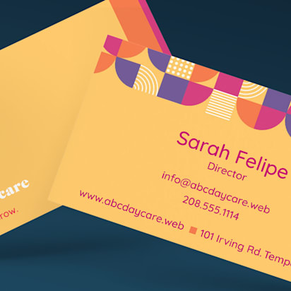
On printed products, sans-serif fonts work best for business names or headings since they are fonts that are easy to read at a glance. Simple, modern and minimal, sans-serif fonts are usually the best kind of font for business cards. Modern examples that print and screen well in 2025 include Inter, Manrope, Space Grotesk, Plus Jakarta Sans and Söhne-style humanist Grotesks. These offer sturdy counters and generous x-heights that keep small text open and legible.


Sans-serif fonts are also used for digital display text. On lower-resolution displays, fine details like serifs can disappear or appear too large. So, use sans-serif fonts to keep your online and offline presence aligned and ensure your brand fonts are consistent across digital and printed applications.
What is a serif font?
Serif fonts originate from carved inscriptions engraved on historic buildings, bridges and gravestones. This historical association means serif fonts are ideal if you want to give your business card a traditional look or make your business appear well-established.


Due to tradition and perceived readability, serif typefaces are commonly used in manuscripts, books, newspapers and magazines. Some believe that the readability and reading speed of long passages are improved with serif fonts, as serifs help the eye travel across a line. Others believe that serif fonts improve readability since that’s what we’re most used to reading.
On business cards, choose modern, high-contrast serifs with care: extremely thin hairlines can break up on uncoated paper or in small sizes. Contemporary, sturdy picks for 2026 include EB Garamond (bookish), Playfair Display (polished for headlines) and Instrument Serif or DM Serif Text (fashion-forward but readable at moderate sizes).
Tip: If you want to add embossed gloss to a serif font on your business card, only do it on the largest text field—like the name of your small business.
Where to use script fonts on business cards
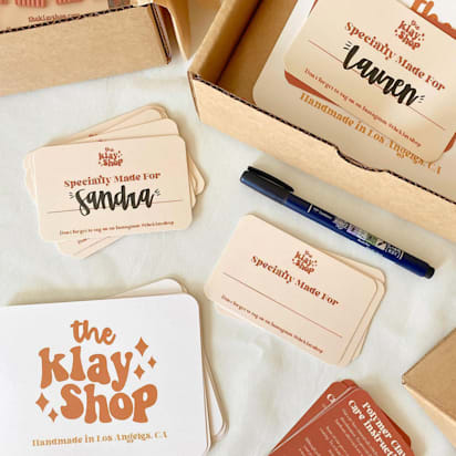
With their flowing cursive strokes and handwritten-style calligraphy, script fonts are typefaces that convey a human touch, great for invitations, greeting cards, headlines or personal messages. Classic flowing scripts achieve an elegant look, while rounder script fonts have a fun aesthetic. Script fonts can add a personal touch to business cards, but they should be used sparingly.

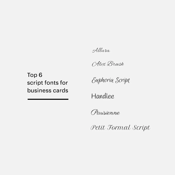
While a script font can help draw attention to your business card, it’s important to make sure the words are still legible. Don’t use script for longer sections of text, as it can be difficult to read at smaller font sizes. If you want to use a script font on your business card, reserve it for second-tier copy, like your brand tagline or motto, rather than for the main contact information.
Tip: For 2026, “imperfect” and handwritten looks are trending again. Use them as accents, not for phone numbers or emails. Look for open counters and moderate stroke contrast so small words don’t blob in print.
Important readability variables
- Weight: Ultra-light and hairline styles can disappear when printed; regular to medium weights hold up better, especially on uncoated stocks.
- X-height: Families with taller x-heights (Inter, Manrope, Verdana) keep lowercase letters readable at 8-10pt.
- Contrast: High-contrast serifs look elegant big, but their thin strokes can break up small. For contact info, use a sturdier serif or switch to a sans.
- Paper texture: Uncoated/cotton stocks are beautiful but can slightly spread ink/toner, so err on larger sizes and heavier weights. Coated or glossy stocks keep edges crisper but can glare; avoid very low contrast color combos.
- Finish: Matte lamination diffuses reflections (great for legibility). Spot-UV and foil add pop to large names/logos, but can fill in small counters.
- Process and size minimums: As a rule of thumb, keep critical details ≥8pt, primary names 10-16pt, and avoid condensed widths for phone/email. Industry printers echo these minimums, with some noting 7pt as a hard floor for legal fine print.
How to combine business card fonts
When designing business cards, narrow your selection down to two fonts. Create a visual hierarchy of information and decide which details should be most prominent—probably your name or the name of your small business. The remaining information, like your contact details and social media handles, should be printed in a smaller size or different font. Two typefaces is still the sweet spot. If you use a variable font, you can achieve contrast (weight/width) without adding a second family.
Here are some more tips for combining fonts on business cards:
- Pair a script or serif font with a sans-serif.
- Avoid pairing fonts that look similar.
- Use different weights and styles (bold, regular, italic) of the same typeface to create contrast.
- Don’t use more than three font sizes on your business card. Two is ideal!
- Create contrast between the text and background in your business card design; you want every text field to stand out.
- Align the tone of your pair (e.g., geometric sans + modern serif for tech, humanist sans + friendly script for creative).
- Avoid the conflict of pairing two stars; choose one workhorse and one character font.
Font combinations to inspire your next business card design
- Inter Semibold (name) + Source Serif 4 Regular (title/contact)
- Manrope Semibold + Cormorant Garamond Medium
- Public Sans Bold + Ivar Text
- Graphik Medium + Sentinel Book (paid)
- Futura PT Demi + Playfair Display (for luxury, keep Playfair ≥11pt)
- Helvetica Now Text Medium + Saol Display (for a single statement word)


| Style | Primary typeface | Secondary typeface | Why it works |
|---|---|---|---|
| Minimalist | Inter / Manrope (Semibold) | Source Sans 3 / Public Sans (Regular) | Big x-height, clean rhythm, easy at small sizes |
| Creative | Futura PT / Cal Sans (Demi) | Playfair Display / Cormorant (11–12pt) | Geometric + expressive serif for personality |
| Luxury | Graphik / Söhne (Medium) | Ivar Text / Sentinel (Book) | Quiet sans + refined serif; great for foil |
| Tech / Startup | IBM Plex Sans / Roboto Flex | Source Serif 4 | Variable axes and broad language support |
| Hospitality | Georgia / Literata | Inter / Source Sans 3 | Friendly, classic text face with modern body |
| Handmade/Artisanal | Poppins / Nunito | Sanelma Clean / Pacifico (tagline only) | Round shapes + tidy script for warmth |


Current typography trends
Two trends dominate font selection today: variable fonts and a thoughtful return to serifs. Variable fonts compress multiple styles into a single file, letting you increase weight for the name line and dial it back for contact information without switching families. In print, that means cleaner hierarchy and fewer inconsistencies. The renewed interest in text serifs, like Ivar or Source Serif 4, adds a premium, editorial tone while remaining robust at small sizes.
Handwritten accents continue to appear, but they work best as a single word or a short signature rather than a full line of copy. Keeping scripts to 10-12pt and limiting flourishes helps them reproduce crisply. Custom lettering and monograms are a strong way to own a brand moment, provided they’re paired with a simple, readable text face for the essentials. Finally, accessibility is shaping smarter choices: Designers are avoiding overly compressed widths for tiny text, maintaining confident contrast between type and background, and respecting minimum sizes so cards can be read comfortably at arm’s length.
Business card font size: Best practices
In typography, point size (pt) is the standard unit of measurement. Prominent business card information, like your name, title or company name should be between 10-16pt, depending on how much space is available.
The size of your secondary text (email address, phone number or Instagram handle) should still be legible but noticeably smaller than the primary text. The minimum font size you should use on our business card templates is 8pt, but you can go a bit larger if you have space. Keep in mind that some fonts appear smaller than others even at the same point size. And be especially careful with script and serif fonts in small sizes. If you do have to include small print, use a sans-serif font for legibility.
Business card fonts FAQs
What is the best font for business cards?
The best font for business cards is one that balances readability with professionalism. Sans-serif fonts like Helvetica, Arial and Futura are excellent choices for their clean, modern look. However, serif fonts like Times New Roman and Garamond can also work well for a more traditional feel. Choose a font that matches your brand identity and ensures your contact details are easy to read.
Can I use multiple fonts on my business card?
Yes, you can use more than one font on your business card, but avoid combining fonts that look similar. It can work well to pair a script or serif font with a sans-serif font. You can also use different weights and styles of the same typeface, like bold or italic, to create contrast. Stick to a maximum of two complementary fonts on your business card—one for your name or company name and another for your contact information or tagline.
What is the best font size for a business card?
Prominent business card information, like your name and company name, should be between 10pt and 16pt, while secondary text, like your contact details, should be noticeably smaller, but at least 8pt. Bear in mind that some fonts appear smaller than others even at the same point size.
Can I use my business card font for other branding materials?
Yes, it’s important that your branding is consistent and that includes your business card! Using the same fonts across your website, social media posts and business cards is an easy way to increase brand recognition. Because sans-serif fonts are used for digital display text, they are a good choice for brand fonts, ensuring your branding is aligned on and offline.
Should I use a trendy or classic font for my business card?
Whether you use fonts that are trending or traditional serifs, the important thing is that the information on your business card is easy to read. Simple, modern and minimal, sans-serifs are usually the best kind of font for business cards.