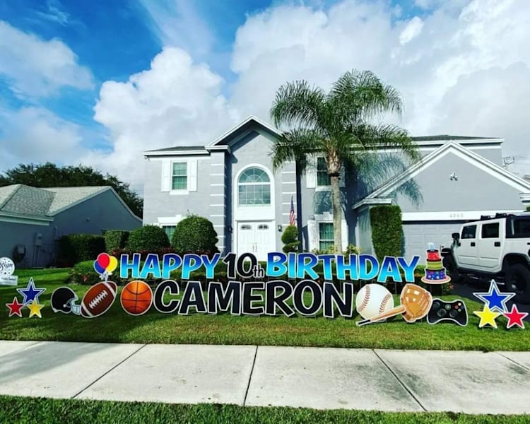
Birthday yard signs are still one of the most high-impact, low-stress ways to celebrate your favorite people. They’re bold, they’re visible and they set the tone before anyone even rings the doorbell. In this guide, we’ll walk through how to make birthday signs that look professional without requiring a design degree, plus creative ideas you can steal, sizing and printing tips, and a simple step-by-step guide using VistaPrint.
- Decide your must-haves first: size, shape, material, single vs. double-sided and H-stakes.
- Use big, high-contrast type and limit colors to improve readability from the street.
- Add personality with photos, themes and fun extras like arrows and writable space.
- Proof like a pro: zoom in, check margins and confirm quantities and timing.
- Professional printing = durable materials, clean color, quick turnaround.
How to make and print a birthday yard sign
Here’s a quick, friendly walkthrough on how to make birthday yard signs—from choosing durable materials and the right size, to customizing a standout design and sending it to print.
Step 1: Pick the right product
Start with the basics, because these choices shape everything else. Yard signs are typically printed on weather-resistant, corrugated plastic that stands up to sun, wind and a little birthday party chaos. If you’re on a corner or expect traffic from both directions, go double-sided. Hanging out on a cul-de-sac? Single-sided may be plenty. Don’t forget H-stakes, those metal stakes that slide into the sign flutes and then into the ground.
Step 2: Start your design
VistaPrint gives you a couple of easy birthday yard sign routes: browse templates or upload your own design. Templates are great when you want a fast start with coordinated fonts and layouts you can tweak. Uploading is perfect if you’ve already designed something. Choose your size (more on that later), shape and orientation—landscape is the classic, but portrait can be striking for tall layouts, arrows or full-body portraits.
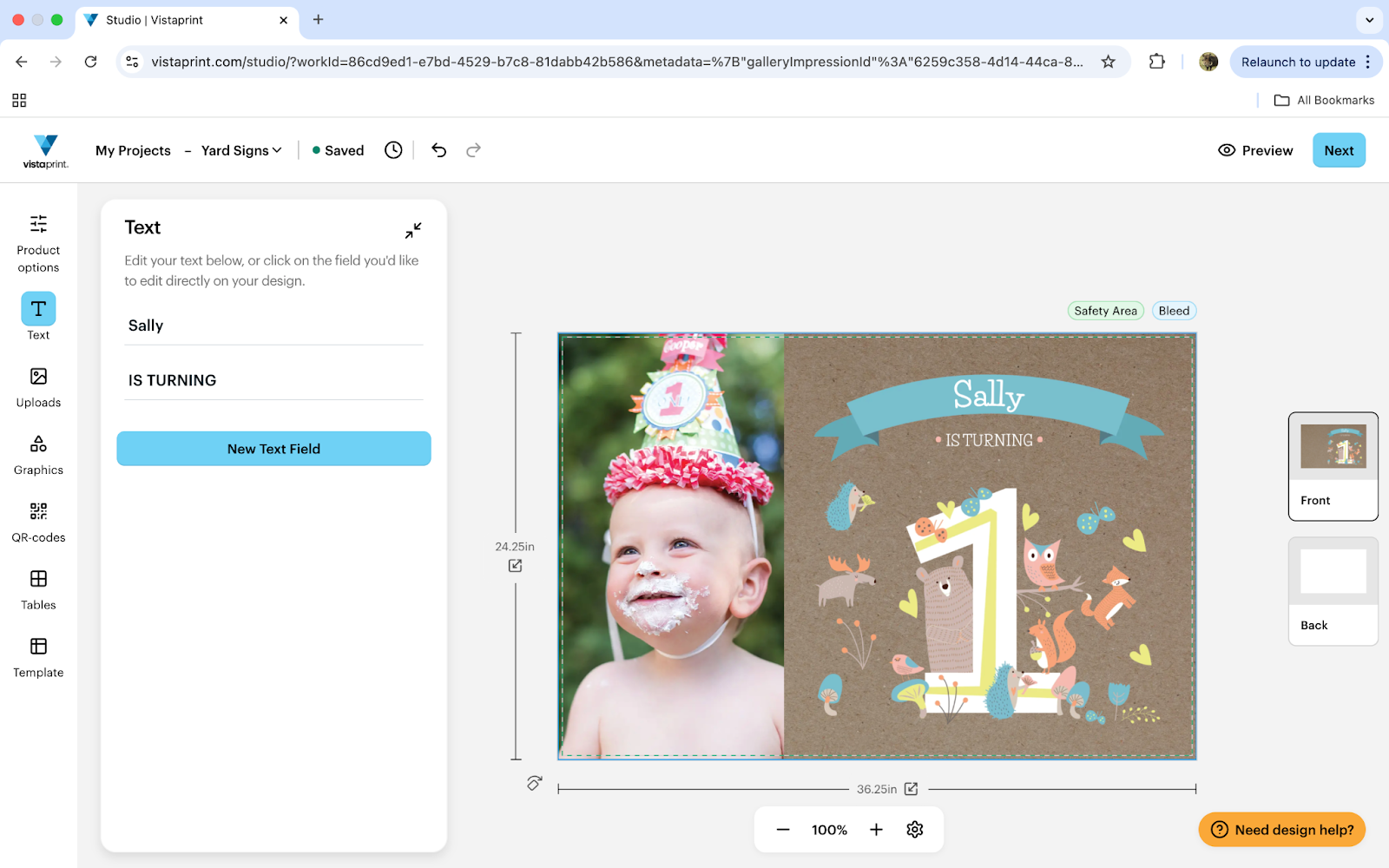
Step 3: Customize for impact
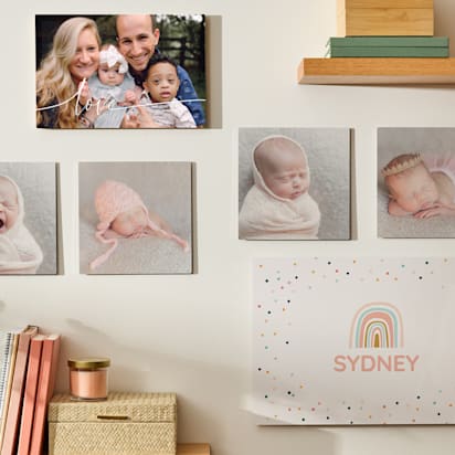
This is where the magic happens. Add the celebrant’s age big and proud (or cleverly understated if they’re “celebrating 29… again”). Include date and a location arrow if you’re guiding guests to a backyard gate or side entrance. Pick a color palette that pops from a distance—think high contrast: navy + white, black + yellow, hot pink + white, deep teal + lemon. Tie colors to a theme (retro neon, botanical, sports team colors). Choose fonts that are bold and friendly; mix one chunky headline font with a simple, clean subhead. Drop in graphics like balloons, confetti, stars or icons for hobbies. Photos are also always a winner—one hero image or a mini collage makes it instantly personal.
Step 4: Prep for print quality
Use high-resolution photos so faces look crisp, not grainy. If you’re not sure, 150–300 dpi at final size is a good target; bigger is better. Keep text inside safe margins so nothing gets trimmed. For birthday yard signs, bold fonts are your friend. Oversize the name and age, keep fine script to a minimum (or use it sparingly for accents like “Happy Birthday!”), and make sure key elements have a strong contrast for curbside readability. If you’re using Vistaprint templates, pick a birthday layout that already includes age badges, balloon/confetti graphics, or photo grids, then swap in your images at full resolution.
Step 5: Proof and order
Hit preview and zoom in. Check spelling and confirm quantities if you’re setting up a yard path or multiple zones (driveway, side yard, front door). Pick your shipping speed to land right before the birthday celebration so the sign looks fresh and party-ready.
Best design ideas for birthday yard signs
From playful typography to photo-forward layouts, these creative ideas will help your birthday yard signs stand out.
Birthday age considerations
Age can be the headline or a subtle nod. For toddlers and kids, big numerals with playful shapes feel celebratory. For teens, leaning into their vibe—be it skate, K-pop, gaming or glam—hits better than generic balloons. For milestone ages (21, 30, 40, 50, 60+), go bold with oversized digits with a cheeky tagline. When in doubt, pair the age with the name as the co-stars of the layout.
Quirky typography
Typography does a lot of heavy lifting outdoors. Try a thick, rounded sans serif for the main line and a hand-drawn script for a secondary line (“Party this way”). Keep letter spacing slightly open to help distance readability. If you want energy, stack words and vary sizes, but avoid overstuffing; two fonts is usually perfect.
Photo collage
A tight three-to-five photo grid is ideal for yard-viewing. Go for a baby pic, a goofy middle-school shot, a triumph moment and a recent favorite. Use consistent photo shapes (all circles or all squares) with clean, even spacing. Include a simple caption like “From Day 1 to 21.”
Full-scale person portrait
Go big with a full-height or waist-up portrait. Choose a photo with clear separation from the background so the person pops. Add a drop shadow or outline if the colors blend too much. Keep text minimal, just the name and age, so the portrait stays the star.
Retro marquee/neon
Bring the vintage theater sign to the lawn. Use a marquee-style headline with bulb dots, arrows or framing bars. Neon color combos like electric blue, hot pink or lime look amazing at a distance. Pair with a dark background for glow-y contrast.
Minimal and modern
Clean, elegant and grown-up. One color background, one high-contrast text color, lots of breathing room. Set the name large, the age even larger. Add a simple line or geometric shape for balance. It feels intentional and upscale (great for milestone dinners).
Seasonal twist
Anchor your design to the birthday month. Spring florals and pastel gradients, summer citrus and sunbursts, fall leaves and warm oranges, winter blues and silver stars. Seasonal motifs instantly read timely and photograph beautifully.
Hobbies, sports and fandom
Make it personal with icons, jerseys or subtle patterning. Baseball stitching across the bottom edge, music notes in the corner, a mini film reel, a chef’s hat, whatever feels like them. For fandoms, borrow the flavor without copying licensed logos. The point is to celebrate their thing.
Botanical/floral
Botanicals add polish without adding noise. Choose one or two hero florals or leaves and repeat them as a border. A sage green or navy background with white text feels classy. Blush + gold accents work nicely for baby showers that double as birthday gatherings.
Metallic/futuristic
Shiny vibes without actual foil. Use gradients and metallic-look textures for a high-energy, space-age feel. Pair with geometric shapes and a sleek sans serif. Great for gamer-coded themes.
Then and now
Split the sign down the middle: baby pic on the left, current pic on the right, with a timeline bar or Then/Now labels. It’s a crowd-pleaser and makes for cute arrival photos.
Interactive/writable space
Laminate a small section or leave a light-colored block where guests can add messages with a permanent marker. “Leave a birthday wish!” with arrows invites interaction, especially for kids’ parties. Just keep the main messaging separate so the scribbles don’t obscure it.
Photo booth frame cutout
Design the sign as a giant frame with a big center opening (or printed illusion of one) so guests can pose behind it. Label it with the birthday hashtag or the person’s name and age. It doubles as décor and a memory machine.
Sizing, dimensions and printing tips
Before you hit order, here’s a quick primer on sizes, materials, layout and file prep, plus why printing with VistaPrint can make your birthday lawn sign sturdier, sharper and easier to read from the street.
Recommended yard sign sizes
For front yards on quieter streets, an 18″ × 24″ landscape sign is the classic sweet spot; big enough to read from the curb without overpowering the lawn. If you’re on a busier road or have more to say (like arrows + directions), step up to 24″ × 36″. For small spaces or accent signs (Gifts here, games in back), 12″ × 18″ works well. When in doubt, size up for clarity; larger type equals easier reading.
Material and build
Corrugated plastic is the workhorse for birthday yard signs. It’s lightweight, water-resistant and budget-friendly. The fluted core pairs with H-stakes for quick setup. If you expect heavy wind, place the sign where it’s shielded by shrubs or a fence, or use multiple stakes for stability. Double-sided printing increases visibility and helps the sign look finished from all angles.
Readability and layout tips
Distance is your design boss. People will read your sign from 15 to 60 feet away. Use a simple rule of thumb: For every 10 feet of viewing distance, aim for at least 1 inch of letter height. High contrast (dark on light or light on dark) beats busy backgrounds every time. Keep your main message to one line if possible. Two lines are fine, and three start to feel cramped. Align elements cleanly and give your text room to breathe. Negative space is not empty; it’s clarity.
Customization options with VistaPrint
VistaPrint’s editor lets you switch sizes, flip to double-sided and add or remove H-stakes. Design options and customizable birthday templates cover everything from kid-cute to sleek-minimal, and you can swap colors, fonts and photos with a couple of clicks and personalize any of the available templates with birthday themes too. If you’re designing multiple birthday lawn sign pieces (welcome sign, arrow signs, dessert table marker), keep the same colors and fonts across all—cohesion makes your event feel intentional.

File prep (if uploading)
Export your birthday design at the final size with a 0.125″ safe margin and at least 150 dpi (300 dpi is excellent). Convert text to outlines if you’re working from a pro design app, or be sure to upload fonts that match. Leave a quiet edge around your layout; avoid placing critical details right at the border. Before you hit order, open the file at 100% zoom on your screen and scan for fuzzy edges or tiny type.
DIY vs. professional printing
DIY has its place. If you have access to a printer that handles large formats, and you’re aiming for a quick, low-cost sign for a small driveway moment, printing at home and mounting to foam board can work. You’ll control every detail, and last-minute edits are easy.
But here’s the truth: Outdoor signs tough it out in sun, wet and wind. Professional printing with a provider like VistaPrint delivers durable materials, consistent color and clean cuts, so your sign looks crisp when guests arrive and still looks good in photos. You also get size options, double-sided printing and hardware (H-stakes) that fit perfectly. If you’re making multiple signs or need them to match, professional printing ensures they look like a set.
When you compare time, materials and the reprint risk if a DIY sign warps or fades, professional often wins on convenience and overall value.
Set the right mood for your birthday event
Making birthday yard signs that feel personal and look professional is easily doable. Now that you know how to make them, you can turn a patch of grass into a confetti-colored billboard for someone you love. Choose the right size and material, design with readability in mind, personalize with photos and themes and send it to print so it arrives party-ready. A well-designed birthday lawn sign does more than decorate; it announces, welcomes and sets the mood before the door even opens.
If you’re plotting a bigger celebration or campaign, don’t forget to explore related resources like best marketing sign types and outdoor signage ideas to build a cohesive look across your space.