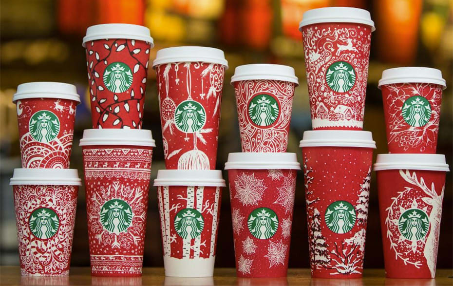
Starbucks holiday cup designs get people’s attention each year (does anyone remember the 2015 red Starbucks cup controversy?). But which holiday cup designs are good or bad? With the help of VistaPrint’s design service, 99designs by Vista, we were able to ask experts to get to the bottom of it.
Let’s take a look at the best and worst Starbucks Christmas holiday cup designs and hopefully learn a thing or two about packaging for your business!
The definitive, ranked list of the best and worst Starbucks holiday cups
1. 2007

While Starbucks claims to have been making red cups since 1997, the Internet was apparently not obsessed with photographing them until at least 2005 (shockingly, I think this is about the time we all started getting cameras on our cell phones). We were surprised when the 2007 cup design, one of the earliest iterations of the Starbuck’s cup, came first. But it totally deserves it.
The 2007 cup is a timeless balance between simplicity and holiday themes. Though some experts we asked complained that the skiers not wearing coats was unrealistic, most agreed that this cup embodied feelings of winter coziness. The geometric design with the polka dot snowflakes over a subtle red pattern is not too distracting, but is also not boring and repetitive. The gently rolling layer of snow at the bottom grounds the cup, and the simple, small characters draw the eye and tell a story without overwhelming the mood of the design. It really make you want to cuddle up with someone special and drink a chestnut praline latte, which is exactly what it’s supposed to do.
2. 2015

In second place is the 2015 Starbucks cup design. We would expect nothing less from a boldly simple design that has caused such an uproar. After all in 2015 minimalism reigns supreme. Flat design has been popular for the previous years, but it’s recently starting to (ironically) take on more dimension. Material design takes all of the simplicity of flat design and matures it with slight animations and subtle gradients, intending to ground it in the material world.
With its own subtle gradient (or ombre, like the cool kids are calling it) the 2015 Starbucks red cup is aligned with design trends. The colors of the gradient are the right balance between warm and bold, making it the perfect emblem of a modern holiday color palette. As our survey showed, the quality of the holiday design cups has been slipping in the past years, so we believe Starbucks made the right call with this shakeup. As one of our experts said, “it makes me want to buy a Starbucks coffee just for the cup.”
3. 2008

In 2008, Starbucks cup design uses the same successful recipe from the previous year, pairing patterns with literal figures. The stamped image quality of the dove and snowflakes give it a homemade feel. And there’s nothing like homemade things to bring out feelings of nostalgia. And everyone knows the joy of the holiday season is made by mixing equal parts love, children’s laughter, coziness and nostalgia.
Like it’s predecessor, the 2008 cup uses an asymmetrical band (this time in a deep red) around the bottom. They also bring their logo into the design scheme, wrapping it in a Christmas ornament, which is a nice touch. Where it looses out to the 2007 cup, however, is in its ability to draw our eye. As one of our experts pointed out, it’s a bit busy; all the images are nice but you’re not sure where too look. Still, solid contender, and well deserving of third place.
4. 2011
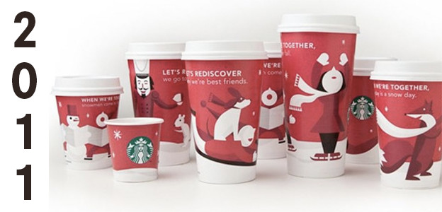
Between 2010 and 2012, Starbucks used the same characters on their cups, but in slightly different iterations. The difference between fourth (2011) and fifth (2012) places was very minimal, but the experts slightly preferred the 2011 iteration. Both sets of cups feature cute characters, but in the 2011 versions they’re farther away from us, giving us more of a sense of activity and movement. They are also in the classic Starbucks red and white color scheme, which allowed them to slightly edge out their 2012 counterparts.
5. 2012
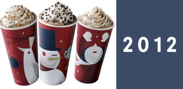
The 2012 cup took the characters that had been developed two years prior and made them more stylized, embracing the then-new trend of flat design, and also adding bold colors to the standard red and white color scheme. These cups were polarizing with our experts: some loved the playful, cute feeling created by the colors and characters, but other were turned off because of the snowman’s creepy wink. One expert noted the cups didn’t feel very Starbucks, illustrating the importance of staying on-brand with your design.
6. 2006
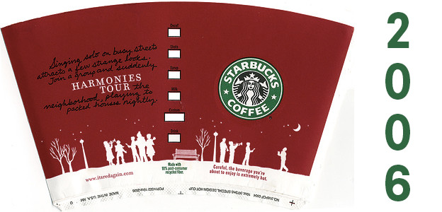
The 2006 cup finished right in the middle of the pack, as is appropriate given that there are some pieces that are working well, but others that just don’t fit. The plain red background and the white silhouettes capture some of the elements that make the top cups great, but the design is marred by the quote, which is printed in a hard-to-read font, and highlights the words “harmonies tour” for no apparent reason. When I think harmonies tour, I think of college a-cappella groups traveling up and down the East Coast in a van singing at alumni clubs. Not peppermint mochas.
Also, as one expert noted, the warning that the beverage you’re about to consume is so hot it might burn you (and they’d better say this or you might sue them) sort of takes away from the feelings of joy and holiday cheer.
7. 2014
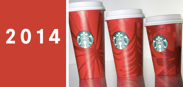
The 2014 cups were very abstract, hinting at Christmas tree and snowflake shapes with dark red brush strokes. These finished in the middle of the pack because they failed to inspire anyone. For the most part, the experts felt they were fine. Ultimately, the designs felt unfocused and a bit messy, but were mostly just not memorable.
8. 2013
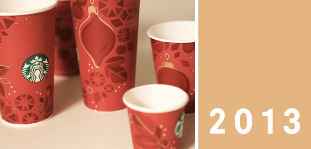
The 2013 cups continued the 2012 trend of adding colors beyond red and white, this time opting for gold highlights. Unfortunately, this experiment fell flat. The overwhelming sentiment expressed by the experts? “Meh.” Several also noted that these cups reminded them of bad Christmas wrapping paper. In fact, now that I think about it, I’m pretty sure there’s a roll in my parents’ collection that looks exactly like that. It’s been there for years because we always overlook it in favor of more exciting things like ice skating penguins and Santa Elvis.
9. 2010

The introductory year for the characters that graced the cups between 2010-2012. These are definitely the least sophisticated of the three. The experts noted that the use of the text made them feel cluttered, and that they were still wintery, but not as happy. These cups may also suffer because of trends: they’re full of noticeable gradients, which were all the rage in 2010.
10. 2005
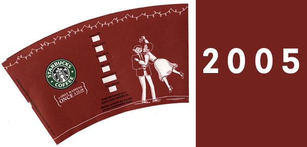
The 2005 cups are the oldest paper cups we were able to find. (Apparently there’s a healthy community for buying/selling/appreciating of the ceramic mugs on ebay, which go back much farther in time. We didn’t want to mix our samples because clearly this was a very scientific study.) It definitely feels dated. Unfortunately, this date is closer to the early 1960s than the mid 2000s. Was vintage popular in 2005? I know that trucker hats, popped collars, and Juicy Couture were big, but I don’t remember the 60s coming back into fashion until Mad Men started in 2007. The 2005 cups were either ahead of or way behind their times.
They were also among our experts’ least favorites. Some noted that they liked the string of lights at the top, but many noted that the characters were a bit creepy, in that sort of puppet-that-has-escaped-its-strings-and-come-alive way. Also, the woman appears to be floating. I mean, maybe she’s just had too many spiked eggnog lattes, but is that really what Starbucks should be promoting?
Several experts also pointed out that the cup was heteronormative and non-inclusive, which definitely goes against Starbucks’ stated value to create a culture of warmth and belonging.
11. 2009

The worst Starbuck’s holiday cup design happened in 2009. Experts felt that it was too busy and in your face. Rather than capturing the themes of hope and love with the design, it simply prints the words. There is also no dimension. The red sprigs of evergreen and the white snowflakes and ornaments are of equal weight. It’s unclear where your eye should focus. The iconic Starbucks mermaid feels lost in this weird two-dimensional forest. And I think we can all agree the caramel brulée latte is just not going to be quite as satisfying if you’re worried about a mermaid being lost in a forest.
Author bio

Kelly Morr enjoys researching, writing and editing awesome articles on design. She also likes cuddling cats, climbing through canyons and over-explaining figure skating to people. You can reach her on Twitter @KelMo.
