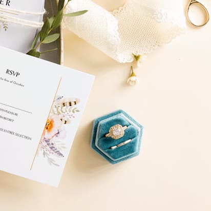
Every detail matters in the whirlwind of wedding planning – from the wedding invitations and save-the-dates to the dress lace and the petals on the aisle. But there’s one element that holds the power to thread everything together: your wedding color palette. It’s not just about picking pretty colors. The color palette for your wedding coordinates your theme, sets the tone of the day, reflects your personal style and helps leave a lasting impression.
If you’re looking for thematic wedding color palette ideas, take our short wedding color quiz and then check out these inspiring wedding color palettes.
- Your wedding color palette sets the mood and unifies the details of your big day, from invitations to florals and attire.
- 2026 wedding color palettes balance personality with timelessness, blending soft neutrals with bold accent hues.
- Lighting, paper stock and print finishes affect how colors appear, so test samples to be sure everything is consistent.
- Pick a 60-30-10 color ratio to create visual balance across decor, signage and stationery.
- Use our wedding color palette quiz to help you discover a scheme that reflects your style and venue.
Take the wedding color palette quiz
[ays_quiz id=”2″]
30 inspiring wedding color palettes
When it comes to wedding color themes, the options are as diverse as the love stories they celebrate. We’ve organized these themes into a list:
- Coastal Chic
- New Rustic
- Blooms & Blossoms
- Vintage Luxury
- Graphic & Editorial
- Hand-Crafted Details
- Classic Neutral
- Storybook Romance
- Glamorous & Elegant
- Monochromatic
However, within each theme lies a spectrum of color possibilities, so we’ve curated three inspiring wedding color schemes for each one. There’s something for every couple’s taste and style.
Get more inspiration in our guide to wedding trends and explore complementary wedding theme ideas.
Coastal Chic wedding color theme
Coastal chic wedding color palettes blend relaxed beach tones with elegant earthy hues. Think sun-washed neutrals, soft coral, sea glass green and warm sand shades inspired by sunset shorelines. Add natural textures like shells, linen paper stocks and deckled edges to evoke a breezy seaside escape.
Soft Coastal Chic
This beachy wedding color palette features sandy tones and pastel coral colorations to reflect your celebration on the beach.

HEX codes for this Soft Coastal Chic wedding color palette:
- FBF6F3
- D1C4B8
- B7A495
- D1D9C8
- EFC7C2
Soft coastal palettes look especially refined on textured cotton or linen paper. Silver foil accents enhance the cool ocean tone.
Coastal Chic Sunset
This soft palette in tones of green and white can work well with the bold red contrast color. It’s great for relaxed beach weddings. Because this color palette is dominated with subdued hues, coral red accent colors are great to incorporate into your decorations and floral arrangements.
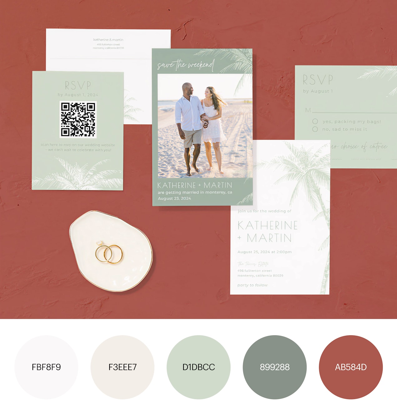
HEX codes for this Coastal Chic Sunset wedding color palette:
- FBF8F9
- F3EEE7
- D1DBCC
- 899288
- AB584D
Tropical Coastal Chic
This palette moves away from soft, sand tones and leans into bolder hues for a tropical feel – great for destination weddings.

HEX codes for a Tropical Coastal Chic wedding color palette:
- F1F3F3
- DDA263
- 7F7AA7
- BFBB7C
- 4F6F58
New Rustic wedding color ideas
This look is evolving toward refined rustic: pairing terracotta, sage and warm neutrals with metallic accents and letterpress textures. These palettes add a touch of sophistication to the countryside aesthetic, swapping out DIY touches for balanced and bold colors that complement refined letterpress and metallic elements.
Whether you’re planning a ranch celebration or a mountain getaway, our selection of New Rustic palettes captures the warmth and charm of the countryside with subtle southwestern influences.
Rich-Tone New Rustic Palette
Bold yellows and rich browns set the tone for an organic palette with pops of color that can easily carry into your big day, through your floral arrangements and more.

HEX codes for this Rich-Tone New Rustic wedding color palette:
- E7E6E2
- CEBD38
- B98138
- 724B27
- 403E2D
New Rustic Meadow
A calm, muted palette with pops of contrasting colors for a classic, vintage-inspired take on rustic style.

HEX codes for a New Rustic Meadow wedding color palette:
- F2F2F3
- EFBE22
- A46628
- F0A341
- C05C27
New Rustic Neutrals
This neutral palette is reminiscent of the outdoors and brings a natural feel to small or DIY-style weddings.

HEX codes for this New Rustic neutrals wedding color palette:
- F2F1F2
- BDBDBD
- A59676
- 858A66
- 5B4C3A
Blooms & Blossoms wedding color palettes
Flowers have always held a special place in weddings, symbolizing love and celebration. However, modern couples are taking their floral arrangements to new heights by making Blooms & Blossoms the focal point of their wedding theme.
If you envision an outdoor celebration surrounded by luscious gardens, harmonizing your wedding colors with the setting is essential. Blooms & Blossoms palettes emphasize layered florals, soft pastels and fresh garden tones for a romantic, immersive atmosphere.
Soft blush and lilac tones glow beautifully during golden hour but can appear cooler under LED lighting so test swatches before printing.
Spring Blooms & Blossoms
This bright, cheerful palette of greens, purple, red and orange is perfect for outdoor weddings in spring or early summer.

HEX codes for this Spring Blooms & Blossoms wedding color palette:
- BDD392
- 99A645
- ECB26E
- BE9AC8
- BF605E
Sun Washed Blooms & Blossoms
This palette is muted, but the tones are perfect for floral wedding stationery designs.
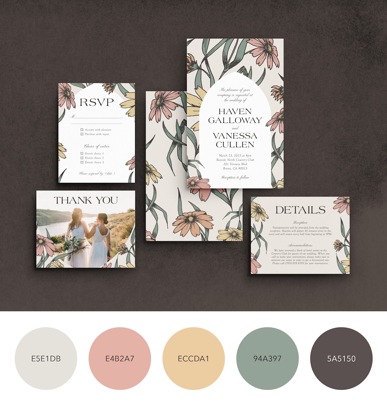
HEX codes for this Sun Washed Blooms & Blossoms wedding color palette:
- E5E1DB
- E4B2A7
- ECCDA1
- 94A397
- 5A5150
Bold Blooms & Blossoms
This palette leans on a bold red tone that stands out against the softer floral colors.

HEX codes for the Bold Blooms & Blossoms wedding color palette:
- F3CF94
- E49E5E
- F1AFA9
- C04C52
- ACA382
Vintage Luxury wedding color themes
With European and historical influences, this trend combines antique details with modern sensibilities to create stationery and decor that feels nostalgic yet fresh. Lace patterns, pointelle textures and ornate typography add depth, transforming your wedding materials into cherished keepsakes.
Try pairing ivory, champagne and dusty rose with gold foil or pearl finishes for heirloom elegance.
Neu-Deco Vintage Luxury
Dark tones like black and charcoal give a rich, luxurious feel to your wedding stationery and can be used to bring contrast to your decor on the day.
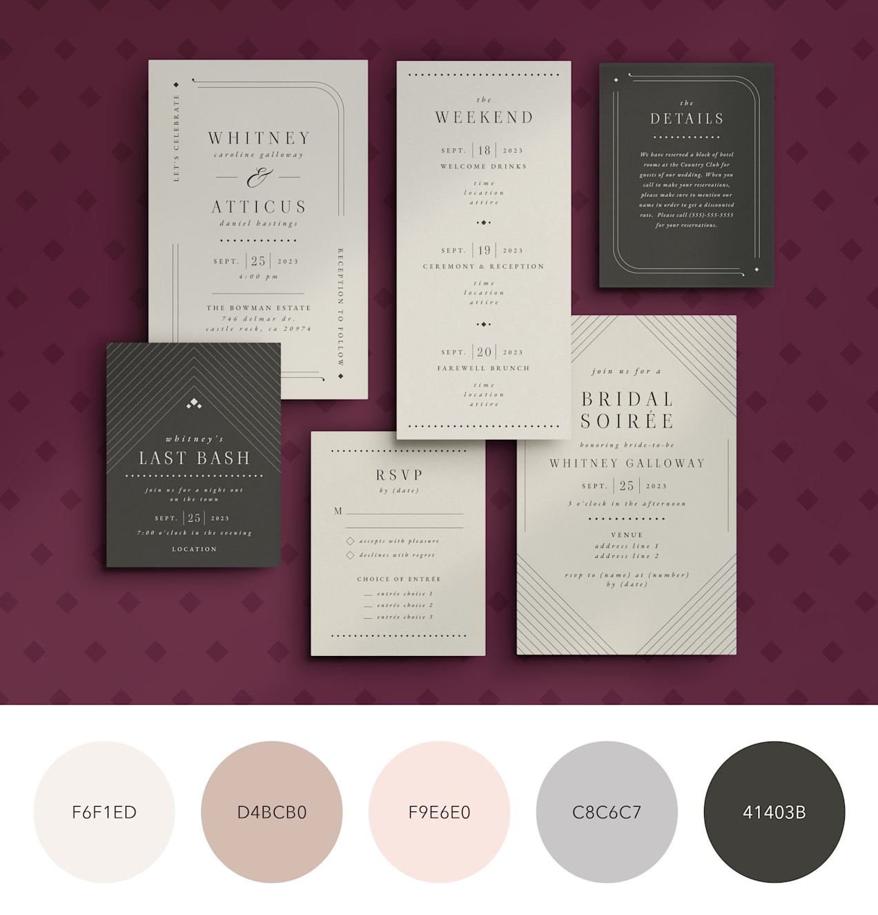
HEX codes for a Neu-Deco Vintage Luxury wedding color palette:
- F6F1ED
- D4BCB0
- F9E6E0
- C8C6C7
- 41403B
Art Nouveau Vintage Luxury
Rich jewel tones have a subdued opulence, and illustrated floral prints can lean into a vintage feel that’s perfect for weddings inspired by bygone eras.

HEX codes for this Art Nouveau Vintage Luxury wedding color palette:
- FCFAFD
- D38139
- 6D843C
- 8C2050
- 44132F
Victorian Vintage Luxury
A delicate palette with floral motifs is the perfect nod to Victorian-era luxury style.

HEX codes for this Victorian Vintage Luxury wedding color palette:
- BAA68E
- D58143
- D7AEBA
- BD697E
- 8A8A65
Graphic & Editorial wedding color schemes
This modern aesthetic embraces negative space, bold typography and striking contrast. Think crisp neutrals paired with cobalt blue, charcoal or bold black for a contemporary editorial look. In 2026, bold contrasts are in, with black grounding schemes and refreshingly natural shades of red and teal emerging as popular accents. This color and design theme especially works well as a neutral canvas for your big day – bring the entire palette together with flowers and decor in your accent colors.
Graphic & Editorial Glamor
This color palette uses deep reds and bold blacks as contrast and relies on classic, blocky typography to create an editorial look.

HEX codes for this Graphic & Editorial Glamor wedding color palette:
- F7EEE5
- A58F6C
- D59C9B
- B15C63
- 231C19
Sophisticated Graphic & Editorial
Cool muted greens and neutrals develop a sophisticated feel when paired with jewel tones like emerald.
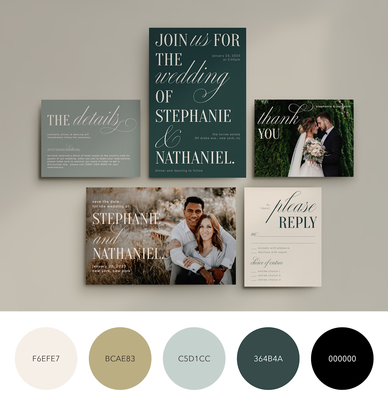
HEX codes for this Sophisticated Graphic & Editorial wedding color palette:
- F6EFE7
- BCAE83
- C5D1CC
- 364B4A
- 000000
Illustrated Graphic & Editorial
Illustrations are the perfect nod to graphic and editorial-inspired wedding themes, setting an artsy, refined tone.

HEX codes for this Illustrated Graphic & Editorial wedding color palette:
- DDDDB
- BCAE83
- 7A8F9E
- 69AAC7
- 354D56
Hand-Crafted Details wedding color palettes
Hand-Crafted Details is all about embracing the unconventional and making a statement. It’s the perfect choice for the non-traditional bride or groom who wants to inject their personality into every aspect of their special day. Layered designs, hand-drawn illustrations and novelty shapes create stationery that feels joyful and one-of-a-kind. These palettes often combine warm neutrals with pops of coral, pistachio green or soft mustard.
Vibrant Hand-Crafted Details
Warm tones like orange and pink are great accent colors, and for weddings with a hand-crafted theme, they make an energetic palette.

HEX codes for this Vibrant Hand-Crafted Details wedding color palette:
- EE2455
- F15931
- D78438
- F0ADB8
- DFB961
Vibes Hand-Crafted Details
Blues and purples are calming – perfect for hand-crafted weddings that want to set the tone for a laid-back celebration.

HEX codes for this Doodle Hand-Crafted Details wedding color palette:
- D7E8FC
- 99C3EE
- D7D6E7
- A293BD
- B9B3D5
Playful Hand-Crafted Details
Sunny tones like orange, yellow and coral make for a cheery wedding color palette that sets a playful mood for your big day.
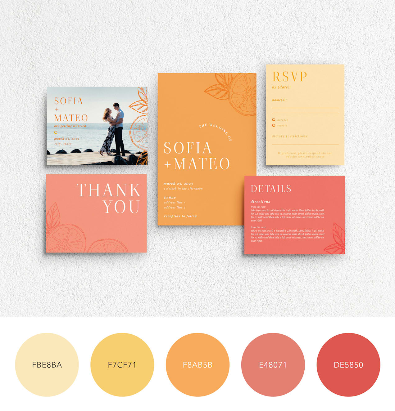
HEX codes for this Playful Hand-Crafted Details wedding color palette:
- FBE8BA
- F7CF71
- F8AB5B
- E48071
- DE5850
Classic Neutral wedding color theme
Neutral wedding color palettes remain timeless in 2026, often paired with soft sage, dusty blue or champagne metallic accents for added depth. Despite the allure of bold and vibrant palettes, many brides and grooms still gravitate toward the understated beauty of neutral colors for their wedding day.
With a palette inspired by the classics, this theme embraces hues that stand the test of time.
Cool Classic Neutral
Cool neutral tones with a black contrast are a timeless and elegant wedding color palette choice.
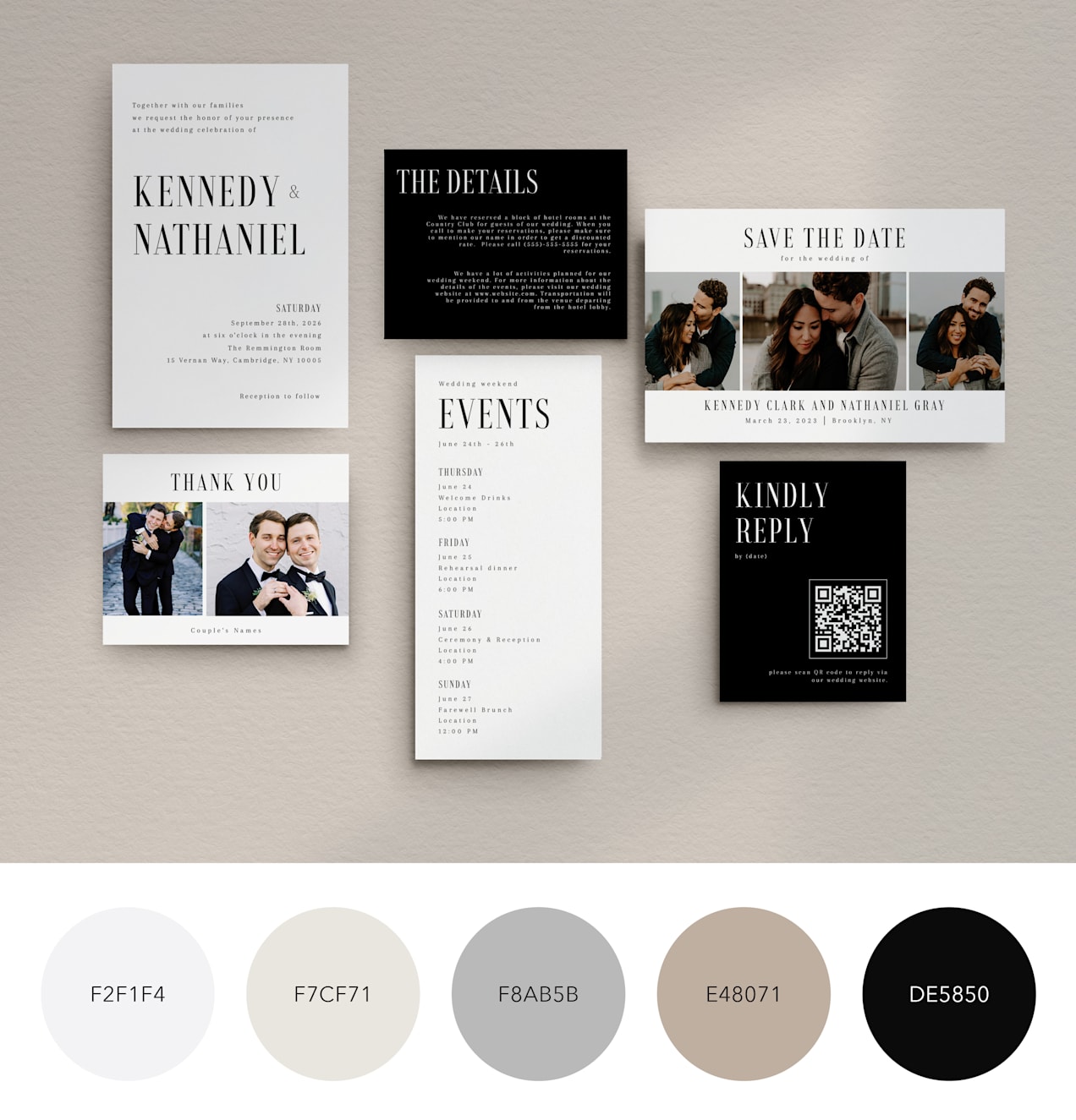
HEX codes for this Cool Classic Neutrals wedding color palette:
- F2F1F4
- F7CF71
- F8AB5B
- E48071
- DE5850
Get the best of two worlds: This Cool Classic bridges two trending palette ideas: Classic Neutrals + Graphic & Editorial.
Floral Classic Neutrals
Neutral colors that lend themselves to florals, like brown and beige tones, are perfect for weddings with a classically elegant theme that still feels modern.
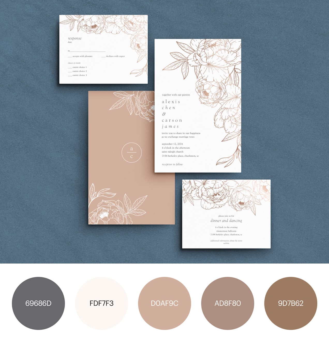
HEX codes for this Floral Classic Neutrals wedding color palette:
- 69686D
- FDF7F3
- D0AF9C
- AD8F80
- 9D7B62
Warm Classic Neutral
Embrace neutral colors without the stark contrast of white with this warm, muted Classic Neutral palette.
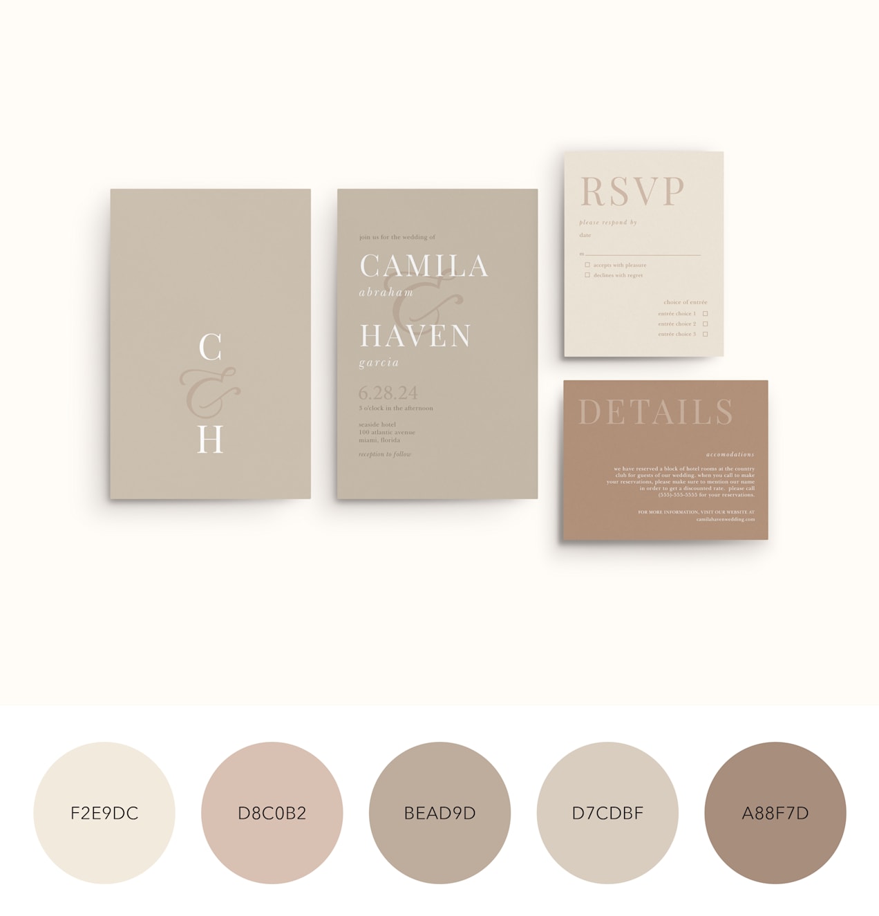
HEX codes for this Warm Classic Neutrals wedding color palette:
- F2E9DC
- D8C0B2
- BEAD9D
- D7CDBF
- A88F7D
Storybook Romance color palettes
This aesthetic evokes fairy-tale charm with whimsical florals and delicate illustrations. Soft tones that create a romantic feel without the need for stark contrasts give your wedding color palette an enchanting atmosphere – perfect for garden venues and romantic estates.
So, if you’re craving a wedding that’s effortlessly cool and uniquely you, explore our Storybook Romance palettes and let your love story shine amidst soft tones and natural elements.
Cottage-In-The-Woods Storybook Romance
This brown and neutral-toned palette has a rustic, Old West feel. Floral accents shift the look toward romantic and cottagey.

HEX codes for this Cottage Storybook Romance wedding color palette:
- F1E7D4
- D6B4A1
- 4A5A28
- C05C27
- 59362A
Fairytale Storybook Romance
Cooler tones bring an elegant feel to Storybook Romance themes, especially when paired with warming brown for a natural, earthy finish.

HEX codes for this Fairytale Storybook Romance wedding color palette:
- E0E9F0
- A9D4E5
- D5C9BD
- A57F5C
- 593726
Garden Storybook Romance
Floral elements perfectly set the scene for an outdoor wedding inspired by gardens.
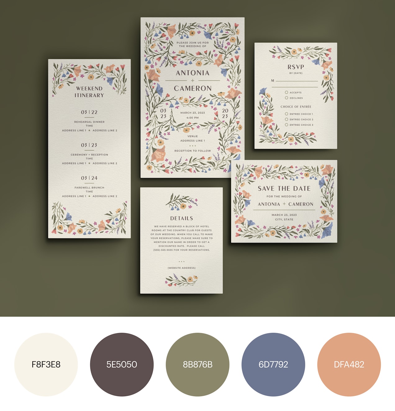
HEX codes for this Garden Storybook Romance wedding color palette:
- FBF3E8
- 5E5050
- 8B876B
- 6D7792
- DFA482
Glamorous & Elegant wedding color ideas
For couples craving a wedding with an unmistakable “wow” factor, the Glamorous & Elegant theme is the perfect choice. This year, mixed metallics, including silver and platinum, are trending alongside traditional gold, offering a modern twist on classic luxury. From bold text to classic fonts and exquisite design elements, this theme exudes timeless elegance.
Whether you’re saying “I do” in a majestic ballroom, a lavish hotel or an elevated outdoor space, our Glamorous & Elegant color schemes are tailor-made to complement your venue perfectly.
Glamorous & Elegant Emerald
Rich emerald with contrasting gold borders has a feeling of classic, old-world flair that sets the tone for an elegant wedding day.

HEX codes for this Emerald Glamorous & Elegant wedding color palette:
- B5ADA2
- C7A76D
- 48573A
- 25392E
- 11140B
Glamorous & Elegant Boho
Striking black with grey and neutral accents brings an alternative, soulful feel to classically elegant wedding themes.

HEX codes for this Alternative Glamorous & Elegant wedding color palette:
- F2E5D1
- D7C8AC
- A49381
- 70706C
- 1C2225
Glamorous & Elegant Golds
Gold or sand tones give a rich, caramely contrast to bold black palettes, giving your wedding theme a charismatic feel.

HEX codes for this Gold Glamorous & Elegant wedding color palette:
- DCDCDD
- 808489
- BD9256
- A57138
- 25231E
Monochromatic wedding color schemes
Monochromatic weddings are the perfect choice for those who love a favorite color so much they want to use it exclusively for their big day. Monochromatic layering is a key 2026 trend, combining multiple shades and textures within one color family for depth and sophistication.
Among the trending color schemes, we have three favorites among soon-to-be newlyweds: greens, blues and warm terra cotta tones.
Monochromatic Green
Greens encompass a mix of shades ranging from light, airy sage to dark, moody forest tones, incorporating elements of greenery and nature for an organic feel.
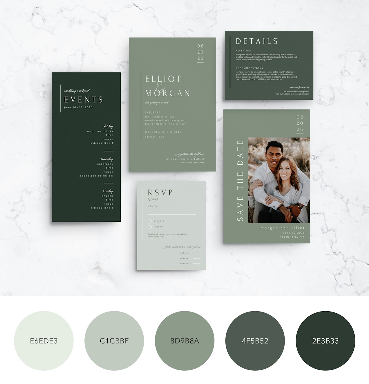
HEX codes for this Green Monochromatic wedding color palette:
- E6EDE3
- C1CBBF
- 8D9B8A
- 4F5B52
- 2E3B33
Monochromatic Blue
Blues range from delicate dusty tones to bold nautical navy, evoking a coastal ambiance or the serene calm of winter.

HEX codes for this Blue Monochromatic wedding color palette:
- DFE8F0
- BECCD5
- 6F93CD
- 7D87A4
- 001B39
Warm Monochromatic
These warm brown shades evoke a muted sunset, the most romantic time of day.

HEX codes for this Warm Monochromatic wedding color palette:
- E4C0A8
- BF7656
- D8A384
- 945650
- 391310
How to choose your wedding color palette
Remember that your chosen wedding color scheme will influence every aspect of your wedding, from the venue decoration to the look of all wedding print materials like invitations, save-the-dates, signage and more.
If you’re still not sure what’s best for you, here’s some tips on how to choose a wedding color scheme:
- Cultural or symbolic meaning: Select colors based on cultural traditions or symbolic meanings associated with specific colors. For example, red is considered lucky in many Asian cultures and is often incorporated into wedding color palettes for good fortune and prosperity.
- Personal preferences: Choose colors based on your personal preferences and favorite hues – colors that hold sentimental value or that evoke certain emotions or memories. This approach infuses your wedding with your unique personalities and tastes.
- Seasonal approach: The season your wedding will take place can also guide color palette selection. For instance, spring weddings feature pastel shades and fresh greens, while autumn weddings incorporate warm, rich tones like deep reds, oranges and browns.
- Venue-inspired approach: Draw inspiration from the venue where your wedding will be held. Consider the colors in the venue’s decor and architecture and choose complementary or contrasting colors for your wedding palette. For example, if the venue has neutral tones like beige and ivory, contrast with bold accent colors to add visual interest.
- Theme-based approach: Choose a specific theme for your wedding (like one of the ten we listed above), and select colors that align with that theme.
Wedding color palette print and design considerations
Your chosen wedding color palette can look surprisingly different once it moves from screen to print and from daylight to candlelight. Understanding how materials, finishes and lighting interact with color will help you select tones that stay true across invitations, signage, menus and decor.
Consider lighting dynamics
Colors shift under candles, LEDs and natural light and will also shift depending on the environment.
- Natural daylight reveals true undertones, making soft neutrals and pastels appear crisp and airy.
- Warm candlelight enriches reds, corals and metallics while muting cool blues and greys.
- LED lighting can cast cooler or warmer tones depending on temperature settings, which may subtly alter whites and blush shades.
Test print samples
Paper stock and print finishes affect color depth and texture. Matte stocks soften and mute tones for a modern, understated look, while linen or textured papers can add dimension and warmth. Gloss or foil accents intensify the color contrast and reflect light, making metallic or darker shades feel more luxurious.
Use the 60-30-10 rule
Balance your palette across both print and decor elements. Aim for 60% dominant color (linens, backdrops), 30% secondary color (florals, attire) and 10% accent color (foil stamping, wax seals, typography) to create a consistent look without overwhelming the design.
For more guidance, try our interactive wedding theme flowchart.
You’ve chosen your wedding color palette. What’s next?
Now that you’re empowered to choose your wedding color palette, it’s time to ensure that every detail reflects your vision and personality. Take a moment to double-check that you truly love the colors you commit to – after all, you want your wedding photos to evoke joy, not regret.
Next, consider how your colors harmonize with your venue and the season of your wedding. Cohesion between your palette and surroundings elevates the overall aesthetic of your celebration.
Finally, remember to test how your colors appear in print. What looks perfect on your computer screen may translate differently onto your table runners and signage. Before printing, request samples to ensure color accuracy and consistency across invitations, menus and signage.
While you may choose your palette using HEX or RGB values on screen, professional printing often uses CMYK inks, which can produce slightly different results. If you’re printing through VistaPrint, you don’t need to convert your colors yourself. Our print process automatically adjusts files for accurate CMYK reproduction, helping your palette look as close as possible to what you see on screen.
Now comes the fun part – incorporate your chosen color palette into every aspect of your wedding! From invitations and decor to attire and floral arrangements, let your colors shine through in every detail.
When bringing your vision to life, consider ordering from VistaPrint. As a reliable printing service, VistaPrint ensures that your chosen color palette looks flawless on your big day.
FAQs about wedding color palettes
Which wedding colors are trending for 2026?
Popular 2026 wedding color palettes include pistachio green, cobalt blue, mocha mousse neutrals, soft silver metallics and romantic dusty rose. Monochromatic layering and mixed metals are also gaining popularity.
How do I choose a wedding color palette that won’t look dated?
Focus on timeless base colors like neutrals or soft greens, then add trend accents through florals or signage. This keeps your palette current without dominating your photos.
How many colors should be in a wedding palette?
Most wedding color palettes use three to five colors. The 60-30-10 rule helps distribute them for balance and visual harmony.
Do wedding colors have to match the season?
Not at all. Seasonal palettes can inspire choices, but personal preference, venue style and lighting often matter more than the season alone.
How do I ensure my wedding colors look the same on screen and in print?
Order printed samples and view your colors in natural and artificial light. Paper stock, ink and finishes can alter color appearance. Also, ensure your designs are adapted as necessary for printing. To learn more, check out our guide to RGB vs. CMYK color codes.
Can I use metallic silver or gold as a primary color?
Yes. Metallics can act as dominant tones when balanced with soft neutrals to maintain readability and elegance.
What is the best way to incorporate bold accents like red or cobalt blue?
Use bold hues sparingly in typography, ribbons or table details to create visual impact without overwhelming the space.
How do I adapt a summer palette for an indoor ballroom venue?
Deepen lighter tones and add metallic accents or candlelight to create warmth and depth indoors.
Should wedding party attire perfectly match printed materials?
Coordinating tones works best. Exact matches aren’t necessary and slight variations often create a more natural, layered look.