Postcards have come a long way and not just in a geographical sense. What began as novelty travel souvenirs has evolved into a form of creative expression for artists and businesses alike. But the purpose of postcards has always been to communicate a message, making a well-chosen postcard font invaluable.
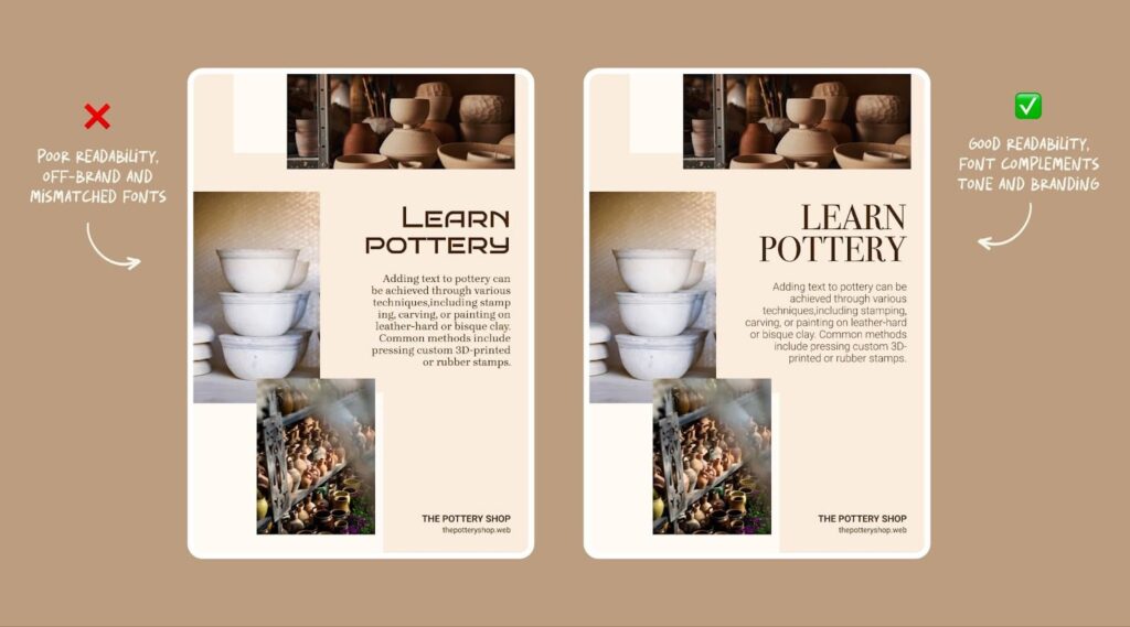
Choosing the right postcard font is not just about style. The best postcard fonts balance personality with clarity, brand alignment (if they’re for a business) and readability at standard postcard size. Fonts that look great on screen can behave very differently once they’re printed, which is why choosing fonts for postcards requires a print-first approach.
From decorative lettering and elegant cursive to retro throwbacks and digital newcomers, there are many ways fonts can express themselves on the canvas of a postcard. But that is exactly what makes choosing the best postcard font such a challenge. To simplify the process, we’re going to explain the basics of how to choose a font for your postcard, showcasing over 40 postcard fonts you can use on your next custom postcard design.
- The best postcard fonts are easy to read at small sizes and at a quick glance.
- Fonts for postcards should align with your brand tone and the purpose of your message.
- Print details like stroke weight, spacing and paper finish can impact the font clarity more than you expect.
- Limiting your design to one or two fonts helps maintain the clarity and visual hierarchy.
- Testing fonts at actual postcard size can help prevent readability issues before printing.

How to choose a postcard font in 7 steps
Choosing a font for your postcard is both a creative and practical exercise. To pick the best postcard font, you have to have a clear objective, knowledge of typographic principles, a budget and a creative vision. Here are the fundamental steps to choosing fonts for a postcard.
Step 1: Outline the purpose of your postcard
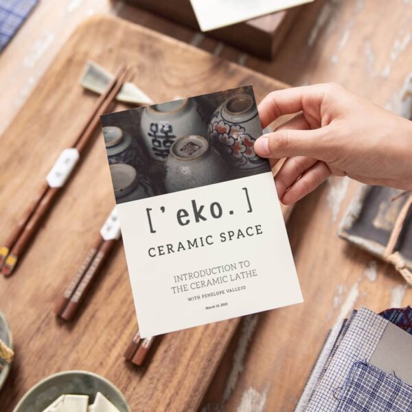
There are countless reasons and ways to use a postcard. The most traditional is for promotional or correspondence purposes by mail. Businesses might use postcards to announce a product launch or special offer, market an event or thank customers for their loyalty, as informational inserts for shopping bags or packaging boxes. On its own, an illustrative postcard makes for simple merchandise.
Before choosing your fonts for postcards, define what action you want the reader to take. Promotional postcards often need bold, high-impact headline fonts. Informational postcards benefit from highly legible body text fonts. And thank-you or event postcards may allow for more personality or decorative styles.
Step 2: Establish your brand identity
A brand voice, personality and overall brand identity guide all of a business’s design decisions. If you haven’t already, develop visual brand assets, especially a logo and brand typeface, both of which will steer your postcard font. For independent creatives, a brand is essentially your personal style, what sets your creative voice apart from other artists.
If your brand already uses specific fonts, your postcard font should feel like a natural extension of that system. Consistent font choices help improve recognition and trust, especially for marketing postcards that will be sent to new audiences.

Step 3: Get familiar with font terminology
To shop for fonts effectively, you’ll need to know the basic typographic terms and principles that font foundries (the companies that license fonts) use. Not only does this give you the language needed to search for a particular style, but each of the different font types has specific ways they are conventionally used.
At a high level, most postcard fonts fall into four categories: serif, sans serif, script and display. Each category affects how your message is perceived and how easy it is to read when printed.
Step 4: Research how fonts communicate
Like everything in design, fonts communicate visually beyond the obvious. Partly through historical uses and partly through shape language, each typeface carries nonverbal associations readers intuitively absorb and interpret.
For example, serif fonts often signal credibility and tradition, while sans-serif fonts feel modern and clean. Script fonts can feel personal or elegant, but may reduce readability at small sizes. Display fonts grab attention but work best in short bursts.
Understand font psychology better to ensure your postcard fonts are sending the right message.
Step 5: Catalog how many fonts your project will need
Depending on your postcard content, you may need to choose one or multiple fonts. For simpler postcards, a single display font for a large headline accompanying an image will suffice. Others may need to balance minor text for informational content like sales copy, promotional descriptions and contact details.
Given the limited space, we recommend no more than two fonts for a postcard design. Keep in mind that you can reuse one font in multiple styles (such as bold, narrow, italic or condensed) to give the illusion of several fonts without breaking visual consistency.
For most postcard designs, a clear hierarchy works best: one font for headlines and one for body text. This keeps the design readable while still allowing for contrast.
Step 6: Establish a budget
While some professional fonts require licensing, many postcard designs can be created using high-quality fonts available through design tools and templates. VistaPrint’s postcard templates include fonts that are optimized for print, helping you avoid common readability issues.
Even if a font is free, make sure to review the license for any restrictions. Many “free” fonts are only free for personal (non-commercial) use.
Step 7: Find postcard inspiration
You may have seen many postcards over the years, but chances are you haven’t paid much attention to their typography design. Take all of the knowledge you’ve gained so far and research current font trends and postcard inspiration to get an idea of professional lettering styles.
Looking at postcards in real marketing contexts can help you understand which fonts hold up best when printed, mailed and read quickly.
Explore more postcard marketing ideas and inspiration in our guide.
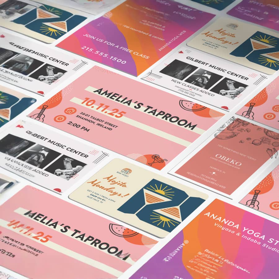
40+ of the best postcard fonts
Each postcard font below is selected based on how it performs in real postcard scenarios, from bold headlines to fine print details. This makes it easier for you to choose the best postcard font for your message, audience and print format.
Business fonts for postcard headlines
Postcard headlines need to grab attention fast. These fonts work best for short, high-impact messages such as promotions, announcements and calls to action. They tend to have strong contrast, bold weights and clear letterforms that remain readable at a glance.
Draw attention with display font headlines and persuade purchases with informative advertisement copy. While a clean geometric sans serif like Bebas Neue or Lader is adaptable to most professional contexts, businesses can get more creative with their promotional postcard fonts using their brand identity.
A classy serif like Sinete, for example, evokes upscale products and tastemaker brands. Gopher has a playful lettering style in thicker variations that pair well with trendy apparel or restaurant brands. An angular sans serif like TT Supermolot Neue comes across as futuristic and useful for tech brands.
Best fonts for postcard body text
Body text fonts for postcards must prioritize legibility. These fonts work well for offers, event details, addresses and CTAs where clarity matters more than decoration. They maintain readability at smaller sizes and print cleanly on a variety of paper stocks.
Given the limited canvas space of a postcard, body text should be easy to scan quickly and readable from arm’s length. That’s why clear fonts like Open Sans and FF Cocon are a popular choice.

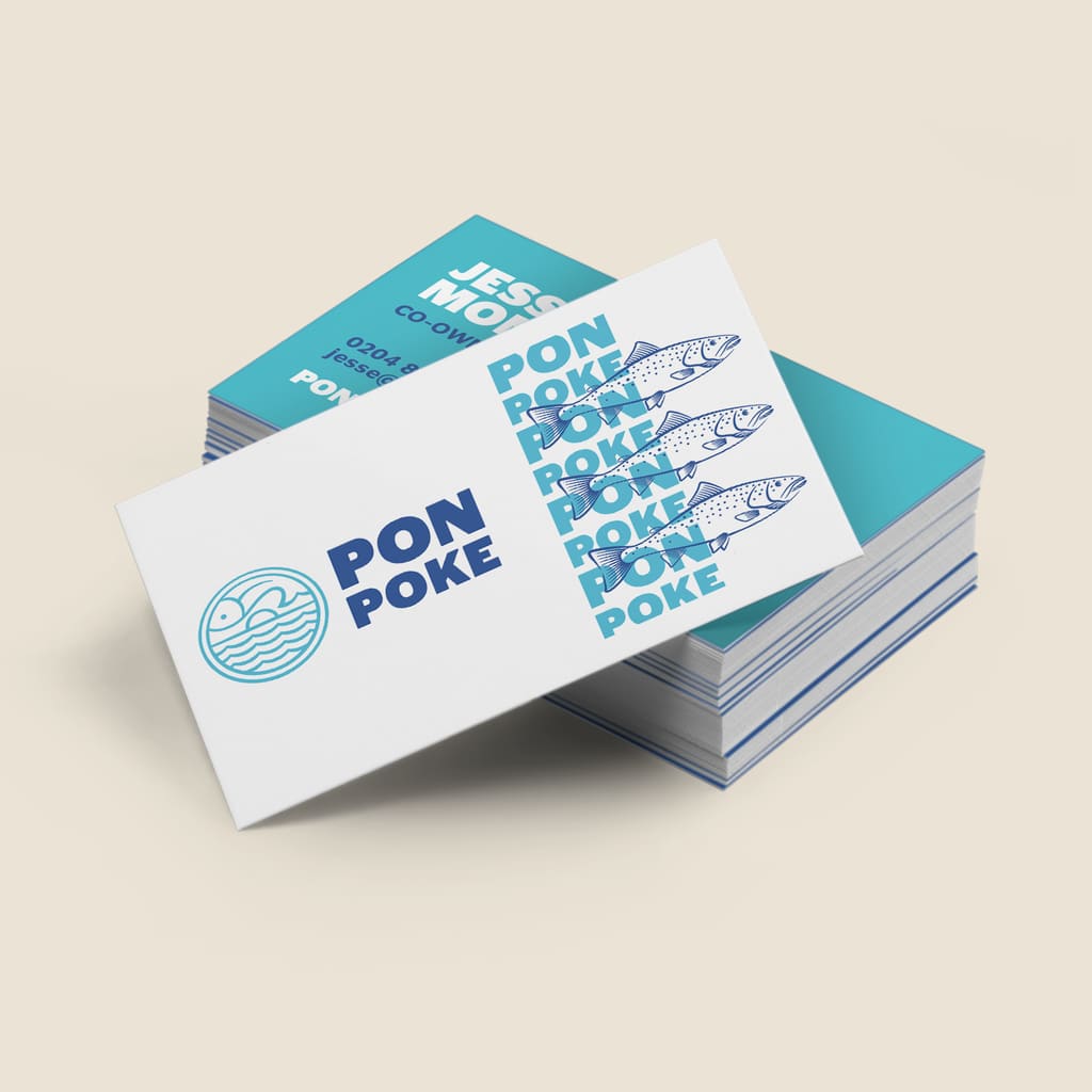
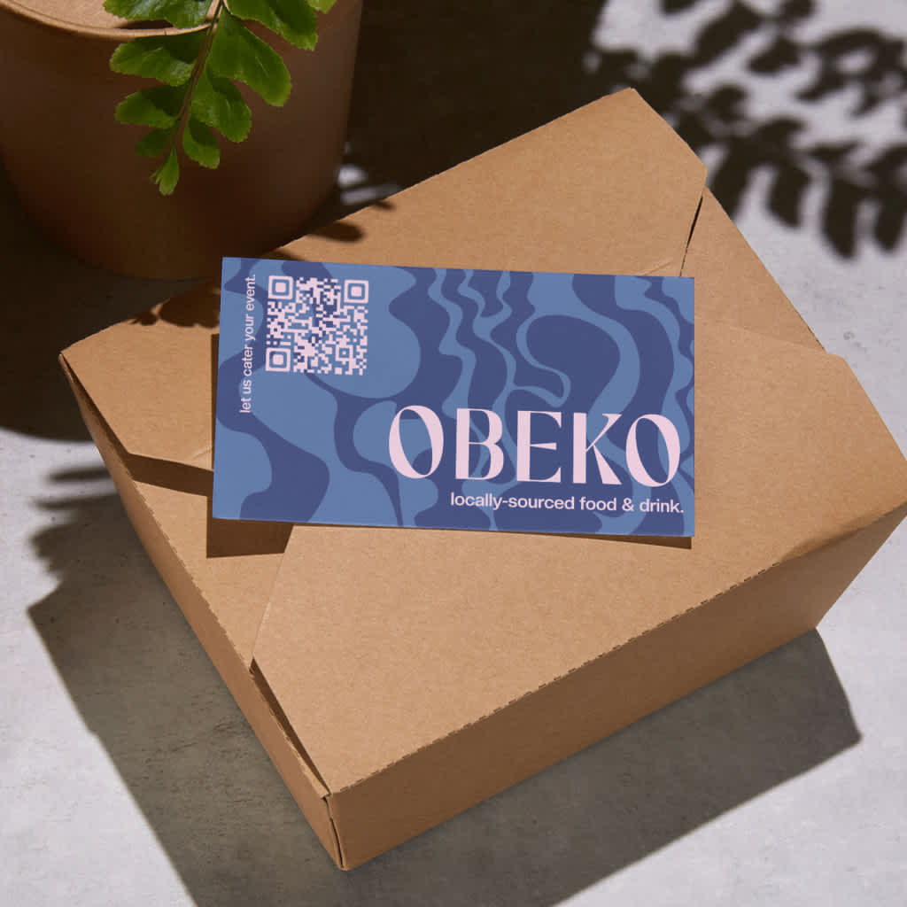
Best fonts for business postcards
Business postcards often require brand-safe fonts that feel professional, trustworthy and versatile. These fonts work well for local marketing, service announcements and customer outreach. Clean sans-serif fonts and balanced serifs like Open Sans and Chopin are commonly used for business postcards because they support both headlines and supporting copy without overwhelming the design.
Best fonts for vintage, travel or event themes
These postcard fonts add personality and emotional tone while still printing clearly. They are ideal for wedding announcements, travel postcards, event invitations and seasonal campaigns where mood matters as much as readability.
For a postcard that conveys a sense of luxury and taste for wedding announcements or formal event invitations, you can’t go wrong with an elegant script or a tall serif like Glow Roses, a serif font with curled letters and stylish ligature connections, which gives the best of both worlds. Script font Holy River contains multiple varieties of cursive swirls for each letter, allowing for interchangeable ornamental flourishes that give the illusion of custom calligraphy.
- Glow Roses
- Holy River
- Autica Monthgel Monoline Script Sans
- Catchy Mager
- Madelyn
- Quelia
- Blue Cashews
- Dodgeland
- Holy Mary
- Rosmerta
Best fonts for illustrated and creative postcards
Illustrated postcards rely on fonts that support the artwork without competing for attention. These fonts tend to be minimalist, subtly stylized or gently hand-drawn to complement the imagery.
Collectors once valued postcards for their characteristic imagery, so it’s no wonder illustrative postcards remain one of the most popular types for artist merchandise, gift store souvenirs or creative business promotions.
Fonts that accompany illustrations are not looking to steal the show but rather reinforce the overall style. Specific font types can cater to specific aesthetics, like the storybook feel of Volkorn or the pixel art in TT New Pixel. Other fonts can match the creative energy of the illustration with unexpected quirks in their letter design, like the shape-changing variance in Transforma.
Get more creative stationery inspiration from our guide to stationery design ideas
Best fonts for hand-lettered postcards
Decorative and hand-lettered fonts work best for short messages, inspirational quotes or creative branding. Because readability can vary, they should be used sparingly and usually at larger sizes.
While many artists design unique hand-lettering for postcards, decorative fonts come close to custom typography for postcards that incorporate inspirational quotes, creative business slogans or personal monograms.
The font Price Check mimics the hand-painted techniques traditionally used for promotional materials. Other fonts embrace digital techniques to reach new creative heights, like Embroidered’s photorealistic stitching.
Best fonts for retro and nostalgic postcards
Retro postcard fonts tap into nostalgia and vintage charm. They are well-suited for travel souvenirs, themed promotions and designs inspired by classic postcards and signage.
Although postcards are still a popular print product, they are an old-fashioned method of communication. Embrace that nostalgia for the good old days of handwritten correspondence with a retro postcard font.
There is a huge selection of bygone eras to choose from, whether the 80s fashion magazine serif font Denton, the feel-good 70s bubble serifs of Plush, the 50s signage lettering of Frontage or the 20s decadence of Luks Deco.
Font pairing tips for postcards
Limit your postcard design to one or two fonts to prevent your design from looking cluttered or hard to read. Pair a bold headline font with a simple body font for clarity and avoid pairing fonts that are too similar, as this reduces contrast and hierarchy.
Current postcard font trends tend to favor clean sans-serif fonts, rounded letterforms and subtle retro revivals. But remember: When following trends, prioritize readability first and use trend-driven fonts sparingly.
For copy guidance, see how to write a postcard that gets results in our guide on how to write a postcard.
Printing tips to keep postcard fonts readable
Follow these simple tips and your postcard will be easy to read and more impactful:
- Use sufficient contrast between text and background
- Avoid ultra-thin strokes that may fade when printed
- Increase line spacing slightly for better legibility
- Always review a proof before printing
Choose the best fonts for your custom postcard
Postcards are pocket-size canvases for creative imagery, and a well-chosen font draws attention to their message while conveying personality and tone. To find the best font for your postcard, consider its intended impact on the reader, research font styles that match this impression and try out options that pair well with your other imagery.
Postcard fonts FAQs
What makes a font suitable for postcards?
A suitable postcard font is easy to read at small sizes, has clear letterforms and maintains clear contrast when printed.
Which postcard fonts are easiest to read when printed?
Sans-serif fonts and simple serif fonts with moderate stroke weight tend to be the most readable on postcards.
Are script fonts a good choice for postcards?
Script fonts work best as accents or headlines, but they should be avoided for long body text as they can be hard to read and are not easily scannable.
How many fonts should I use on a postcard design?
One or two fonts are ideal for maintaining clarity and visual hierarchy, without cluttering the design or impacting the readability.
Do certain fonts work better for marketing postcards than others?
Yes. Fonts with strong contrast, clear letterforms and bold weights perform best for promotional and direct mail postcards.


