Business cards are small but mighty. Handing someone your card is often the first physical touchpoint with your brand. That tiny rectangle (or square or circle!) can capture your personality, your professionalism and even your values. But you don’t have to start with a blank page. Looking at real-world business card examples is one of the best ways to find inspiration.
In this guide, we’ll explore 15 different approaches to card design with tips you can actually apply to your own brand. We’ll also share practical advice on size, shape and finish, plus resources to help you design and print your own.
- Explore diverse business card design examples, from simple typography to bold color and custom shapes.
- Pick one or two standout features (like foil or texture) that fit your brand, rather than try them all at once.
- Use artist business card examples for creative inspiration and professional designs for polished, corporate ideas.
- Apply these insights to design a card that feels personal, practical and memorable—a good business card example you’ll be proud to hand out.
1. Minimalist typography that makes a mark
A pared-back design says a lot without shouting. Think: one strong font, plenty of white space and a simple color palette. This approach is timeless because it communicates clarity and confidence.
You’ll often see this in professional business card examples for lawyers, consultants or architects. But minimalism doesn’t have to mean boring. You can play with font weights, letter spacing or subtle textures in the background.
Print on thick matte stock to add weight to your minimal design. The tactile feel reinforces the message of authority and professionalism.

2. Bold business card examples for standing out
If minimalism feels too restrained, go the other way. Artists, photographers and designers often use business cards as tiny canvases. Bright color gradients, hand-drawn illustrations or even paint-splatter textures infuse designs with instant personality.
For example, a freelance illustrator might showcase a snippet of their work on each card, turning every exchange into a mini gallery. It’s more than a name and phone number—it’s a portfolio in your pocket.
Keep contact details easy to read. Bold backgrounds work best with simple, high-contrast typography.
3. Unique shapes show your business thinks differently
Not every card needs to be a rectangle. Rounded corners, square cards or slim vertical cuts all change the way your card feels in a hand. They also signal that you do things differently.
Learn more about business card dimensions before experimenting. A smaller or square card might be memorable, but make sure it still fits standard wallets and cardholders.
Think about your industry. A square card might suit a café or fashion label, while a traditional rectangle still feels right for accountants or financial planners.

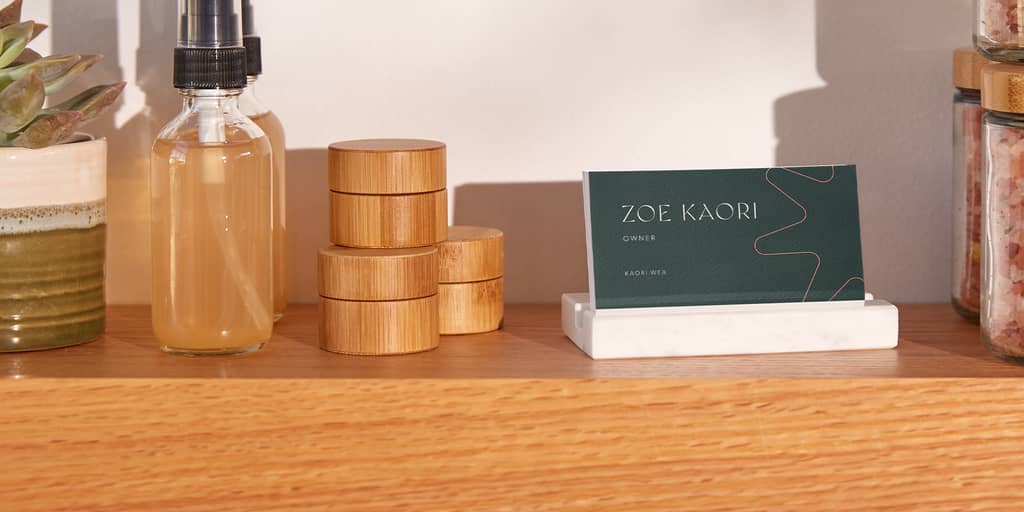
4. Embossed designs for professional business card examples
Texture matters. Embossing lifts elements like your logo or initials off the card stock, creating a subtle 3D effect. It’s not flashy, but it makes people want to run their fingers over your card—which means they’re engaging with it for longer.
For professional services, embossing balances formality with flair. You’ll often see this technique in law firms, real estate agencies or corporate branding. Similarly, the effect lends a bit of polish to more playful brands and in unexpected industries, like retail or photography.
Pair embossing with a restrained color palette. Too many competing features can dilute the impact.

5. Eco-friendly materials reflect your business values
Eco-friendly design isn’t just a trend—it’s a statement of values. Kraft paper, recycled stock or even seed paper shows your commitment to sustainability. It’s especially relevant for eco brands, wellness businesses and food companies that want to highlight their environmental ethos.
One standout example comes from a florist who used seed paper for their business cards, allowing customers to plant them and grow wildflowers.
Mention your sustainable material choice on the back. It turns your card into a talking point.

6. Foil finishes add luxury to your business cards
Metallic foils, including gold, silver, copper and even holographic, transform a simple design into something luxurious. This technique works across industries, but it shines (literally) for high-end hospitality, event planning or beauty services.
Foil doesn’t have to cover the whole card. Sometimes, just highlighting your logo or initials is enough.
Pair foil with dark backgrounds like navy or black to maximise contrast.

7. Multi-purpose business card design examples
Why not make your card work harder? Many small businesses use the back of their card for practical functions: appointment reminders, loyalty stamps or even discount codes. This approach not only keeps your branding front-of-mind but also gives customers a reason to hold onto your card longer.
If you’re a café, add a simple loyalty system. For service providers, use the back for booking details or QR codes.

8. Photography builds instant connection with customers
Images make an instant impact. A strong photo, whether it’s your headshot, your product or an abstract brand image, transforms your card into something memorable.
Photography turns a card into more than just contact info. For example, a wedding photographer might use a striking black-and-white shot from a real event, making the card itself feel like part of their portfolio. It instantly conveys professionalism and builds trust.
Start with images at 300 dpi or higher, this ensures your card looks polished and your visuals stay sharp in print.

9. Vertical layouts modernize your business image
Turning your card portrait-style creates a fresh, modern feel. It also gives you space to stack information neatly, which works well for industries with multiple services.
For instance, a marketing consultant might list services like social media, email marketing and SEO on the vertical back, while keeping the front minimal.
Balance is key. Use strong alignment and grid layouts to keep vertical designs polished.
10. Artist partnerships business card examples
Some brands commission local artists to design their cards. This not only produces one-of-a-kind designs but also signals community support.
Imagine a craft brewery commissioning a street artist for bold illustrations. The card becomes a collectible, something people want to keep, even if they never call.
If you collaborate, credit the artist on the back. It’s respectful and helps cross-promote both businesses.

11. Illustrations make your brand approachable and fun
Illustrations don’t have to be complex. Simple doodles, icons or patterns can make your card approachable and fun. This is a smart option for cafés, children’s services or creative startups.
One café prints latte art illustrations on the back of their loyalty cards. It’s whimsical, on-brand and instantly recognizable.
Think about scale and placement. Small icons can work as patterns on the back, while larger illustrations shine as focal points on the front. Match the color palette to your overall branding for cohesion.
12. QR codes add digital savvy to your business card
We live in a hybrid world, and your card should bridge physical and digital spheres. Adding a QR code or NFC chip lets people jump straight to your website, portfolio or LinkedIn profile.
Learn more about digital business cards to see how small businesses are embracing new tech for this traditional business tool.
Test your QR code before printing. Nothing kills a first impression like a broken link.
13. Textured finishes elevate your business feel
The finish of your card changes the whole feel. Options like soft-touch matte, linen or gloss coatings create a sensory experience. A soft-touch matte feels silky, while gloss can make colors pop.
Match your finish to your industry. Glossy cards suit bold creative businesses, while soft matte feels premium and understated.
14. Color blocking grabs attention for modern businesses
Color blocking uses strong contrasting sections to grab attention. Think half neon pink, half crisp white. It’s simple but striking.
This style works well for modern startups, fashion brands or agencies that want to look cutting-edge.
Stick to two or three colors max. Too many blocks can look messy.

15. Die-cut business card examples
Shape can be as powerful as color. Die-cut cards take on unique forms, like a house outline for real estate, a guitar pick for musicians or a camera shape for photographers. This extra level of customization makes your card more memorable and reinforces your brand identity.
If something iconic suits your brand, be sure to explore our unique business card examples for more inspiration.
Aim for designs that balance fun with function. Think of a coffee shop with a cup-shaped card that still slots into a wallet or a photographer’s camera cutout that doubles as a frame for a mini photo.

How to apply these business card examples to your brand
It’s easy to get carried away when you see so many clever ideas. Metallic foil catches your eye, embossing feels luxe, die-cuts are fun and bold gradients look striking. But the best cards usually focus on just one or two standout features and let them shine. Layering too much at once can dilute your message and make your card feel busy rather than memorable.
So how do you narrow it down? If you want inspiration that feels bold and creative, start by looking at artist business card examples. If you’re aiming for polish and authority, browse professional business card examples. As you compare, ask yourself three simple questions:
- Does this reflect my brand personality?
- Will it resonate with the customers I want to attract?
- Is it practical enough for everyday use?
If you’re stuck, the best move is to go back to the basics. Our guide on how to design a business card walks you through layout, typography and hierarchy so your card communicates clearly. Once you’ve nailed the essentials, dive into more creative business card design ideas to add those unique touches that make your card yours.
Think of it as a two-step process: build a solid foundation first, then add a design element that feels true to your brand. That’s how you move from simply copying a good business card example to creating one that’s completely your own.
Ready to create your own stylish business card?
VistaPrint makes it easy to bring your vision to life. Choose your style, upload your design or customize one of our templates. Start designing your business cards today.
FAQs about business card examples
What makes a good business card?
Good cards balance clarity with creativity. They highlight your brand identity and make people want to hold on to them.
What size should a business card be?
The most common size is 3.5 x 2 inches, but you can explore variations. For tips, our guide to business card dimensions will cover everything you need to know for a standout card.
Are vertical cards professional?
Yes. Vertical layouts look fresh and modern when balanced with clean typography.
Do digital business cards replace paper ones?
Not yet. Physical cards still create personal connections. The best approach is a hybrid: a printed card with a QR code or NFC to your online presence.
Can artists use business cards effectively?
Absolutely. The best artist business card examples show how cards can double as mini artworks, making them highly collectible.
Which finishes are most popular?
Matte and gloss are classics. Soft-touch matte is trending for premium brands, while recycled kraft stock appeals to eco-conscious businesses.
