Designing merch that people actually keep comes down to what stays after the first interaction. Bigger formats can work, but they ask for time, space and a decision. Micro merch moves differently. Stickers, labels, small collectibles slip in easily, then stick around. One lands on a laptop, another on a water bottle, a third on a notebook. Those placements add up – small, repeated moments that build familiarity over time. One sticker turns into a few, and suddenly your brand is part of someone’s everyday.
That’s where custom sticker design starts to matter. In this guide, we break down how to design a sticker that holds up in the real world, explore the merch design trends for 2026 and discuss guerilla marketing with stickers – turning a simple format into a scalable brand-building tool.
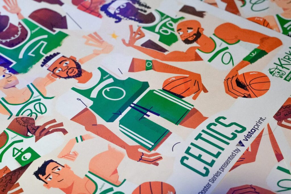
Along the way, we draw on insights from Kirk Wallace, founder of Bonehaus and Boston Celtics Artist in Residence. His art-first philosophy, rooted in an engineering background, balances technical print precision with visual storytelling – visible in work that prints clean, reads instantly and holds up in use.

- Micro-merch builds your brand through small, repeated moments that show up on everyday items and keep your brand in view over time.
- To design a sticker, focus on clarity and simplicity by using strong visual hierarchy, high contrast and elements that hold up at small scale.
- To choose the right shape, consider how the sticker will be used – standard shapes keep things clear and cost-effective, die-cuts help you stand out.
- The merch design trends shaping 2026 include minimal icon-driven designs, Y2K details, imperfect visuals and collectible sets.
- Use micro-merch for branding and engagement by adding them to packaging, releasing limited drops, handing them out at events or connecting online and offline.
The sticker strategy: Building a brand through micro-moments
Big merch asks for commitment. A hoodie needs the right size. A tote competes with five others already at home. Even a well-designed tee raises questions: Will I actually wear this? Does it fit my style? Do I want to carry this brand around?
Even a fleeting moment of hesitation is enough to stall momentum.
If you want to remove friction, the entry point has to feel effortless – free of sizing concerns, commitment asks or second thoughts. Only things that slip into a hand and stay there make the cut. Stickers fit that role perfectly.
Cheap, small and easy to overlook, stickers tend to get dismissed as throw-ins. But that’s also exactly why they work. A well-designed sticker lands without pressure and still feels worth keeping.
Because they ask for very little and give something back right away, these small pieces turn into ‘bits of joy.’ A detail, a character, a clever line – something that makes a person stop for a second.
That moment can show up in a few different ways:
- Packaging inserts add a small reward to an otherwise routine unboxing, which makes the whole order feel more considered.
- Product labels carry enough personality to help shape how customers view your brand rather than mindlessly gloss over.
- Event giveaways stick around because they don’t take up space and don’t require a decision on the spot.
- Collectible series create a reason to come back, especially when there’s a limited run involved.
Source: Sticker design by Kirk Wallace
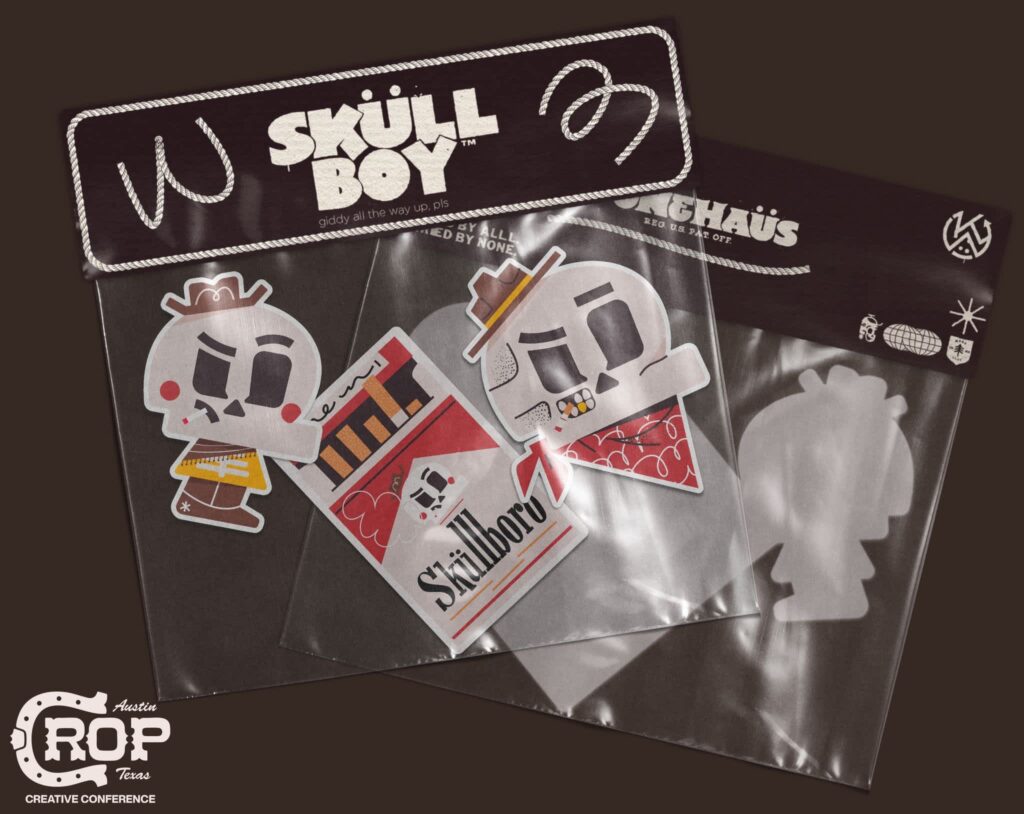
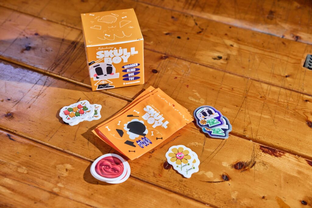
Kirk Wallace leaned into the collectible aspect while working on the branding for a wooden toy project for a client, Skully:
“Toward the end, I kept looking for ways to make the product feel more unique, so I added these little stickers and hand-wrote with a gold foil pen 1–20 and numbered them all. It felt so fun and made something go from ‘just a piece of wood’ to something special that’s worth collecting.”

Source: Branding by Kirk Wallace

Source: Packaging design by Kirk Wallace
In Skully’s case, numbering stickers by hand changed the flow of the interaction. Instead of simply taking one, people checked the number, compared and held onto it. Just like that, a simple format turned into something collectible.
For small businesses, marketing with stickers works for a few practical reasons:
- Affordable: Low production cost makes it effortless to test ideas without committing upfront.
- Portable: Weightless and compact, stickers are easy to include in orders, hand out at events or carry in bulk.
- High visibility: Once placed, they stay in sight, often in places you didn’t plan for.
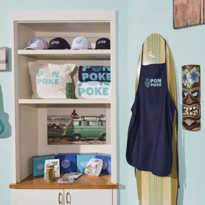
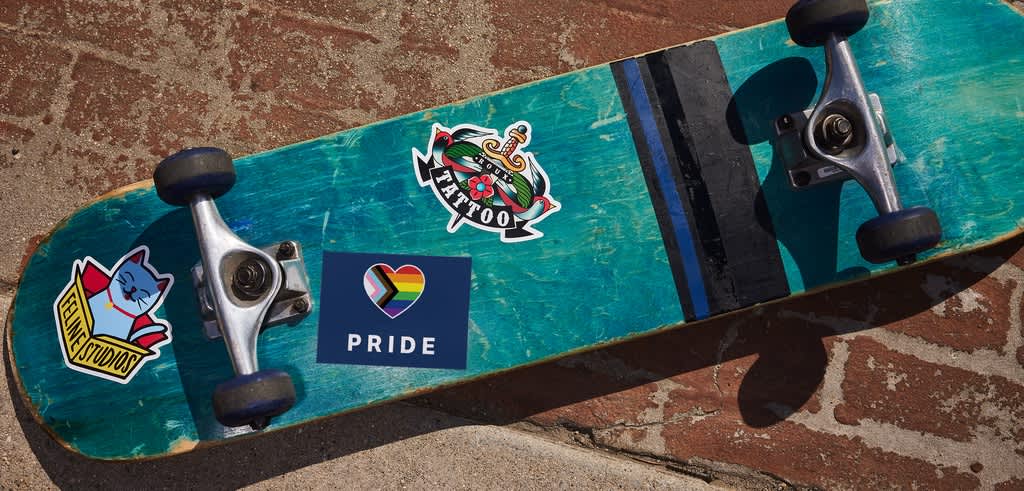
That last benefit is arguably the most important. Micro-merch ends up on laptops, water bottles, notebooks – your customer decides where to put your stickers, often on items that make a statement and travel with them.
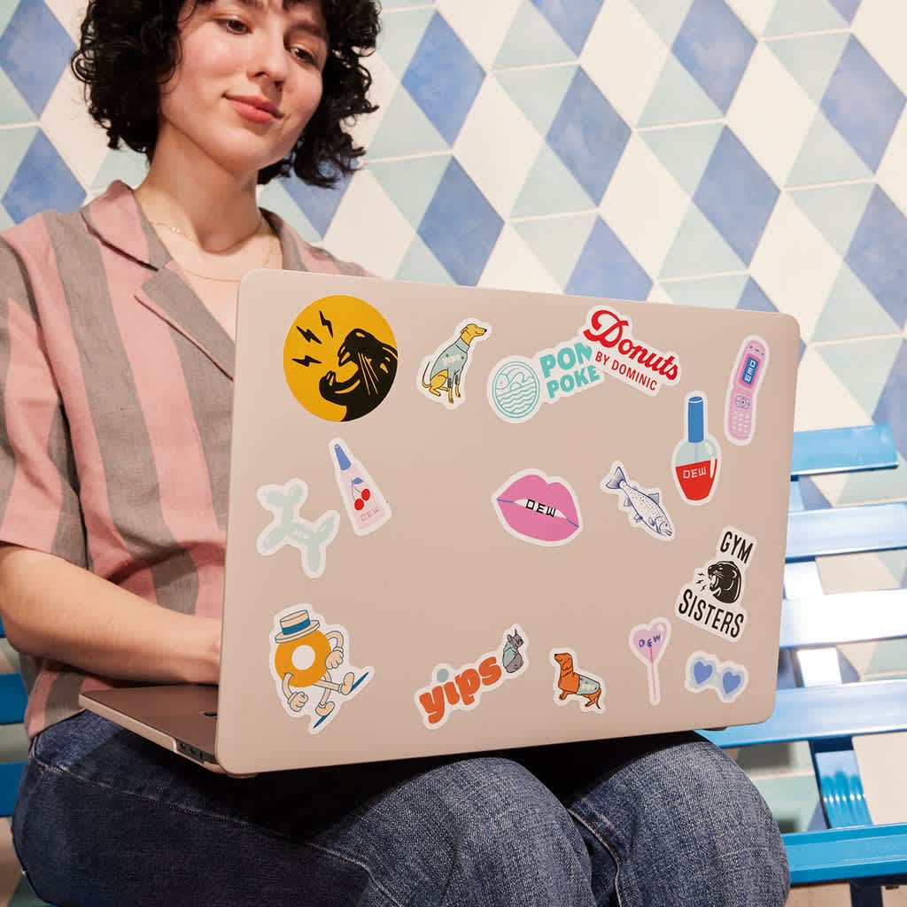
That’s what makes stickers such a strong starting point. They let you test your visual identity in a low-risk format and see what actually connects. Once something lands, it’s easier to carry it into larger formats – apparel, packaging or a full micro merch line.
Designing merch on a tiny canvas: Sticker design fundamentals
The same way stickers act as “bits of joy” for the people getting them, they’re just as fun to create for the businesses behind them. Affordable and low-risk, they give you room to experiment with ideas you wouldn’t attempt on larger merch.
That freedom comes with a constraint, though. You’re working with a few centimeters of space, often seen at a glance. What stays, what goes, what leads – every decision shows. There’s no room for clutter, and every element has to earn its place.
When in doubt, take something out and see what breaks. If the design still works, it doesn’t need to be there.
Once you start figuring out how to design a sticker, that balance becomes obvious. No matter how unconventional the idea, the best-working custom sticker designs tend to follow a few consistent rules. As Kirk puts it, “the best results come from balancing instinct with structure.”
Visual hierarchy matters more at small scale
At sticker size, attention is limited, and everything competes for it. If the design doesn’t guide the eye immediately, it gets skipped.
That’s why custom sticker design usually starts with restraint.
Simplify your brand elements first by reducing fine detail, avoiding thin lines and removing anything that won’t hold at small scale. Then, instead of squeezing everything onto one tiny canvas, pick one core element – a logo, an icon or a character – and build around it.
Trying to fit everything in often leads to nothing standing out, so commit to a single idea.
Kirk sets that priority early:
“One of the first questions I ask with stickers is ‘how big will it be?’ As well as ‘what is its purpose?’ and ‘where will it live?’ That helps me understand what needs to be included and the priority to it all.”
Really, where the sticker ends up should guide the design:
- If it’s meant to stand on its own – handed out at an event or placed somewhere visible – it needs a clear focal point that reads instantly.
- If it’s going inside packaging, it can be more subtle and detailed, since people will have time to look at it up close.
Instead of forcing everything into one design, he leans on the format itself:
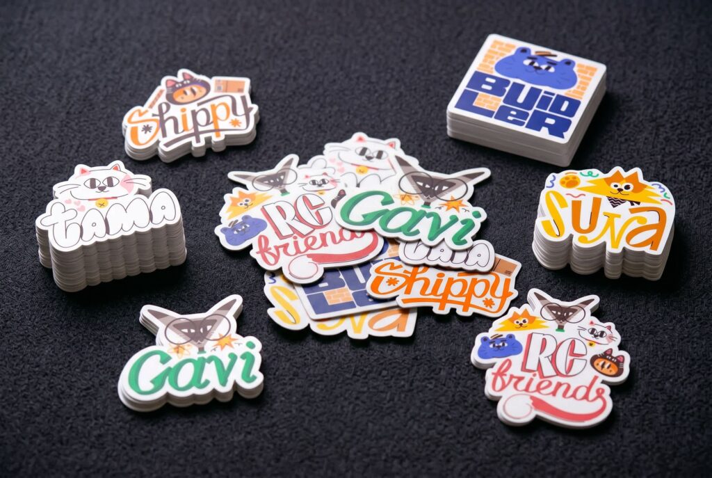
“The nice thing about stickers is they’re pretty affordable and plentiful. So it’s easy to make a few different stickers that all carry their own weight, rather than one massive super-sticker that tells multiple stories. One sticker, one story.”
That approach also makes the system easier to scale. Instead of trying to piece individual stickers into one cohesive whole, work backwards – start with a full composition, then simplify:
“I like to create a big combo sticker with the message, logo, character and icon all together… and then break it out into separate simpler stickers. That’s a great way to know that all the designs will work together nicely.”
Source: Kirk Wallace
The same rule holds whether the format shrinks or expands to an extreme. A tiny sticker and a billboard ask for the same thing – clarity that reads instantly.
Bold color and contrast
Once the structure is locked in, color takes over. At sticker scale, color tends to carry the strongest first impression – and the longest memory. If the contrast is off, even a well-composed design starts to fall apart.
High contrast keeps the design readable at a glance, separating elements and reinforcing hierarchy. It also helps the design hold together once the sticker leaves your screen and ends up in less controlled settings – like a cluttered laptop lid, a scratched water bottle or a crowded event table.
To get contrast right, pair light and dark deliberately – avoid placing mid-tones on mid-tones, as they tend to blur together. Before finalizing, check your design in grayscale. If elements still stand apart, your contrast is doing its job.
No matter how important readability is, it’s only half the equation. Another job color carries is making the design an extension of your brand – unmistakably yours.
That recognition comes from consistency. If every sticker uses a different palette, there’s nothing for people to latch onto.
To make color work in your favor:
- Start with your brand colors: Use one or two as the foundation across your stickers.
- Choose supporting colors carefully: Make sure they complement your brand palette, not compete with it.
- Keep the palette tight: If in doubt, reduce the number of colors – simple combinations are easier to control and often read better at small scale.
- Adapt colors for contrast: Ensure your main color stands out clearly against the background, even if that means adjusting shades slightly.
- Check how they behave in context: Test color performance on light, dark and textured surfaces, not just on a clean screen.
To keep colors consistent from screen to print, convert your design to CMYK early, avoid subtle gradients and print a small sample before ordering in bulk.
Source: Sticker design by Kirk Wallace
Over time, those choices turn color into a shortcut. People start recognizing your brand without needing to read anything. It also speeds things up. Once the palette is set, there’s no need to rethink it every time, so you can move faster and focus on making.
Typography that survives shrinking
Most stickers only have a few centimeters to work with. That leaves very little room for text, and even less for fonts that rely on fine detail.
To make type work at this scale:
- Use clean, legible fonts: Choose sans-serifs like Helvetica, Inter or Futura that hold their shape when scaled down.
- Avoid thin strokes and complex scripts: They blur or disappear once printed and placed.
- Keep it short: Stick to a word, a number or a symbol rather than a full phrase.
- Adjust for size: Increase weight, spacing or scale until it reads instantly.
Kirk’s smaller sticker work leans into that balance:
“Those tiny numbered stickers… they’re so small. A bit aesthetic, but also informational and intentional.”
![Rows of custom small, round, die-cut sticker singles with a frame, the “Wagepoint hero 2022” text inside the frame and golden hand-written numbers “–/50”]](https://blogadmin.vpsvc.com/hub/wp-content/uploads/2026/05/custom-small-round-die-cut-stickers-2-1024x716.jpeg)
Source: Die-cut sticker singles design by Kirk Wallace
Most importantly, always stay realistic. As much as you might want to use your brand fonts, some typefaces aren’t built for small formats. When that happens, legibility takes priority. You can carry your identity through color, layout or illustration instead.
If a specific letter or detail isn’t reading well at a small scale, adjust it. Fonts are just shapes. Small custom tweaks in spacing and weight can improve legibility without losing the overall feel.
Designing with shape in mind
Up to this point, everything lives on the surface. Shape is where the design starts interacting with the real world.
It affects how the sticker is applied and how it feels once placed. If you treat the shape as an afterthought, even a strong design will feel awkward in use.
Kirk often comes back to designing for the surface itself:
“I speak often about ‘designing for your canvas.’ Thinking about tattoo design – what looks great on a skateboard doesn’t mean it’s going to make a good tattoo. Match the curves, blend with it or contrast it… be thoughtful.”
If there’s one thing to keep in mind when designing merch, it’s that stickers don’t exist in isolation. They go on laptops, bottles, packaging – each with its own shape, texture and wear. The outline should account for that, either working with the surface or deliberately standing apart from it.
In practice, it comes down to the shape you choose. Different shapes signal different things, so the outline should match what the sticker is trying to do:
- Closed shapes (circles, rectangles): Feel stable and contained, making them a strong fit for logos or information-driven designs.
- Die-cut shapes: Follow the contour of a character or object, giving the sticker more personality and making it easier to recognize.
- More expressive cuts: Use irregular outlines like wavy borders, asymmetrical blobs or exaggerated silhouettes, leaning into playfulness and making the piece feel more collectible.
Kirk’s work reflects that split:
“I think I have characters mostly as die-cuts and informational stuff more as closed shapes. The more ‘information-driven’ the sticker is, the simpler the shape, in most cases.”
Source: Sticker design by Kirk Wallace
Get the shape right, and each sticker carries its role without confusion – whether it’s meant to inform, decorate or stand out.
How to choose the right shape for a custom sticker
Shape already does a lot of the storytelling, but it’s rarely the only factor behind the final decision.
Once you move from concept to production, a few practical constraints come into play:
- Budget
- Print method
- Material
- Placement
- How the sticker will be used
A design that works on screen might need adjusting once you factor in cost per cut, surface durability or how easily it peels and applies.
Kirk often approaches this as a balance between expression and restraint:
“If the sticker is a hero – the main piece, the one meant to stand on its own – I tend to lean into die-cut and let it be fully playful and unique. But if the sticker is assisting a hero… I lean into simpler holding shapes like circles and squares, so it doesn’t steal the thunder.”
In a nutshell, the choice usually comes down to how the sticker is meant to be used:
- Standard shapes: Circles, squares and rectangles are predictable in the best way. They’re cheaper to produce, easier to stack or ship and work well when clarity matters more than novelty.
- Die-cut shapes: Custom outlines give the design more presence. They work best when the sticker is meant to stand out on its own or carry a stronger visual identity.
- Framed silhouettes: A hybrid approach. Start with a clean base shape, then let parts of the design break the edge. It keeps things cohesive while still adding character.
Kirk often builds within those expectations: “You can lean into a tidy badge shape… or have elements poke out to make it unique.”
Source: Sticker design by Kirk Wallace
Before sending anything to print, consider the basics: finish (matte vs. gloss), material (paper vs. vinyl) and cut type (kiss-cut vs. full die-cut). These choices affect both cost and durability. For a deeper breakdown, see this guide on how to print stickers.
Merch design trends 2026: What’s shaping sticker aesthetics
Once the fundamentals are in place, you have room to play. Instead of demanding perfection, stickers reward ideas that feel current, distinct and a little unexpected.
That’s where merch design trends 2026 come in – less as rules to follow, more as a snapshot of what people are responding to right now.
And the best part is that they don’t box you in… Just give you something to build on. The value comes from knowing what’s resonating, then borrowing what fits and leaving the rest. Used this way, trends sharpen your visual language and give people something they actually want to keep.
Opt-Out Minimalism
Less to read means faster recognition. This direction leans on icons, marks and shapes that already carry meaning, so the design can stay minimal without losing clarity.
Kirk points out how much visual language is already defined:
“For the longest time, people were fussing over putting everything on there – social handles, email, phone number. Now it’s really just an @ and your name. People will find you. Focus on the fun parts instead… We’re in a time of knowing what a play button does without it needing to say ‘play’… So we can get weird, simple, abstract.”
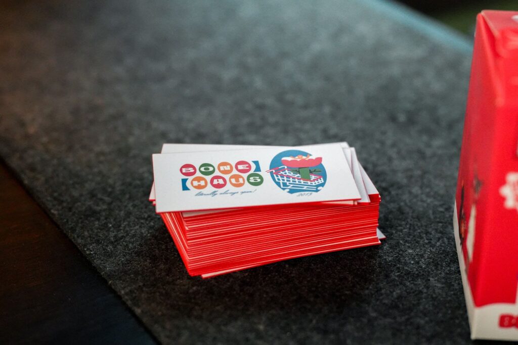
Source: Business card design by Kirk Wallace
Best for: Logo stickers, brand marks, anything meant to register instantly.
Instead of layering in handles, URLs or extra context, reduce the idea to a single signal and let it hold.
Y2K Nostalgia
Y2K aesthetics translate well to stickers because they thrive on bold surfaces. Chrome textures, glossy gradients and oversized type create visual weight even at small sizes.
Kirk frames it as a shift in how we use information:
“What we actually had to design for in 2000, we get to now treat as aesthetic.”
Crop marks, Pantone labels and “net wt.” tags become part of the design, adding detail without relying on scale.
Best for: Standout stickers, packaging inserts, designs meant to catch attention on cluttered surfaces.
Perfectly Imperfect
At sticker size, small imperfections become part of the charm. Hand-drawn lines, uneven shapes and irregular outlines give the design texture that polished vectors often lack.
Wallace sees it as a response to overly clean outputs:
“One thing robots and AI can hopefully never take away from us is our flaws… we really should be celebrating them… Perfect is boring. Let me see human life on this little tiny screen I stare at all day.”
Source: Poster design by Kirk Wallace
That human trace makes stickers feel more personal, especially when they’re handled, shared or collected.
Best for: Character stickers, illustrative designs, anything meant to feel personal or expressive.
Collectible Series
Stickers rarely live alone. Sets, variations and limited micro-merch runs turn individual designs into something people want to keep, compare and collect.
Kirk ties it to how brands use merch today:
“We no longer need to worry about how serious something is… no one’s confused if a tech company makes a toy. From there, let’s bring in all the things we love – stickers, merch, collectibles.”
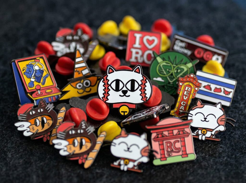
Source: Pin micro-merch design by Kirk Wallace
Numbering, color variants or small changes across a series add depth without complicating each design.
Best for: Drops, product launches, repeat engagement through small variations.
Creative ways to use custom stickers for branding and engagement
No matter what custom sticker design you go with—whether it leans into merch design trends 2026 or reflects your brand alone—there’s a way to turn it into sticker advertising. In fact, stickers are one of the simplest ways to tap into guerrilla marketing: using small, unexpected touchpoints to spark curiosity and engagement without a big budget.
Here are a few creative ways to use custom stickers for branding and engagement:
- Packaging surprise: Add stickers to shipments to create a small moment people don’t expect. It turns routine delivery into something worth sharing.
- Collectible drops: Release limited-edition sets tied to product launches. Variations and scarcity give people a reason to come back.
- Event marketing: Hand out stickers in person to start conversations and keep your brand visible after the event ends.
- Digital bridge: Use QR codes to link stickers to pages, content or offers, turning a physical item into a point of entry.
- Community building: Encourage customers to share where their stickers end up. It extends reach and builds a sense of participation around your brand.
The key is to think beyond logos. The most effective sticker campaigns use short, intriguing messages or bold visuals that make people pause, engage, or share—turning each sticker into a small but powerful brand interaction. And, while each approach works just fine on its own, combining them turns stickers into a channel rather than a one-off.
Want to bring both offline and online into your sticker marketing strategy? Pair printed stickers with digital stickers to extend their reach across both.

Turning small surfaces into brand storytelling
Stickers may be small, but they carry real weight. The ones that last come down to a clear idea, executed with precision and just enough personality to make someone keep them.
That shows up in every decision – from shape and color to type and placement – and holds once the sticker leaves your hands. Trends can push things further, and smart distribution helps them travel, but the foundation stays the same.
For small businesses, that makes stickers an easy place to start. They’re quick to produce, simple to test and easy to adjust as your brand evolves. With VistaPrint, you can take that idea from screen to surface without overcomplicating the process – whether you’re working with standard shapes or custom cuts, paper or vinyl, matte or gloss.
FAQs about designing micro merch
How do I ensure my sticker design doesn’t look cluttered?
Start with one focal point and build around it, then strip back detail until the design reads clearly in a split second at its actual size.
What is the difference between a die-cut and a kiss-cut sticker?
Die-cut stickers are cut to the exact outline of the design for a clean, standalone look, while kiss-cut stickers keep a backing border that makes them easier to peel, package and distribute.
Can I include a QR code on a small product label?
Yes, as long as you give it enough space, keep contrast high and test it on a printed sample to avoid scan issues.
Which materials are best for outdoor or high-use stickers?
Vinyl with a protective laminate holds up best, since it resists water, UV exposure and daily wear without fading or peeling.
How do I choose a font that is legible at a very small scale?
Choose a simple sans-serif with solid weight, avoid decorative details and always check how it performs once printed at the final size, not just on screen.