
We chatted with Tristan LeBreton, Creative Director at 99designs by Vista, for tips on creating a brand style guide. Read on for Tristan’s advice and learn why your small business needs a style guide.
As your small business grows bigger, so do the opportunities for people to discover you for the first time. From accepting your business card at an event to visiting your website for more information, every experience people have with your business should be consistent.
Because your brand isn’t just a logo and color scheme – it’s the experience people expect from your business, and the words they use when recommending you to someone else. And a key part of staying consistent is creating a brand style guide.
According to Tristan LeBreton, Creative Director at 99designs by Vista, a style guide is a visual document that outlines how your business looks and speaks to the world. “It captures the heart and soul of your brand – your mission, vision, and values – and presents it as a visual reference tool for your business.”
Your brand style guide ensures your print and digital marketing efforts are coordinated and represent your business accurately and professionally. Detailed brand guidelines can also help you show new employees how you talk about the business, along with your products and services.
Tristan says that a typical brand style guide should include a summary of your brand story; logo variations and best usage; color palette and tone of voice; and preferred typography. “It’s a powerful tool for small businesses, as it not only shapes your overall brand identity but helps maintain consistency across how it is used, positioning you as a credible, reliable and trustworthy business. There’s a reason some people call it a ‘brand bible.’”
Here, we’ll go over everything you need to create a brand style guide for your small business.
1. Start with the “why.”
Tristan notes that before you even start creating a style guide, you need to know your brand inside and out. “This includes your mission, vision, core values, brand personality and your target audience. Your brand identity simply serves to communicate these elements to the world through design…so it’s important to nail these first.”
So, a great way to open your style guide is with your brand mission, vision statement or an action-oriented declaration of how your business serves your customers. We like opening with a mission statement because it immediately establishes the kind of customers you’re trying to reach, sets the tone for how you present your brand and shares what you stand for.
And beyond defining what you do, your brand mission shares the purpose of your work and the effect you intend to have on the world around you. It states what you do for others and the approach you follow as you aim to achieve the goals you’ve set for yourself and your business.
Vistaprint Tip
Struggling to start? Tristan recommends collecting references and inspiration from existing brands. “What do you like about their design choices? Getting really specific with your notes – right down to how you feel about their font or brand voice – will help you build a detailed picture of what you do and don’t like.”
2. Identify what makes you unique.
When writing your mission statement, you may have identified your unique selling proposition (USP). This communicates how your business differs from the competition, and is another piece of the brand puzzle that needs a place in your style guide.
Your USP speaks directly to your target market—in their language, about their problems, beliefs or concerns. So, including your USP in a consistent way across print and digital means you’re building credibility and ingraining your brand in your audience’s mind. Branding is all about recognition, and your USP plays a big part in convincing people why they should choose you over your competitors.
And while your brand mission, values and USP aren’t necessarily tangible marketing assets, they are at the core of every interaction with your business. They direct the tone, aesthetic, channel and platform, making them necessary for any comprehensive brand style guide.
3. Define how to use your logo.
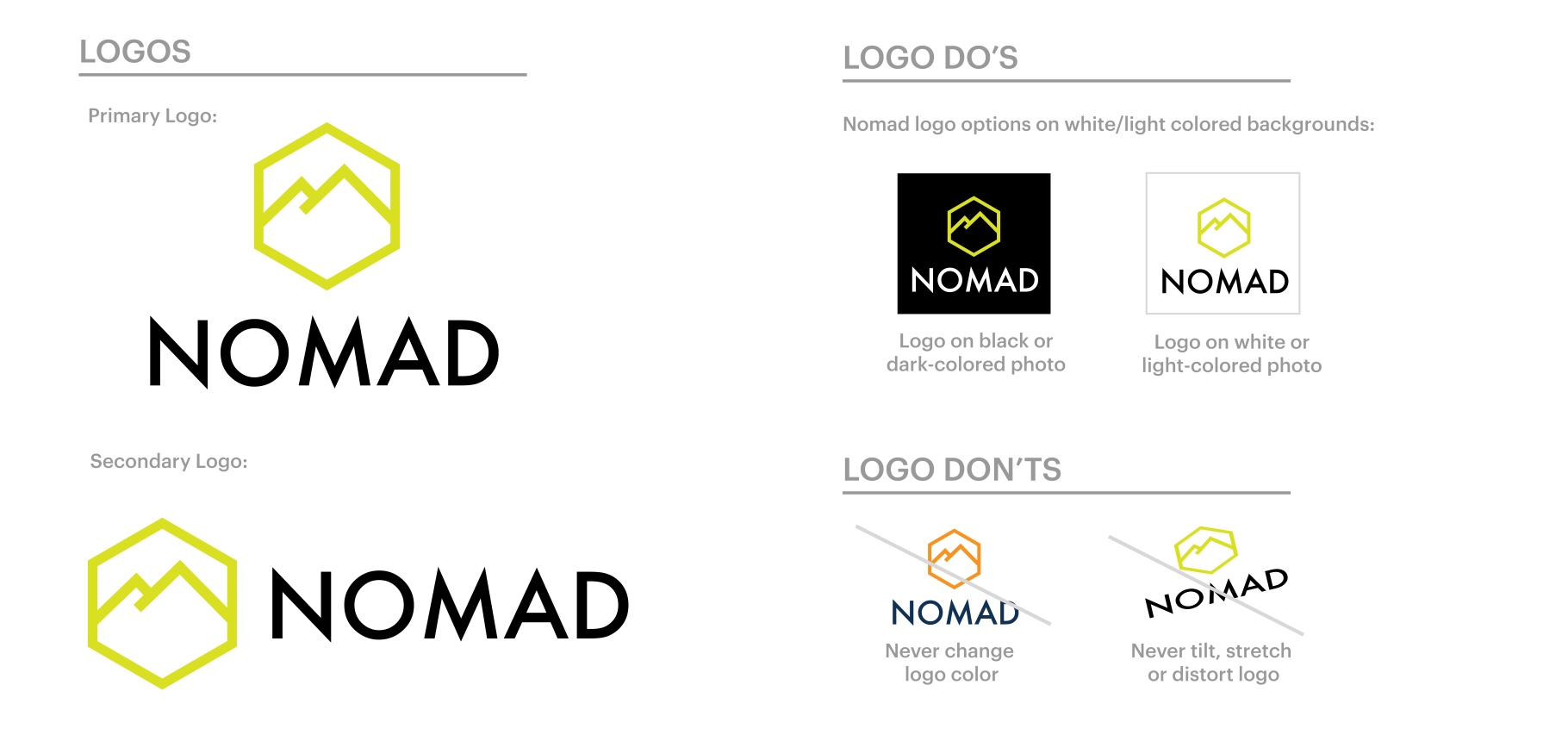
Your logo is the visual representation of your business and makes it easy for people to recognize your brand. It’s a good idea to include your logo in your brand style guide, along with an explanation of what it represents. Since a brand style guide is meant to be an educational and actionable resource for internal and external partners, explanations are always helpful.
Beyond , your brand style guide should show approved and unapproved use cases for your logo. Feel free to have as many variations of your logo as you want in your style guide, and make sure each one ties back to a specific use. This is your catch-all, so be as robust or lean as you’d like. For example, providing specific dimension ratios, color inversions and black and white only logo specs will help keep consistency across your marketing materials.
After all, says Tristan, “Consistency is one of the most important factors in creating a strong brand identity that customers recognize, connect with and, most importantly, trust. If your brand looks different on your website than your social media page, this can confuse customers. A brand style guide gives you a single source of truth for how your brand should look, wherever you use it.”
4. Specify your color palette.
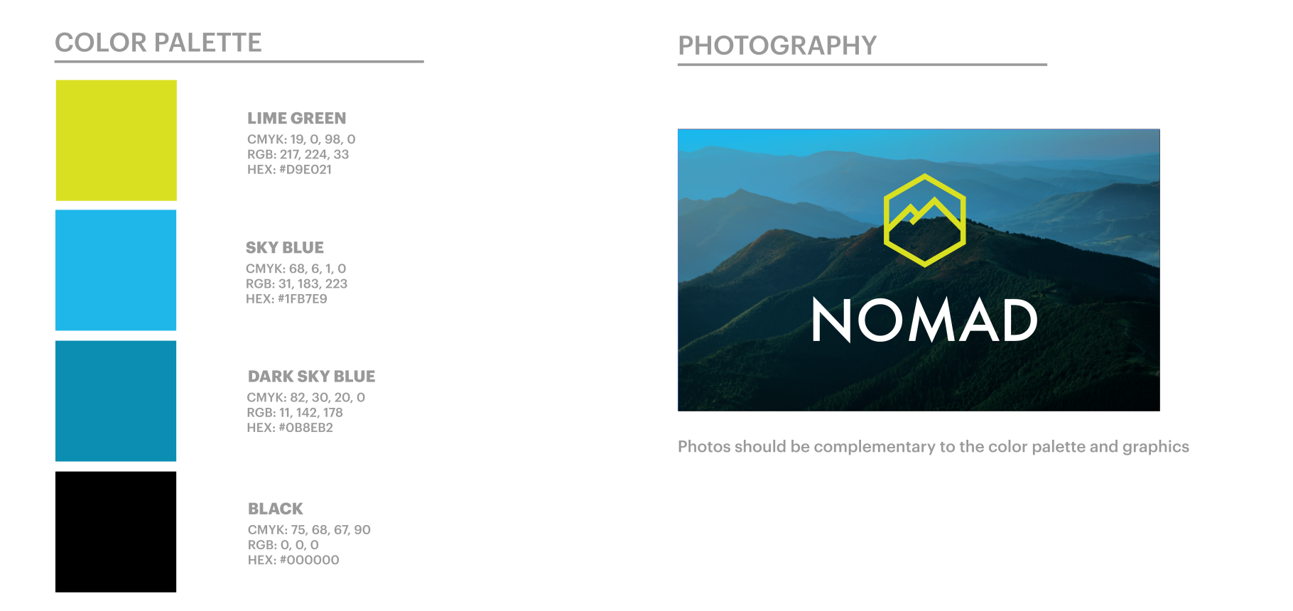
Aside from your logo, you’ll want to define one to three colors in your color palette. Add those colors to your brand style guide, including the color names, CMYK swatches and hex codes (the HTML version of color names).
Much like your logo, it’s important to use the same colors across your marketing materials, signage, website and social accounts – this will help you build a reputable and recognizable brand. Having your approved colors and relevant information in your style guide means there’s less room for errors.
It takes time to find the perfect suite of colors, so be sure to research popular associations with colors and what palettes are trending during the process. Once you’ve narrowed them down, use your style guide as a home for your color palette. You’ll save time in the long run by having your specific colors in one place, and your online and offline brand presence will be cohesive.
Vistaprint Tip
When putting a style guide together, Tristan recommends being clear about how the guide will be used in the future. “Will writers be using it to understand your brand’s tone? Do you need HEX color codes for your website or CMYK colors for printing? Consider who is going to be using your style guide – whether it’s just you, an employee or freelancer – as this may impact how it’s created and what’s included.”
5. Select typography.
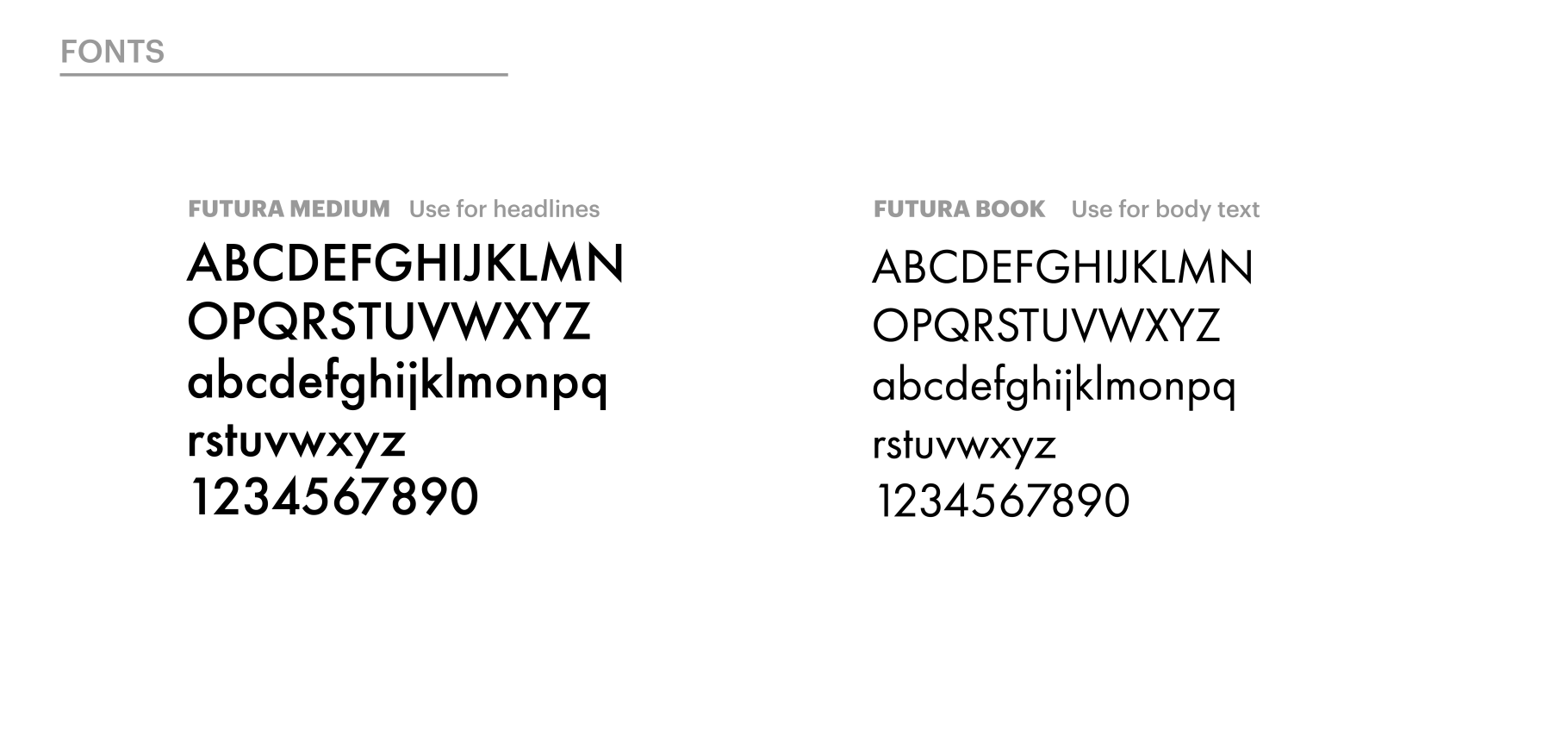
Just like your brand colors, you need to use the same suite of fonts to build a trustworthy and consistent brand. And while you were designing your business card or creating your first flyer, you probably chose one or two fonts that felt right for your brand. So, consider these your approved set of fonts. Add the names of these fonts and their preferred sizes to your style guide, along with examples of use cases.
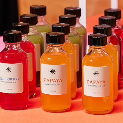
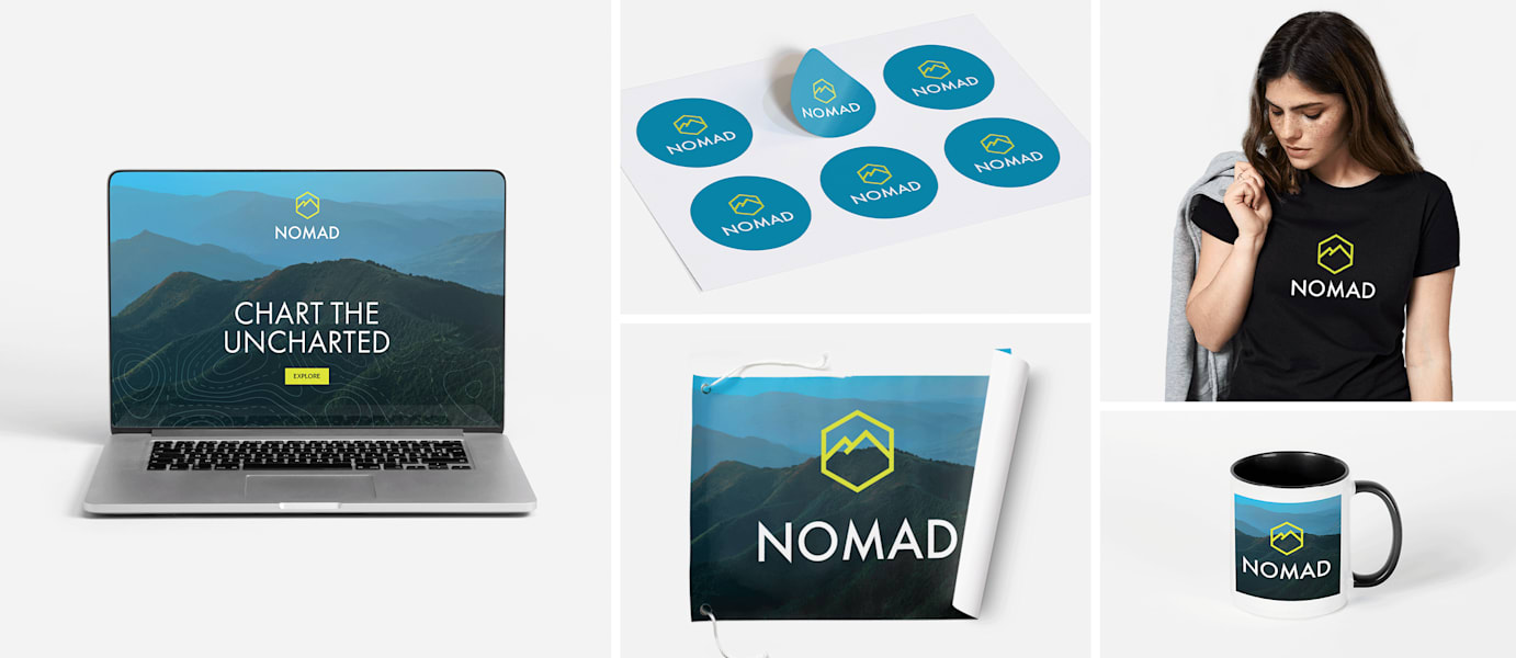
6. Choose appropriate imagery.
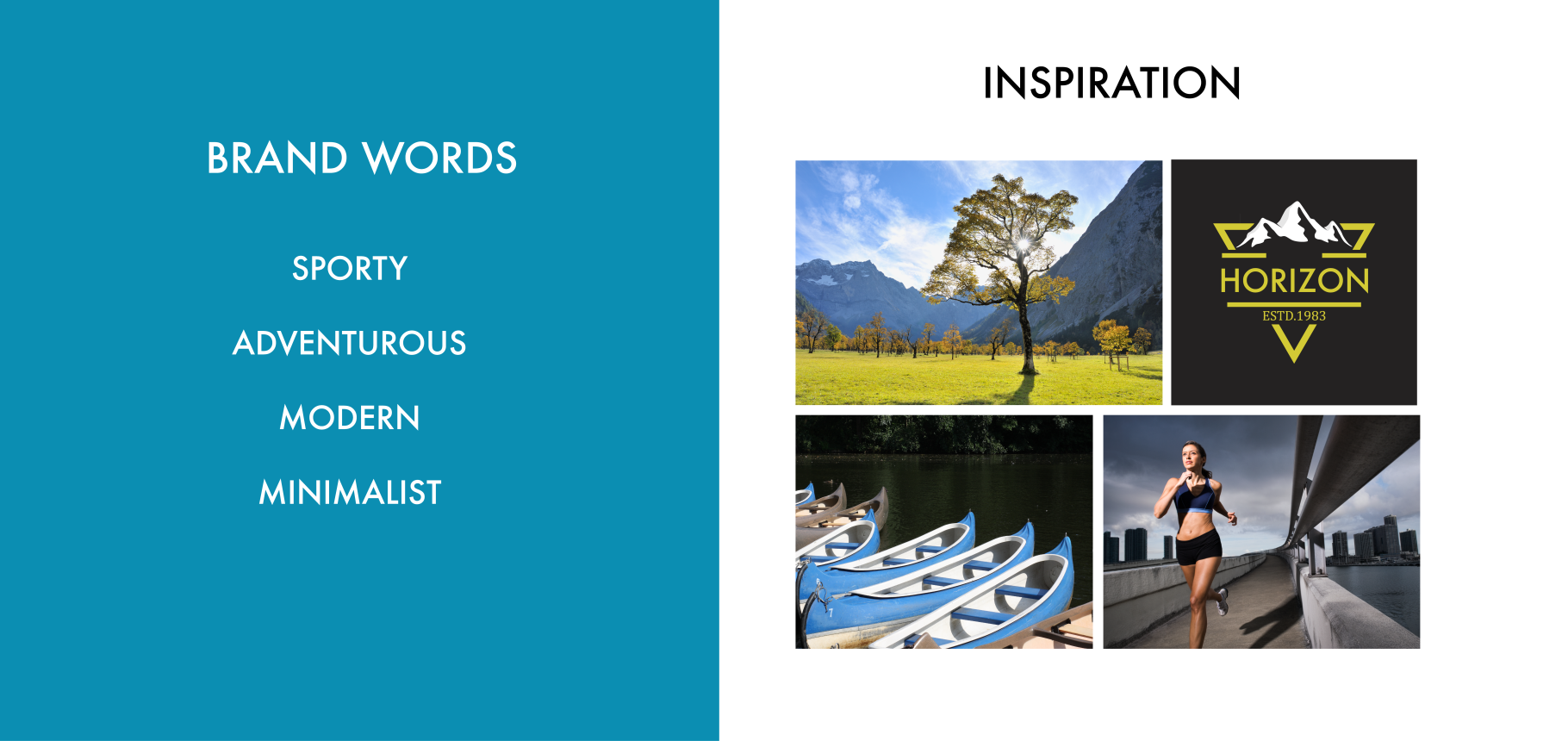
Including a set of approved images (preferably original images) and themes that fit within your brand is an effective way to communicate what your business does. Outlining appropriate niche areas also helps guide future image selection to ensure brand consistency. In the Nomad example above, you can see the aesthetic they’re trying to cultivate, and it’s clear which types of images work for this brand. That’s the purpose of your imagery section. You don’t need hundreds of images, just a few that capture your brand’s different focus areas and values.
Your inspiration pages are helpful as they offer at-a-glance clues that reflect the brand’s visual identity. These details are useful when you’re briefing a writer or designer about your brand style or onboarding a new member of staff.
7. Define your voice.
The way you speak to customers matters…so make sure you have a defined brand voice. You might hear terms like ‘voice’ and ‘tone’ thrown around, but there is a difference between the two. Your brand has the same voice all the time, but the tone varies depending on each conversation.
Voice is a brand’s personality, which is usually described in adjectives. Voice makes your writing more consistent
Tone is the emotional quality of the voice. It’s how a brand “speaks” in slightly different ways depending on the audience, circumstance, or subject matter.
And while your business voice is not a tangible material – like a logo – it remains an integral part of your brand identity. Your brand voice should sound the same across every interaction with your business, from flyers to your Facebook page.
Give as much direction as possible, so no matter who is writing for your business, the voice sounds consistent wherever people discover you.
8. Detail your writing style.
ALL CAPS or Sentence case?
The way you write affects the tone of your message. Languages are flexible, and there are many ways to communicate the same words in a message. Detailing your writing style helps maintain consistency across all your written messaging.
Take this message, for example:
Contact us for a quote
CONTACT US FOR A QUOTE
They feel different, right?
The capitalized (or all caps) version looks a lot sterner. It’s almost like someone is shouting. Conversely, the first example uses sentence case with no end punctuation. It makes the message more conversational and seems less like an order.
Keep in mind, though, that there are circumstances when all caps is appropriate – maybe for your company name if you want to convey energy and boldness, or in a promotional flyer if you’re trying to build excitement.
9. Share your style guide.
Once you’ve created your style guide, think about how you’re going to share it. Will it be a shared document that your employees can add to? Will it be printed and hung up in your workspace? Do you need to password protect it? One free tool you can use to store and share your style guide is Google Slides. This platform is ideal for creating a living brand guide, meaning you can update it regularly and share via email. Its familiar, collaborative workflow makes it easy to achieve great results.