A brand style guide is the essential tool for businesses that gives clear guidelines on how to communicate a brand effectively. It details the style, voice and the intended audience of a company that ensures consistency across all your communication channels.
Who benefits from a brand style guide, you ask? Almost all sections of a company can benefit, starting from its developer team through to the marketing and creative departments. As a whole, the company needs to be across what’s accepted and what’s not accepted when representing your brand to outside audience, and a brand style guide can help make those rules clearer.
But while a brand style guide carries such responsibility, it need not be boring. Over the years, we’ve seen a wide variety of the standard brand style guide that don’t compromise their ultimate objective to inform. Some stay true to the company’s branding by decorating its pages with the brand’s color theme, and others display key inspirational images to reiterate the company’s vision and mission.
Whatever the choice is, there is a brand style guide for everyone! Here are the 30 best brand style guides and why they work so well.
What is a brand guideline?
A brand guideline is your brand’s rulebook, a comprehensive document that lays out all the do’s and don’ts for creating and maintaining a consistent brand identity. It includes specific instructions on using your essential branding elements such as logos, colors, fonts, images and everything else that shapes your brand’s unique look and feel.
Think of a brand guideline as a roadmap that keeps everyone on the same path, ensuring that your brand always looks and sounds just right, no matter who’s handling it.
Here are some benefits of having brand guidelines in place:
- Enhanced brand recognition: Every piece of marketing material, from social media posts to billboards, has the same look and feel.
- Time-efficient designs: With clear instructions at hand, you cut down on endless revisions and explanations, freeing up time for more creative work.
- Enhanced credibility: Your brand appears more professional: a sleek, cohesive image builds trust with your audience.
- Smooth collaboration: Makes it easy for teams, partners and vendors to create on-brand materials. Everyone’s on the same page, leading to better and faster results.
- Brand integrity: Protects your brand from being misused or misrepresented.
- Clear communication: Since your brand’s tone and style are defined, your message is consistent across all channels—no more mixed messages or off-brand content.
- Boosted brand value: A strong, consistent brand identity can enhance the perceived value of your brand, leading to greater customer loyalty and higher sales.
What to include in your brand guidelines?
Remember, the more detailed and comprehensive your brand guidelines, the better. Including extensive information ensures that anyone working on your brand’s materials can deliver exactly what you want, maintaining consistency and quality across all platforms.
Here’s a brief list of essential items to include in your brand guidelines:
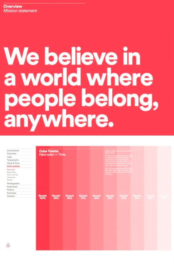
- Brand overview
- Mission statement
- Vision statement
- Core values
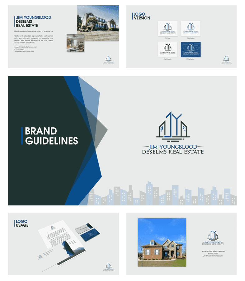
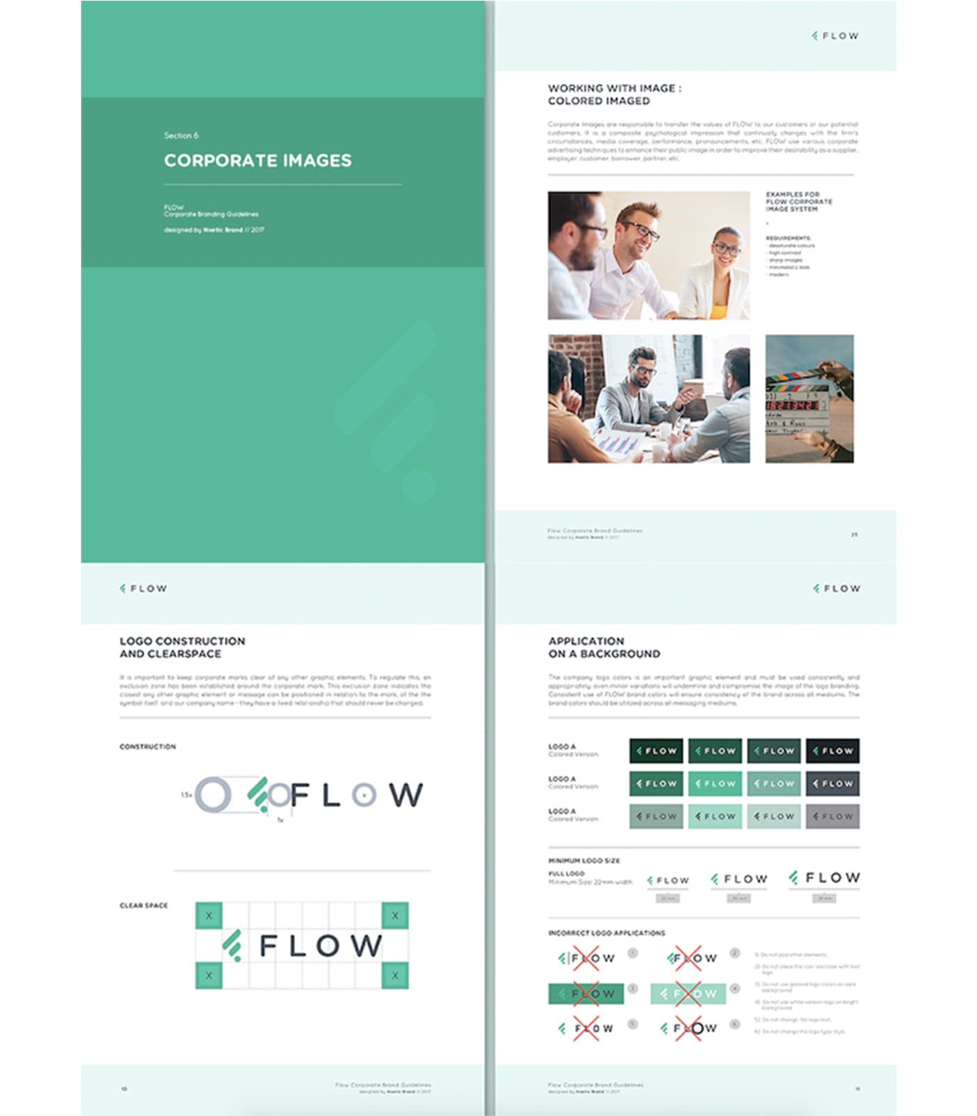
- Logo usage
- Primary logo
- Secondary logos and their variations
- Clear space
- Minimum logo size
- Dos and don’ts — visual examples of how your logo can and can not be altered
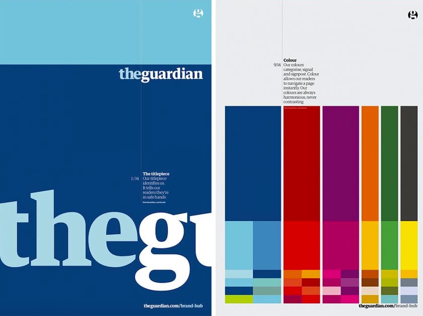
- Color palette
- Primary colors (Hex, RGB and CMYK codes)
- Secondary colors (Hex, RGB and CMYK codes)
- Color usage rules
- Typography
- Primary fonts
- Secondary fonts
- Font sizes and hierarchy
- Line spacing and alignment
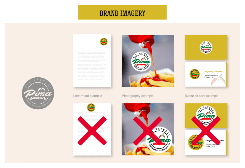
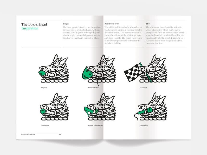
- Imagery
- Style and tone of images
- Photography guidelines
- Iconography and graphics
- Tone of voice
- Brand voice and brand personality
- Key messaging
- Writing style and grammar rules
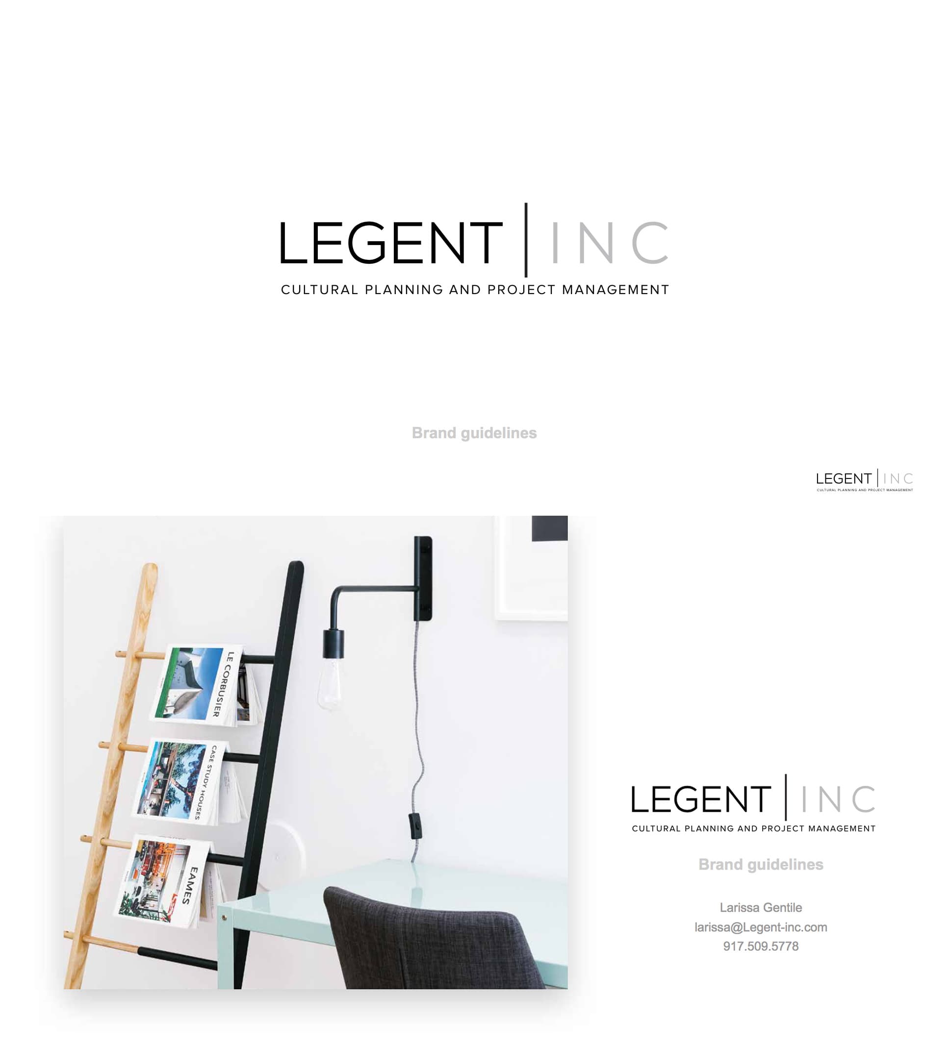
- Brand applications
- Business cards and stationery
- Marketing materials (brochures, flyers, etc.)
- Digital assets (website, social media, email templates)
- Packaging and product design
- Additional elements
- Patterns and textures
- Illustration styles
- Motion and animation guidelines
- Contact information of the person to contact for brand-related queries
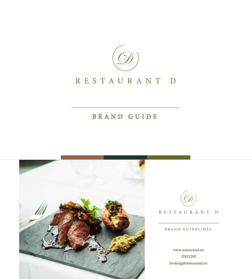
Use an inspirational image as your brand guide focal point
Sometimes an eye-catching brand guide doesn’t need much. Some brand style guides use key inspirational images to reiterate the brand’s voice and theme.
Think about the images you may have collected at the beginning of the design process—these could be key images that either you found yourself or your designer shared with you. Use these images to help you tell the story of the brand.
One way to incorporate such an image is by using it as striking background for some pages of your brand guide. This helps anchor the important pages to the audience so they always know where they’re at in the brand guide:


Using the island image as background to the brand logo and the four key themes pull it all together. NISSI brand guideline by Asha7 via 99designs by Vista.
Alternatively, a focal image can be used as an effective highlight of what the particular brand is all about. Choose strong images that speak for themselves or need little explanation so that when the audience sees it in the brand guide, they automatically know the image epitomizes the brand:

Working Lunch Co. brand guideline by Sarah Crawford via 99designs by Vista.
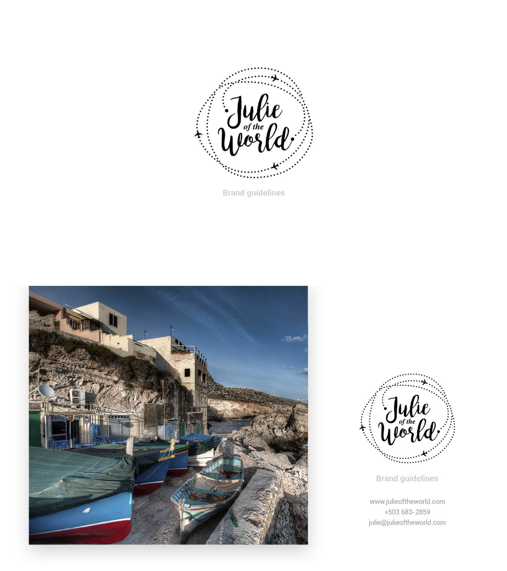
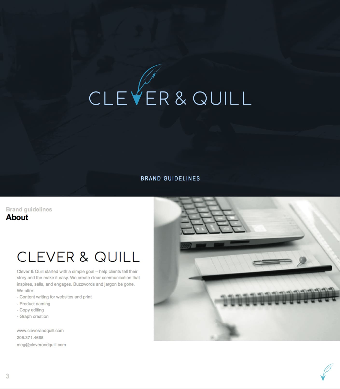
Keep it simple
Whitespace can go a long way. You don’t need a lot of details to get the point across: simple and clean designs prove to be clear winners no matter what the nature of the business is.
There are a few reasons why adding whitespace to a brand style guide is beneficial for the audience. Firstly, it focuses them to what’s most important in the guide. The empty space around a certain element in the brand guide encourages the audience to think that that is the highlight and they should take notice.
In the examples below, you can see that an entire page of blank space is dedicated to one or a few elements (logo design or key brand image). But it works because it lets them take center stage and demand the audience’s attention.

Produce Haus brand guideline by 3whales studio via 99designs by Vista.

Secondly, whitespace acts as a separator between different parts of information. It ensures the audience can properly ‘breathe’ before moving on to the next piece of the information and follow the intended flow of the guide.
In the following examples, the space around the text becomes an effective separator between the images which are full of texts and that without the space, they would otherwise look convoluted and busy.

Root + River brand guideline by Pace Creative Design Studio
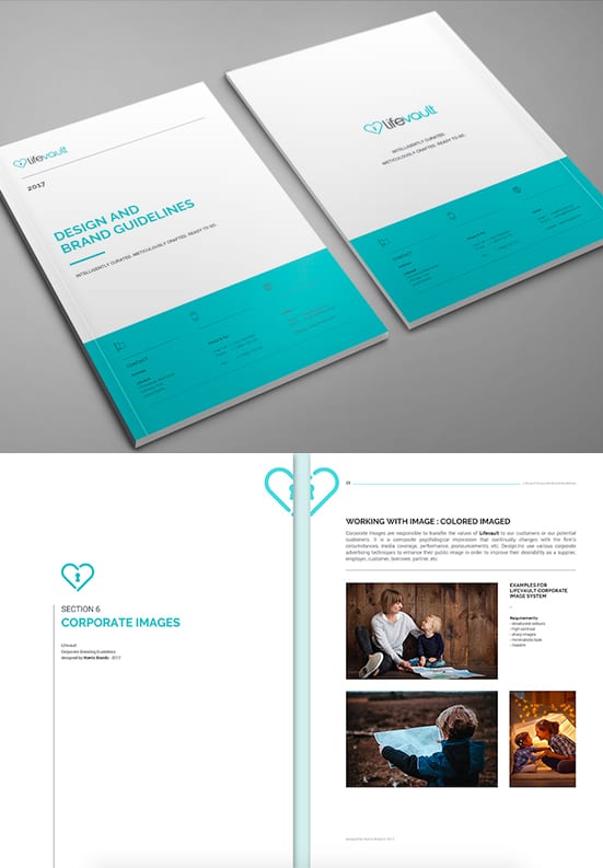
Adding details for an on-brand finish
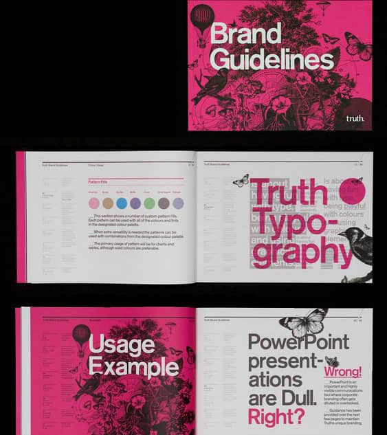
Staying on brand is good, but staying on brand with style? Even better. Think about how to add brand details to certain pages of the brand guide that will lift it to the stratosphere. These designs play around with the layout, as well as adding shapes and colors that call back to the brand to personalize the guide’s overall look.
As shown in the following examples, the result is a cohesive branding bible anyone will be happy to refer to at any time.

In this brand guideline for SwitchRCM, the designer took care to include the brand’s logo in each page to subtly reiterate the branding throughout the viewing experience. By Terry Bogard via 99designs by Vista.


The Nuudle Company brand guideline by E·the·re·al” via 99designs by Vista.
Let your brand style flow
Sometimes the audience needs that extra helping hand to keep them focused on what they’re seeing. It’s especially nice to see your reading flow visualized in attractive graphics.
The following designs use elements to straddle multiple pages of the brand guide to convey a sense of continuity. For example, Quiqup’s brand guide below uses cursive, flowing lines to gently guide the audience from one page to the next. The result: they are subliminally reminded that they are viewing Quiqup’s brand and strengthen the brand effect in their minds every step of the way.

A brand guideline for Quiqup that has the right flow. Via MultiAdaptor.
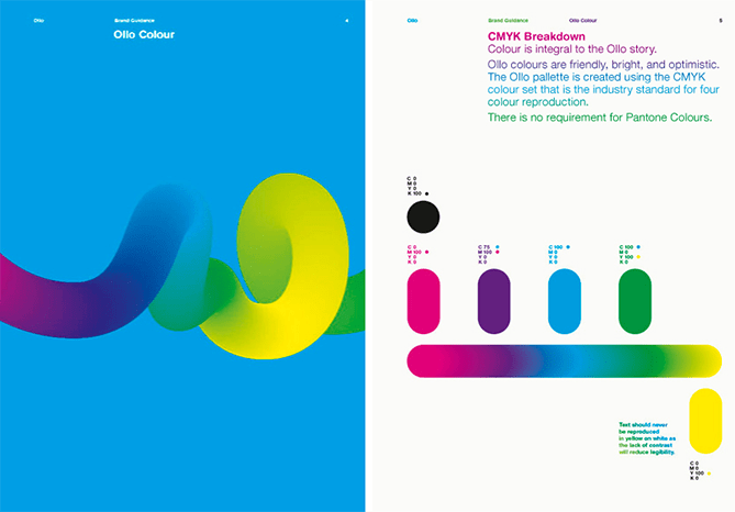

Ollo is another example that uses flowing line in its brand guideline to emphasize its brand. The decorative colorful line reiterates on the logo to remind the audience just whose brand guide they’re viewing. By Bibliothèque Designs
Another way to visualize your reading flow of a brand guide is to strategically place elements in two pages at a time. The following brand style guides place on-brand images and text in between pages and successfully create a cohesive reading experience.
Do you have an idea for your brand guidelines?
Remember, the sole purpose of brand guidelines are to always inform your audience how to communicate a brand effectively. We love a seriously attractive brand style guide, but at the end of the day, if it doesn’t do its job properly, then it loses its significance quickly.
Test out your freshly-designed brand guide with various layers of your company. After all, they must all benefit from it and understand clearly how to represent your brand, so make sure creative flair doesn’t get in the way of equally important communication skills.
Want to learn more? Here are our top branding tips and here’s how to create a solid brand identity for your business.
Author: Sasha Manusama