When learning how to design a flag for your business, it helps to know what you’re about to tackle. There are three categories of considerations: the fundamentals of flag design and why it’s different, how to choose the right flag shape, and how location changes everything from materials to placement. Don’t worry. We’ve got you.
In this guide, we put together a 10-minute design workflow, practical size-and-scale guidance, color and layout best practices as well as the file-prep basics that keep your design crisp in print – plus a quick rundown of common mistakes and how to fix them. Let’s learn flags.
- Flags need a different design approach than normal graphics because they’re seen in motion and from a distance, so simplicity, symbolism and quick recognition matter more than fine detail.
- The flag shape you choose affects how your design is seen and where it performs best, so picking between feather, sail, teardrop, wall and pennant should be a strategic decision based on your use case.
- Where the flag will live should guide your material choice, visibility plan, placement tactics and even your base selection for maximum flexibility.
- A simple, repeatable workflow helps you move fast without guessing, from defining the flag’s job to choosing the right format, building a clean layout and testing for readability in motion.
- Turn a good concept into a flag that works with these practical execution details like sizing and scale, color, text and logo decisions and print-ready file prep.
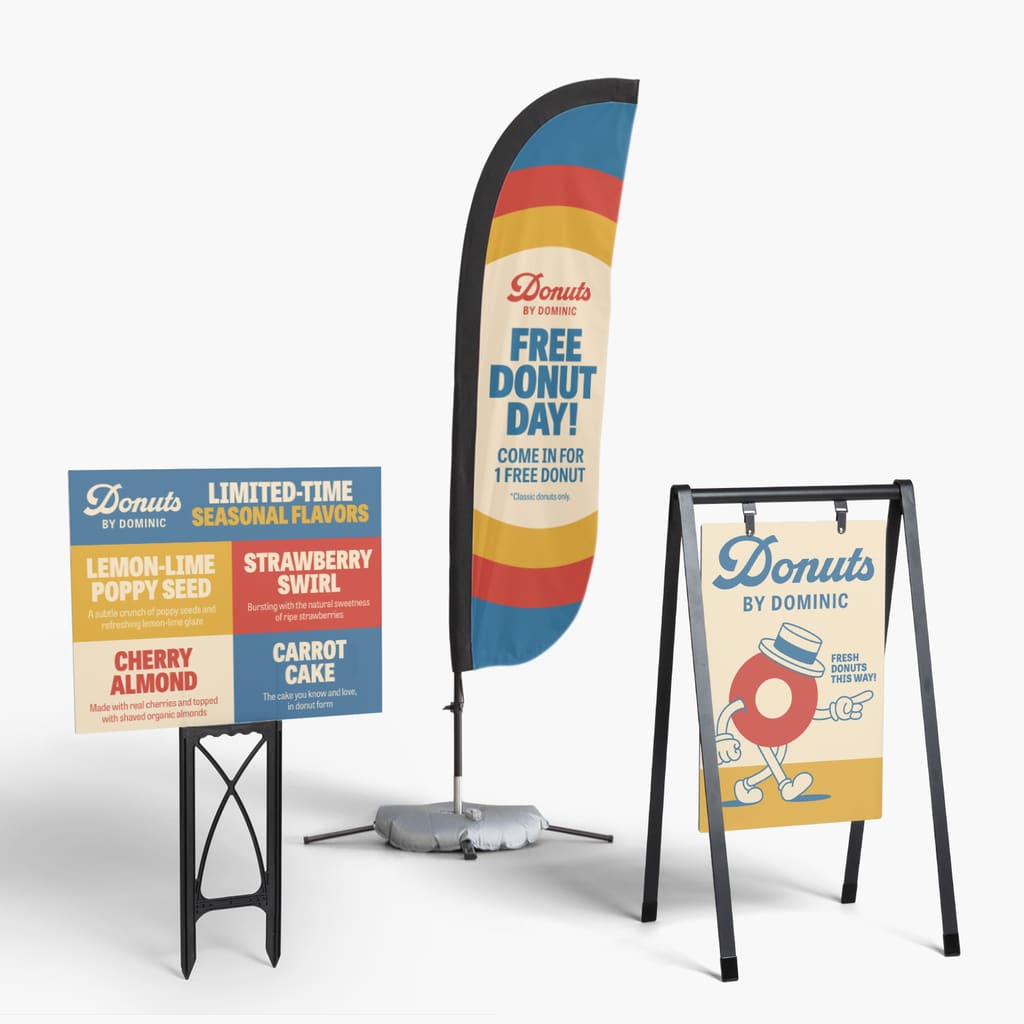
Custom flag design considerations and principles
Flags are not posters or billboards. They’re like roadside wayfinding: Quick reads, angled views and split-second attention. Most people won’t see your entire flag at once. They’ll see a partial glimpse, then another, then a clearer moment as it unfurls.
Hierarchy
This is where decluttering becomes a business decision, not an aesthetic one. If your design needs explanation, it’s going to lose because most people won’t see your whole flag at once, and they definitely won’t stop to decode it. The strongest flags usually center on one primary symbol or a big, bold word that can carry the message on its own.
What makes it all work is breathing room: generous spacing and simple layouts that stay readable even when the fabric folds, twists and hides parts of the design mid-flutter.
Color best practices
Color psychology is helpful, but it’s secondary to contrast. Outdoors, sunlight and shadows flatten subtle palettes. The safest path is a light-on-dark or dark-on-light pairing, with 2–3 colors total. Flags for indoor use have a bit more flexibility in their color palettes.
Longevity matters too. Weather and sun can shift colors over time and some bright reds can appear to fade faster with heavy exposure. Choose strong contrast and designs that still read if saturation softens.
Text and logo best practices
Text is optional, not required. If it doesn’t pass the distance test, cut it. If you must use text, keep it short, thick and high-contrast. If possible remove text from your logo.
Logos often need a flag version. Use the icon alone, simplify internal details, remove hairline outlines and scale up aggressively. Think recognition first, brand purity second.
Symbolism
Vexillology (the study of flags) applies here, too. Traditional flag rules were built for the same physics you’re dealing with: distance, motion and instant recognition. They also lean on symbolism: one shape can carry meaning faster than a paragraph. A spark for a maker brand, a leaf for sustainability, a wave for surf or wellness. If you’re brainstorming custom flag ideas, start with what you want people to feel or do, then find one clean symbol that carries that meaning.
Scale rules
On flags, the central message or symbol should dominate. Aim for your icon or main word to take up roughly 60–70% of the usable visible area. Avoid thin strokes, tiny gaps and fine textures – printing on fabric and motion will erase them.
File preparation and print readiness
For clean printing and easy resizing, vector files (AI/EPS/PDF) are ideal. Raster images (JPG/PNG) can work if they’re very high resolution, but they’re easier to pixelate when scaled.
Leave safe margins away from edges, fabric finishing and movement can nibble at details near seams. Also understand printing options: single-sided flags typically read correctly on the front and appear mirrored on the back, while double-sided flags read right on both sides but can lose visibility outdoors when light shines from behind. Double-sided flags can also be heavier and flutter differently.
Custom flag shape
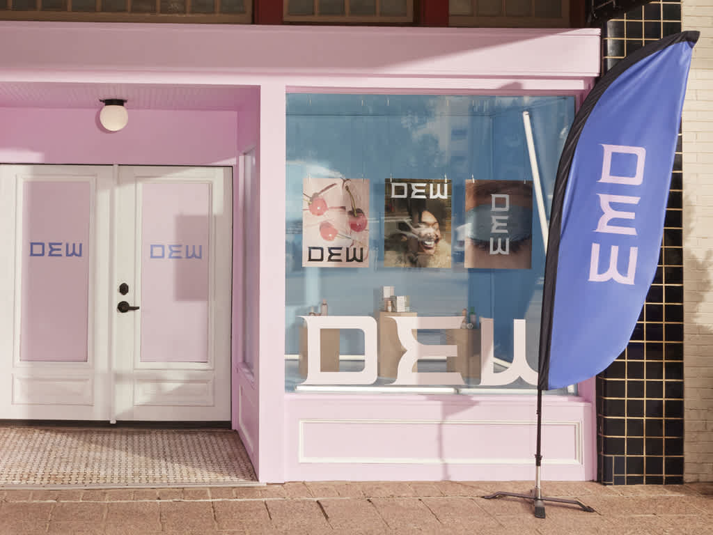
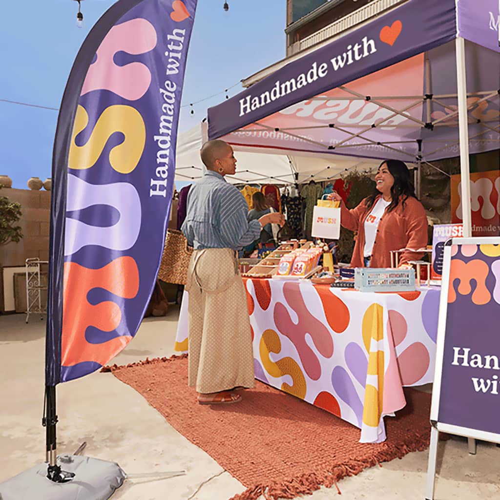
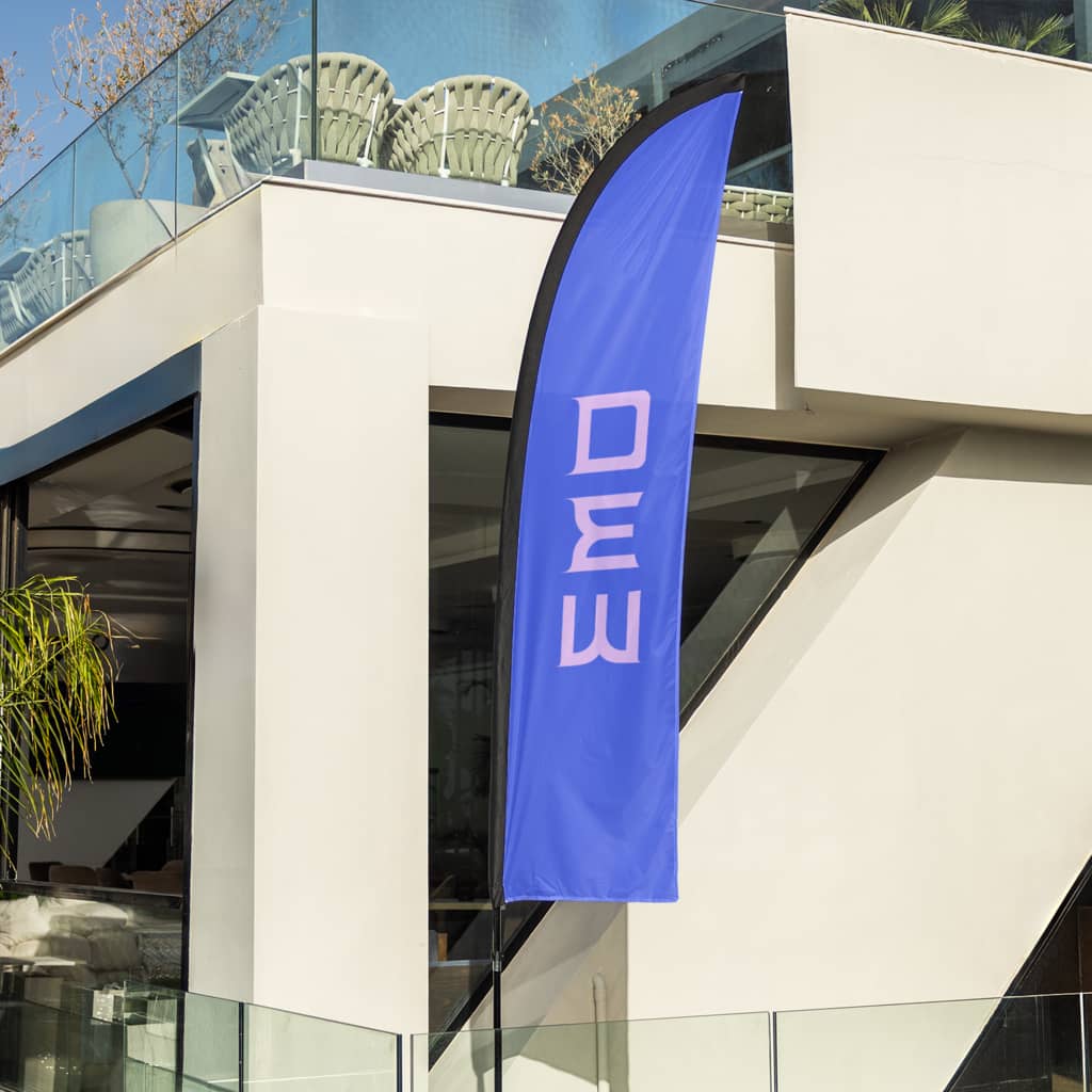
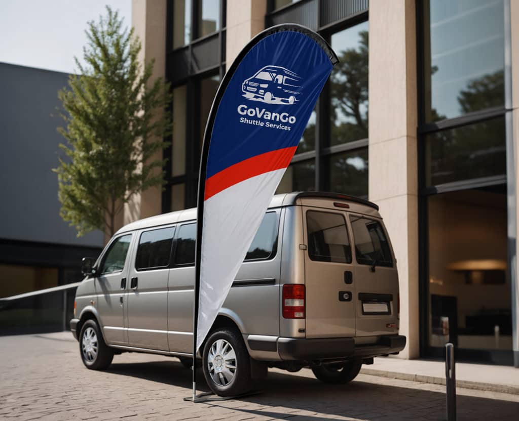
Shape is strategy. Feather and teardrop flags are excellent attention grabbers for storefronts and events, sail flags give you a bigger branding presence, wall flags are tidy for mounted placements and pennants are energetic for promos.
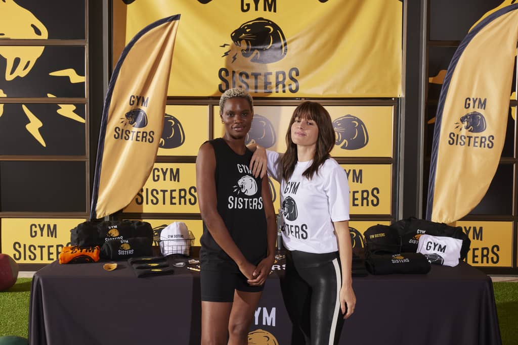
Feather
Feather flags are tall, narrow and constantly moving, so your design has to work even when the middle is folding over itself. Build a clear top-to-bottom reading path and place your most important element in the upper half, where it’s most likely to stay visible at distance. If you’re using a logo, simplify it – logos and clean wordmarks outperform detailed flags because thin lines shimmer and disappear as the fabric ripples. Keep generous margins away from edges and seams, and stack short text vertically so it stays readable without needing the full flag to be perfectly unfurled.
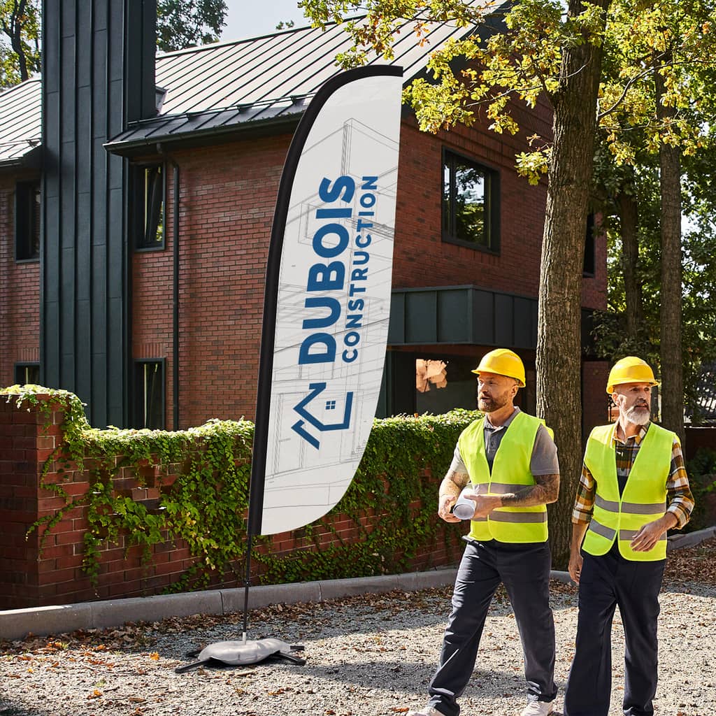
Sail
Sail flags give you more space than a feather, but the goal is clarity, not cramming. Use the extra area to make your hero element bigger and to add breathing room, not extra information. Since sail flags are often seen from multiple angles like event entrances and open lots, a centered or slightly upper-centered focal point helps the design read quickly from different approaches. Keep secondary text short and separated with obvious spacing, and avoid busy backgrounds as movement can turn patterns into visual static, especially in tight booth areas.
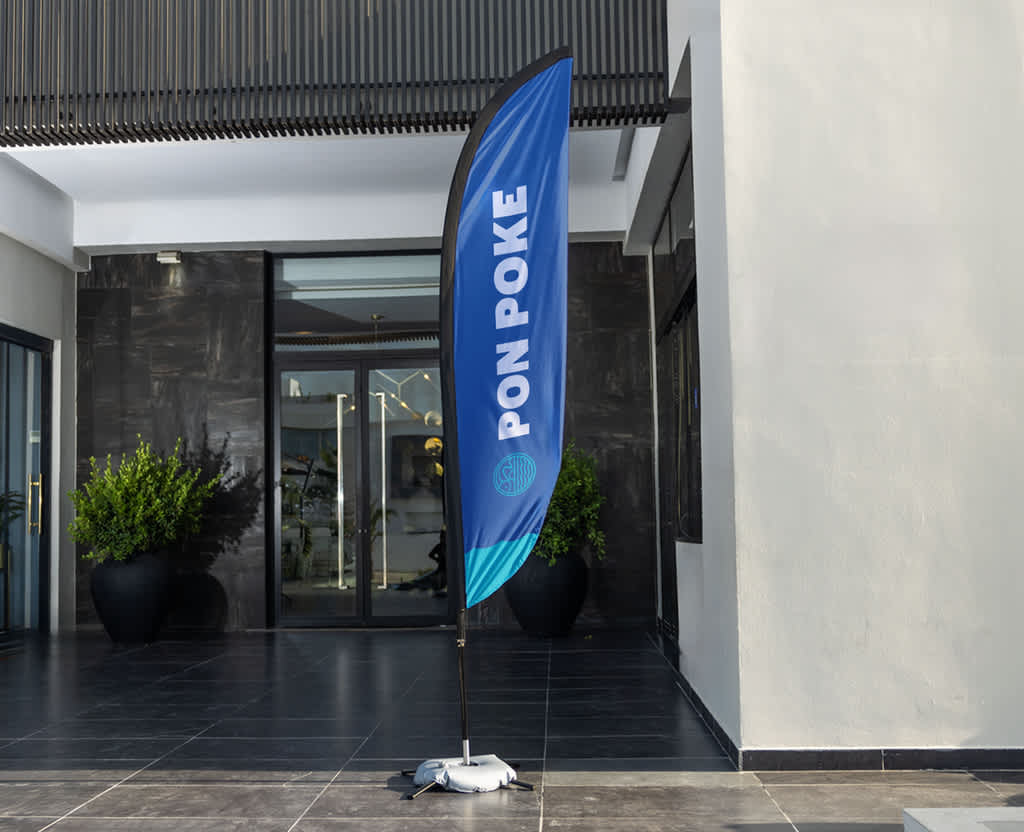
Teardrop
Teardrop flags hold their shape more consistently, which makes them reliable in unpredictable wind. The main design consideration is the curve: don’t park critical details right on the rounded top where curvature and tension can distort shapes. Place your key icon or message slightly below the top curve and keep the composition compact and centered. Because the flag narrows toward the bottom, long horizontal lines of text tend to feel cramped – short words, bold icons and simple emblems usually look best.
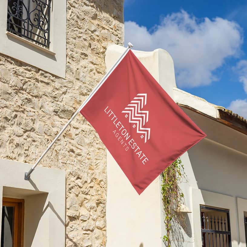
Wall
Wall flags behave more like controlled vertical panels, so layouts can be more structured and alignment-friendly. Treat them like a tall signboard: clear hierarchy, clean spacing and strong contrast. Because they flutter less, you can often include a bit more context, like a short service descriptor, without losing readability, but fine details still soften on fabric.
Wall flags also pair well with other types of signs because they reinforce branding without the constant motion competing for attention.
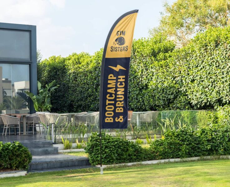
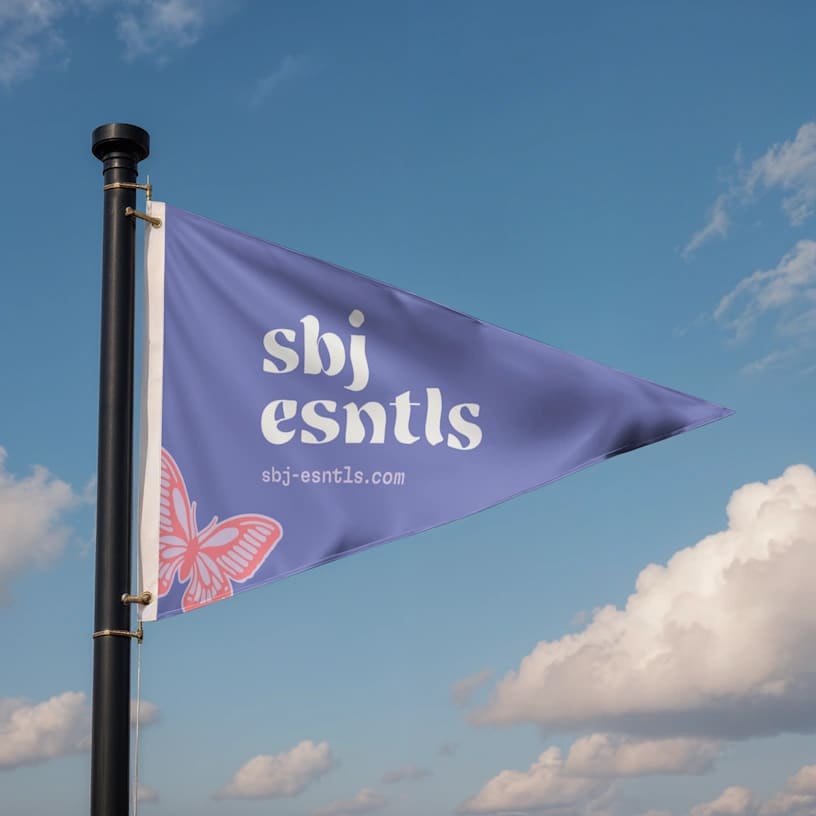
Pennant
Pennant flags are built for energy and urgency, so they shine with one bold message or one oversized icon. Think promo-first: “SALE,” “OPEN,” “NEW,” or a big symbol that reads instantly. Avoid designs that rely on precision, small type or multiple elements as movement will make them feel chaotic. If you include a logo, keep it large and place it closer to the wider area so it stays visible when the tail end flutters. High-contrast colors work great here, as long as the message stays single and simple.
Custom flag design location considerations
Where the flag is used changes everything: fabric choice, how much detail you can get away with and how you should place it to catch eyes.
Outdoor vs. indoor
For windy outdoor use, polyester mesh is a smart choice because it’s built for airflow and durability. The outdoor rule: bold shapes, fewer colors, thicker elements.
Indoors at a trade show, you can often use premium material options like a matte finish on one side and a semi-gloss finish on the other, for a sharper, more finished look. You can also have more detail indoors, but you’re still competing with crowds, lighting and visual clutter, so don’t overdo it.
Visibility
Visibility depends on angle, motion and where people are coming from. Roadside viewers are moving fast and scanning laterally. Expo hall viewers are scanning for landmarks over people’s heads. Either way, your flag should act like a beacon. This overlaps with broader signage ideas: flags are attention and navigation tools first, information tools second.
Placement strategy
Be tactical, not decorative. For storefronts, place flags as close to perpendicular to the road so they present to traffic from both directions. For events, put your tallest flag at an aisle-facing corner so it becomes a landmark, especially if the hall is packed.
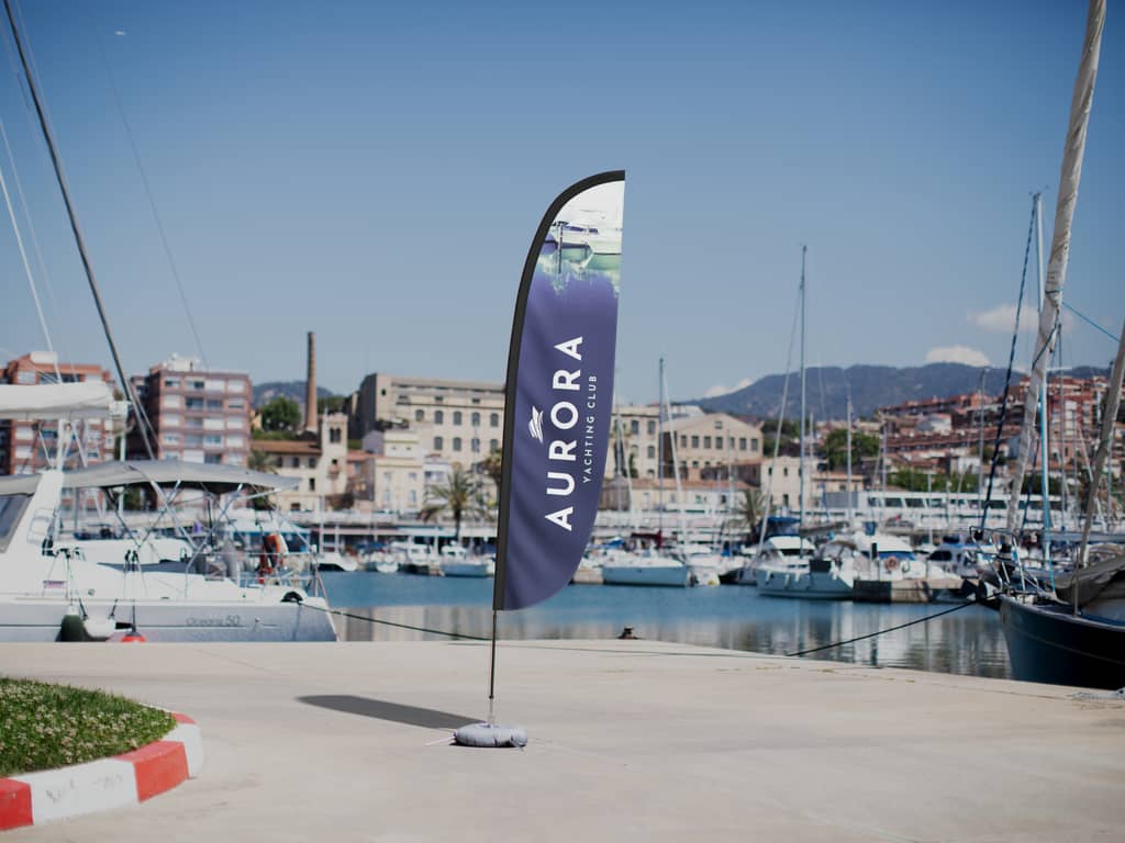
Base choice
Your base is a strategy decision. Ground spikes are great for grass and soil. Water bases are essential for concrete, asphalt and indoor floors. The right base gives you placement flexibility, which is one of the most underrated tips for using outdoor event signs. If you can’t place the flag where it performs best, the design doesn’t get a fair chance.
Size and scale tips
Sizing is about balance: between the flag and its viewing distance; between the flag and the pole; and between your design elements and the open space on the fabric.
Pole height to flag size
Match the flag to the pole so it doesn’t look tiny or overloaded. As a practical example: a 20′ pole pairs well with a 3′ x 5′ flag. Taller poles generally need bigger flags to keep the same readability ratio.
Sizing tables
Use the sizing tables below as a fast cheat sheet to match pole height and flag type to real-world visibility, so your flag looks balanced on the hardware and stays readable from the distance you need.
Table of pole height and recommended flag size
| Pole height | Recommended flag size | Best for |
| 15′ | 2.5′ x 4′ | Smaller storefronts, closer viewing |
| 20′ | 3′ x 5′ | General business use (best all-around) |
| 25′ | 4′ x 6′ | Larger lots, longer sightlines |
| 30′ | 5′ x 8′ | Big visibility in open areas |
Table of flag type and common heights
| Flag type | Common height range | Typical use |
| Feather | 8’–15′ | Sidewalks, storefronts, pop-ups |
| Sail | 10’–17′ | Entrances, brand-forward areas |
| Teardrop | 7’–12′ | Markets, promos, mixed wind |
| Wall | 3’–6′ | Patios, building edges, indoor |
| Pennant | 6’–12′ | Sales promos, sports/festival setups |
The 10-minute workflow: How to design your own flag fast
When you’re short on time, this quick guide will take you to a clean, print-ready layout that still reads clearly with the flutter factor.
Step 1: Define the job
Finish this sentence: “This flag’s job is to ____ .”
Examples: Get drivers to notice us, mark the entrance, help people find our booth, point to pickup.
If you can’t define the job, you’ll end up stuffing the flag with everything.
Step 2: Choose the flag type
Use feather/teardrop for flexible visibility, sail for bigger branding impact, wall for tidy mounting, pennant for promo energy. If you’re trying to design your own flag quickly, choosing the shape early saves you from painful layout refits later.
Step 3: Build the layout
Start with a central element. Make it bigger than you’re comfortable with. Add one supporting line only if needed. Skip the rest. Most flags fail because they try to do the job of a brochure.
Step 4: Run a quick “distance + motion” test
Shrink the design on your screen until it’s tiny. If you can’t recognize it instantly, simplify. Then scroll past it quickly or blur your eyes – if it turns to mush, increase contrast and remove detail.
Common custom flag design mistakes (with quick fixes)
- Using a detailed logo as-is → Pull out the icon, simplify and scale it way up.
- Including too much text → Keep 1–3 words, move details to another sign nearby.
- Combining low contrast colors → Switch to light/dark contrast and reduce the palette.
- Designing like it’s a poster → One central message/icon + one support line, then stop.
Simplify and communicate fast for your custom flag design ideas
A flag that works is one that communicates fast, even when it’s half-folded and flapping like it’s auditioning for a drama. Choose the right shape for the job, size it correctly, especially relative to pole height, keep your colors high-contrast and simplify until it feels almost too clean. That’s how to design a flag that actually performs – at your storefront, in an expo hall or anywhere you need eyes to land on your business.