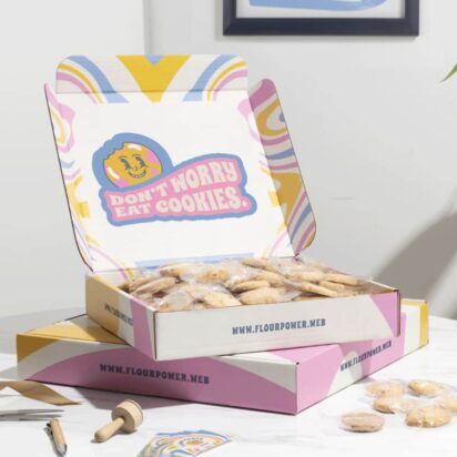
Shelves are crowded. Search results are crowded. Even farmers market tables have become surprisingly competitive. Your product usually gets a few seconds to make an impression before someone moves on to the next jar, bottle or box sitting nearby. Strong label design ideas help decide what happens during those few seconds. Labels introduce the product, signal quality and shape expectations before customers ever open the package.
Good label design also plays a bigger role in branding for small businesses than many people realize. Research shows that consistent use of color can increase brand recognition by up to 80%, which explains why the brands people remember rarely feel visually random.
This guide covers the full picture – from creative product labels and packaging styles to material choices, current trends and the practical details that help designs survive life outside a mockup file. By the end, you should have enough packaging label inspiration to stop staring at blank templates and start making decisions.
- Label design matters because it shapes first impressions, builds brand recognition and influences whether customers notice, trust and choose your product.
- Good label design usually combines clear visual hierarchy, consistent branding, readable layouts and enough personality to stand out without creating clutter.
- Label design ideas are often categorized by brand vibe, with styles ranging from rustic and minimalist to luxury, bold or vintage-inspired aesthetics.
- In 2026, label design trends are leaning toward human-centered details, tactile finishes, transparent labels, softer luxury aesthetics, QR integration and collectible limited-edition packaging.
- The best label materials depend on the product itself, with paper working well for dry goods, waterproof materials suited for beverages and skincare, clear labels supporting modern packaging and sustainable options helping eco-conscious brands align packaging with their values.
Why label design is an essential part of branding for small businesses
A great product label does a lot of heavy lifting before anyone tastes, smells or tries what’s inside. In crowded retail spaces, farmers markets and online storefronts, people make snap decisions. So, your packaging only gets a few seconds to convince someone your hot sauce deserves a spot in their cart over the twelve others sitting next to it.
That’s why smart branding for small businesses starts with the label. The good news is that you don’t need an expensive agency or a five-figure packaging budget to create custom sticker designs that look polished on shelves and online. Most of the time, the difference comes down to clarity, consistency and a design that actually fits your product instead of looking ripped from a random online editor template graveyard.
Here’s why label design matters more than many small brands realize:
- Signals quality instantly: Customers judge your product before they try it, and a sloppy label can make even an excellent product feel cheap or questionable.
- Increases perceived value: Strong design changes how people perceive pricing. Better packaging and a professional label layout can make a $12 candle feel worth $28 without changing the formula inside the jar.
- Helps you compete with bigger brands: A strong label design can make a small-batch product look premium, established and professionally made without pretending to be a corporate giant.
- Builds brand recognition: Consistent typography, colors and visual style help customers remember your products and spot them quickly on shelves or in social media photos.
- Drives shelf impact and sales: Eye-catching packaging label inspiration often comes down to smart contrast, readable layouts and clear hierarchy. If people notice your product, they’re more likely to pick it up.
- Builds trust and credibility: Clean structure, readable ingredients and thoughtful design details make products feel safer, more reliable and easier to buy with confidence.
What makes a good label design?
The best label design ideas usually look effortless. In reality, though, every element is carefully doing its job. Good labels guide the eye, communicate key information quickly and make products feel cohesive before customers even pick them up.
Many small businesses overdo it here. Too much text, too many fonts, too many competing ideas. Strong packaging should feel intentional, not overcrowded.
Strong visual hierarchy in professional label layout
Customers should immediately understand what they’re looking at. A strong professional label layout creates a clear visual flow, so the eye moves naturally across the most important information first.
Source: Label design by StanBranding via 99designs by Vista
Most labels work best when they prioritize:
- Brand name
- Product name
- Key details like flavor, scent or product type
- Supporting information
Consistency across your branding for small business
Consistency makes products recognizable on shelves, in social media photos and across different product lines. Colors, typography and layout choices should feel connected from one label to the next.
Source: Label design by StanBranding via 99designs by Vista
That, however, doesn’t mean that every product needs identical packaging. Instead of copy-paste branding, you should strive for cohesion.
Typography is usually where brands lose control first. Mixing multiple font styles rarely improves packaging. This guide to typography for packaging design covers the fundamentals without turning into a design theory lecture.
The right information without overwhelming the design
Trying to squeeze every selling point onto the front label usually creates clutter. Customers should understand the product within seconds.
Source: Product label design by FreshApple@Michelle via 99designs by Vista
Focus on essentials first:
- Product name
- Main benefit or differentiator
- Quantity or size
- Required product information
Everything else should support the design instead of burying it. Clean structure and spacing make labels easier to scan quickly.
Creativity that supports function
Creative packaging should still be practical. Unusual layouts and decorative fonts can help products stand out, but they should never make labels harder to read.
Many brands push creativity so far that usability disappears. Tiny text, weak contrast and overly complex layouts frustrate customers faster than most businesses realize. But the best packaging label inspiration usually balances personality with clarity.
Fit-for-purpose design
Context matters, too. A label designed for boutique skincare will not work the same way for bottled sauces or grab-and-go snacks.
Think about where and how the product will be seen:
- Retail shelves vs online thumbnails
- Wet vs dry environments
- Luxury vs everyday positioning
The same goes for audience expectations. Minimalist apothecary branding may look beautiful on facial oils, but it will probably disappear on, say, a crowded hot sauce shelf.
Find your style: A quick quiz to guide your label design ideas
Before collecting packaging label inspiration from this article, Pinterest boards, grocery aisles and Instagram packaging accounts, it helps to figure out what your brand should actually feel like. Otherwise, it’s very easy to end up with trendy labels that look nice but make zero sense for your product.
The following questions help narrow your visual direction before you start designing.
1. What feeling should your product evoke?
Choose two to three words:
- Clean
- Luxurious
- Playful
- Nostalgic
- Clinical
- Earthy
- Handmade
- Modern
- Cozy
- Bold
- Minimal
- Organic
2. Who are you selling to?
Pick the option that feels closest:
- Trend-focused Gen Z shoppers
- Busy parents
- Wellness enthusiasts
- Gift buyers
- Luxury customers
- Budget-conscious everyday shoppers
- Eco-conscious consumers
- Foodies and specialty shoppers
3. Where will your product be sold?
Your packaging should fit the environment:
- Boutique retail shelves
- Farmers markets
- Large grocery stores
- Online marketplaces
- Instagram and TikTok shops
- Subscription boxes
- Apothecary-style stores
4. Do you want to stand out or blend into your category?
Choose your approach:
- Bold and disruptive
- Familiar with a modern twist
- Clean and understated
- Premium and refined
- Loud and playful
- Traditional and trustworthy
5. How should your product feel price-wise?
Pick the closest fit:
- Luxury
- Mid-range premium
- Handmade artisan
- Everyday affordable
- Natural and practical
- Trend-driven impulse buy
Turning your answers into visual direction
Your answers should start shaping your design choices naturally.
- Minimal + luxury → Muted colors, serif fonts, matte finishes
- Handmade + cozy → Textured materials, warmer tones, illustrated elements
- Bold + trend-driven → Bright contrast, oversized typography, playful layouts
- Natural + organic → Earthy palettes, kraft textures, softer typography
Label design ideas by brand vibe
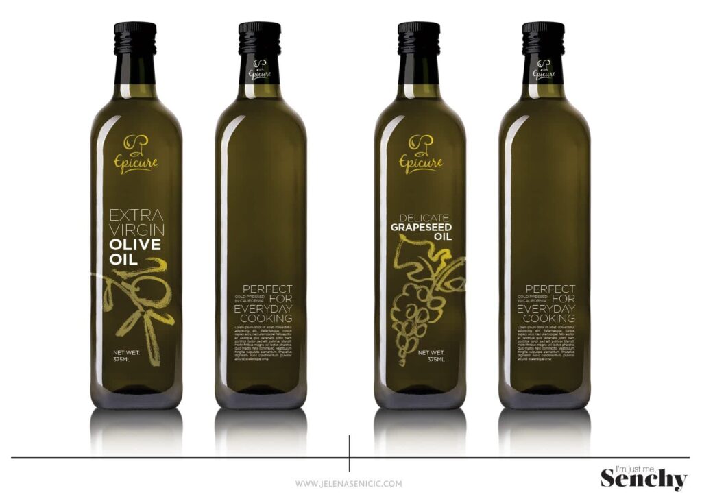
Not all products should follow the same label design formula. A handcrafted soap brand, a premium olive oil company and a playful hot sauce startup all need different visual approaches to feel authentic and fit customer expectations.
Different label types create different impressions. Your packaging should reflect the product, the audience and the personality behind the brand. Some styles stay clean and understated. Others lean into layered graphics, vintage references or color combinations that are hard to ignore.
The ideas below break down different brand aesthetics and practical ways to make each one work without forcing trends that do not fit the product.
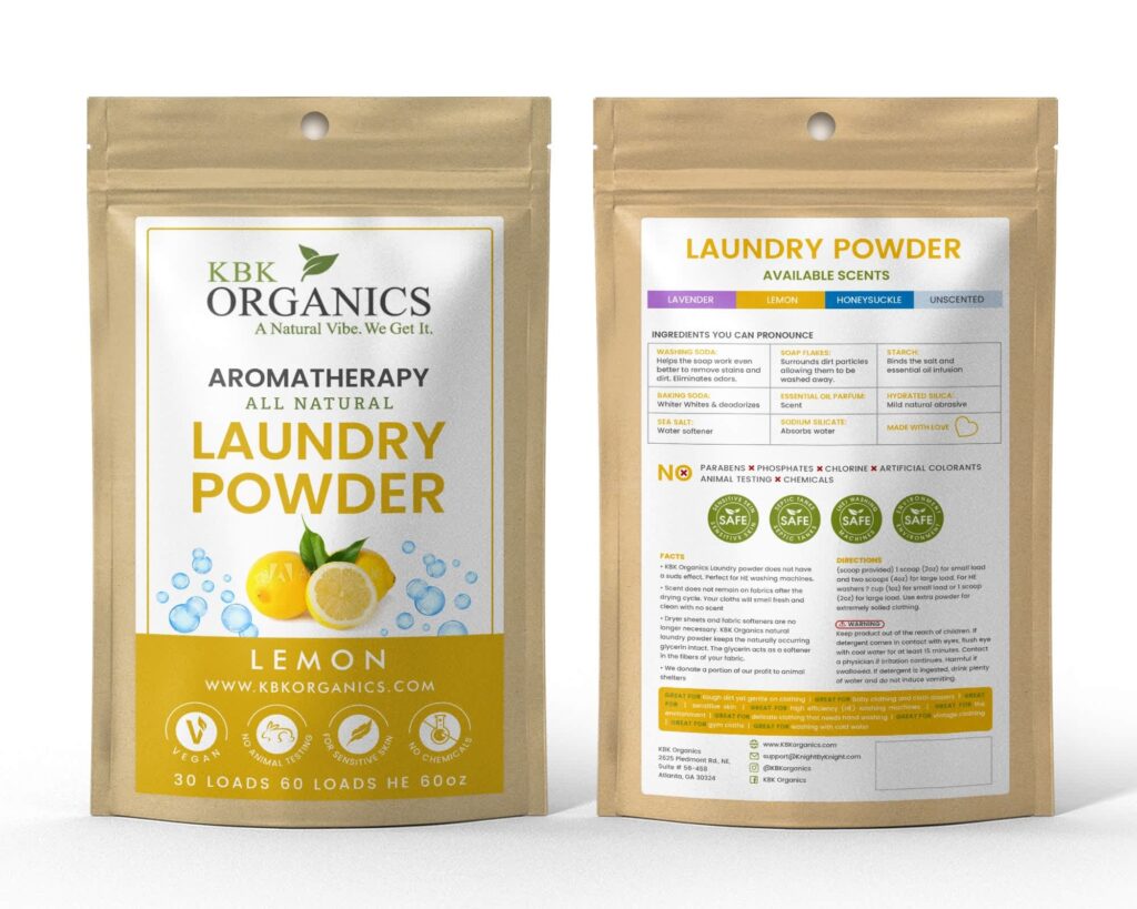
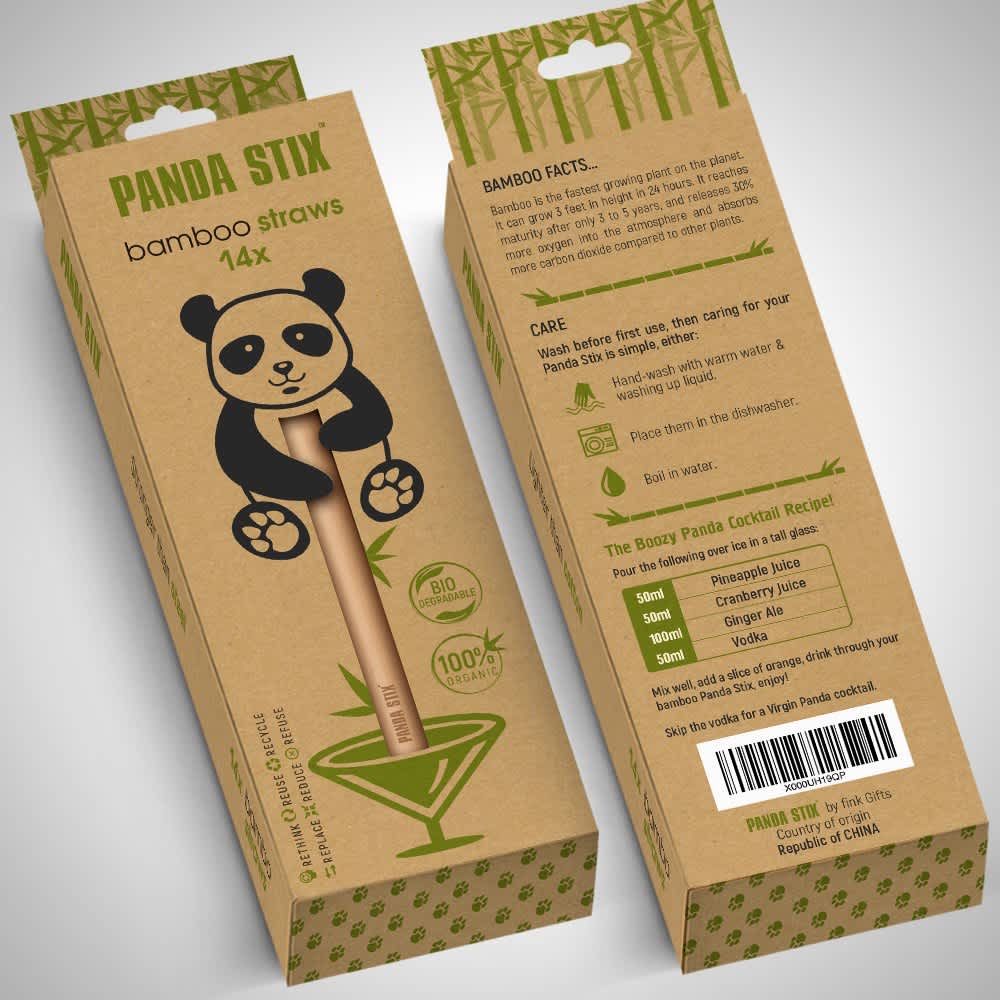
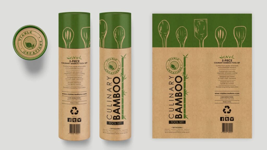
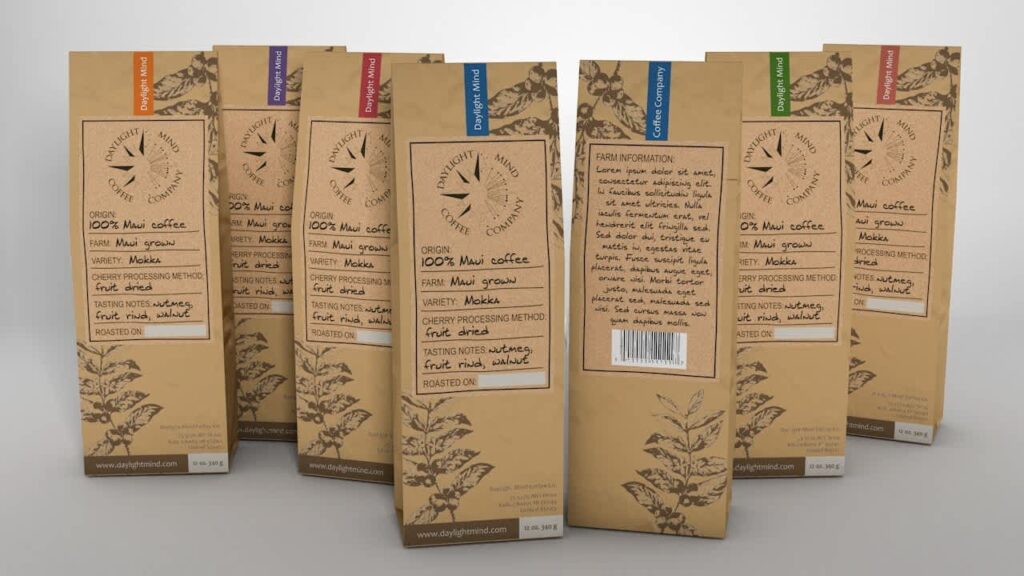
Rustic label design ideas for handmade and natural products
Rustic packaging works well when customers want products to feel personal rather than mass-produced. Handmade soaps, candles, honey jars, herbal teas and apothecary products often sit comfortably in this space because a little visual imperfection can actually help build trust.
Clean, perfectly polished designs can sometimes feel too manufactured for products that are supposed to feel natural or small-batch.
Source: Label design by okdesignstudio via 99designs by Vista
Design elements worth exploring:
- Kraft paper labels and textured materials
- Muted greens, warm browns and earthy neutrals
- Hand-drawn illustrations of herbs, plants or ingredients
- Soft edges and organic shapes
- Subtle grain or paper textures

Source: Label design by tale026 via 99designs by Vista
Source: Label design by P.D.S. via 99designs by Vista
Remember, though, the goal isn’t to make the label look unfinished. The best rustic label design ideas still feel considered. Slight texture, uneven illustration styles and handcrafted details create warmth without making the packaging look like a last-minute farmers market project.
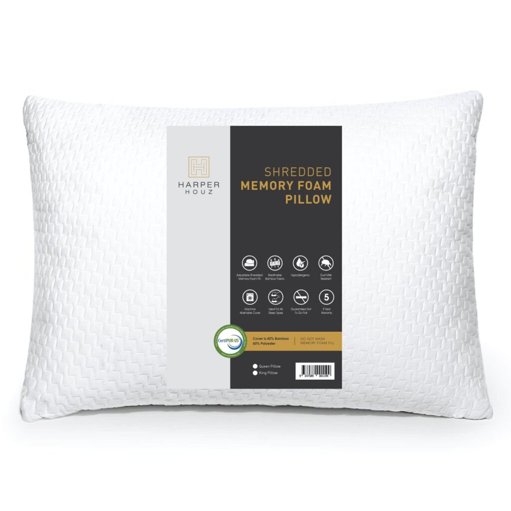
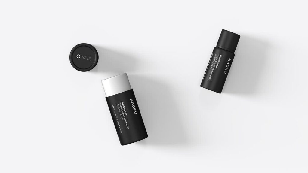
Modern and minimalist label design ideas for clean, professional product packaging
Some products sell better when the design takes a step back. Skincare, wellness products, supplements and premium food brands often benefit from restraint because simplicity tends to signal confidence.
Source: Label design by Ossobüko Studio via 99designs by Vista
Minimalist packaging leaves very little room for design mistakes. Every choice becomes more visible, and a few elements usually carry the visual weight:
- Clean layouts with generous spacing
- Simple typography with strong hierarchy
- Limited color palettes
- Thin dividers or subtle graphic accents
- Plenty of empty space around key information
Source: Label design by goopanic via 99designs by Vista
This style works particularly well for brands aiming for a refined, elevated look. The label doesn’t need decorative extras when the professional label layout already feels clean and intentional.

Caption: Source: Label design by Pice Wilf via 99designs by Vista

Source: Label design by Ossobüko Studio via 99designs by Vista
Luxury label design ideas for premium product packaging
Luxury packaging rarely feels crowded. Most high-end labels rely on details people notice after picking up the product rather than from across the room.
Source: Label design by Windmill Designer™ via 99designs by Vista
Visual choices are often subtle, but materials and finishing techniques do a lot of the heavy lifting.
Common design elements include:
- Foil details in gold, silver or copper
- Embossed or debossed elements
- Deep tones like charcoal, navy, forest green or black
- Serif fonts with refined spacing
- Thick label stocks and soft-touch finishes
Source: Label design by LucaToni via 99designs by Vista
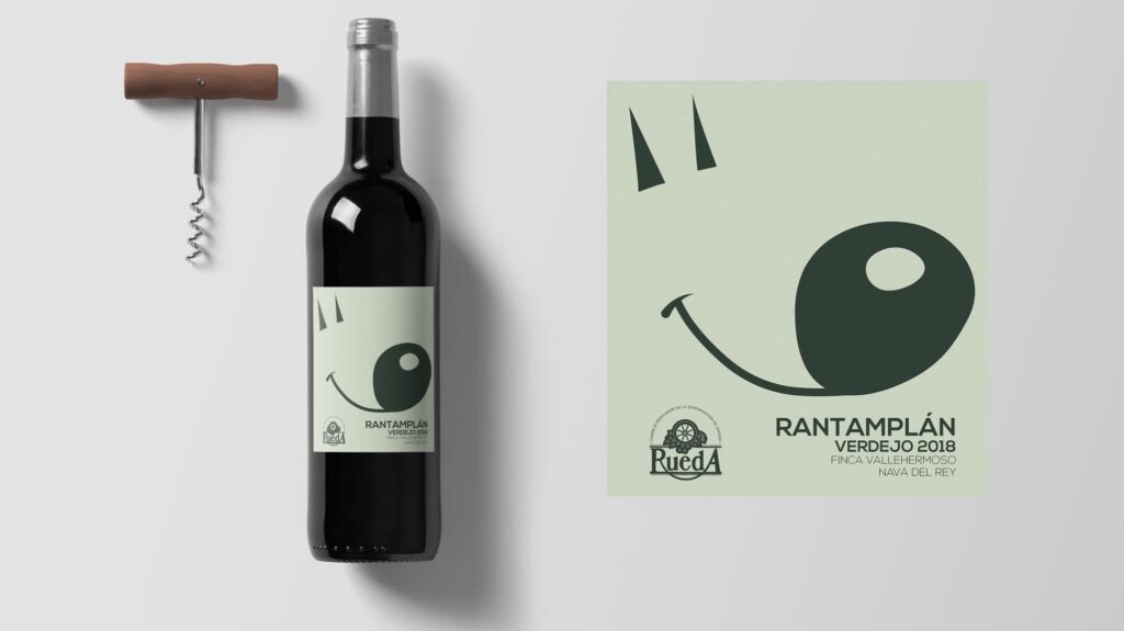
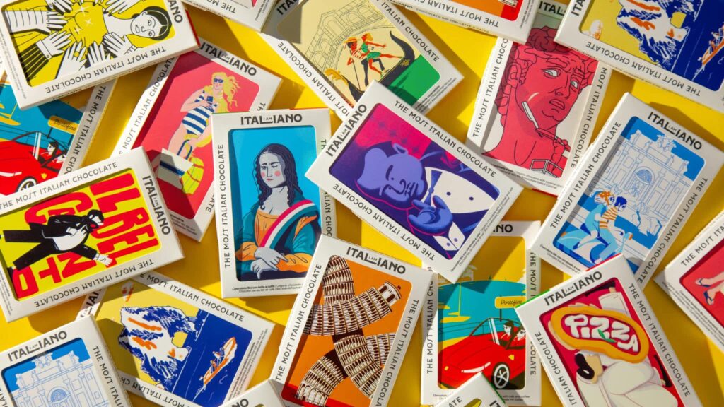
Bold and maximalist creative product labels for eye-catching brands
Some brands have no interest in blending in, particularly in categories where shelves already look predictable. Energy drinks, hot sauces, snacks and trend-driven products often use louder visual systems because attention matters.

Source: Label design by goopanic via 99designs by Vista

Source: Label design by goopanic via 99designs by Vista
Bold designs give brands more room to experiment. Some maximalist label design ideas to explore include:
- Bright color combinations
- Oversized typography
- Pattern-heavy wraps
- Large graphic elements
- Typography-first labels with minimal imagery

Source: Label design by Khramova via 99designs by Vista

Source: Label design by Ossobüko Studio via 99designs by Vista
This style works best when there is still structure underneath the chaos. Strong creative product labels can feel energetic without becoming visually exhausting.
Vintage packaging label inspiration with nostalgic appeal
Vintage-inspired labels often rely on familiarity. People naturally connect with visual cues that feel established, traditional or slightly nostalgic, even if the brand itself launched six months ago.
Done well, the style feels timeless rather than costume-like.

Source: Label design by Mj.vass via 99designs by Vista

Source: Label design by Mj.vass via 99designs by Vista
Design elements to consider if you’re interested in vintage packaging labels:
- Retro color palettes
- Heritage-inspired fonts
- Framed layouts and decorative borders
- Vintage illustrations or badges
- Small storytelling details about ingredients or origins
Source: Label design by Mj.vass via 99designs by Vista
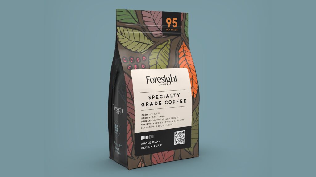
This type of packaging label inspiration works particularly well for coffee, sauces, baked goods, spirits and specialty food products where history and craft can become part of the experience.

Source: Label design by Ossobüko Studio via 99designs by Vista

Source: Label design by P.D.S. via 99designs by Vista
2026 label design ideas and packaging label inspiration
Label trends tend to shift in small ways rather than dramatic ones. A few years ago, everything was ultra-minimal. Then brands started pushing louder colors and a heavier personality. In 2026, the strongest label design ideas sit somewhere in the middle. Packaging still needs to feel polished, but people are responding more to labels with character, texture and details that feel less manufactured.
Here are some packaging label inspiration trends showing up across food, beverage and apothecary brands.
Handmade and human-first creative product labels
Perfectly polished packaging has started losing ground to designs that feel more personal. Small imperfections are becoming part of the appeal because they add warmth and make products feel less factory-produced.
Source: Label design by Andrea Castelletti Studio via Behance
Design ideas to explore:
- Hand-drawn typography
- Pencil-style illustrations
- Sketch textures and imperfect lines
- Handwritten notes or signatures
- Brush strokes and organic shapes
The goal is controlled imperfection. Customers should think “crafted by humans,” not “printed in a hurry.”
Source: Label design by Ica Studios via Behance
Transparent labels and the “no-label” look
Some products are becoming part of the design itself. Clear labels allow the color, texture or ingredients inside the packaging to do some of the visual work.
Source: Label design by Senchy via 99designs by Vista
This approach works particularly well for drinks and juices, honey and syrups, skincare products, oils and apothecary packaging.
Design elements often stay simple:
- Minimal typography
- White or black ink
- Small logo placement
- Clean spacing
When the product already looks visually appealing, less label coverage can create a cleaner and more premium result.
Tactile custom sticker designs and premium finishes
Packaging is becoming more physical again. Brands are paying closer attention to how labels feel in someone’s hand rather than focusing only on appearance.
Small material details can change the perception of quality quickly.

Source: Label design by Dimesign via 99design by Vista
Popular finishing choices include:
- Soft-touch coatings
- Embossed or debossed details
- Spot gloss accents
- Foil elements
- Textured papers

Source: Label design by Kseniia Sedina via Behance

Source: Label design by Kseniia Sedina via Behance
For small businesses, adding one tactile element often creates a stronger effect than layering five different finishes onto the same label.
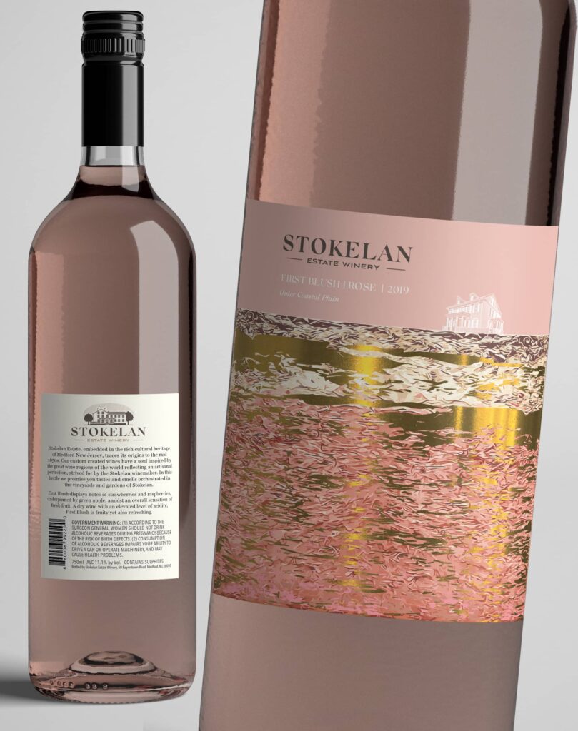
Warm, approachable luxury label design ideas
Luxury packaging has been shifting away from cold minimalism and hard contrast. The newer version feels softer and more inviting.
Source: Label design by Sebastian Rubio via 99designs by Vista
Instead of sharp black-and-gold combinations, brands are moving toward:
- Warm creams and muted neutrals
- Dusty pinks and earthy tones
- Soft metallic accents
- Rounded typography details
- Natural textures
The result still feels elevated, but less intimidating and easier to connect with.
Source: Label design by Dimesign via 99designs by Vista
Nostalgic label design ideas with modern execution
Retro design continues to show up, but the newer version feels cleaner and more edited. Brands are borrowing familiar visual references without recreating old packaging line for line.

Source: Label design by garryveda.com via 99designs by Vista

Source: Label design by garryveda.com via 99designs by Vista
A few combinations are showing up frequently:
- Heritage-inspired fonts with minimalist layouts
- Vintage illustrations with cleaner spacing
- Retro color palettes with modern typography
- Old-style badges used sparingly
This approach works well because it brings personality without making packaging feel dated.
Source: Label design by Evan.C ☆ via 99design by Vista
QR code integration
QR codes are slowly moving out of the “technical requirement” category and becoming part of the label itself. Brands are using them to connect packaging with ingredient sourcing information, product tutorials, behind-the-scenes content, recipes and usage ideas, and loyalty programs.
Source: Label design by Dimesign via 99designs by Vista
Treat QR codes as part of the label layout, not an extra item added at the last minute. Place them alongside supporting details like ingredients, product stories or usage instructions so they feel intentionally built into the design.
Seasonal and limited edition labels
Limited releases create a sense of movement around a product line. Customers tend to notice packaging changes, especially when they feel temporary.
Ideas that work well:
- Holiday-specific illustrations
- Seasonal color variations
- Numbered collections
- Artist collaborations
- Collectible series packaging
Source: Label design by Happycentro via Packaging of the World
Small changes are usually enough. Swapping colors, graphics or one design element can refresh a product without rebuilding the entire label system.
Label materials for durable and professional product labels
Design gets most of the attention, but label materials decide whether a label still looks good after two weeks on a shelf or two days in a refrigerator. That becomes even more important if you liked the tactile custom sticker designs and premium finishes trend mentioned earlier. Texture, coatings and finishes only work well when the material underneath supports them.
Paper label materials for dry products
Paper remains one of the most common choices because it is affordable, versatile and works across a wide range of packaging styles.
It tends to work best for:
- Candles
- Dry foods
- Gift boxes
- Tea packaging
- Cartons and paper packaging
Paper also handles rustic textures and premium finishes well. Just keep moisture in mind. Steam, oil and water can turn a beautiful label into a very disappointing science experiment.
Waterproof label materials for beverages and apothecary products
Once products move into kitchens, bathrooms and refrigerators, durability starts becoming less optional.
Materials like BOPP and vinyl are designed to handle:
- Water exposure
- Oils and spills
- Friction and frequent handling
- Temperature changes
Source: Label design by DolphinArt via 99designs by Vista
They work especially well for:
- Bottles
- Skincare packaging
- Beverage labels
- Food products stored in kitchens
If your product regularly deals with condensation, wet hands or bathroom shelves, paper labels usually will not enjoy the experience.
Clear label materials for modern packaging label inspiration
Clear materials continue showing up in modern packaging label inspiration because they create a cleaner, lighter appearance. They also pair naturally with the “no-label” trend covered earlier.
This approach works particularly well when the product itself has visual appeal:
- Colored drinks
- Oils
- Skincare products
- Bath and apothecary products
There is one catch, though. Readability becomes less forgiving, so contrast, text size and placement need extra attention so important information does not disappear into the product behind it.
Sustainable label materials for eco-conscious branding for small business
Sustainability has shifted from a niche selling point to an expectation in many categories. More small businesses are matching packaging choices to broader brand values.
Popular options include:
- Recycled paper stocks
- Compostable materials
- FSC-certified papers
- Labels made with renewable materials
For many brands, sustainable materials also become part of the story customers see and remember, particularly in wellness, food and handmade product categories.
Ready to turn packaging label inspiration into real product packaging?
Good label design rarely happens because someone picked a nice font and called it a day. The labels people remember usually come from a mix of smart decisions and creative choices working together. Brand personality, layout, materials, durability, trends, readability and a few details that quietly do a lot of heavy lifting.
The good news? You do not need a design degree or a packaging budget that belongs to a global snack company. Test ideas. Compare styles. Print samples. Sometimes the label you were convinced would become your bestseller ends up losing to the one you almost skipped over.
And when you’re ready to move from mockups to something customers can actually hold, VistaPrint makes the process easier. The right label design ideas should look just as good on a screen as they do wrapped around a bottle, jar or box sitting on a shelf.
Label design ideas FAQs
Can I design and print my own labels at home, or should I use professional printing?
Home printing can work for testing designs, short runs or hobby projects. Once products move into retail, shipping or repeated handling, professional printing (like VistaPrint) usually delivers better color accuracy, cleaner cuts and materials that survive real-world conditions.
Should my label design match my packaging exactly?
Not necessarily. Labels and packaging should feel connected, but exact matching can make designs feel flat. A little contrast often creates stronger results. A minimalist label on a textured box or a clean label on colored glass can add visual interest while still keeping the brand consistent.
What are bleed and safety margins in label design?
- Bleed is extra design space that extends beyond the trim edge to prevent thin white borders from appearing after cutting.
- Safety margins create a protected area inside the label where important details stay safe during trimming.
As a general rule, keep critical elements like text, logos and QR codes at least 1/8 inch inside the trim edge, and extend background colors or graphics about 1/8 inch beyond the cut line for the bleed area. Keeping text too close to the edge is one of the fastest ways to turn a polished design into a very expensive printing lesson.
How do I make my product label stand out from competitors?
Start by looking at what everyone else in your category is doing, then look for patterns. If every product uses muted colors and delicate typography, then stronger contrast may help. If shelves already look loud and crowded, a cleaner design can stand out more effectively. Standing out does not always mean being louder. Sometimes it means giving people a visual break.