For a flyer or brochure to stand out, it needs an eye-catching design, a compelling message and the right font. These print marketing materials are all about delivering promotional or educational information, and the way that information is styled can make or break its impact. The best fonts for flyers and brochures strike a balance between creativity and readability, all while representing your brand and setting the right tone.
In this article, we’ll break down how flyer fonts and brochure fonts differ, share print-ready sizing and pairing tips, cover key print vs. digital differences and finish with font ideas by use case.
- Flyer fonts and brochure fonts should match the job: Flyers need fast legibility from a distance, and brochures need comfortable reading for body text.
- Build hierarchy with size and weight to support a viewer’s reading order.
- Aim for two fonts, but you may use a third as a small accent.
- Avoid thin strokes, tight spacing and low-res exports for a clean print.
- Pick one vibe from 2026 trends and commit: Variable fonts, clean minimalism or a bold display type.
A simple way to choose flyer fonts and brochure fonts
Before we split flyers and brochures, let’s start with the shared typography rules that apply to both. Think of this as your roadmap: first pick fonts that fit your message, then make sure they print cleanly, then dial in hierarchy and sizes. After that, you’ll adjust for flyer vs. brochure needs.
Step 1: Start with purpose and tone
Ask yourself what the reader should feel and do? A flash sale flyer needs urgency. A service brochure needs confidence and clarity. When your purpose is clear, your font choices get easier fast, because you’re choosing a voice, not just a typeface. Not sure what font is best for each? Don’t worry – we’ve put together a handy infographic below.
Step 2: Choose fonts that print well
Print adds real-world constraints you don’t feel on screens: CMYK can reduce contrast, paper texture softens edges and ink spread can make tiny details blur or fill in. That’s why choosing print marketing fonts isn’t just aesthetic, it’s partly technical. When in doubt, choose sturdier weights and avoid ultra-thin styles for small text.
Step 3: Build hierarchy before you decorate
An effective flyer or brochure font will draw the eye, inspire an emotional response and convey the nature of the content all at a glance. But which font you use depends on the context: What is the brand design, and who is the message for? The fastest way to make any layout feel designed is to set a clear reading order, then style around it.
Start with purpose, then match tone. A playful event flyer can handle a punchy display face, while a service brochure needs calm readability and predictable rhythm. If you’re building a reusable system of best fonts for brochures and flyers, choose one headline family and one body family you can carry across multiple designs.
Learn more about flyer design and brochure design in our guides.
Flyer vs. brochure fonts: Keep these differences in mind
Here’s the non-contradictory version: the rules above apply to both formats, but flyers and brochures stress different parts of the system. Flyers stress distance legibility and speed. Brochures stress comfort and consistency across panels. Same foundation, different priorities.
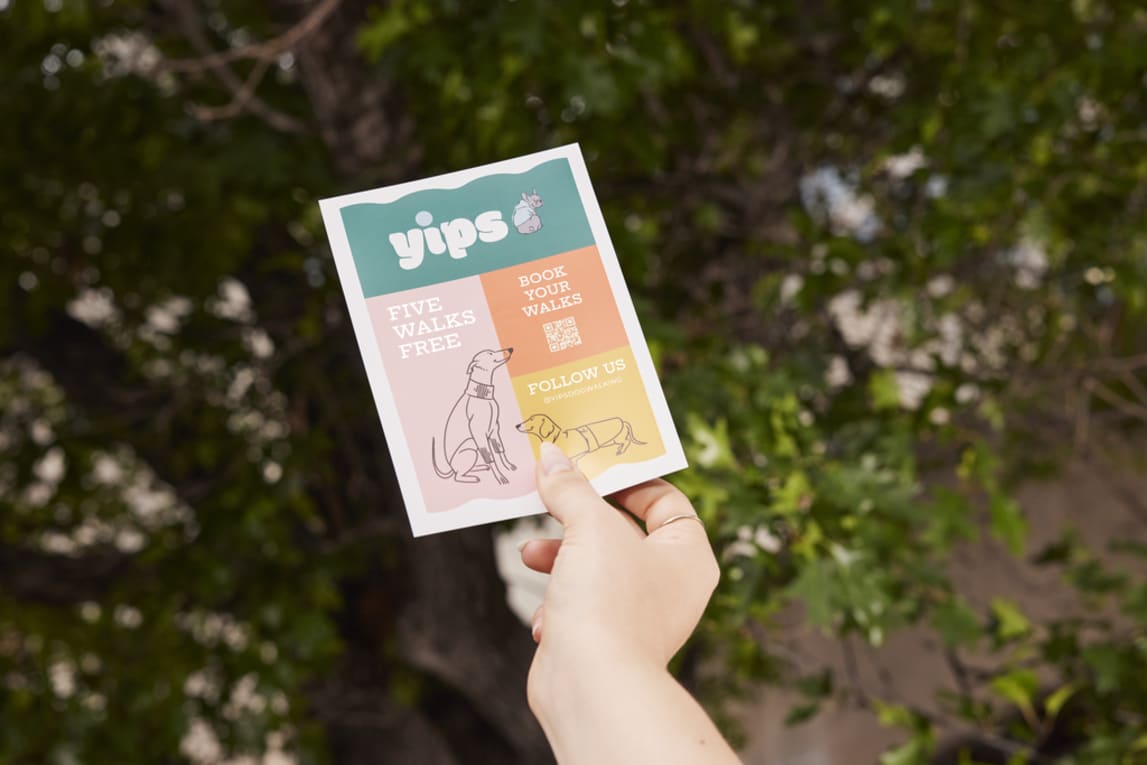
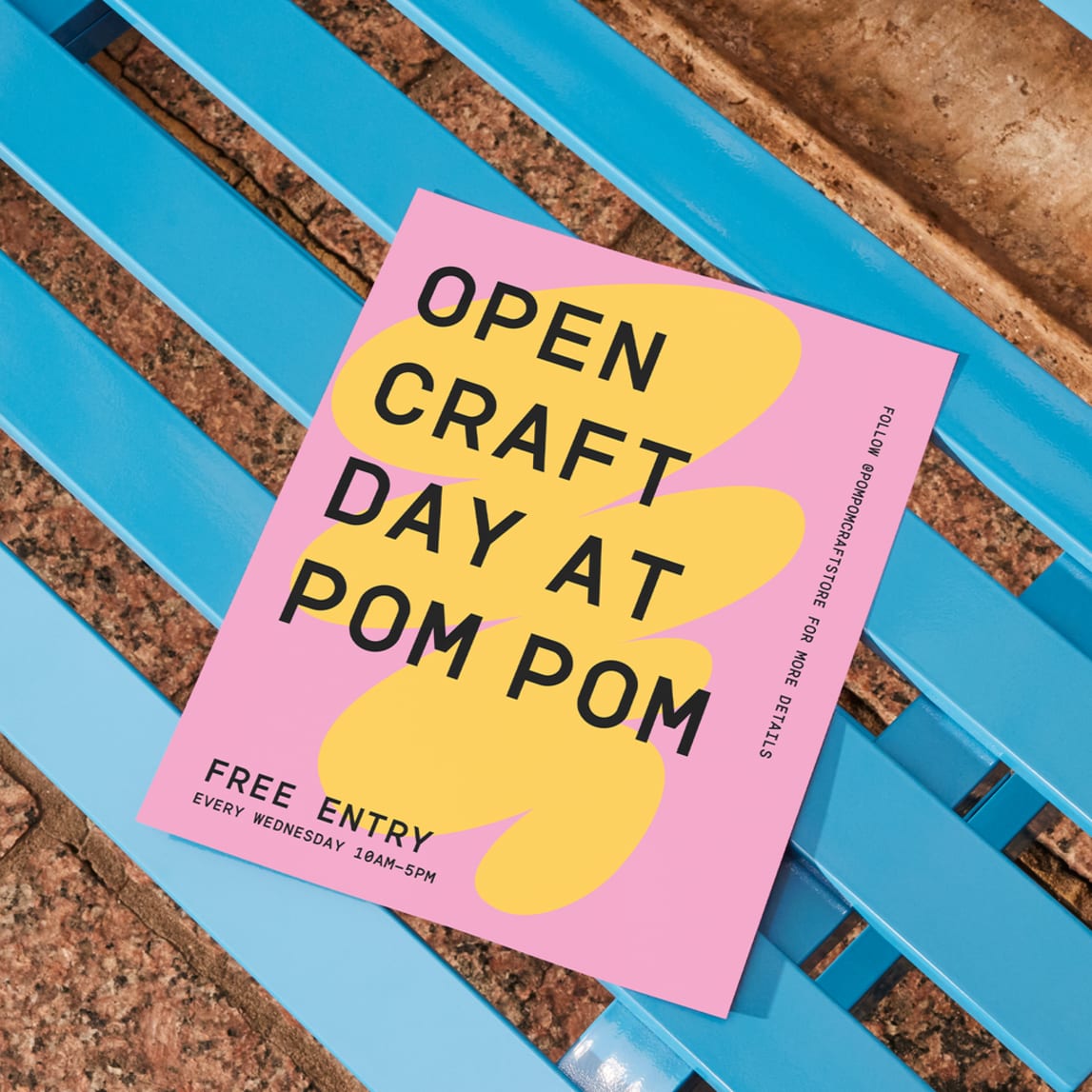
Flyer focus: High-attention type that reads from a distance
Flyers are where typography needs to shout clearly without turning into visual noise. Your headline should have strong shapes and enough weight to hold up on common paper stocks, especially when printed quickly. Condensed fonts can work well for impact, but only if spacing stays clean, as tight tracking is a common way to accidentally make a flyer feel blurry.
If you’re learning what flyering is, remember most flyers get only a few seconds of attention, so your typography for flyers has to work immediately, even if the reader never stops walking.
Brochure focus: Readability for longer text
Brochures need body typography that doesn’t tire the eye, especially across folds and panel breaks, including tri-fold brochure templates. This is where the serif vs. sans serif question matters. Traditional serifs often help the eye track from line to line in print, while modern sans serifs can feel clean and contemporary if you give them enough breathing room.
The easiest way to get a real feel for brochure fonts is unglamorous: Paste a full paragraph into your layout and read it like a real person. If you find yourself losing your place, the issue is usually spacing or line length, not that the font isn’t fancy enough.

Print typography tips that make everything easier
Now that you know what each format prioritizes, here are the practical knobs you’ll actually turn while designing: hierarchy, sizing, font limits, pairing and print setup. These are the steps that keep your type consistent, readable and intentional.
Hierarchy
Hierarchy is the silent salesperson in print. It’s created through clear differences in font size, weight, spacing and placement, so the most important message naturally grabs the eye first. If the reader can instantly tell what to read first, second and third, your piece feels professional, even with simple fonts.
A quick test: If you squint and still understand the order of the page, your hierarchy is doing its job.
Flyer and brochure font sizes
As a starting point, flyers often land best with headlines roughly in the 24–36pt+ range (larger if the flyer is meant to be read from farther away), while brochure headings often sit around 20–30pt because panel layouts shrink usable space.
Body text typically prints comfortably around 10–12pt, and dipping under 9pt tends to hurt readability fast, especially on textured paper.
Line spacing is a quiet upgrade: Body text often looks noticeably more polished with roughly 120–140% line height, so lines don’t clump after ink hits paper.
How many fonts should I use?
Two fonts are ideal (headline + body). Three can work if the third is a restrained accent used sparingly, like for a pull quote or a small label style. More than three looks chaotic in print. If you want variety without mess, stick to one family with multiple weights (regular, medium, bold) instead of adding more typefaces.
Font pairing strategy
If you’re pairing fonts, aim for contrast that doesn’t clash. A classic formula is a bold headline with a neutral body. For a modern, clean look, a geometric sans headline with a softer sans body can feel cohesive without being bland. For a more traditional brochure tone, a high-contrast serif headline paired with a very plain sans body often reads premium in print. And if you’re going bold for an event flyer, keep the expressive font confined to the title while the details use a no-drama workhorse.
Print vs. digital
While digital type is RGB and backlit, print is CMYK ink on paper. That changes edge sharpness, contrast and how fine strokes behave. Another common issue from digital to print is exporting typography as a low-resolution image or flattening it so it rasterizes, meaning type that looks crisp on screen can print as jagged or fuzzy.
A practical, ready-to-press mindset helps:
- Keep text in vector format
- Export a press-ready PDF
- Embed fonts
- Avoid re-saving designs through apps that compress everything like a photo
- Do a quick test print at 100% size
2026 typography trends
This year, print typography is leaning hard into personality, humanness and a little nostalgia. You’ll still see variable fonts used for practical tweaks, but the bigger shift is how type feels: friendlier shapes, warmer curves and details that look intentionally imperfect, like ink, stamps, signage or old-school editorial layouts. Minimalism isn’t gone, but it’s softer now – less clinical white space, more quiet with character. The key is to choose one vibe, such as nostalgic and expressive or clean and restrained, then keep it consistent so the design feels intentional rather than confused.
If you’re collecting flyer design ideas, look less at cool fonts and more at hierarchy: where the designer used weight, spacing and contrast to make reading effortless.

Best fonts for flyers and brochures by use case
By this point, you’ve probably noticed a pattern: headline fonts have one job (grab attention), and body fonts have a different job (stay readable). So instead of one big mixed list, the suggestions below are grouped by use case, with separate picks for headings and body text. Use them as starting points, then adjust weight and size to match your format.
Informational
Headlines: Akzidenz-Grotesk, FF Din, Franklin Gothic, Bogart, Denton
Body text: Garamond, Baskerville, Cardo, Larsseit, Sassoon
Accent options: Hanley Pro, Des Montilles, Tondo
Event
Headlines: Knockout, Monument, Modesto, Ivi Sans Display, Northwell
Body text: Avenir Next, TT Norms Pro, Amsi Pro, Brandon Grotesque, Acme
Accent options: Bon Vivant, Amsterdam Signature, Toroka
Promotional
Headlines: Gotham, Rockwell, Recoleta, Garrison, Winden
Body text: Futura, Univers, Uni Sans, Vitesse®, Amasis™
Accent options: The Seasons, Baloo

Corporate
Headlines: Bodoni, ITC Lubalin Graph®, Big Caslon, Argesta, Lovelace
Body text: Dia, Trade Gothic, Monotype Grotesque, Museo Sans, Rational TW
Accent options: Bickham Script Pro, Canela Script, Söhne, Druk Condensed
For professional brochures, test a full paragraph at print size before committing.
Creative
Headlines: ITC Bauhaus, Bacode, Stone Iron, Prêt-à-porter, Ask For Mercy
Body text: Apparel, ITC Avant Garde Gothic, Nereida, Reins, Nording
Accent options: Hollie Script Pro, São Torpes, The Sunday Times
Versatile
Headlines: Helvetica Neue, Proxima Nova, Nexa, Sackers Gothic, Evert Variable
Body text: Frutiger, Foco, Trade Gothic, Quicksand, Exo
Accent options: GT America, Noe Script, Tiempos Text, Knockout

Get the perfect font for your brochure or flyer
Text lies at the heart of flyer and brochure design, and the right font can make that text so much more than information. Although there may be endless font options available online, a few simple guidelines will lead you to the right choice. Just make sure your font is reflective of your brand, contributes to visual hierarchy and conveys the tone appropriately, and you’ll be well on your way to a flyer or brochure that resonates with its audience. If you take one thing from this guide, pick fonts for their job, then let hierarchy and print setup do the rest.
FAQs on the best fonts for flyers and brochures
What is the most accessible font for readers with visual impairments?
Fonts with open shapes and clear character distinction are a good baseline. Verdana and Arial are widely available and dependable, and Atkinson Hyperlegible is designed specifically to improve character recognition. Accessibility also depends on size, spacing and contrast, not just the font.
How many different fonts can I safely use in a single brochure design?
Two is best (headings and body). Three is the upper limit if the third is a restrained accent. Consistency matters more in brochures because the reader spends longer with the layout.
Do I need a separate license for fonts used in print vs. digital materials?
Sometimes. Many fonts separate desktop (often covers print/static design files) from webfont (website embedding) and other uses (apps, broadcast). Always check the EULA or marketplace terms for your specific font.
Why do fonts sometimes look blurry or jagged on printed flyers?
Most often, it’s rasterization or low-resolution export: type got turned into pixels, then printed. Thin weights on absorbent paper can also soften edges due to ink spread. Export a press-ready PDF, keep text as vector, embed fonts and choose sturdier weights for small sizes.