If you’ve ever stared at a brand kit wondering whether your font should rock tiny feet or not, welcome, you’re in exactly the right place! This guide breaks down serif vs. sans serif in plain English, with real-world examples, insights and a helpful step by step guide. By the end, you’ll know which style fits your brand’s personality, where each shines and how to combine them without creating a typographic identity crisis.
- Serifs lean classic, credible and editorial while sans serifs lean modern, clean and approachable.
- Context matters: print vs. digital, long-form vs. user interface (UI) text, luxury vs. scrappy brand, etc.
- There’s no universal “best” font, only the best fit for your brand personality and audience.
- Readability depends more on size, spacing, contrast and execution than on serif or sans serif alone.
- Mixing both styles is powerful when you set a clear hierarchy and limit the number of typefaces.
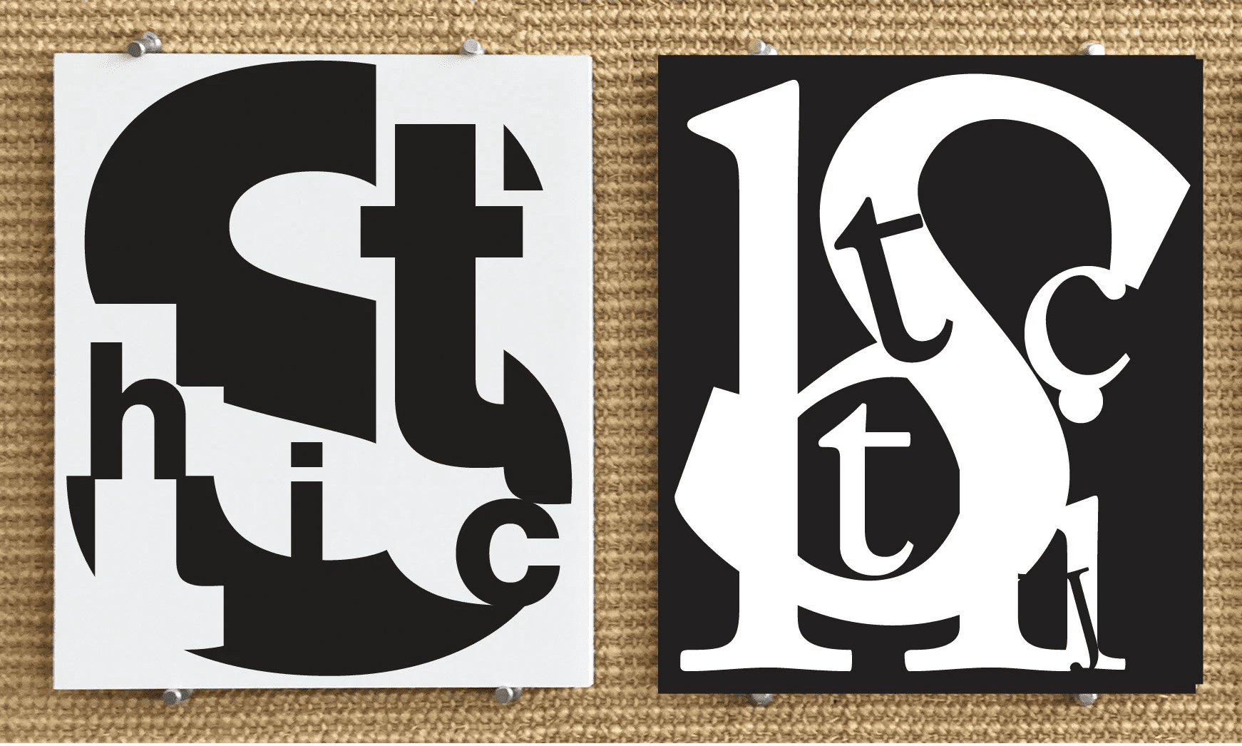
What are serif and sans serif fonts, and where did they come from?
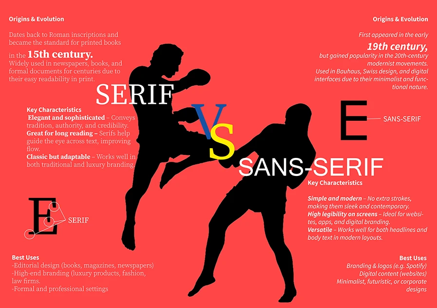
Serifs are those little finishing strokes on letterforms, think of them as the elegant handles that guide your eye along a line of text. Sans serifs ditch the handles for a streamlined look. Historically, serifs evolved from Roman inscriptions and centuries of book printing. Sans serifs arrived later, popularized in the 19th and early 20th centuries as industrialization and modernism demanded simpler, more utilitarian forms. That historical baggage matters: it quietly shapes how people feel about your brand before they read a single word.
Source: infographic by Cindy Vanessa Rubio via Behance
Key characteristics and psychological impact: Serif vs. sans serif fonts
Brand perception isn’t random, it’s influenced by what researchers call typeface personality and processing fluency, i.e. how easily something is read and understood. Studies in typography and marketing psychology have repeatedly shown that people attribute traits to typefaces: warmth, competence, sincerity, excitement, sophistication and so forth.
Serif typefaces often score higher on signals of tradition and authority, while sans serif typefaces often score higher on modernity and clarity. When text is easy to process (good spacing, line length, contrast), people tend to judge the content and the brand more favorably. The takeaway: choose a style that matches your brand’s intended personality, then execute it with excellent readability.
Best font for branding and identity
Picking the best font for your branding isn’t about what’s trending on social media, it’s about aligning the silent message of your brand typeface with your brand’s identity. Look at your mission, values, audience and the contexts where your brand lives, then choose the style that tells the same story before the words even land.
Serif
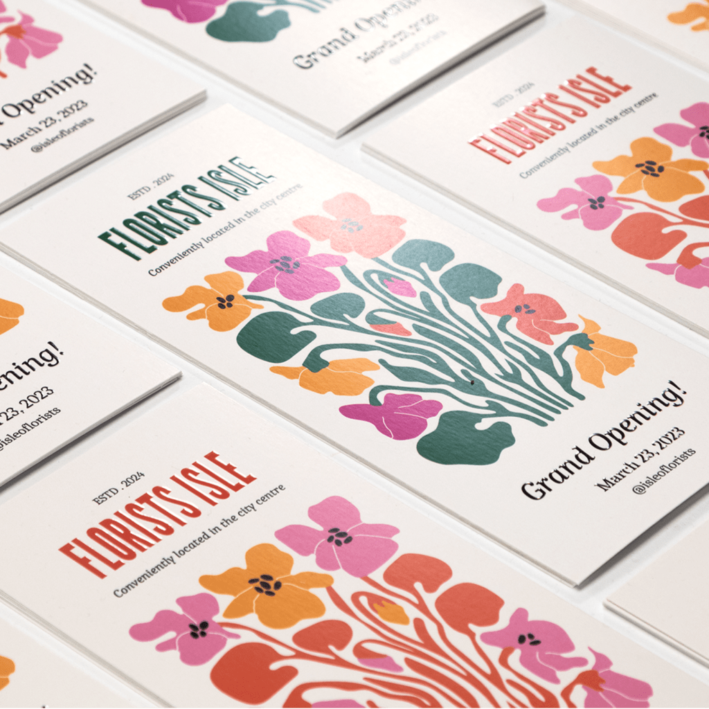
Serifs excel when your brand leans artisanal, authoritative or editorial. Think boutique hotel, legal firm, investment advisory, craft coffee roaster or a founder-led storytelling brand. A serif logo can make a young business feel established and tasteful, which is gold if you’re selling trust, expertise or craftsmanship.
Popular examples and why they work
Old-style serifs (like Garamond) deliver warmth and tradition. Transitional serifs (like Baskerville) offer elegance and high contrast. Modern serifs (like Didot or Bodoni) feel luxurious and fashion-forward, while slab serifs (like Clarendon) hit a friendly, sturdy note that can feel both vintage and bold.
Where to use in branding
Serifs can be fantastic for logos and headlines on packaging, menus and editorial-style websites. For long-form blog posts or print brochures, they offer a rich reading texture, provided that you dial in size, spacing and line length.

Sans serif
Sans serifs are the go-to for brands that want to feel modern, easygoing and efficient. That’s why you’ll find them in consumer-facing brands, fintech apps and product-led companies. A sans serif logo reads instantly at small sizes, scales beautifully and plays nicely with icons and UI components.
Popular examples and why they work
Grotesques (like Helvetica, Akzidenz) bring a straightforward, neutral voice. Humanist sans serifs (like Gill Sans, Frutiger, Calibri) add warmth and motion. Geometric sans serifs (like Futura, Avenir, Poppins) feel precise and contemporary. Neo-grotesques (like Inter, Roboto) are optimized for screens and interfaces. Different sans families let you tune your vibe from friendly to sleek.
Where to use in branding
Sans serifs shine in digital-first environments: websites, apps, emails, product interfaces and ad creative where small sizes and fast scanning matter. For startups aiming at clarity and scale, a sans serif system simplifies your design ops across channels.
Design contexts and considerations for sans serif vs. serif fonts
The font you choose shouldn’t live in a vacuum. It should flex across channels, sizes and situations, keeping your brand voice consistent while staying readable and practical.
Choosing the right font for you
Start with your brand’s personality. Do you want your brand to be considered a trusted advisor, disruptive innovator or down-to-earth neighbor? Then consider your main channels, are you primarily digital, heavy on print or somewhere in between? Look at where your fonts will be displayed—product UI, blog, packaging, pitch decks, signage—and how your customers will view them. Finally, be honest about your team’s design expertise. If you have limited design resources, a simplified, well-documented type system will save your future self countless hours.
Balancing tradition and modernity
A common strategy is pairing simple fonts, like a confident serif for headlines with a clean sans for body copy. This gives you contrast without chaos. If your brand story straddles heritage and innovation, that mix will feel authentic. Just resist the temptation to grab five different fonts, constraint signals professionalism—and will make information easier to access for your customers.
Font usage in media
Where your type lives changes how it’s perceived. The same font can feel elegant on a printed label and clinical on a mobile app, or vice versa, based on size, spacing and contrast.

Print media
On paper, serifs can bring editorial warmth and structured rhythm. They’re well suited to packaging with a tactile finish, business cards on thick stock or premium brochures . High-contrast serifs can look amazing in headlines but may “shimmer” in tiny sizes making them difficult to read, so test proofs. For signage and small print, a robust slab serif or a sturdy sans can carry more weight and survive reading at a distance.
Digital media
On screens, sans serifs tend to feel cleaner, especially in UI and at small sizes. That said, many modern serifs are screen-optimized and look fantastic for headlines and long-form reading on high-DPI devices. The big variables are size, line height and color contrast. Get those right, and the serif vs. sans serif debate becomes less about readability myths and more about brand expression.
Serif vs. sans serif fonts case studies
Ok, so you’re not a global mega brand. Still, marquee examples help because they show how typography evokes strategy, and those lessons scale down perfectly for small businesses.
New York Times (serif)
The New York Times’ (NYT) iconic masthead and editorial typography lean heavily on classic serifs. The newspaper trades on authority, investigation and heritage—all values that serifs embody. The NYT typographic system makes dense information feel organized and serious, which strengthens trust and perceived credibility.
For a small business, the lesson isn’t “copy the Times”, it’s this: if your brand needs to project long-standing expertise, say you’re a law practice, a wealth advisor, a heritage food brand or a boutique publisher, a well-chosen serif can do a ton of lifting before your copy even starts.
Source: New York Times graphic by Jun Hong via Behance
Google (sans serif)
Google’s brand centers on simplicity, speed and accessibility. Its product interfaces rely on crisp sans serif typography that’s purpose-built for screens and legibility at every size. The sans serif approach reinforces the promise of clarity and utility.
The takeaway is straightforward: if your brand lives primarily online, if you’re shipping a product that needs to feel intuitive, or if your identity hinges on approachability and scale, a sans serif system will support those goals across websites, apps and ads with minimal friction.
Source: Google graphic by Entropico via Behance
When to use serif vs. sans serif
There’s no universal winner. Choose the type style that reinforces your message in the environment where your audience interacts with you most.
By medium
For websites, apps and email, sans serifs are often the default for UI text, navigation and small labels. They scale well, load predictably and feel clean. That doesn’t mean serifs are off-limits. For landing page headlines or long-form articles, a modern or transitional serif can add sophistication and improve perceived quality.
In print, serifs bring a classic reading experience for brochures or editorial layouts, while sans serifs dominate signage and short bursts of text where fast scanning matters.
By audience and demographics
Your audience’s expectations matter. Luxury shoppers often expect refined serifs. Tech-savvy audiences lean toward minimal, sans-first brands. Family services and education respond well to friendly, humanist sans serifs. B2B buyers may trust a restrained serif or a sober grotesque sans.
If you’re global, consider how your typeface handles extended language support. Nothing breaks trust like a font that swaps to an odd fallback for key characters.
By readability constraints
Readability is about execution. If your brand uses tiny font sizes, a screen-optimized sans can keep things clear. For printed body copy at reasonable sizes, many serifs are beautifully readable. High contrast, tight letter-spacing and long line lengths can undermine either choice. Test on actual devices and printers. Check color contrast and how your fonts render on Windows vs. macOS as well as iOS vs. Android. The differences are real, and your customers use all of the above.
Mixing the two: Do’s and don’ts
- Do set a clear hierarchy: one font for headlines, one for body, stick to two weights per face for simplicity.
- Do pick contrasting categories (e.g. a refined serif with a humanist sans) so roles feel intentional.
- Do document sizes, line heights and spacing for consistency across your team.
- Don’t mix two similar serifs or two near-identical sans serifs, they’ll clash in an unappealing way and may even seem messy or inaccurate.
- Don’t exceed two typefaces in your core system unless you have a seasoned designer maintaining it.
Recommended pairings:
Playfair Display (serif) + Source Sans 3 (sans)
Freight Text (serif) + Inter (sans)
EB Garamond (serif) + Avenir Next (sans)
Sentinel (slab serif) + Roboto (sans)
Step by Step guide for choosing sans serif vs. serif fonts
1) Define the brand personality
Write three to five traits, say: modern, expert or warm—then translate them into type cues. As a rule of thumb, sans serifs read as modern, minimal, functional and approachable. Serifs feel editorial, crafted, established and premium.
2) Map your primary medium
Consider where your type will live over the next year and note the dominant contexts. If roughly 70% or more of your touchpoints are digital UI: apps, dashboards, small screens, then lean toward a sans-first system. If long-form print and editorial content leads, lean serif-first.
3) Check audience needs and accessibility
Consider what your audience expects from your category, their likely age ranges and the reading environments they use. Luxury and crafted spaces comfortably support serif cues, tech and utility often expect sans. Prioritize clear letterforms, generous x-height, open counters and strong contrast.
4) Ensure distinctiveness
Survey six to ten competitors and note their primary type styles—geometric sans, humanist sans, Didone serif and so on. Identify any overused default in your category and commit to avoiding it so your voice doesn’t blur into the noise.
5) Filter for practicality
Shortlist two or three families that can actually scale with your needs. Look for a useful spread of weights and italics, language support for current and planned locales, figure sets for data, and features like small caps or optical sizes if relevant. Confirm that licensing fits your channels and budget, that the foundry is active and that variable fonts or updates are available.
6) Pilot and test quickly
Place each finalist into a handful of real assets: a mobile UI screen, a marketing page, a one-to-two-page reading sample and any data-heavy component you ship. Review on both high-density and average screens, and print a one-pager. Choose the winner based on clarity at small sizes, brand alignment and distance from competitors.
7) Decide your system structure
With a winner chosen, define how it pairs and where it plays. A sans-first system can borrow a serif for headlines or long reads, a serif-first system benefits from a functional sans for UI labels and small text. Assign roles for headings, body, captions, data, buttons and inputs, then lock a simple type scale so teams can apply sizes consistently.
8) Document and enforce
Condense everything into a one-page spec anyone can follow. List the exact fonts and where to get them, map usage by element and include sizes, line-height and letter-spacing for key breakpoints. Add minimum color-contrast guidance, quick do/don’t examples, then pin the PDF or shared doc in your brand folder so it’s easy to find.
For further font selection help, check out VistaPrint’s handy guide to selecting fonts for your brand.
Future trends of serif and sans serif fonts
Type evolves with culture and technology. First, screen-optimized serifs will keep gaining ground in digital spaces as variable fonts make them more adaptable: thin for headlines, sturdier for text, all within one file. Second, personality is back: after a decade of minimalist sameness, brands are embracing expressive serifs and characterful humanist sans serifs to stand out. Keep an eye on font trends—not to chase every wave, but to understand where flexibility and distinction are opening up new possibilities.

Let your font tell the story of your brand
Choosing between serif vs. sans serif is a strategic decision that shapes how customers feel about you, how easily they use your product and how memorable your brand becomes.
Serifs bring heritage, authority and editorial warmth. Sans serifs bring clarity, modernity and digital ease.
Most strong brands use both, carefully, and let the job dictate the tool. Start with your brand personality, check your primary mediums, consider your audience, and pick the style that tells the same story your brand copy does. With a clear system, a couple of well-paired families and a bit of testing, your typography will stop being a question mark and start being a competitive advantage.
FAQs
What’s the difference between serif and sans serif fonts?
Serif fonts include small finishing strokes (serifs) at the ends of letters, giving them a more traditional, bookish character. Sans serif fonts omit those strokes for a cleaner, modern look.
When should a brand use serif fonts versus sans serif?
Use serif when you want to express tradition, expertise, luxury or an editorial voice. Great for boutique goods, heritage narratives and authority-driven services. Use sans serif when you want to signal modernity, speed, and clarity. Ideal for tech products, digital-first brands and UI-heavy experiences.
Are serif fonts more readable in print and sans serif better on screens?
That’s the conventional wisdom, but it’s only partly true. On paper, serifs often read beautifully in long-form text. On screens, sans serifs usually feel crisp at small sizes. But modern, well-hinted serifs can look great digitally, and well-spaced sans serifs can be comfortable in print. Readability hinges more on font quality, sizing, spacing, line length and color contrast than on the category itself.
Can you mix serif and sans serif fonts in the same design?
Yes, and it’s a powerful way to build hierarchy and personality. Choose contrasting families (e.g. a refined serif with a warm humanist sans), assign clear roles (headlines vs. body) and keep your system tight (no more than two typefaces). Document sizes, line heights and weights so everyone on your team can apply them consistently.
What emotions or brand messages are conveyed by serif vs. sans serif fonts?
Serifs commonly convey trust, sophistication, tradition and craft. Sans serifs communicate clarity, modernity, friendliness and efficiency. Pick the style that reinforces the emotion you want customers to feel before they read the first sentence.