Despite the dominance of digital marketing in our daily lives, flyers remain a hugely effective marketing tool for small businesses. Because they can be produced easily without design experience and are affordable in large quantities, flyers are a cost-effective way to spread the word about your brand. So, here’s everything you need to know about the impact a well-designed flyer can have on your brand and how to make a flyer for business in six simple steps.
- Flyers are a cost-effective way to reach local customers at scale, with a tangible format that’s easy to notice, keep and act on.
- For a strong business flyer, start with a clear goal and audience, then focus on one message and one call to action.
- Choose the right size and format to help your flyer fit the job, from quick handouts and bag inserts to noticeboards and window displays.
- To make a business flyer, pick a tool or template, add your content and branding, review a proof, then print in the right paper and finish or export a digital version for email, social and online sharing.
- Make it easy to measure results and improve your next flyer campaign with a simple tracking method like a QR code, custom URL or promo code.
Well-made flyers still deliver business success
In our often digital-first world, do flyers still make sense for business? Simply, yes. Flyers are cost-effective print marketing materials that come in many shapes and sizes for various use cases. Plus, people are more likely to follow up on a call to action in print than they are on a digital ad. In fact, flyers are seen by 78% of people that receive them and read carefully by 23% (this jumps to 33% if the flyer includes an offer or coupon). Considering the fact that email has an average open rate of just 37% and click-through rate of only 1.4%, the humble flyer is a pretty powerful competitor, especially when combined with digital marketing. Plus, flyers have several practical benefits:
- Affordable to produce
- Easy to print in large quantities
- Great for helping small businesses raise their profile in a local area
- Effective for generating leads and increasing sales
So, how do you make it all work for your business? Let’s start with how to actually make your flyer then cover best practices, ideas and key considerations.
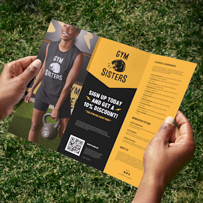
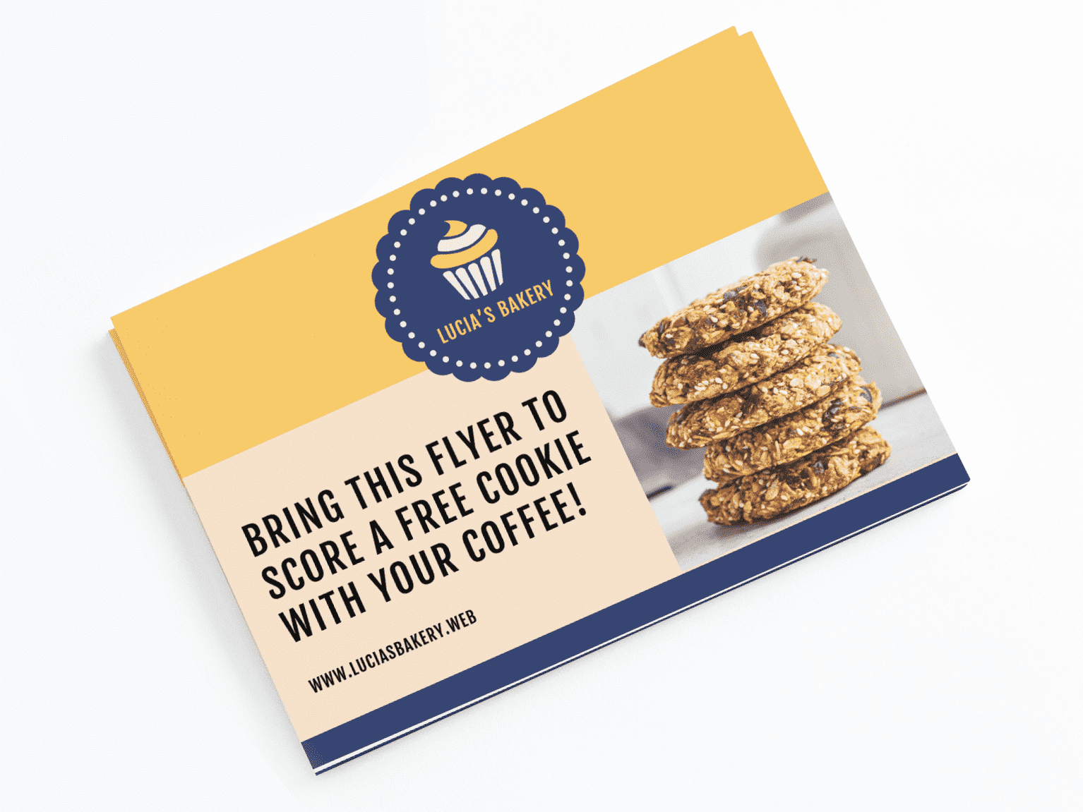
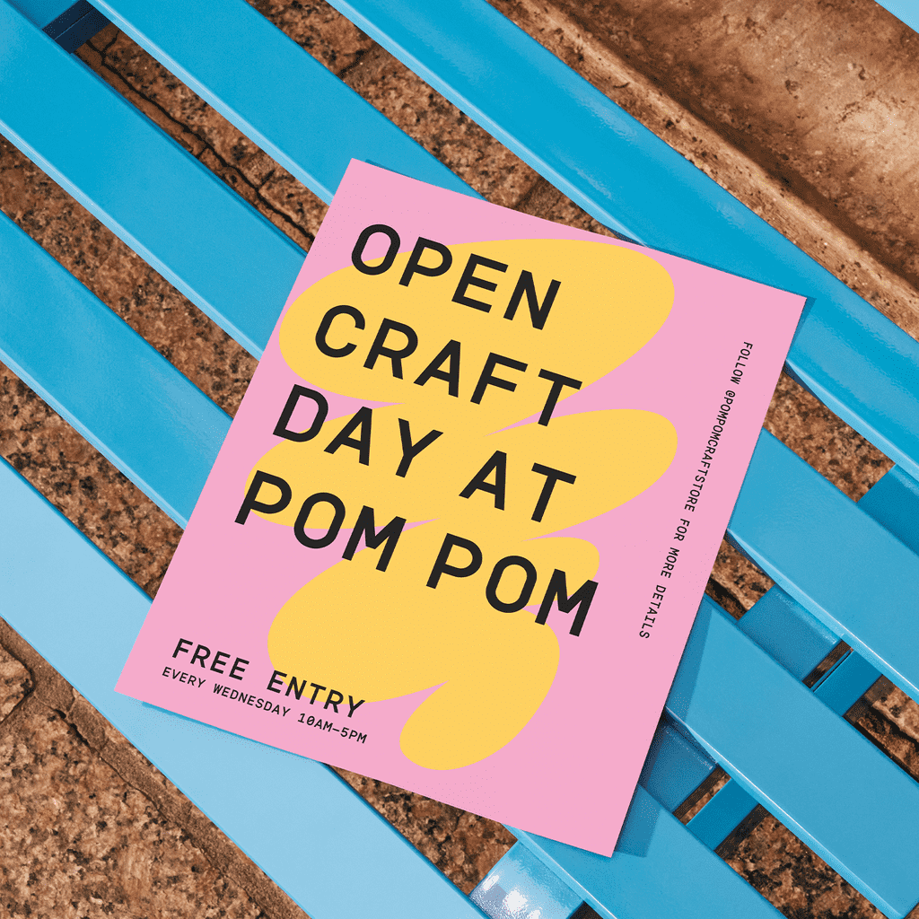
Source: Flyer design by Rose* via 99designs by Vista
How to create a flyer for your business: Step-by-step guide
You don’t need design skills (or hours of free time) to learn how to make a flyer that gets results. The key is to follow a simple workflow that mirrors how real businesses market: start with the goal, choose the right size and format, design for fast scanning, then pick print or digital distribution – and track what works.
Step 1: Define your goal
Before you pick a template, decide what you want your flyer to achieve. Flyers work best when they’re built around one outcome and one clear next step.
Choose your primary goal, then match it to the right flyer type:
- Drive foot traffic → Local offer flyer: Best for cafés, salons, retail and studios. Lead with a simple incentive (“Bring this flyer for 15% off”) and make your location unmissable (address, hours and a deadline).
- Promote an event → Event details flyer: Best for grand openings, workshops, pop-ups and classes. Put the event name, date, time and location at the top, then add one short reason to attend. If sign-up is needed, use a QR code that goes straight to registration.
- Generate leads → Lead-capture flyer: Best for service businesses. Offer something worth responding to (free estimate, consultation, first-visit deal), then send people to one simple action, like a QR code or short URL to a booking/form page.
- Launch a product or service → Spotlight flyer: Best when you have one hero item to promote (seasonal menu special, new arrival, new package). Use one strong visual, one clear benefit and a “try it” CTA – skip the long list of everything you offer.
- Increase repeat business → Return-visit flyer: Best for bag inserts and checkout handouts. Use a bounce-back offer with an expiry date (“$10 off your next visit by March 31”) and keep redemption instructions easy for customers and staff.
- Build local awareness and trust → Introduction flyer: Best for home services and new neighborhood businesses. Lead with the problem you solve, then add one or two proof points (years in business, guarantee, testimonial, “licensed and insured” where relevant).
Come up with a single call to action for the flyer to support your flyer goal.

Step 2: Choose the right flyer size and format (business flyer dimensions)
Flyers come in different shapes and sizes. Smaller business flyers are easy to hand out on the street and easily fit in customers’ shopping bags, while larger flyers such as A4 or 8.5 x 11” can display even more product or sales information, offering the potential for storytelling and space for more imaginative use of images.
Here are some of the main flyer sizes and what they’re best suited for, followed by a helpful table of common sizes and use cases.
Small flyer sizes
Standard flyer sizes vary from country to country, but smaller sizes include:
- 2.5” x 4” (63.5 x 101.6mm)
- 4.2” x 5.5” (106.7 x 139.7mm)
- 4” x 6” (101.6 x 152.4mm)
Where to use them: If you can fit your message on a limited canvas, these smaller flyers are perfect for distributing in large numbers while spending less on printing. They can be used as takeaway info at checkout, in-bag marketing or even as mailers.
Standard flyer sizes
These slightly larger flyers remain affordable, but offer more space to promote your business:
- 6” x 6″ (152,4 x 152.4mm)
- 5” x 7” (127 x 177.8mm)
- 5.5” x 8.5″ (139.7 x 215.9mm)
- 8.5” x 11” (215.9 x 297.4mm)
Where to use them: Choose these sizes for everyday promotions like menus, event announcements, and in-store displays when you need enough space for key details while keeping the flyer easy to distribute and cost-effective.
Flyers are great for short attention-grabbing messages, but if you want to display more information or use multiple pages, consider using a leaflet or brochure to promote your business.
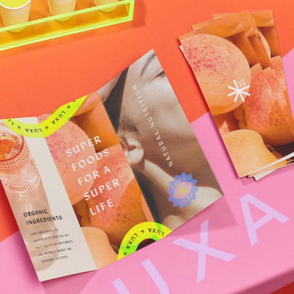
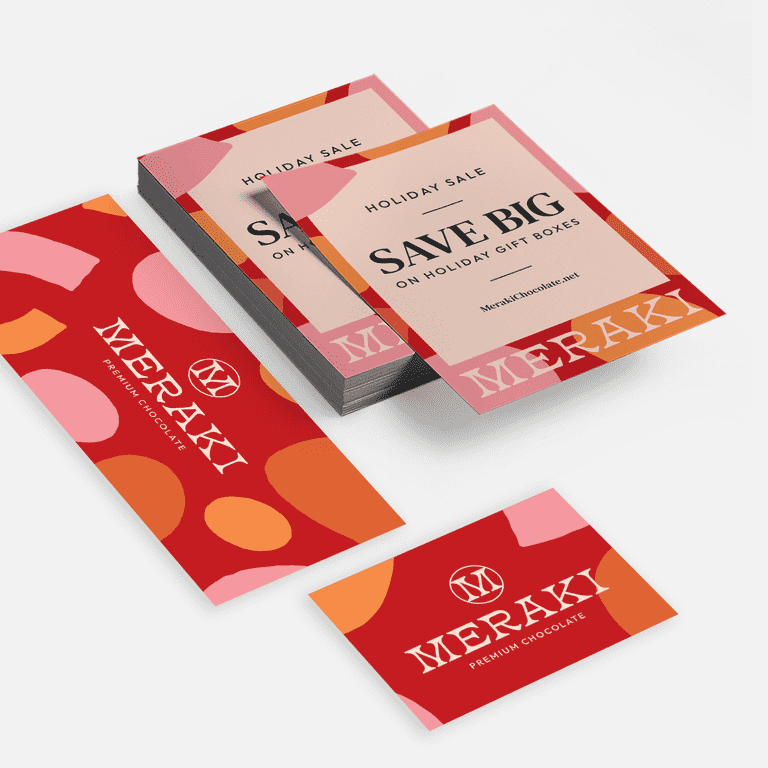
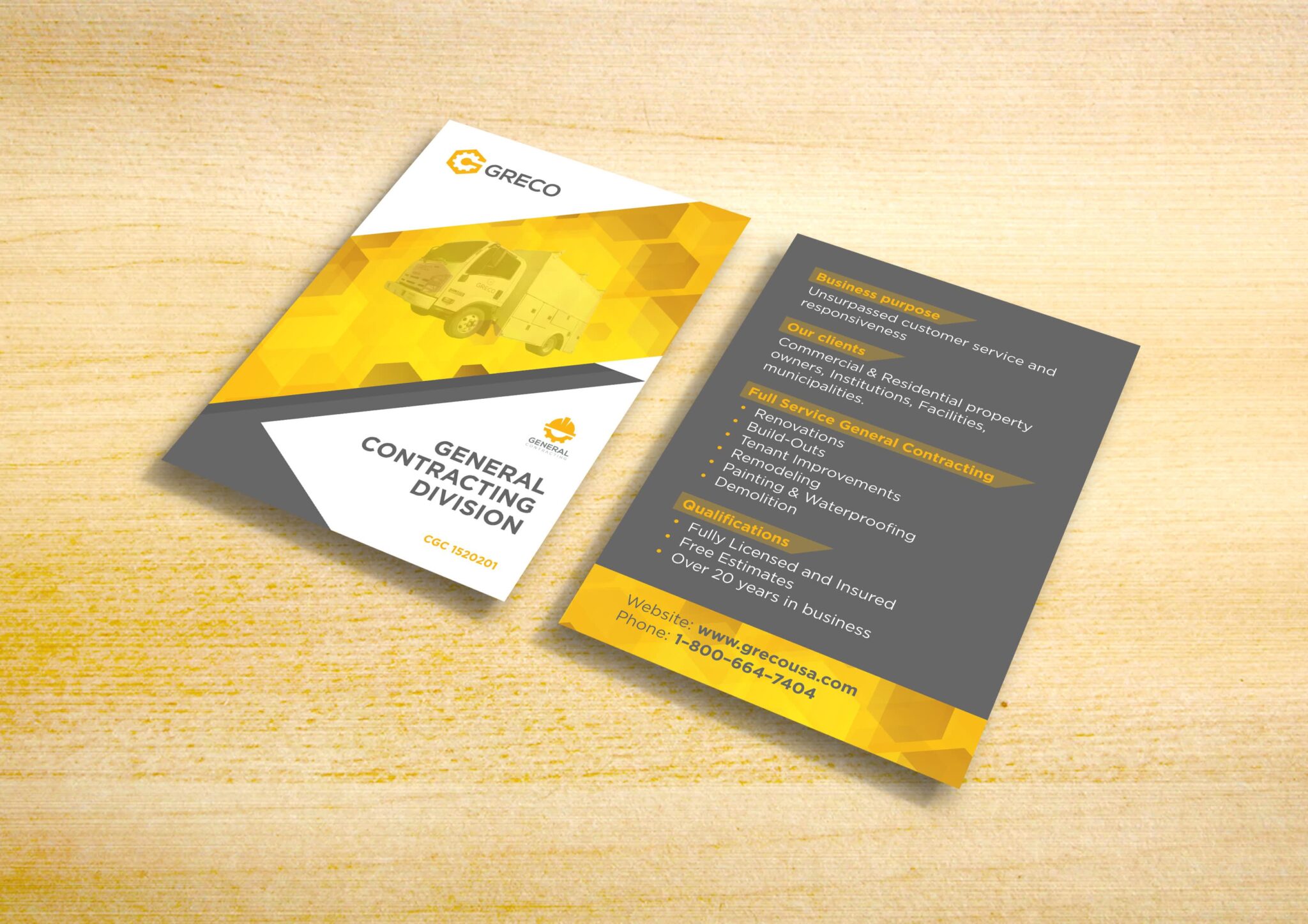
Source: Flyer design by FuturisticBug via 99designs by Vista
Large flyer sizes
Larger flyer formats include:
- 8” x 8″ (203.2 x 203.2mm)
- 11” x 17” (279.4 x 431.8mm)
Where to use them: Longer, slimmer fliers (sometimes called DL or “Dimension Lengthwise” flyers) provide space for more detailed information, lists or vouchers.
Framework for choosing flyer dimensions
A great rule: match the size to the moment your customer will see it. Handouts need to be quick and portable. Window displays need to be readable from a few steps away. Menus and price lists need room to breathe.
Use this simple framework to decide fast:
- Where will it be seen? Handed out, bag insert, posted, counter display, mailed or shared online
- How much information is essential? One offer, event basics, a short list or a detailed menu
- What do you want them to do next? Visit today, register, call, book, scan, redeem
- Do you need print, digital or both? If you’ll share online too, pick a layout that crops cleanly and stays readable on a phone
Once you’ve answered those, choose a size that fits.
| Size & format | Best for | Pros | Cons |
|---|---|---|---|
| 2.5” x 4” | Coupon-style handouts, quick promos, bag stuffers | Lowest print cost per piece in bulkEasy to carryPerfect for one offer + QR code | Very limited spaceSmall text becomes unreadable fastNot ideal for event details |
| 4” x 6” | Street handouts, counter takeaways, appointment reminders | Comfortable to holdEnough room for headline, offer and key infoEasy to distribute in quantity | Can feel crowded if you add a menu or long service listNeeds strong hierarchy to stay scannable |
| 4.2” x 5.5” | Local promos with a little more detail | More breathing room than postcard sizesStill cost-effective for mass distribution | Less common format in some marketsCan look awkward if you reuse a template built for 4” x 6” |
| 5” x 7” | Service menus, event promos, “new service” announcements | Great balance of space and costSupports bigger images and clearer sectionsFeels more premium | Easier to overfill with textSlightly higher print cost than smaller sizes |
| 5.5” x 8.5” | Offers with fine print, multi-service promos, class schedules | Allows clean layout with headings and spacingGood readabilityWorks well double-sided | If your message is simple, the extra space can dilute impactHigher cost per piece |
| 8.5” x 11” | Detailed event info, seasonal menus, in-store signage, community boards | Highly readableRoom for storytelling and strong visualsEasy to design in standard document formats | Not ideal for hand-to-hand distributionHigher printing costMore likely to be folded |
| 6” x 6” (square) | Modern promos, boutique retail, social-friendly designs | Stands out from standard rectanglesStrong for bold visualsCrops well for social | Less space for long detailsCan be slightly pricierLayout needs careful balance to avoid awkward spacing |
| 8” x 8” | Bold promos, window displays, hero-image flyers | High visual impactGreat for one big messageWorks well for storefronts | Overkill for simple handoutsCosts moreNeeds high-quality imagery to avoid looking empty |
| 11” x 17” | Grand openings, big announcements, poster-style promotion | Maximum visibilityReadable at a distanceDoubles as a poster or keepsake | Higher print costNot practical for handing outRequires strong, simple messaging to work |
| Long & DL-style formats | Price lists, restaurant menus, vouchers, step-by-step offers | Excellent for structured infoEasy to foldSupports columns and icon-led sections | Text-heavy designs can get crampedWeak headlines get lostNeeds disciplined spacing |
Quick picks for your small business flyer
- One offer, quick scan, mass distribution: 2.5” x 4” or 4” x 6”
- A bit more detail without losing portability: 5” x 7”
- Menus, schedules, lots of practical info: 5.5” x 8.5” or 8.5” x 11”
- Windows, noticeboards, big announcements: 11” x 17”
- Lists or vouchers that fold neatly: Long/DL-style
Step 3: Choose the right tool and template
With your goal set and your size picked, the next decision is simple: how are you going to build the flyer? The right tool keeps you moving and helps you avoid the usual time-wasters – formatting issues, blurry images and designs that look fine on screen but fall apart in print.
VistaPrint: design & print in one place
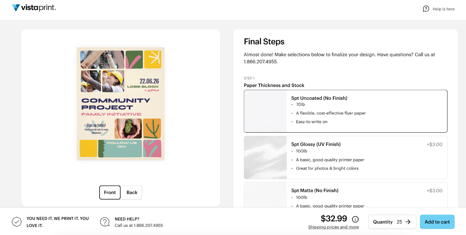
If you want the quickest path from idea to finished flyers, VistaPrint lets you handle the whole process in one workflow. Pick your flyer size and paper options first, then either upload your own file or start with one of our flyer templates.


From there, you can customize fonts, colors, images and add practical elements like your logo or a QR code.
When you’re done, preview the design, download a PDF proof if you want to double-check it and send it straight to print without having to reformat anything elsewhere.
Online flyer makers: Make fast edits with a low learning curve
If you’re short on time and want a clean design without fuss, an online editor with ready-made layouts like VistaCreate is a solid choice. These tools are built for non-designers: you start with a template, swap in your wording and visuals and keep everything aligned as you go. They’re especially handy when you’ll reuse the design across channels, because you can quickly adapt to different formats and export versions for print, email and social.
Desktop design software (maximum control for advanced layouts)
If you’re comfortable with design tools – or you’re working from an existing brand system – desktop software like Adobe Illustrator gives you the most flexibility. It’s useful for complex layouts, precise typography and highly customized graphics. The tradeoff is time: you’ll spend longer setting things up, and you’ll need to be more careful about print-ready details when exporting.
Step 4: Design your flyer content and layout
With your goal, size and tool chosen, keep the design simple and focused. A flyer should be easy to scan and even easier to act on.
Build your layout around these essentials:
- Headline: Make the point instantly by highlighting the offer, event or main benefit.
- Key details: Give just the essential facts someone needs to decide – what, when, where, what’s included and any terms.
- Visual: Choose one strong image or graphic that supports the message, not a collage.
- Call to action: Provide one clear next step, such as visiting, booking, calling, scanning or redeeming.
- Contact info: Include your website, social handles or phone number, and add your address and hours if you want in-person visits.
- QR code (optional): Use a QR code when you want people to go online, and label it clearly (for example, “Scan to book” or “Scan for the menu”).
Looking for more guidance? Dive deeper with our primer on how to design a flyer for small business.
Before you move on, do a quick scan test. If the offer and the next step aren’t clear in a few seconds, trim the extras and give the main message more space.

Step 5: Choose the right channel for your flyers (print vs digital, or both)
Once your flyer is designed, decide where it’s going to live. The same offer can perform very differently depending on whether it’s handed out on the street, pinned to a community board or shared in a local Facebook group. Choose your channel based on how you expect people to act.
Print flyers
Print works best when you want local reach and physical visibility – the places people pass by, pause and make quick decisions.
Use print for:
- Storefront windows (walk-by traffic and inspire impulse visits)
- Community boards (libraries, cafés, gyms, coworking spaces)
- Local events (markets, fairs, school events, festivals)
- Street teams and bag inserts (handouts, deliveries or at partner locations)
Once you’ve picked where the flyers will go, make sure the finish matches the job. A window poster needs to stay readable in changing light. A bag insert needs to feel good in-hand.
If you want the flyer to feel more premium – and survive pockets, bags and countertops – go thicker. Lightweight paper can still look good, but thicker stock makes the piece feel intentional.

Digital flyers
Digital is the right move when you need speed, shareability and easy distribution without printing a single copy.
Use digital for:
- Email newsletters (quick promotion to existing customers)
- Social posts (feed posts for reach, stories for urgency)
- Community groups and online listings (local forums, neighborhood groups, event directories)
- Event pages (RSVP and reminders)
A practical approach for many small businesses is hybrid: print to reach people nearby, then share the same design digitally to keep the offer moving. If you’ve used clear hierarchy and kept the message tight, you won’t need a redesign – just export the right sizes and publish.
Step 6: Distribute and evaluate the performance of your flyers
A flyer campaign is only worth repeating if you can tell what it delivered. The good news: you don’t need fancy tools to get a clear read on performance. You just need a plan for where the flyers go, and one or two simple ways to track what happens next.
Distribute with intention
Treat distribution like targeting. Put flyers where the right people already are (and where they have a reason to act).
If you’re handing flyers out, focus on high-intent spots: outside your location, near complementary businesses, at local events or anywhere people are already in “decision mode” (shopping areas, lunch queues, community hubs).

For bag inserts, think about timing. A bounce-back offer works best when it’s given at the moment someone’s just bought from you.
For noticeboards and windows, refresh them before they start blending into the background.
Whatever method you choose, commit to it. A small, consistent drop in the right places will usually outperform a one-time scatter.
Successful print campaigns often use complementary marketing assets. Spread the message further by building your business marketing collateral.
Evaluate with simple tracking
Pick one tracking method before you print. Otherwise you’ll be guessing.
Use any of these quick options:
- QR code to a dedicated landing page so scans are easy to count and the next step is friction-free
- Custom URL (like example.com/special) that’s short enough to type and unique to the flyer
- Unique promo code (like FLYER10) that staff can recognize instantly at checkout
- Ask at checkout with a single question: “How did you hear about us?” and keep the answers simple to log
Then measure what matters for your goal:
- Redemptions (coupon or code used) for offer-led flyers
- Visits to the flyer URL/page for awareness and consideration campaigns
- Bookings or form submissions for lead generation
- Foot traffic lift during the promo window if you’re aiming for in-store visits
One rule makes this much easier: run one offer at a time. If you swap the message every week, you’ll never know which change moved the needle – and you’ll end up reprinting based on hunches instead of results.
Tips for making impactful business flyers
Here are seven of our top flyer design tips to keep in mind when creating and designing flyers for your business.
1. Tailor the flyer to your target audience
Any flyer you make (and any marketing that you do) should speak to your target audience – their pain points, wants and needs. To customize your flyer’s messaging to your ideal customer base, keep in mind “What’s in it for them?” By asking this question, you’ll communicate the benefits for your audience through messaging and design.
2. Choose a purpose and message
You might have a lot to say to your target consumer, but when it comes to flyers, it’s all about using fewer words, keeping your message simple and having just one objective. Consider: What do you want to achieve with your flyer? And stick to keeping it clear.
3. Include a call to action
Directly related to having one clear message, an effective business flyer has a call to action. What single action do you want someone to take after reading your flyer?
A call to action is a sentence that clearly tells your reader what to do next, whether signing up for guitar lessons, following you on social media or coming by your store to redeem a special offer coupon. When it comes to a call to action, it’s better to tell your reader to do just one thing.
4. Hook their attention with a headline
The headline, or title, lets the reader know instantly what the flyer’s content is about. It’s what your audience will read first, so it’s one of the most important things to consider when learning how to create flyers for business. To hook the reader’s attention, include one of the main benefits that addresses a problem your target customer faces.
5. Create an impactful design
Just like a good headline, the flyer’s visual design helps catch your ideal customer’s eye. In general, clear visuals, bright colors and bold fonts grab attention best.
- Pay close attention to color: Use your brand colors for recognition, and choose hues that match the feeling you want to evoke (warm colors feel energetic; cool colors feel calming).
- Choose the right typography: Pick flyer fonts that fit your purpose and are easy to read at a glance.
- Use bold fonts strategically: Make the headline font bold and attention-grabbing, and pair it with a contrasting secondary font for key details and a call to action.
- Keep it balanced: Keep the layout simple by balancing visuals with white space, large elements with small ones and vibrant colors with neutral tones so the message stays clear.
Check out creative flyer design ideas to draw inspiration for your flyer marketing.
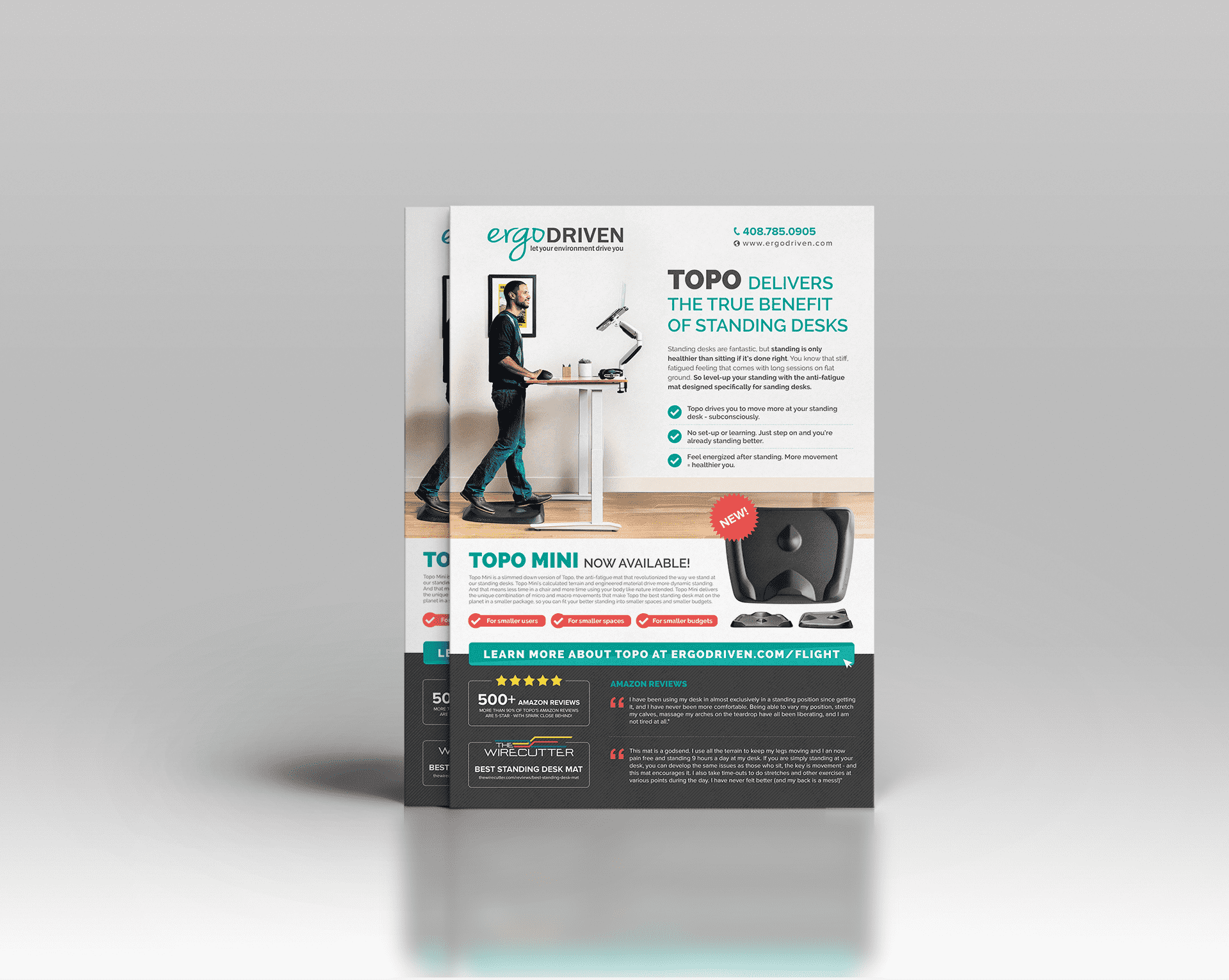
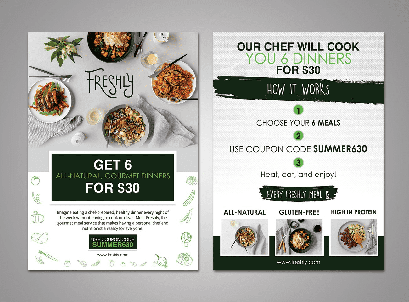
Source: Flyer design by KVA via 99designs by Vista
Learn how to design a flyer that stands out.
6. Focus on visual hierarchy
Visual hierarchy is how you organize the design elements on your flyer so that the reader’s eye is guided to each piece of information in order of importance. It deserves special attention. Emphasize the most important details using color, contrast, position and size.
If the headline is the most important part of an event flyer, it should be in a larger font so it’s read first, while the date and time could be in a contrasting color to stand out.
7. Choose the right paper and finish
It’s vital to get your message and design right, but the material you choose when creating business flyers is almost as important. It will affect the cost and impact your flyers have. You can choose between:
- Matte: This finish absorbs light rather than reflecting it, making text clear and legible, with little glare. Matte finishes also tend to be cheaper and lighter, making this an affordable way to share and distribute your message.
- Glossy: A gloss finish shines, making colors pop but may make text less clear. It’s therefore great for visual flyers with heavy imagery rather than lots of text.
- Uncoated: Skip the coating for flyers that are clear to read, with a more subtle and natural feel. Uncoated flyers look professional and save you money.
- Recycled: These eco-options are better for the environment and help underline your business’s sustainability efforts.
Also consider your flyer paper weight: For professional-looking flyers, use thicker card (14 to 18 pt thickness) for a more durable feel than cheaper, thinner paper.
Start making your small business flyers today
Intuitive online design tools and ready-made templates make it easier than ever to create flyers. Now that you know how to make flyers for business, it’s time to use this marketing tool to spread the word and tell everyone what your small business can offer them.
How to make business flyers FAQs
What size should a flyer be for a business?
The best flyer size depends on where it will be seen and how much information you truly need. For most small businesses, 4” x 6” is a strong default. It is affordable in bulk, easy to hand out and it forces a clear message. If you’re sharing a menu, schedule or service list, move up to 5” x 7” or 5.5” x 8.5” so it stays readable. For windows and noticeboards, 8.5” x 11”or 11” x 17” usually performs better because it’s legible from a distance.
For more, check out our guide to flyer and poster sizes for business.
What is the best way to design a flyer for print?
When you’re learning how to make a flyer for print, stick to the basics to start.
- Use high-resolution images.
- Keep key text away from the edges.
- Design with strong contrast so it stays readable under different lighting.
Print a proof before ordering, especially if you’re using a QR code. Codes that scan perfectly on screen can fail once they’re printed. Also leave generous spacing around important info – smart use of whitespace is one of the fastest ways to make a flyer look professional.
What tools can beginners use to make flyers for business?
If you’re a beginner, start with a template-based builder so the layout work is handled for you. VistaPrint is a practical option because you can design and print in one place: choose a size, customize a template with your logo and details, preview the proof, then send it to print without worrying about file exports. Other beginner-friendly tools can work too, but make sure they support print-ready downloads and let you resize without breaking the layout.
How do you write effective copy for a business flyer?
Strong flyer copy is written for scanning. Lead with one clear promise in the headline, then add only the details someone needs to decide: price, date, location, what’s included and any deadline. Keep sentences short and make the CTA a direct instruction like “Bring this flyer,” “Scan to book,” “Visit today” or “Call for a quote.” If you’re trimming, cut anything that doesn’t help someone take the next step. That’s how to make flyers for business that convert.
How can you measure whether a flyer campaign is successful?
First define success for this flyer: store visits, bookings or redemptions. Then track it with one simple identifier: a QR code to a dedicated page, a short custom URL or a unique promo code. For foot traffic, measure results within a set window like two weeks and compare it to a similar period before distribution. One key rule: don’t change the offer mid-campaign. Run one version long enough to learn, then adjust one element at a time so you can see what improved results. Importantly, true insights can be difficult to pin down if your distribution is minimal, so be sure to get your materials out in the world!
What design elements are essential for an effective business flyer?
Essential flyer design elements include:
- a clear attention-grabbing headline
- high-quality images or graphics
- concise text highlighting key benefits
- a strong call to action
- contact details
Use your logo and brand colors for consistent branding, and consider thicker paper or a special finish for a high-quality flyer feel.
What are the key differences between designing a digital flyer vs a printed one?
Digital flyers should be optimized for screen viewing, using lower resolution images and clickable links. They also allow for easy sharing and updates.
Printed flyers need high-resolution images and benefit from a physical call to action, such as a QR code or a tear-off coupon. They offer a tangible experience and can be used to target customers in a local area.
Consider a hybrid approach for maximum impact.