Flyers are an incredible way to spread the word about your business, event or product. When designed well, they’re impossible to ignore – grabbing attention, sparking curiosity and inspiring action.
So, how do you design a flyer that stands out for all the right reasons? In this guide, we’ll show you how to create a flyer design that connects with your audience and drives real results, from clarifying your goal and shaping your message to making smart layout and branding choices – plus the print-ready essentials (like bleed, margins and image resolution) that help your flyer look professional on paper.
- Start your flyer design by defining one clear goal, a specific audience and a focused message before opening any design tool.
- Build a strong concept by choosing readable colors, consistent brand elements, the right size and format, and a clear call to action.
- Design the layout around a single focal point, logical hierarchy and intentional spacing so readers can understand it within seconds.
- Keep typography controlled and visuals purposeful to avoid clutter and maintain clarity.
- Prepare your flyer for print by setting up bleed and safe margins, using 300 DPI images, converting to CMYK and selecting paper weight and finish that match your objective.
Which type of flyer are you designing?
Before you open a template or pick a color palette, decide what the flyer needs to do. That single choice will steer every design decision you make – layout, imagery, copy length, even paper stock.
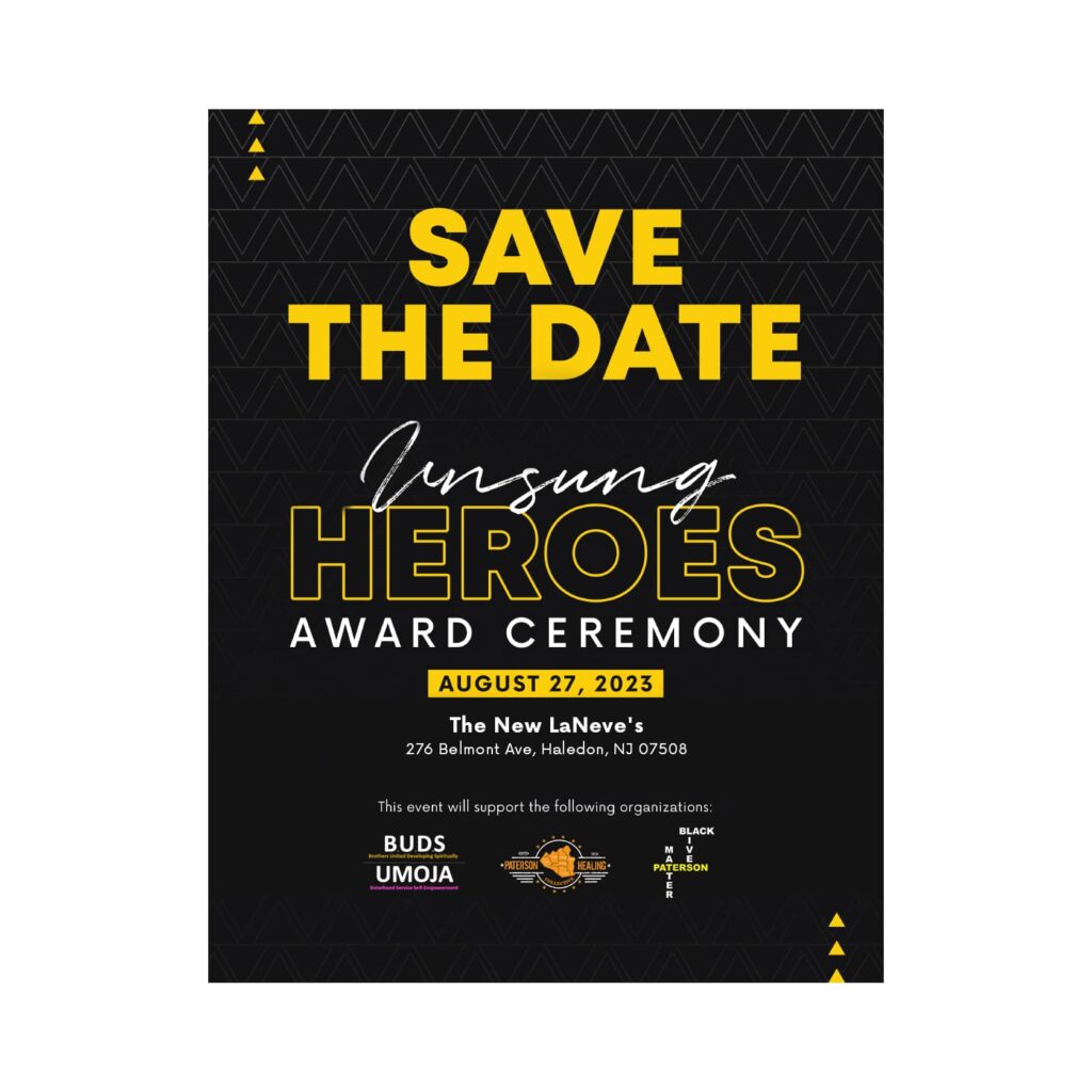
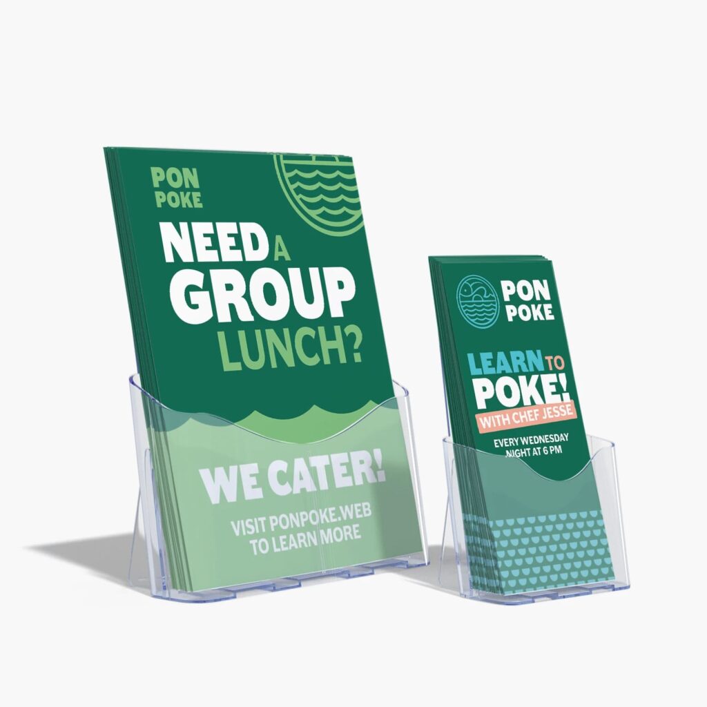
Event flyer
If the goal is turnout, your flyer has one job: make the details effortless to grasp. Lead with the event name (or the main draw), then put date, time and location where the eye naturally lands. Use one strong visual, keep supporting copy tight and don’t bury the “how to attend” step (tickets, RSVP, walk-ins, age limits).
Informational flyer
Informational flyers work when they scan well. Break content into labeled sections, use short lines and guide readers with simple visual anchors like icons or rules. Think: What can someone absorb while standing in a lobby or waiting in line? If you need paragraphs, keep them short and give them breathing room.
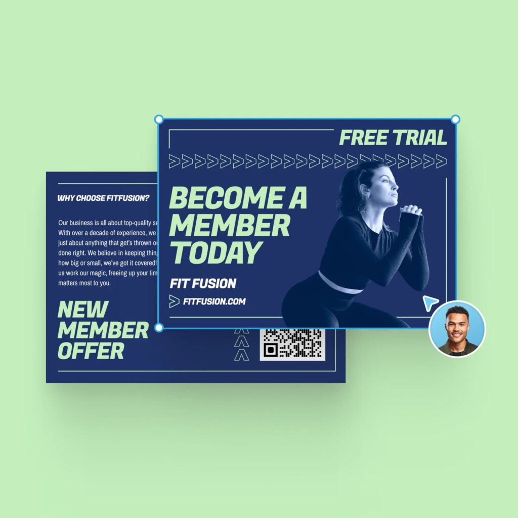
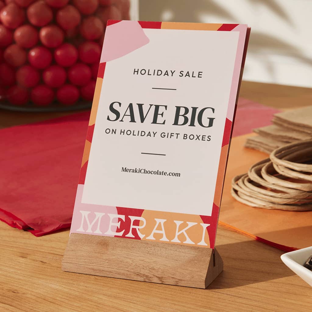
Sale or promotional flyer
Here, the offer is the headline. Put the discount, bundle or price front and center, then back it up with one reason it’s worth acting on (limited stock, seasonal timing, best-seller, new arrival). Make the deadline obvious. A promo flyer that’s “pretty” but vague doesn’t sell.
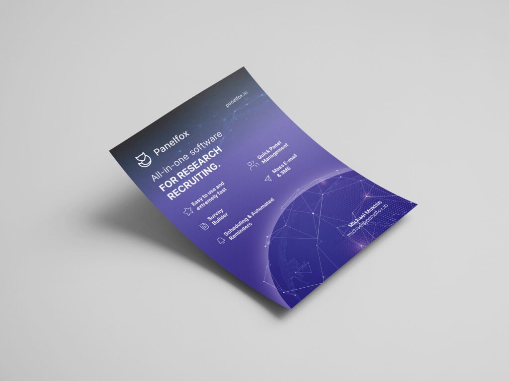
Brand awareness flyer
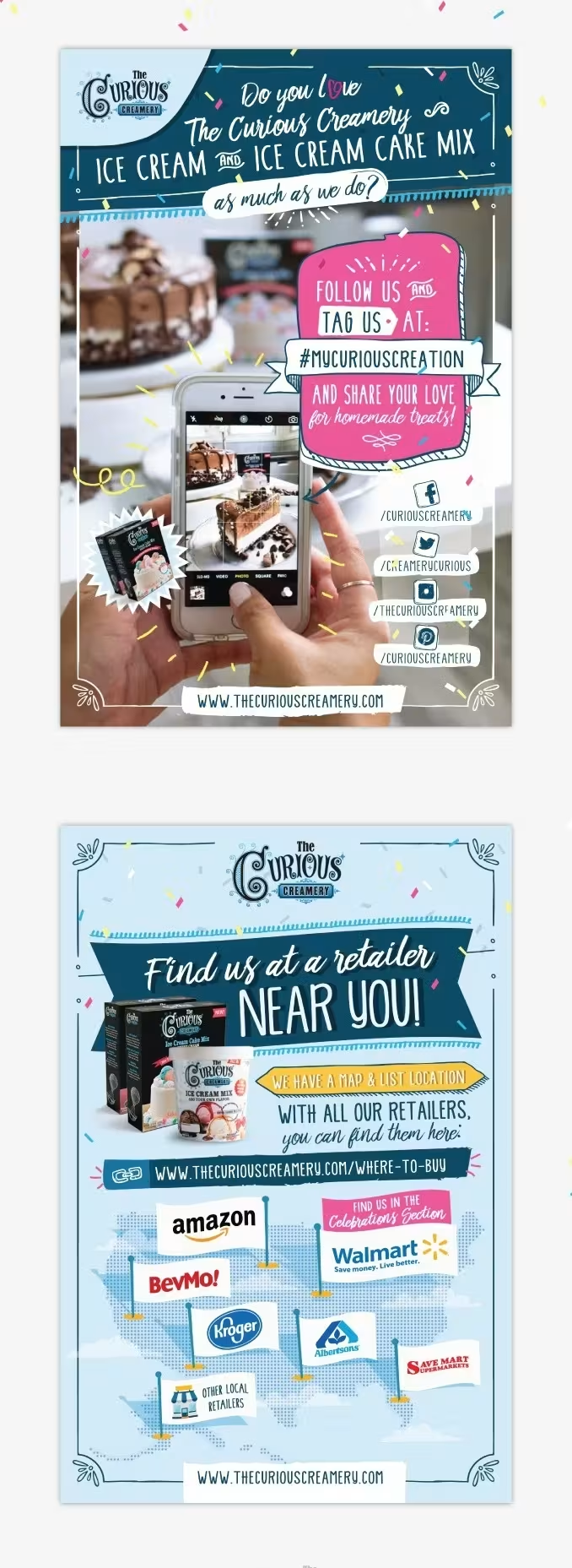
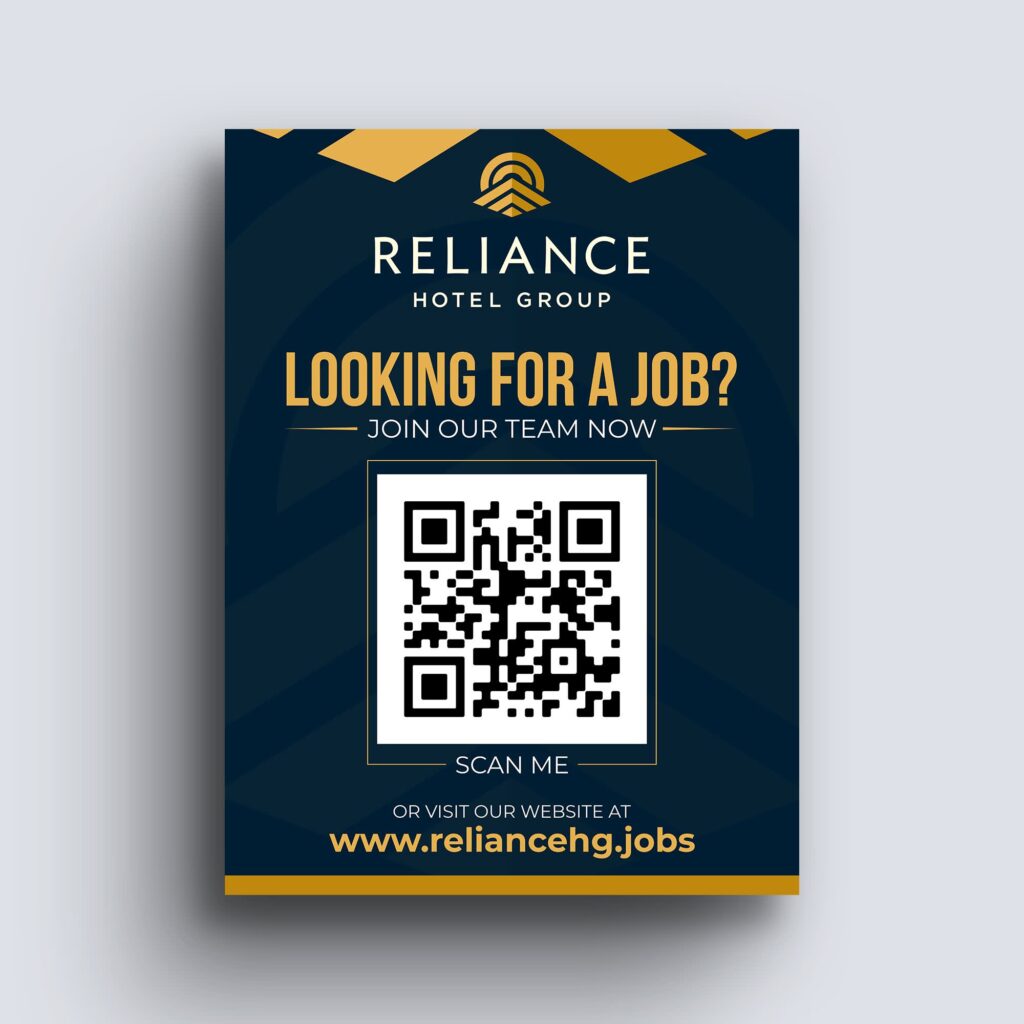
If you’re introducing a business or reinforcing your presence locally, design for recall. Keep the message simple, build around recognizable brand elements (logo, color, type) and choose one clear promise: what you do, who it’s for and why it’s worth paying attention. End with a low-friction next step like a QR code, a short URL or a social handle that’s easy to type.
Once you’ve picked the flyer type, you’ve already made half the design decisions. Next up: a quick strategy pass that keeps your message focused before you move into layout.
How to design a flyer strategy that works
A flyer is a quick read, so your strategy needs to be even quicker. Before you design anything, lock in a few decisions that will keep the layout focused and prevent the “cram everything in” trap.
- What’s the goal – one goal? Pick the main outcome: sell tickets, drive store visits, promote an offer, explain a service, build local awareness, etc. If you try to do three things at once, the design won’t know what to prioritize.
- Who is it for – and where will they see it? A flyer on a café noticeboard needs big type and a bold focal point. A handout flyer can carry a bit more detail. Designing for where it will live (and how fast people will scan it) helps you choose the right layout, font sizes and amount of copy.
- What’s the single message they should remember? Write your key message in one sentence. That sentence becomes your headline or the first line under it. Everything else should support it or get cut.
- What action should they take next? Be specific: “RSVP by Friday,” “Show this for 20% off,” “Scan to book,” “Visit us on Main Street.” Then make that step visually loud and easy to complete with the right link, QR code or contact details.
Need help with the actual build? If you’re looking for step-by-step guidance on tools, templates and setup, check out our guide on how to create a flyer.
Once those pieces are clear, you’re ready to build a design concept that looks good and does its job.
How to construct your flyer design concept
Your concept is the difference between a flyer that appears “thrown together” and one that conveys purpose. Before you touch layout, decide what your flyer will look like and what it must say first: your colors, your visual style, your brand cues and the few details people need to remember. Get this part right, and the design stage will go faster (and be cleaner).
1. Choose a color palette that supports readability
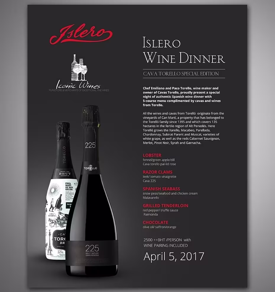
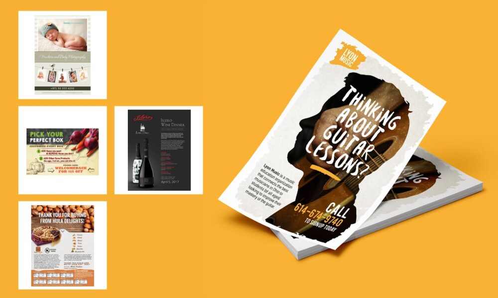
Flyer design by Lalitha for Islero Wines via 99designs by Vista
Bold and bright colors can grab attention, but they need to work with your brand, industry and audience.
Start with your brand colors, then decide whether your flyer should feel energetic, calm, premium, playful or minimal. Check out our guide to color psychology for inspiration.
Ask yourself:
- Do these colors reflect my brand personality?
- Will they still be readable when printed?
- Does the most important information stand out clearly?
High contrast is essential. Dates, prices and calls to action should never blend into the background. Before printing, test your main text/background combinations using a color contrast checker to make sure they’re easy to read in real-world lighting.
If you’re working with a tight budget, consider whether the design would still hold up in black and white. A strong layout should survive without color doing all the work.
2. Decide what your brand needs to “own” on the page
Whatever the flyer promotes, readers need to know who it’s from.
Your logo is non-negotiable, but placement matters. It should be visible without competing with the headline. A corner placement or anchored footer often works well.
Beyond the logo, think about what makes your brand recognizable (aka, your brand identity):
- Brand colors used consistently (not overwhelming the page)
- Typography style (ideally one headline font and one body font)
- Photo or illustration style
- Icons, patterns or graphic treatments
- Tone of voice reflected in the copy
Source: Flyer design by Fi2 Design via 99designs by Vista
If you don’t have defined brand fonts, keep it simple. Too many typefaces make a flyer feel chaotic. If you need ideas, explore these reliable fonts for flyers.
A quick gut check: If someone saw your flyer from a few steps away, would they recognize it as yours?
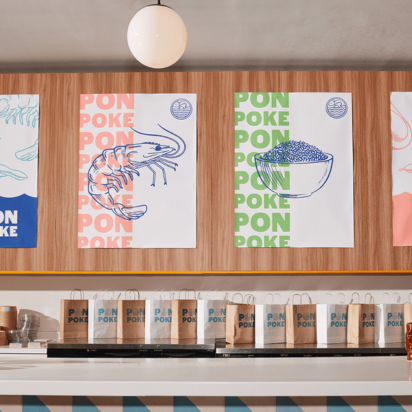
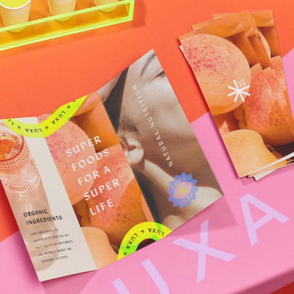
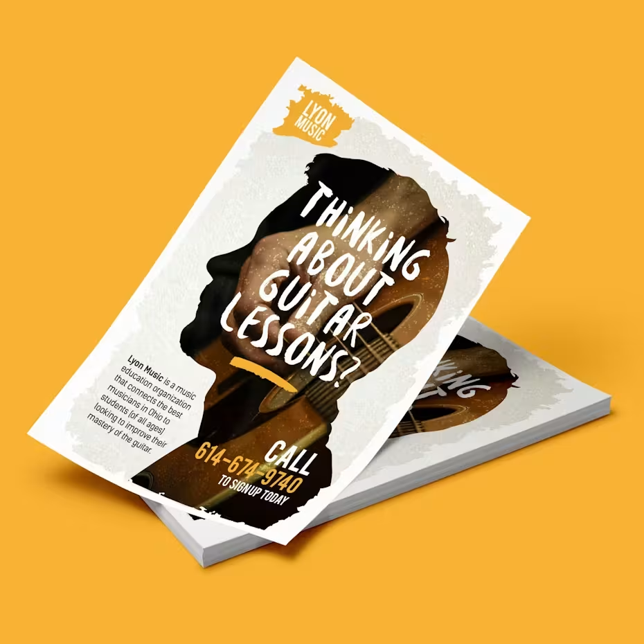
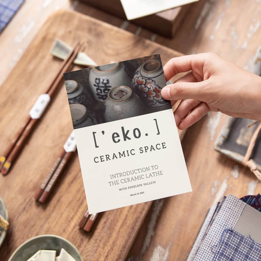
3. Pick imagery that earns its space
Speaking of imagery, what kind of style are you going for? High-quality photography can be really effective in drawing people in – do you have your own, or are you open to using stock photos? What about other kinds of images? Could it be appropriate to use graphics or icons, or maybe even cartoons or drawings? As before, think about your brand, your industry and your target audience when making these decisions.
4. Map your message hierarchy before you write the final copy
Flyer design by Luz Viera via 99designs by Vista.
Now it’s time to determine the exact text that will be on the flyer. Remember the key message you identified earlier and make sure that it’s clear that this is the primary message. Next, decide what other information needs to be on the flyer and in what order it should appear. Can anything be left out if there isn’t enough space?
A solid baseline hierarchy looks like:
- Headline (the “Why should I care?”)
- Key detail or benefit (the “What am I getting?”)
- Supporting info (the “What do I need to know?”)
- CTA + how to act (the “What do I do now?”)
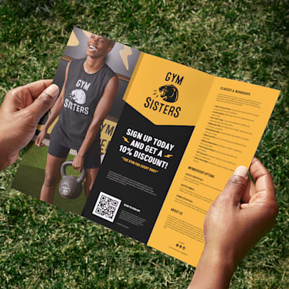
5. Decide on a call to action
Within the message hierarchy, you need to be super clear on the call to action that you identified in your strategy. What’s the next step you want people to take, and what information do they need – social media profile, website URL or something else – to be able to take that action? Make it super straightforward so that there’s no guesswork involved.
Examples:
- “Scan to book your spot” + QR code
- “Bring this flyer for 10% off” + validity dates
- “Order by Friday” + short URL
- “Visit us today” + address and hours
6. Understand if the flyer needs to be a certain size or shape
Flyers tend to come in some pretty standard formats – often, they’re A5. Do you want to stick with the standard flyer size and shape, or do you want something that stands out? If it’s a luxury product and you have a lot of information to convey, maybe you need more of a brochure format in a large size? Can you think of a creative format that gets people interacting with it – even if it’s just folding and unfolding – or using it after they get it?

Source: Flyer design by tadaam via 99designs by Vista

Source: Flyer design by Adwindesign for Broadway Supercars via 99designs by Vista
Flyer design for non-designers: How to design your flyers
Now that you have your strategy and concept for the flyer, you can go ahead with the actual design.
Before you start: Collect smart inspiration
To get an idea of what’s possible, look at other flyers that are out there. Start collecting flyers when you get them and notice what makes you read and act. Remember not to just save designs you like – make sure to figure out what they’re doing well.
Pick three to five flyers you genuinely like (online or in the wild), then look for:
- What grabs you first (headline, image, price, color block)
- How the information is grouped (sections, spacing, dividers)
- How many fonts and colors they use (usually fewer than you think)
- Where the CTA sits and how it’s emphasized
If you want examples to learn from, browse these flyer design ideas and save a few that match your flyer type.
1. Build the layout first, then refine the styling
This is where non-designers often get stuck: They start tweaking colors and fonts before the structure is working. Flip the order.
Start with a rough layout in blocks:
- Headline
- Hero visual (if you’re using one)
- Key details
- Supporting information
- Call to action
Source: Flyer design by Rose ❋ via 99designs by Vista
Once that skeleton feels right, styling becomes the easy part. If the layout is weak, no font choice will save it.
A practical way to check yourself: Zoom out until the text is unreadable. You should still be able to tell what matters most, what comes next and where the CTA sits. If everything looks equally loud, your hierarchy needs work.
2. Use hierarchy and spacing to make your flyer scannable
People don’t read flyers the way they read articles. They scan and move on. Your job is to guide that scan.
Bigger type isn’t enough to create hierarchy. It comes from contrast, too. For best results, use size, weight, spacing and placement together, always giving your headline room to breathe. Keep details grouped so the reader doesn’t have to hunt for them, and avoid squeezing information into the margins. Miss that, and that’s where legibility goes to die, especially in print.
Source: Flyer design by YaseenArt via 99designs by Vista
A few layout rules that hold up across flyer types:
- One primary message per flyer: Supporting points are fine; competing messages aren’t.
- Group-related info: Dates should sit with time and location. Prices should sit with the offer.
- Let important elements “own” space: Crowding makes even good design feel cheap.
- Keep lines short: Long line lengths are harder to scan quickly.
If you’re tempted to shrink the font to fit more copy, that’s usually a sign the copy needs trimming, not the design.
3. Make your branding clear, and your message central
A common mistake is treating branding like a badge you slap on at the end. It should be built into the design from the start, with control.
Keep your brand cues consistent:
- Place your logo where it’s visible but not competing with the headline.
- Use brand colors as anchors (headers, accents, shapes) rather than flooding the background.
- Stick to one font for headlines and one for body copy if you can. Too many fonts break trust fast.
If your flyer could belong to any business once the logo is removed, it’s missing distinctive brand signals. If your brand is so dominant that the offer or event details feel secondary, dial it back. A strong flyer balances both.
4. Design the call to action to be noticeable
Within your message hierarchy, the call to action needs to feel like the natural end point. The reader should land there without effort.
Make the action specific (“Scan to book,” “Bring this for 20% off,” “RSVP by Friday”), and pair it with the exact information needed to do it: QR code, short URL, social handle, address and opening hours.
If you’re using a QR code, add a brief instruction next to the CTA so it doesn’t look like a random square.
One more practical detail: Don’t bury the CTA inside a paragraph. Instead, always aim to give it separation. Use a button-like shape, a contrasting color block or simply add more space around it.
5. Choose your final design, then proofread like a skeptic
An effective flyer design communicates a clear message to the right audience and inspires a specific action. When you think you’re done, get feedback from someone who matches your target audience, even if it’s just a quick glance.
Source: Flyer design by roberto615 via 99designs by Vista
Ask them:
- What do you think this is for?
- What’s the most important detail?
- What would you do next?
If they hesitate, the design needs simplification.
Then proofread. And then proofread again. Check the obvious things that are easy to miss: dates, times, address, pricing, URL, spelling of names, etc. Flyers are unforgiving, and one missing detail can undo the entire effort.
How to prepare your flyer design for print
A flyer can look perfect on screen and still disappoint when it’s printed. Colors can shift, edges get trimmed and images soften. To ensure none of that happens – and your flyer turns out in print exactly as you designed it on-screen – you need to prepare your flyer design files specifically for print. This part is about protecting the design you’ve already done.
1. Set up bleed, trim and safe margins
Printers trim stacks of flyers, and cuts can vary slightly. Bleed prevents thin white edges if the trim lands a hair off.
- Bleed: Extend background colors and images beyond the final size by 0.125 in (3mm) on each side.
- Safe margin: Keep text, logos and QR codes at least 0.25 in (6mm) inside the trim line.
If anything important sits too close to the edge, it’s a gamble.
2. Use high-resolution images (300 DPI)
Print needs detail. For sharp results, your images should be 300 DPI at the size they’ll appear on the flyer.
The common failure is stretching a small image to fill a large space. On screen, it can look fine. However, in print, it quickly turns fuzzy.
if you’re unsure, view the design at 100% and inspect edges and fine detail, paying particular attention to social media images, as those are often too compressed to hold up.
3. Make sure your colors are print-ready (CMYK)
Screens use RGB, while printers use CMYK. Because of this, bright colors can dull or shift when converted, especially vivid greens and blues.
Before exporting, switch your file to CMYK and review key areas (brand colors, backgrounds, color blocks behind text). If something looks muddy, adjust it now. You won’t be able to after those 500 copies arrive.
4. Pick a paper weight that matches your goal
Paper changes how your flyer feels, and that changes how it’s perceived:
- 130–170gsm: Lightweight, budget-friendly, good for high-volume handouts
- 200–250gsm: Sturdier, more “kept” than tossed
- 250–300gsm: Postcard-like, premium feel, great for strong offers or brand-first pieces
If the flyer is meant to be saved (menus, schedules, vouchers), thicker stock usually earns its cost.
5. Choose a finish that supports readability
Finish is not just aesthetic; it affects legibility and how the flyer holds up.
- Matte: Clean, low glare, easy to read under bright lights
- Glossy: Richer color pop, but glare can hurt readability
- Soft-touch: Premium feel, subtle, great for luxury brands
- UV coating: Adds shine and durability; works well for highlighting key areas (where available)
If your design is text-heavy, matte is often the safest choice.
6. Export the files your printer actually needs
This is where the old “make sure you get the files you need” guidance lives.
For print, you’ll typically want:
- A print-ready PDF (usually the safest format)
- CMYK color mode
- 300 DPI images embedded
- Bleed included (and crop marks if your printer requests them)
- Fonts embedded or outlined so type doesn’t shift
Always check the printer’s specs before exporting. If the preview shows anything odd – thin borders near the edge, text too close to trim, soft images – fix it now. As a rule of thumb, those problems don’t improve on paper.
Source: Flyer design by Distinguish♐︎ via 99designs by Vista
Flyer design checklist
Before you send your flyer to print (or share it digitally), run through this list. It takes a few minutes and can save you from expensive mistakes.
Strategy and message
- One clear goal defined (event, promotion, informational, brand awareness)
- Single primary message – no competing headlines
- Target audience considered (tone, visuals, readability)
- Clear, specific call to action
Layout and hierarchy
- Strong focal point visible within five seconds
- Information is organized in logical order
- Headline, details and CTA clearly differentiated by size and spacing
- Related details grouped together (date + time + location, etc.)
- No overcrowded sections; sufficient white space
Branding and visuals
- Logo placed clearly, but not overpowering the headline
- Brand colors are used consistently and intentionally
- No more than two main fonts (three at most, with purpose)
- Images are sharp, relevant and not stretched
- Color contrast ensures text is easy to read
Print readiness
- 300 DPI images at final size
- CMYK color mode applied
- Bleed (0.125 in / 3mm) included where needed
- Safe margins respected (text not too close to trim edge)
- Fonts embedded or outlined
- All details double-checked (dates, URLs, prices, phone numbers)
If every box is checked, your flyer is ready to go.
How to print and distribute your flyers
This is when your flyer really comes to life, and you get it out there in front of your audience.
1. Find a printer
When choosing where to print your flyers, you’ll want to consider price, quality, type of printing and time.
Online printers like VistaPrint usually offer a quick turnaround time, and you’ll get an estimate of when you can expect to receive your order. Prices can vary depending on the quantities you’ll need. Usually, the larger the run you want to print, the less you’ll pay per unit. So, it may be worth printing one larger run instead of repeatedly printing small batches.
2. Choose the quality and texture of the paper itself
What thickness of paper do you want? Do you want something more like a postcard, or are you happy with a flimsy leaflet? Matte or glossy? Does it need to be folded? Get some samples from the printer to see what the options are. You may need to compromise here depending on your budget.
3. Decide on the number of copies
Obviously, price per flyer will decrease as the total number increases – but you don’t want to waste money printing more copies than you need and have them all end up in the bin. If it’s a time-sensitive event or a seasonal offer that you’re promoting, you won’t be able to reuse them, so plan accordingly.
Play around with the various options for quantity, sizes, paper texture and thickness to find the combination that best suits your needs and budget.
4. Consider a test print
If you’re running a very large batch, you could consider a test print before printing the full order. Things look different on paper than they do online, so this way, you can really check the final product, see the quality of the pictures and colors, make sure the copy is legible in the actual size and proofread it one more time!
5. Physical distribution
The flyer process doesn’t end at the printing stage – that’s really only the beginning! Now is your chance to make sure that all your hard work pays off. How are you going to get these stunning print marketing materials into the right people’s hands? How will you maximize the chances of the flyers being seen, read and acted on? Make sure you’re going to the right places and reaching the right people.
6. Digital distribution
Finally, don’t forget that you can get even more mileage out of these suckers by using them online, too. Consider sending them as PDFs to your email list and posting them on social media to reach even more people at no extra cost.
FAQ about how to design a flyer
How do I start a flyer design if I’m not a designer?
Start with clarity. Write down:
- The single outcome you want (sell, promote, inform, attract).
- The one sentence someone should remember.
- The exact action they need to take.
Only then open a template or design tool. Most weak flyer designs fail because people start arranging visuals before deciding what the flyer needs to accomplish.
What makes a good flyer design stand out?
Clarity and restraint are a good start. A strong flyer:
- Communicates its purpose within seconds
- Uses hierarchy to guide the eye
- Keeps copy tight
- Makes the next step obvious
- Prints cleanly without technical mistakes
What usually ruins a flyer isn’t a lack of creativity, but rather overcrowding, weak contrast or unclear messaging. The best flyer design often looks simpler than expected.
How much information should a flyer include?
Enough to trigger action. Not enough to answer every possible question.
If someone needs full details, your flyer should direct them to a website, landing page or in-store conversation. Trying to replace a brochure with a single-page flyer usually leads to clutter and smaller fonts.
Should I use a template or design from scratch?
Templates are useful when:
- You need speed
- You don’t have formal design training
- You want a proven layout structure
Designing from scratch makes more sense when:
- You have strict brand guidelines
- You need a custom size or format
- You’re building something highly distinctive
Either way, the principles remain the same: hierarchy, contrast, spacing and clarity.
What size flyer works best?
There’s no universal “best” size. It depends on where it will be seen and how much information you need to include.
- A5 works well for handouts and events
- A6 suits simple promotions
- A4 is useful for noticeboards or information-heavy designs
Is digital flyer design different from print flyer design?
Yes, especially in the technical setup. Digital flyers can use RGB color and lower resolution. Print requires CMYK and 300 DPI. Digital layouts can include clickable buttons; print relies on physical prompts like QR codes and clear URLs.
If you’re designing for both, prepare separate files rather than resizing one version and hoping it works everywhere.
When should I choose a flyer over a poster or brochure?
Choose a flyer when you need something:
- Affordable to print in volume
- Easy to hand out or leave behind
- Focused on a single message
If your content needs more space or is meant to stay displayed long-term, a poster may be better. Here’s a guide on how to make a poster if that fits your goal better.