If you’ve ever tried to figure out how to print a booklet, you already know it’s not as simple as dropping your design into a PDF and hitting “send to printer.” First-time creators often run into the same roadblocks: margins that cut off text, layouts that don’t flow from page to page or images that look crisp on screen but blur in print. These mistakes can turn what should be a polished piece of marketing into something that feels rushed or unfinished.
This guide is here to simplify the process. You’ll learn how to set up your file correctly, choose the right paper and binding, and avoid costly mistakes so you can upload your design with confidence. With step-by-step advice from VistaPrint, you’ll have everything you need to turn your booklet concept into a polished, print-ready product that reflects your vision.
- Before you make a booklet, you need to decide on the binding type, paper stock and size, since these choices shape the design process.
- The main types of booklets are saddle stitch, self-cover and perfect bound.
- To make a print-ready booklet, you need to follow design best practices like using grids, setting margins, balancing text and visuals, and preparing high-resolution images.
- Avoid mistakes like incorrect trim, missing bleed, wrong page order, low-res images and misaligned spreads.
- To upload your booklet for print, select your specs on the VistaPrint product page, use the provided templates, check your file against the upload checklist and review the online proof before placing an order.
How to print a booklet: Choosing the right paper and binding for your booklet
If you’re learning how to print a booklet, don’t rush straight into design mode. The first decisions you make should be about paper and binding. These two factors shape everything that follows.
The binding method determines your page count options and even the way your file needs to be set up. Paper choice influences how your colors look, how heavy the booklet feels in hand and whether your design lands as polished or budget-friendly.
The general steps for designing booklets are similar, but the instructions for a 20-page saddle-stitched handout will differ from a 200-page perfect bound catalog. Laying down these fundamentals first ensures you avoid costly redesigns later and get marketing collateral that works exactly as planned.
Common types of booklets
Knowing which format you’re dealing with—even before a pixel lands on your layout—saves time, money and prevents errors. Here’s a sharper breakdown of three popular methods: what each is, how it behaves, what it shines at—and where it trips up.
Saddle-stitch booklets

A saddle-stitch booklet
A saddle-stitch booklet is the simplest booklet style, created by folding sheets together and stapling them along the spine.
Key characteristics of a saddle-stitch booklet:
- Accommodates 8-76 pages (including all four cover pages) and offers five size options (5.5” x 8.5”, 8.5” x 11”, 6” x 9”, 6” x 6”, 8” x 8”)
- The interior stock comes in either 9.5pt matte or glossy
- Opens completely flat, making double-page spreads easy to craft and view
An open saddle-stitch booklet
Saddle stitch is a reliable format for event programs, product brochures and slim catalogs. Because the pages lie flat, it’s especially effective for designs that span two pages. It offers a professional look without the higher costs of more complex binding methods.
When creating a saddle-stitch booklet, prepare your file in four-page increments, since the cover (front, inside front, inside back, back) counts toward your total.
| Pros of saddle-stitch booklets | Cons of saddle-stitch booklets |
|
|
Self-cover booklets

A self-cover booklet
A self-cover booklet is a type of booklet where the same paper stock is used for both the front cover and all interior pages.
Key characteristics of a self-cover booklet:
- Available in up to 76 customizable pages, across five size options (5.5” x 8.5”, 8.5” x 11”, 6” x 9”, 6” x 6” and 8” x 8”)
- Can be printed on both glossy and matte paper
- Uniform paper throughout—one weight, one texture, from cover to final page
- Cover and interior printed in one run
A self-cover booklet
Self-cover booklets are best for projects that need to be practical and affordable rather than long-lasting. They work well for instruction manuals, assembly guides and event programs that are used briefly and set aside. They’re also effective for product catalogs, newsletters and direct mail inserts where weight and postage costs matter. And because they’re quick to produce, easy to pack and budget-friendly, they’re a smart choice for promotional handouts or event guides.
| Pros of self-cover booklets | Cons of self-cover booklets |
|
|
Perfect bound booklets

A perfect bound booklet
A perfect bound booklet is made by stacking printed pages together and securing them to a square spine with adhesive, similar to a paperback book. This method gives the booklet a polished, professional appearance suitable for longer publications.
Key characteristics of a perfect bound booklet:
- Supports 32-398 customizable pages (including four cover pages)
- Available in five sizes (5.5” x 8.5”, 8.5” x 11”, 6” x 9”, 6” x 6”, 8” x 8”) and two orientations
- Cover and inside pages can use different paper stocks
- Optional cover lamination: none, glossy, matte or soft-touch
- Printed in full color with a squared spine that can feature titles, logos or other branding elements
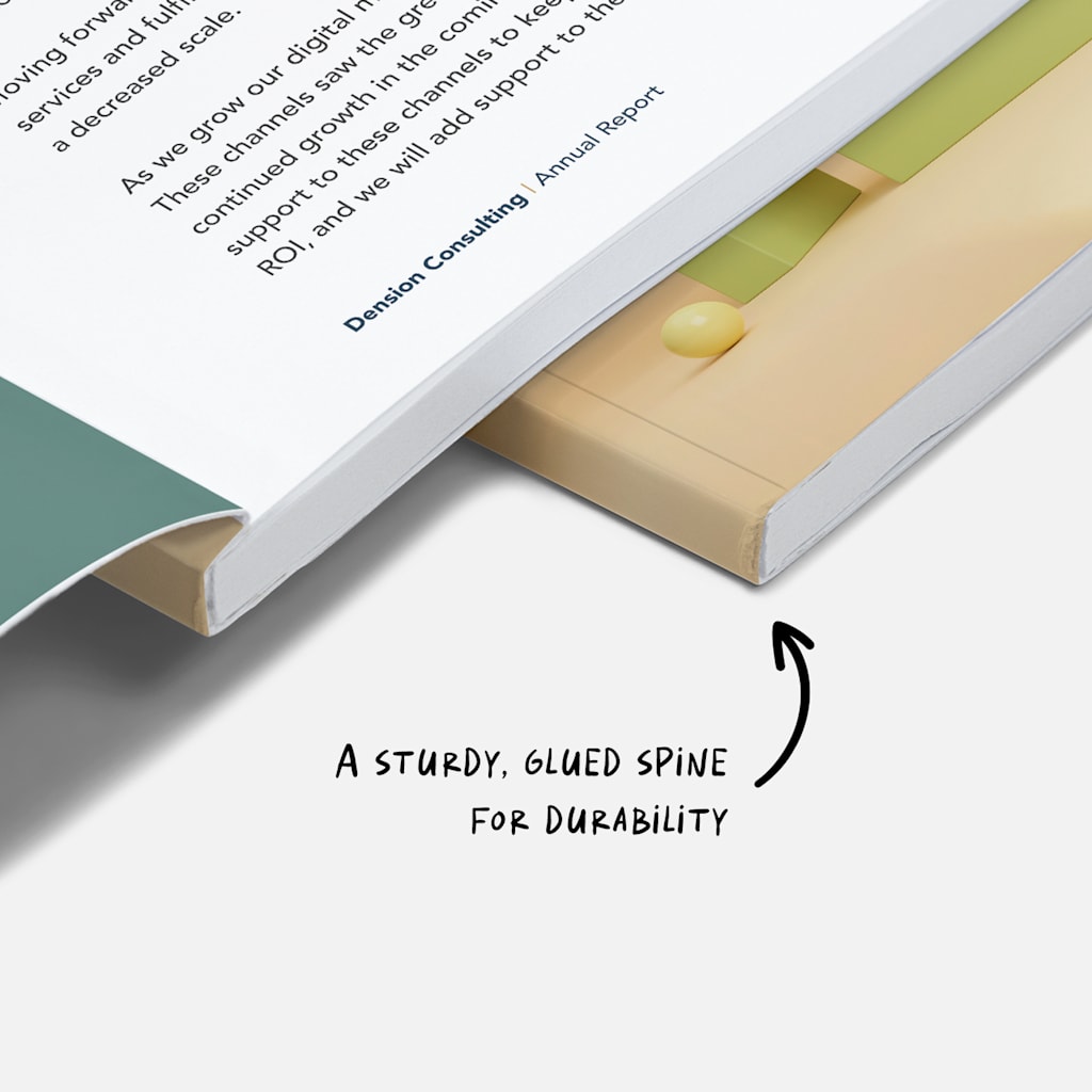
Glued spine of a perfect bound booklet
Perfect bound booklets are often used for catalogs, magazines and corporate brochures that need to project a polished image. They also work well for product guides, training manuals and informational resources designed for repeated use.
Finally, this booklet type is perfect for creative projects—whether you’re pulling together a design portfolio, a company lookbook or creating your own photobook—where both appearance and durability matter.
| Pros of perfect bound booklets | Cons of perfect bound booklets |
|
|
Wire-bound booklets

A wire-bound booklet is made by punching holes along the binding edge and securing the pages with a metal wire coil. This creates a durable, flexible spine that allows the booklet to open fully flat—or even fold back on itself—without damaging the pages.
The result has a more functional, utilitarian look than perfect bound or saddle stitch formats, making it especially useful for content that needs to be read or referenced frequently.

Wire-bound booklets are ideal for manuals, workbooks, training guides, calendars and presentations—any material that needs to stay open during use. Their lay-flat design makes them especially practical in classrooms, offices, workshops and other hands-on settings.
| Pros of wire-bound booklets | Cons of wire-bound booklets |
|
|
Popular booklet paper types
Just like binding, paper type has a big impact on how your booklet looks and feels. It affects cost, durability and readability, so the right choice depends on your budget, the intended use and the impression you want to create.
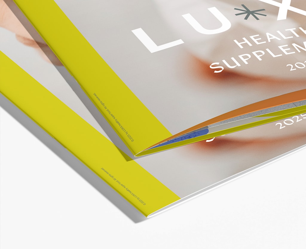
For the cover, you can choose heavier or treated stock that protects the pages and gives the piece more impact. Options such as matte, glossy, uncoated or even laminated finishes (gloss, matte, or soft-touch) let you decide whether the cover feels understated, vibrant or premium.
A laminated cover also adds durability, which is helpful if the booklet will be handled often.

Matte paper stock for booklet cover

Glossy paper stock for booklet cover
For the inside pages, lighter stocks are typically used to balance cost and readability:
- Matte paper offers a smooth, non-reflective finish that’s easy to read and gives off a refined, understated look. It’s practical for text-heavy content such as manuals or informational guides.
- Glossy paper enhances color and image sharpness, giving photos and graphics more punch. It’s ideal for product catalogs or visual-heavy booklets where presentation is everything.
- Uncoated stock offers a natural, textured feel that can suit creative projects or booklets with a more tactile, minimal aesthetic.
Ultimately, the pairing of cover and inside paper should match your booklet’s purpose. A glossy cover with matte interior pages can strike a balance between visual appeal and readability. A soft-touch laminated cover with glossy pages can give a high-end catalog an unmistakably premium feel.
Your choices shape aesthetics—they also determine how long your booklet lasts, how practical it is to use and how your brand is remembered.
How to make a booklet that’s ready for print
Once you’ve locked in your binding and paperstock choices, the next step is setting up a booklet layout that fits those decisions. The size and format you chose will shape how much content each page can hold, how images are displayed and how the reader experiences the booklet.
A smaller format (5.5” x 8.5”) works best with concise copy and larger images that create impact without crowding the page. A larger format (8.5” x 11”) gives you more room for detailed explanations, charts and multiple visuals per spread.
One common question is which software to use for booklet design. Professional designers often rely on Adobe InDesign because it handles multi-page layouts, grids and facing pages seamlessly. Adobe Illustrator can work for simpler booklets with more visuals than text. VistaCreate and other online tools are user-friendly for beginners, though they may offer less control over advanced print settings.
Whatever size or software you’re working with, applying the principles of design ensures your layout stays professional and easy to follow.
Establish a clear visual hierarchy
Readers should know immediately where to start on a page and which elements matter most.
One way to achieve this is by making titles larger and bolder than everything else, giving section headers their own distinct style, and keeping body text clean and readable.

Booklet design with clear visual hierarchy
Color contrast also plays a role—dark headers on light backgrounds, for instance, make main points stand out. Spacing is just as important; leaving white space around headlines draws the eye without adding clutter.
You can also use subtle design elements like rules, icons or background shapes to separate sections and guide the reader through the content.
Use grid layouts for consistency
A grid is an invisible framework of columns and rows that helps you place text and images in an orderly way. It keeps layouts cohesive across multiple pages and reduces design guesswork. Common grids include:
- Two-column grid: Works well for manuals, reports or text-heavy booklets
- Three-column grid: Useful for balancing text and small visuals side by side, often seen in magazines
- Modular grid: Divides the page into smaller blocks, ideal for product catalogs or photo-driven designs where flexibility matters
Choose a grid based on your content—more columns for dense information, modular for creative layouts.
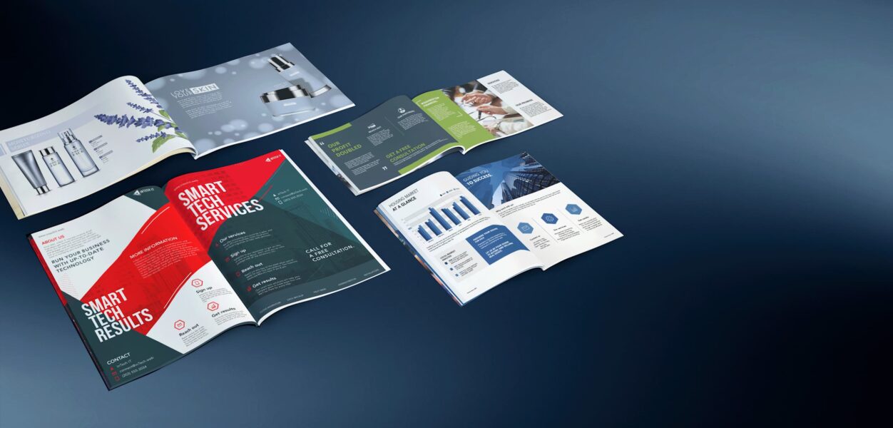
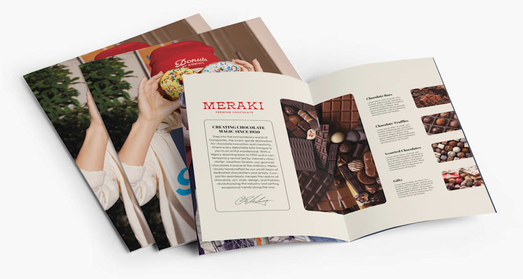
Balance text and visuals
A booklet that’s all text feels dense, while one overloaded with images lacks context. Aim for balance: Use a strong visual to anchor each spread and pair it with concise copy. Break up longer passages with callouts or infographics, add captions so visuals connect to the story and leave white space so pages don’t feel cramped.

Well-balanced text and visuals in booklet design
Set up optimal margins and spacing
Maintain at least 0.125” margins on all sides to prevent trimming issues. For text, use line spacing that feels open (around 120-140% of the font size is a good rule of thumb). Space between paragraphs should be consistent and slightly larger than line spacing to create clear separation.
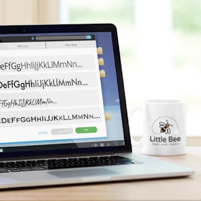
Ensure consistency in fonts and colors
Fonts and colors do more than decorate—they shape the tone of your booklet.
- Fonts: Stick to two to three complementary choices. A sans serif for headings and a serif for body text often works well. Avoid overly decorative fonts except for accents.
- Colors: Build your palette around your brand’s existing colors, then add neutral shades for balance. Keep usage consistent—headings in one color, body text in another—so the booklet feels cohesive.
Align typography and color choices with your broader identity.

Booklet design that uses brand colors and fonts
Follow the image guidelines
Always prepare images at 300 DPI for print. Lower resolutions may look fine on screen, but will blur once printed. Use original or licensed high-resolution files to avoid pixelation, and check that images match the tone of your brand.
Create alignment and consistency across pages
Consistency builds trust. Create rules for how recurring elements are placed and stick to them:
- Keep titles aligned the same way (e.g., always left-aligned or always centered)
- Apply identical padding around text boxes and image frames
- Use consistent borders, styles and positioning for photos across spreads
- Maintain uniform footer/header placement if including page numbers or section labels
Consider readability for your audience
Even strong designs fall flat if the content is hard to read. Body text should typically sit between 10-12 pt, depending on the booklet size, so it remains comfortable at a glance.
High-contrast combinations—like dark text on a light background—make copy easier to process and reduce strain. Long, unbroken blocks of text should be avoided; shorter paragraphs are more approachable and hold attention better.
Finally, match the content density to your audience. A younger reader may respond better to layouts with more visuals, while professional audiences are often prepared for more detailed, text-driven pages.
Common mistakes to avoid when making a booklet
Even if your booklet design looks great on-screen, it’s how it comes off the press that matters the most. A few technical missteps can undo hours of design work. Here are the pitfalls that catch beginners most often (and how to avoid them during the booklet-making process).
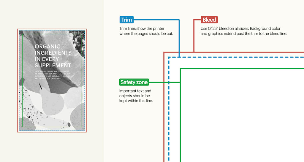
Incorrect trim marks and lines
Trim lines show the printer where the page should be cut. If they’re not set up correctly, key elements like text, logos or page numbers can end up sliced off or uncomfortably close to the edge. Always keep vital content inside the safe zone and use proper trim guides from the start.
Improper bleed setup
A booklet without a proper bleed risks white slivers appearing along the edges. Background colors and images need to extend at least 0.125″ beyond the trim line so they reach the edge once cut. Skipping this step makes even a well-designed booklet look unfinished.
Regardless of the booklet type you choose, each booklet product page on VistaPrint offers template files with proper bleed, trim and safety measurements. Download them for free in the preferred format and use them to ensure the correct setup.

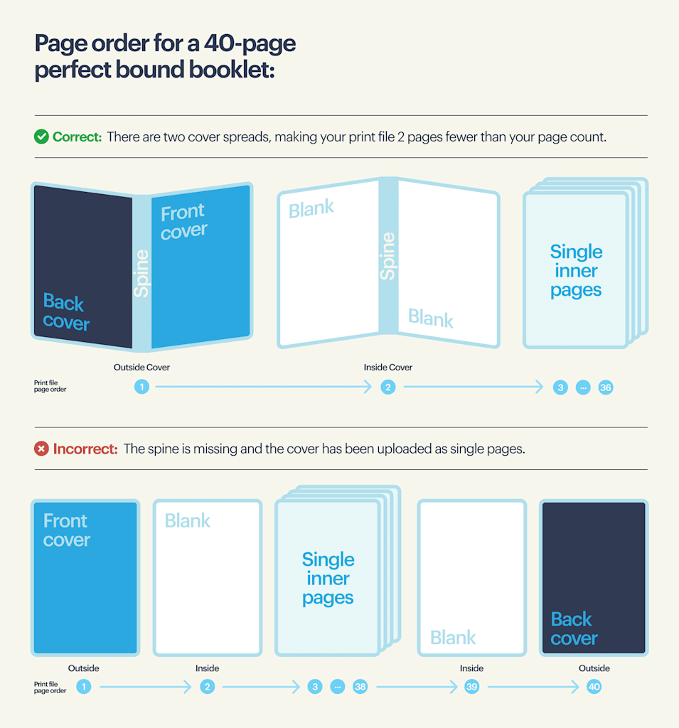
Page order issues
When working with multi-page documents, especially in perfect-bound booklets, keeping pages in the correct order is critical. A misplaced page can throw off an entire spread, confuse the narrative and create a poor reading experience. Double-check sequencing before sending files to print.
Low-resolution or RGB images
Images that look fine on a monitor can fall apart in print. Anything below 300 DPI will print soft or pixelated, and RGB colors often shift when converted to CMYK.
To avoid this, always check your image resolution before placing it in your design—most editing software lets you verify DPI in the file properties. Convert all images to CMYK before export so the printed colors match what you expect.
If you’re working with logos or icons, use vector formats (AI, EPS or SVG) whenever possible, since they scale cleanly without losing quality.
Incorrect page alignment or crossover
Spreads that span two pages require precise alignment; otherwise, the gutter break becomes distracting.
To avoid issues, always set up your file as facing pages rather than individual ones so design elements flow across the spread correctly. Keep critical text or logos away from the gutter, since small shifts in trimming or binding can cut them off.
For full-bleed images, extend them across both pages and make sure the bleed is applied consistently on each side.
Before sending your file to print, review crossovers in your PDF export and in the digital proof to confirm that visuals line up seamlessly without gaps or misalignment.
How to upload your booklet for printing
Once your booklet design is finished, the final step is uploading it for print. On the VistaPrint booklet product page, you’ll first choose your size, paper, page count and more. These are the same decisions you made while designing, so the file you upload should already match those specs.

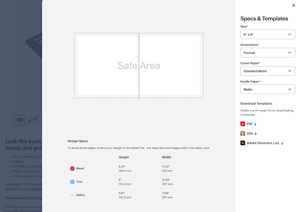
Download a print-ready template in PDF, SVG or Adobe Illustrator (.ai) from the Specs & Templates section of the product page. Using one of these ensures your file is set up with the correct dimensions, trim and bleed right from the start.
Before you upload, run through this quick checklist:
- Confirm your file has the correct page count for your binding type (e.g., saddle stitch must be in multiples of four, perfect bound requires a higher minimum).
- Export as a PDF with embedded fonts and no password protection.
- Verify all images are at least 300 DPI and saved in CMYK color mode.
- Check for proper bleed (0.125”) and margins (0.125” from the edge) so nothing gets cut off.
Once everything is ready, click the “Upload file” button.

The system will automatically validate your file and generate a preview of your booklet. This preview is your chance to review every page, confirm alignment, and ensure the bleed looks correct.

If the proof matches your expectations, you can proceed straight to checkout and place your order with confidence.
Reach out to VistaPrint Support to get guidance.
Now you know how to print a booklet—what’s next?
By now, you’ve seen that printing a booklet isn’t complicated once you understand the moving parts. Binding, paper choice, layout and upload settings all have clear rules to follow, and when you get those details right, the process is straightforward. If you run into questions mid-way, resources like downloadable templates and design guides are there to keep you on track.
The next step is simple: Put what you’ve learned into practice. Whether you’re planning a product catalog, a training manual or a creative project, the groundwork is in place to make something polished and professional. With the right preparation, your booklet will become a piece of marketing your audience actually wants to hold onto!