Often, your logo serves as an example for the tone, aesthetic and values of the entire brand. Logo usage guidelines ensure that your logo is used properly and as you intended. An integral part of any brand strategy and brand style guide, these guidelines help maintain consistency, clarity and recognizability across every place your logo appears – print, digital, packaging, social media and merchandise.
Read on to learn how to set logo usage guidelines for control over how your logo looks with different backgrounds, its orientation, shape, logo type, proportion and more.
- Logo usage guidelines are simple rules that keep your logo looking consistent everywhere.
- Logo guidelines stop your logo from looking stretched, blurry or “off” across print, digital and merch.
- Your guidelines should include spacing, color values, fonts, logo variations, minimum sizes and the right file formats.
- Include poor and “off” examples of your logo in your guidelines to further help avoid errors.
- Set clear do and don’t rules so your logo never gets distorted, recolored or lost on a busy background.
What are logo usage guidelines?
Logo usage guidelines are rules on how to properly display your brand’s logo. They help keep consistency with your logo and avoid errors. This helps maintain professionalism. Your logo guidelines can be their own document or a section in your brand style guide.
Rules to set in your logo guidelines
Describe your logo
Your guidelines should open with a description of what your logo is and is not – a brief explanation of what your logo looks like and why. Spelling out your logo and how you want to use it helps define all the situations you need to consider.
The logo in essence, is the brand name, but not all logos need to include a name. Think about Apple. We are all familiar with the monochrome, minimal apple with the right corner bitten off. The name is synonymous with the symbol, the logo is an apple and the company is called Apple.
Here is an example of a logo from one of our top designers:

A wordmark with missing “o”s creates a dynamic yet simple and memorable logo. Design by
Milos Zdrale via 99designs by Vista.
Here is a description example from 99designs:
“We’re 99designs. We’re not 99 Designs, or 99Designs or 99 designs. Just simply 99designs.”
Decide how much space to keep around the logo
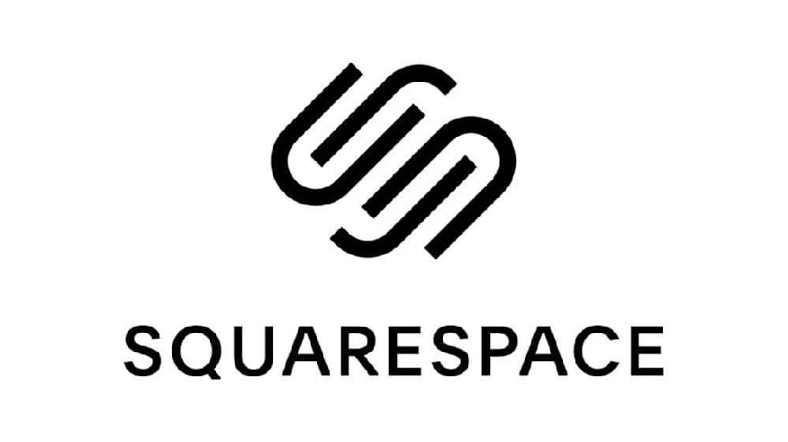
Provide padding around the logo to help your logo appear clean and uncluttered. Via Squarespace Logo Guidelines.
One of the first rules to include in your logo usage guidelines is spacing around your logo. There should be sufficient clear space around the logo to let it breathe and prevent its clarity and visual impact from being obstructed.
Take a look at this logo guideline example for spacing and how it relates to the brand.
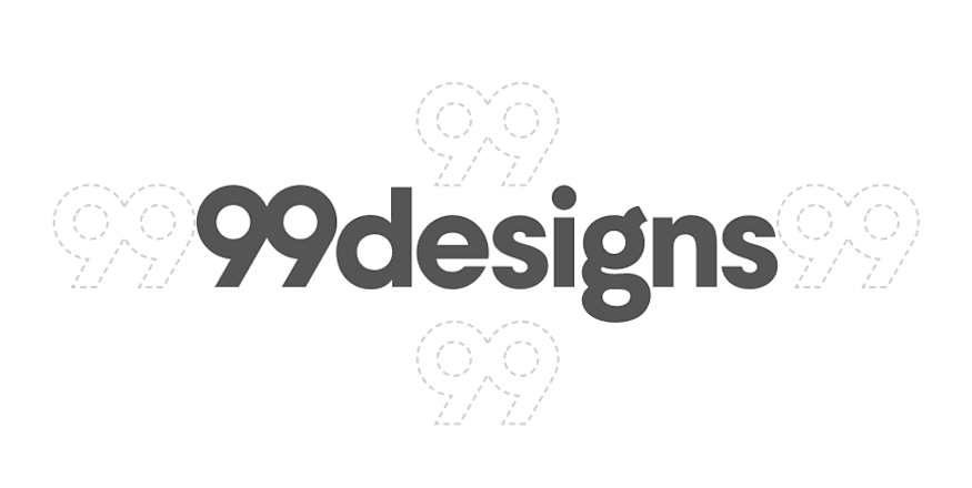
The “99” spacer sets a precedent of how the logo should be spaced. Via the 99designs Brand Assets.
“The 99designs logo uses an ’open white canvas’ as a metaphor that underpins the visual language of the brand – it’s crucial that whitespace is used liberally. A ’99’ spacer on all sides of [the] wordmark and logomark is not the expectation, but the absolute minimum.”
This guideline is specific by giving you a why and how. 99designs puts emphasis on whitespace, so it expects at minimum a ‘99’ space on all sides.
Include your color palette

This mood board shows the brand color palette. By Aquarellina via 99designs by Vista
A defined color palette ensures your logo looks consistent wherever it appears, so your guidelines should spell out exactly which colors represent your brand.
Your brand’s color palette should be 4 or 5 colors. These colors include or are complimentary with the colors of your logo.
The rule of thumb for brand colors is:
- One light color to use as the background
- One darker color for text
- One neutral shade that goes with everything
- One color that catches the eyes
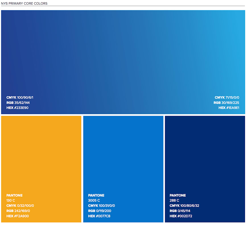
New York State’s color palette from their Branding overview. Via New York State Brand Guidelines.
Your logo usage guideline should describe the colors with:
- Pantone color name and number
- CMYK code (print color)
- RGB code (digital color)
- Hex code
Specify your typography and font
Typography plays a key role in how your logo is read and remembered, so your logo brand guidelines should set clear rules for which fonts support your brand identity.
Your typography guidelines should outline:
- Your primary brand font and how it supports your overall brand personality.
- The fonts used in other communications, such as headings, body copy and captions.
- Any rules around styling, including whether shading, outlines, italics or effects are allowed. For some forms of typography, you may even specify the kerning, or spacing between the letters.
- How typography should appear alongside the logo, so type treatments stay consistent and on brand.
Here’s an example from easyGroup’s brand manual:

easyGroup’s brand guidelines specify where each font should be used on all their materials. Via easyGroup Brand Manual.
To make typography rules easy to follow, many brands show exactly which fonts to use for headings, body copy and supporting text. For example, the Open Source Initiative’s guidelines clearly state which font weights pair best with their logo, helping users maintain a consistent hierarchy across all materials.
“Use Open Sans Ultra-Bold for headings and Open Sans Semi-Bold for subheadings and supporting copy to complement the OSI logo.”
This keeps the instruction simple and focuses on how someone using the brand should style their text.
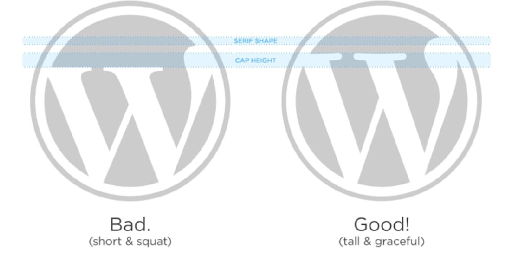
Explain your logo size preferences

Medium’s minimum digital size for its wordmark emphasizes its importance to the brand identity. Via Medium Branding Guidelines
Setting size rules in your guidelines keeps your logo clear and readable across print and digital applications, no matter how large or small it appears. First, set a minimum size. The minimum size is ideally in pixels for digital use and in inches or millimeters for print. Setting proportional values is as important as setting a minimum size. It is crucial for your logo to have sizing consistency across letterheads, over various products, on digital applications versus print.
Your size guidelines could be as simple as:
- Should be legible at any size. Do not use our full logo unless there is ample space to allow for legibility.
- Do not stretch or distort.
Or as specific as:
- Our favicon must always be 16 x 16 pixels.
- Minimum digital size for BOTH our wordmark and logomark is 20 pixels.
- For all our digital sign offs, the minimum size is 35 pixels.
For more sizing tips, check out our post on logo sizes and dimensions.
Outline your logo colors
Determining color variations of a logo is very important to your brand identity. Design by Musique! via 99designs by Vista.
Color variations are essential for keeping your logo flexible without losing consistency, so your guidelines should outline which versions are allowed. One of the key principles of logo design is that your logo should look good in black and white, in its simplest form with no effects.
Here are logo color considerations you need guidelines for:
- Logo colors over white backgrounds
- Logo colors over dark backgrounds
- What your black and white logo looks like
- Grayscale logo vs. full color
- Reversed logo colors
Your guideline should include all the acceptable color variations of your logo to set a clear precedent.
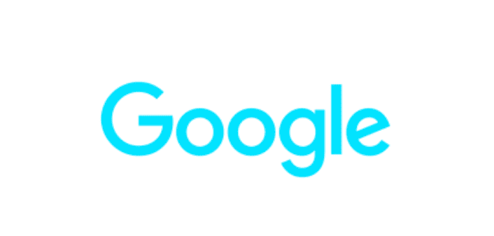
Google’s Logos and Trademarks page has specific guidelines for which colors the logo can and cannot be in. Via Google
Read more about logo colors in our logo characteristics guide.
Be specific about file formats and color modes
File formats and color modes affect how sharp and accurate your logo appears, so clear rules help prevent quality or color issues. To avoid blurry logos or unexpected color shifts, your guidelines should be of high quality and specify:
- SVG: for digital platforms and infinite scaling
- PNG: for transparent backgrounds
- EPS/PDF: for printing and signage
- RGB vs. CMYK: explain when each is used and why it matters
Your logo usage guidelines should always include both RGB and CMYK values so your colors stay accurate across screens and printed materials.
Set logo accessibility guidelines
Accessibility guidelines ensure your logo is readable and inclusive for every audience. They protect legibility in real-life situations, like small screens, dark backgrounds or when customers have varying levels of vision.
Specify:
- Contrast ratios (meeting WCAG AA when possible), so your logo stays readable on both light and dark backgrounds.
- Minimum on-screen sizes, so your logo stays legible on mobile and tablet devices.
- Approved background combinations that avoid clashes or low contrast.
- Rules for accessibility-friendly animations, like keeping motion subtle and avoiding fast flashing elements.
Examples of bad logo usage
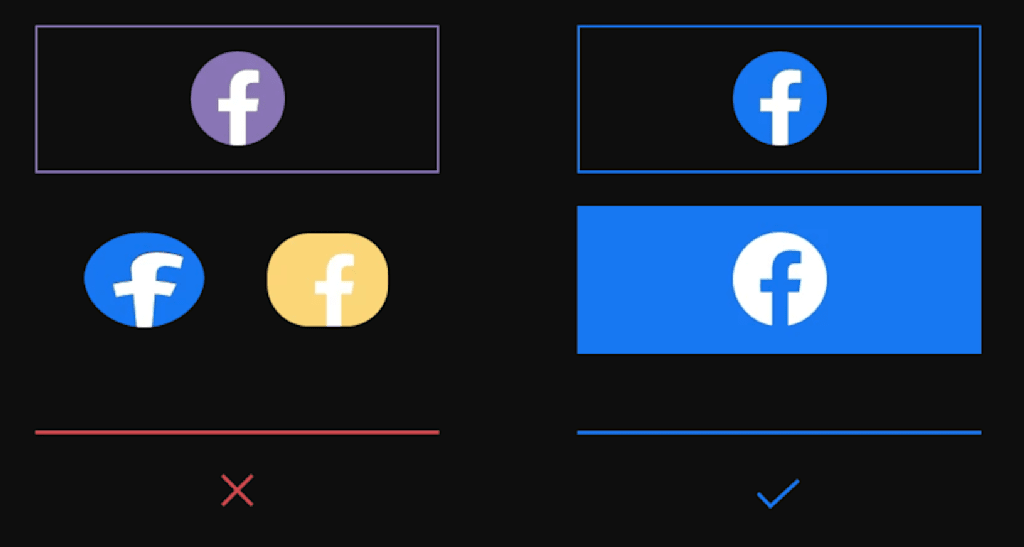
It is just as effective to show how not to use your logo as it is to show how to use your logo. Make sure that your guidelines include samples of your logo distorted, in the wrong color, too small, etc.
Examples of bad logo usage:
- Low-contrast logo colors that disappear against backgrounds
- Uploading the wrong file type (e.g., JPG screenshot) resulting in pixelation
- Using CMYK logo colors in a digital environment, causing a muted look
- Placing the logo inside shapes or containers not part of the official design.
For more tips, read our guide to the anatomy of a logo and how to best use them.
Optional logo guideline: Logo variations and when to use them
Many brands use different logo versions for different contexts, so your guidelines should explain when each variation should be used.
Depending on your needs, it may prove useful to have a full version of your logo, wordmark, lettermark, a simplified logo version, an avicon and/or an avatar. All these logo variations need to reflect each other and stay within your logo’s general style.

Design by bo_rad via 99designs by Vista.
You may not need all the variations, but depending on your type of business, it may be recommended to have a few. Wordmarks, for example, are font based logos that benefit companies with catchy and memorable names.
If your logo usage guidelines include variations, also include recommendations for where they will appear. For example: Our standard logo looks like this, it should be included on all merchandise. Our wordmark looks like this, this needs to be included to sign off any content.
To determine which logo types more accurately reflect your needs, check out our post on types of logos (and how to use them).
Logo usage across print, digital and merchandise
Because your logo appears in many places, your logo usage guidelines should also cover how it behaves across print, digital channels and merchandise. A good set of guidelines helps anyone who touches your brand – designers, printers, social media managers, etc. – create consistent, on-brand work without guesswork.
Printed materials have physical limitations, so your guidelines should outline the exact conditions where your logo will stay clear, sharp and true to color:
- Minimum CMYK values to ensure colors don’t wash out when the design is printed.
- Line weight limits (for example, “no strokes under 0.5 pt”) so small details don’t disappear.
- Minimum printable sizes for items like business cards, labels, packaging, stickers and signage.
- Bleed and margin requirements if the logo will ever sit near the edge of a printed piece.
- Paper-based considerations, like how matte vs. glossy finishes may change color perception.
Digital
Digital brand presence changes depending on screen size and color settings, so your guidelines should protect legibility and accessibility.
Define:
- RGB and HEX color codes for consistent screen color reproduction.
- Safe spacing for mobile devices, where logos shrink and compete with tight layouts.
- Favicon and app icon versions, optimized for tiny sizes (16 × 16 px, 32 × 32 px, etc).
- Accessibility standards, including contrast ratios that make the logo readable for all users.
- Rules for animation if you ever use an animated logo intro, loading screen or social post.
Social media
Describe how you want your logo to appear on the social media channels you expect your brand to use.
Every platform crops, frames and displays logos differently, so create these guidelines for each channel:
- The avatar version of your logo (often simplified, square or circular) and how it should be centered.
- Clear-space requirements so your logo doesn’t touch platform UI elements.
- Do-and-don’t examples, like not placing the logo over busy photography or filter effects.
- Guidelines for Reels, Stories and Shorts, where fast movement can blur fine details.
- How the logo should appear in branded templates (e.g., bottom-left corner, 80% opacity).
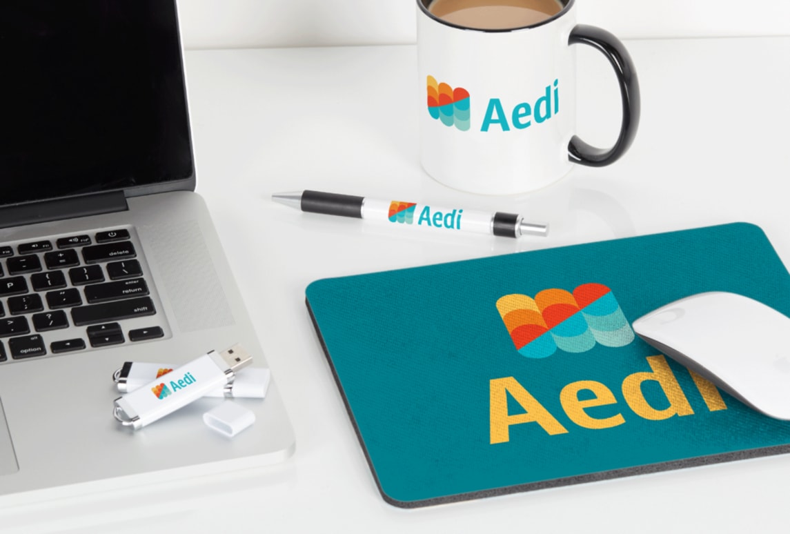
Merchandise
Merch comes with its own technical rules, and your logo needs to survive stitching, printing and wear.
To cover the different types of merchandise, include:
- Embroidery-safe versions with thicker lines and simplified logo shapes that won’t get lost in thread.
- Screen-printing constraints, including which details may need to be removed or thickened.
- Maximum ink coverage to avoid cracking or heavy prints on apparel.
- One-color and two-color variations for cost-effective merch like tote bags, pens or mugs.
- Placement guidelines (front chest, sleeve, label tag, bottle front) so your brand looks intentional.
Make sure your logo looks right with logo usage guidelines
The most important aspect of setting logo usage guidelines is showing the right and wrong ways of using your logo in all the possible situations your logo should be used. Well-written logo usage guidelines protect your brand equity by ensuring customers always see the same professional, trustworthy version of your logo.
Building guidelines is a creative process that works with possibility and variation. Setting these guidelines will preserve the thought and effort you’ve put into creating a logo by making sure it always looks good and correctly represents your brand everywhere your logo is used.
Logo guidelines FAQs
What file format should I use for my logo?
Use SVG for digital, EPS/PDF for print and PNG when you need a transparent background. If your logo needs to scale or be printed at high quality, always choose a vector format.
How do I change my logo color without losing quality?
Edit the original vector file (SVG, AI or EPS) so lines stay sharp and colors stay accurate. Avoid recoloring screenshots or JPGs because they degrade quickly.
How can I update my logo while staying consistent with my brand?
Make small improvements like cleaner shapes or modernized colors instead of a full redesign. Update your logo usage guidelines so every new version stays aligned with your brand.
Should my logo look the same across all platforms?
Yes, but different channels need different versions, like avatars, favicons and print-ready files. The goal is consistent branding that’s optimized for each platform’s size and format.
What software is best for editing a logo?
Vector tools like Adobe Illustrator or Affinity Designer are best because they keep your logo crisp at any size. Photo editors like Photoshop can export assets but aren’t ideal for making changes.