We’ve rounded up everything you need to know about Cloud Dancer, the Pantone Color of the Year 2026. This article will explore what this airy white color means and represents, its cultural and emotional significance, why Pantone chose it as its color of the year and how its calming simplicity can be used to elevate your brand. This article will offer inspiration and practical guidance for applying Cloud Dancer to your branding and designs, and appeal to new audiences.
- Pantone Color of the Year 2026 is PANTONE 11-4201 Cloud Dancer, a lofty, serene white symbolizing calm, clarity and spaciousness.
- Cloud Dancer represents a cultural focus on simplification, introspection and mindfulness. It’s a soft reset from an overstimulated world.
- Pantone’s curated palettes, including Powdered Pastels and Light & Shadow, show how Cloud Dancer can be combined with other colors.
- Cloud Dancer is easily adaptable across print, branding, interiors, product design and digital assets thanks to its versatility and neutrality.
- Businesses can use Cloud Dancer as a grounding base or accent color in marketing materials for a clear, modern and calm look.
What is the Pantone Color of the Year?
On December 4, 2025, the Pantone Color Institute announced the highly anticipated Pantone Color of the Year 2026. Its selection for the year ahead was PANTONE 11-4201 Cloud Dancer—a shade best described as a “lofty white whose aerated presence acts as a whisper of calm and peace in a noisy world.” The billowy yet still, serene hue evokes introspection and the quiet joy of a fresh start.

Source: Color of the Year 2026 via Pantone.com
Pantone describes Cloud Dancer as “a symbol of calming influence in a society rediscovering the value of quiet reflection.” It invites a sense of mental breathing room and evokes a moment of stepping above the noise—the feeling of soft light passing through sheer fabric, or the gentle brightness of the early morning sky.
Cloud Dancer is expansive yet discreet, offering visual cleanliness without feeling sterile. Its softness communicates a quiet optimism, spaciousness and a return to simplicity.
“Similar to a blank canvas, Cloud Dancer signifies our desire for a fresh start. Peeling away layers of outmoded thinking, we open the door to new approaches. An airy white hue, PANTONE 11-4201 Cloud Dancer opens up space for creativity, allowing our imagination to drift so that new insights and bold ideas can emerge and take shape.”— Laurie Pressman, Vice President, Pantone Color Institute


Source: Cloud Dancer via Pantone.com
If you’re looking to incorporate the Pantone Color of the Year 2026 into your branding design or marketing materials, you’ll need to know the specific color codes of Cloud Dancer:
- What is the Cloud Dancer Pantone code? PANTONE 11-4201
- What is the Cloud Dancer RGB code? 240, 238, 233
- What is the Cloud Dancer HEX code? #F0EEE9
- What is the Cloud Dancer CMYK code? 0%, 1%, 3%, 6%
- What is the Cloud Dancer HSL code? 43, 18.9, 92.7
Why did Pantone choose Cloud Dancer as the Color of the Year 2026?
Each year, Pantone selects a color that reflects the current cultural mood and emotions, as well as global design trends. The institute chose Cloud Dancer as its Color of the Year as a response to:
- A collective desire for mental clarity
- Overstimulation from digital noise
- A cultural shift toward simplification and focus
- Renewed appreciation for reflection, minimalism and spaciousness
Cloud Dancer embodies this shift. It’s a deliberate pause, a moment to breathe and reset. Pantone explains that Cloud Dancer is intentionally understated. Its softness and neutrality symbolizes possibility and openness rather than emptiness. Where 2025 leaned into warmth, comfort and connection with Mocha Mousse, 2026 leans into clarity, elevation and renewal.
“At this time of transformation, when we are reimagining our future and our place in the world, PANTONE 11-4201 Cloud Dancer is a discrete white hue offering a promise of clarity. The cacophony that surrounds us has become overwhelming, making it harder to hear the voices of our inner selves. A conscious statement of simplification, Cloud Dancer enhances our focus, providing release from the distraction of external influences.”— Leatrice Eiseman, Executive Director, Pantone Color Institute

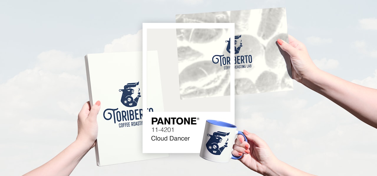
Source: Cloud Dancer business cards by Felix SH via 99designs by Vista
Discover how to refresh your branding and appeal to audiences with our guide to color trends for 2026.
Color palettes featuring Cloud Dancer, Pantone Color of the Year 2026
Pantone suggests curated palettes to help designers and business owners combine Cloud Dancer with other colors effortlessly. Browse these color palettes featuring Pantone’s Color of the Year to figure out how you can apply Cloud Dancer. The palettes also consider how the color behaves across shifts in light, tone and mood.

Source: Cloud Dancer color palette via Pantone.com
“The Pantone Color of the Year 2026, PANTONE 11-4201 Cloud Dancer, is a key structural color whose versatility provides scaffolding for the color spectrum, allowing all colors to shine. In a world where color has become synonymous with personal expression, this is a shade that can adapt, harmonise and create contrast, bringing a feeling of airy lightness to all product applications and environments, whether making a standalone statement or combined with other hues,” making it one of the most adaptable recent color selections.
The official color palettes for 2026:
- Powdered Pastels
- Take a Break
- Atmospheric
- Comfort Zone
- Tropic Tonalities
- Light & Shadow
- Glamour & Gleam
Powdered Pastels, 2026 Pantone Color of the Year Palette
Pastel tones form gentle, compatible combinations with Cloud Dancer in the Powdered Pastels palette. The result creates a look that is understated and quietly uplifting, ideal for soft branding, wellness and lifestyle products, and minimalist packaging.

Source: Powdered Pastels color palette via Pantone.com
“Pastel and neutral tones make compatible combinations to Cloud Dancer, offering subtle shifts in hue that are nuanced, pleasing and understated.”— Pantone
Colors in this palette:
- PANTONE 11-0515 TCX Lemon Icing
- PANTONE 13-4108 TCX Nimbus Cloud
- PANTONE 11-1400 TCX Raindrops on Roses
- PANTONE11-4201 TCX Cloud Dancer
- PANTONE13-4306 TCX Ice Melt
- PANTONE 12-1107 TCX Peach Dust
- PANTONE 13-6006 TCX Almost Aqua
- PANTONE 13-3802 TCX Orchid Tint
Take a Break, 2026 Pantone Color of the Year Palette
This playful palette invites a moment of indulgence. In Take a Break, Cloud Dancer becomes the soft anchor for dessert-inspired hues such as fizzy pinks, caramel browns, warm yellows and tropical shades. The effect is cheerful and expressive, perfect for hospitality, food and beverage brands, as well as creative campaigns.


Source: Take a Break color palette via Pantone.com
Colors in this palette:
- PANTONE 15-1040 TCX Iced Coffee
- PANTONE 15-0960 TCX Mango Mojito
- PANTONE 18-1020 TCX Cocoa Créme
- PANTONE 16-1735 TCX Pink Lemonade
- PANTONE 16-0213 TCX Tea
- PANTONE 15-1243 TCX Papaya
- PANTONE 11-4201 TCX Cloud Dancer
- PANTONE 16-1439 TCX Caramel
Atmospheric, 2026 Pantone Color of the Year Palette
In this color palette, Cloud Dancer evokes a feeling of altitude and airiness, with the soft white working well with dusky purples, cold grays and aqua blue-greens. Together, these tones create a serene, calming feel that’s well-suited for spa, wellness and sustainability branding, and modern editorial design.

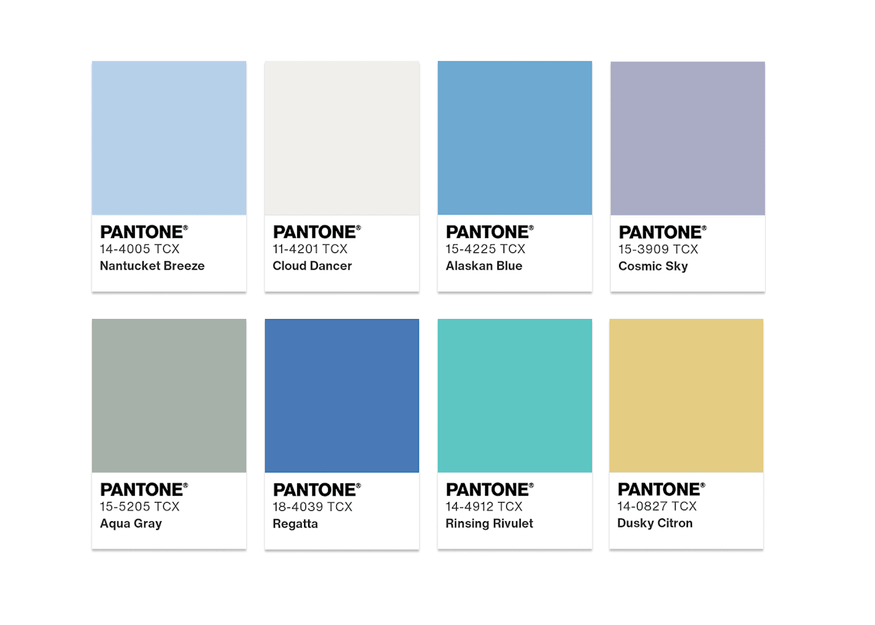
Source: Atmospheric color palette via Pantone
“Cloud Dancer lifts us to lofty heights where this diaphanous white breaks through gray skies revealing clear, breezy blues under a misted sunlight. Aqueous blue-greens emanate from the watery depths.”— Pantone
Colors in this palette:
- PANTONE 14-4005 TCX Nantucket Breeze
- PANTONE 11-4201 TCX Cloud Dancer
- PANTONE 15-4225 TCX Alaskan Blue
- PANTONE 15-3909 TCX Cosmic Sky
- PANTONE 15-5205 TCX Aqua Gray
- PANTONE 18-4039 TCX Regatta
- PANTONE 14-4912 TCX Rinsing Rivulet
- PANTONE 14-0827 TCX Dusky Citron
Comfort Zone, 2026 Pantone Color of the Year Palette
The Comfort Zone color palette surrounds Cloud Dancer with natural and organic colors that feel grounding, warm and restorative. These hues evoke quiet interiors, slow living and moments of quiet. This palette is perfect for home decor, beauty brands, lifestyle design or brands that want to communicate inclusivity.


Source: Comfort Zone color palette via Pantone
“Everyone needs a comfort zone, a place to disconnect, to unwind and decompress.”— Pantone
Colors in this palette:
- PANTONE 14-1210 TCX Shifting Sand
- PANTONE 16-1329 TCX Coral Haze
- PANTONE 17-0807 TCX Mountain Trail
- PANTONE 14-1217 TCX Amberlight
- PANTONE 15-0703 TCX Ashes of Roses
- PANTONE 16-1806 TCX Woodrose
- PANTONE 18-1512 TCX Rose Brown
- PANTONE 11-4201 TCX Cloud Dancer
Tropic Tonalities, 2026 Pantone Color of the Year Palette
Inspired by tropical escapes, this palette pairs Cloud Dancer with bright, lively colors. Against this vivid backdrop, Cloud Dancer becomes a balancing presence. Tropical Tonalities is a palette that’s ideal for travel and summer campaigns, bold packaging and outdoor brands.

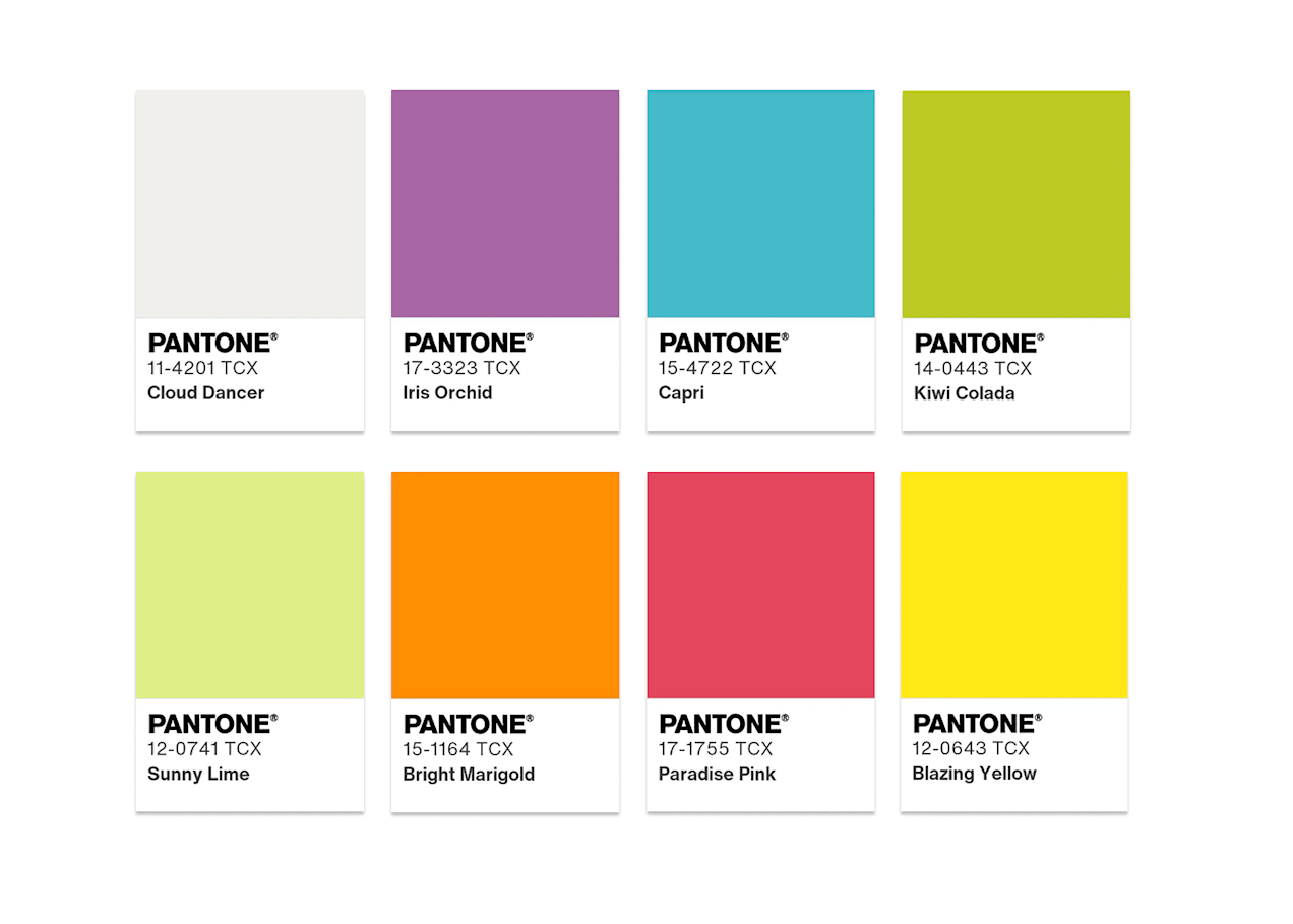
Source: Tropic Tonalities color palette via Pantone.com
“When we imagine the tropics, vivid colors come to mind: a turquoise ocean, sparkling citrusy refreshment, bright florals and exotic birds. If there is a cloud in this sunlit paradise, it’s a billowy and buoyant Cloud Dancer.”— Pantone
Colors in this palette:
- PANTONE 11-4201 TCX Cloud Dancer
- PANTONE 17-3323 TCX Iris Orchid
- PANTONE 15-4722 TCX Capri
- PANTONE 14-0443 TCX Kiwi Colada
- PANTONE 12-0741 TCX Sunny Lime
- PANTONE 15-1164 TCX Bright Marigold
- PANTONE 17-1755 TCX Paradise Pink
- PANTONE 12-0643 TCX Blazing Yellow
Light & Shadow, 2026 Pantone Color of the Year Palette
This palette leans into tonal contrast, blending Cloud Dancer with understated hues for gentle dimension. Light & Shadow is perfect for luxury branding, editorial layouts, architecture and monochrome-inspired designs.

Source: Light & Shadow color palette via Pantone.com
“Cloud Dancer gracefully blends into a veiled palette of softened hues that ultimately dissolve into shadowy shades, producing an easy and effortless contrast in color.”— Pantone
Colors in this palette:
- PANTONE 11-4201 TCX Cloud Dancer
- PANTONE 12-6000 TCX Veiled Vista
- PANTONE 14-4320 TCX Baltic Sea
- PANTONE 13-0624 TCX Golden Mist
- PANTONE 16-3610 TCX Quiet Violet
- PANTONE 16-1523 TCX Cloud Cover
- PANTONE 17-5800 TCX Hematite
- PANTONE 180-4218 TCX Blue Fusion
Glamour & Gleam, 2026 Pantone Color of the Year Palette
The Glamour & Gleam palette mixes Cloud Dancer with striking color contrasts for a glamorous, cinematic and bold look, well suited to beauty, high fashion, luxury products and event campaigns.
“The yin of white inevitably meets the yang of black, accented by a sultry lipstick red. The glamor is heightened by vintage wine and teal, glimmering graphite, shimmering gray, and a silvery satin metallic.”— Pantone
Explore our guide on how to find aesthetic colors that work for your brand.


Source: Glamour & Gleam color palette via Pantone.com
Colors in this palette:
- PANTONE 19-4005 TCX Stretch Limo
- PANTONE 11-4201 TCX Cloud Dancer
- PANTONE 19-1558 TCX Scarlet Smile
- PANTONE 17-1710 TCX Bordeaux
- PANTONE 19-4826 TCX Dragonfly
- PANTONE 20-0188 TCX Graphite
- PANTONE 20-0020 TCX Satin Slipper
- PANTONE 20-0007 TCX Micron
How to apply the Pantone Color of the Year 2026: Examples of Cloud Dancer in real life
As always, Pantone’s Color of the Year arrives with collaborations showing how the color can be brought to life across industries. Cloud Dancer enters 2026 with a wide range of real-world collaborations.
Joybird x Pantone
The Joybird collaboration integrates Cloud Dancer, “the color of calm,” into inviting tactile fabrics that evoke tranquility and inspire quiet reflection. These designs focus on cultivating calm and relaxation, creating spaces that feel restorative, fulfilling the current cultural longing for serenity at home.


“Cloud Dancer represents a conscious pause in our frenetic world, allowing us to truly center. The new Joybird x Pantone collection is understated elegance and light.”— Gifty Walker, Senior Director and General Manager of Joybird
Mandarin Oriental x Pantone
Mandarin Oriental applies Cloud Dancer through curated afternoon tea sets, cloud-inspired spa rituals, sky-view stays and special Cloud Dancer postal boxes for letters to Santa. Each experience is rooted in elevation, serenity and reflective luxury.

Source: Mandarin Oriental x Pantone Color of the Year 2026 via Pantone.com
Play-Doh x Pantone
To celebrate Play-Doh’s 70th anniversary, the brand has introduced Cloud Dancer as a creative blank canvas to encourage imaginative play and connection.
“You’ve got that play of light and shadow that it keeps undulating…To me, that is the most fantastic effect.”— Leatrice Eiseman, Executive Director, Pantone Color Institute

Source: Play-Doh x Pantone Color of the Year 2026 via Pantone.com
Motorola x Pantone
Motorola’s Color of the Year edition applies Cloud Dancer to their iconic smartphone design. Pantone describes the partnership as an exploration of technology as a canvas for personal expression, connecting digital clarity with emotional wellbeing.

Source: Motorola x Pantone Color of the Year 2026 via Pantone.com
“Cloud Dancer reflects a new kind of design mindset, one that celebrates simplicity as strength. It represents a reset for the senses, a moment to slow down and rediscover focus. By softening our surroundings, we make room for what truly matters. That message comes to life through the way we designed Motorola Edge 70—thin, balanced, and beautifully understated.”— Ruben Castano, VP of Design, Brand and Consumer Experience at Motorola
Pura x Pantone
In collaboration with Pantone, Pura reimagines Cloud Dancer as a multi-sensory experience, translating the tone’s quiet clarity into a fragrance.

Source: Pura x Pantone Color of the Year 2026 via Pantone.com
“Scent, like color, has the power to shift emotions. With Cloud Dancer, we wanted to create a sensory interpretation of calm, a moment of quiet amidst the noise. It’s about new beginnings and simply being.”— Mara Dumski, Pura’s Chief Fragrance Experience Officer
Command™ Brand x Pantone
Command™ Brand introduces a Cream Speckled collection inspired by Cloud Dancer, turning everyday organization into a visually calming experience.

Source: Command x Pantone Color of the Year 2026 via Pantone.com
Post-it® x Pantone
Post-it® has integrated Cloud Dancer into its Neutrality Collection, a palette designed to create calm without sacrificing clarity. It’s ideal for workplaces looking to create softer visual environments.

Source: Post-it x Pantone Color of the Year 2026 via Pantone.com
Cloud Dancer in print: How businesses can use the 2026 Pantone Color of the Year
Because Cloud Dancer is a quiet, grounding white, it performs extremely well in print marketing, especially for:
- Modern minimalist branding
- High-end editorial layouts
- Beauty, wellness and lifestyle brands
- Sustainable or eco-focused companies
- Luxury real estate and hospitality
- Tech brands wanting a clean interface aesthetic

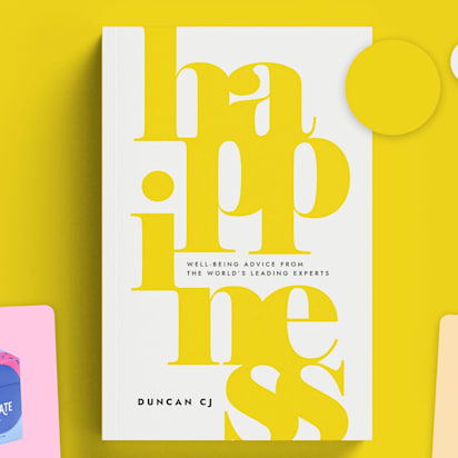
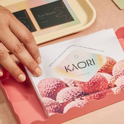
Source: Packaging using Cloud Dancer by spoonlancer via 99designs by Vista

Source: Cloud Dancer used for whitespace on posters by greeninblue via 99designs by Vista
The key benefit of Cloud Dancer is that it can work as a core brand color, an accent or secondary color, or as a backdrop for seasonal campaigns. White tones create clarity, whitespace and modern elegance that’s perfect for business cards, signage and product packaging. Cloud Dancer can also bring balance to posters, menus and brochures.
Pantone Color of the Year 2026 FAQs
What is Cloud Dancer?
Cloud Dancer is the Pantone Color of the Year 2026, a soft, lofty white (PANTONE 11-4201) chosen for its sense of calm, clarity and spaciousness. Pantone describes it as an airy hue that acts like a “blank canvas,” offering mental breathing room and encouraging creativity, reflection and fresh starts.
What colors does Cloud Dancer work best with?
Because Cloud Dancer is a structural neutral, it can brighten, soften or balance almost any palette while giving other colors room to shine. Cloud Dancer is incredibly versatile and works well combined with pastels and muted tones, soft blues and vivid hues, warm neutrals and earthy tones, and shadowy grays and striking reds.
How can I use Cloud Dancer in my marketing design?
Cloud Dancer can work as a core brand color or an elegant accent. Use it for minimalist business cards and stationery, product packaging and labels, seasonal campaigns that need a clean, modern feel or digital backgrounds for clarity. Its serene presence makes designs feel fresh, spacious and modern, perfect for brands wanting to communicate focus, calm or sophistication.