A strong paper cup design can build recognition long after a customer leaves the counter. For cafés, restaurants, food businesses and event planners, the cup travels through busy streets, offices and social feeds, giving your brand more chances to be seen.
Effective cup design starts with a clear business goal. Consider how the cup will look in someone’s hand, on the move and in a photo, then make practical decisions about layout, cup sizes, artwork, color and QR codes.
- Start with one clear goal, like building brand awareness, promoting a seasonal drink or encouraging loyalty sign-ups.
- Place your logo or main message in the center of the cup so it is visible when held.
- Adapt your artwork for each cup size instead of applying one file unchanged.
- Use vector artwork or images with a resolution of at least 300 DPI for a clear print result.
- Keep important text and graphics away from the rim, base, seam and trim area.
- Test QR codes at their intended print size before ordering.
- Review the design with the lid and sleeve you plan to use.
Start your paper cup design with one clear goal
Before opening a design tool, decide what your cup needs to achieve. It might introduce your brand, promote a limited-edition drink or help regulars join your loyalty program. Choose one primary goal:
- Build brand awareness
- Promote a seasonal drink or event
- Encourage customers to share photos
- Drive repeat business through a QR code or loyalty offer
- Create a consistent look across your branded packaging
Your goal determines what deserves the most attention. If recognition is the priority, lead with your logo. If you want loyalty sign-ups, the QR code and its call to action need a clear supporting role. Then follow the customer journey.
Ask whether people will recognize the brand while walking, whether the design works when held and whether someone would be inspired to take an Instagram selfie with the cup. Check that a website or QR code can be found quickly, too.
Know where customers look first
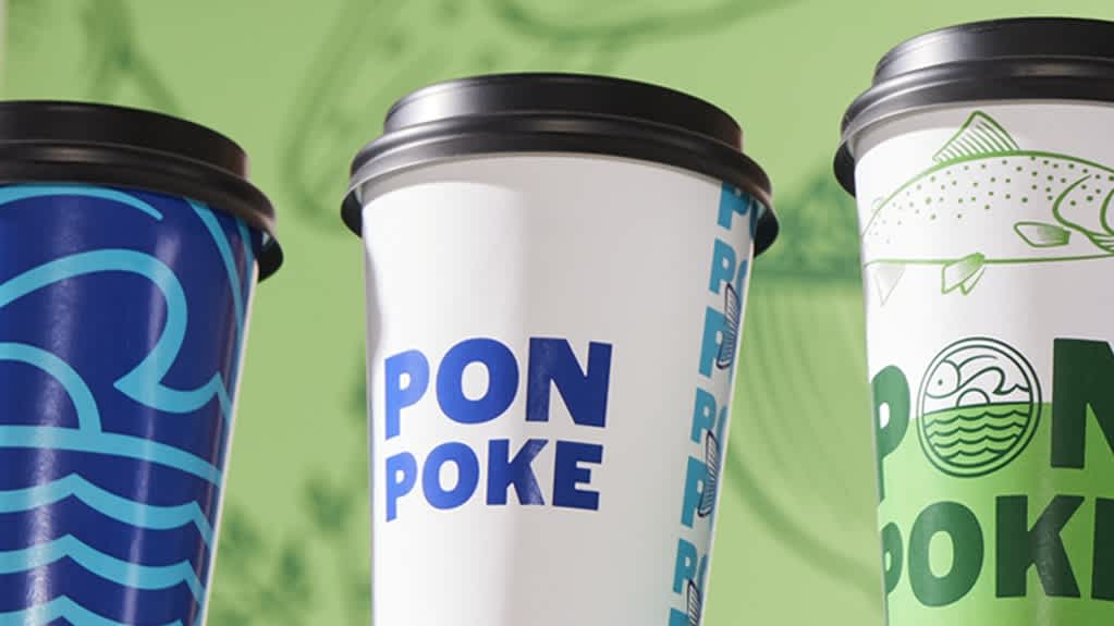
The center of the cup is the primary branding zone because it’s usually the most visible area when someone holds a drink. Place your logo, campaign idea or main graphic here rather than near the rim or base, where the design may be obscured or distorted.
Build the rest of your layout in this order:
- Logo or campaign idea
- Short supporting message
- Action element, such as a QR code or web address
- Small secondary details
Use one focal point and strong contrast in your design and limit your font combinations. Leave breathing room and keep messages short, as crowding is more noticeable on a curved surface, so you don’t need to fill the template.
Not sure where to start? VistaPrint’s paper cup templates can spark your own design inspiration.
Adapt the design to each cup size
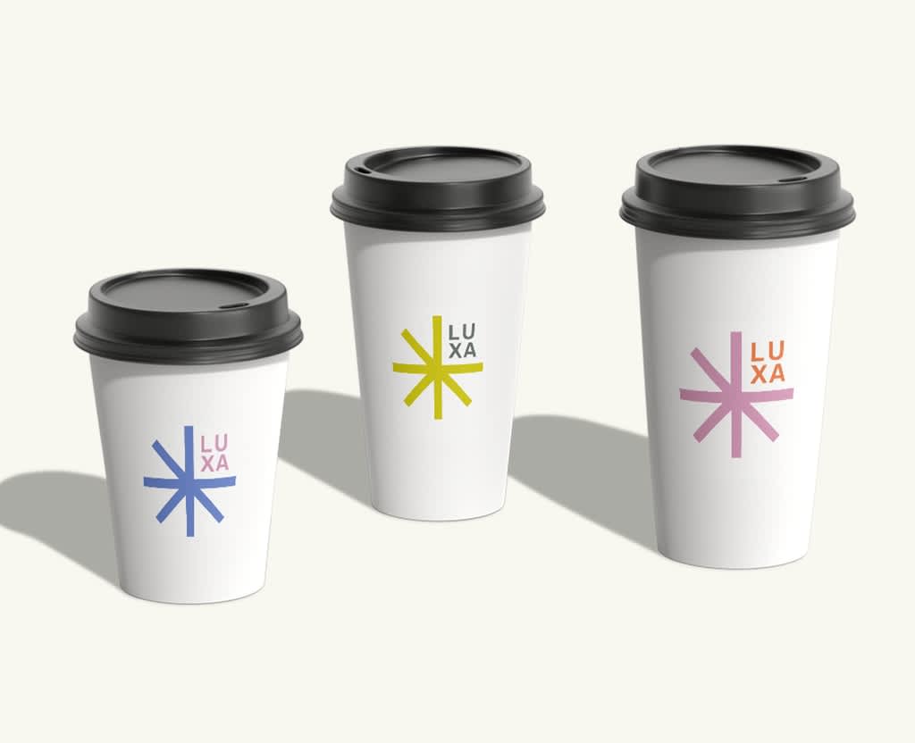
Cup sizes have different heights and curves, so the same artwork won’t sit identically on each one. Smaller cups need fewer details. Larger formats offer more room for illustration or a supporting message, but the logo should still be easy to find.
Create a separate artwork file for every size you plan to order. Adjust the scale and spacing while keeping the logo, colors, fonts and overall style consistent. This gives your customers the same brand experience whether they order an espresso or a large iced drink.
Review each design with its intended lid and sleeve. A sleeve may cover a QR code or tagline, while a lid in a clashing color can weaken an otherwise consistent design.
Understand the paper cup design template
In a paper cup template, a dieline is the flat guide that’s used to position artwork before the cup is formed. Always use the template for the exact cup size and follow the printer’s specifications rather than estimating the shape yourself.
The main template markings are:
- Bleed: Artwork that extends beyond the trim line to help prevent unprinted edges.
- Trim line: The line where the printed piece is intended to be cut.
- Safe area: The space where important logos, text and graphics should remain.
- Seam: The area where the sides overlap when the cup is assembled.
A customer sees only part of a wraparound design from one angle, often around one-third of the template. Repeat a small brand element if visibility from several angles matters, but keep the main logo within a clear front-facing zone. Wide logos and geometric shapes can look distorted if they’re stretched too far across the curve.
Prepare artwork that prints clearly
Use vector files like AI, EPS, SVG or vector PDF for logos and simple illustrations whenever the upload process supports them. For photos or other raster images, use files at least 300 DPI at final print size and avoid screenshots or images saved from social media. VistaPrint’s guide to print resolution explains why an image that looks sharp on screen can still print poorly.
If you are preparing the file in professional design software, converting text to outlines can help prevent any font substitutions. Check the product upload requirements with your printer before exporting because accepted file types can vary.
When choosing paper stock, it’s important to make sure the paper and interior coating are food-safe and designed for direct contact with drinks. VistaPrint paper cups are made from durable laminated paper with a liquid-barrier coating inside.
Plan for color differences in print
Screens produce color with RGB light, while commercial printing typically uses CMYK inks. As a result, printed colors may look slightly different from the ones on your monitor and very bright neon shades may be difficult to reproduce exactly. Read more about RGB and CMYK color modes, then follow your printer’s color settings and proofing guidelines for the best color outcomes.
Think about handling as well as color accuracy. Large areas of very dark color can make fingerprints or scuffs more noticeable, so a pattern, lighter background or more selective use of dark tones may be more practical for a busy takeaway setting.
Connect the cup to the rest of your brand
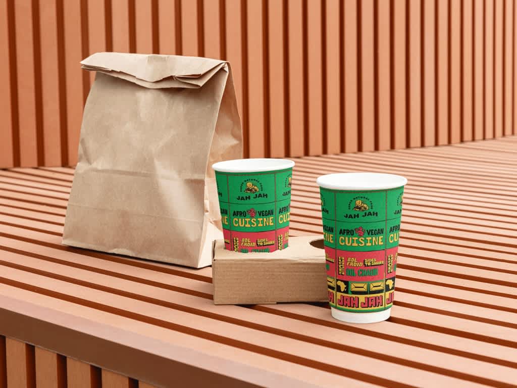
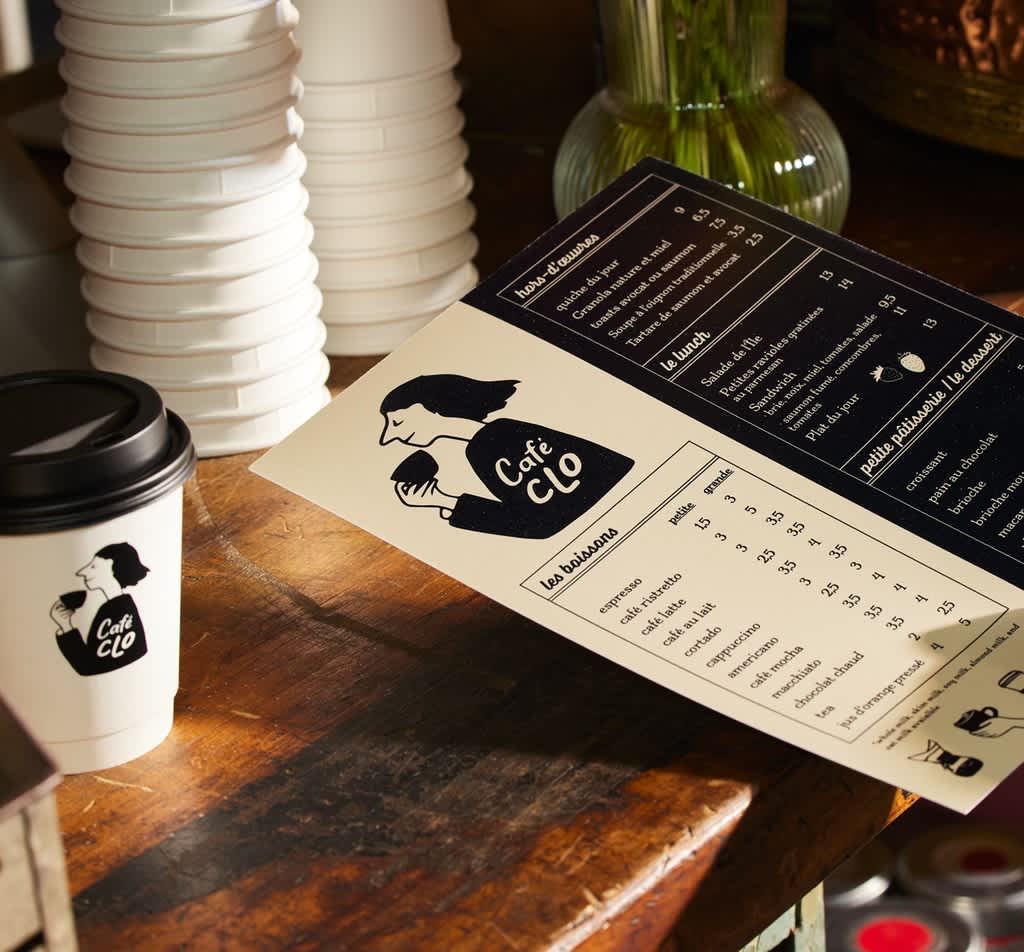
Your cup should feel related to every item a customer receives. Repeat the same core logo, color palette, typography and graphic style across cup sleeves, takeaway bags, stickers, napkins and drink carriers. Consistent brand packaging helps separate pieces feel like one considered experience.
Seasonal campaigns let you adapt that system without losing recognition. Useful paper cup design ideas include:
- Holiday drinks with a simple festive pattern
- Pumpkin spice season with warm brand colors
- Valentine’s Day messages or illustrations
- Pride Month designs created with genuine relevance to your business
- Summer artwork for iced drinks
- Grand-opening cups with the date or location
- Limited-time collaborations featuring both brands clearly
Keep your logo consistent and change one or two supporting elements, such as the color, pattern or message. For more inspiration, explore these product packaging design tips.
Give QR codes a specific job
A business QR code can lead your customers to a menu, loyalty sign-up, limited-time offer or event page. Link to the action you want people to take rather than just sending them to a generic homepage, and add a short prompt like “Scan to collect points” to encourage engagement with the QR code.
Aim for a code around 0.75-1 inch wide, keep clear space around it and use strong contrast. Treat that range as a starting point because code complexity, print surface and scanning distance all affect its performance. Test it at final size with several phones and on a physical mockup.
Test a physical cup mockup before ordering
If you are learning how to design cups for the first time, an actual-size mockup is one of the simplest ways to spot any problems before you order hundreds of cups. Print the template at 100% scale, cut it out and wrap it around a blank cup with similar dimensions. Add the lid and sleeve, then view it from different angles.
Check that:
- The logo is still visible when the cup is held
- The text is easy to read at arm’s length
- Important details aren’t hidden by your hand, curve, seam, lid or sleeve
- Wraparound graphics meet as expected at the seam
- The QR code scans at its printed size
This test can reveal common paper cup design mistakes before they reach the production stage. Thin fonts can disappear, artwork near the trim can be cut off and wide logos can look stretched. Too many fonts, gradients or competing messages can also make the curved surface feel cluttered. Finally, ask someone else to proofread every word, URL and offer detail.
For a more accurate test, VistaPrint paper cups are available in quantities starting at one, so you can check the color, print quality and placement on a real cup before committing to a larger run. You can also order a paper cup sample kit to compare all four sizes, single- and double-walled options and compatible lids.
This small test run can show any paper cup design mistakes before they reach production. Thin fonts may disappear, artwork near the trim can be cut off and wide logos can look stretched. Too many fonts, gradients or competing messages can also make the curved surface feel cluttered. Finally, ask someone else to proofread every word, URL and offer detail.
Measure what your paper cup design achieves
Return to the goal you set at the start and choose a result you can track. Monitor QR code scans, loyalty sign-ups, offer redemptions, social media tags or customer photos. You can also ask a feedback question at the counter or compare the performance with your usual packaging.
These results should shape your next order. Low scan numbers may mean the code needs a clearer prompt or better placement. Customer photos might show which side of the cup appears most often, helping you refine the main branding zone for your future designs.
Final paper cup design checklist
- The logo is easy to recognize
- Text is readable at arm’s length
- Images are high resolution
- Colors follow the brand guidelines
- The QR code works on multiple phones
- Contact details, links and offer terms are correct
- Another person has proofread the design
- Important artwork stays within the safe area
- Separate files have been checked for every cup size
- The design works with the intended lid and sleeve
Some of our favorite paper cup designs
These examples from VistaPrint’s paper cup gallery show how different businesses make good use of a curved surface:
CARRA coffee cups
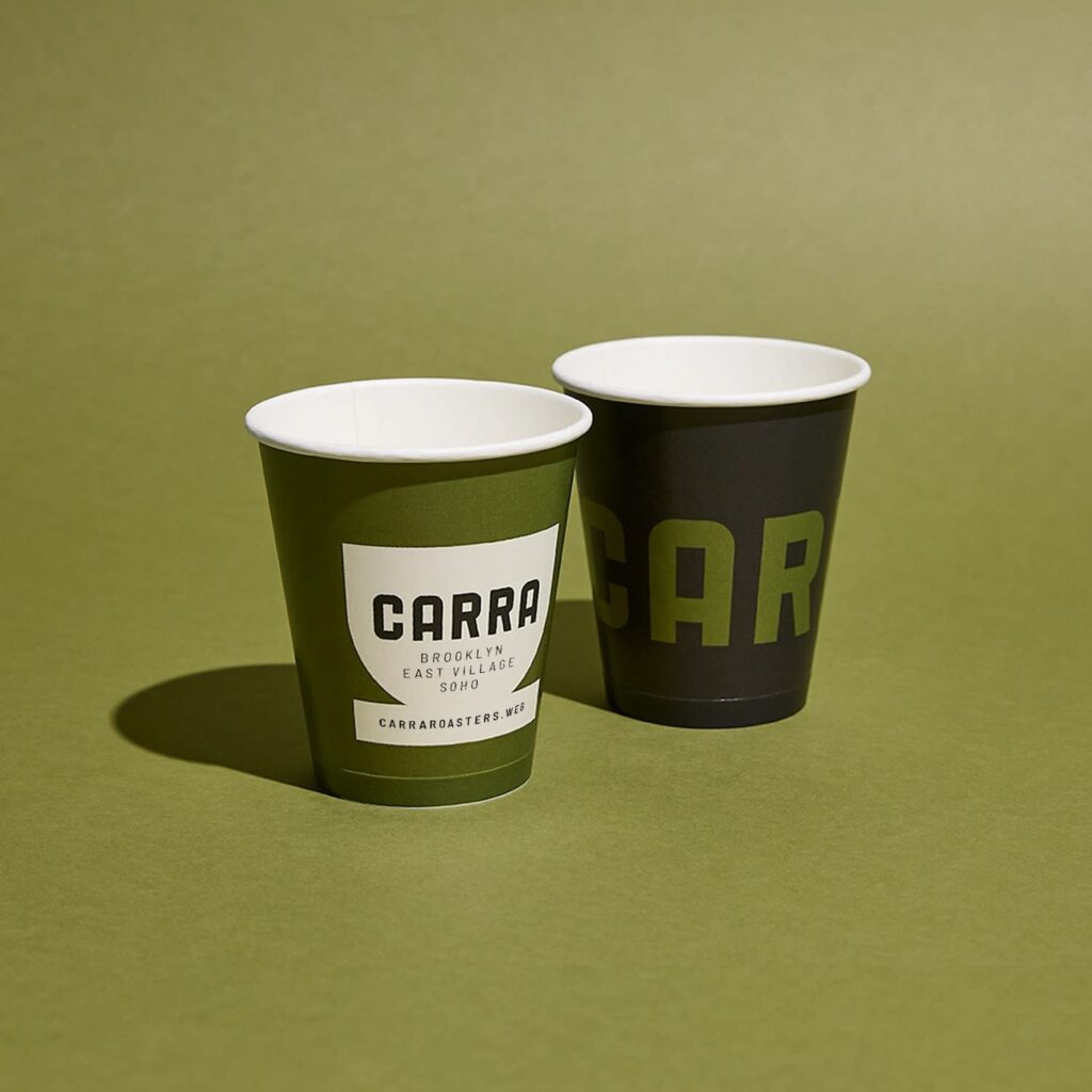
Oversized lettering creates impact, while the olive, charcoal and white palette keeps the wraparound design feeling consistent. Smaller location names and a web address form a clear second level of information.
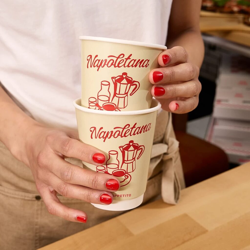
Napoletana takeaway cups
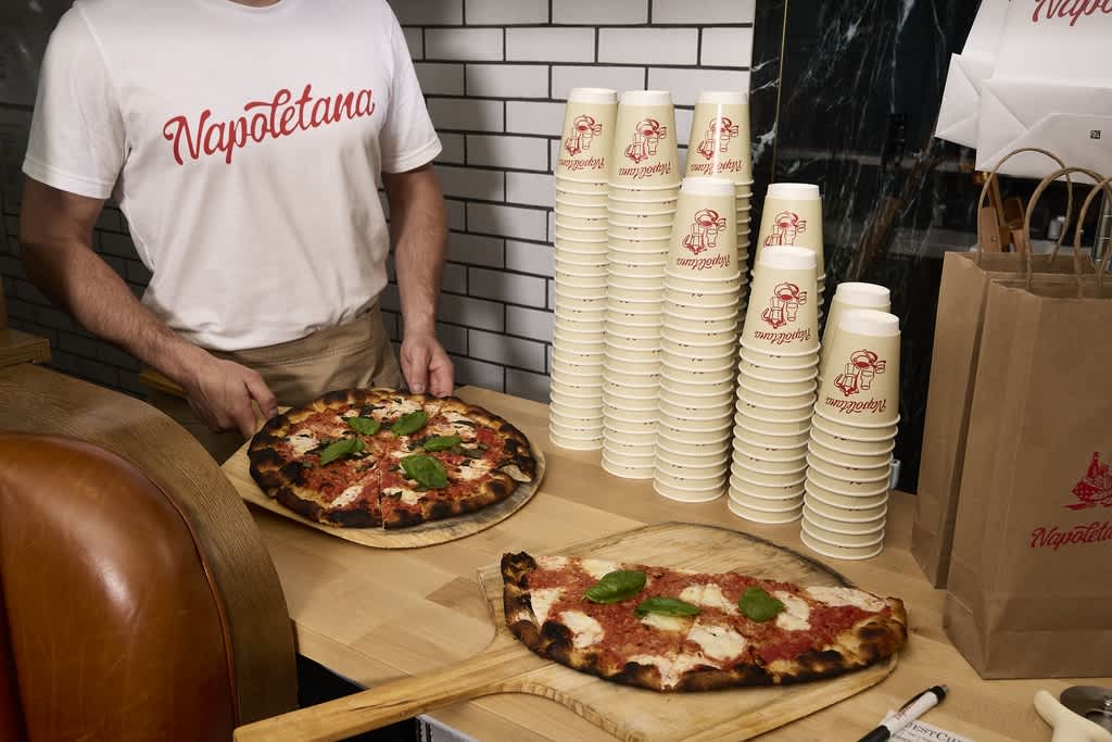
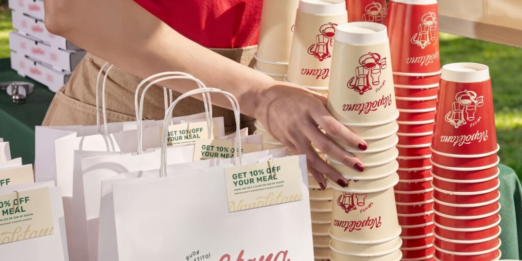
Red script and simple coffee illustrations stand out against a cream background. The same palette and logo appear on the brand’s takeaway bags, connecting the cup to the wider packaging design.
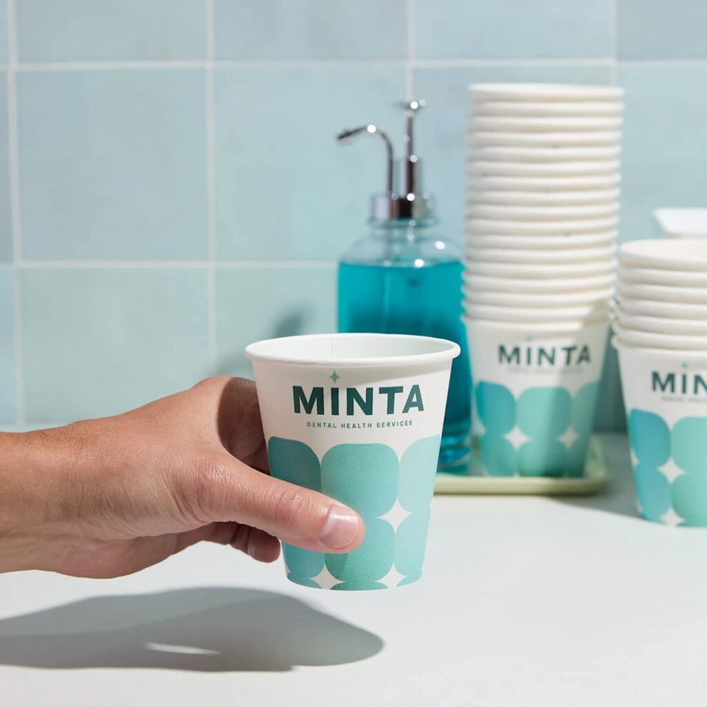
MINTA dental cups
A teal geometric pattern adds brand personality without competing with the bold logo. The design shows how branded cups can reinforce brand recognition in customer-facing spaces beyond cafés and restaurants.
Find inspiration for your paper cup design
Look at cups from different coffee shops, bakeries, restaurants and during seasonal campaigns, and pay attention to what you notice first. What remains visible in someone’s hand is the main element to focus on when designing your own branded paper cups. The strongest examples are usually clear, recognizable and closely connected to the wider brand.