Poster resolution determines whether your poster looks sharp when printed. If your poster design looks crisp on screen, it can print crisp too – as long as the DPI is high enough and the file has enough pixels for the poster size and viewing distance. This guide will explain what poster resolution means, how it affects print quality at different sizes and how to choose the right DPI for posters. It will also cover poster bleed size and poster CMYK color setup, so you know what DPI you need, when to use 300 DPI and how to check that your poster will look sharp when printed.
- The most common DPI for posters are 300 DPI for close viewing and 150-250 DPI for larger posters.
- To choose the right DPI for poster printing consider the poster size, viewing distance and design detail.
- Common poster resolution mistakes involve scaling artwork, low-res images, rasterized logos, compressed JPEGs and RGB-to-print color shifts.
- Bleed avoids unwanted white borders. Safe zones protect key content, and poster CMYK ensures consistent colors.
What is poster resolution, and how does it affect print quality?
Poster resolution affects the detail your file can deliver at print size. Pixels are interpreted for print through DPI, which is how much ink is printed in each inch of the poster. The same image, printed larger, spreads those pixels out more, which is why a poster design file that looks sharp on screen can look blurry when printed.
Here’s how the same poster design looks when printed at different DPI settings:
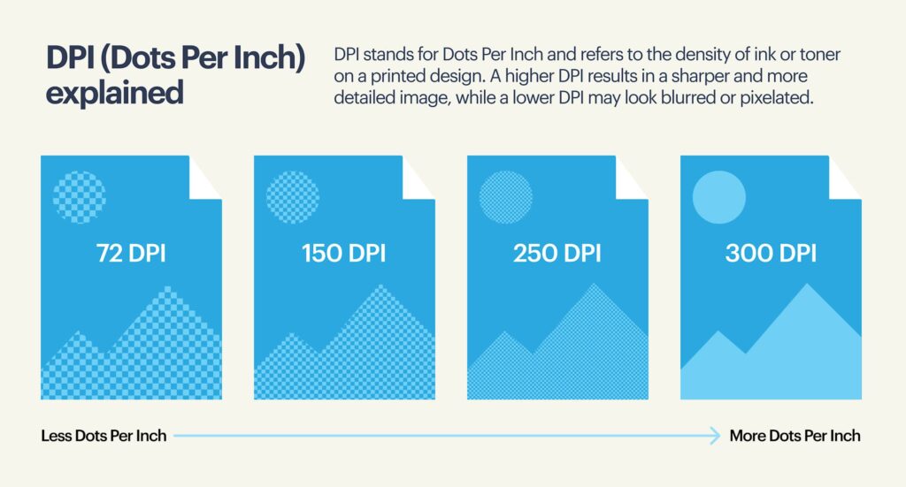
Low poster resolution reads means blurry photos, blocky pixelation and jagged edges on text and logos. When creating posters, avoid thin lines and high-contrast text, as they’re usually the first to be affected.
Learn more about what makes a good business poster in our guide.
Is 300 DPI for posters necessary?
300 DPI for poster printing is a standard, not a rule. The right choice of DPI depends on the poster size, use case and viewing distance. 300 DPI is necessary for:
- Close viewing, especially indoors
- Image-heavy designs where detail matters
- Smaller posters that need crisp text and logos
When is lower resolution acceptable?
Large posters viewed from farther away can often be printed at a lower DPI. As distance increases, the eye can’t pick out ultra-fine detail, so a higher DPI stops paying off. Lower resolution means smaller files, quicker exports and smoother uploads, so don’t assume that a higher DPI is always better.
What resolution is best for printing posters?
Poster resolution is a decision you need to make on a case-by-case basis. The right poster resolution depends on the poster size, the viewing distance and the purpose of your poster.

Rule of thumb:
- Bigger poster + farther viewing distance = Lower DPI (150-250 DPI)
- Smaller poster + close viewing = Higher DPI (300 DPI)
- More detail = Higher poster resolution (300 DPI)
The point is to use higher resolution (300 DPI) for posters with fine detail or that will be viewed up close.
Step-by-step guide to poster resolution
Step 1: Know your poster’s viewing distance
Start with where the poster will be displayed and the distance from which people will view it:
- Up close (1-3 ft): For posters viewed closely, people can see detail, so low resolution pixelation is obvious.
- Typical indoor (3-6 ft): The most common range for wall posters like retail signage that customers step closer to read. Like close-up posters, use a higher DPI for clarity.
- Far (6-10+ ft): Posters displayed at trade shows and large indoor spaces are read from farther away, so high resolution isn’t as important, but make sure the headline and main visuals stand out.
- Outdoor or drive-by: People see these posters briefly and from a distance, meaning simple, attention-grabbing design matters more than high DPI.
Smart hierarchy and spacing do more for legibility than a high DPI. If your design feels cluttered, revisit your poster layout first.
Step 2: Match poster use to level of detail
Different types of posters, use cases and goals demand different poster resolution:
- Photo-heavy promotions: Images benefit from higher DPI, especially with gradients or close-up shots.
- Text-led flyers: Clean typography holds up well at moderate DPI if line spacing and contrast are solid.
- Scientific posters: Dense charts and small labels need higher DPI for poster printing to stay readable.
- Event posters: Large type and bold visuals tolerate lower DPI for poster printing.
The key point is to use higher resolution only where fine detail actually needs to be seen.
Step 3: Understand recommended DPI for poster printing
Once viewing distance and poster purpose are clear, the goal is to choose a high enough resolution that keeps text, images and edges clean at the intended size:
- 300 DPI: Up-close viewing distances, high level of detail
- 240 DPI: Slightly lower DPI works for most indoor posters
- 200 DPI: Practical for many larger or outdoor posters
- 150 DPI: Large-format signage viewed from afar
- 100-120 DPI: Works for very large posters but use carefully
| Viewing distance | Event posters | Marketing posters | Scientific posters | Trade show posters |
| Up close (1-3 ft) | 300 DPI(small details, readable text) | 300 DPI(product photos + logos that need crisp edges) | 300 DPI(dense charts + small type) | 300 DPI (booth-side reading, brand clarity) |
| Typical indoor (3-6 ft) | 240 DPI(great balance of sharpness + file size) | 240 DPI(works for most printing needs) | 240 DPI(legibility for graphs, captions) | 240 DPI(common for booth graphics + promos) |
| Far (6-10+ ft) | 150-200 DPI(large type + bold imagery) | 150-200 DPI(headline-first designs hold up well) | 200-240 DPI(charts still need structure, even from afar) | 150-200 DPI(large-format messaging, quick scanning) |
| Outdoor | 100-150 DPI(viewed briefly + from distance) | 100-150 DPI(simplicity over details) | 150-200 DPI(only if it must be read, otherwise simplify) | 100-150 DPI(big visuals, minimal text) |
Step 4: Convert poster size to pixels
Printers need to know whether your file contains enough pixels to support the resolution at the final printed poster size. This is where you convert your poster dimensions into pixels, then compare them to your actual file so you can spot any problems early.
The good news is the math is simple, and you’ll know right away whether your file is ready to print or needs a quick fix: Pixels = inches × DPI
For example:
- 24” × 36” poster printed at 200 DPI = 4800 × 7200 px
- 18” × 24” poster printed at 240 DPI = 4320 × 5760 px
- 11” × 17” poster printed at 300 DPI = 3300 × 5100 px
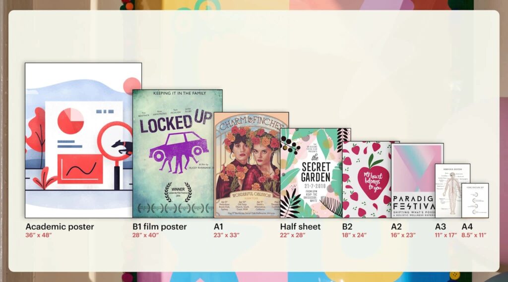
Standard poster sizes and recommended DPIs
| Poster size | Recommended DPI | Pixel dimensions |
| 8.5” × 11” | 300 DPI | 2550 × 3300 px |
| 11” × 17” | 300 DPI | 3300 × 5100 px |
| 16” × 20” | 240 DPI | 3840 × 4800 px |
| 18” × 24” | 240 DPI | 4320 × 5760 px |
| 22” × 28” | 200 DPI | 4400 × 5600 px |
| 24” × 36” | 200 DPI | 4800 × 7200 px |
| 28” × 40” | 150 DPI | 4200 × 6000 px |
| 36” × 48” | 150 DPI | 5400 × 7200 px |
Step 5: Check your poster will look sharp using this print resolution checklist
Poster resolution and printing prep checklist:
- Confirm viewing distance: This will affect whether you choose 300, 250 or 150-200 DPI.
- Match DPI to detail: Small text, charts, patterns or detailed images call for higher DPI for posters.
- Check pixel dimensions: Don’t enlarge the file and hope for the best. Instead, reduce print size, replace the image or simplify the design. Don’t export at a high DPI “just in case.”
- Set bleed and safe zone: Keep important text and logos away from edges so nothing gets trimmed off.
- Convert to CMYK: For reliable print color, prepare your print file in poster CMYK.
- Embed fonts or outline text: Avoid font substitutions that affect spacing and create line breaks.
- Choose the paper stock: Pick poster materials and paper stock based on durability needs.
- Export a print-ready PDF: PDF is the best file type for printing posters because it preserves layout, fonts and vector elements.
- Do a final check: Proofread, check URLs and test QR codes before sending posters to print.
Poster printing considerations: Bleed, safe zones and CMYK
Before uploading your poster for print, make sure your file includes a 0.125” bleed, uses CMYK color mode and is exported as a print-ready PDF. For setup instructions and technical definitions, see our complete prepress checklist.
Keep text, logos, QR codes and other important elements at least 0.25” inside the safe zone. If your design contains multiple visuals, small text or content near the edges, allow a little more space so the layout still feels balanced after trimming.
Safe-zone guidance for framed posters
Standard print safe zones account for trimming, but poster frames can hide additional artwork around the edges. Some frames overlap the outer edge of the print and may cover elements that technically sit inside the standard safe zone.
If your poster will be framed, leave extra space around QR codes, contact details, logos and other important content. A design that prints correctly can still lose visibility once it’s placed behind a frame.
Recommended spacing:
- Standard safe zone: 0.25″
- Framed posters: consider ~0.5″
This matters most for layouts with small text or details positioned close to the edge. Dates, pricing, URLs and QR codes are often the first elements affected.
Common poster printing issues (and what printers check)
Even after you’ve checked poster resolution, pixel dimensions and export settings, files can still get flagged when artwork is scaled, logos are flattened into images or the DPI doesn’t match the final poster print size. This section covers the most common reasons poster files get flagged and how to avoid last-minute fixes.
Scaling issues
Scaling is the fastest way to decrease resolution. When you enlarge artwork after it’s been designed, the pixel count stays the same but the design gets stretched across a larger area. That’s how a file that started at 300 DPI can drop to 120 DPI by the time it reaches the printer.
This usually happens when:
- A small poster design is repurposed for a larger size
- A design is scaled up inside a layout tool instead of rebuilt
- A printer resizes the file to fit a different size
Always calculate DPI based on the final print size. If the poster needs to be bigger, check pixel dimensions first instead of simply dragging the corners.
Raster vs. vector
Not every element in a poster file behaves the same way when printed. A photograph, logo and illustration may look equally sharp on screen, but they can produce very different results at poster size depending on whether they are raster or vector files.
Photographs are typically raster images, made up of pixels with a fixed resolution. They’re well suited to detailed imagery, textures and natural gradients. Logos, icons, line art and many illustrations are often created as vector graphics, which use paths rather than pixels and can be scaled without losing sharpness.
Most poster files contain both formats. A product image may be edited in Adobe Photoshop (PSD), while logos and illustrations are created in Adobe Illustrator (AI). Problems often occur when vector artwork is exported as a low-resolution image or when a website graphic is used in place of the original source file. These issues can be difficult to spot on screen but become much more noticeable once the design is printed at poster size.
If a logo gets rasterized during export, its edges can blur, especially on large posters. Keep brand elements as vector files to avoid resolution warnings.

Quality of source images
Changing the resolution can’t fix a weak source image. Smartphone photos can work for poster printing, but only under the right conditions. Low-resolution images struggle when shot in low light, zoomed in or cropped, and pulled from social media. Good lighting and minimal compression matter more than pixel count.
Can I use an iPhone or Android photo for a poster?
Whether a phone photo works for a poster usually comes down to size. An image that looks great on a phone screen or social feed can blur once it’s stretched across a larger format. The larger the poster gets, the more detail the file needs to hold together.
Use the guide below as a starting point:
| Poster size | Recommended pixels | Smartphone suitability |
| 11” × 17” | 3300 × 5100 px | Good for most iPhone and Android phones released since 2020 |
| 18” × 24” | 4320 × 5760 px | Usually suitable when using the original file |
| 24” × 36” | 4800 × 7200 px | Depends on image quality and how much detail remains |
| 36” × 48” | 5400 × 7200+ px | Can work, but results become more dependent on source quality |
For the strongest results:
- Shoot photos in good lighting.
- Use the original file from your camera roll.
- Keep cropping to a minimum.
- Avoid screenshots and downloaded social media images.
- Avoid digital zoom while shooting.
- Check the image at 100% zoom before uploading.
If small details already look soft at full size on a screen, they’ll become more noticeable once the image is printed as a poster.
How do I check if my image resolution is good enough for a poster?
To check if your image resolution is good enough for a poster, first look at its pixel dimensions (not just the DPI) and compare to your final print size: pixels needed = inches × the DPI you plan to print at (for example, a 24” × 36” poster at 200 DPI needs 4800×7200 px). Then view the image at 100% zoom – if edges or small text look soft or blocky there, they’ll likely print blurry.
AI upscaling can help improve sharpness and smooth edges or textures, but it can’t invent detail – small text, fine patterns and image clarity still depend on the original file.
Low-resolution poster files at full size look worse in print than on screen. Catching that early saves time, money and expensive reprints.
Common poster printing mistakes
Most poster printing issues come from:
Using website graphics and social posts that are too low-res
Fix: Use the original logo file (SVG, EPS, PDF) or a high-res image sized for your final poster.
Not having bleed can leave white slivers, and tight margins can clip content
Fix: Don’t crowd the edges, add poster bleed size at 0.125” and keep key elements 0.25” inside trim.
Assuming the DPI for posters
Fix: Choose DPI for posters based on distance and detail: 240-300 DPI for close viewing or small prints; 150-200 DPI for larger posters viewed farther away.
Exporting a compressed JPEG, affecting text edges and gradients
Fix: Export a print-ready PDF (the best file type for printing posters).
Enlarging the design at the end
Fix: Because scaling decreases effective DPI, try to design at final size or recalculate pixel dimensions before resizing.
Shifting on-screen RGB colors or colors looking dull in print
Fix: Convert to CMYK and request a proof
Export settings for VistaPrint posters
Uploading artwork at the correct size from the start helps avoid the most common setup issues. A file that has been scaled after design, exported at the wrong dimensions or built without enough margin space can trigger low-resolution warnings or place important content too close to the edge.
For VistaPrint posters, create your document at the final print size and use one of the supported file formats below:
- SVG
- Adobe Illustrator (.ai)
Use these document specifications when preparing your file:
| Poster size | Bleed (W × H) | Trim (W × H) | Safety (W × H) |
| 8.5″ × 11″ | 8.66″ × 11.18″ | 8.50″ × 11.02″ | 8.35″ × 10.87″ |
| 11″ × 17″ | 11.16″ × 17.16″ | 11″ × 17″ | 10.84″ × 16.84″ |
| 16″ × 20″ | 16.16″ × 20.16″ | 16″ × 20″ | 15.84″ × 19.84″ |
| 18″ × 24″ | 18.5″ × 24.5″ | 18″ × 24″ | 17.84″ × 23.84″ |
| 22″ × 28″ | 22.16″ × 28.16″ | 22″ × 28″ | 21.84″ × 27.84″ |
| 24″ × 36″ | 24.5″ × 36.5″ | 24″ × 36″ | 23.84″ × 35.84″ |
| 28″ × 40″ | 28.24″ × 40.24″ | 28″ × 40″ | 27.76″ × 39.76″ |
| 36″ × 48″ | 36.16″ × 48.16″ | 36″ × 48″ | 35.84″ × 47.84″ |
Before placing your order:
- Review the VistaPrint upload preview.
- Check for low-resolution warnings.
- Confirm that trimming and content placement look correct.
- Check that fonts, logos and images display as expected.
The upload preview is the last opportunity to catch issues before printing. A quick review here can prevent unexpected cropping, missing elements or quality warnings later.
Proofreading and pre-print checks
Once you’ve got the resolution, bleed and color right, before exporting to a PDF, check:
- Spelling, dates, phone numbers, pricing and URLs
- QR codes with a smartphone camera
- Margins, bleed and that no key elements sit outside the safe zone
- Images aren’t low-resolution placeholders
Ready to print your posters using the right resolution?
For poster resolution, choose DPI based on viewing distance and detail, confirm pixel dimensions, then add bleed, keep key content inside the safe zone, convert to CMYK and export a print-ready PDF.
Poster resolution FAQs
What’s the best resolution for posters with lots of text?
Posters with dense text or small labels benefit from higher resolution. Aim for 300 DPI at final size, so text edges stay clean and don’t blur, especially for indoor posters viewed and read up close.
Should I design my poster at full size or scale it later?
Design posters at full size whenever possible. Scaling up at the end lowers effective DPI and can soften images and text, even if the file originally looked sharp on screen.
What file settings make VistaPrint posters print-ready?
Upload a print-ready PDF with bleed (0.125”), safe margins, CMYK color mode, embedded or outlined fonts and images sized to the final poster dimensions.