Typography packaging design shapes how your product is recognized, judged and chosen – often in seconds. The fonts on your packaging influence clarity, perceived quality and brand recall, yet they’re often treated as a last-minute decision. If you’re not a designer, choosing packaging fonts can quickly turn into guesswork.
In this article, you’ll get a clear breakdown of how typography for packaging design actually works, along with practical ways to choose, pair and apply packaging fonts so your design holds up on the shelf, not just on screen.
- Typography for packaging design matters because it shapes how quickly your product is recognized, how it’s perceived and whether it gets chosen.
- Choose packaging fonts that align with your brand personality and match expectations within your product category.
- Readability should guide every decision, especially for product names, key details and functional text.
- Visibility depends on strong contrast and clear hierarchy, so your packaging stands out and registers at a glance.
Why typography packaging design matters more than you think
You already know typography matters. What’s less obvious is how much it actually controls in packaging design. In a retail setting, physical or digital, your packaging design fonts often determine whether someone stops or scrolls past.
Most shoppers don’t study packaging. They scan it. Over 70% of purchasing decisions happen at the shelf, which means your packaging fonts have seconds to do their job. If the message isn’t clear or the design feels off, the product gets ignored. Simple as that.
Here’s what typography for packaging design is really doing:
- Helps customers understand what the product is: Typography defines how quickly a product is recognized. When the name, category and key descriptor are clear and easy to process, shoppers can identify the product in seconds. When type is overly stylized or lacks contrast, recognition slows down and attention shifts elsewhere.
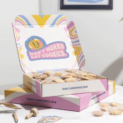
- Communicates brand personality: Packaging fonts act as a visual shortcut for brand positioning. A geometric sans-serif reads as clean and modern, a high-contrast serif suggests premium, a script style leans handmade or niche. These signals shape expectations before any copy is read.
- Creates trust and perceived quality: People associate good typography with professionalism. Balanced hierarchy, consistent spacing and thoughtful font choices signal a reliable product.
- Makes the product easier to choose in a retail environment: Typography works within the packaging design layout to guide attention. When key information like flavor, variant or benefit is easy to locate, decision-making feels effortless.
- Prevents your packaging from looking cheap or confusing: Typography has a direct impact on perceived value. Cluttered layouts, low contrast text or excessive font styles can make packaging feel unrefined and difficult to read. That friction often translates into hesitation or rejection.
10 product packaging typography tips
Typography does a lot of heavy lifting – that’s true… But only when it’s handled with intent. The difference between packaging that converts and packaging that gets ignored usually comes down to a handful of decisions most people overlook.
This is where practical product packaging typography tips come in. Let’s look at the most important ones.
1. Start with visual hierarchy to improve your packaging design layout
Before you think about fonts, you need structure. Visual hierarchy is simply the order in which people process information – what they see first, second and third. In typography packaging design, this is what determines whether your message lands or gets lost.
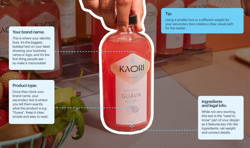
Every package carries three levels of information:
- Primary → Brand name or product name
- Secondary → Key benefit, flavor, USP
- Tertiary → Ingredients, instructions, legal details

Source: Packaging design by goopanic via 99designs by Vista

Source: Packaging design by goopanic via 99designs by Vista
Typography controls how these levels show up.
- Size signals importance – larger text gets noticed first.
- Weight adds emphasis – bold stands out, regular recedes.
- Placement directs attention – front-facing elements dominate, side panels support.
- Spacing separates ideas so they don’t compete.
When these elements work together, the design feels effortless to scan. When they don’t, everything blends into noise.
Source: Packaging design by goopanic via 99designs by Vista
Practical rules to keep it sharp:
- From 3 feet away, only primary information should be readable.
- Secondary details should become clear once the product is picked up.
- Tertiary content should stay accessible without cluttering the front.
If you’re building this out from scratch, it’s worth reviewing a solid product packaging design guide to map how typography fits into the broader packaging design.
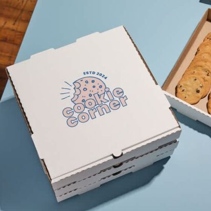
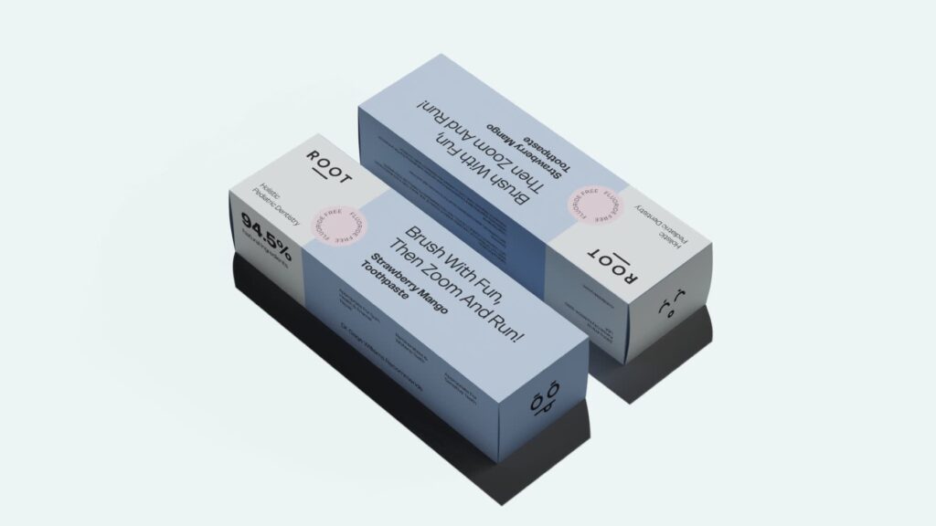
2. Choose packaging fonts that reflect your brand personality
Once your hierarchy is defined, the next question is how your product should feel at a glance. Packaging fonts answer that immediately. Before a shopper reads the name or benefits, they’re already forming an opinion based on how the text looks.
Each font style comes with built-in associations:
- Serif → Classic, premium, established
- Sans serif → Modern, clean, accessible
- Script → Personal, artisanal, expressive
- Display → Bold, distinctive, attention-grabbing
These signals need to match the category you’re in. A soft script can work for handmade food. The same style on a tech product can feel out of place. Packaging fonts should align with both your brand and what customers expect from that type of product.
To check alignment, pick 3 adjectives that describe your brand, like “premium,” “minimal,” “approachable.” Then compare them to your packaging fonts. If they don’t match visually, customers will feel the disconnect, even if they can’t explain it.
Source: Packaging design by Mr. Ozz via 99designs by Vista
Most brands already have a font system. The problem is that what works on a website or social post doesn’t always perform on packaging.
Here’s how to adapt existing brand typography for packaging:
- Increase weight for visibility: If your primary font is thin or light, switch to a heavier weight. Fine lines tend to disappear in print, especially on smaller labels.
- Push size contrast further: Packaging needs stronger hierarchy than digital layouts. Your headline should dominate, not blend in.
- Add a functional support font if needed: If your main font is decorative or hard to read at small sizes, pair it with a clean sans serif for ingredients and instructions. Keep the tone aligned, not identical.
- Swap for a close alternative when necessary: If your brand font struggles with legibility, choose a similar typeface that holds up better in print while keeping the same overall feel.
Source: Packaging design by Luz Viera Studio via 99designs by Vista.
3. Limit your packaging fonts to 2–3 for a clean, professional design
Packaging font variety is where a lot of packaging designs fall apart. Too many fonts create visual clutter, which makes the product harder to read and easier to ignore.
To make sure there’s no chaos in your packaging design layout, follow this simple structure (it works across most categories):
- 1 font → Minimal brands that rely on a single, strong typeface
- 2 fonts → The most balanced and flexible setup
- 3 fonts → The upper limit, used with clear roles
Source: Packaging design by DLab™ via 99designs by Vista
At the same time, it’s important that each of the fonts in the setup has a defined job:
- Font 1 – Brand name or headline
- Font 2 – Supporting information
- Font 3 – Optional accent for small highlights
Anything beyond that starts to feel unstructured. After all, when every element looks different, nothing stands out.
4. Use proven font pairings in typography for packaging design
You can pick good fonts and still end up with packaging that feels off. The issue is usually how those fonts interact.
Strong typography for packaging design relies on pairing, not just selection. The goal is to create contrast where needed and consistency where it matters, so each element has a clear role.
A few rules keep things from falling apart:
- Pair different styles instead of similar ones.
- Assign clear roles, headline vs. body vs. accent.
- Avoid fonts that look almost identical, they compete instead of complement.
Packaging fonts pairing cheat sheet
One quick clarification before we get into pairings: these aren’t exact font recommendations but font categories. Instead of copying a specific combination, you need to understand which styles naturally work together in typography for packaging design and where each one fits within the hierarchy.
- Serif + Sans Serif – Balanced, widely used across premium and heritage brands
- Sans Serif + Sans Serif – Works when you create contrast through weight, size or spacing
- Script + Sans Serif – Expressive headline paired with clean, readable supporting text
- Display + Neutral Sans – Bold, attention-grabbing identity supported by functional text
- Serif + Serif – Effective when combining a high-contrast serif for headlines with a simpler serif for body text
- Condensed Sans + Regular Sans – Useful for space-limited packaging where you need hierarchy without adding another style
- Display + Serif – Strong personality up front, with a more refined and readable secondary layer
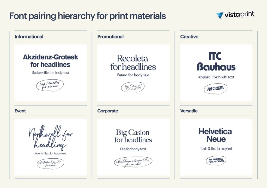
If you’re working with existing brand typography, start there. Use your primary font for the headline, then introduce a complementary font only if readability or contrast is lacking. Most of the time, one strong pairing is enough.
5. Prioritize readability in product packaging typography
A good-looking font pairing is great. But aesthetics isn’t the only factor influencing your decision. While style gets attention, it’s readability that closes the deal.
Source: Packaging design by goopanic via 99designs by Vista
Packaging lives in tight spaces, often viewed quickly and under imperfect lighting. If text isn’t easy to read, it doesn’t matter how good it looks.
Common readability issues tend to show up in predictable ways:
- Thin fonts lose visibility at small sizes, especially in print.
- Overly decorative styles slow down recognition because they take longer to process.
- Tight spacing makes text feel cramped, which quickly becomes uncomfortable to read.
The balance is practical. Use expressive fonts where they have impact, usually in headlines or short phrases. For anything functional, like ingredients or instructions, stick to simple, legible styles that hold up at smaller sizes.
Quick readability check:
- Can the main text be read from 3 feet away?
- Is smaller text still clear when printed?
- Is there enough spacing between lines and letters?
- Does the text stand out from the background?
- Are decorative fonts used sparingly?
If any of these fail, the typography needs adjustment.
6. Use the right font size and spacing for packaging fonts on labels
Another thing you need to keep in mind is that print and digital don’t translate one-to-one. Type that looks sharp on screen can lose clarity once it’s printed, especially on smaller labels or textured materials.
Font size needs to reflect how the product will actually be viewed:
- Primary text should be visible from a distance.
- Secondary text should read clearly when held in hand.
- Tertiary text typically sits around 6–8pt minimum, depending on print quality.
Source: Packaging design by G@rry via 99designs by Vista
Spacing matters just as much as size, especially with smaller text. Tight line spacing can turn ingredients or instructions into a dense block, while giving the text more room makes it easier to follow. The same applies to letter spacing, small adjustments help prevent characters from blending together.
Labels also come with obvious space limits, so they can’t be treated like a full layout. Trying to fit everything on the front usually leads to clutter.
If you’re working across formats, it helps to understand how typography adapts to different types of labels, since size and shape directly influence how much content can fit and how it will be read.
7. Maximize contrast in typography for packaging design to stand out on the shelf
Once your hierarchy, font choices and sizing are in place, visibility becomes the next challenge. Contrast determines whether your typography packaging design stands out or fades into the background.
Retail conditions aren’t forgiving: lighting varies, products are tightly packed and shoppers move quickly. Packaging with weak contrast often gets overlooked, even if everything else is done right.
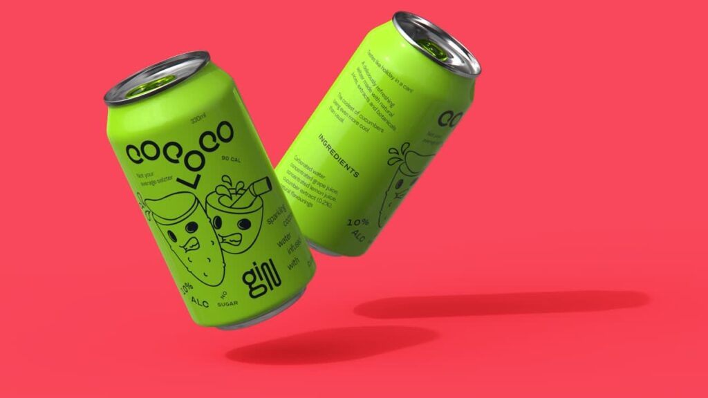
Source: Packaging design by goopanic via 99designs by Vista
This packaging is a good example of contrast doing the heavy lifting. That lime green dominates the entire design, which means softer typography would disappear into it. The black type works because it creates enough separation to stay readable, even with such an intense color palette.
At this point, the difference comes down to what holds up in real conditions and what doesn’t.
| What works | What doesn’t |
| Dark text on a light background | Light grey on white |
| Light text on a dark background | Muted tones layered too closely |
| Clear separation between text and surface color | Soft gradients that reduce definition |
Muted palettes are common in current packaging design trends. They can still work, but contrast needs to come from somewhere else. Heavier weights, larger type or subtle background blocks can keep the text visible without disrupting the overall aesthetic.
Print a quick sample and check it under different lighting, natural light, store lighting and even low light. If the text starts to disappear or lose clarity, the contrast needs adjustment.
8. Adapt your typography for packaging design to different packaging types
When working on typography packaging design, keep in mind that it doesn’t exist in isolation. It’s shaped by the format it sits on, and different types of packaging come with very different constraints.
Each format forces different decisions. What works on a flat box panel won’t translate directly to a bottle label.
- Boxes offer flat surfaces and more space, which makes hierarchy and spacing easier to control.
- Bottles introduce curves that can distort text or break alignment.
- Pouches are flexible, so folds and movement can interfere with layout and readability.


If you’re working with shelf-ready packaging, where products are displayed in groups, check how your typography reads both on a single unit and across multiple items. It should hold up individually and still feel consistent when repeated.
9. Test your packaging fonts in print for real-world results
We’ve already touched on testing packaging fonts, but this product packaging typography tip is important enough to deserve its own section.
Typography decisions can look solid in a file, then fall apart once they’re printed and used in context.
Fine details often get lost during production. Tight spacing becomes harder to read, colors can shift depending on the material and finishes can affect how sharp the type actually appears.
The simplest way to avoid this is to check your typography under real conditions:
- Print a sample at actual size.
- Look at it from the same distance a customer would.
- Review it on the material you plan to use, whether that’s paper, plastic or something textured.
10. Make sure your packaging fonts are properly licensed for commercial use
Finally, let’s talk about the elephant in the room, the part of packaging typography most people ignore until it becomes a problem.
Yes, you need a license to use fonts on packaging. Not all “free” fonts are cleared for commercial use, and packaging definitely counts as commercial.
Using unlicensed fonts can lead to legal issues, but it can also affect how your brand is perceived. So it’s definitely not a detail worth overlooking.
Before you start your typography packaging design process, check which bucket your fonts fall into:
- Free fonts – Confirm they include commercial use rights.
- Paid fonts – Review licensing terms, especially for large-scale distribution.
When in doubt, buy the license. It’s a small cost compared to fixing a problem later.
Typography for packaging design checklist
Now that you’ve gone through the key product packaging typography tips, it’s time to turn them into something practical. Use this checklist as a quick reference to make sure nothing gets missed before you finalize your packaging.
- Hierarchy is clear: Primary, secondary and tertiary information are easy to distinguish at a glance.
- The product is instantly recognizable: Name and category can be understood within a second or two.
- Fonts match your brand: Packaging fonts reflect the tone you want to communicate.
- Font usage is limited and consistent: No more than 2–3 fonts, each with a clear role.
- Font pairings make sense: Styles contrast enough to create structure without clashing.
- Text is easy to read: No overly thin, decorative or cramped typography in functional areas.
- Font sizes are appropriate: Key information is visible from a distance, small text remains legible.
- Spacing supports readability: Line and letter spacing prevent text from feeling crowded.
- Contrast is strong enough: Text stands out clearly against the background in real conditions.
- Typography fits the packaging format: Layout works on the actual structure, whether it’s a box, bottle or pouch.
- Print test has been done: Typography holds up at real size, on real materials and at real distances.
- Fonts are properly licensed: All typefaces are cleared for commercial use.
Run through this once before finalizing your packaging design. If anything feels off, it usually means something earlier in the process needs a second look.
Ready to choose the right packaging fonts?
Typography packaging design shapes how your product is understood and judged in seconds. Clear hierarchy, well-chosen packaging fonts, controlled pairings and strong contrast all work together to make your packaging easier to read and easier to choose. Get those right, and everything else becomes easier. Miss them, and even a great product can get overlooked.
And really, you don’t need a full redesign to fix it. Small changes, better spacing, clearer type, smarter testing, can all make a noticeable difference. Refine, test in real conditions and adjust.
When you’re ready to print, VistaPrint helps make sure your typography holds up on actual packaging, not just on screen.
Typography in packaging design FAQs
Should I use custom fonts or ready-made fonts for packaging design?
Ready-made fonts work for most brands and are faster to implement. Custom fonts make sense if typography is central to your identity or you need something distinctive that competitors can’t replicate.
Are free fonts safe to use for product packaging?
Only if they’re licensed for commercial use. Many free fonts are limited to personal projects, so always check the license terms before using them on packaging.
How do I make my packaging typography stand out in e-commerce thumbnails?
Simplify. Use fewer words, increase font size and rely on strong contrast. Thumbnails reduce everything, so clarity matters more than detail.
Should packaging typography be consistent across all my products?
Yes, but with flexibility. Keep core elements like font choices and hierarchy consistent, while allowing variations for flavors, variants or product lines.
How do I test if my packaging typography is effective before printing in bulk?
Create scaled mockups and review them at thumbnail size and real size. Then print a small batch or sample to see how the typography performs in actual conditions.