Wondering what visual identity is and why it matters? The core elements of visual identity—from your logo and imagery to graphic systems and physical brand assets—shape how audiences see your brand, increase brand recognition and build customer trust and loyalty. This guide provides real-world examples and practical steps to help you audit, build or refresh your visual identity.
- Visual identity is the visible language of your brand, shaping perception, trust and recognition.
- Core visual brand elements are logos, color palettes, typography, imagery, patterns, motion, physical assets and scalable systems.
- To build a strong visual identity, define your brand, identify your target audience, develop a visual system and document clear guidelines.
- Apply your visual identity consistently across print, digital, packaging, merchandise, signage, events and AR/VR.
- Trends include responsive logos, adaptive branding, inclusive color systems, motion micro-interactions and AI-assisted tools.
What is visual identity?
Visual identity is the imagery and graphical information that expresses who a brand is and what sets it apart. It’s all the visual elements of branding—from the logo, typography and store design to packaging design, social media templates and website layouts.
Source: Visual identity by Yevhen Genome via 99designs by Vista

Source: Visual identity by Yevhen Genome via 99designs by Vista
Visual identity vs brand identity
A strong visual identity doesn’t exist in a vacuum. It’s one part of a bigger system—your brand identity. The difference between the two comes down to what goes on behind the scenes versus what the world sees.
- Brand identity is your values, mission, brand voice and personality.
- Visual identity is how those ideas are expressed visually through color, typography, imagery and design systems.
When brand identity and visual identity work cohesively together, the result is a brand people remember and trust. The State of Brand Consistency Report found that consistent branding can increase revenue by 33%, while a study by the University of Loyola, Maryland showed that consistent use of color in branding increases brand recognition by up to 80%.
Check out our brand design statistics for more on how visual identity influences customer trust and conversions.
Effective branding is the reason why big brands like Apple are instantly recognizable—logos, colors and overall design language mirror its values without saying a word.
The 8 core elements of a strong visual identity
A strong visual identity is built from a system of visual cues that work together to shape how people see and experience a brand. Each component adds meaning, personality and recognition.
1. Logo and wordmark
A brand logo is the cornerstone of any visual system. Whether it’s on a business card, a billboard or an app icon, your logo is often the first interaction customers have with your brand, and sometimes the only thing they remember. A well-designed logo distills your brand identity into a simple, distinctive symbol or wordmark that can be applied across all platforms.
Logo designs should always be:
- Simple—complex logos don’t scale well.
- Versatile—create versions in color, black and white, and small and large formats.
- Memorable—distinctive shapes and spacing make a big difference.
- Responsive—adapt versions for different uses (e.g., app icons, signage, product labels).

Source: Responsive logo design by Mamei via 99designs by Vista
Modern visual identity systems increasingly use responsive or dynamic logos—designs that adapt to different formats without losing their identity. A full version might appear on a website header, while a simplified icon works for a mobile app and an animated mark adds movement. These flexible logos are easier to integrate into today’s multi-platform ecosystems and maintain a consistent look no matter the context.
Source: Logo design by Yevhen Genome via 99designs by Vista
Source: Motion logo design by Yevhen Genome via 99designs by Vista
Current logo design trends point toward minimalism, motion and scalable design, making brands recognizable and memorable across every channel.
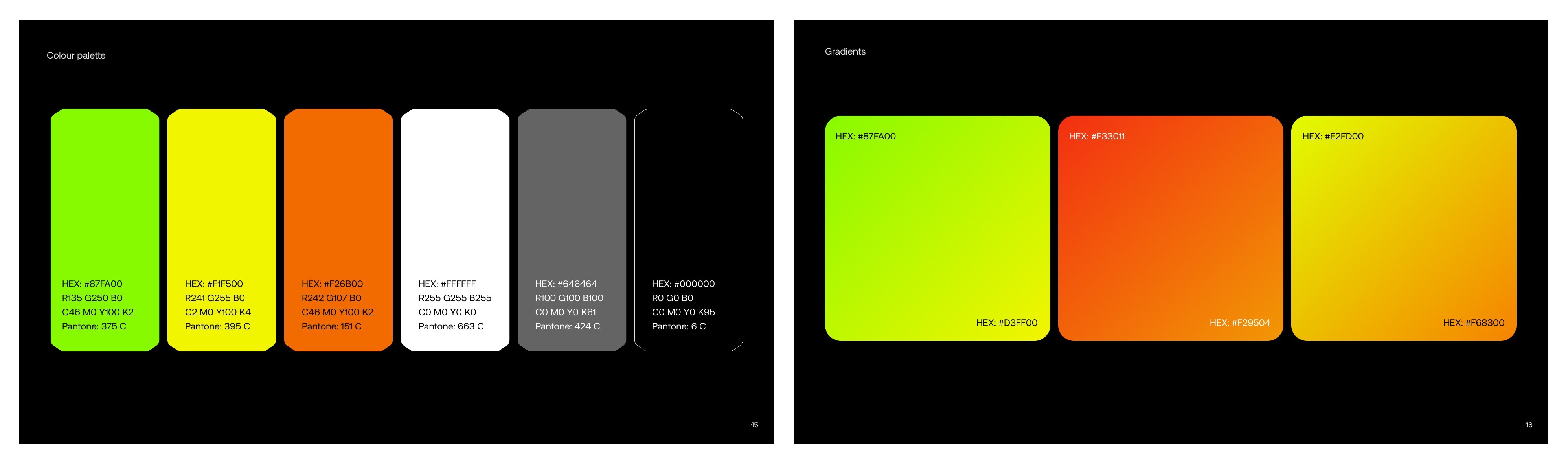
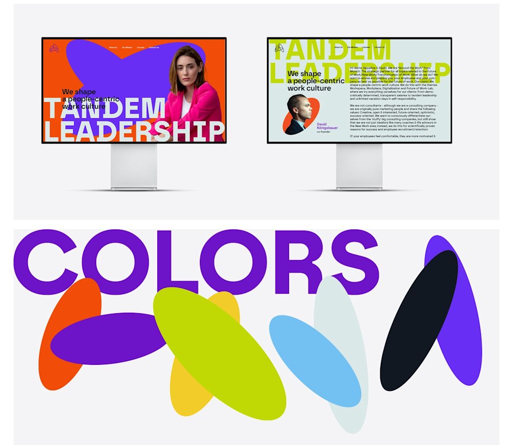
2. Color palette
Color is one of the quickest and easiest ways to convey your brand’s personality, spark emotion and make your brand recognizable at a glance. Many iconic brands, like Coca-Cola or Tiffany & Co., owe their position to strategic, consistent color choices.
Source: Visual identity by Yevhen Genome via 99designs by Vista
Brand color palettes include:
- Primary colors for core brand recognition.
- Secondary colors for flexibility.
- Accent colors to highlight calls to action or key details.

When deciding on your brand colors, consider:
- Contrast to ensure legibility.
- Accessibility so everyone can engage with your brand.
- How colors perform in both print and digital assets.
Source: Visual identity by goopanic via 99designs by Vista
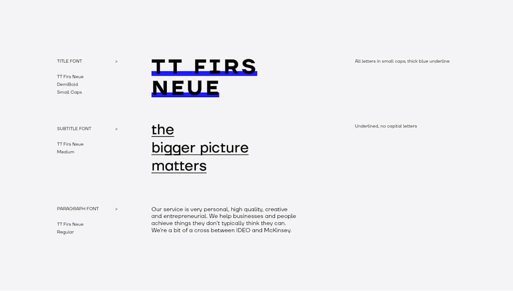
3. Typography and typeface
Typography communicates personality before a single line of text is read. Bold, clean brand fonts convey confidence; soft, rounded fonts feel approachable; and serifs often suggest heritage and sophistication. Most brand systems pair a headline font for impact with a body font for legibility.
Source: Brand fonts by goopanic via 99designs by Vista
Source: Visual identity by Yokaona via 99designs by Vista
Effective brand typeface design works seamlessly across print and digital channels. The best systems are readable, scalable and consistent, whether on a storefront sign or an app interface.
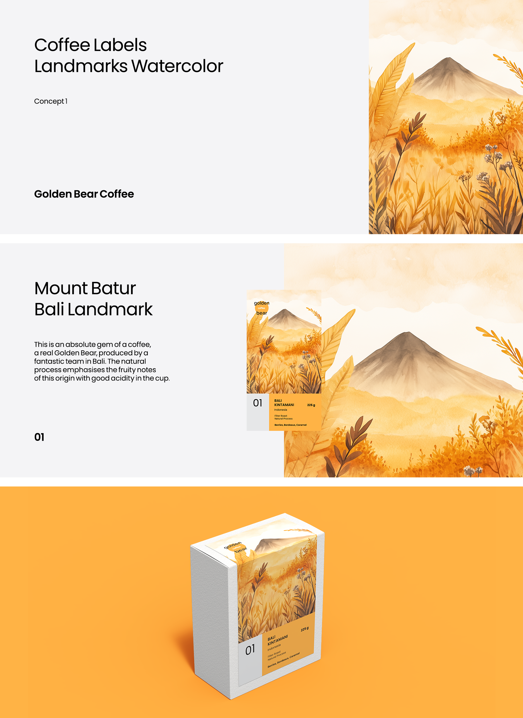
4. Imagery and photography
A clear imagery style—defined by tone, subject matter, filters, lighting, framing, composition and editing—can make a brand instantly recognizable, even without a logo.

Use inclusive brand imagery to show what your core values are, signaling belonging and building trust.
For instance, Nike uses high-contrast, movement-driven photography that communicates energy and determination, while Glossier uses soft, natural tones and minimal retouching to emphasize authenticity.

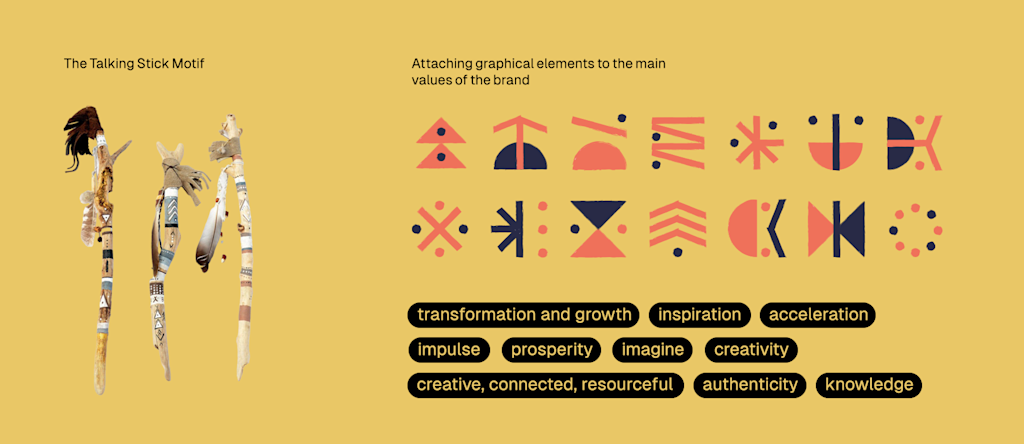
5. Patterns, textures and graphic systems
Patterns and graphic systems—subtle background textures, icon sets, grids or bold repeating shapes—act as a connective thread across every touchpoint, giving your brand visual flexibility while maintaining recognition.
Source: Visual identity by goopanic via 99designs by Vista
They’re especially powerful in modern digital ecosystems, where brands live on multiple platforms at once. A well-designed pattern system adapts seamlessly to websites, apps, AR interfaces and physical assets, like business cards and flyers, keeping the experience cohesive no matter where people interact with your brand.

Source: Visual identity by goopanic via 99designs by Vista

Source: Visual identity by goopanic via 99designs by Vista
Patterns, textures and graphic systems work best when they are:
- Integrated consistently across print, digital and packaging.
- Designed to scale from a business card to a website hero banner.
- Organized as a reusable library, so your team can apply them easily.

6. Motion and micro-interactions
Static design can only go so far. Motion adds energy, guiding how users interact with a brand. Animations, scroll effects, hover states and loading sequences can all become part of a brand’s visual identity. These micro-interactions make digital experiences feel intuitive and interactive, and can reinforce brand personality just as much as a logo or font choice. Many forward-thinking brands now treat motion as a core identity asset.
Source: Animated logo design by Ševarika™ via 99designs by Vista

Source: Website design and animation by Arthean via 99designs by Vista
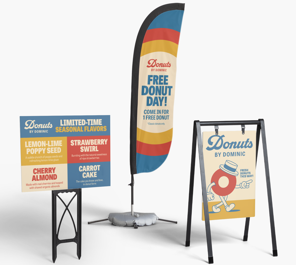
7. Physical brand assets
Strong visuals also extend into the real world. Physical assets—like signage, uniforms, product packaging or the layout of a retail space—shape how people experience your brand offline. When done well, physical assets reinforce the same identity customers see online, creating a seamless brand experience.

Source: Visual identity by goopanic via 99designs by Vista

Source: Visual identity by goopanic via 99designs by Vista

Source: Visual identity by goopanic via 99designs by Vista

8. Scalable visual systems
Modern brands need visual identities that grow with them. Scalable systems are built to adapt across platforms—web, mobile, AR and print—without losing clarity or impact. Instead of relying on static assets, they use flexible frameworks that keep elements cohesive as the brand expands.
For example, Spotify uses a modular grid and flexible color system that works equally well on mobile apps, billboards and event stages. Google’s Material Design language scales its visual identity across countless products and devices.
How to build a visual identity: Step-by-step guide
You’ve seen the core elements that make a strong visual identity. Now it’s time to put them into action. This practical step-by-step guide will help you build a visual system that’s clear and consistent.
Step 1: Define your brand
Before choosing brand colors and fonts, set the creative direction that will guide them. Start by mapping out your brand’s personality and identity—values, mission and tone of voice—and translate these into visual cues.
Source: Brand identity by goopanic via 99designs by Vista
Create mood boards that capture textures, shapes, imagery and styles that reflect how you want your brand to look and feel. This first stage ensures later design decisions align with your core identity.
Step 2: Identify your target audience and market
Different industries and audiences respond to different visual languages. For example, tech brands often lean toward clean and minimal, while retail and hospitality businesses use warmer, more tactile aesthetics.
Research how your market niche presents itself visually, then position your look either within the visual norms of your industry or intentionally against them to stand out.
Step 3: Develop your visual system
With your brand identity and target audience defined, start building your visual toolkit. Begin with your logo, then your color palette, typography, imagery, motion and layout systems.
- Make sure assets scale smoothly from social icons to large-format signage
- Balance aesthetics with function so design supports usability
- Factor in accessibility—contrast, legibility and inclusivity should guide design choices
Step 4: Document in a brand style guide
A brand style guide keeps everyone from designers to marketing teams on the same page about the visual rules. To ensure your visuals remain consistent no matter who executes your branding, document:
- Logo usage rules and minimum clear space
- Color specifications for digital and print
- Typography hierarchy and spacing
- Image guidelines and layout principles
- Do’s and don’ts for common applications
Step 5: Be consistent
Consistency is what turns design elements into a recognizable brand. Apply your visual identity across every channel—website, packaging, signage and social media. Repeated visual elements build recognition. And recognition builds trust.

Source: Business card design by goopanic via 99designs by Vista

Source: Packaging design by goopanic via 99designs by Vista

Source: Car decals design by goopanic via 99designs by Vista

Source: Billboard design by goopanic via 99designs by Vista
Step 6: Evolve your visual identity over time
As your business evolves, so should your visual identity. Schedule regular brand audits to see what still works and what needs a refresh. Adapt to new channels, formats and technologies like AR or emerging platforms.
Cross-channel execution: Making your visual identity work everywhere
A visual identity only works if it’s applied consistently. Once the system is built, the challenge is making it work across every touchpoint—from business cards to digital ads. One brand, many channels, zero disconnect.
Print brings your visual identity into the physical world. Business cards, brochures, packaging and signage all demand precision. Colors may look different on paper than on a screen, and small details—like font weight or spacing—can change when printed.

Source: Poster design by goopanic via 99designs by Vista

Source: Packaging design by goopanic via 99designs by Vista
To keep your visual identity consistent in print:
- Use print-specific color profiles (CMYK) and high-resolution assets.
- Adjust typography to ensure legibility at various sizes.
- Standardize logo placement and spacing across all materials.
- Test proofs before full runs to avoid costly errors.


Digital
Digital channels extend your brand reach—but they also demand optimizing visuals for digital environments. Websites, apps and social media platforms each have their own design requirements, so assets that work in print rarely transfer directly.
Source: Website design by goopanic via 99designs by Vista
For a consistent digital presence, prepare assets in RGB color and use responsive layouts that adapt to any device. Choose web-safe fonts and test them across screen sizes. Define a clear hierarchy for typography and CTAs to guide attention and keep motion, imagery and interactions aligned with your visual system.
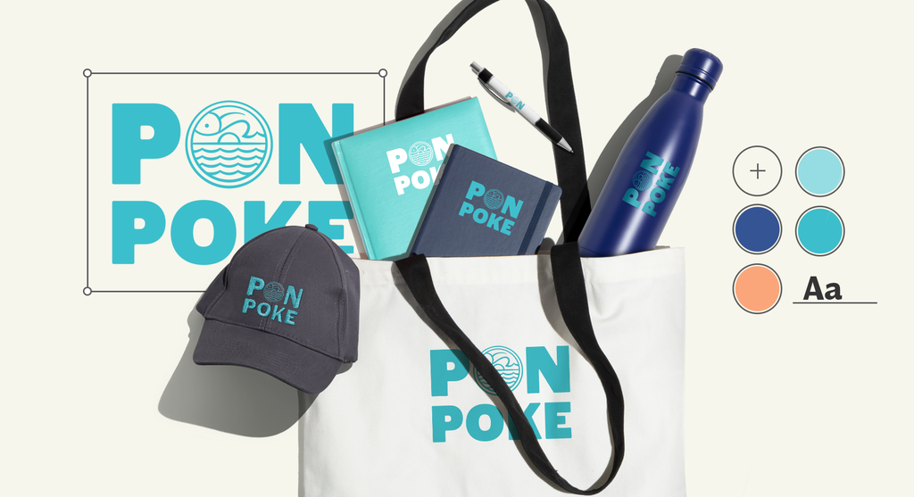
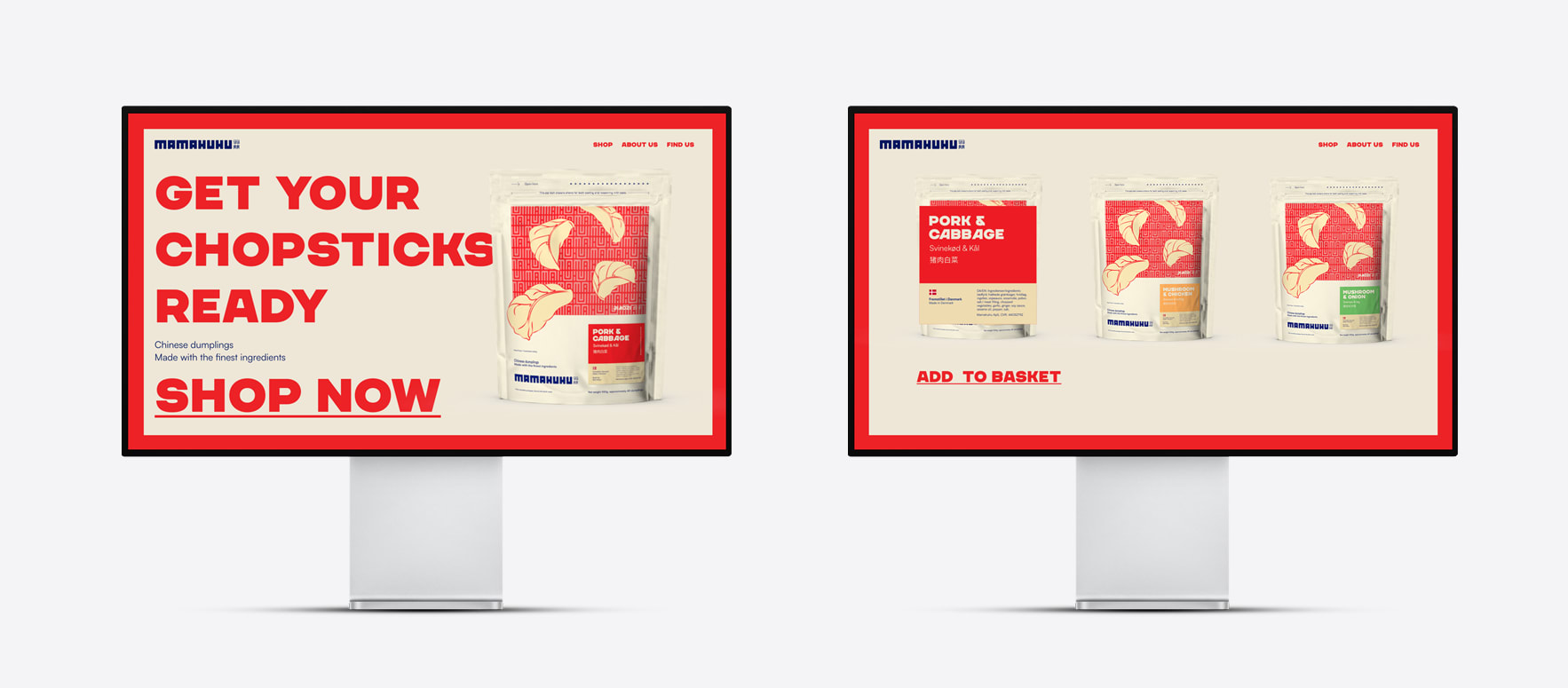
Merchandise and packaging
Branded products are often the first physical expression of your brand that customers encounter. Whether it’s apparel, labels or packaging, these touchpoints should mirror the visual identity your audience sees online.

Source: Packaging design by goopanic via 99designs by Vista

Source: Packaging design by goopanic via 99designs by Vista

Source: T-shirt design by goopanic via 99designs by Vista

Source: Packaging design by goopanic via 99designs by Vista
To keep everything aligned:
- Lock in logo placement and clear space
- Match brand colors across materials and finishes
- Choose typography that fits the product’s shape and scale, ensuring readability in context
- Plan smart scaling so your design works equally well on a small tag or a large tote bag
Events and in-store signage
Pop-ups, trade shows and retail spaces bring your brand to life, so ensure visual cohesion at a glance. Your signage, displays and branded environments should echo the same design language as your online presence.


AR/VR and motion-driven channels
As brands expand into immersive spaces, visual identity must work in new dimensions. AR filters, virtual stores and interactive experiences demand visual assets that move, scale and respond seamlessly.
Tips for AR/VR and motion-driven channels:
- Adapt your color palette and typography for depth and motion
- Use 3D-ready, lightweight assets for smoother performance
- Keep animation styles consistent with your brand’s tone
- Prioritize clarity—motion should enhance, not distract
Visual identity trends to watch in 2026
Visual identity trends are redefining how brands build, scale and express their identities across every channel.
- Dynamic and responsive logos: Flexible logo systems that adapt to different formats, from mobile icons to immersive environments.
- Responsive design: Visual identities built to scale seamlessly across devices and screen sizes.
- Adaptive branding: Modular frameworks let brands expand to new channels and technologies while staying recognizable.
- Dark mode optimization: As dark interfaces become standard, visual systems are being designed to work flawlessly in both light and dark settings.
- Inclusive color systems: Accessibility drives color palette choices, prioritizing strong contrast and legibility.
- Motion and micro-interactions: Animation and micro-interactions are becoming core components of visual identity.
- AI-assisted branding tools: AI is streamlining concepting, testing and scaling, making it easier to build and evolve cohesive visual systems.
Ready to bring your visual identity to life?
A strong visual identity builds trust, makes your brand instantly recognizable and keeps it top of mind long after the first interaction. Start small if you need to, but approach it as a visual system from the start. Logos, colors, typography, motion and packaging should work cohesively together, in an adaptive and scalable visual system.
Visual identity FAQs
How often should a business refresh its visual identity?
There’s no fixed timeline, but a smart rule of thumb is to review it every 2-3 years. If your audience, channels or products have evolved, your visuals should reflect that change without losing your core identity.
What’s the difference between a rebrand and a visual identity refresh?
A rebrand involves redefining your entire brand strategy and identity, while a refresh focuses on updating visual elements like logos, colors and layouts to keep them current and relevant.
How can small businesses build a strong visual identity on a tight budget?
Start with the essentials: a clean logo, a defined color palette and consistent typography. Free or affordable design tools can go a long way if you stick to a clear visual system and avoid unnecessary complexity.
What’s the best way to ensure branding consistency?
A well-documented brand style guide is key. Clear rules for logo usage, colors, fonts and layouts make it easier for different teams, marketers or partners to keep everything aligned.