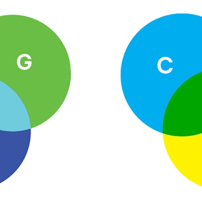
Color contrast is one of the fastest ways to improve the clarity, usability and overall professionalism of a design. A well-chosen color combination can make content easier to read, guide attention to important actions and create a stronger brand experience across websites, marketing materials and printed assets.
In this guide, we’ll explore a wide range of contrast design examples and the principles behind them. You’ll learn how different types of color contrast work, which combinations are best suited for specific industries and how to choose color pairings that balance accessibility, visual appeal and brand consistency across both digital and print.
- Color contrast is the visual difference between two colors, directly impacting how easily a user can distinguish and interpret design elements.
- A good color contrast combination balances readability, accessibility (meeting formal guidelines), visual hierarchy, brand consistency, and print performance.
- Light and dark color contrast relies entirely on brightness differences, offering the most stable and legible foundations for body text and long-form content.
- Complementary color contrast pairs opposites on the color wheel to create maximum visual separation, making it highly effective for catching the eye.
- Saturation contrast juxtaposes vivid colors with muted neutrals, letting a single focal point pop without overwhelming the surrounding design layout.
- Color proportion contrast uses structural field sizes – restricting high-impact colors to tiny percentages – to guide a user’s eye with ultimate restraint.
What is color contrast, and why does it matter?
Color contrast is the visual difference between two colors. In website design, color contrast most commonly appears as text against a background, but it also affects buttons, logos, icons and other interface elements.
Because users need to distinguish content and actions quickly, contrast plays a major role in how easy a website is to read and navigate. Strong contrast improves clarity, while low contrast can make even a polished design difficult to use.
Some of the biggest benefits of effective color contrast in website design include:
- Improved readability: Clear separation between elements makes content easier to read and understand.
- Better accessibility: Higher contrast helps more people use your website comfortably, including users with low vision and color vision deficiencies.
- Stronger visual hierarchy: Contrast directs attention to the most important content and helps distinguish headings, body copy and interactive elements.
- Faster decision-making: Users can identify important information, navigation options and calls to action more quickly.
- Reduced eye strain: Content requires less visual effort to process, particularly during longer browsing sessions.
- More reliable performance across devices and formats: Designs remain clear across different screens, lighting conditions and printed materials.
Color contrast is only one piece of the puzzle. Layout, typography, navigation and content structure all influence how users experience your site. For more practical guidance, explore these small business website design tips.
What makes a good color contrast combination?
Not every high-contrast color pairing is an effective one. Regardless of which type of contrast you’re using, the best combinations share several characteristics.
Before choosing a combination, evaluate it against five key criteria:
- Readability: Can users easily read and scan the content?
- Accessibility: Does the color pair meet meet WCAG contrast requirements?
- Visual hierarchy: Can a visitor quickly identify the most important action on the page?
- Brand consistency: Does the contrast support your overall cohesive branding?
- Print performance: Will these digital choices remain clear and legible when pressed onto physical business cards, marketing flyers and product packaging?
[IMG: Good vs bad color contrast design examples
Alt text: An infographic showing a website with good color contrast and bad color contrast side by side]
Print performance is particularly important for small businesses. Colors don’t behave the same way across every medium. A combination that appears crisp on a backlit screen can lose definition once printed.
That’s why contrast should be considered alongside your brand colors aesthetic and broader understanding of color psychology, helping create a visual identity that remains effective wherever customers encounter it.
Accessibility and WCAG requirements for small business websites
WCAG (Web Content Accessibility Guidelines) is the internationally recognized standard for website accessibility. It includes minimum contrast requirements designed to keep text readable for people with low vision, color vision deficiencies and other visual impairments.
For small businesses, following WCAG guidelines helps create a better user experience while reducing the risk of important information becoming difficult to read.
The current minimum contrast ratios for brightness are:
4.5:1 for normal text (under 18pt, or under 14pt if bolded).
3:1 for large text (18pt and above, or 14pt and above if bolded).
If users struggle to read your content, your design isn’t working, regardless of how attractive it looks.
How to test color contrast
Fortunately, you don’t need to calculate contrast ratios manually. Several free tools can check them in seconds:
- WebAIM Contrast Checker: A simple tool for checking whether color combinations meet WCAG requirements.
- Adobe Color Contrast Checker: Helps evaluate contrast and accessibility during the color selection process.
- Figma plugins: Tools such as Stark allow designers to test contrast directly within their designs.
Different types of color contrast
There are many different types of color contrast – for this guide, we’ll focus on the color contrast types most relevant to website design: contrast of light and dark, complementary contrast, contrast of saturation and contrast of proportion.
The following color contrast design examples show how good contrast creates designs that are visually effective, easy to use and accessible.
Light and dark color contrast design examples
Light and dark contrast is created by placing light colors next to dark colors. In some cases, both colors can come from the same color family, with one simply being much lighter or darker than the other. It remains one of the easiest and most versatile contrast systems to read across both digital and print media.
1. Black on white: The readability benchmark
If there were a default setting for color contrast, this would be it. Black text on a white background remains a highly recognizable and widely used example of light and dark contrast.
![Black on white color contrast design example from the Notion homepage]](https://blogadmin.vpsvc.com/hub/wp-content/uploads/sites/14/2026/08/black-on-white-color-contrast-example-1024x552.jpeg)
Source: Notion
The combination works because it creates maximum visibility between content and background. Users don’t need to work to decipher the text, which makes scanning feel almost effortless. Familiarity helps too. Most people have spent decades reading dark text on light surfaces, whether on paper or on screen.
Commonly used by:
- Professional services
- Healthcare organizations
- Law firms
- Editorial websites
Works especially well for: Body text, blog content, forms, business cards and brochures.
Black on white performs consistently across virtually all paper stocks, making it one of the safest choices for businesses that regularly produce printed materials.
2. Charcoal on off-white: Softer than pure black
For brands that appreciate the clarity of black and white but want something less stark, charcoal on off-white offers a subtle refinement.
The contrast remains strong enough for comfortable reading, yet the softer tones create a more relaxed visual experience. Long-form content often benefits from this approach because it reduces the visual intensity that can sometimes come with pure black on bright white backgrounds. The overall impression feels more curated and premium without sacrificing usability.
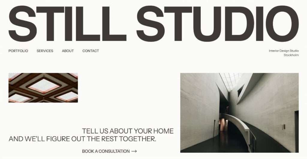
Source: Website design by Sasha Tsyhaniuk via Behance
Commonly used by:
- Architecture firms
- Luxury brands
- Creative agencies
- Interior design studios
Works especially well for: Websites, lookbooks, editorial layouts and brand collateral.
For printed materials, this combination translates particularly well to matte and uncoated paper stocks, where its softer character feels intentional rather than muted.
White on deep navy: Professional and trustworthy
Moving from light backgrounds to dark ones introduces a different visual dynamic. White text on deep navy maintains excellent readability while introducing a stronger sense of authority.
Deep navy carries many of the same practical benefits as black but feels slightly more approachable. It’s a color frequently associated with trust, stability and expertise, which explains why it appears so often in corporate and B2B design.
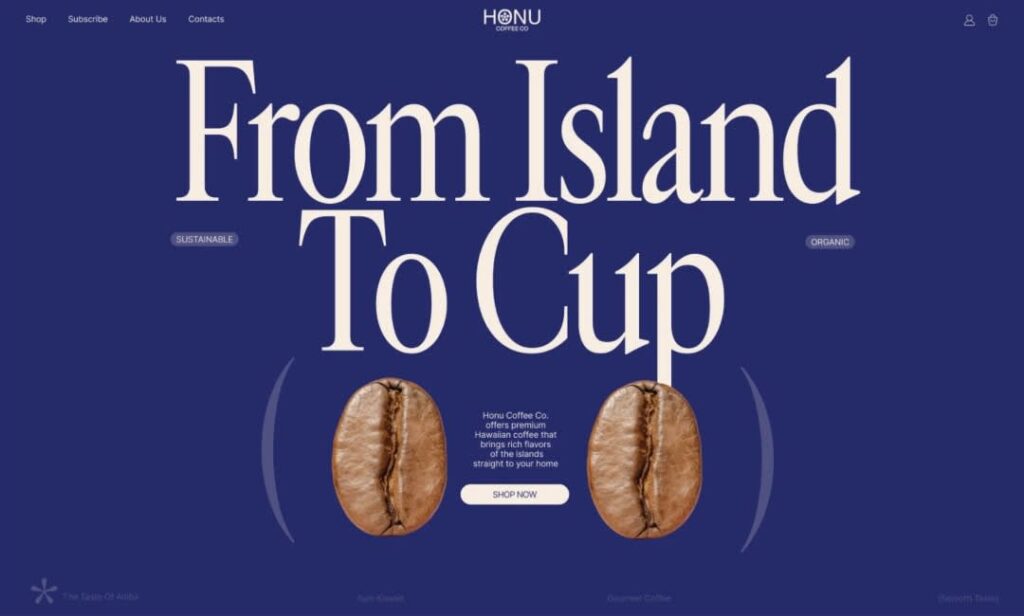
Source: Website design by Anna Humeniuk via Behance
Commonly used by:
- Financial firms
- SaaS companies
- B2B service providers
- Corporate brands
Works especially well for: Hero sections, presentation decks, business cards and directional signage.
White text should remain large enough to avoid filling in during the printing process, particularly when using smaller type sizes.
4. White on forest green: Readability with more personality
Not every high-contrast combination needs to feel corporate. White on forest green delivers strong readability while introducing more character into the design.
Forest green brings associations with nature, sustainability and authenticity. Because the background remains dark enough to support clear contrast, brands can inject personality into their visual identity without compromising usability.

Source: Website design by Sudip Dutta via 99designs by Vista
Commonly used by:
- Wellness brands
- Food and beverage businesses
- Sustainability-focused companies
Works especially well for: Product pages, menus and product labels.
Forest green generally reproduces reliably across most paper stocks, helping maintain a consistent appearance between digital and printed materials.
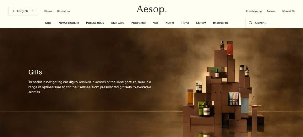
5. Dark brown on cream: Warm and approachable
Where black and white can feel crisp and formal, dark brown on cream creates a warmer atmosphere from the first glance.
The contrast remains highly readable, but the color palette introduces a sense of craftsmanship and familiarity. That’s why variations of this combination appear so often in hospitality, specialty food and handmade product branding. It feels less corporate and more personal.
Source: Aesop
Commonly used by:
- Cafés and coffee shops
- Bakeries
- Artisan product brands
- Hospitality businesses
Works especially well for: Menus, packaging, loyalty cards and promotional flyers.
In print, dark brown on cream performs particularly well on textured and natural paper stocks, where the warmth of the palette complements the physical material itself.
Taken together, these examples show why light and dark contrast remains the foundation of accessible design. Even when the colors change, the principle stays the same: a clear difference in brightness makes content easier to read while giving brands plenty of room to express their personality.
Complementary color contrast design examples
Complementary colors sit directly opposite one another on the traditional color wheel. When paired, they create strong visual separation, turning buttons, promotions and other key elements into natural focal points.
Because they generate high visual tension, complementary color combinations are often used to direct attention and add energy to a design.
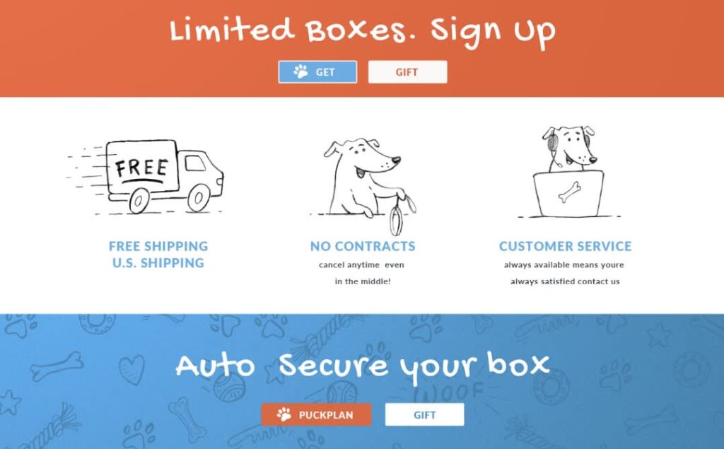
6. Blue and orange: The marketing classic
Few complementary pairings are as recognizable as blue and orange. Blue provides structure and stability, while orange introduces energy and movement.
Source: Website design by DSKY via 99designs by Vista
The contrast works because each color strengthens the presence of the other. Orange naturally draws attention, making it particularly effective for actions that need to stand out.
Commonly used by:
- E-commerce stores
- Tech startups
- Home service businesses
Works especially well for: Primary CTA buttons, promotional banners, landing pages and limited-time offers.
Ensure orange remains sufficiently saturated during CMYK conversion for print. Otherwise, it can lose intensity and appear muddy in print.
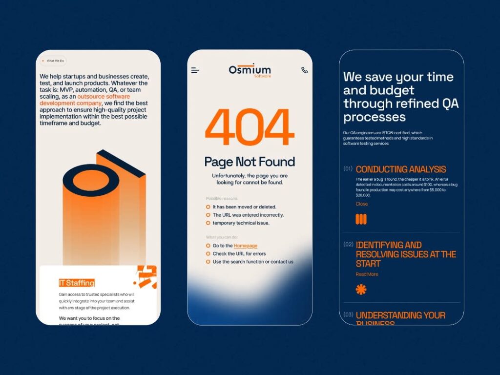
7. Navy and burnt orange: A sophisticated alternative
For brands that like the blue-and-orange formula but want a more refined presentation, navy and burnt orange offer a natural next step.
Compared to brighter versions of the pairing, the deeper tones feel calmer and more established. The contrast remains noticeable, but the overall impression is closer to editorial design than advertising.
Source: Website design by Zentix Soft via Dribbble
Commonly used by:
- Management consulting firms
- Higher education institutions
- Professional service providers
Works especially well for: Executive websites, service pages, annual reports, premium business cards and office signage.
Burnt orange generally reproduces more consistently than highly saturated orange tones, making it a dependable choice for printed materials.
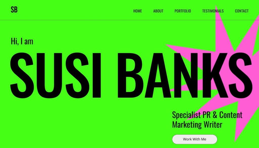
8. Magenta and green: High-visibility creative contrast
As complementary combinations become more adventurous, magenta and green stand out for their ability to command attention.
The pairing feels playful, expressive and difficult to ignore. Used in moderation, it creates memorable visual moments that help brands differentiate themselves from more conventional competitors.
Source: Website design by Yevhen Genome via 99designs by Vista
Commonly used by:
- Live events
- Educational organizations
- Creative agencies
Works especially well for: Campaign landing pages, event websites, promotional graphics, posters and conference materials.
Bright green should be used carefully for smaller text elements, as it can lose legibility against lighter backgrounds when printed.
9. Red and green: Strong contrast with accessibility considerations
Red and green create one of the strongest complementary relationships on the color wheel. The combination attracts attention quickly and carries familiar associations that many audiences immediately recognize.
That familiarity can be useful for holiday promotions, food-related branding and products connected to agriculture or nature.
However, this pairing also introduces a practical accessibility challenge. Red-green color blindness is common, so important information should always be reinforced with text labels, icons or other visual cues.
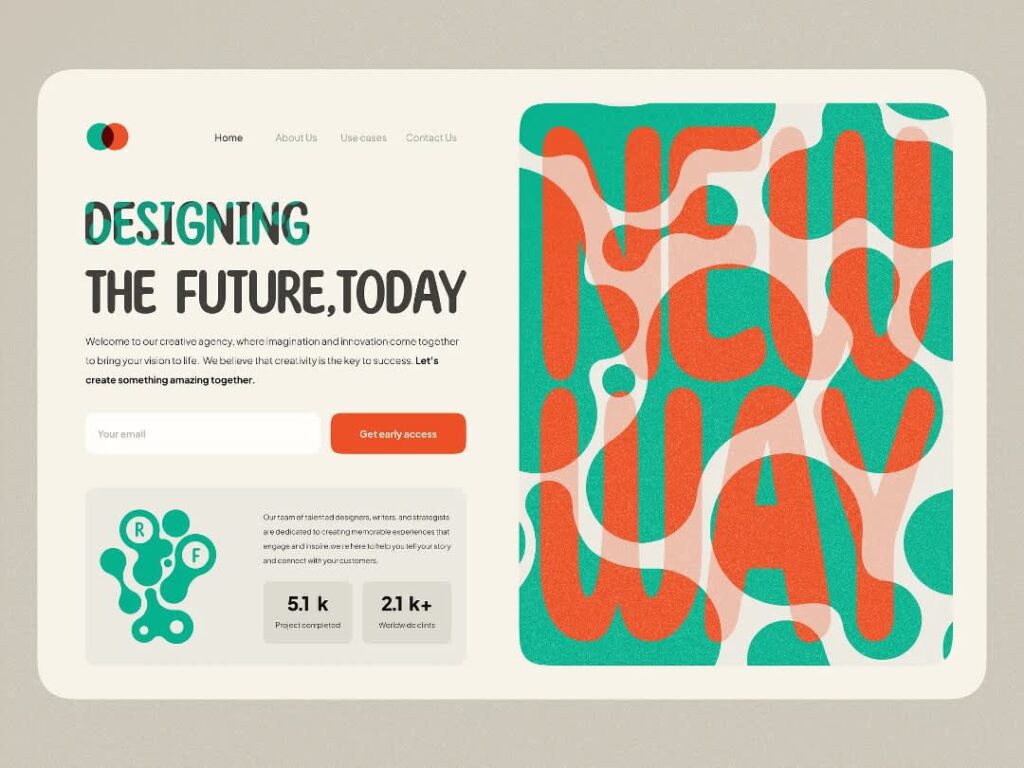
Source: Website design by Sadegh Sadeghi via Dribbble
Commonly used by:
- Food brands
- Agricultural businesses
- Seasonal marketing campaigns
Works especially well for: Promotional graphics, product packaging, seasonal website banners and retail displays.
10. Teal and coral: A modern interpretation
Not every complementary-inspired pairing needs to follow traditional color wheel formulas. Teal and coral sit closer to a near-complementary relationship, creating contrast with a softer, more contemporary feel.
The result is vibrant without being aggressive. Many modern brands use this combination to create a friendly, approachable personality while still maintaining enough contrast to guide attention.
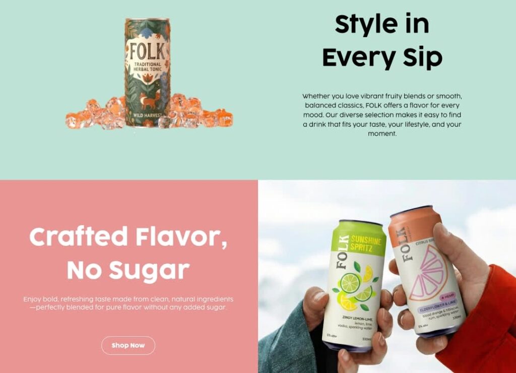
Source: Website design by Johurul Tahmil via Behance
Commonly used by:
- Lifestyle brands
- Boutique wellness companies
- Direct-to-consumer products
Works especially well for: Website interfaces, product pages, social media graphics, retail packaging and digital advertising.
Coral tones can lose some of their vibrancy on highly absorbent, uncoated paper stocks, so printed proofs are worth reviewing before production.
Together, these examples demonstrate why complementary contrast is often used for emphasis rather than long-form reading. When two opposing colors work together, they create natural focal points that help direct attention exactly where it’s needed.
Saturation contrast design examples
The previous examples relied on either brightness differences or opposing colors. Saturation contrast takes a different approach. Instead of pairing completely different hues, it creates emphasis by combining a vivid, highly saturated color with a softer, more muted one.
This is one of the most common techniques in modern web design because it allows a single element to stand out without making the entire interface feel loud.
11. Bright orange and light gray: The SaaS favorite
If you’ve spent time on software company websites, you’ve probably seen this combination before. Light gray quietly fades into the background while bright orange takes center stage.
The contrast comes from intensity rather than brightness. Because the gray doesn’t compete for attention, the orange naturally becomes the visual destination.
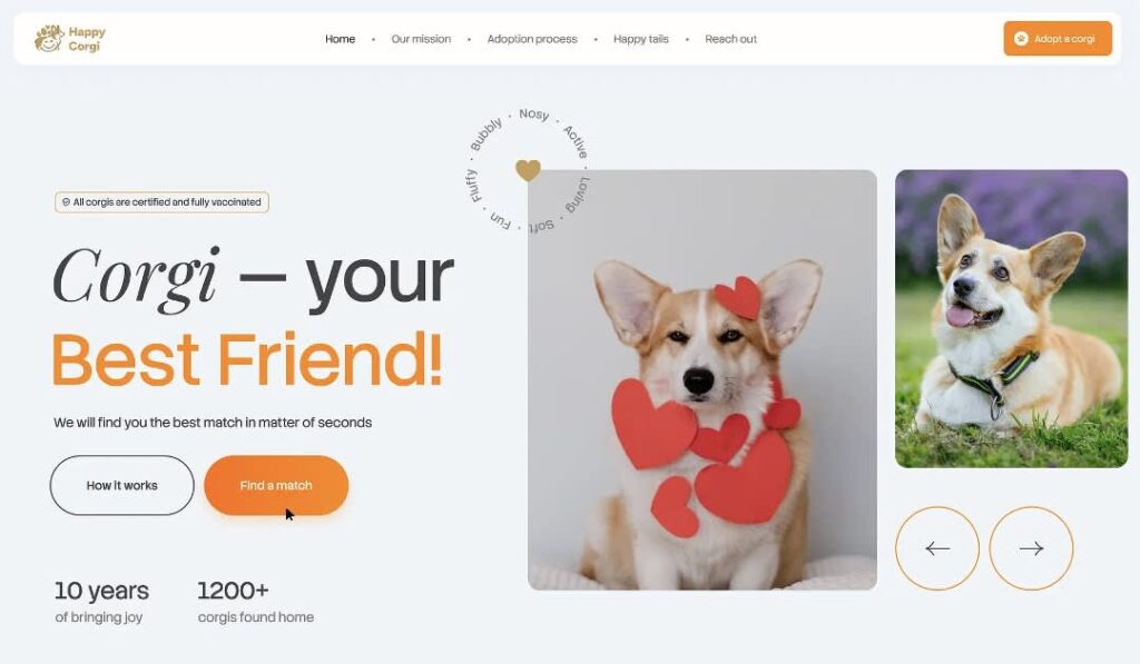
Source: Website design by Ana Miskarian via Dribbble
Commonly used by:
- SaaS companies
- Service businesses
- Lead-generation websites
- Appointment-based businesses
Works especially well for: CTA buttons, signup forms, pricing pages and conversion-focused landing pages.
Orange can lose some of its intensity in print, especially on uncoated paper stocks. If it’s being used for a critical call to action, a slight saturation adjustment may be necessary.
12. Vivid red and warm gray: Drawing attention to promotions
While orange is often used to guide users toward an action, red tends to create a stronger sense of urgency.
Warm gray provides a neutral backdrop that allows red to dominate the visual hierarchy without overwhelming the rest of the design. The result feels promotional without becoming chaotic.
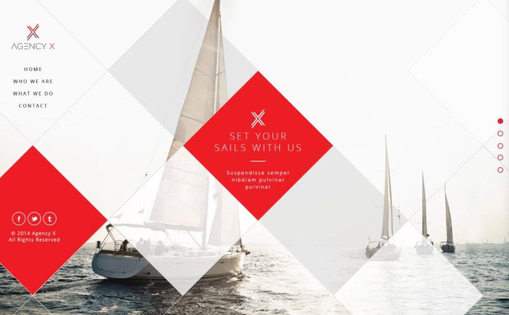
Source: Website design by arosto via 99designs by Vista
Commonly used by:
- Retail businesses
- E-commerce brands
- Seasonal campaigns
- Event marketers
Works especially well for: Website banners, promotional sections, sale graphics and marketing flyers.
Red generally reproduces well in print, but large areas of saturated red can quickly overpower surrounding content.
13. Electric blue and stone gray: A modern technology palette
As designs become more product-focused, many brands shift toward cooler color palettes. Electric blue and stone gray is a common example.
The blue acts as the primary visual anchor, while the muted gray supports navigation, content and interface elements without competing for attention. This balance helps create a clean, contemporary user experience.
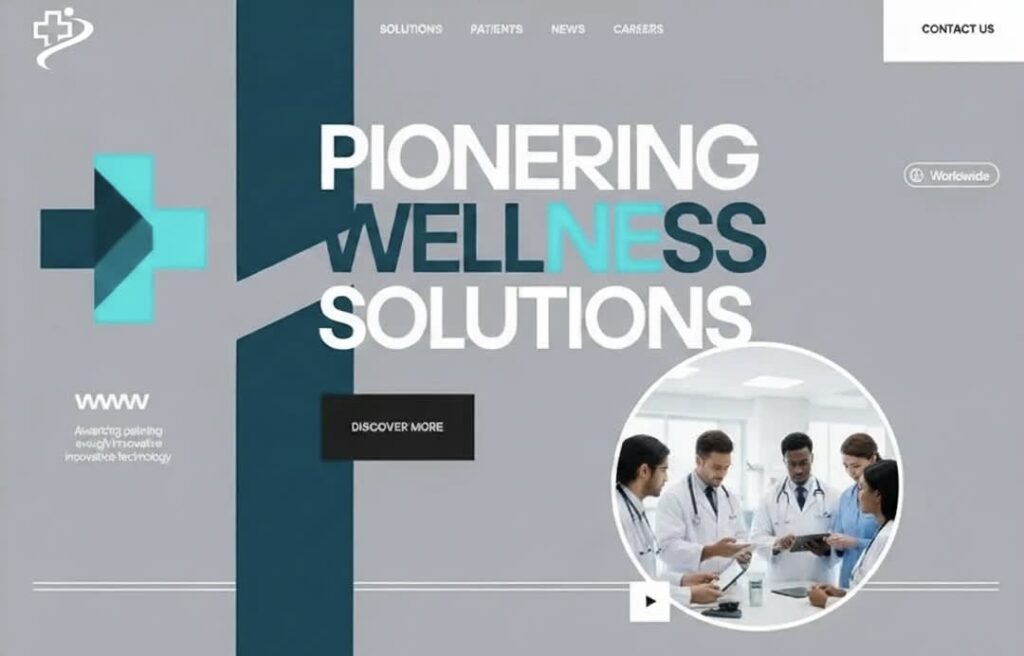
Source: Website design by MD Tanzim Hossain Mridha via Dribbble
Commonly used by:
- Technology brands
- Software companies
- Digital products
Works especially well for: Navigation systems, product interfaces, dashboards and feature highlights.
Stone gray remains stable across most paper stocks for print materials, helping the blue retain its visual prominence.
14. Bright green and slate gray: Energy against a neutral foundation
Some brands need to communicate momentum rather than stability. Bright green paired with slate gray does exactly that.
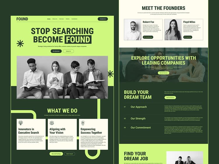
Source: Website design by The Designrs Studio via Dribbble
The vivid green introduces energy and emphasis, while the darker neutral foundation prevents the design from feeling overly aggressive. For the Found website above, the design creatively uses black and white photography to add slate gray to the palette. This combination often appears in products that want to feel active, optimistic or forward-looking.
Commonly used by:
- Fitness brands
- Startups
- Apps
- Sustainability-focused businesses
Works especially well for: CTA buttons, status indicators, product highlights and interactive interface elements.
Highly saturated greens can appear noticeably duller on uncoated stocks and may require color adjustments before print production.
15. Hot pink and sand beige: High visibility with a softer feel
At the opposite end of the spectrum sits a combination that prioritizes personality. Hot pink immediately attracts attention, but the sand beige background prevents the design from becoming visually exhausting.
This pairing feels expressive and modern while maintaining enough restraint to support longer interactions with the brand.
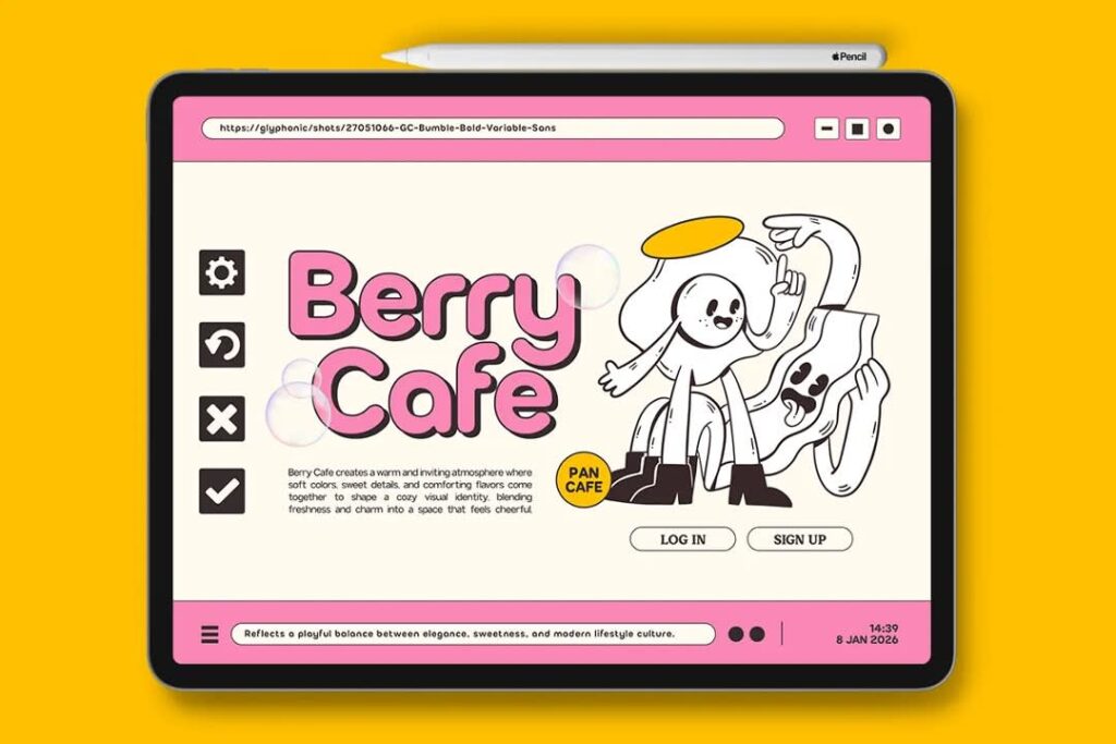
Source: Brand identity design by Glyphonic via Dribbble
Commonly used by:
- Beauty brands
- Fashion businesses
- Lifestyle companies
Works especially well for: Website promotions, product launches, social media graphics and packaging design.
The muted background helps balance highly saturated accent colors, preserving a more polished appearance in print.
By varying color intensity rather than relying on completely different hues, brands can guide attention with precision while maintaining a clean, cohesive visual experience. Which is exactly why saturation contrast has become a favorite among modern designers.
Color proportion contrast design examples
Contrast isn’t created by color choice alone. The amount of space a color occupies can be just as important. A color often stands out because it’s used sparingly, not because it’s brighter or more saturated.
This principle is known as contrast of proportion, or contrast of extension. In the examples below, the contrast breakdown shows the approximate percentage of the design assigned to each color, making it easier to see how color distribution influences visual hierarchy in the website layout.
16. White and teal: Creating focus without dominating the layout
Many modern SaaS and professional-service websites rely on this formula because it feels clean, organized and easy to navigate.
Contrast breakdown:
- 90–95% white and light neutrals
- 5–10% teal
Because teal appears only in selected locations, users quickly learn where to look for actions and interactive elements. The color becomes noticeable through restraint rather than intensity.
Design formula: A neutral foundation paired with a single accent color reserved for interactive or high-priority elements.
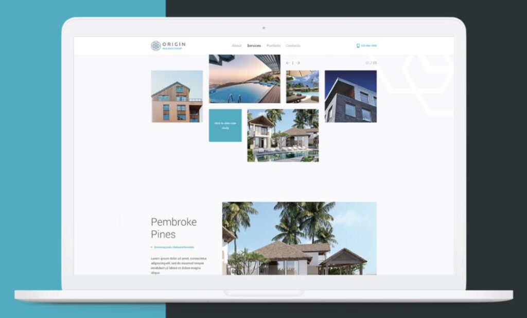
Source: Website design by ludibes via 99designs by Vista
Commonly used by:
- SaaS companies
- Professional service firms
- Healthcare brands
- Educational platforms
Works especially well for: Navigation systems, CTA buttons, contact forms and resource libraries.
This approach translates well to brochures and one-pagers, where teal can be reserved for headings, icons and calls to action.
17. Deep navy and gold: A premium focal point
The same principle can create a very different impression. Deep navy and gold shift the mood from functional to premium.
Contrast breakdown:
- 90–95% deep navy
- 5–10% gold
The gold feels memorable precisely because it appears so rarely. Limiting it to a handful of strategic locations creates a stronger effect than covering an entire page with metallic accents.
Design formula: A dominant brand color supported by a small amount of high-impact accent color.

Source: Website design by Hire Jordan Smith via Dribbble
Commonly used by:
- Luxury brands
- Financial services
- Real estate companies
- Hospitality businesses
Works especially well for: Hero sections, navigation accents, premium service pages and brand identity elements.
This approach works particularly well on premium printed materials and can be enhanced further with foil finishes and specialty printing techniques. For more inspiration, explore different business card color combinations.
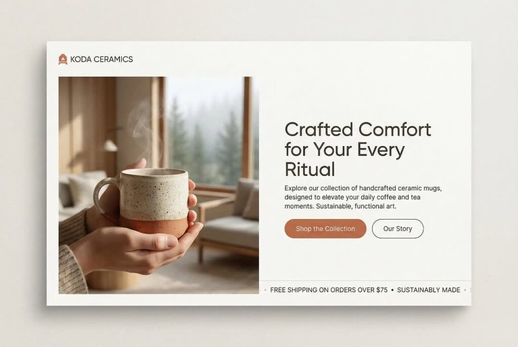
18. Cream and terracotta: Directing attention through restraint
Not every proportion-based contrast needs to feel corporate or luxurious. Cream and terracotta create a softer, more approachable version of the same strategy.
Contrast breakdown:
- 85–90% cream
- 10–15% terracotta
The terracotta naturally draws attention toward selected content areas while preserving the relaxed character of the overall design. Visitors notice important information without feeling visually pushed toward it.
Design formula: A soft neutral background paired with a warm accent color used only for emphasis.
Source: Web design by Bea Grey via Dribbble
Commonly used by:
- Food and beverage brands
- Wellness businesses
- Sustainable brands
- Hospitality companies
Works especially well for: Product highlights, featured collections, promotional banners and category navigation.
This combination performs consistently across packaging, menus and printed promotional materials.
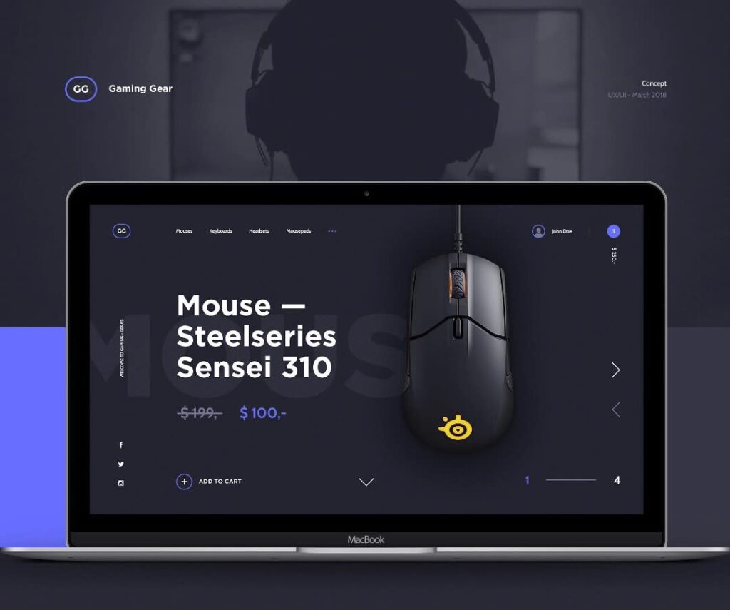
19. Charcoal and electric purple: Maximum visibility from minimal color
At the opposite end of the spectrum sits a combination built around dramatic restraint.
Contrast breakdown:
- 95% charcoal and dark neutrals
- 5% electric purple
Because the purple appears nowhere else in the interface, it immediately becomes the focal point. Designers often use this approach when they want a website to feel modern and distinctive without overwhelming users with color.
Design formula: A dark monochromatic foundation paired with a highly distinctive accent color used sparingly.
Source: Website design by Matt Wojtaś via Behance
Commonly used by:
- Technology brands
- Gaming companies
- Digital products
- Startup websites
Works especially well for: Product announcements, feature highlights, CTA buttons and navigation accents.
Bright accent colors often appear less intense in print than they do on screen, making physical proofs especially important before production.
These examples highlight an often-overlooked design principle: contrast isn’t always about choosing stronger colors. Sometimes the most effective way to attract attention is to use less color, not more.
Ready to design with color contrast in mind?
Good color contrast helps people move through a design with confidence. It makes content easier to read, important actions easier to spot and information easier to understand. As we’ve seen throughout these examples, different types of contrast can be used to solve different design challenges, whether that’s improving readability, creating focal points or guiding attention without overwhelming the page.
The most effective color combinations balance aesthetics with usability. They support accessibility, reinforce brand identity and remain clear across both digital and printed materials. When choosing a color palette, look beyond how it appears on screen and consider how it will perform everywhere your brand shows up. A thoughtful approach to contrast can make the entire customer experience feel more polished, consistent and intuitive.
Color contrast design examples FAQs
Can a website have too much color contrast?
Yes. Pushing every element to maximum contrast (such as pairing vibrant neon yellow text directly against a pure black backdrop across an entire page) creates intense visual vibration. This leads to rapid eye fatigue, making long-form reading highly uncomfortable for visitors. Use maximum contrast intentionally for small accents, not full layouts.
Should every button on a website use the same color?
Not necessarily, but your primary actions should remain completely unified. Best practice dictates assigning a highly saturated accent color exclusively to your primary conversion buttons (like “Buy Now” or “Book Appointment”). Secondary actions (like “Learn More” or “View Gallery”) should use a more muted, lower-contrast style like an outlined border or neutral gray button.
Are trendy low-contrast websites bad for accessibility?
Yes, they frequently violate international accessibility standards. While minimalist, ultra-low-contrast designs (such as light gray text on a slightly lighter white background) occasionally appear in creative portfolios or seasonal web design trends, they alienate users with visual impairments and cause unnecessary frustration for regular users on mobile screens under direct sunlight.
What is the best color contrast for a website?
For core body text, the undisputed champion is a strong light-and-dark contrast foundation – either pure black text on a white background or a softened dark charcoal on a clean off-white background. For interactive items and conversion points, pairing a dominant neutral canvas with a highly saturated complementary or proportional accent color delivers the best overall results.
Why don’t website colors always work in print, and how to ensure brand consistency?
Digital designs are displayed using light, while printed materials rely on ink and reflected light. Paper stock can further alter how colors appear, affecting contrast, readability and overall clarity.
As a result, a color combination that works perfectly on a website may need small adjustments to the brightness, size or saturation to remain legible once printed.
How do I choose accessible colors for my brand?
Start your design journey by selecting a rich, high-contrast primary text color along with a clean background shade that easily passes the WCAG 4.5:1 ratio check. Once your core reading text is locked in safely, use online contrast checkers to pick one or two bright accent colors specifically dedicated to your buttons, icons, and primary marketing highlights.