The goal of a logo is to clearly and quickly represent your brand to an audience while also differentiating it from others. When someone looks at your logo, they should be able to determine two things: if they desire the product and whether they want to buy it from your company. These principles of logo design will help you do that.
Learning how to design a logo can seem overwhelming. Where do you begin? That’s where the six logo design principles below come in handy, and good news: You don’t need to be a full-time designer to make smart decisions; you just need a clear plan and a little restraint.
Logo design is a process that gets easier when you approach it with knowledge, experience and a solid plan. This article will walk you through the six key principles of logo design and show you how to apply them to your brand.
- A great logo is simple enough to recognize in a second and still works in black and white.
- Original doesn’t mean “wild,” it means distinct and on-brand, not a copycat.
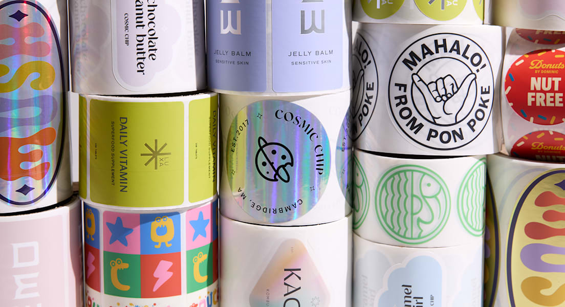
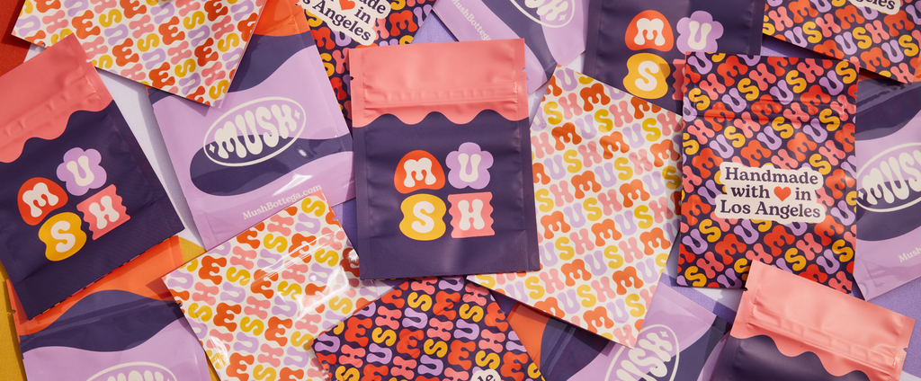
- Versatile logos are built for real-life use: social icons, signage, packaging and everything in between.
- Scalability is non-negotiable – if it breaks at small sizes, it’s not finished.
- The best logos age well because they’re based on brand fundamentals, not trends.
The 6 key principles of logo design
A strong logo isn’t about fancy effects, it’s about making your brand easy to spot, easy to remember and easy to trust. Use the six principles below as a checklist, whether you’re DIY-ing, using a logo maker or hiring a designer.
1. Simplicity
Simplicity is what helps a logo stand up against the challenges of time and what makes it replicable and easy to work with.

You want your logo to be as clear and visible as possible while reflecting your aesthetics and conveying your philosophy. Take the Nike logo – nothing more than a monochrome swoosh. It doesn’t get simpler than that.
Wise choices in typeface, color options and graphics are crucial to this step. The fewer moving parts (fonts, colors, shapes, effects), the easier it is for customers to recognize you at a glance – on a sign, a label or a tiny social icon. Simple logos are also easier (and cheaper) to reproduce in print.
Try the three-second test. Show your logo to someone for three seconds, hide it, then ask what they remember. If they can’t describe it, simplify.
2. Originality
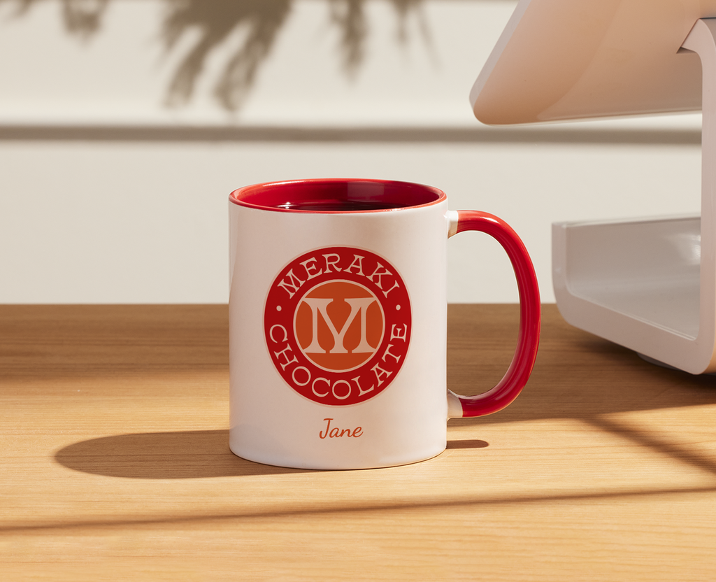
An original and memorable logo design by svart ink via 99designs by Vista.
Your logo needs to be different enough to attract attention and memorable enough to remain in people’s minds.
Think of all the unforgettable logos stashed in your memory: Starbucks, UPS and Apple are at the top of the list. Maybe we remember them because we see them non-stop, but perhaps it’s also because they’re original and unforgettable. For SMBs, originality builds credibility fast because it signals you’re established and intentional, not generic.
A logo calls for a unique design concept. This is the point in logo design where artistry meets great ideas and a firm grasp of consumer design. A skilled graphic designer can respond to your logo goals, with all these considerations in mind, and create something truly original.
Do a quick competitor scan. If your logo would blend in on a page of similar businesses, change either your symbol, your font style or your color palette.
3. Versatility
Your logo has a big job. It will adorn all of your products, shop signage, digital ads and much more (think t-shirts and bumper stickers!). So, your logo needs to be versatile and adaptable to land anywhere. Think of all the places you’ll want to use your logo and make sure it looks good in every single one of them.
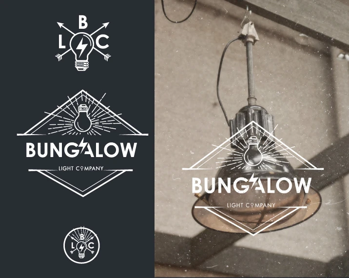
Different logo variations help to make a logo versatile. Design by C1k.
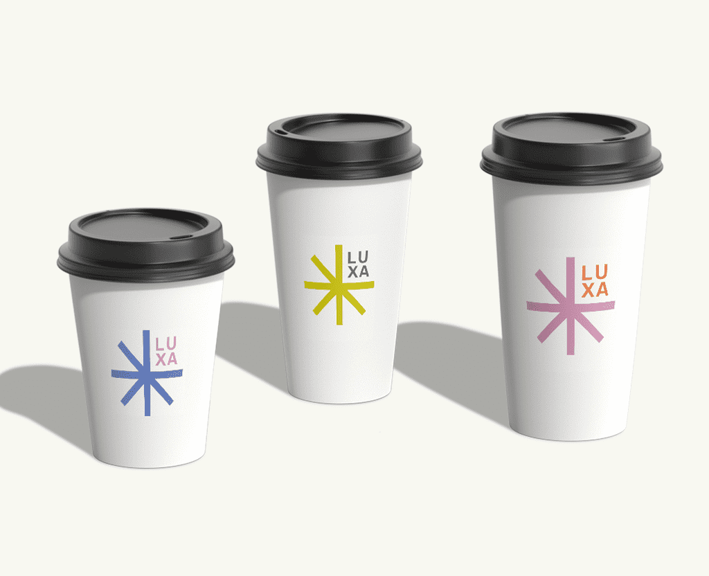
Having a simple, easily recognizable logo can help with versatility. Another great way to achieve versatility is with a responsive logo. Responsive logos are adaptive and have different variations of size, complexity or even color to accommodate and adapt to wherever they are placed.
The rule of thumb is that your logo should also be able to work with any color or background. That means it needs to look good in black and white with no effects. This is your logo’s most bare bones form. Is it still unique and memorable? Does it still carry your company’s voice?
Create a mini logo set: full logo, stacked version, icon-only mark. You’ll use all three more than you think.
4. Scalability
Similarly, your logo should be able to adapt to any size. Can it go on a giant billboard and a tiny pen? Going back to the adaptability principle, we know that your logo ought to be scalable to represent your brand anywhere.
A scalable logo needs to make sense, look good and remain legible at any size – whether it is printed on a tiny business card or on a huge poster. If you include too much detail in your logo, it will make it harder to scale down to a small size.
To achieve scalability in your logo, you will need to create it in vector format. Vector files are created with rescaling in mind, so your logo looks just as sharp when it’s blown up to a large size.
Shrink it to the size of a social profile icon and a favicon. If it’s not readable there, adjust the spacing, simplify details or create a simplified small-size version.
5. Balance and proportion
Humans recognize balanced designs as beautiful. A well-proportioned design will strike a balance between the various elements that make up your logo.
Proportion refers to the weight of each of the elements that make up your logo. From a practical perspective, the right proportions will make your logo whole and help it to make sense.
Symmetrical logos are balanced through equally weighted elements aligned on either side of a center line. On the other hand, asymmetrical logos can be balanced too, using opposite weights to create a composition that is not even, but still has equilibrium.
Flip your logo to black-and-white and blur your eyes. If one part visually shouts louder than the rest, rebalance size, weight or spacing.
6. Timelessness
A timeless logo will look just as good in 10 years as it looks today. Avoid giving in to short-lived fads when designing your logo and go for a classic look. Psychedelic 70s-inspired logos might be all the rage for your industry today, but they might be played out in a year. Epic logos stand the test of time because they pay attention to logo principles and rules that last, rather than what everyone else is doing right now.
As your company grows and changes, a logo that holds your fundamental goals and ideals will remain current. Something that may seem quirky or timely in the current cultural sphere might help your brand gain attention at the moment, but it might lose that meaning in the future. Something that speaks to you and speaks for you will stay by your side for the duration.
Ask yourself, “Will this still feel like us in five years?” If the logo depends on a trend (ultra-thin fonts, heavy gradients, hyper-minimal symbols), dial it back and lean into brand fundamentals instead.
How to apply the logo design principles to your brand
Now let’s turn the principles of logo design into a simple, repeatable process you can actually use.
Define your brand basics
Before you design anything, get clear on who you’re targeting, your tone and the few words you want people to feel when they see your business.
Try this: Write three to five keywords that describe your brand personality (for example: friendly, modern, local, premium, outdoorsy). Then check your logo ideas against those words. SMB reality check: If your audience is mostly local and referrals matter, clarity and trust signals usually beat a clever feel.
Choose the right type of logo
It’s important to know the importance of a logo and the different types of logos. A wordmark is just your business name in a distinct type style (great if your name is strong). A lettermark uses initials (helpful if your name is long). An icon + text combo gives you flexibility (use both together or separately). An emblem puts text inside a badge/shape (often feels classic or established, but can get tricky at small sizes).
If you’re a new or local business, a readable wordmark or icon + text often works best because people need to learn your name fast. If you’re a highly visual or lifestyle brand, an icon can help – just don’t make it so abstract that nobody knows what you do.
Create or brief your logo
Whether you’re designing yourself or working with a pro, your brief should include your brand basics, preferred colors and fonts, where you’ll use the logo most, and a clear ask to follow the six principles.
Don’t start with an idea like “make it pop.” Start with specifics like “must be readable on a storefront sign,” “needs a one-color version for packaging stamps” or “should work as a social profile icon.” This keeps the work practical and keeps revisions from spiraling.
Test your logo in real-world contexts
Don’t judge your logo in a vacuum. Test it in print and digital mockups: business cards, flyers, labels, packaging, shop signage, website header and social profiles. Ask yourself, is it readable from a distance? Does it still work in black and white? Does it feel consistent wherever it appears? Print it on plain paper and tape it to a wall – seriously. If it’s hard to read from a few steps back, it’ll be hard to read on a sign or a moving screen.

Let your logo live up to its responsibility
Your logo reflects your brand’s voice and face. It carries a lot of responsibility on your behalf, and therefore, you carry a lot of responsibility to create it as thoughtfully as possible. By using these principles as a guide, you’ll be able to see what works and spot any flaws in your logo design.
Whether it’s your first logo or hundredth logo creation, and whether you’re designing a logo yourself or working with a graphic designer, make sure to do it with logo design principles in mind. And remember, they’re not rules to box you in – they’re guardrails that help your logo work in the real world.
FAQs
How do I know whether to use a logo maker or hire a professional designer for my small business?
If you need something fast and budget-friendly, a logo maker can work as a starter, especially if you’re still validating your business. The downside is that many templates look similar. If your logo will go on signage, packaging or you’re building a long-term brand, hiring a professional can be worth it for strategy, originality and the right file formats.
What’s the difference between a logo, a brand and branding – and how do they work together?
Your logo is the mark people recognize. Your brand is the overall impression people have of your business. Branding, compared to a logo, is the system that creates consistency: colors, fonts, voice, visuals and how everything shows up. A logo works best when it’s supported by that bigger system.
How do I choose the right colors and fonts so my logo feels consistent with the rest of my branding?
Start with your brand basics (audience, tone and three to five personality keywords). Pick colors and fonts that match those words and stay readable in real use. Always test in black and white and at small sizes; a lot of SMB logos fall apart there.
What are the most common logo design mistakes small businesses make, and how can I avoid them?
The most common mistakes are doing too much (too many elements), leaning on trendy effects and not testing at small sizes or in black and white. Use the six principles as a checklist for every draft and revise anything that fails before you finalize.
Once I have a logo, what are the first branded materials I should create to make my business look professional?
Start with your highest-visibility touchpoints: website header and favicon, social profiles, email signature and a few core templates (invoice/estimate, flyer/menu/price list). If you sell products, prioritize labels/packaging and a one-color version for simple printing. Consistency is what makes you look established.
