Custom T-shirts can do a lot for a small business, student club or startup: promote an event, unite a team, sell merch or make your brand easier to spot in a crowd. But even a great design can look off if it sits too low, too high, too large or too close to a seam.
This T-shirt design placement guide walks through the standard measurements, tools and practical steps that help you position logos, images and text accurately before you print. You’ll learn where to place designs on the front, back, sleeves and hem, how far down to measure and how fabric type can affect the final result.
- Most standard front designs should start 2 to 3 inches below the collar so they sit on the upper chest, not the stomach.
- Left-chest logos (chest-pocket designs) usually work best in a 3- to 4-inch-wide space, aligned from the shoulder/collar down toward the chest.
- Full-front and full-back designs typically look balanced at 10 to 12 inches wide on adult shirts.
- Cotton, polyester and blended fabrics can all affect how sharp, flexible and durable your print looks after washing and wear.
- Always check placement on the actual shirt size and style before ordering in bulk.
Core layout options: T-shirt design placement guide
A shirt design should be placed where it supports the purpose of the shirt. Small business uniforms usually look best with subtle left-chest branding, event shirts often work well with bold front or back graphics and retail-style merch can handle more creative layouts.
Here are the main placement options to consider.
Front placements
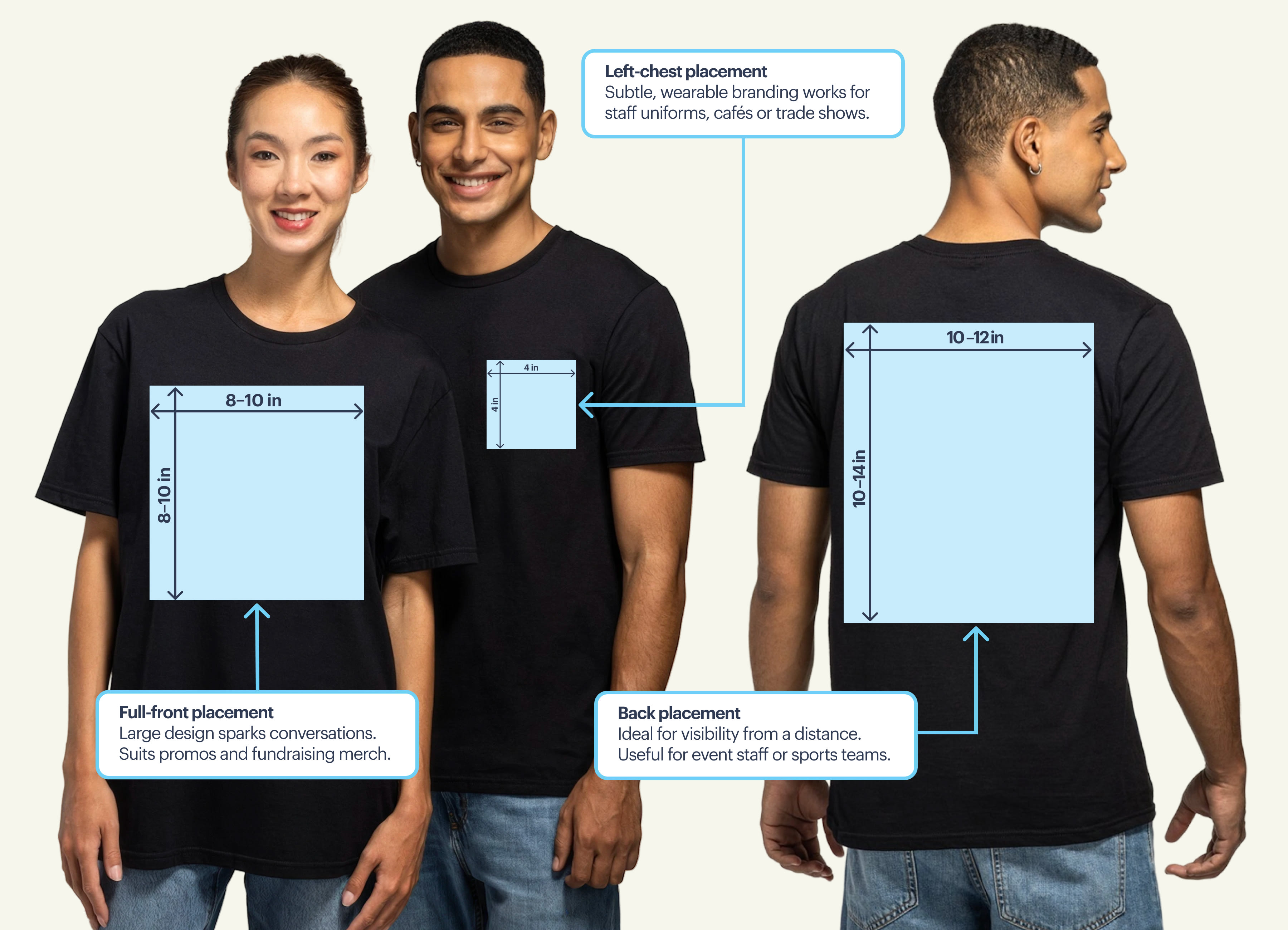
The front of a T-shirt is the most visible spot during conversations, photos and everyday wear. For most logos, slogans and illustrations, place the top of the design 2 to 3 inches below the collar and keep the artwork centered side-to-side.
Full front
A full-front design typically works well at 10 to 12 inches wide on adult shirts. Start the top edge 2 to 3 inches below the collar so the graphic sits across the chest. For text-heavy designs, use large lettering, strong spacing and fewer words so the shirt is easy to read in photos and in person.
Best for: event shirts, launch merch, school clubs, fundraisers and bold promotional designs.
Center chest
A center-chest design sits slightly higher than a full-front print and works best at around 6 to 10 inches wide. Keep text short and easy to read from a few feet away. If your logo has lots of small details, simplify it first so it does not turn into a tiny blur.
Best for: short slogans, simple icons, student groups, small business promos and casual merch.
Left chest
A left-chest logo (chest-pocket) should be 3 to 4 inches wide. To place it, measure from the shoulder/collar point down about 7 to 9 inches, then align the graphic between the shirt’s center and the left side seam. This placement looks clean, professional and wearable because it brands the shirt without shouting.
Best for: staff uniforms, trade shows, contractors, cafés, fitness teams and corporate giveaways.
Oversize front
Oversize front graphics can run around 13 to 15 inches wide, but they need extra care. Large prints may feel heavy, stiff or awkward on smaller shirts, so check how the design scales across your size range before committing.
Best for: streetwear-inspired merch, fashion drops and graphic-led retail designs.
Back placements
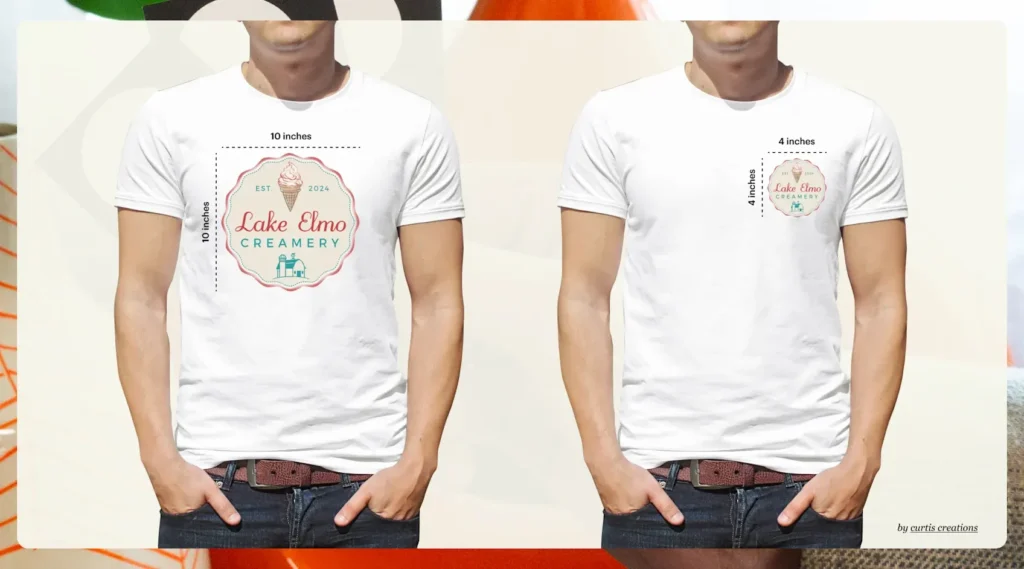
Back placements are ideal when you want visibility from a distance without crowding the front of the shirt. They’re especially useful for event staff, volunteers, sports teams, service businesses and designs that need names, roles, dates or sponsor details.
Back collar
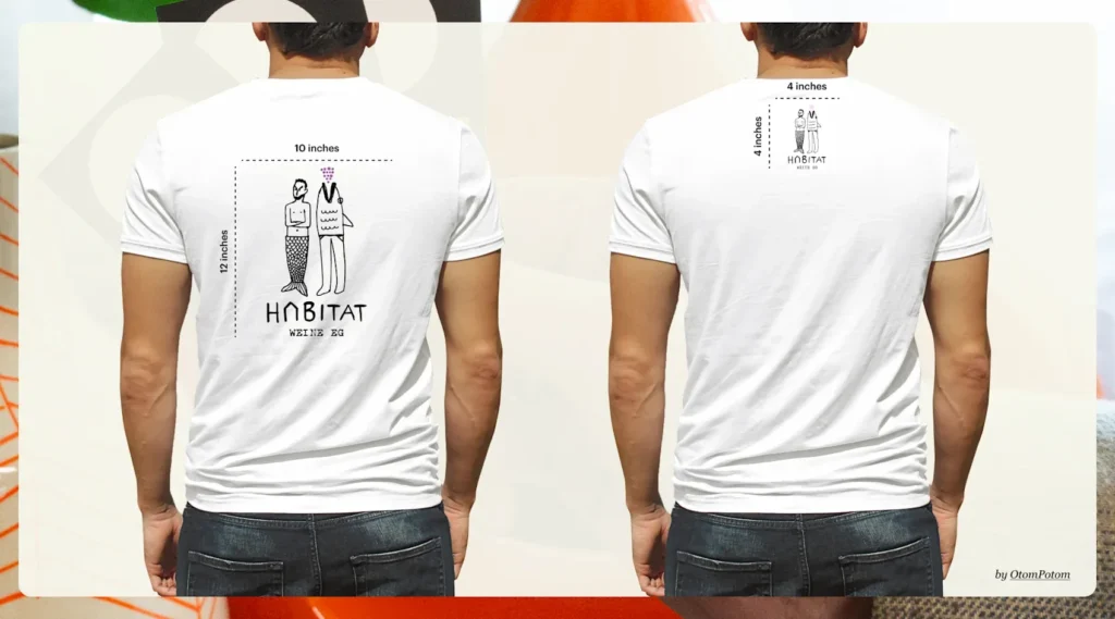
A back-collar design is a small finishing touch, usually placed about 1 inch below the rear neckline. Keep it compact, around 2 to 3 inches wide. It works nicely for a small logo, website, founding year or brand icon.
Upper back
An upper-back print usually sits between the shoulder blades, around 3 to 4 inches below the collar. Keep it around 8 to 10 inches wide. This is a strong spot for “STAFF,” team names, departments or event roles.
Best for: staff, teams or any group with roles
Full back
A full-back design gives you the most room for larger artwork, sponsor lists or detailed event graphics. Most adult shirts look balanced with a back print around 10 to 12 inches wide. Avoid placing the design too low, or it can look droopy when the shirt is worn.
Best for: sponsors, illustrations or event info
Sleeve and hemline placements
Sleeves and hemlines are useful for small supporting details. They’re not usually the main message, but they can make a simple T-shirt feel more polished and intentional.
Long sleeve
Long-sleeve prints work well for vertical text, repeating logos or simple graphic elements. Keep the design narrow, usually 2 to 3 inches wide, and leave space near the cuff and shoulder seams so the print does not distort.
Best for: sponsors, icons or locations
Short sleeve
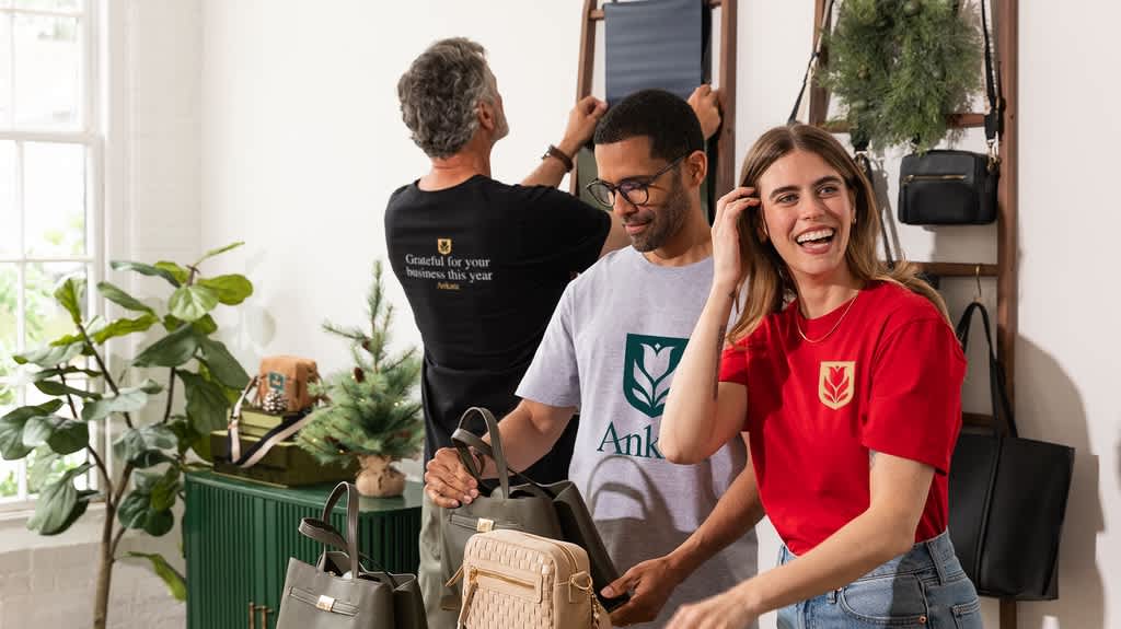
Short sleeves are great for sponsor logos, small icons, locations or secondary branding. Keep the artwork around 2 to 3 inches wide and center it on the sleeve panel so it does not wrap awkwardly around the arm.
Hemline/Lower front or back
A hemline logo, placed 1 to 2 inches above the bottom seam, can give retail merch a nice label-like detail. Keep it small, around 3 to 4 inches wide. Avoid this placement for uniforms that will be tucked in.
Best for: retail logos
Advanced and creative graphic tee placement ideas
If your project is more fashion-focused than uniform-focused, creative placement can help your T-shirt feel more like retail merch and less like a basic giveaway. Use these ideas when the goal is personality, not just visibility.
Wrap-around layout mechanics
A wrap-around design moves across the side of the shirt, connecting the front and back. It can look high-end, but it is harder to produce because seams can interrupt the artwork. Use simple patterns or abstract graphics rather than tiny text or detailed logos.
Shoulder graphic positioning
A shoulder graphic can add a fun, unexpected detail to boutique merch or team apparel. Keep it small, around 2 to 3 inches, and avoid placing rigid artwork directly over the sleeve joint where the fabric moves most.
Check out these advanced options to spark your imagination if you are hunting for inspirational T-shirt ideas for your business.
Popular T-shirt design placement combinations
You can combine placements, but keep the overall shirt balanced. One main design plus one or two smaller supporting details is usually enough.
Popular combinations include:
- Left chest and full back: This works best when most attention will be on the wearer’s back – a painter, for example. It’s great for service businesses, contractors, event staff and volunteer teams.
- Full front and back collar: This combo shines when most attention is in front of the wearer, like a cashier. It’s good for retail-style merch with a small brand sign-off.
- Left chest and sleeve: Because both are smaller, this look is minimal and professional. It’s a great option for uniforms, clubs or teams that want subtlety.
- Full front and full back: This combo uses maximum possible visibility. It’s best for big events, fundraisers or bold graphic merchandise.
How far down do you put a design on a shirt?
For a standard front T-shirt design, place the top edge 2 to 3 inches below the collar. For a left-chest logo, measure 7 to 9 inches down from the shoulder seam and align the design under the point where the collar meets the shoulder.
Those measurements are starting points, not magic spells. Adjust slightly for youth sizes, women’s cuts, V-necks, oversized shirts and very large designs. The goal is for the print to sit naturally on the upper chest when worn.
Where do you measure for T-shirt logo placement?
Measure from stable garment landmarks: the collar, shoulder seams, sleeve seams, side seams and bottom hem.
For a full-front print, fold the shirt in half vertically or use a T-shirt ruler to find the center line. Then measure down from the collar 2-3 inches and mark the top edge of your design.
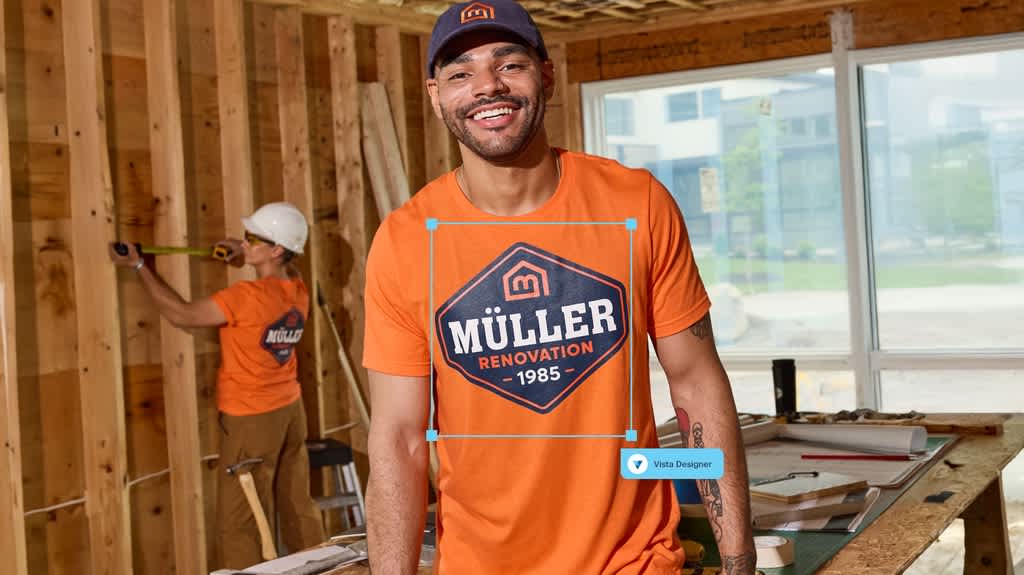
For a left-chest logo or a pocket logo, start at the point where the shoulder seam and collar meet. Measure down 7 to 9 inches, then place the logo slightly toward the wearer’s left side. If you are using an online design tool, check the preview carefully and use any available alignment guides before ordering.
To explore how these placement boundaries shift depending on the overall size of your garment, check out Vista’s comprehensive analysis on all you need to know about T-shirt design sizes.
The ultimate T-shirt design placement reference table
Use this quick reference table as a starting point for your next custom T-shirt project. Always check the final proof and adjust for shirt size, cut and fabric.
| Placement | Best for | Typical size | Basic measurement |
| Center chest | Slogans, small graphics, clubs | 6–10 inches wide | Top edge around 3 inches below collar |
| Left chest | Logos, uniforms, business branding | 3–4 inches wide | 7–9 inches down from shoulder/collar point |
| Full front | Events, merch, fundraisers | 10–12 inches wide | Top edge 2–3 inches below collar |
| Oversize front | Streetwear, retail graphics | 13–15 inches wide | Adjust by size so print does not overwhelm shirt |
| Upper back | Staff, teams, roles | 8–10 inches wide | 3–4 inches below back collar |
| Full back | Sponsors, illustrations, event info | 10–12 inches wide | Keep centered and avoid going too low |
| Sleeve | Sponsors, icons, locations | 2–3 inches wide | Center on sleeve panel |
| Hemline | Retail-style detail | 3–4 inches wide | 1–2 inches above bottom seam |
Technical fabric constraints and material realities
Fabric affects how your T-shirt design placement holds up after printing, washing and wearing. A layout that looks perfect on one shirt can behave differently on a stretchy performance tee, a heavy cotton shirt or a textured blend. Here are some important considerations to help guide your choices.
| Fabric type | Print impact | Durability and use |
| 100% cotton | Deep ink absorption, excellent color richness for detailed art | Susceptible to structural shrinkage, which can pucker heavy ink blocks |
| Polyester blends | Smooth texture, sharp edge lines, exceptional for heat transfers | Highly resistant to shrinking, but stretches across active print boundaries |
| Performance mesh | Moisture-wicking weave, best for lightweight, minimal graphics | Prone to cracking if heavy, rigid ink blocks restrict fabric flexibility |
| Stretch blends | Elastic composition that flexes heavily with body movement | Warps large artwork; requires scaled-down, localized logo placements |
For a deep dive into prepping your custom vector artwork for clean production results across complex fabrics, explore our ultimate guide on how to design T-shirts.
The right fit for the right job
The best T-shirt design placement is practical, readable and right for the job your shirt needs to do. A left-chest logo can make uniforms feel polished, a full-front graphic can help event merch stand out and a small sleeve or back-collar detail can add a little extra character.
Before you print, check your measurements, simplify overly detailed artwork and think about how the fabric will behave after washing and wearing. A few minutes of setup can make all the difference.
T-shirt design placement FAQs
Should placement change for V-neck or scoop-neck shirts?
Yes. Since the neckline sits lower, your design may need to move down slightly so it does not crowd the collar. Use the neckline as your guide and check the design on the actual shirt style before printing.
Can I print over seams, pockets or zippers?
It is usually best to avoid printing over seams, pockets and zippers because they create uneven surfaces. The design may break, blur or fail to bond properly in those areas.
Do pocket T-shirts need different logo placement?
Yes. If the shirt has a pocket, avoid placing a left-chest logo directly on top of it unless that is part of the design. You can use the pocket itself as the placement area or move the logo to the opposite chest, sleeve or back collar.
Should T-shirt placement change for kids’ sizes?
Yes. Youth shirts need smaller artwork and slightly adjusted spacing. A design that looks balanced on an adult large may overwhelm a child’s shirt, so scale the print down and check each size range separately.
What should I check in a digital proof before printing?
Check that the design is centered, placed at the right height, scaled correctly and easy to read. Also confirm spelling, colors, logo quality and whether the artwork looks balanced on every shirt color and size you plan to order.