Networking events, client meetings, quick introductions at the coffee shop—your business card is often the first thing people see after your smile. The problem? Most cards look the same, say little and end up in the recycling bin. That’s where business card psychology comes in. Every design choice—color, font, shape, even paper weight—triggers a response, shaping how people think about you and whether they remember you once the conversation ends.
This article is your shortcut to making those choices count. We’ll break down how business card psychology works and show you how to use it to your advantage. By the end, you’ll know how to design a card that reflects your brand, builds credibility and keeps you top of mind long after the handshake.
- Your business card communicates brand identity and values through design choices.
- Color psychology shapes first impressions and emotional response.
- Fonts set the tone and reflect personality.
- Layout should highlight key details and keep the design balanced.
- Materials and finishes influence credibility and memorability.
- Choosing the right style means aligning every element with your brand.
What is business card psychology?
Business card psychology is the study of how design choices—colors, fonts, shapes, layouts and materials—influence the way people perceive you and your brand. It’s less about the text itself and more about how the design communicates on your behalf, sending signals that shape impressions the moment your card is in someone’s hand.
Business cards shape first impressions. People often make snap judgments based on the look and feel of a card, which is why design and quality matter so much. Most consumers say their initial opinion of a business starts with the card they’re handed.
The design choices you make have a ripple effect:
- Instant first impressions: The moment someone receives your card, they begin forming opinions about you and your business. In a survey by VistaPrint, 63% of the people we asked said that having a quality business card helps make a good impression on them.
- Reflects your brand identity: Your card’s style communicates your values before any words do—whether you’re modern, eco-friendly, luxury or playful. A bad mismatch between brand promise and design breeds dissonance (and distrust).
- Builds trust and credibility: Seemingly just a little detail, a polished card builds confidence in your professionalism. In fact, 60% would be more likely to use a business that has a unique or memorable card.
- Differentiates you from the competition: In a crowded market, a creative or thoughtfully designed business card helps your brand stand out and stay memorable—especially when it reflects your unique personality or values.
- Enhances networking success: Cards that feel high-quality or visually distinctive are more likely to be kept and revisited, helping you make a lasting impression and strengthen new professional connections.
This psychological layer is what transforms a business card from a piece of paper into a persuasive tool. And it starts with color.
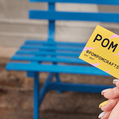
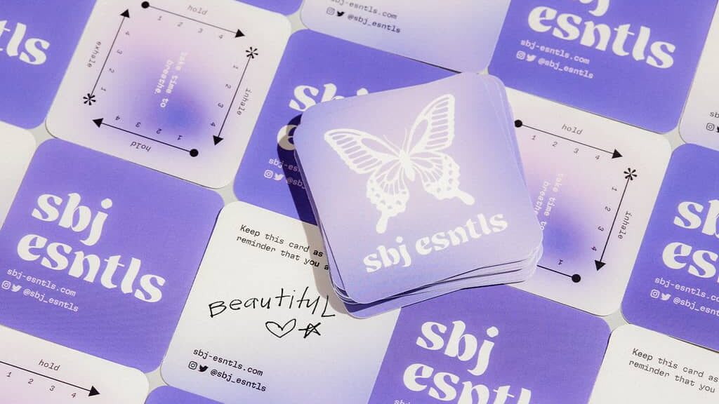
The power of color in business card psychology
Colors are one of the first design cues people register, and they do far more than decorate. Business card colors influence emotions, behaviors and perceptions, with studies suggesting they can account for up to 90% of a first impression.
It’s important to understand what colors imply and choose a scheme that reflects your brand’s personality. Some common associations include:
- Red: Passion, energy, urgency
- Blue: Trust, professionalism, stability
- Green: Growth, wellness, eco-consciousness
- Black/White: Luxury, elegance, timelessness

Want to dive deeper into meanings and combinations? Explore this guide to business card colors.
The way color is applied in a business card design also plays a major role in business card psychology. It doesn’t have to cover the entire card—color can show up in the background, typography, accents or even the logo.
Each choice shapes how the card feels and how the brand is perceived. A dark background can project authority, while a bright accent might signal creativity and approachability. Typography in a strong color draws the eye to key details like your name or title, while more subtle shades in secondary text keep the focus where it belongs. Even a small color element, used with intent, can guide attention and reinforce the personality of your brand.
Keep your palette simple—stick to two or three core shades. Too many colors can dilute your message and create visual noise.
And while color speaks volumes, typography adds another layer to the conversation.
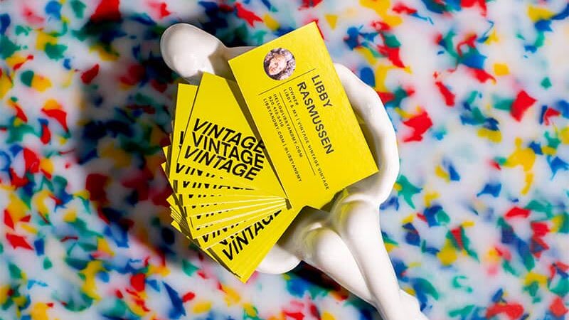
Fonts and typography: The silent communicators
The font on your business card shapes how people see your business. That’s because typography extends beyond readability—it sets the tone and conveys personality. A law firm might use a typeface that feels authoritative and traditional, while a bakery could choose something warm and approachable.
Here’s a breakdown of common business card font families and what they convey:
- Serif fonts: Professional, traditional, trustworthy
- Sans-serif fonts: Modern, clean, simple
- Script fonts: Elegant, artistic, personal
- Display fonts: Bold, impactful, unique


Beyond font style, size and placement matter too. Your name should stand out without overshadowing the essentials like company and contact info. White space plays a subtle but critical role here, preventing clutter and guiding the eye naturally across the card.
Once the font is locked down, the overall structure of the card determines how all these elements interact.
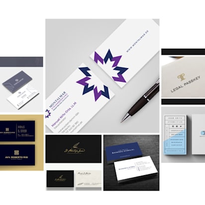
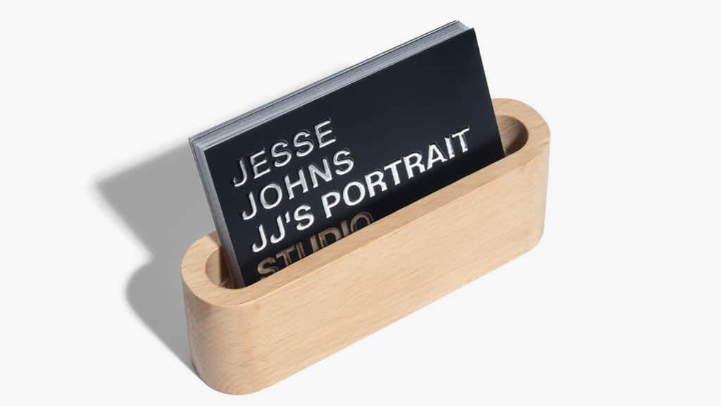
Shape and layout: How structure defines perception
Even the most carefully chosen colors and typography won’t land the right impression if the layout doesn’t support them. Shape and structure dictate how all the design elements work together—and they influence perception just as much as style.
A standard rectangle feels familiar and dependable, while rounded corners add a softer, contemporary touch. Square cards carry a creative, unconventional edge, and die-cut shapes instantly command attention.
- Standard rectangle: Trustworthy, familiar, professional
- Rounded corners: Soft, approachable, modern
- Square cards: Bold, creative, non-traditional
- Die-cut cards: Custom, attention-grabbing, unique
The layout then pulls it all together. Placement of text, balance of visuals and the amount of breathing room decide whether the card feels deliberate or cluttered. A clear structure makes information easy to scan and leaves the card looking polished.
For ideas on how to achieve a balanced business card design, see this business card layout guide.
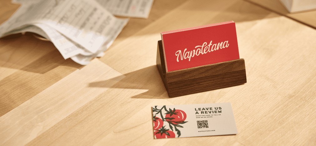
The role of materials and finishes: Sensory business card psychology
Design is visual, but business card psychology extends to the senses. The weight, texture, and finish of your card influence how people perceive your brand long after they’ve stopped looking at it.
- Standard cardstock: Reliable, professional, practical
- Thick cardstock: Credibility, luxury, high-end perception
- Textured paper: Creative, tactile, premium feel
- Specialty finishes (matte, glossy, spot UV, embossed): Each creates a different sensory message, from sleek and smooth to bold and dimensional
For guidance on options, see this business card paper breakdown.

Match weight and finish to your brand identity. A luxury brand benefits from heavy card stock and subtle embossing, while a creative studio might choose textured paper with bold spot UV for a more playful impression.
How to design a business card with psychology in mind
So far, we’ve looked at how colors, fonts, layouts and finishes shape perception. The next step is turning those principles into practice. If you’re wondering how to design a business card that actually communicates your brand’s personality and builds connections, these steps will help.
- Define your brand message: Start by deciding what you want people to feel when they see your card. Is your brand authoritative, approachable or creative? Every design decision should reflect that core message.
- Prioritize key information: A business card isn’t a brochure. Keep the spotlight on essentials like your name, company and contact details, and use hierarchy in the design to guide the eye.
- Experiment with shape (purposefully): Shape can shift perception in seconds. Standard rectangles are safe and professional, but rounded corners, squares or custom die-cuts can make you more memorable if they fit your brand.
- Incorporate digital elements: Adding a QR code connects your physical card to a digital experience. It can lead to your website, portfolio or social channels, giving people a quick way to learn more without cluttering the design.
- Keep consistency across all touchpoints: Your card should feel like it belongs with the rest of your branding. Colors, fonts and style need to align with your website, packaging and marketing materials to build trust and recognition.
Follow these steps and your business card will do more than just look good. It will clearly represent who you are and leave the right impression on the people who matter.
Find your ideal business card style with our flowchart
Answer five questions about your brand to unlock suggestions of business card design styles with color, typography and card stock recommendations that speaks to your business and makes a great first impression.

Leverage business card psychology for your brand
The psychology behind business card design shows how every choice affects the way people see your business. A well-designed card can spark trust, make you memorable and even support sales, turning a small rectangle into a branding tool with real impact.
Want your business card to make the right impression? VistaPrint gives you the tools to make it happen, with customizable templates, a wide choice of paper stocks, professional finishes, different sizes and unique shapes.