Colors set the mood for everything from your website and digital marketing to your packaging and storefront. That’s why keeping up with color trends in 2026 is a smart move for any small business. This year’s palettes are all about balance, with futuristic tones inspired by tech, nostalgic shades that feel familiar and softer pastels that make digital spaces more human. After speaking with our global community of freelance designers at 99designs by Vista, as well as our in-house design experts, the consensus is that the standout shades of 2026 are less about following rules and more about expressing personality and meaning.
Expect to see trending color palettes drawn from nature, fantasy and science, with branding taking inspiration from styles like shimmering Mermaidcore, Sunwashed Soft pastels and the luxurious black-and-gold palette of Clubroom Contrast. Pantone’s 2026 Color of the Year (to be revealed later this year) will set the tone for interiors.
Need more inspiration? Take a look at last year’s color trends. Or view our collection of trends predictions over the years, picked by the global community of creatives that work with small businesses every year through VistaPrint.
1. Mermaidcore
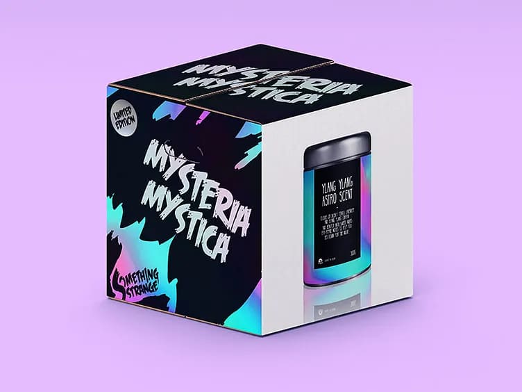
Mermaidcore captures the shimmer and mystery of the ocean with iridescent aquas, soft teals, pearlescent purples and glittery silvers that create dreamy, fluid palettes. These tones shift like light on water, and paired with deep midnight blues or pastel overlays, the effect feels magical and otherworldly.
Source: The Mermaidcore color trend has a magical, watery feel. Example by Diana Hlevnjak via Dribbble
It marks a shift away from the muted “quiet luxury” neutrals of the past few years and brings back bold fantasy and a touch of escapism. As consumers look for designs that feel less predictable, Mermaidcore is an imaginative alternative that balances glamor with nostalgia.
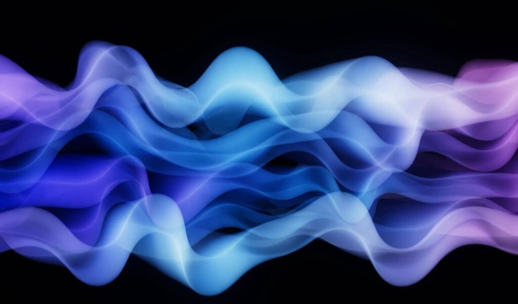
Source: The Mermaidcore trend is defined by soft, gradient tones. Example by Microsoft Design via Dribbble
For small businesses, this trend works beautifully in beauty, fashion and lifestyle branding. A boutique could use pearlescent gradients on their packaging, or a spa might choose teal-to-purple color washes to create calming digital visuals. To try it, experiment with gradients, metallic finishes and translucent layers that add depth and sparkle to your designs.
Source: An example of the Mermaidcore color trend 2026 on a website by Gleb Kuznetsov via Dribbble
Key features of the Mermaidcore trend:
- Iridescent aquas, soft teals, pearlescent purples and glittery silvers
- Fluid gradients that mimic the play of light on water
- Pairings with deep midnight blues for drama or pastel overlays for softness
- Shimmery, metallic or translucent finishes that add movement and depth
- A fantasy-inspired vibe that blends nostalgia with modern glamor
2. Banana Yellow
Banana Yellow is a cheerful and uplifting soft pastel that feels both playful and calm. It’s brighter than cream but gentler than neon, making it easy to pair with neutrals, earthy browns or other pastel colors. For small-medium businesses (SMBs), this versatile shade can bring an optimistic feel to your branding.
Source: Banana Yellow is a soft color trend that most SMBs can incorporate into their color palette. Example by Moonpie Studio via Behance
This trend signals a shift away from the muted beige palettes of previous years, bringing back color that feels optimistic and joyful. Where pastels were once reserved for spring collections or children’s branding, Banana Yellow is now being embraced across industries as consumers look to designs that feel more positive and approachable.
Source: The Banana Yellow color trend 2026 works well for highlights and accents. Example by Abdullah Zia via Behance
“This colour is a sweet treat for the eyes and yes it does look as yummy as it sounds! Think smooth custard, a slice of light sponge cake or a spoonful of creamy gelato. This shade gives a taste of delight and subtle satisfaction for my senses.”— Mary Pho, Art Director, VistaPrint
For small businesses, this versatile shade can bring an optimistic feel to your branding. A café could use banana yellow menus to brighten up interiors, while an online shop might add it to their product photography for a fresh, modern look. Start by introducing it as an accent background or in typography highlights and lifestyle visuals where you want to create a feeling of warmth and friendliness.
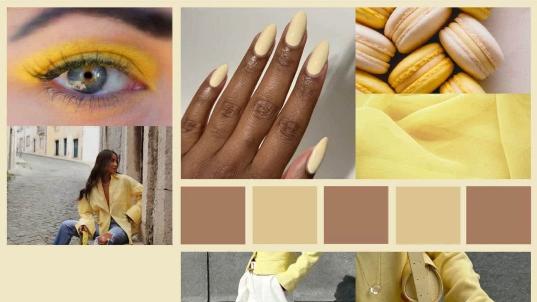
Source: Banana Yellow is a versatile color that can be used by most industries. Example by Tássia Cristina via Behance
Key features of the Banana Yellow color trend:
- A soft pastel tone that’s brighter than cream but gentler than neon
- Versatile enough to pair with neutrals, earthy browns or other pastels
- Conveys optimism, joy and warmth without overwhelming the palette
- Works well across packaging, digital design and photography
- Ideal for brands wanting to appear friendly, modern and approachable
3. Tangerine Disco
Tangerine Disco channels the glow of a sunset. It’s rich, theatrical and instantly eye-catching, sitting between the warmth of cinnamon tones and the gloss of bright orange. It feels glamorous yet approachable, and when paired with mint green or glitter finishes, it can nod to retro Vegas while staying modern.
It’s also the primary color for Taylor Swift’s upcoming new album, and if it’s anything like Charlie XCX’s “Brat Green,” then it’s likely you’re about to start seeing it everywhere!

Source: Tangerine Disco demonstrated by SRGrafica via 99designs by Vista

Source: Tangerine Disco demonstrated by bow wow wow via 99designs by Vista
This trend reflects a broader move away from the cooler, muted palettes of recent years toward high-energy, expressive colors. As consumers look for vibrancy and celebration in their design, shades like Tangerine Disco bring instant impact and nostalgia without tipping into neon overload.
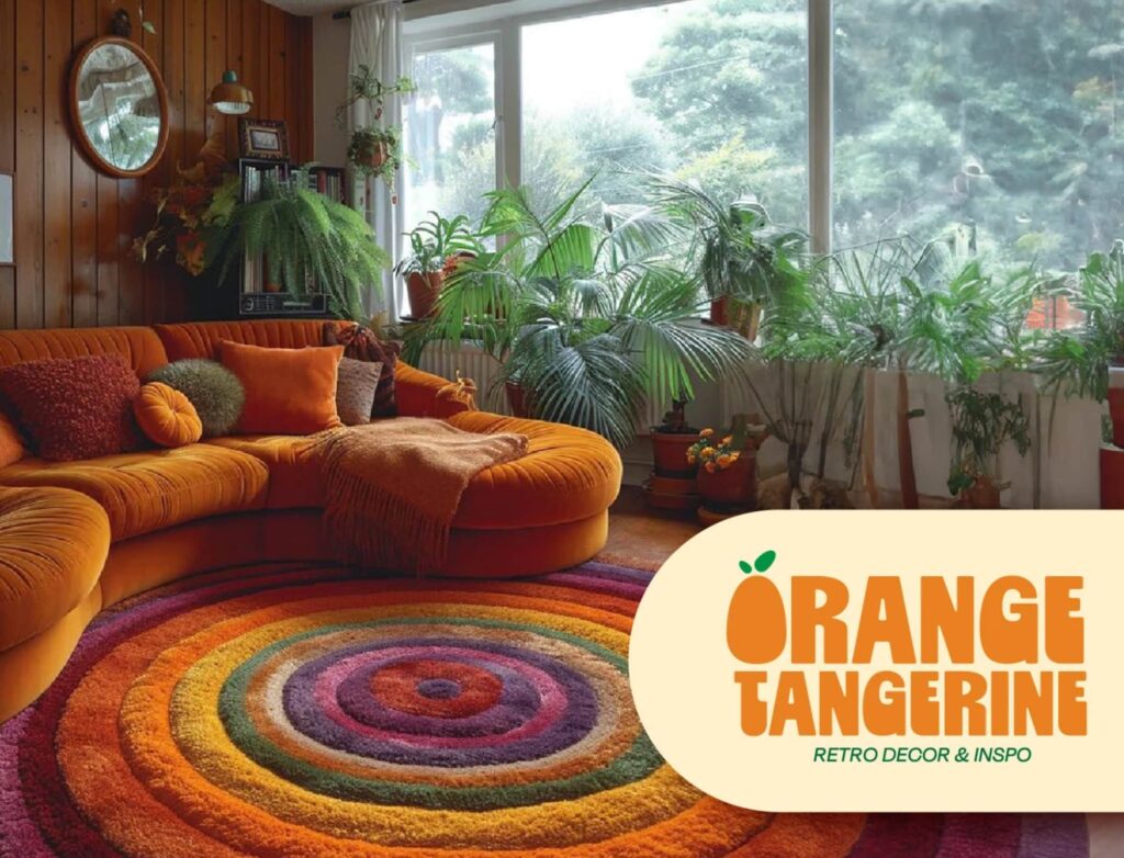
Source: Tangerine Disco has a nostalgic, retro feel. Example by Gloria Lastra via Behance
For small businesses, this is a great way to bring energy to branding, promotions and seasonal campaigns. A bakery could use Tangerine Disco in neon-style lettering for event signage, while a fashion brand could weave it into their packaging ribbons for a bold pop. Try adding this shade as a statement accent on headers, call-to-action buttons or campaign visuals as a starting point.
Source: A website using Tangerine Disco as an accent color by Delaram Hemati via Dribbble
Key features of the Tangerine Disco trend:
- A rich orange tone between cinnamon warmth and glossy brightness
- Feels theatrical and glamorous with a retro energy
- Pairs well with mint green, metallics or glitter finishes
- Evokes nostalgia for disco-era aesthetics while still feeling modern
- Works best as a bold accent for branding, packaging or campaign visuals
4. Sunwashed Soft
Sunwashed Soft colors look like they’ve been softened by time and light. Dusty pinks, chalky blues, muted olives and pale terracottas evoke a feeling of warmth, authenticity and nostalgia. This mood is less about brightness and more about natural desaturation.
Source: An example of a brand using Sunwashed Soft colors by Denian via 99designs by Vista
“This trend taps into nostalgia to spark emotion in your brand. Remember leaving toys out in the sun until they faded? Now that washed-out, sun-soaked vibe is exactly what makes designs feel warm, retro, and full of character. Give your brand a dose of sunshine and nostalgia.”— Justin Hamra, Creative Director, VistaPrint
It is a move away from saturated, high-gloss palettes toward something gentler and more grounded. Consumers are increasingly drawn to tones that have a feeling of ease, honesty and a lived-in quality. This acts as a counterbalance to digital overstimulation and the polished “perfection” of earlier design eras.
Source: A restaurant using Sunwashed Soft blue colors in its branding by Liz Nikol via Dribbble
Small businesses can use this trend to create calm, lived-in branding that feels trustworthy. A yoga studio might use sun-bleached tones across its website backgrounds for a calm feel, and a home goods shop could design packaging in chalky blues and faded pinks for a modern feel. To experiment, focus on muted variations of your brand’s core colors and pair them with sandy neutral tones instead of harsh white contrasts.
Source: Sunwashed Soft colors feel warm and nostalgic. Example by SMPLY Studio via Dribbble
Key features of the Sunwashed Soft colors trend:
- Dusty pinks, chalky blues, muted olives and pale terracottas
- Naturally desaturated tones that feel softened by light and time
- Evokes warmth, authenticity and nostalgia rather than vibrancy
- Balances well with sandy neutrals and off-whites
- Ideal for brands wanting to project calm, honesty and familiarity
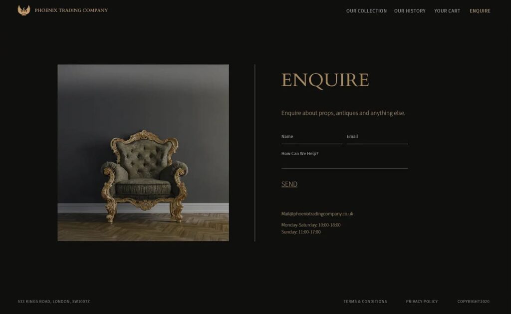
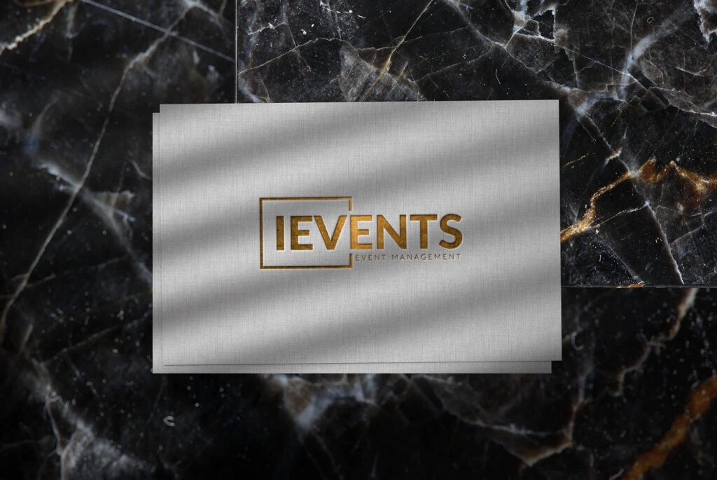
5. Clubroom Contrast
Few palettes say “luxury” like black and gold. Clubroom Contrast combines deep inky backdrops with metallic gold accents to create instant drama and sophistication. From matte foils to shimmering gradients, the contrast is bold yet timeless.
Source: The Clubroom Contrast 2026 color trend is perfect for premium brands. Example by Caleb Lam via Dribbble
This trend evolves from popular, minimalist “all-black” palettes, adding a new layer of opulence. Where stark black once represented exclusivity through a feeling of restraint, pairing it with gold is now a sign of confidence, indulgence and high-impact luxury. It highlights a broader cultural appetite for designs that feel rich and celebratory.
Source: Black and gold color palettes are associated with luxury. Example of Clubroom Contrast by Daniel Raubenheimer via Dribbble
For SMBs, this trend is ideal for premium positioning. Hospitality, jewelry or high-end services can all use this color palette to represent the high-end nature of their product or service. A small distillery could use black-and-gold bottle labels, while an event planner might design gold-embossed invitations. Start with a dark foundation and add gold sparingly for maximum impact.
Source: The Clubroom Contrast color trend 2026 can be used across all marketing materials. Example by Mariem Hana via Behance
Key features of the Clubroom Contrast trend:
- Deep black backdrops paired with metallic gold accents
- Finishes ranging from matte foils to shimmering gradients
- Creates instant drama, sophistication and high-impact luxury
- Moves beyond minimalist black by embracing opulence
- Ideal for hospitality, jewelry, premium services and event branding
6. Neon Shock
Neon Shock is about using neon as a highlight, rather than flooding your branding with fluorescent color. Electric greens, acid yellows and hot pinks can energize palettes with muted or industrial foundations, acting as bold exclamation marks throughout your branding.
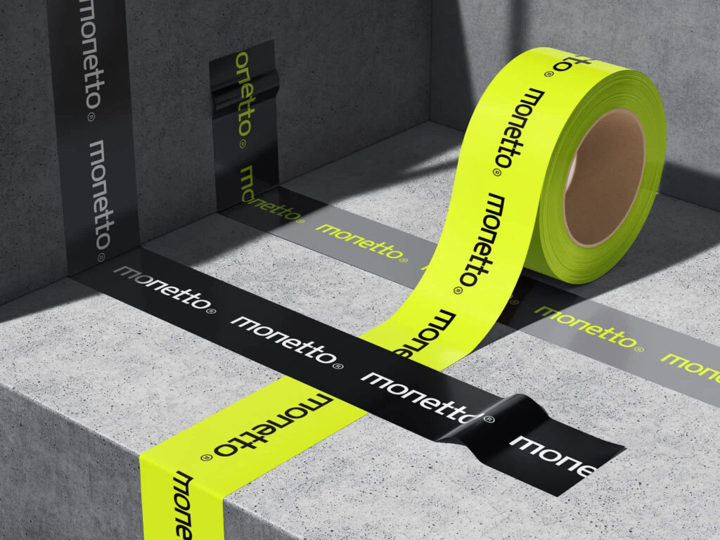
Source: The Neon Shock color trend brings instant attention to your branding. Example by Ivan Ermakov via Dribbble
This steps away from the all-over neon palettes of the late 2010s and early 2020s, which often overwhelmed designs. In 2026, neon is more refined and used sparingly to add energy and impact. It reflects how brands are learning to balance attention-grabbing color with readability and restraint, creating designs that pop without exhausting the eye.
Source: An example of a brand using the Neon Shock color trend 2026 by Julie9 via 99designs by Vista
Small businesses can benefit from this effect by grabbing attention in crowded markets. A food truck could use neon accents in its menu design, or a creative studio might integrate them into social media posts. To try it yourself, add neon shades to website buttons or other iconography that you want to have instant visibility.

Key features of the Neon Shock trend:
- Neon shades used as accents rather than dominant palettes
- Electric greens, acid yellows, hot pinks and searing oranges
- Works best when paired with muted, neutral or industrial foundations
- Acts like an exclamation mark, guiding the focus to key elements
- Balances boldness with restraint for lasting impact
7. Walnut Retro
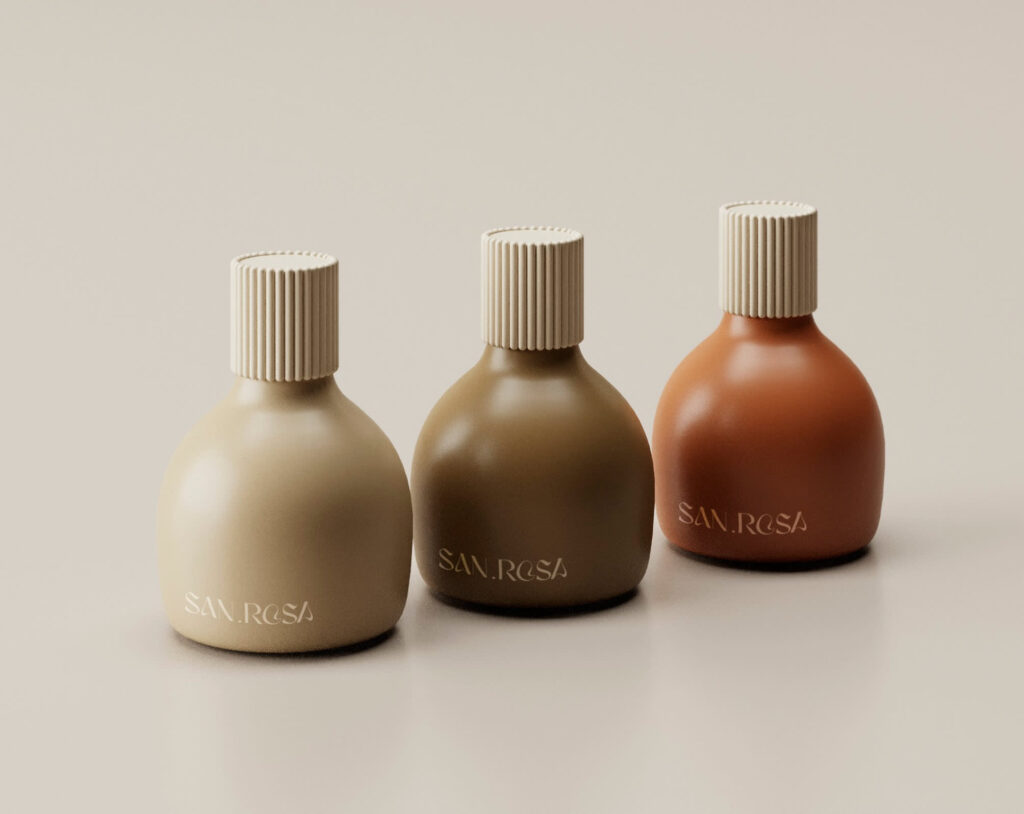
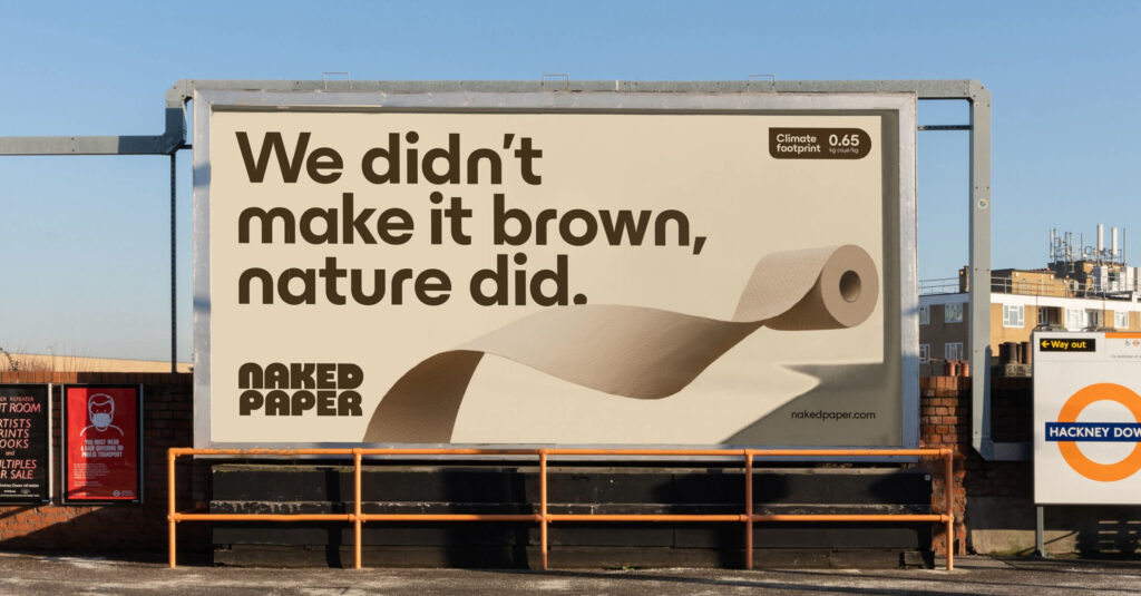
In 2026, brown is stepping into the spotlight as a full color scheme, not just an accent color. Taupes and sandy beiges, deep chocolates, chestnuts and monochrome browns all evoke warmth, comfort and sophistication. And with roots in ‘70s culture, Walnut Retro feels both retro and fresh at the same time.
Source: Brown tones feel warm and sophisticated. Example by Kyle Lane via Dribbble
This trend is an upgrade on the cooler, minimalist neutrals like grey and stark white, which dominated branding for years. As consumers seek designs that feel grounded and more human, brown provides a warm, earthy alternative that’s versatile across various industries. It also taps into a wider cultural embrace of nostalgia and sustainability, making it a future-facing yet familiar choice.
“The retro revival will be continued into 2026, especially with Gen Z and younger Millennials craving emotional familiarity.”— tapay, Designer on 99designs by Vista
Source: Walnut Retro color trend 2026 steps away from more basic neutral palettes like blacks and grays. Example by adamk. via 99designs by Vista
Walnut Retro is a refined alternative to gray or black palettes that feels fresh and interesting for SMBs. A coffee roaster could build an entire palette around earthy browns as it perfectly matches their product. On the other hand, a fashion boutique might design their packaging in layered chocolate tones for a sophisticated feel.
For an easy introduction to this palette, choose three to four complementary brown tones and use them across your socials backgrounds, text and product photography for consistency.
Source: Walnut Retro is a color trend that can be used timelessly by most businesses. Example via Creative Boom
Key features of the Walnut Retro palettes trend:
- Full-spectrum browns like taupe, beige, chestnut, chocolate and red-tinted tones
- Warm, grounded alternative to cooler neutrals like grey and black
- Evokes a feeling of comfort, nostalgia and natural sophistication
- Versatile across categories including coffee, fashion, interiors, packaging and more
- Works well in monochrome palettes or layered with earthy textures
“These natural muted tones remind me of cosy comforts: rich lattes, creamy chocolate, timeless woodern interiors with earthy tones. It’s a colour that gives off class, warmth and calm, grounded with hints of nostalgia.”— Mary Pho, Art Director, VistaPrint
8. Thermal Glow
Thermal Glow turns invisible heat into a dazzling palette. Electric purples, incandescent reds and fiery oranges all blend into surreal gradients that are inspired by thermal imaging. The result feels futuristic and cinematic, and when used right it creates a high impact.
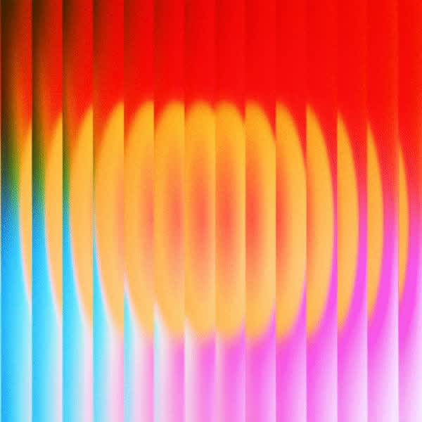
Source: The Thermal Glow color trend 2026 features bright, incandescent colors for impact. Example by Maria Eugenia via Pinterest
This trend is the opposite of the predictable digital gradients and moves toward palettes that feel alive and atmospheric. As brands and consumers both lean into technology and science for inspiration, Thermal Glow is a reflection of the desire for visuals that are both experimental and emotionally charged. It bridges the worlds of science fiction and design, transforming invisible energy into a striking creative language.
“When one color just won’t cut it, Thermal Glow’s the way to go. Stacking layers of neon color, you get sharp, electric visuals that feel futuristic, cinematic, and unmissable no matter where they show up.”— Justin Hamra, Creative Director, VistaPrint
Small businesses can use this trend to signal their innovation and boldness. A tech start-up can use infrared palettes on product landing pages, or a music venue could incorporate them into their posters and digital ads. A good starting point is to build gradient overlays with high-contrast colors and balance them with neutral typography so that you don’t lose readability.
Source: Thermal Glow color trend 2026 feels futuristic and cinematic. Example by Sava via Dribbble
Key features of the Thermal Glow trend:
- Inspired by thermal and infrared imaging
- Electric purples, incandescent reds, fiery oranges, piercing pinks and deep blues
- Surreal gradients that feel futuristic and cinematic
- High-contrast color schemes balanced with neutral type for clarity
- Ideal for brands that want to showcase innovation, energy and disruption
How to use 2026 color trends for your brand
The color trends for 2026 highlight a broad spectrum of possibilities for brand colors in all industries whether you opt for soft, human-centered pastels and browns or bold futuristic neons and infrareds. While we’re still awaiting Pantone’s official Color of the Year 2026, which will no doubt influence product design and branding, small businesses can still start experimenting with these palettes. now helps you connect with your customers and signals that you’re on top of global style trends.