The colors you choose for your brand are a form of communication, influencing customer attention, emotion and trust. This guide to the psychology of colors in business will explain what each color means and how you can apply color to logo, packaging and signage design to help your brand palette perform in the real world.
We spoke to Dr. Sally Augustin, Ph.D, an environmental and design psychologist, to learn more about the psychology of color. Read on for her expert tips on choosing the right colors for your brand and how to apply color psychology to small business branding. Color says a lot about your business—so when designing your logo and brand identity, make sure you’re sending the right message and setting the right tone.
- The psychology of color in business shapes how customers notice, remember and evaluate your brand, influencing clicks, foot traffic and sales.
- Understanding the meanings of colors and when to use them on specific products will help you send the right message to the right audience.
- Blue is associated with trustworthiness, black with strength and sophistication, green with the environment, and yellow and orange with energy, while white represents modernity and simplicity.
- Always consider cultural context, accessibility and RGB/CMYK print differences when choosing brand colors.
The importance of the psychology of colors in business
Color can help create a strong first impression, signal quality and trigger customer action. Your choices impact brand recognition, the effectiveness of your marketing and conversion rates across marketing touchpoints. Color influences what the eye sees first, how long people linger on content and their perceptions of a brand. Different colors communicate trust, excitement, calm or value, so it’s important to understand and apply the psychology of color in business effectively.
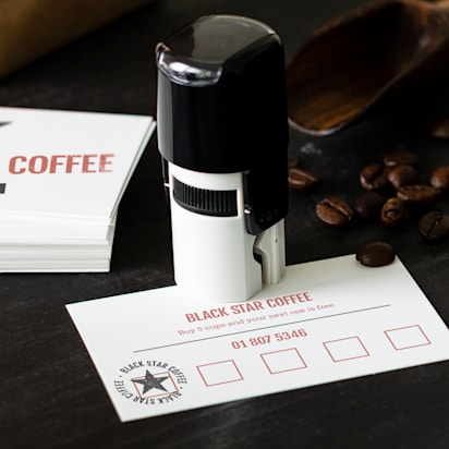
Pick a base color that fits your brand identity, add high-contrast accents for calls to action and avoid low-contrast pairings that can damage the readability of text, especially on business cards and labels.
Your color palette needs to work everywhere customers interact with your brand, from your logo and branding to your business cards and stationery, packaging and labels, storefront signage and posters, staff uniforms, website, email, ads and social posts. Effective brand design will mean consistent colors across all materials.
What colors mean (and how to use them)
Here’s what Dr. Sally Augustin had to say about the psychology of color, how certain colors influence the way we think and behave, and how that can be applied to small business branding.

Blue
Blue is generally associated with competence and trustworthiness, making blue color schemes a good choice for finance, healthcare and any trust-led service provider. According to VistaPrint data, blue is the most popular color selected by its customers for marketing materials.
“At a global level, if you ask people what their favorite color is, they’re more likely to tell you it’s blue than any other color. Researchers aren’t sure why blue is so popular, but we think its status may have something to do with the fact that during our early years as a species, the things that we valued were blue—for example, skies during good weather and water holes seen from a distance are both blue,” Dr. Augustin says.

Black
“Black is a widely used and preferred shade. Since many associate black with strength, sophistication, tradition and formality, its popularity isn’t surprising,” Dr. Augustin explains. Black can be a great choice for retail, fashion or any businesses that want to convey sleekness, sophistication and luxury.

Adding print finishes like foil accents, embossed gloss and raised foil can give added elegance to your business cards.
White
White is one of the most versatile colors; it can work for almost any industry since it’s so neutral. On its own, white represents modernity and simplicity. It’s a great color choice for small businesses in the tech and health industries, as well as for upscale fashion retail brands.

Green
Green is associated with nature and environmental responsibility, making it an ideal choice for businesses that prioritize sustainability or health. Green is also linked to spring and rebirth, making it a good option for small businesses that help people with new beginnings, like a nutritionist, personal trainer or tutor.
“Seeing green, even briefly, has been tied to enhanced creative thinking, so using it in marketing materials may be a good idea if people need to do a little creative thinking to understand your appeal,” Dr. Augustin says.

Red
Red communicates love, danger and excitement. It’s also linked to holidays or celebrations. “Research has shown that looking at red can degrade our analytical reasoning, but seeing red on a wall or similar surface does give us a burst of strength,” Dr. Augustin explains. “It’s the perfect color to look at as you lift weights,” making it a good choice for gyms. And because the color red can stimulate appetites, it can also be a great fit for restaurants and food brands.

Pink
Pink represents romance and femininity, making it ideal for small businesses with women as their target audience. Pink has a youthful energy that works well for fast-food businesses, skincare and beauty brands, thank-you cards and staff uniforms. And since there are so many shades of pink, it’s super versatile. For example, soft blush communicates warmth, while hot pink gives off a bold personality.

Purple
Purple blends the excitement of red with the calmness of blue, helping brands to appear luxurious, innovative or feminine. Purple isn’t as widely used as pink in brands built for women, but lighter shades feel feminine and can be great for your small business if you specialize in beauty, skincare, jewelry or luxury retail.

Orange
Orange is an energetic color that combines the excitement of red with the friendliness of yellow. Use orange in your small business branding if you want to communicate energy. This bold color can be a great choice for a gym, travel or even a toy business.

Yellow and orange can be perceived as ‘cheap’ colors, which is great if you’re an affordable brand, but if you’re trying to communicate that you’re a high-end brand, consider using a different hue.
Gray
Gray represents balance and neutrality with a serious, corporate feel. This color fits professional sectors like law, finance, accounting and construction. Charcoal is great for communicating authority, while light gray works well on dark backgrounds.

Brown
“Brown is linked in our minds to ruggedness,” Dr. Augustin says. A lot of utility businesses use brown, like construction companies or package delivery services, as well as more “earthy” brands, like coffee companies. This color can make branding feel more masculine, so it’s a good option if you’re targeting a male audience.

Yellow
Yellow can be used as a powerful accent color to help brand marketing or signage stand out. As a primary hue, it communicates cheerfulness, accessibility, energy and affordability, which can work well for fitness studios, casual restaurants and budget-friendly product lines.

Understand the impact of cultural context
Color meanings change depending on culture, industry and audience, so it’s important to understand the psychology of colors in marketing to avoid missteps and respect local and cultural norms. For example, in North America and Europe, white is used as a wedding bridal color, but in parts of East Asia, like China and Japan, it’s linked to mourning and funerals. And while red signifies danger and romance and is often used for retail sales in the West, in China, it also means good luck and prosperity.
Industries also have “default” colors that set expectations with audiences. Healthcare, finance and tech are often associated with blue and cool neutrals, signalling trust and competence. While eco, outdoors and wellness companies tend to use greens, browns and sage tones to instill a sense of nature and calm.
Different demographics also need different levels of accessibility and inclusivity. Older audiences benefit from higher contrast and larger type, while those with color vision impairments are most likely to have issues recognising red and green.

How to choose colors: A quick guide
With this practical and quick guide, you can move from the first ideas for your color palette to finished assets in line with the theory of color psychology.
Step 1: Define your brand personality
Start by listing three feelings you want customers to have when they see or think about your brand identity, for example, calm, reliable or modern. Match those feelings to color traits (e.g., blues for trust, greens for renewal and black for luxury). Sense-check your color choices against your target audience and price point so that your color palette aligns with their expectations of your business.
Step 2: Collect color references
Create a mood board with real-world cues like product packaging, competitor color palettes and environments where customers find you (for example, a farmers market or a clinic waiting room). Include 10-15 images and 3-5 color swatches that feel “on brand”.

Step 3: Use the color wheel to understand which colors work well together
Keep your color palette simple. Once you understand elements of color psychology like warm vs. cool, and the roles of hues (color family), value (light/dark), complementary (high contrast), analogous (calm), triadic (balanced energy) and saturation (intensity), you can choose harmonious shades that match your brand.
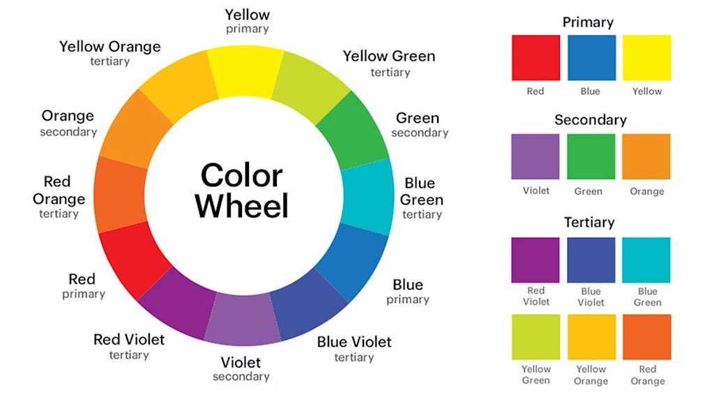
Great color palettes aren’t random. They’re built on simple harmony rules that balance contrast for visibility with a cohesion of shades. Use these color-matching patterns to decide when to go bold, when to stick with calm tones and how to keep text and CTAs readable in print and on screens:
- Complementary colors like blue and orange are opposites on the color wheel. Together, they create high contrast that grabs attention.
- Split-complementary palettes use one base color and the two colors next to its opposite on the color wheel, e.g. teal with coral and mustard.
- Analogous palettes use neighbors on the wheel like sage, teal and navy to create calm cohesion.
- Monochrome palettes work with variation on one color’s tints and shades to create a professional feel.
- Triadic palettes use three evenly spaced hues, for example, blue, red and yellow or teal, magenta and amber, to give balanced energy without chaos.

Using different shades of the same color is an analogous or monochrome palette

Triadic color palettes take evenly-spaced colors for a fun, lively feel
Step 4: Choose a base, neutral and accent colors
Each color in your palette has its own job, creating a hierarchy between the base, neutral and accent tones:
- Base: the main brand color used ~60% of the time, for example, on cards and headers.
- Neutral: the background color that supports the rest of your branding. This is often white, off-white, gray, black or charcoal.
- Accents (1 or 2): these are action/highlight colors used on buttons, price tags and badges, etc.
When choosing your base color, it’s important to understand the basic legibility rules like keeping text-on-color contrast ≥ 4.5:1 (≥ 3:1 for large text), so the lighter color is 4.5x brighter than the darker hue.
Avoid light text on light backgrounds and test small fonts on business cards, labels and menus.

Step 5: Test on screen and physical products
Colors change depending on the medium they’re being printed on. Print uses CMYK and different papers and finishes, while screens use RGB or HEX and backlight. Here are some tips to help you test your color palette across different print products:
- Order small runs of business cards, labels and flyers in your preferred palette.
- Compare stocks and finishes, for example, uncoated vs. coated, matte vs. gloss, standard vs. premium.
- Check the lighting in different settings, as daylight, warm store bulbs and evening light will change how colors appear.
- Consider how printing on fabric, kraft, clear labels and metals can all tint color differently.
- Think about how durable your print materials need to be. Choosing a slightly darker, lower-chroma hue (or textured stock) will wear better—great for restaurant menus, for example.
For more details, read our in-depth guide on how to choose brand colors.

Common mistakes to avoid
Even strong color palettes can miss the mark if you skip the print proofing step, overcomplicate your colors or ignore contrast rules. Use this quick checklist to spot and fix the most common color issues before they damage readability, brand consistency or potential conversions.
Only testing colors on screens
Colors look different on paper and fabric than they do on screens. Screens use RGB/HEX, while printers use CMYK, plus papers and finishes (matte, gloss, uncoated) and fabrics can affect hue, value and saturation. Always proof in print and order a small run of business cards or labels to compare stocks/finishes and check your colors in daylight, store lighting and evening light.

Screens use RGB

Print uses CMYK
Discover the differences between RGB vs CMYK in our handy guide.
Too many colors and weak hierarchy
A crowded palette blurs your message and confuses your identity. Stick to a simple system with one base, one neutral and 1-2 accents and assign jobs, like base color for headers and backgrounds, accent for CTAs and badges, and neutral for body text.
Low contrast on small text
Tiny type and light-on-light pairings are bad for legibility, especially on labels, menus and business cards. Instead:
- Contrast for text-on-background should be ≥ 4.5:1 (≥ 3:1 for large/bold text).
- Darken the background or lighten the text (not both).
- Bump your font weight/size and swap to your neutral for body copy or add a solid color block behind key details like prices, URLs and QR prompts.
- Keep CTA button text ≥ 4.5:1 vs the button color and make the hover and focus visibly different from one another.
Bring your colors to life
You now have a practical toolkit for understanding the psychology of colors in business. You’ve mapped out clear brand goals, chosen a palette, learned color harmony rules and factored in culture, accessibility and how colors appear on print vs. screen. You’re ready to apply your colors across your business cards, packaging, signage, logo, promotional products and website.
Start small and prove your essential products, run simple A/B tests, gather feedback and keep your brand kit updated so every new asset stays consistent. The more you use your cohesive color palette on assets, the faster customers will recognize and trust your brand.