Branding is a key part of building any business. But what if you are the business? When promoting yourself—as all entrepreneurs, consultants and freelancers must do—one of the first steps is to create a strong, recognizable logo that conveys who you are, both as a person and as a company.
Sound complicated? It can be. But luckily, there are some incredibly successful branding role models who can show you the way—professional athletes. Though many of them are part of a team, top athletes also have specific personal brands that accompany them wherever they go.
So, what is a logo? And how do you create a personal logo that’s inspiring and enticing (and represents the essence of who you are, of course)?
Let’s check out how some of the pros have done it.
1. Ken Griffey, Jr. — boast your talents

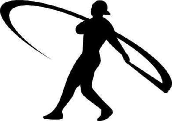
Ken Griffey Jr. is one of the all-time greatest hitters in baseball history with 630 career home runs, along with the all-time record for the most consecutive games with a home run.
Naturally, his logo focuses on his million-dollar swing. The curved line portrays a sense of motion and power, while the silhouette of the player demonstrates stability. It’s the swing that all the kids want to emulate. This logo shows that Griffey is for real, yet the backward hat adds a sense of playfulness. He’s not all business; he can be fun, too.
What’s your “swing,” the thing that helps you stand out from the crowd? What are you best at in your industry and field? Name that thing and then use it as a starting point of inspiration for your logo.
2. Michael Jordan — create your vibe

The Air Jordan logo, a.k.a. “Jumpman,” is arguably the most recognizable athlete logo in the world. The best part? It’s based on an actual photograph. Yes, Michael Jordan really did this.
If we’re going to get technical (and factual), the truth is that he never did it in a game. It was a posed photograph to promote the 1984 Olympics. But that’s the point. A logo doesn’t have to be factually accurate; it simply has to portray the feeling that you’re hoping to convey with your brand. If you want to give a sense of reliability, creativity or playfulness aim for a logo that embodies these characteristics. As Maxwell Scott famously said in the film, The Man Who Shot Liberty Valance, “When the legend becomes fact, print the legend.”
3. The Ball family — maximize meaning

The Balls are a ridiculously talented family of athletes. The brothers—Lonzo, LiAngelo and LaMelo—are high-level basketball players (Lonzo played for the LA Lakers, LiAngelo was a shooting guard at UCLA and LaMelo was a point guard on his high school team). LaVar, the patriarch of the family, decided to capitalize on these talents (even while the youngest was still in high school) with a Big Baller Brand and a nifty logo that’s not as simple as it seems.
The 3 Bs lettermark looks straightforward, but it uses a clever layering of meaning. The first B looks like a 3, to call out the three Ball brothers, but it also references the 3-point shot in basketball.
The goal here is to infuse many layers of meaning into a simple grouping of letters. How clever can you be?
4. Tiger Woods — keep it simple, silly

Tiger Woods was one of the first athletes to use his initials as a lettermark. Though simple and straightforward, the bold lines are striking—ideal for placement on clothing or golf equipment.
One of the more ingenious aspects of the logo is the two-tone, black-and-white color scheme. Depending on the color of the item on which it is featured, you can simply invert the logo to make it pop. If you’re planning to use your logo in a variety of places, it’s smart to build versatility into the logo itself.

Recently, Woods created a new logo, to separate his brand from his long-time partner, Nike (who is no longer making golf equipment).
Clearly, a lot of thought went into this logo—perhaps too much. The three triangles resemble both trees (“Woods”) and a claw (“Tiger”). It’s a bit like the famous Boring Figure, sometimes called “the young-woman/old-woman illusion.”
While the layers of meaning in the Big Baller Brand logo are effective, Wood’s latest logo seems to be trying too hard. It’s impossible to see both perspectives at the same time, so the logo winds up being more confusing than interesting.
So, while creating layers of meaning is a good thing, there’s definitely a caveat: don’t make your logo overly complicated or contradictory. When in doubt, follow the key principles of logo design to make sure your logo will communicate what you want and stand out. If you are ready to venture out on your own, go ahead and try our free logomaker!
5. Leo Messi — speak to your audience

Like many athletes, Leo Messi is strongly associated with his number. That’s why this soccer star calls his personal company Messi 10. This logo simplifies the name into a strong lettermark: M10.
The logo adds another layer by using light blue, a key color of Argentina’s flag, where the star forward calls home. Messi is an Olympic gold medalist and Argentina’s top goal scorer, so patriotism runs high for his target audience. This subtle design choice helps Messi speak directly to his fans by igniting their national pride.
Sometimes, like Messi, you’ll want to create a logo after you’ve established yourself. If this is your approach take some time to consider how your audience (or your friends) already see you. Do you have a distinguishing personality or characteristic, are you particularly proud of some aspect of your background (like your nationality) or do you always wear a specific article of clothing or accessory (like a trendy pair of glasses, a bowtie or a unique pair of earrings)? Incorporating one of these details into your logo can help to differentiate you from the competition and connect you directly to your customers.
6. Venus Williams — own your vision

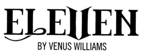
The tennis star’s logo centers around this number, transforming the V into an 11—or the 11 into a V, depending on how you look at things. Venus boldly decided that a V can be an 11 (and an 11 a V) and she expects her customers to think so, too. She owns her vision for her company and in doing so inspires her customers to own it, too.
This is a feature of the best logos. You inspire the viewer to see things the way you do.
So, what’s your vision?
7. Sasha Banks — be part of the whole

Sasha “Legit Boss” Banks is a key member of the WWE. She is part of the wrestling organization while simultaneously maintaining her own brand identity with her own style and personality.
Banks adopts a brash, over-the-top persona on stage, and her logo, all glitter and shine, reflects that sensibility. Yet, her brand also functions seamlessly within the larger WWE brand. She doesn’t contradict the WWE style. In fact, her logo compliments the WWE’s bold lines and sharp angles.

If you’re working within a larger organization, take your cue from the Legit Boss. Don’t try to separate yourself and your brand from the overall essence of the bigger brand. Instead, build a personal brand that fits in even as it stands out.
8. Maria Sharapova — do the unexpected
The sugary world of candy may not seem like a natural fit for a professional athlete, but it’s a world that tennis pro Maria Sharapova happily entered. Instead of shying away from the contradiction, she leaned into it, declaring her appreciation of the sweet stuff and even starting a candy company inspired by her own name, Sugarpova.

The logo itself embraces contradictions, too. The mouth is obviously where you put candy, but it’s also sexy and playful, like Sharapova herself.
When thinking about your own logo, don’t be afraid to do the unexpected. Your logo should be as unique and original as you.
Be your own star
These sports stars rode their athletic prowess to fame and fortune—and to their own successful brands and businesses. You may not be rich and famous yet, but you can still build a personal brand with a logo that represents you perfectly. A killer logo is the first step!
Want to learn more? Check out the world’s most famous logos and the evolution of a sports logo update to find out how to apply those insights to your logo design.
Author: Matthew Price


