Brand identity is the special sauce that makes your business instantly recognizable and memorable. Just like your personal identity makes you uniquely you, your brand identity shapes how people see, feel about and choose your company. In this guide, you’ll learn what brand identity is, why it matters, where it shows up and practical steps (with tips) to build one that works in the real world.
- A strong brand identity is the sum of visuals, voice, values and experience—not just a logo.
- Consistency across every touchpoint (site, packaging, email, social, signage) builds trust and recall.
- Start with strategy: Purpose, audience and positioning guide every design choice you make.
- Keep it simple and scalable: Design assets should work on a tiny favicon and a trade-show wall.
- Document everything in a style guide so anyone creating assets keeps the brand on track.
What is brand identity?
Brand identity is the collection of visual, verbal and experiential elements a company creates to convey the right image to its audience. It’s different from branding, which is the ongoing practice of shaping perception, and from brand image, which is how the world currently perceives you.
Brand identity design covers your logo, color palette, typography, imagery, voice, tone and the ways your brand shows up across experiences—from packaging to email to the way your product works. Keep it clear, consistent and true to your positioning, and customers will quickly recognize and remember you.

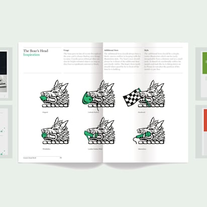
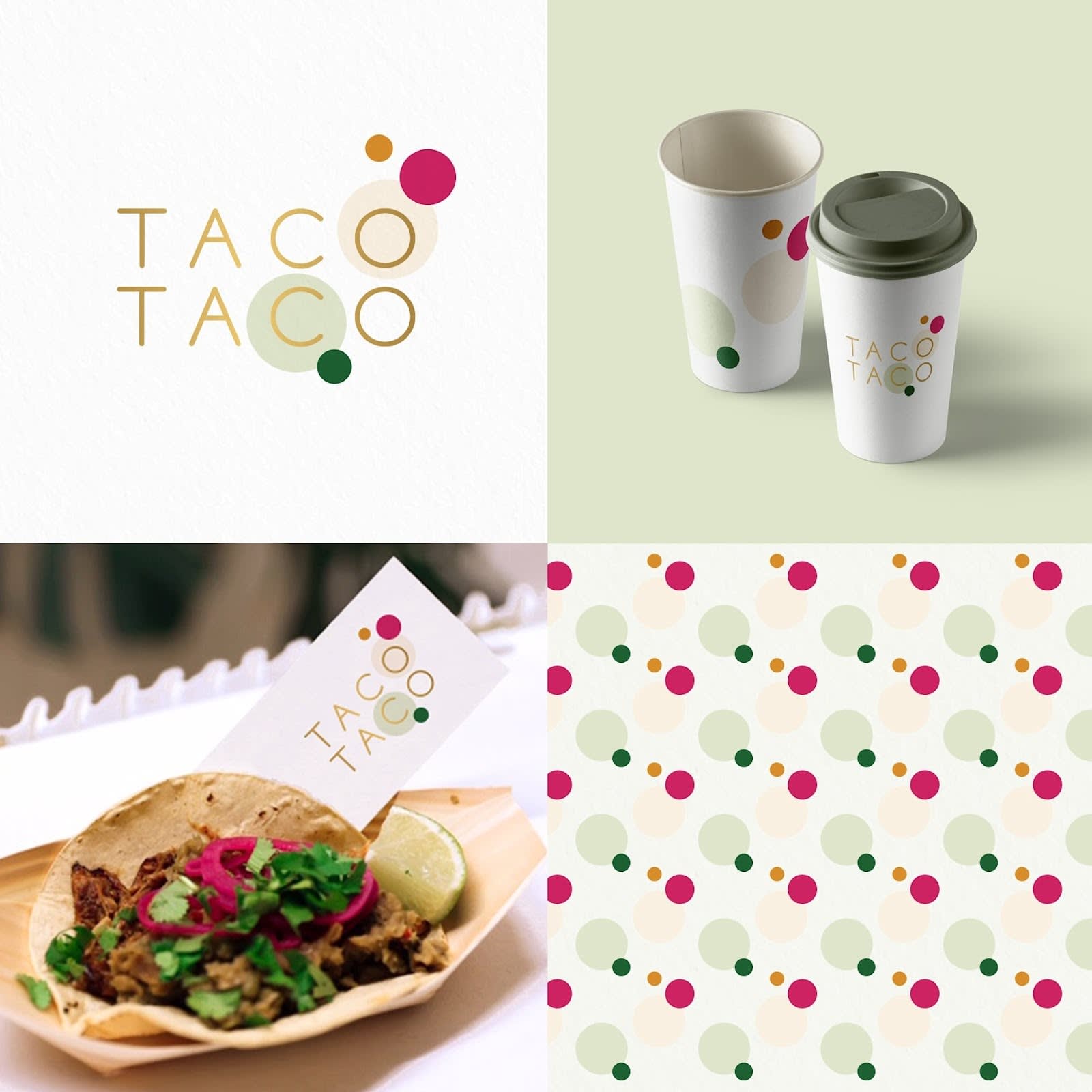
Source: Brand identity design by Ševarika™ via 99designs by Vista.

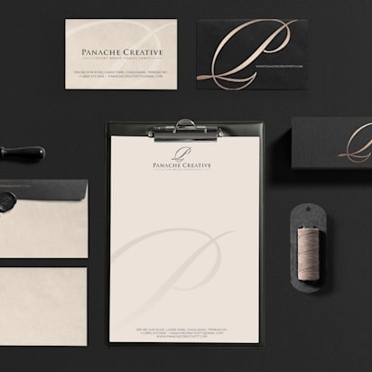
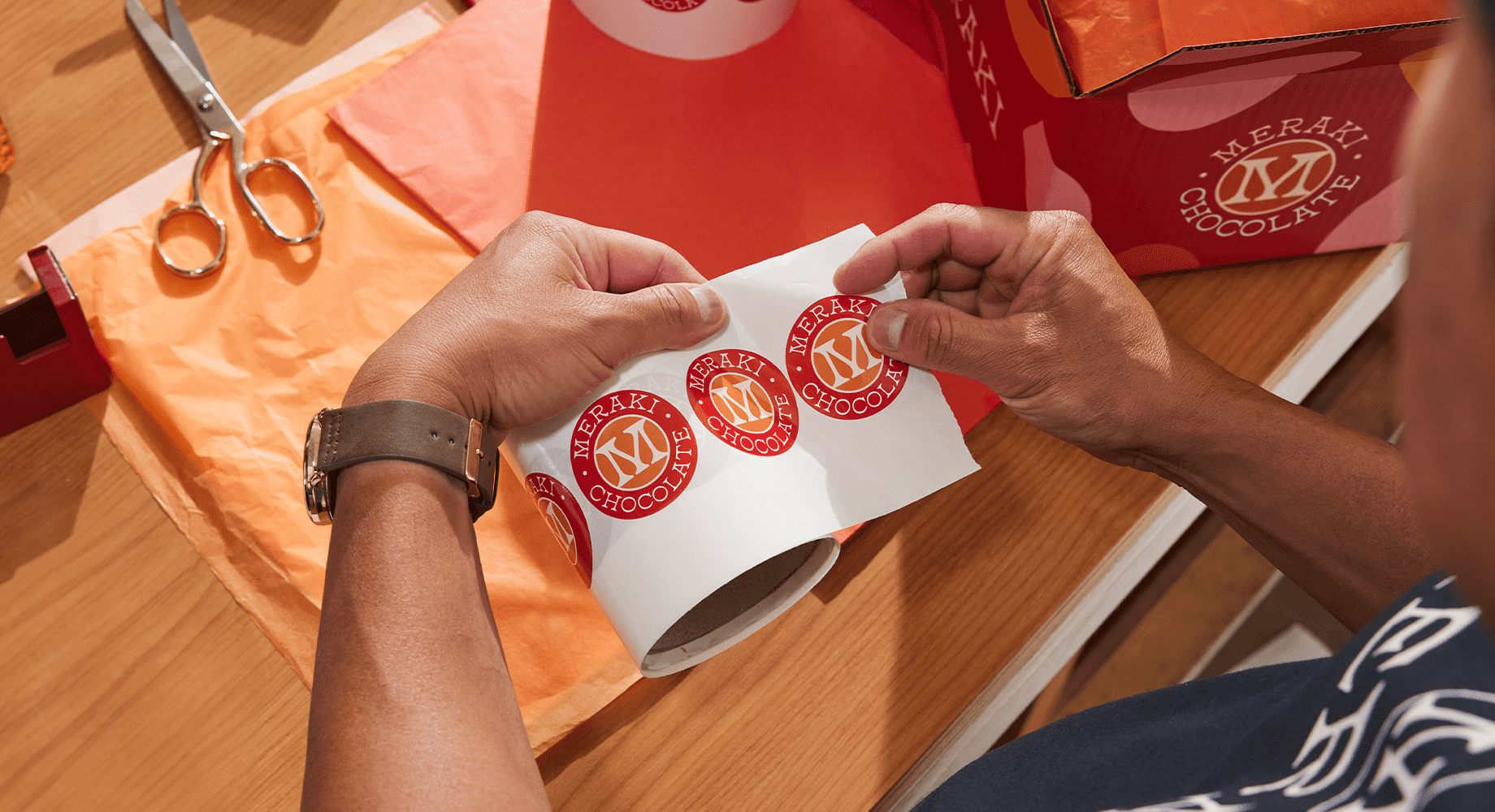
Source: Brand identity design by Yokaona via 99designs by Vista.
Ultimately, your branding impacts your financial success and there’s data to prove it. In a survey that 99designs by Vista (one of VistaPrint’s design services) conducted, the majority of small business owners (86%) reported that visual branding is important to their overall business success, with 78% saying it significantly contributes to their revenue growth1.
The importance of brand identity
A thoughtful brand identity does three big jobs: It signals what you stand for, it differentiates you from competitors and it builds loyalty over time.
Key components of branding
Behind every strong identity sits a simple structure. Branding strategy defines your purpose, mission, values, audiences and positioning. Expression turns that strategy into business names, taglines, messaging and a clear voice and tone. Design translates the strategy into a system of logo, color, typography, iconography, imagery, motion and layout rules. Finally, experience applies all of the above across your website, product, packaging, service scripts, support emails and physical environments so the brand feels coherent at every step.
Contexts of brand identity
Your identity needs to show up consistently wherever people meet your brand. This includes your website and app, social profiles and content, online ads, product packaging and inserts, business cards, email signatures and campaigns, presentations and proposals, storefront signage and interiors, event booths and swag, and even invoices and customer support messages. If it’s customer-facing, it’s brand-building.
How to build a brand identity
Here’s how to translate your purpose and positioning into a clear, consistent identity you can apply everywhere—from voice and visuals to your website, packaging and emails.
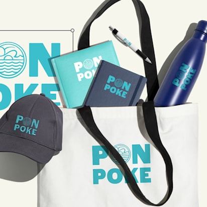
Source: A colorful, playful and fun brand identity design by pecas via 99designs by Vista.
Know who you are
Start with clarity. Define your purpose in a sentence, write three value statements that guide decisions and capture the brand personality in three adjectives that anyone on your team could recognize. Describe your positioning by stating who you serve, the need you meet, what makes you different and the proof you can show.
Read your purpose and values aloud. If they sound like any company could say them, sharpen them until only your business plausibly would.
Audience and competitor research
Get specific about the people you serve. Write down the situations in which they look for you, the outcomes they want, the pains they feel today and the alternatives they consider. Collect real words from customer interviews, reviews and support tickets; these phrases will become message starters and even influence naming and UI labels.
Map your closest competitors’ visuals and messages to see where categories cluster, often by color, tone or feature emphasis, then choose a lane that helps you stand apart while still feeling appropriate for the space you operate in.

Source: Rose Finch gin bottles designed by sikaramel via 99designs by Vista.
Create a simple “Category Map” with two axes that matter to customers (for example, price vs. simplicity). Place competitors and your desired position on the grid to make differentiation visible and deliberate.
Design
Translate strategy into a branding design system that is distinctive, legible and easy for teams to use day-to-day. Start with typography by selecting one versatile workhorse family for body copy and interface elements and, if needed, one expressive face for headlines. Make sure your choices render well on different screens and at small sizes, and establish a type scale so headings, subheads and body text are consistent across pages and documents.
Move to color by choosing a primary brand color, a secondary accent and a balanced set of neutrals. Document hex, RGB and CMYK values so digital and print match. Consider the role of shape and form in buttons, cards and icons. The point isn’t trend-chasing; it’s coherence with your strategy and usefulness for the team that will apply it.


The four major types of typography
Print a one-page sampler with your fonts, headline sizes, paragraph styles and color swatches, then view it outdoors and on a phone. If anything is hard to read, adjust it before you lock the system.
Logo
Design a logo that is simple enough to work at favicon size and distinctive enough to stand out on a crowded feed. Plan for a primary lockup, a horizontal version and a compact mark or monogram for tight spaces. Define minimum sizes, clear-space rules and misuse examples so the logo doesn’t get stretched, crowded or recolored in ways that dilute recognition. Export a tidy package that includes vector formats for scale (SVG, EPS), transparent PNGs for everyday use and guidelines on when to use light or dark versions.
Test your logo in the three most common real-world contexts you’ll use this year—your website header, social avatar and a small print item like a sticker or card. If it struggles in any one of those, refine before launch.
Create your website
Your website is often the first and most complete expression of your brand. Start with structure by planning clear navigation and a homepage that states your value in a single line above the fold. Build a component library (buttons, cards, forms, banners) so new pages stay consistent by default. Write copy in your defined voice and keep paragraphs short and scannable, using subheads to orient readers.
Optimize performance with compressed images and lightweight code so the experience flows smoothly. Ensure accessibility by meeting contrast standards, supporting keyboard navigation and labeling forms clearly; inclusive design is good brand design.
Draft your homepage using only black text on a white page. If the story doesn’t land without visuals, the message isn’t clear yet.
Product packaging
If you sell a physical product, packaging is your most tactile brand moment. Begin with the unboxing flow by planning the order in which someone encounters surfaces, messages and materials. Align the structure and substrate with your values and price point. A recyclable mailer with one high-impact print area can look premium if the hierarchy is clear and the color is consistent with your palette.
Use inserts to encourage the next step, such as a thank-you note with a short brand story, a QR code to register for benefits or a card that prompts reviews and referrals.
Build a full-scale mockup with paper, tape and a desktop printer to check reading order, crease locations and how colors look under indoor light before you order any samples.
Business cards
Even in a digital world, a crisp business card can cement a connection at events or in client meetings. Keep content to your name, role, brand mark, essential contact details and a scannable QR that links to a well-maintained destination. Use the card to reinforce your system, not to introduce new experiments; the same type scale and color proportions should carry through. If you add a production flourish, choose one signature move such as heavier stock, soft-touch lamination, letterpress or spot gloss.

Place three cards side-by-side with different paper weights or finishes and ask two colleagues which one feels most you. The quick gut check often reveals the right choice faster than spec sheets.
Email design
Email builds frequency with your audience, so clarity and consistency matter more than decoration. Establish a standard header that includes your logo and navigation and use a clear typographic hierarchy for headlines, body text and legal copy. Keep image file sizes modest so messages load quickly on mobile data, and write alt text that communicates meaning if images are blocked.
Write the subject line and preview text before you design the body. If those two lines don’t make a compelling promise in your brand voice, the email won’t perform.
Create a brand style guide
A branding style guide turns your brand into a system people can use correctly on the first try. Start with strategy summaries like purpose, audience snapshots and positioning on a half page each. Add voice and tone with examples of “write this” and “avoid this,” plus a short glossary of preferred terms and spellings. Document your logo with usage rules, spacing, sizing and misuse examples. Color with values, contrast guidance and approved combinations, and typography with a type scale, weights, line lengths and examples of headlines and paragraphs.
Include imagery direction covering photography style, illustration rules and icon usage. Finish with downloadable assets and templates—presentation decks, letterheads, social post starters—so teams aren’t reinventing components.

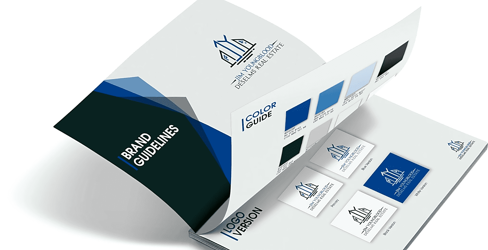
Source: A brand guide with brand colors by ludibes via 99designs by Vista.
Branding worksheet
VistaPrint’s free branding worksheet makes it easy to define your brand and business with clarity. In a few short questions, it helps you articulate why you do what you do, what makes you unique and the problems you’re solving by guiding you to prioritize what your customers actually want and value. Use it to turn loose ideas into a focused purpose, sharper positioning and messaging you can apply across your logo, website, packaging and more.
Common mistakes
Here are the pitfalls that most brands stumble into. Use this list as a quick self-audit before you launch (or refresh) your branding identity:
- Treating the logo as the whole brand while neglecting voice, UX and overall experience.
- Chasing trends that don’t fit your strategy, then dating your look within a season.
- Inconsistent execution across channels, which confuses customers and erodes trust.
- Overcomplicating color and typography so non-designers can’t apply them correctly.
- Skipping accessibility (poor contrast, tiny type, unlabeled inputs) and limiting reach and usability.
- Messaging that tries to say everything to everyone, blurring positioning and value.
- Rolling out assets without a style guide, templates or examples to keep teams aligned.
- Ignoring performance and practicality, like heavy pages, unreadable print or assets that don’t scale.
Brands with strong brand identities
Brand identity design requires a lot of work, but it’s the work that pays off and brings your business lots of brand recognition, increased brand awareness and, ultimately, more sales. Here are brands that prove this point.
Patagonia

Source: Mamamia
Patagonia leads with mission, sustainability and durable product design. Those choices show up everywhere from product materials to campaigns. The nature-inspired palette and confident, minimal typography support a brand that stands for longevity and environmental stewardship. The result is recognizability that goes beyond a logo: the experience of buying, repairing and reselling gear feels like one continuous story.
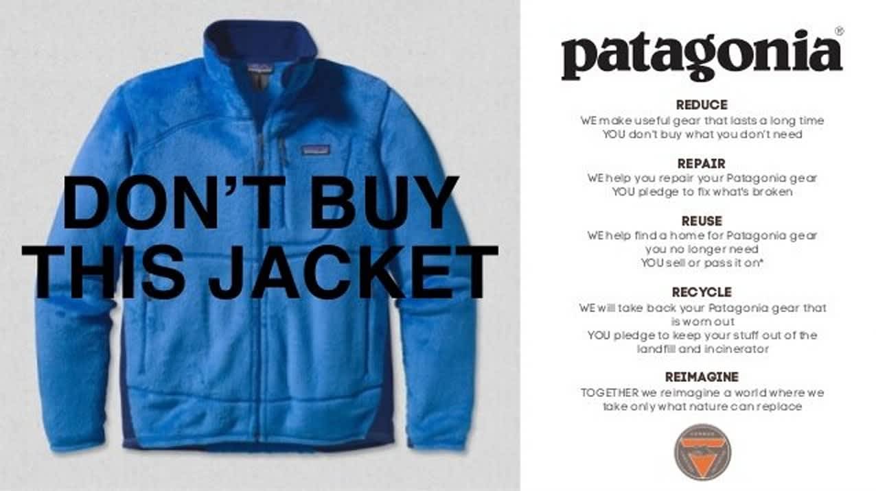
Source: Patagonia’s Don’t Buy This Jacket campaign via Patagonia
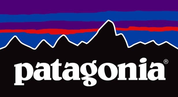
Source: Patagonia’s logo via ASI
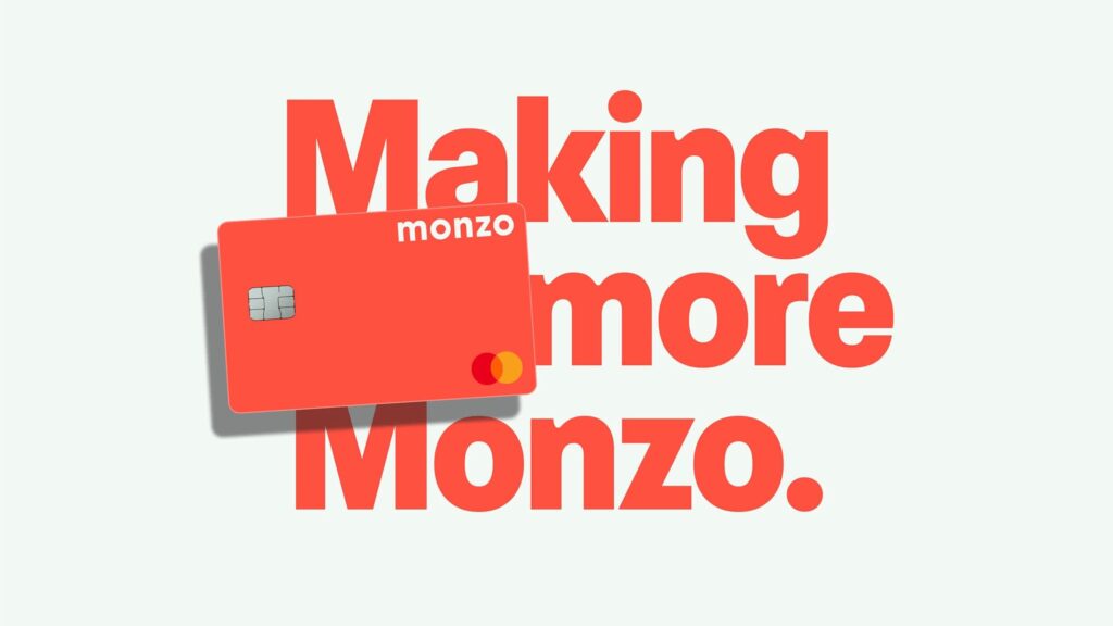
Monzo
Monzo demonstrates how a simple, distinctive asset can anchor an entire system: The coral card stands out in wallets and feeds, while the app uses plain-English copy, clean layouts and friendly micro-interactions to make finance feel approachable. The same tone carries into help content and status updates, which turns operational transparency into a branding strength.
Source: branded advertising by Monzo via Behance
Lush
Lush pairs bold, hand-lettered typography with minimal black-and-white packaging to foreground product freshness and ethics. In-store experiences emphasize scent, texture and sampling, which shifts the brand from a visual identity to a sensory one. Activist campaigns and straightforward product naming extend the same no-nonsense voice customers encounter on labels and receipts.

Source: product advertising by sphere.obj via Behance
Brand identity in a nutshell
Your brand identity is how strategy becomes visible, audible and tangible. Get the fundamentals right—purpose, audience, positioning—then design a system that’s simple, scalable and documented. Apply it consistently across every context and your brand will be easier to recognize, trust and choose. When in doubt, return to the promise you’re making to customers and ask whether each element, including typography, color, layout and interaction, helps deliver it clearly and repeatedly.
FAQs about brand identity
1) What’s the difference between brand identity, branding, and brand image?
These branding terms get mixed up a lot:
- Brand identity = the elements you create to present yourself (visuals, voice, values, and how they show up).
- Branding = the actions and choices that apply identity across real materials and moments (campaigns, packaging, signage, emails, etc.).
- Brand image = what people actually think and feel about you (the perception in their minds).
2) What are the core building blocks of a brand identity (beyond just a logo)?
A workable identity is a system, typically including: logo, color palette, typography, shapes/patterns, imagery style, plus brand voice and messaging—and it needs to translate across digital and physical touchpoints (website, packaging, business cards, email, social, signage).
3) How do I define the “inside” of my brand before choosing the visuals?
Many teams start with a few grounding decisions: mission/why, values, personality, unique positioning, and voice. Once those are clear, design choices (fonts, colors, logo style) become easier because they’re expressing something specific rather than chasing aesthetics.
4) How do I keep brand identity consistent across every touchpoint without becoming boring?
Consistency comes from rules (and flexibility):
- Set a simple visual system (logo usage, font hierarchy, color roles, imagery approach).
- Use repetition for recognition, and variation for freshness (templates, seasonal palettes, campaign type styles).
That way your brand stays recognizable while still adapting to new formats.
5) What related topics should I explore next: style guides, visual identity, and brand frameworks?
If you’re expanding from “identity” into a full brand system, the most useful next steps are:
- Building a brand style guide so anyone can apply the identity correctly. (VistaPrint)
- Learning the difference between visual identity (the visible language) and broader brand strategy.
Using a framework like the Brand Identity Prism to connect visuals, culture, relationship, and customer reflection into one coherent story.