
Your brand is a living thing, and your logo will need to adapt with it. For example, you’ll need to edit your logo to add a tagline or create alternate color versions for new contexts. And because editing a logo is something most business owners will have to deal with at some point, it’s important to understand how to edit a logo. The good news is that there are plenty of logo edits that are simple enough for anyone to make, regardless of your design skills or design experience.
In this article, we’re going to walk you through how to edit an existing logo step by step, as well as how to know whether your company logo needs refinding or redesigning. We’ll discuss the most common edits you can make and the steps you need to take while referring to real-world case studies.
- Always edit from a vector master file (AI, EPS, SVG) and export (PNG, JPG, PDF) from that source.
- Start every logo edit by defining the problem clearly so changes are purposeful and intentional.
- Create a responsive logo with primary, stacked and icon-only versions for different contexts.
- Make color and font choices that are on-brand and accessible across print and digital applications.
- It’s time for a logo redesign when your brand identity, audience or business strategy has fundamentally changed.
How to edit a logo step by step
When editing your logo, follow this step-by-step workflow to ensure changes are intentional and effective.
Step 1: Decide if your logo needs editing
First, decide whether your logo actually needs editing and why. Examples of when to edit a logo include:
- Rebranding after a name change, a new identity, a merger, a new audience or a shift in positioning.
- Modernizing a dated look with fresh fonts, colors and symbols.
- Scaling for digital contexts like app icons, favicons, dark mode and motion.
- New applications like packaging, vehicle wraps or outdoor signage, where the current logo doesn’t scale easily or work on a new color background.
Sometimes the prompt for a logo edit is strategic, such as appealing to a new audience or differentiating from competitors, and sometimes it’s practical, like improving accessibility and legibility at small sizes.
Step 2: Define the issue
Write a one-sentence problem statement that explains your main reason for editing your logo, and decide whether you’re refining (small, targeted improvements) or redesigning (a fundamental change) to guide every step that follows. Specified issues and clear goals for editing a logo will make all the difference in its success.
Source: Logo design by -Alya- via 99designs by Vista
Having considered the scope of edits, make sure your logo’s issues have clear solutions. For example, if your logo font feels too old-fashioned, replace it with a modern font, while a warmer color scheme may be all you need to make your brand logo feel more approachable. And if your logo collapses at small sizes, simplify the shapes and increase stroke weights so it stays crisp and legible.
Check out our guide on what makes a good logo.
Look at your logo everywhere you use it: your website, app icons, packaging, business cards, email signatures, signage, vehicles and merchandise. Seeing these uses side by side will show you where the logo works and where it struggles, making it easier to define where the issue lies.
Use A/B testing to try out different variations of your logo on different audience segments to understand which version people prefer.
Step 3: Determine the complexity of your logo edit
Now you’ve pinpointed what needs to change, the question is how extensive the edits will be. This article will focus on minor edits that anyone can make themselves, such as changing the size or color of a logo. A major change would be a logo redesign, which involves introducing new design elements and a graphic designer.

Source: Logo redesign by Trinitiff via 99designs by Vista

Source: Logo redesign by Trinitiff via 99designs by Vista
Step 4: Collect your logo assets
First of all, make sure you are working with an editable logo file. Logos are ideally stored in vector file formats such as AI or EPS. You can access these files through logo design software such as Adobe Illustrator (which we’ll be referencing in this article, though most alternative vector programs work in a similar way).
Vector files are much easier to edit than raster files: they can scale infinitely, their shapes are simplified to points and lines, and each shape is automatically separated into its own layer via the Layers panel. Whereas raster graphics use pixels—tiny squares that make up an image—which makes them harder to edit. If all you have is a raster image of your logo, you’ll need to vectorize it in order to edit the logo.
Illustrator has an “Image Trace” function that converts a raster image to vector. However, the easiest way to get a vector file is to trace over it using a vector program.
Step 5: Save your original logo
When you’re ready to edit a logo, make sure that you duplicate and save a copy of your original logo file. While this might seem like common sense, it’s an easy step to forget. This is useful for a before/after comparison, and you’ll need a backup if your first (or second or third) attempt at a logo edit doesn’t go according to plan.
Step 6: Plan a responsive logo set
One logo version is rarely enough. Create a small, flexible set of logos, including:
- A simple primary logo without the wordmark
- A primary logo with the wordmark
- Horizontal and stacked versions for different layout needs
- An icon-only or monogram version for app icons and social media profiles etc.
- Black, white and single-color versions for limited-color contexts
When designing responsive logos, think about how you want your logo to behave on mobile, tablet and desktop, how it looks in dark mode and light mode and how it might animate in video, motion graphics or AR.
Step 7: Size and scale your logo
Changing the size, position or scale of your logo are some of the easiest edits you can make. In Illustrator, the Selection Tool in the toolbar allows you to select and reposition your logo as needed.
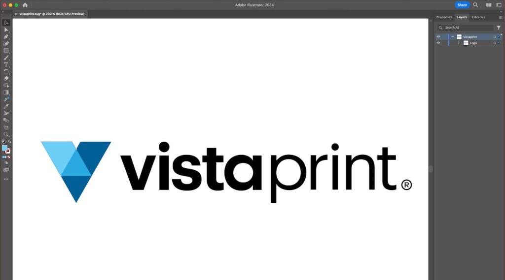
How to edit a logo in Adobe Illustrator
If your logo is not grouped (meaning you can only select one shape at a time), use the Selection Tool to drag a box around and select the entire logo.
The Rotate Tool allows you to rotate the logo clockwise or anticlockwise. To rotate your logo by a specific number of degrees, double click the Rotate Tool in the toolbar to open the Options window, where you can enter more precise increments.
If you’re working with a vector program, adjusting the scale is as easy as selecting the logo and dragging the corner of the box to scale up or down (hold Shift to constrain proportions as you scale, and hold Option to scale from the center). If you’re working with a raster file in a program like Photoshop, navigate to Image > Image Size to scale the logo up or down. The only way to change the size of a raster file is to add or remove pixels, but this reduces the quality, which is why vector files are a much better option for editing a logo.
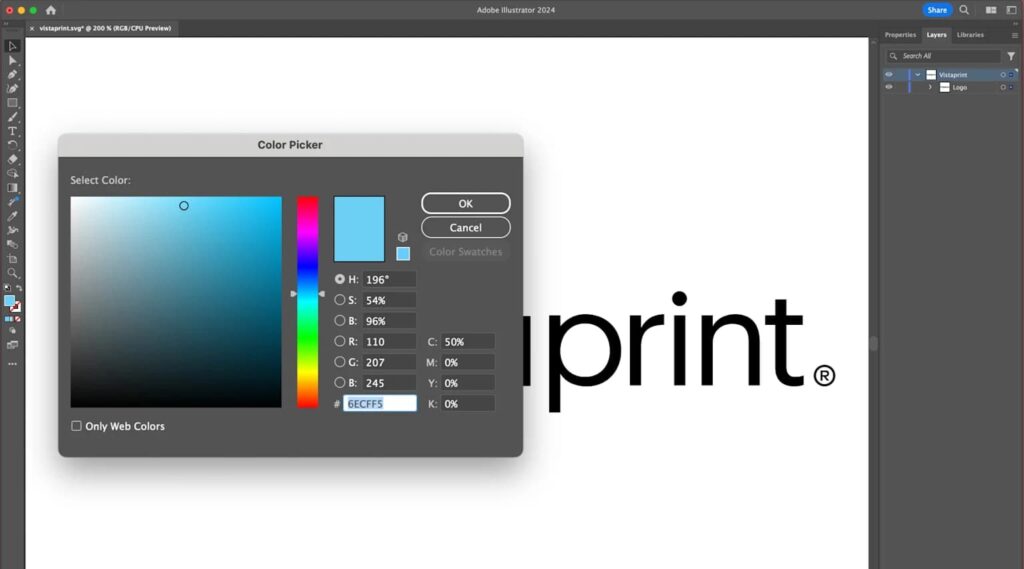
Step 8: Change the colors
To find the color values of your existing logo, select one of your shapes, then double click either the stroke or fill icon to open the Color Picker window where you’ll see the color represented by the different values. Alternatively, use the graphic color mixer on the left of the Color Picker to choose your logo colors by dragging the slider to your desired base hue and clicking Select Color to edit saturation and brightness.
How to edit the colors of a logo in Adobe Illustrator
When editing logo colors, stay consistent with your brand colors and consider how they’ll look and reproduce in different environments, both online and offline. Use RGB or HEX values for digital applications such as apps, websites and digital ads, and CMYK for full-color printing, such as on packaging, textiles or signage.
Create a full-color version of your logo for standard usage, a white version for dark backgrounds, a black version for light backgrounds and a single-color version for limited-color situations. To create a black or white logo, change the six digit HEX code (#) to all 0s for black or all Fs for white.
Test all logo versions on your website and packaging materials, creating real-world mockups and print proofs. Pay attention to contrast and accessibility, particularly when your logo includes small text.
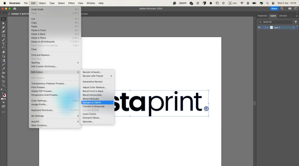
Convert the color mode of your document by navigating to Edit > Edit Colors
If you need to edit the color mode to CMYK for printing or RGB for digital contexts, select your logo, navigate to Edit > Edit Colors > Convert to CMYK (or RGB as the case may be). Before finalizing your colors, get a CMYK version professionally printed to ensure your colors are consistent on and offscreen.
Step 9: Edit the logo text
How to add a tagline to a brand logo in Illustrator
To edit the logo text, you need the font file used in your existing logo (if you’re sticking with the same one). If you can’t find the font, use a font matching service like WhatTheFont. Once you have it, download the font and install onto your computer (you may need to purchase a font license).
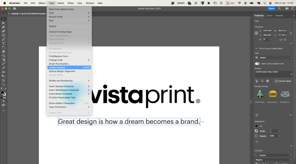
Typically the designer will have outlined the text of your logo, which means that it is converted from an editable font to a static shape. This ensures consistency: if you don’t have the same font the designer used, Illustrator will replace it with a similar one. To edit the text, select and delete it to type in your new text.
If you’re adding text, such as a tagline, make sure to review type design standards and pay attention to spacing and alignment. Once you’re finished, outline the font by navigating to Type > Create Outlines.
Work with a type designer to create (or recreate) an original typeface for your unique logo.
Step 10: Edit a logo’s shape
Editing the shape of a logo requires slightly more knowledge of how vector programs work. Vector shapes essentially come down to points and lines (called Anchor Points and Paths in Illustrator). Clicking on a shape using the Direct Selection Tool reveals these points, so you can adjust them individually.
In Illustrator, vector shapes are made up of points and lines
Click on one of the anchor points attached to a curved line and two handles (bezier handles) will stretch out from it. Dragging one of these handles adjusts the curvature of the line on either side of the anchor point.
To add bezier handles to a corner point, select it and choose the icon in the upper left panel labeled Convert selected anchor points to smooth. The icon next to it, Convert selected anchor points to corners, eliminates the curve. To add or remove a point, use + or – to bring up the Add Anchor Point Tool or the Delete Anchor Point Tool.
Use the handles attached to anchor points to adjust the curvature of a line
The Pathfinder tools, which you can find in Window > Pathfinder are generally more advanced, but include some basic functions for creating and editing compound shapes.
Unite combines two separate shapes, Minus Front subtracts the shape on top and Minus Back subtracts the shape on the bottom (you’ll find the order of your shapes in the Layers panel).
Step 11: Export logos in the right formats
It’s time to export your logos from your vector master, for each context:
- PNG files with transparent backgrounds are best for digital uses, such as websites and social media.
- JPG files are appropriate when you don’t need transparency and want relatively small file sizes.
- PDF or EPS files are widely accepted by printers and preserve vector data for sharp output.
- SVG files are useful for web and apps when you want artwork that stays crisp on high-density screens.
Once you’ve exported your set of logo files, create a simple logo kit—a zipped folder with clearly named assets (for example, brandname-logo-primary-rgb.png, brandname-logo-icon-white-rgb.png, brandname-logo-primary-cmyk.pdf), that you can share with your team, printers and partners.
Step 12: Document edits in your brand style guide and deploy
Once you’ve edited your logo, update your brand style guide to include:
- Rules for logo variations, explaining when to use each.
- Define clear space around the logo and minimum sizes.
- Document your approved color values in HEX, RGB, CMYK and Pantone if applicable.
- Dos and don’ts, such as not stretching or squashing the logo, not changing the colors, not adding drop shadows and not placing it on busy backgrounds.
This clear set of rules helps employees and partners apply your edited logo consistently across marketing and branding assets, protecting your new logo.
Real-world logo edits
Let’s take a look at some well-known logos and their evolutions to see what small businesses can learn.
Mastercard
Mastercard simplified its logo to two overlapping circles with a wordmark, then began using just the circles in most contexts. The shapes and colors are so iconic that the brand is recognizable without the company name.
Takeaway for small businesses: When you have a strong visual identity, simplifying your logo to the essentials can make your logo more flexible and modern.
Burger King
In line with a broader brand update, Burger King’s most recent logo refresh leaned into a retro look with warmer colors and more character.
Takeaway for small businesses: Updating doesn’t always mean modernizing through innovation. Sometimes modernizing means embracing your brand heritage in a more focused, more thoughtful way.
Pepsi
The Pepsi logo evolution brought back bold contrast and a more dynamic, nostalgic feel, while optimizing for digital and motion.
Takeaway for small businesses: Tapping into nostalgia with better contrast and stronger shapes can reconnect a brand with its history and story while improving digital performance across modern contexts.
Gap (the cautionary tale)
Gap’s 2010 logo redesign was a radical shift that dropped key elements people associated with the brand. The backlash was so intense that they reverted to the old logo within days.
Takeaway for small businesses: Drastic change to a logo design without a clear reason, story or testing can backfire on brand recognition and loyalty. When in doubt, refine instead of completely redesigning your logo.
Does your logo need refining or redesigning?
If you’re on the fence about whether to refine or redesign a small business logo, use this decision matrix to ask yourself:
| Question | If “Yes,” you likely should… | Why? |
| Does the logo mostly work but fail at small sizes or in dark mode? | Refine | Fix these issues with weight/contrast tweaks and responsive variations. |
| Has your brand name, offering or positioning changed significantly? | Redesign | Surface-level tweaks won’t align your logo with a new brand identity. |
| Are you changing the typeface, colors and symbol all at once? | Redesign | That’s effectively a new visual identity, and is worth doing properly by hiring a designer. |
| Do customers recognize and like your current logo? | Refine | Keep the distinctive and recognizable parts of your logo, like symbols and colors, and edit to improve it. |
| Is the logo difficult to print, embroider or put on signage? | Refine | Simplify shapes and minimize colors for easier application. |
When in doubt, implement small, strategic refinements, then gather feedback and iterate.
Using AI to edit logos
AI can also be a really helpful cost-effective fast logo editing assistant. Start by locking in what can’t change—your core shape, key color or signature letterform—so brand recognition stays intact. Work with tightly scoped prompts like “thicken strokes for small sizes,” “increase contrast” and “no new symbols.”
When you land on a logo design, convert it to vector and clean the paths by hand: snap points to a grid, fix curves and align geometry. Test at real sizes like a 24-32 px favicon, a social avatar and a business card mockup, so you catch issues before rollout. Specify exact HEX values and create black, white and single-color versions.
Always edit a logo design with care
According to VistaPrint’s 2025 Small Business Marketing Guide, 81% of consumers said it’s important for a business to have a branded website, reinforcing why your logo needs to be great.
You can’t always strike gold on your first attempt at logo design. However, the beauty of the digital age is that almost nothing is set in stone, and easy-to-use design software means most logo edits aren’t difficult to make. At the same time, the logo design process can be more complex than it appears. Take the time to learn how to design a logo and the key principles of logo design, and browse logo inspiration and ideas to ensure you create a unique logo that looks professional.
How to edit a logo FAQs
What is the best software to edit a logo?
Use a vector editor, such as Adobe Illustrator, Affinity Designer, Figma or CorelDRAW, so your artwork stays looking professional at any size. VistaPrint’s easy-to-use tools and templates can help you create a logo in minutes, and apply your logo design to print materials fast.
How can I edit a logo without losing quality?
Work from the vector master (AI, EPS or SVG file formats), avoid upscaling raster copies (PNG or JPG files) because they rely on pixels and will blur, and export size-appropriate assets for each use instead of stretching.
Can I edit an existing logo design myself?
Yes—for color tweaks, text changes or building an icon-only logo variation, you can follow this step-by-step workflow. If your strategy, brand name or audience is changing, that’s a redesign. For logo redesigns, hire a professional to ensure a top-quality logo design.

