“Do I want a logotype or logomark?” It’s one of the first questions you need to ask yourself when looking for a logo (along with “What is a logo?”), because it has huge ramifications on branding, and it’s especially important for small businesses that need every marketing touchpoint to work harder.
If you don’t know the difference between a logotype and a logomark, don’t feel bad. Plenty of people are just as confused as you – enough folks for us to justify writing an entire article about it! If you’re planning a logo design or logo redesign, take a dive below to see if your brand would benefit more from a logotype or logomark, and why.
- A logotype is text-first (your business name or initials); a logomark is image-first (an icon or symbol).
- For many small businesses, logotypes often build name recognition faster, while logomarks shine once customers already know you.
- A combination mark (text + icon) gives you flexibility across signs, social icons, packaging and more.
- Responsive logos (multiple variations) help your logo stay legible everywhere, from mobile headers to storefront signage.
- Tools like VistaPrint’s Logomaker and professional design support can help you go from idea to print-ready branding.
What’s the difference between a logotype and a logomark?
A logotype is a logo centered around a company name or initials, while a logomark is a logo centered around a symbolic image or icon. The general term logo refers to all marks that represent a brand. So, when a designer asks whether you want a logotype vs. a logomark, they’re really asking if you want a text logo or a picture logo. Logotypes are also often referred to as wordmarks or lettermarks, while logomarks are also known as pictorial logos or logo symbols.
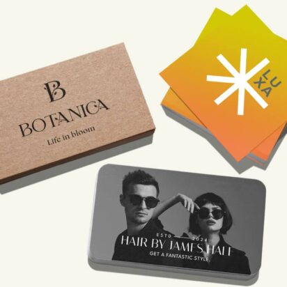
Examples of logotypes:


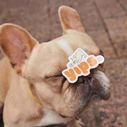
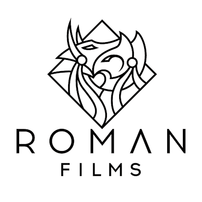
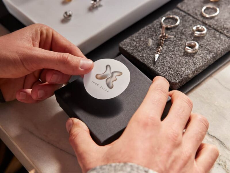
Examples of logomarks (or pictorial marks):


Where it gets confusing is when the lines between them blur. A lot of logos have both text and a picture. Some logos have text that forms a picture. So really, the anatomy of a logo includes three choices. It’s not just logotype vs. logomark, it’s more like logotype vs. logomark vs. a combination.
You don’t have to pick one forever. Many small businesses start with a logotype, then add a logomark later once the name is familiar.
It’s also worth noting that recently, companies have been using more than one logo. A trend known as variable or responsive logo design recommends having different logo variations depending on where they’re located. For example, the same company might use a logotype for their email letterhead, a logomark for the corner of their mobile website and a combination for a giant street billboard. By having multiple logos, you can select the best one for wherever you put them.
So, to sum it up, when you see logotype, think text, and when you see logomark, think picture – and don’t forget that they can be combined. When asked which one you want, remember you can choose more than one, depending on where and how you plan to use your logo.
Whichever route you choose, prioritize legibility and contrast so your logo is easy to read online and in print.
What is a logotype?
Logotypes encompass all logos that involve text or letters, whether the company’s name, initials (monograms) or sometimes a person’s signature. A logotype tends to promote name recognition and is associated with more traditional and formal approaches to branding. For a small business, that name recognition can be your biggest win, especially when you’re still growing word-of-mouth and local visibility.
The success of a logotype depends on how well the typographic style matches the brand’s identity. Black, bold letters suggest a strong and stable brand, but colorful, loopy cursive letters suggest a more fun and casual company.
Pick a style that matches how you want customers to feel when they see your truck, storefront, website and receipts, because the type is doing emotional work.
Don’t make the mistake of thinking logotypes are easier than the other options. In fact, you could argue that they’re harder to design than logomarks: Both require design choices like composition, sizing and color, but logotypes also have to deal with typographic choices on top of that.


The pros of logotypes:
- Comes across as traditional and classic (so be sure that’s what you’re going for).
- Ideal for name recognition.
- Ideal for brand awareness.
- Allows an opportunity for puns and wordplay.
- Can provide information about the company.
- No risk of brand confusion (because your name is right there).
If customers are likely to find you through referrals, putting the name front and center helps that referral convert faster.
The cons of logotypes:
- Don’t fit every location – logomarks tend to be more compact.
- Fewer options for creative designs, not as fun as logomarks.
- Doesn’t work as well for long or hard-to-pronounce brand names.
- Certain letters have more artistic opportunities than others.
- Font trends change over time, so stagnant logotypes may appear dated after a few years.
If your business name is long, consider an intentional abbreviation (initials/monogram) as a secondary logo for hats, stickers and social icons.
What brands are logotypes recommended for?
- New brands that want people to learn their name.
- Brands whose name reveals some information about what they do.
- Brands that want to incorporate their slogan into their logo.
- Brands in formal industries like finance and law.
- Brands that want to leverage a famous name.
- Brands going for a sophisticated or historical approach (monograms work well here).
How to design the perfect logotype:
- Double down on your typography expertise. You need to understand concepts like kerning, strokes, leading and ligatures to learn how to use them most effectively.
- Test your logotype at different sizes to make sure it’s always legible.
- Create a version of your logotype that’s monochromatic. This will come in handy if you’re printing your logo on marketing swag or on paper.
Having a one-color version often saves money and prevents surprises on embroidery, stamps and single-ink packaging.
What is a logomark?
To be iconic, you first need an icon. Logomarks depict certain concepts or ideals in the same way a stick figure depicts a person. In the right hands, a logomark can be a powerfully influential tool capable of reversing how people view your entire brand identity. A strong icon can be memorable on a storefront window, a sticker on a takeout bag, or a profile photo – places where your full name might not fit.
While logotypes have the force of language behind them, logomarks have to make the most out of visual communication. Different logo shapes convey different ideas and characteristics: Circles tend to come across as playful and casual, whereas squares denote stability and confidence. You can manipulate abstract shapes to create a new visual unique to your brand. The same goes for colors, size and use of negative space.
Alternatively, you can use a popular image as a shortcut to expressing your brand personality. Nothing says wisdom like an owl, or maybe you want to flaunt your environmental sensibilities with a leaf-like logo, like in the example below for Uprooted. The freedom of using pictures can also help explain what your business does with an illustration to broadcast your services.
If you use a common symbol (like a leaf, house or cupcake), add a distinctive twist – unique shape, negative space or an unexpected detail – so you don’t blend into a sea of similar logos.
The pros of logomarks:
- Highly personalized and unique (if designed well).
- Unbridled creativity.
- The right image can capture and convey complex ideas – a picture is worth 1,000 words.
- Very flexible in how it can be applied; great for depicting a variety of brand characteristics.
- Can be enlarged or compressed to fit a variety of locations.
Icons are especially handy for small, high-frequency placements like social avatars, app icons, stickers and loyalty cards.
The cons of using a logomark:
- Can slow down brand recognition for new brands.
- May require graphic design expertise for the full effect.
- Runs the risk of creating an emblem that looks too similar to another logomark.
If you’re new, pair the logomark with your business name early on (even temporarily), so customers learn the connection faster.
What brands are logomarks recommended for?
- Brands whose company name is an object or animal: Apple’s apple, Shell’s shell, Penguin’s penguin.
- Emerging brands seeking a radical rebranding.
- Brands whose services or products require explaining; a logomark’s image can demonstrate what a company does.
- A popular icon or symbol that already represents your brand identity, i.e., scales of justice for a law firm.
How to design the perfect logomark:
- Review popular icons and symbols to see if any speak to you or your brand. Your perfect logo may already exist as an Egyptian hieroglyphic, for all you know. Though make sure you can legally use what you create – avoid copying recognizable symbols too closely, and don’t rely on clip-art that others can license.
- Consider creative combinations of images. For example, the Bluetooth logo combines the initials of Harold Bluetooth in Viking runes.
- Match an artistic style to your brand identity. A scratchy, hand-drawn logo conjures different emotions than a glossy, digital one.
Combining a logotype and a logomark into a combination mark
If you’ve been reading along both entries for logotypes and logomarks, you might be asking yourself, why not both? In many cases, combining logotypes and logomarks into one creates a more effective logo than each on its own. For small businesses, combination marks are often the most practical starter set: Customers learn your name while also getting used to your icon.
Basically, combining logotypes and logomarks gives you the best of both worlds, but sometimes you lose the advantage of one or the other. Don’t forget you can have multiple logos, so having one of each ensures you can always use the perfect choice for the perfect location.
Think of your logo system like a toolkit – full logo for your website header, a stacked version for flyers and an icon only for social and labels.


The pros of combining a logotype and logomark:
- Boosts name recognition for unknown brands that still want to use a logomark.
- Can be creatively combined for visual wordplay or a more meaningful message.
- You get the benefits of both.
- Also great for print – your name stays readable while the icon adds personality on packaging and signage.
If you’re launching locally (one city, one neighborhood), combination logos help you build recognition quickly across signs, menus and social posts.
The cons of combining a logotype and logomark:
- By combining logomarks and logotypes, the result is usually bigger than each separately, making it harder to see and read at smaller sizes.
- Can seem clunky or obtrusive in more streamlined locations.
Design a simplified, small-size version (initials or icon) so you’re not forcing the full logo into tiny spaces.
What brands are a combined logotype and logomark recommended for?
- Unknown or new brands that want to build recognition for their logomark.
- Established brands going through rebranding.
- Brands that have a clever idea for how to combine logotypes and logomarks into a unified logo.
How to effectively combine a logotype and logomark:
- Proactively look for ways to merge the two into one. Maybe one letter extends a stroke to become part of the logomark, or maybe the way the letters combine creates a part of the logomark. Aim for a clear silhouette – if your shape becomes fuzzy or complicated, simplify.
- Use consistent colors and styles to unify the two together. Limit your palette (often one to two main colors) so your brand feels consistent and prints reliably.
- Experiment with how you stack them. Sometimes, you’ll need a tall logo with the logomark above the logotype, and sometimes you’ll need a wide logo with the logomark and logotype in a horizontal line. Create both layouts up front so you’re never stuck forcing a logo into the wrong space.
Choose the type of logo that fits your brand
When it comes to logos, you have so many options to choose from. It’s crucial that you pick a logo that perfectly represents who you are as a brand. Still unsure what kind of logo is right for you? Take a look at our article on the different types of logos that take you through all your options and how to use them. And if you’re a small business that needs to move quickly, consider starting with a strong baseline logo you can actually use everywhere, then refine once you see what resonates with customers.
Remember: Your logo is your most important branding asset, so do everything you can to get it right. Make sure you take the time to learn how to design a logo. Or, if you’d rather get to a usable result faster, tools like VistaPrint’s Logomaker can help you create a polished logo and generate the files you need for real-world uses (business cards, signs, packaging and branded merch).
FAQs
What’s the biggest mistake small businesses make with logos?
Choosing a logo that looks good in one place but fails everywhere else, like a detailed icon that disappears on a phone screen or thin lettering that won’t print well. The fix is to test early (tiny, normal, huge) and build a small set of logo variations you can reliably use.
Which is better for a brand-new small business?
Often, a logotype (or a combination mark) is easiest because it helps people learn and remember your business name immediately, especially on signage, invoices and local ads where first impressions matter.
How does my logo connect to branding and brand identity?
Your logo is one of the fastest ways customers recognize you, but it works best as part of a system – colors, typography, tone of voice and consistent placement across everything you put into the world.
Where should I plan to use my logo before I finalize it?
Think beyond your website: social profiles, email signature, invoices, packaging, storefront signage, uniforms, vehicle decals and print marketing like business cards, flyers and menus.
How can I create a logo if I’m not a designer?
You can use a logo maker tool (for example, VistaPrint’s Logomaker) or templates to generate a style you like, then refine fonts, spacing and color. If you want something more custom, professional design help can elevate your concept while keeping it production-ready.