Brochures remain a cornerstone of marketing collateral for small businesses because they’re tangible, practical and persuasive. Handing someone a brochure gives them something to hold onto long after a meeting or event, making it one of the most effective ways to showcase products, services or your brand story.
But before you dive into design, there’s a big decision to make: the fold. Brochure folds shape how your message is revealed and guide readers through your content. In this guide, we’ll break down three of the most common brochure types—bi-fold, tri-fold and Z-fold—and show you how to pick the right fold for your project, audience and goals.
- The main brochure types are bi-fold, tri-fold and Z-fold, each with its own structure and best use cases.
- Bi-fold brochures (one fold, four panels) are ideal for large visuals and short, impactful messages where simplicity and polish matter.
- Tri-fold brochures (two folds, six panels) are perfect for step-by-step storytelling and moderate amounts of content in a familiar, portable format.
- Z-fold brochures (two folds in alternating directions, six panels) work best for timelines, processes, and campaigns where sequential flow and interactivity enhance the reader experience.
- To choose the right brochure fold, match the format to your content, audience expectations, design priorities and distribution needs.
Why brochure folds matter
When you’re planning a brochure, it’s tempting to focus only on the words and visuals. But the way your brochure is folded plays just as big a role in how it’s received.
The fold is what shapes the reading experience, guides attention and determines whether your carefully crafted message lands smoothly or gets lost in clutter. Think of this as the structural backbone of your brochure; it dictates how the story unfolds (literally) in the customer’s hands.
Here’s why brochure folds matter:
- Built-in structure: Whether you’re laying out service categories, a timeline or a product showcase, each fold carves your brochure into distinct sections and gives you a ready-made framework for dividing content.
- Guided flow: Beyond structure, folds dictate the order readers encounter information. A tri-fold lets you build a story panel by panel, while a Z-fold creates a step-through reveal.
- First impressions: The fold shapes how your brochure looks and feels the moment someone picks it up. Sleek bi-folds feel polished, while multifold options create a sense of discovery.
- Practical usability: Portability and handling come down to the fold. A compact tri-fold slips into a pocket or bag, while a bi-fold offers larger panels for bold visuals.
- Design possibilities: Each fold opens unique creative opportunities. A Z-fold can create a panoramic spread, while a bi-fold gives you full-page real estate to make one big idea shine.
- Fit for purpose: The fold you choose should match your goal. A tri-fold works well for menus or step-by-step guides, a bi-fold is great for highlighting a single product line, and a Z-fold is ideal when you want content to be revealed in stages.
Check out our guide to brochures for more on what shapes the look and feel of a brochure beyond the fold.
The 3 most common brochure types
Now that we’ve established why folds matter, let’s dig into the three brochure types you’ll encounter most often. Each one offers its own structure, flow and creative potential.
Bi-fold brochures

A bi-fold brochure is the simplest format: one fold down the center, giving you two panels on the front and two on the back. Sort of like a booklet without the staples.
This type is a strong fit when you need large visuals or want to focus on a small number of key messages. Product catalogs, corporate overviews and real estate listings often rely on bi-folds because the wide panels let photography and bold design elements breathe. A restaurant might also use a bi-fold for a streamlined, upscale menu that looks polished on the table.
Pros and cons of bi-fold brochures
| Pros of bi-fold brochures | Cons of bi-fold brochures |
|---|---|
| Wide panels allow impactful images and layouts | Less space for detailed text |
| Simple, professional look | Limited panel count restricts content flow |
| Easy for readers to navigate | Can feel too minimal for complex information |
| Works well for premium, visual-heavy projects | May require larger paper size for enough detail |
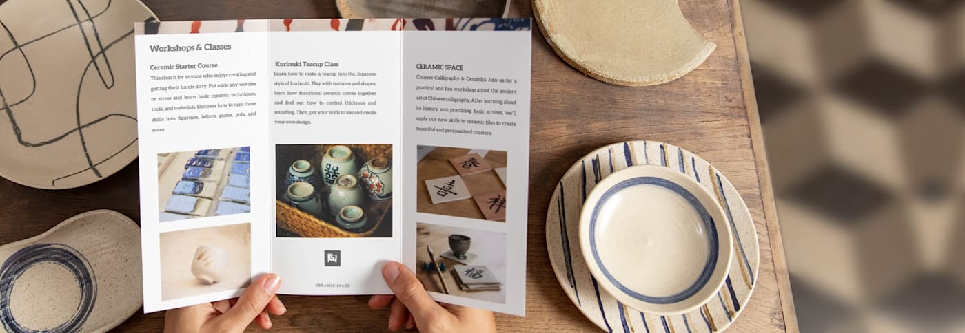
Tri-fold brochures

A tri-fold brochure uses two folds to create six panels—three on each side. This structure is the most common because it gives you a natural storytelling path.
Tri-folds excel when you want to guide readers step by step. Event promotions, travel guides and product or service overviews all benefit from the logical panel progression. Hand one out at a trade show, and attendees can quickly flip through information in the exact order you want them to see it.
Pros and cons of tri-fold brochures
| Pros of tri-fold brochures | Cons of tri-fold brochures |
|---|---|
| Compact and easy to carry | Narrow panels can limit image size |
| Built-in progression for step-by-step info | Can feel crowded if overloaded with text |
| Familiar format that audiences recognize | Less premium feel than bi-folds |
| Cost-effective and versatile | Not ideal for large visuals or maps |
Z-fold brochures

Just like tri-folds, Z-fold brochures also have six panels, but instead of folding inward, the paper alternates direction to create a zig-zag. When opened, it stretches into a continuous sequence that’s easy to unfold and refold without confusion.
This format shines when you’re laying out processes, timelines or storytelling campaigns. Tech companies use it to explain product features in stages. Event organizers like it for schedules because each panel can hold a day, location or set of activities. It’s also popular for instructional content since each step gets its own panel, with room for visuals.
Pros and cons of Z-fold brochures
| Pros | Cons |
|---|---|
| Panels open sequentially, great for storytelling | Less common format, may surprise readers |
| Unfolds into a long, continuous spread | Can be tricky to design across multiple directions |
| Easy to separate content into stages | Slightly less compact than a tri-fold |
| Offers unique, interactive feel | Not always suited for single-topic brochures |
Bi-fold vs. Tri-fold vs. Z-fold brochures: A comparison table
To see how these brochure types stack up side by side, here’s a quick reference:
| Brochure type | Panel count | Space for text/images | Best for (use case) | Design strengths |
|---|---|---|---|---|
| Bi-fold | Four panels | Large visuals, concise text | Product catalogs, menus, corporate overviews | Clean, premium look with wide panels |
| Tri-fold | Six panels | Balanced space for text and images | Event promos, travel guides, service overviews | Logical flow, compact, versatile |
| Z-fold | Six panels | Sequential layout, step-by-step visuals | Timelines, schedules, process explanations | Unique zig-zag reveal, continuous spread |
Not sure if you need a flyer instead? Check our guide on what a flyer is and see how flyers vs. brochures vs. pamphlets differ.
How to decide which brochure fold is right for you
You’ve seen how bi-fold, tri-fold and Z-fold brochure folds compare. The next step is figuring out which one fits your project best. The right choice depends less on preference and more on the practical details of your content, audience and goals.
Keep these factors in mind before you commit to a fold:
Amount of content
Count how many sections or ideas you need to present. A bi-fold works if you’re only covering one or two key points with minimal text. If you need to break down multiple services, explain a process in stages or include both text and visuals without cramming them together, a tri-fold or Z-fold will give you the extra panels to do it cleanly.
Design priorities
Identify whether visuals or text carry the weight of your message. Wide bi-fold panels let large photos, floor plans or product hero shots dominate the page. If your message relies on building a logical sequence—like an introduction, details and next steps—a tri-fold or Z-fold provides a panel-by-panel structure that naturally guides readers.
Audience expectations
Think about how familiar your readers are with brochures. A tri-fold is instantly recognizable and requires no effort to navigate, which works well for general audiences.
On the other hand, a Z-fold feels more interactive and is better suited if your audience is open to creative formats or if you want to surprise them with an unfolding story.
Portability and distribution
Match the fold to how you plan to get brochures into people’s hands. For trade shows and events, go with a tri-fold or Z-fold that tucks easily into a pocket or bag. For direct mail, make sure the brochure folds flat to fit a standard envelope without extra postage. If the brochure is meant to be displayed on tables or handed out in person, a bi-fold can make a strong impression with its larger panels.
Purpose and use case
Align the fold with the job you want the brochure to do:
- A bi-fold makes sense for premium catalogs, high-end menus or property listings where the visuals need space to stand out.
- A tri-fold works well for travel guides, service menus or fitness class schedules where readers follow a clear sequence.
- A Z-fold is best for timelines, event schedules or step-by-step instructions where the zig-zag flow reinforces the content.
Budget and printing needs
While none of these folds will break the bank, there are small differences. Bi-folds use less folding and may save a bit on design setup. Tri-folds and Z-folds require more layout planning and sometimes slightly higher print costs, especially if you’re ordering in smaller runs.
Heavier paper and quality finishes instantly upgrade the look of your brochure, no matter which fold you go with.
Choose a bi-fold brochure when…
- You want a straightforward format with a clean, open canvas.
- Your message relies on large visuals, product photos or hero images that need uninterrupted space.
- You’re designing restaurant menus, real estate listings, event programs or premium catalogs that should feel polished and easy to skim.
- You only need to highlight the essentials without diving into detailed explanations.

Choose a tri-fold brochure when…
- You want a tried-and-true layout that customers instantly recognize.
- Your story benefits from a step-by-step flow—ideal for guiding readers from an introduction through to a call-to-action.
- You have a moderate amount of content: multiple services, product features or short blocks of text alongside supporting visuals.
- You need something compact and portable that slips into a bag, folder or envelope.
- Best for tourism brochures, fitness class schedules, corporate overviews or service menus.
If you’re unsure which way to go, the tri-fold is often the safest bet. It balances space, flow and familiarity in a way most audiences will respond to.

Choose a Z-fold brochure when…
- You want a format that feels dynamic and reveals information in stages.
- Your content divides naturally into separate sections but still needs to flow as one continuous piece.
- You’re showcasing timelines, processes, event schedules or campaign journeys that unfold step by step.
- You want a less common format that sparks curiosity and encourages readers to keep opening.
- Ideal for music festival programs, instructional guides, product launch roadmaps or creative brand storytelling.

Bring your project to life with the right brochure fold
Way more than a finishing touch, brochure folds set the stage for how your message is read, understood and remembered. Choosing between a bi-fold, tri-fold or Z-fold comes down to matching the format with your content, your audience’s expectations and your design goals.
When the fold supports the story you want to tell, the entire brochure works harder for your business!
Of course, the fold is only part of the equation. Paper quality, print clarity and finishing details all play a role in how professional your final piece feels. To make the most of your design, you’ll want to partner with a printing service that delivers top-quality results consistently.