In the competitive world of business, making a lasting impression is crucial.
Unfortunately, choosing the right colors for your signage is often overlooked when creating a strong visual impact. Colors not only influence visibility but also evoke emotions and contribute to brand recognition. In this article, we’ll go over the nuances of selecting the perfect signage colors for your business.
Navigating the impactful world of colors
Deciding on colors can seem like a mysterious talent that designers and visual thinkers have and others just can’t seem to manage. While some people do have an intuitive sense for color combos, color theory and pairing colors is a science and can be easily learned. Here are some helpful considerations to guide you.
Colors: more than aesthetics in signage
In the intricate world of signage, colors transcend mere aesthetics, emerging as a potent tool to mold visibility, mood and brand perception.
Distance and visibility: the dynamics of high contrast colors
Whether targeting individuals at a distance or contemplating the interplay of colors against various backgrounds, the choices you make can amplify—or dilute—your message. Amid the chaos of a bustling environment. imagine bold colors against neutral backdrops, ensuring that your signage catches readers attention and clearly communicates your message.
Consistency in color: building trust and recognition
Consistency in color use is a cornerstone for building customer trust and fostering brand recognition. Look no further than IBM, where the steadfast use of blue and white colors is now synonymous with reliability and professionalism.
To maximize the impact of colors on your brand, apply the concept uniformly across all customer touchpoints. Consistency in color use strengthens your brand identity, making it easily recognizable and memorable for your audience.
While your business signs do not always have to follow your brand coloring, we recommend using a brand color palette to inform your ongoing sign color combinations. If you don’t yet have a brand palette or if you need to refresh yours, here are some helpful resources.

Source: by bo_rad
Whether targeting individuals at a distance or contemplating the interplay of colors against various backgrounds, the choices you make can amplify—or dilute—your message. Amid the chaos of a bustling environment. imagine bold colors against neutral backdrops, ensuring that your signage catches readers attention and clearly communicates your message.
Consistency in color: building trust and recognition
Consistency in color use is a cornerstone for building customer trust and fostering brand recognition. Look no further than IBM, where the steadfast use of blue and white colors is now synonymous with reliability and professionalism.
To maximize the impact of colors on your brand, apply the concept uniformly across all customer touchpoints. Consistency in color use strengthens your brand identity, making it easily recognizable and memorable for your audience.
While your business signs do not always have to follow your brand coloring, we recommend using a brand color palette to inform your ongoing sign color combinations. If you don’t yet have a brand palette or if you need to refresh yours, here are some helpful resources.
- Everything you need to choose your brand’s color palette
- How to choose brand colors with color theory
Mood and perception: the psychology of colors

Source: by Roma@n
Colors extend their influence even further by shaping brand perception. Take, for instance, black. Black has long been synonymous with sophistication, power and a timeless sense of elegance. It carries an air of authority and commands attention, making it a popular choice in various contexts, from fashion to design. Now, imagine harnessing the power of black in your signage, accentuated with yellow and white elements.
Yellow, associated with warmth and optimism, adds a dynamic and cheerful element to the combination. It injects energy into the overall mood, making the signage not just authoritative but also inviting and vibrant.
White, with its connotations of purity and simplicity, complements the pairing by providing a clean and sophisticated backdrop. It enhances legibility and ensures that the overall design remains sleek and polished.
Every color has its own host of connotations based on culture and situation. It’s important to consider the impressions colors have in people. Before diving into design, we suggest taking a moment to review the essential elements of color psychology in business marketing.
Understanding color psychology

Source: by ludibes
As mentioned above, color psychology plays a pivotal role in conveying messages and emotions through signage. Consider the following:
- Calming blues and greens: These shades are your go-to for brochures promoting wellness services. Why? Because they align perfectly with the psychological impact of calming tones, fostering a sense of tranquility that speaks to your audience.
- Energetic reds and oranges: Promoting events or high-energy products? Reds and oranges are your dynamic duo. Their vibrant hues stimulate enthusiasm and create a sense of urgency, effortlessly capturing attention because they mean business.
- Warm yellows for optimism: Picture this—your brand colors associated with joyous occasions, radiating optimism, happiness and positivity. How? With warm yellows that create an uplifting and inviting atmosphere. It’s all about setting the right mood.
- Neutral tones for professionalism: When it’s all about professionalism and reliability, think grays, and soft browns. These neutral tones are associated with stability and trustworthiness, making them your go-to for a variety of contexts because they mean business.
- Dynamic contrasts for technology focus: In the tech game? Vibrant blues paired with whites are your secret weapons. They suggest innovation, modernity, and cutting-edge technology, appealing directly to a forward-thinking audience. Why? Because you’re on the cutting edge.
- Bold blacks and whites for minimalism: Embrace minimalism with bold blacks and whites, creating a clean and sophisticated look. This palette is your ticket to modern and sleek branding, making a powerful visual impact because their simplicity speaks volumes.
Understanding the psychology and strategic application of colors in signage is crucial for effective communication. Whether aiming for a calming effect, energetic appeal, warm optimism, professional reliability, dynamic innovation or sleek minimalism, the right color choices elevate your brand message and leave a lasting impression.
Color wheel combinations for signage

Source: via 99designs by Vista
In the vibrant world of marketing, the strategic use of color can be the secret ingredient that sets your brand apart. Understanding color wheel combinations unlocks a powerful tool for crafting compelling visuals that resonate with your audience, driving engagement and reinforcing brand identity in the competitive landscape of business.
Complementary color combinations
Complementary colors are pairs of colors that sit opposite each other on the color wheel, such as red and green or blue and orange. When used together, they create contrast and vibrancy, making each other appear more intense, and are commonly employed in design and marketing for their visually striking effects.

Source: by traffikante
Embrace the power of complementary color combinations by selecting hues that starkly contrast each other. Picture vibrant red set against a green background, producing a dramatic and attention-grabbing impact that commands attention. It’s the skillful use of visual contrast to its fullest potential.
Other examples besides red and green:
- Fiery oranges paired with cool blues for a dynamic and energetic appearance.
- Deep purples contrasted with bright yellows for a vibrant and lively design.
Analogous color choices
Analogous colors are groups of colors that are adjacent to each other on the color wheel, such as red, orange, and yellow. These colors share similar undertones and create harmonious combinations, making them ideal for creating cohesive and visually pleasing designs in various contexts, including branding and interior decorating.
Explore the world of analogous color choices to achieve a subdued and cohesive look. Opt for colors that harmoniously reside side by side on the color wheel. Envision seamlessly merging various shades of yellow and orange, resulting in a welcoming and warm color palette that invites engagement. It’s the art of creating a visual story that exudes familiarity and warmth.

Soure: by cindric
Other examples besides yellow and orange:
- Muted greens combined with soft blues create tranquil and soothing ambiance.
- Blue and green invokes a harmonious and visually pleasing experience.
- Soft purples paired with pinks embody a gentle and cohesive look.
- Earthy tones such as browns and greens soothe with their natural and calming effect.
Primary colors for signs
Bright and vibrant primary colors—red, blue, and yellow—take the spotlight in this context.
Why? Because of their exceptional effectiveness.
Inherently bold, they stand out against various backgrounds and lighting conditions, ensuring that the message is clear and eye-catching. Additionally, primary colors have strong psychological associations.
- Red evokes excitement and urgency.
- Blue conveys trust and reliability.
- Yellow represents energy and positivity.
These innate associations help reinforce the intended message or brand identity. All in all, they amplify visibility and captivate attention, especially in signage. Elevate your message and guarantee prominence and memorability with vibrant primary hues.
Impactful secondary colors
Now, shifting our focus to secondary colors. Secondary colors are hues formed by mixing two primary colors together, resulting in orange, green, and purple. These colors are crucial in art, design, and color theory, providing a broader palette for creativity and enabling a diverse range of visual expressions.
Purple embodies luxury, creativity, and sophistication, making it a top choice. Combining contrasting secondary hues, such as orange with teal, can revolutionize brand signage by boosting attention-grabbing qualities. Why does this work? Because it improves readability and accentuates crucial elements.
Nuanced tertiary colors
Tertiary colors bring nuance into play. They’re created by mixing a primary color with a neighboring secondary color on the color wheel, such as red-orange or blue-green. As a blend of primary and secondary hues, these colors offer subtleties and versatility in signage. Explore the spectrum of tertiary color combinations, because finding that perfect balance is key.
Strategic use of colors in outdoor signage is a powerful tool for communication
Whether opting for the bold impact of primary colors, the luxurious touch of secondary hues, or the nuanced sophistication of tertiary blends, your color choices can transform outdoor signs into attention-grabbing, visually appealing statements that leave a lasting impact.
Maximize impact with our color tips for small business owners
Align colors with brand identity
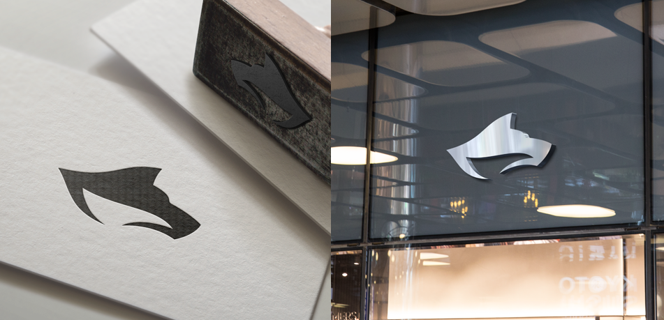
Consistency is key. Align your color choices across all branding materials, including signage, with your brand identity. Why? Because it fosters brand recognition and reinforces your unique visual identity. It’s like your brand’s signature—consistent, memorable and uniquely yours.
Source: by Roma@n
Adapt hues to cultural preferences
Now, let’s talk about cultural finesse. Small business owners, be mindful of cultural preferences when selecting colors for your signage, especially if you serve a diverse audience.
Why? Because colors carry different meanings in various cultures.
Choose hues that resonate positively and, most importantly, avoid potential cultural sensitivities to create an inclusive brand that speaks to everyone in the language of color.
Key takeaways for picking colors for business signage
As we conclude this colorful journey into the world of business signs, let’s revisit the essentials!
- Understand the impact of colors on contrast, visibility, mood and brand perception.
- Dive into color psychology and choose hues that align with your brand’s personality.
- Master the art of crafting harmonious color schemes, complementary combinations and analogous choices.
- Optimize outdoor signs with primary, secondary, and tertiary colors for maximum impact.
To transform these insights into a visual masterpiece for your business, start exploring VistaPrint’s custom signage options and bring your brand to life. If you are looking for a sign design or unique logo design for signage, check out 99designs by Vista—unleash the creativity of a global design community to craft a unique and captivating visual representation of your brand!
Ready to find the perfect signage color for your business?
Check out all your sign options and bring your design to life! Let’s go
