Retail packaging design can help your products compete with bigger brands. In stores, shelf interruption is a visual technique used to break the uniform pattern of a retail aisle using visual contrast, unexpected shapes and color breaks. These interrupt mindless browsing and help the autopilot shopper notice your product. But getting noticed is only the start – your packaging also needs to make it easy to understand what you’re selling and why it’s worth buying.
This guide explores how to apply buyer psychology to retail packaging design decisions. You’ll learn how to choose colors, materials and finishes to help your product stand out on the shelf.
- Shelf interruption packaging stands out using color, shape or visual contrast.
- To test packaging design, see if a customer can identify your brand, the product and why they should choose it using the 3-second rule.
- Shelf height and surrounding display all influence how easily shoppers notice a product.
- Sturdy paperboard and a tactile finish can help communicate product quality.
- Order packaging samples to check the look and feel before committing to large orders.
Shelf interruption and retail packaging design
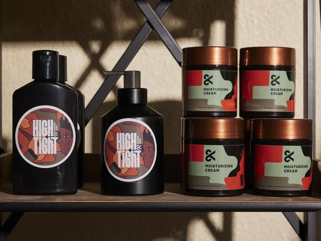
Autopilot shoppers tend to look for familiar logos or colors before reading labels, making it easier for recognizable brands to sell their products and harder for smaller brands to compete. For retail packaging that stands out from the other products on the shelf and grabs customers’ attention, use color breaks, unexpected shapes and visual contrast for shelf interruption.
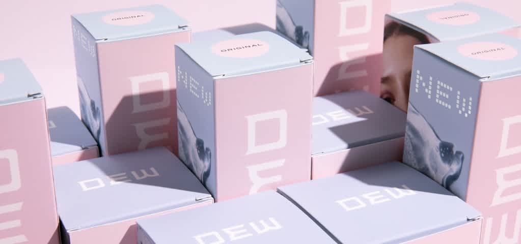
For example, a light-colored box might stand out next to brightly colored packaging, while a distinctive pattern could draw attention beside understated packaging. The boldest packaging design isn’t always the most noticeable – it’s what interrupts the visual pattern on the shelf.
To put shelf interruption into practice:
- Consider the surroundings. Note the colors and shapes of the other packaging on the shelf, then consider how your packaging could offer something different.
- Choose one main point of contrast. Try a distinctive pattern or unexpected shape to get your product noticed.
- Test shelf interruption packaging. Ask a consumer what catches their eye on the shelf.
Shopper psychology and how it drives in-store decisions
Cognitive heuristics are mental shortcuts that help shoppers make decisions quickly. A sturdy box is a sign of product quality, while familiar branding is an easy choice. These visual cues can shape customer perceptions, all before they look at the product label.
For small businesses, the psychology of retail display starts with understanding what visual information customers need quickly. Here’s how visual merchandising psychology can inform packaging decisions:
- “I recognize this brand.” → Use brand colors and fonts consistently across packaging.
- “This looks like what I need.” → Make the product category and variant easy to identify.
- “This looks worth the price.” → Choose materials that support your brand positioning.
Choice overload means too much visual or written information on packaging causes shopper hesitation. Limit design noise to help a single brand message stand out instantly, communicate one main benefit and use consistent layouts. For example, a soap brand should put the scent in the same place on every product box, helping customers compare fragrances easily.
The 3-second rule: Front packaging information hierarchy
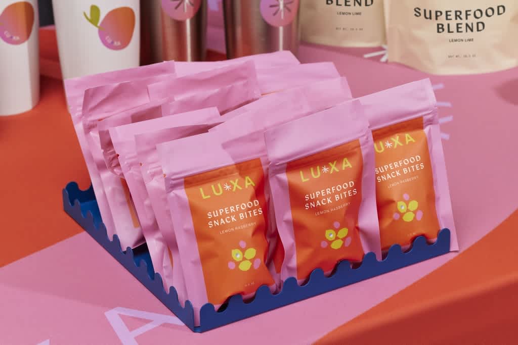
The 3-second rule tests whether shoppers can quickly identify your brand, product category and key benefit within three seconds. To test this, show someone your packaging for three seconds and ask them what the brand is called, what the product is and why they would buy it.
Use the front of your packaging to make important information clear using visual hierarchy:
| Information | What shoppers need to know | How to communicate it |
| Brand name | Who are they buying from? | Give your brand name or logo a clear position with enough space around it. |
| Category clarity | What are they buying? | Use a simple product description, such as “ground coffee”. |
| Key differentiating hook | Why should they buy it? | Highlight one specific key benefit for customers. |
It’s tempting to use the front panel to explain everything you love about your product. Instead, use plenty of whitespace and choose the message that’s most likely to persuade someone to buy it. Then, any supporting information can be printed on the sides or back of product boxes.
Common small business packaging mistakes include cluttered designs, confusing visuals or hidden product claims. When choosing fonts and colors for custom retail packaging design:
- Make information readable at arm’s length. Your product description and main benefit should be easy to read at a glance, so use a minimum font size of 8pt.
- Use high contrast text on a clear background. Dark type on a light background is most readable. Avoid placing text over busy patterns.
- Print packaging at its actual size. Check whether text is readable under store lighting.
Place your packaging on the shelf next to similar products. Ask a few people what they think it is, which detail they noticed first and what they’d still need to know before buying.
With promotional packaging, the seasonal or campaign message should be easy to understand without hiding the product name or benefit, keeping your branding recognizable.
Visual merchandising: Color, shape and eye-level positioning
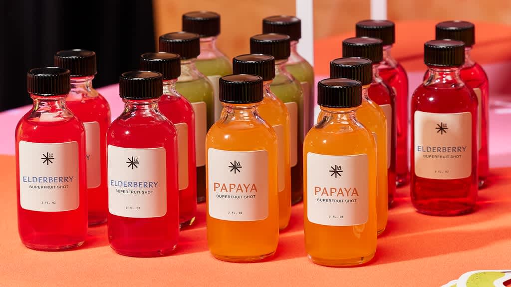
Eye-level positioning means placing products where shoppers can easily see them while browsing. You might hear the phrase “eye level is buy level,” but the right height really depends on the display layout. For store display product placement, consider how easily someone can spot and reach your product.
If possible, try different positions and track what sells while keeping prices and promotions consistent. If another retailer stocks your products, ask where they’ll be placed before finalizing your packaging design. Check that the main message stays visible above shelf-edge labels.
Choosing colors using color psychology
Color psychology in retail displays is about the associations colors bring to a product, although these vary with the audience and context. For example, red communicates energy or urgency, green evokes nature and wellness, while blue communicates calm or trust.
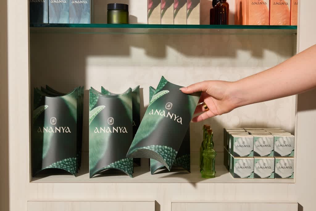
Different shades can help shoppers understand flavors or scents, provided each variant also has a clear written label. Keep branding consistent so the products still look cohesive.
Matching packaging to the retail display
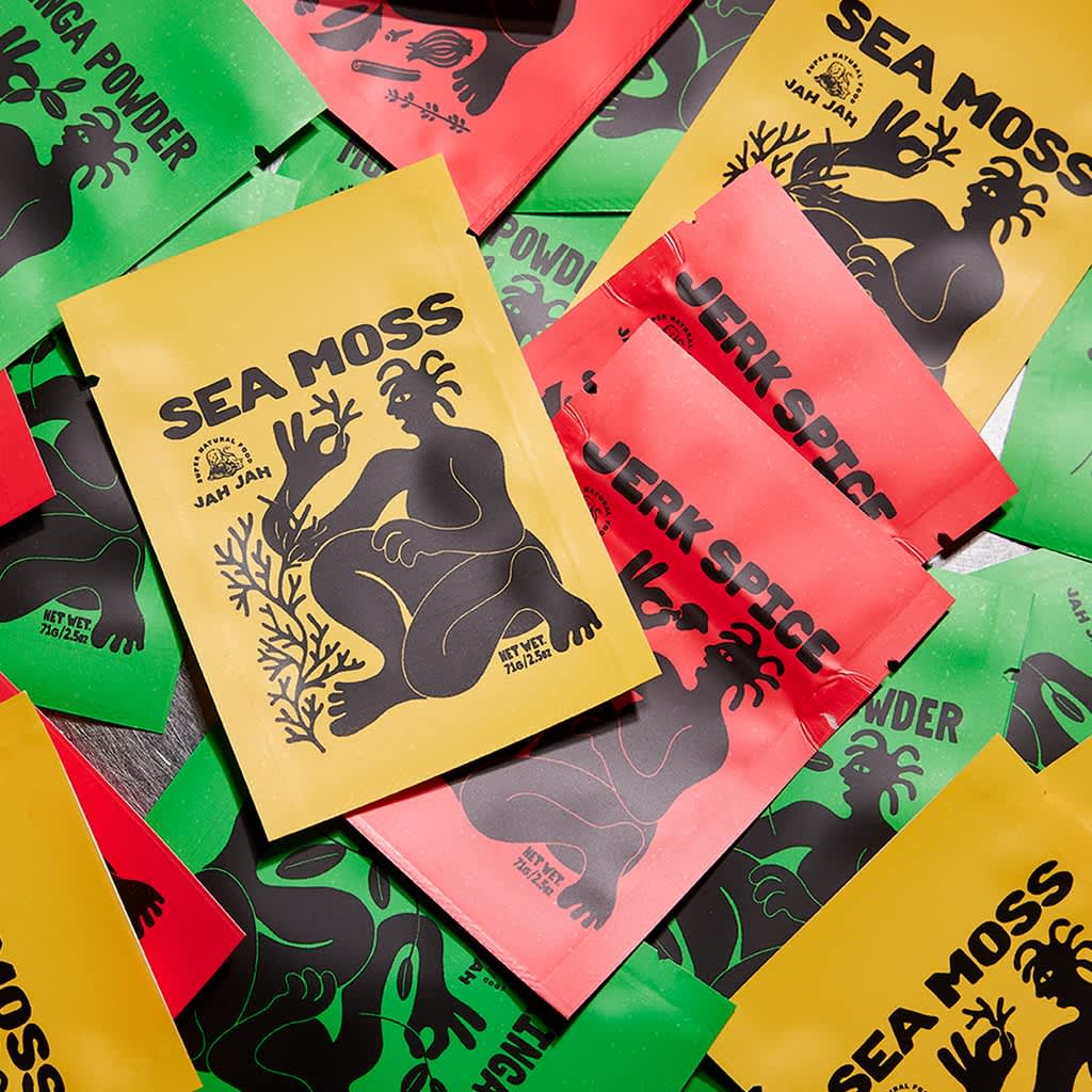
These packaging formats offer different ways to present your products in its retail display:
| Packaging type | Where it can work | What to consider |
| Reverse tuck boxes | Shelves and grouped countertop displays | Flat panels provide space for a clear front message and supporting details elsewhere. |
| Lock bottom boxes | Shelves with heavier items like jars and candles | An interlocking base adds security. Test the fit with your actual product. |
| Stand-up pouches | Counters and point-of-sale areas | Check that the filled pouch stands steadily and its front message remains easy to read. |
Consider your packaging costs and budget before deciding which type of packaging to go for.
The haptic effect: How touch can influence perceived value
The haptic effect is how tactility subconsciously signals premium quality. Touch can inform a buyer’s perception of a product or brand, including its quality and value. In retail packaging design, that means considering how a box feels when someone picks it up from the shelf.
Does it feel sturdy and is the surface tactile? The useful lesson from tactile psychology is to choose packaging materials and finishes that support the impression you want to create.
Understanding paperboard thickness
Paperboard thickness (pt) communicates the weight, thickness and strength of the material. Generally, the thicker the material, the more the customer is likely to trust your product quality. VistaPrint’s reverse tuck boxes and lock bottom boxes use 19 pt coated white paperboard. Always test a sample with your product inside to judge how the complete package feels.
Choosing a finish
VistaPrint offers matte, gloss and soft-touch options. Each creates a different impression:
| Finish | Look and feel | What to check |
| Matte | A matte texture with an understated look and no shine | Whether colors look vibrant enough. |
| Gloss and raised spot UV | A shiny surface that reflects light and makes colors and details pop | Whether reflections make text harder to read under store lighting. |
| Soft touch | A smooth, velvety feel | Whether the tactile texture adds enough to justify the extra cost. |
Custom retail packaging design strategy and steps
A retail packaging strategy should consider your budget, your product and its place on the shelf. Low-MOQ packaging (low minimum order quantity packaging) can reduce upfront costs, although smaller orders may cost more per unit. Compare both the total price and the cost per pack before you decide order quantities. Ensure all customization elements are high-impact.
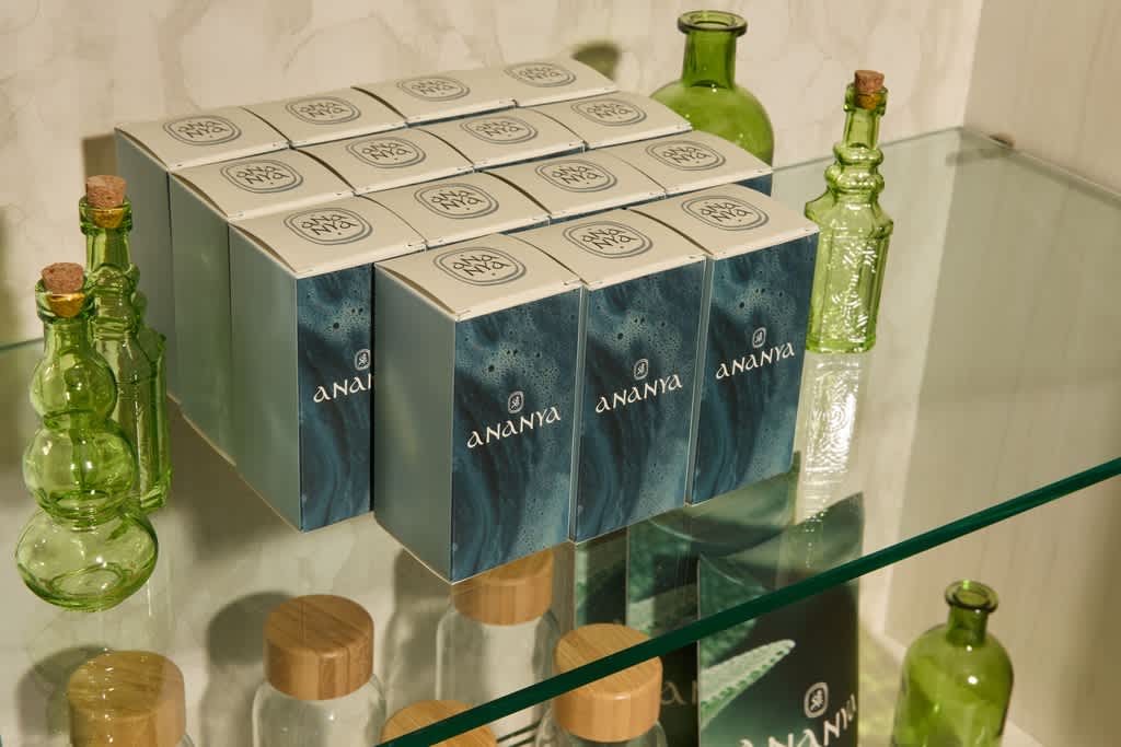
Follow these steps to get your packaging store-ready:
- Choose a packaging type. Consider your product’s dimensions, weight and intended retail display. Compare pouch or box sizes and check that your choice is easy to stock, display and handle.
- Make your packaging design stand out. Use buyer psychology and shelf interruption packaging techniques to make your product stand out from others on the shelf.
- Make the front message clear. Your brand name, product description and main benefit should be instantly obvious. Use the three-second test to check, and adjust the layout and font sizes based on what they struggle to identify.
- Test a sample. Order a custom packaging sample to review the artwork, weight and tactility. Put your product inside and check how the packaging looks, feels and stands on the shelf.
- Order a small run. Check the minimum quantity. Launch with an amount you expect to use, then gather customer and retailer feedback before reordering.
Put your retail packaging strategy into practice
Good retail packaging makes shoppers notice your product and helps them understand what it is and why they should buy it. Start with a clear product description, a distinctive color, shape or pattern and a tactile finish, then test it on the shelf and gather customer feedback using the 3-second rule to see how effective the information and visual hierarchy is.
Retail packaging design FAQs
How does retail packaging affect consumer behavior?
Retail packaging can influence what shoppers notice, how they understand a product and whether it feels worth the price. Clear descriptions and recognizable branding make the comparison easier, while materials and finishes can shape customer expectations of the quality.
What is the psychology of store displays?
The psychology of store displays explains how everything from color to product placement can influence customer decisions. Grouping related items together helps shoppers find what they need while an organized display makes products easy to understand, compare and reach.
How do you design packaging for retail shelves?
Start with your product dimensions and the space where it will be displayed. Make your brand name, product description and main benefit easy to find, with clear lettering that’s readable at arm’s length. Test a physical sample on the shelf with the product inside to check that it stands securely, fits the shelf and all important information is still visible.
How does color impact retail displays?
Color can help product packaging to stand out, make a brand recognizable and distinguish between varieties. The effect depends on the surrounding display and the associations buyers bring to it. Include written variant names so customers don’t have to rely on color alone.