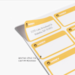

Too Light
Sep 27, 2025 | Ricky H. |  Verified Buyer
Response from Vistaprint Customer Care Team:
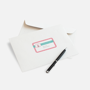
We understand how important it is for your address to be clearly legible on your mailing labels, and we’re truly sorry for the inconvenience caused by the print outcome appearing too light. We fully appreciate your concern and are eager to assist. After reviewing your order, we found that the submitted design featured a light grey text color that didn’t provide sufficient contrast against the white background, which led to the readability issue you experienced. To help prevent this in future projects, we recommend making full use of the on-screen preview and downloading a PDF proof before completing your order. These tools offer an accurate representation of how your design will appear once printed. You can learn more about these features here: https://www.vistaprint.com/customer-care/help-center/360052259371/?querycat=helpcenter_search_dropdown&q=pdf%20proof
Additionally, we suggest selecting a text color with stronger contrast against the background to ensure a clearer, more polished result. Once you’ve made these adjustments, you’re welcome to place a new order at your convenience. We hope this guidance proves helpful.